Posts filed under Ink Reviews

Graf von Faber-Castell Turquoise Ink Cartridge Review

(Jeff Abbott is a regular contributor at The Pen Addict. You can find more from Jeff online at Draft Evolution and Twitter.)

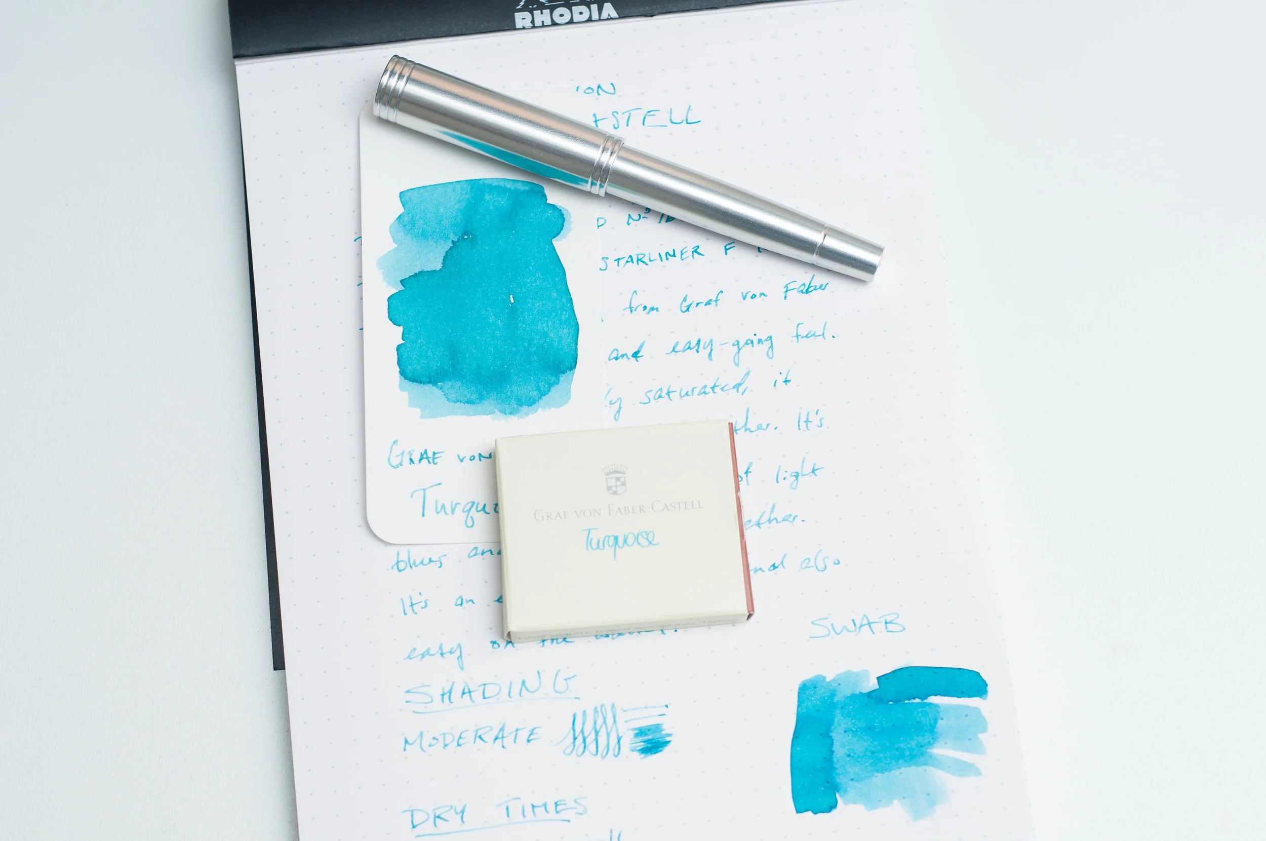
We're currently in the middle of summer vacation season, and Turquoise from Graf von Faber-Castell has me thinking of Indonesian beach scenes due to it's calming light turquoise color. While not my favorite turquoise ink, the one does offer a different, lighter take on the hue that is refreshing.

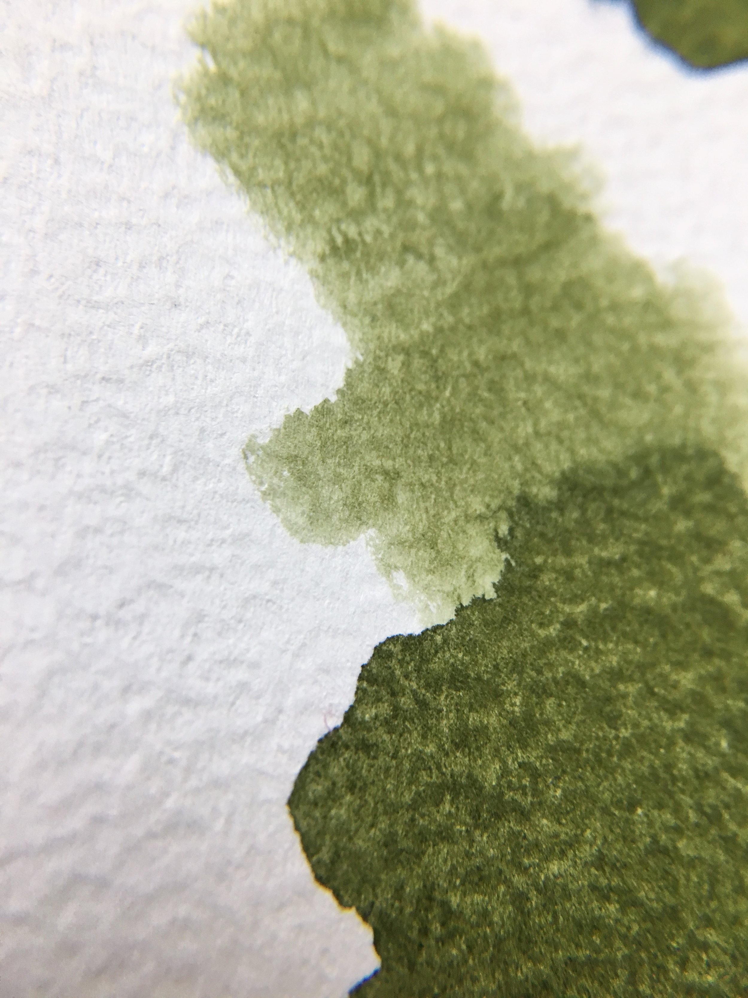
Like any turquoise ink, there's a delicious mixture of blue and green that reminds me of an idyllic tropical paradise. In some light, I see more blue coming through predominately, while other lights bring out the green. This changing nature is something that I always enjoy in an ink (as long as it matches up with the name and base color).

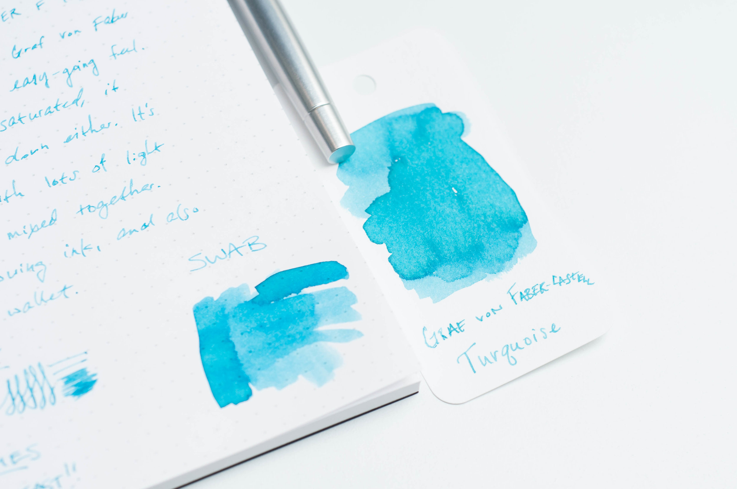
What gives this ink a unique feel is the precise lack of saturation compared to other teal and turquoise inks on the market. The ink looks thinner and less saturated than others I've used, but that's an illusion. There's plenty of color in the ink, but the light saturation doesn't lower the vibrancy at all. It's still gorgeous, which is something I can't say about other inks that seem watered-down or semi-transparent.

One of my favorite features of any blue or green ink is the shading property. In Turquoise, I'm delighted to report that there's plenty of moderate shading to be found. Obviously, this will be more dramatic with wider nibbed pens, but it even shows up well with fine nibs.

This is my first exposure to a Faber-Castell ink, so I wasn't sure what to expect as far as feathering, dry time, lubrication, and cleaning. Well, this ink is incredibly well-behaved. I haven't detected any feathering or bleeding, and due to the light color, there's almost zero show-through on most papers. The ink lubricates the nib very well, which makes writing smooth and effortless.

Dry time is something that surprised me the most. In most cases, the ink is smudge-resistant after ten seconds, and completely dry by 15. Very fast!

After running the ink through a couple of pens, I was also happy to find that cleaning this ink out from my pens was incredibly easy. It didn't require several passes.

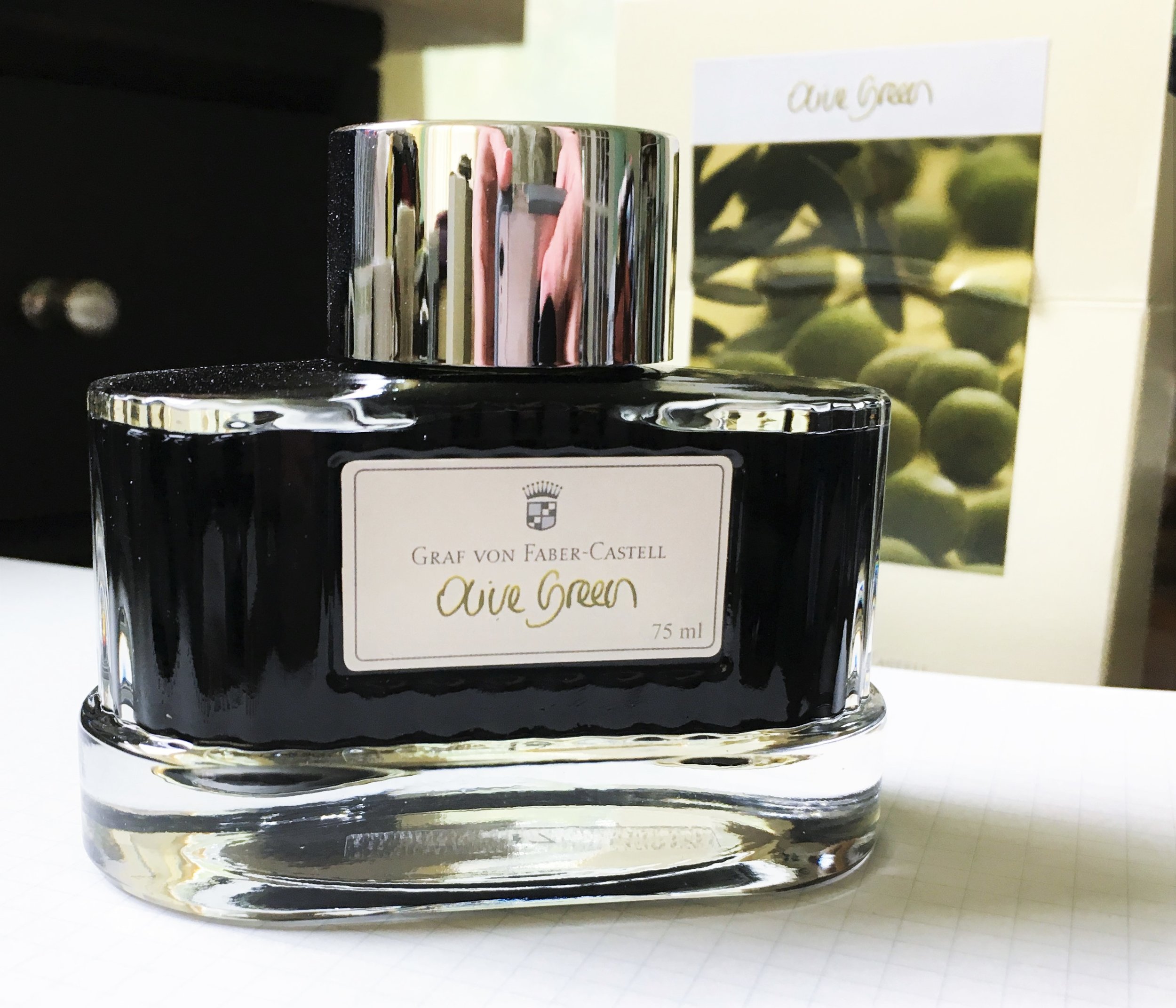
Overall, this is a fantastic ink that I've enjoyed using over the past few weeks. It has a cheery color, great properties, and a great price as well. I'm using cartridges, which can be had for under $4 for a box of six. If you want a bottle, you're stuck with the gigantic 75ml bottle that runs about $30. To me, a "normal" bottle size is about 50ml, so you get quite a lot for the price. Just make sure you like the color before you commit to such a large amount!

(JetPens provided this product at no charge to The Pen Addict for review purposes.)


Enjoy reading The Pen Addict? Then consider becoming a member to receive additional weekly content, giveaways, and discounts in The Pen Addict shop. Plus, you support me and the site directly, for which I am very grateful.

Membership starts at just $5/month, with a discounted annual option available. To find out more about membership click here and join us!

Posted on August 1, 2018 and filed under Faber-Castell, Ink Reviews.

Graf von Faber-Castell Olive Green Ink Review

(Sarah Read is an author, editor, yarn artist, and pen/paper/ink addict. You can find more about her at her website and on Twitter.)

A lot of times I can't tell the difference in performance between luxury ink brands and some of the smaller indie companies. There's no discernible justification for the difference in price or hype. But every time I've used a Graf von Faber-Castell ink, I've definitely noticed the quality and they never fail to impress me.

The ink comes in a 75 ml bottle--it's one of the biggest ink bottles in my collection. It's a sturdy glass bottle with a weighted bottom that prevents any tipping or sloshing. The glass is fluted and beautifully accented. The bottle is deep enough that I haven't had any trouble filling pens, but it is a bit squat, so I imagine that there may be some challenges as the ink level lowers. The inner chamber is flat on the bottom, so there's no interior well to position your nib in to get the best fill when the bottle runs low. Overall, it's a very heavy bottle. It makes a lovely paperweight. The lid is chrome with the Faber-Castell shield in black plastic set into the top. The front of the bottle has a cream sticker label with the color name on it.

The overall effect is a charming vintage look. I could see this bottle feeling right at home on a desk in the 30s or 40s. That's plenty enough reason for me to be enchanted, but it also happens to be full of some really great ink.

This is a lovely grassy Olive Green. It's a very mature color--there's nothing garish or exciting about it. It seems very businesslike. There aren't any flashy effects--no sheen that I could see, very little shading, and no shimmer. The pigments separate into a lime green and slate blue--it's not a complex color, but it's a very relaxing shade. If you prefer bright colors or fun effects, you could easily say that this ink is boring. But sometimes you need boring. And the things that win me over with this ink are in its performance.

This is a wet-flowing ink. It's smooth and pools nicely in the line to give it just enough character. But somehow, it's also very fast-drying. There's barely any smearing at 15-20 seconds, and at 25 it's completely dry. It's also very water-resistant. I tried dripping water and wiping it off, allowing the drops to soak in and let them stand for several minutes, and I can still see all of the lines as plain as new with hardly any color running at all. With as wet as the ink was going down on the paper, I expected it to smear all over and then wash away in the smallest raindrop. But no, this ink is super well trained. If you're a leftie who likes wet inks, this might be a great one to try.

A wet, smooth ink in a professional color that dries fast and stays put is the kind of ink that gets good use around here. I love bright, fun effects, and I always have a few playful inks in rotation--but I need inks like this on a daily basis for work and other important things. Boring things. And if I can lighten the boredom with an ink that is a true pleasure to use, that's a huge plus.

$30 for 75 ml of excellently behaved ink is definitely a good price. And there are other more exciting colors available, too, if this rich olive doesn't suit your fancy. I have a few colors in my collection, and I've been happy with all of them.

(JetPens provided this product at no charge to The Pen Addict for review purposes.)


Enjoy reading The Pen Addict? Then consider becoming a member to receive additional weekly content, giveaways, and discounts in The Pen Addict shop. Plus, you support me and the site directly, for which I am very grateful.

Membership starts at just $5/month, with a discounted annual option available. To find out more about membership click here and join us!

Posted on July 26, 2018 and filed under Faber-Castell, Ink Reviews.

Krishna Ink Anokhi: A Review

(Susan M. Pigott is a fountain pen collector, pen and paperholic, photographer, and professor. You can find more from Susan on her blog Scribalishess.)

I reviewed Krishna Ink’s Jungle Volcano a few weeks ago (link here), and I gave a little background on the ink and its maker in that review. So, if you’ve not heard of Krishna Ink before, go to that review first to read about the ink in general.

This week, I’m reviewing Krishna Anokhi. If my Google searches are correct, the word “anokhi” means “unique.” It is also the name of an Indian clothing company that produces beautiful textiles in a variety of colors and patterns.

Krishna’s Anokhi ink is a purple ink with lime green sheen. I tested it using a Pilot Vanishing Point with a medium stub nib on Maruman Septcouleur white paper. The ink did not exhibit any sheen or shading in my tests on this paper. Rather, the ink presented as a pleasant medium purple ink with good saturation. It is not waterproof and is fairly wet.

The chromatography test revealed only magenta and purple colors in the ink, so I’m not sure where the green sheen comes from.

This ink is best appreciated on paper that reflects sheen (like Col-o-dex Rotary Cards [reviewed here]) or in wide nibs. You can see the vivid green in the following photos.

Anokhi is another wonderful color from Krishna Ink. I love the purple and green together because it’s such a unique combination—and that makes the name “Anokhi” a perfect name for this ink.

You can purchase a 20ml bottle of Krishna Anokhi from Vanness Pens for $8.00. The bottles are very small, so if you want to use the ink with over-sized nibs, you’ll need to use a syringe or some other method to fill your pen.

(Vanness Pens provided this product at no charge to The Pen Addict for review purposes.)


Enjoy reading The Pen Addict? Then consider becoming a member to receive additional weekly content, giveaways, and discounts in The Pen Addict shop. Plus, you support me and the site directly, for which I am very grateful.

Membership starts at just $5/month, with a discounted annual option available. To find out more about membership click here and join us!

Posted on July 6, 2018 and filed under Krishna, Ink Reviews.