Posts filed under Ink Reviews

Cult Pens + Diamine Maureen and Robert Iridescink Review

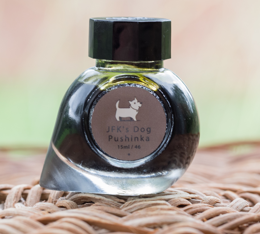
(Note: I'm not sure I've had a harder time accurately capturing two ink colors than these. It was challenging, and I'm still not happy with the results. No matter the lighting setup, I never fet I did them justice. YMMV.)

Over the past year or two I have taken a passive stance on two of the most popular ink trends: Shimmer and sheen. While I have admired them from afar, I haven’t wanted to use them myself. I’m not a big risk taker when it comes to fountain pen inks, although the siren’s call of their results on the page is breaking me down.

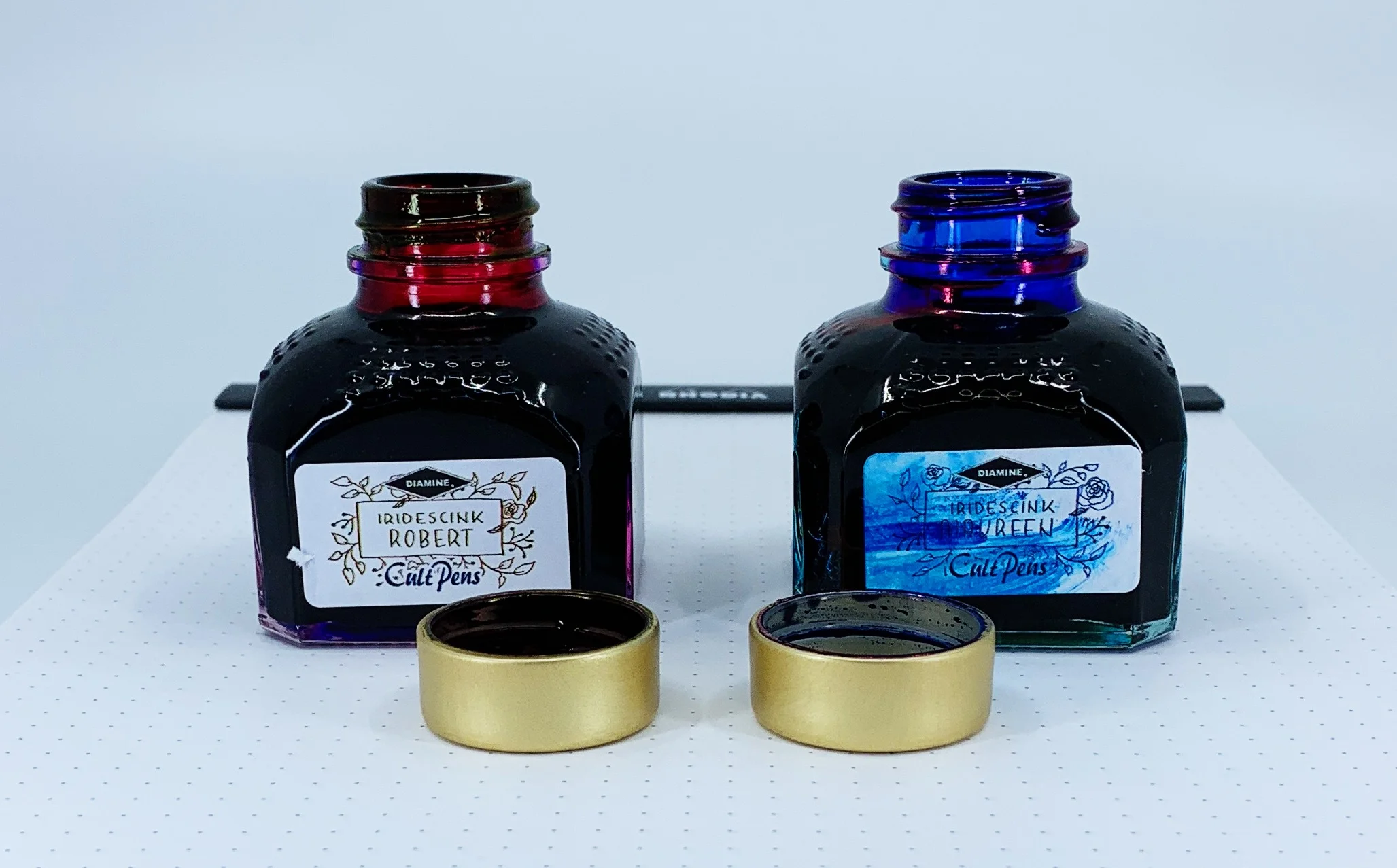
If I am going to head down one of these two shiny paths, sheen seems to be more my thing. And when I saw the first pictures of the new collaboration from Cult Pens and Diamine, I knew I was done for. Maureen and Robert are the ones for me.

Just look at the stock pictures and you will see why I am so enamored. The purple ink of Robert has a beautiful greenish-gold sheen, and Maureen’s deep and saturated blue ink pops with red. And these are not passive, slightly on the edge of the line, sheens. They are full-bore, 50-75% coverage sheens, if not more.

The kicker with these inks is do you like this type of effect when writing? Some people live for it. Others can do without. Big sheening inks have never been a priority for me because of my use of primarily extra fine nibs. Finer lines inherently don’t show off the ink properties as well, but Maureen and Robert are here to change my mind.

I inked up Maureen in my Pelikan M805 Ocean Swirl with an EF nib. This nib is essentially a Japanese Broad in line width, so I knew it would show off most of the ink properties, and it did. This is a rich, saturated blue, and I immediately though of Parker Penman Sapphire. Maureen may be a shade darker, but the way this ink behaves is awfully similar.

Robert was put into use in my Pilot Falcon. I purposely chose this soft fine nib to see how the ink would perform, and I have to say, it’s better than I thought. It may be the two nib choices, but I assumed I would prefer Maureen over Robert. I assumed incorrectly, as I’m enjoying the purple and green sheen out of the Falcon nib more.

To get the full effect of the sheen, you need to use a coated paper - like Rhodia - or the magic capabilities of Tomoe River. Basically, a paper where the ink takes longer to dry than is sometimes acceptable. That is the tradeoff to get the beautiful sheen of these inks to pop. Using them on a faster-drying paper like Leuchtturm deprives you of the main feature of these inks.

Swabs on Tomoe in a lightbox

With specialty inks like this, my main concern is: “Will I be able to use these for more than special occasions?” For Maureen and Robert, undoubtedly yes. I’ve enjoyed general every day writing with them, but I do make sure to use Rhodia for the most part. When I’ve used them on my favorite Nock and Studio Neat notebooks I haven’t enjoyed them nearly as much. I think you may even be able to get away with these in an office environment - if you bring your own paper.

Finally, and as I mentioned on the podcast recently, I have a soft spot for fun names, and fun stories about how they came to be. Fountain pen inks named Maureen and Robert? Sign me up!

There are many factors to consider when making a buying decision, and these inks tick all of my boxes. They are fun, functional, innovative, and have a great story behind them. They are also priced well, at £9.50 in the UK, or approximately $10.50 per 80ml bottle, minus the VAT. Big thanks to Cult Pens for send these my way for review.

(Cult Pens provided this product at no charge to The Pen Addict for review purposes.)


Enjoy reading The Pen Addict? Then consider becoming a member to receive additional weekly content, giveaways, and discounts in The Pen Addict shop. Plus, you support me and the site directly, for which I am very grateful.

Membership starts at just $5/month, with a discounted annual option available. To find out more about membership click here and join us!

Posted on October 22, 2018 and filed under Diamine, Ink Reviews.

Colorverse Strelka and JFK's Dog Pushinka Ink Review

(Susan M. Pigott is a fountain pen collector, pen and paperholic, photographer, and professor. You can find more from Susan on her blog Scribalishess.)

Colorverse’s Trailblazer in Space Series pays homage to animals, insects, and rockets that were launched into space. The Strelka and JFK’s Dog Pushinka set is based on the following story: in 1960, two dogs named Strelka and Belka boarded Sputnik 2. They were accompanied by forty mice, two rats, and several plants, and they successfully orbited Earth eighteen times. Strelka later gave birth to a litter of puppies. One of them, Pushinka, was given as a gift to John F. Kennedy (Dogs in Space).

The Strelka/Pushinka set comes with some pretty fabulous packaging. The outer box has pictures of both dogs with their respective color inks. The inner box is decorated with stars and the solar system.

In addition to the ink, the box contains some extra goodies: two branded napkins for wiping ink off nibs, a cardboard bookmark, a cardboard pen holder, and stickers.

Strelka

The Strelka ink comes in a 65ml teardrop-shaped bottle. It is a bright, peacock blue color with little shading or sheen.

I tested the ink using a Sailor Cross Point nib on Maruman Septcouleur paper. The ink flows extremely well and is definitely an eye-catching color. It’s a wet ink and is not colorfast.

My chromatography test showed little variation in color.

The color is really quite beautiful. But writers (like me) who enjoy shading and/or sheen will be disappointed that Strelka is so flat.

JFK’s Pushinka

The Pushinka ink comes in a tiny 15ml bottle. Pushinka is a rather odd color that looks tan in swabs. But with a nib it almost looks looks greenish. The ink does not contain any sheen.

I tested this ink using my Franklin-Christoph medium SIG Flex nib on Maruman Septcouleur paper. It exhibits a tiny bit of shading when you write with it, but is a flat tan color in swabs. It is much drier than Strelka ink, and it is not waterproof.

The chromatography test indicates that this rather bland color actually contains several interesting hues: gray, yellow, orange, and blue.

In spite of the cool chromatography, I’m not at all impressed with this drab color, though it does capture the tan colors of Pushinka’s ears and tail. Although the tiny bottle is adorable, it’s not practical for pens with large or long nibs. In fact, I filled the converter straight from the bottle rather than trying to draw ink up through the nib.

This is my first experience with Colorverse inks, and I’m definitely intrigued, even though the colors I tested didn’t have shading and sheen. I love the space themes Colorverse emphasizes, and I hope to try out some different colors in the future. You can purchase this Trailblazer set from JetPens for $33.00.

(JetPens provided this product at no charge to The Pen Addict for review purposes.)

Posted on September 14, 2018 and filed under Colorverse, Ink Reviews.

Graf von Faber-Castell Viper Green Ink Review

Out of the vast rainbow of fountain pen ink colors available, there are two shades I generally don’t care for: Red and Green. Red does nothing for me - bright, brick, blood - none of it registers. Green was there at one time too, especially traditional greens and dark greens. I think it is time I moved green off the list, because I found a new one I am enjoying immensely.

Graf von Faber-Castell Viper Green is one of the newest GvFC inks, which I picked up from Vanness Pens at the D.C. Pen Show. I was looking for a new ink to match my recently purchased Nakaya Piccolo Heki-Tamenuri and its brown-green finish, and Viper Green has turned out to be a great match.

For me, Akkerman #28 Hofkwartier Groen is the only green that sees regular use. It’s bright with yellow undertones and has fantastic shading. It looks great in all nibs, but shines in wide ones. Viper Green shares some of the same brightness I enjoy from Hofkwartier Groen, but with less yellow. It’s like a bright apple green hard candy on the page.

Traditional, standard production line greens (think Lamy, Waterman, Sheaffer) are some of my least favorite inks around. They tend to look washed out and weak, with no character at all. Viper Green has great character, with a deepness and saturation that makes it pop off the page. There is not a huge shading range, but enough to where you can see the variance. It dries reasonably well too, at least on the few pages I’ve tried it on.

While I’ve enjoyed several of the darker green inks I’ve reviewed, they never stick in the rotation. I’m not sure why. They are nice, and loved my many. Maybe it’s not my aesthetic. That’s ok, I have bright greens to fall back on, and Viper Green fits the bill perfectly.

(Vanness Pens provided this product at no charge to The Pen Addict for review purposes.)


Enjoy reading The Pen Addict? Then consider becoming a member to receive additional weekly content, giveaways, and discounts in The Pen Addict shop. Plus, you support me and the site directly, for which I am very grateful.

Membership starts at just $5/month, with a discounted annual option available. To find out more about membership click here and join us!

Posted on August 13, 2018 and filed under Faber-Castell, Ink Reviews.