Posts filed under Ink Reviews

Caran d’Ache Chromatics Hypnotic Turquoise Ink Review

Ink cartridge review, to be more specific.

I've always had an affinity for fountain pen ink cartridges, but have never truly embraced all of the options available. Until this point, my most used cartridge has been Pilot Blue Black in most any Pilot pen I own. That's right; they are proprietary. Same with Sailor, Platinum, and Lamy. Proprietary is fine, as long as there are options.

If you want even more options, international-sized cartridges give you that. But they are often limited to short international cartridges, made primarily for pocket pens with shorter barrels that can't accommodate a full-length cartridge. Pelikan makes an excellent standard international cartridge for their Edelstein lineup, but that's about it.

For mixing and matching colors with your compatible pens, short international cartridges are where it's at. And thankfully, that market has blown up over the past several years.

When I first got into Kaweco pocket pens, I felt limited by their stock cartridge offerings. They were excellent, and I used blue black and aubergine with regularity, but I wanted the choices in my ink cartridges to be closer to my options in ink bottles. Yes, I've syringe-filled many an ink cartridge in my day, but that kind of defeats the convenience of cartridges in the first place.

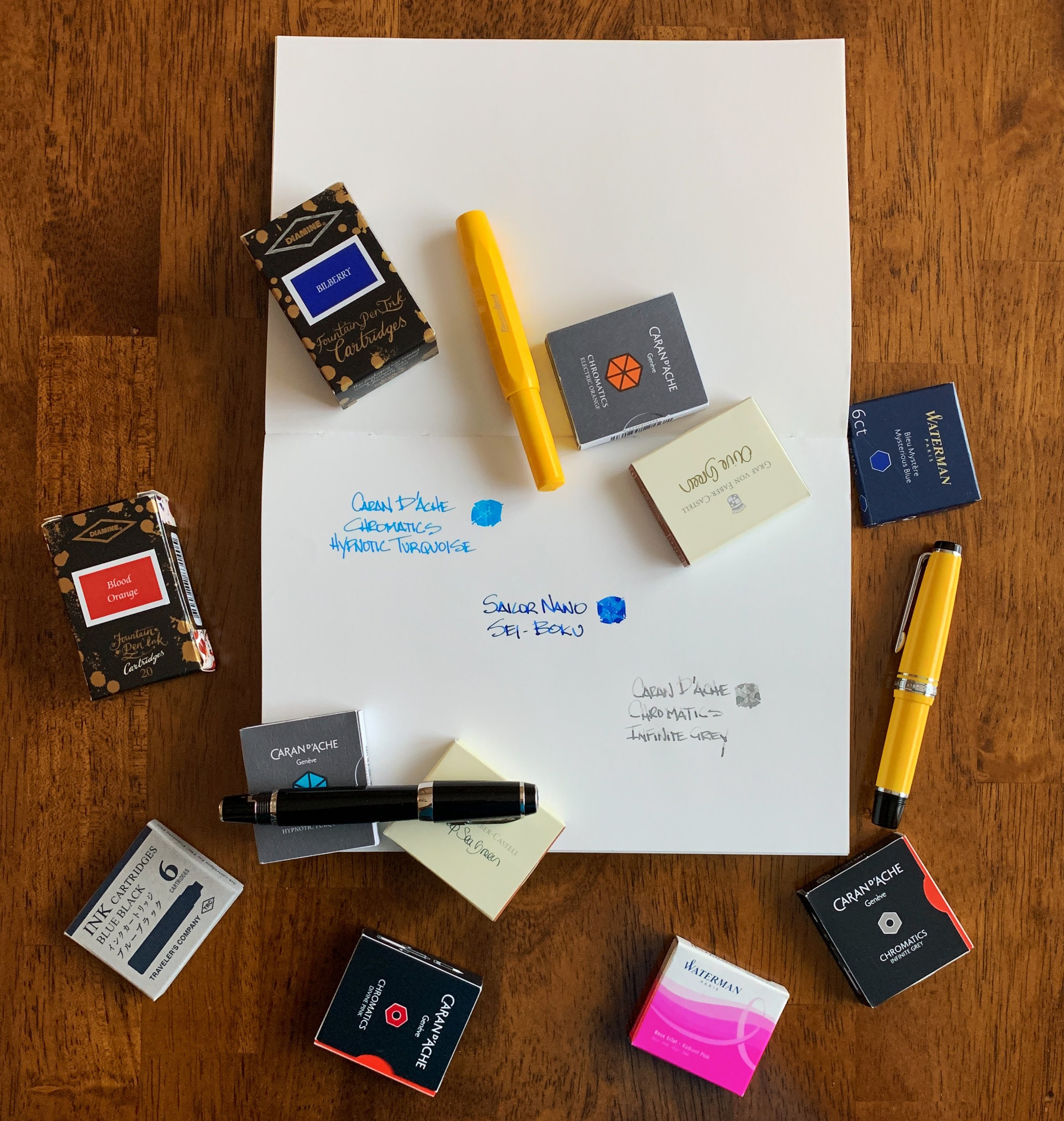
With more brands expanding their short international ink cartridge lineups I'm beginning to get the choice I've always wanted for my pens. And it is time for me to start exploring.

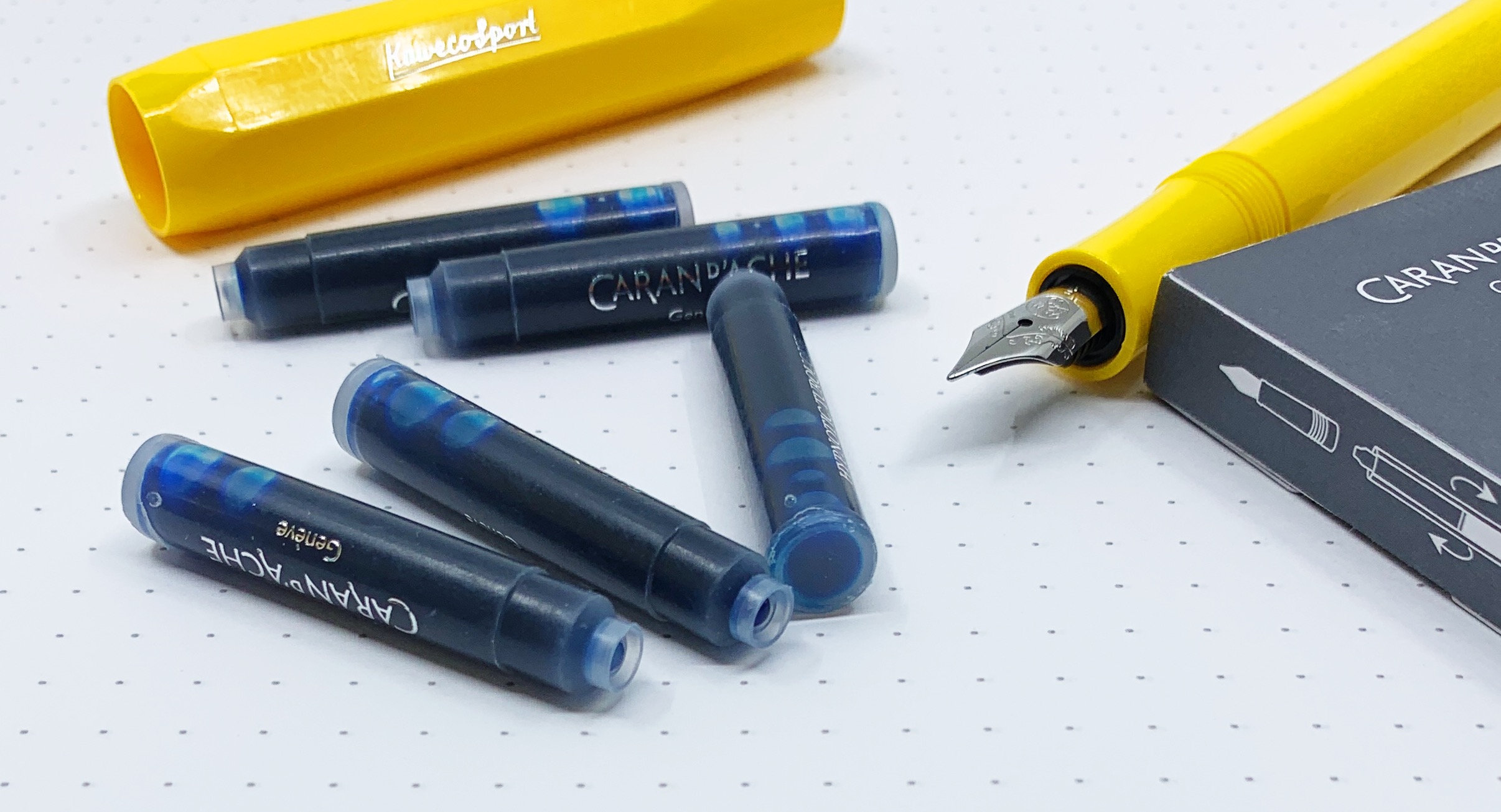
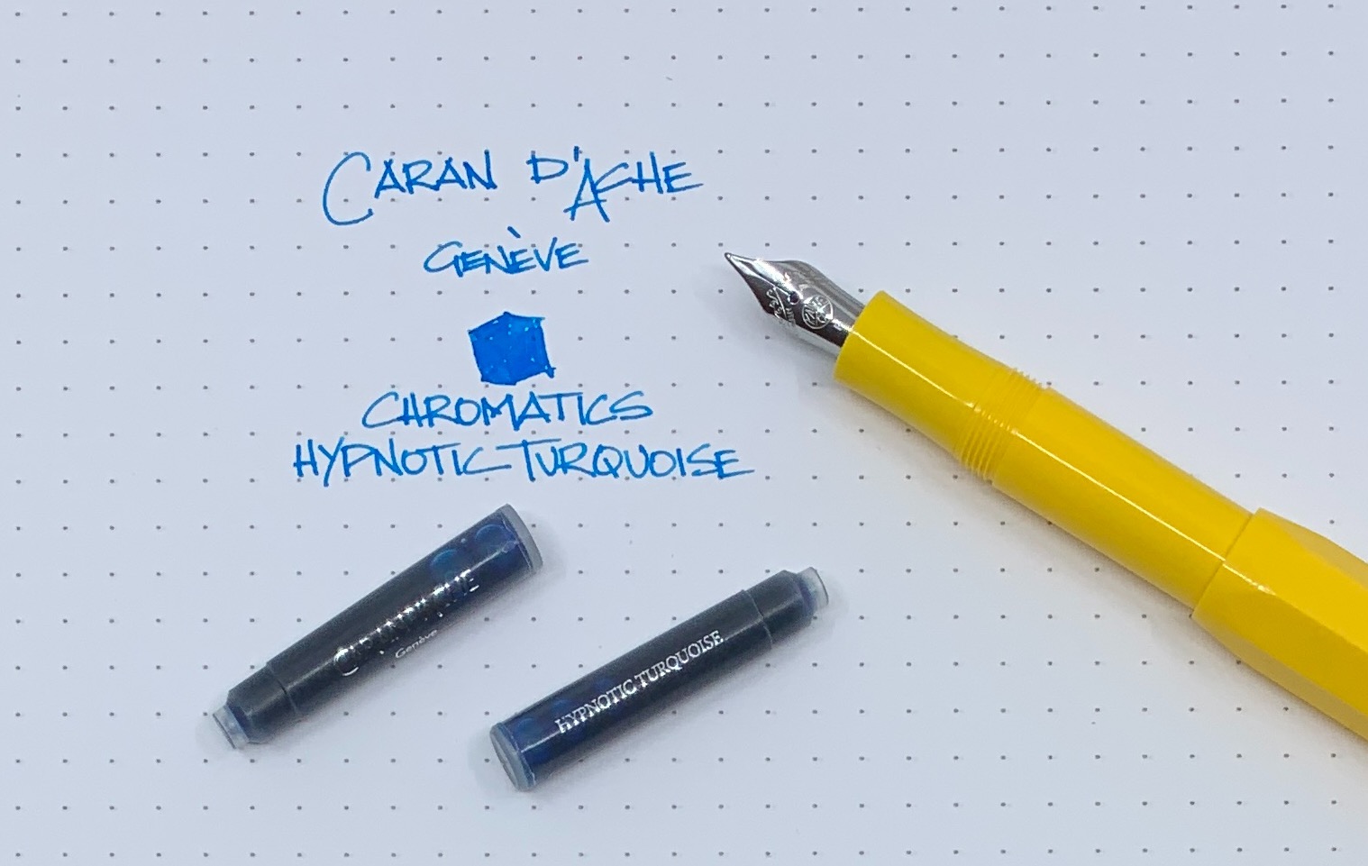
The words “Caran d’Ache” and “good value” will never be used in the same sentence. They are a luxury brand, and luxury pricing applies. On the surface, $5 for a 6-pack of short international ink cartridges may not sound like a lot, but comparatively, it is pretty steep. If I can get the quality I see out of my first cartridge choice - Hypnotic Turquoise - in the rest of their lineup, then I will have no problem saying that the price is worth it.

This bright blue pops off the page. It flows wonderfully from my Fine steel Kaweco Sport nib and has yet to dry out or hard start on me. There is a visible red sheen on the edges of my letters, and while this nib doesn't show off the inks full shading characteristics, I can see the color variation that would be even more present in a broader nib.

In short, this is a fantastic ink. I want more of this, and that is the path I am going down with this next little experiment of mine. I bought a dozen or so different ink cartridge colors and brands and will be testing them out. I also got your recommendations last week and will be adding those to my shopping list.

Right out the gate, they are going to have a tough time beating Hypnotic Turquoise.

(JetPens provided this product at no charge to The Pen Addict for review purposes.)


Enjoy reading The Pen Addict? Then consider becoming a member to receive additional weekly content, giveaways, and discounts in The Pen Addict shop. Plus, you support me and the site directly, for which I am very grateful.

Membership starts at just $5/month, with a discounted annual option available. To find out more about membership click here and join us!

Posted on April 22, 2019 and filed under Caran d'Ache, Chromatics, Ink Reviews.

Fountain Pen Ink Cartridges: What Are Your Favorites?

I’m not one to shy away from yet another experiment, and this time around it is fountain pen ink cartridges. Specifically, short international fountain pen ink cartridges. As you know, I’m a fan of small, or pocket-sized, fountain pens, and using an ink cartridge in them is more often than not the best solution.

Either I haven’t been paying enough attention, or the ink cartridge market has exploded over the past several years. Maybe in response to the popularity of smaller fountain pens? Whatever the reason, I approve, and I’m going to be testing a bunch out.

With that in mind, do you have a go-to fountain pen ink cartridge? I’ve stuck to the basics over the years, but the options are wide and varied these days, and I want to explore. I’m off to a good start as you can see above, but tell me your favorites in the comments below, or hit me up on Twitter.

Posted on April 17, 2019 and filed under Fountain Pens, Ink Reviews.

Robert Oster Blue Water Ice Ink Review

My most used ink color list looks something like this:

  1. Blue Black
  2. Orange
  3. Bright Blue
  4. Purple
  5. Bright Green

Blue Black ink goes in any every day writing pen and nib combination. Stock Fine Japanese nibs for example. The same goes for Orange, although it will find its way into finer nibs more often than Blue Black. Bright Blues, on the other hand, tend to find their way into the extreme ends of the nib spectrum. XXF, UEF, and PO on the fine side, and big stubs on the broad side. I almost never use them in the middle range of nib sizes.

Why is that? Bright Blues offer the perfect amount of character and readability for the nibs I use them in. Blue Black inks are arguably more readable on the micro side of the ledger, but will lose their character when the line is that fine. Conversely, they are a bit boring on the wide end. There are inky exceptions, of course, but in general terms I find this to be the case.

Orange inks look cool in micro nib sizes, but they are more difficult to read. Wide nibs tend to show off their brightness, but they often lack the big shading and sheening characteristics that other colors have.

Bright Blues, like Robert Oster Blue Water Ice, are my favorite in nibs that aren’t covered by Blue Black and Orange. For this review, I used my Pelikan M805 Demonstrator with a Medium nib modified to a stub by Dan Smith. As wide as stock Pelikan nibs already are, this made the line somewhere around a 1.0 mm stub, which shows off the characteristics of Blue Water Ice wonderfully.

This is a moderately shading and light sheening ink. There is good color variation within the line, and the edges show off a bit of red sheen that stands out the more characters there are on the page. In pictures and swabs I thought it would be similar to Pilot Iroshizuku Kon-Peki and Sailor Sky High, but in use it is lighter and greener, despite what my premier photography skills show in these images.

Because of that lightness, it is the perfect stub nib Bright Blue ink. It would be difficult for me to choose Blue Water Ice over Kon-Peki, for example, in something like my Pilot Custom Heritage 912 with PO nib. It would work just fine, but it wouldn’t be the best experience for me.

And that’s what fountain pen inks are for me: An experience. Finding that perfect match of ink color, nib, pen, and paper is something all of us fountain pen fans strive towards. That’s why we obsess over the little things, such as one ink being perfect for a fine nib, but not necessarily a medium nib. That’s why when we find that combination we go to it over and over again. And that’s what I find so fun about this crazy little hobby of ours.

(I'm fairly certain I bought this ink from Vanness Pens at a pen show in 2018 but I honestly can't recall the specifics. Maybe I got it for free.)


Enjoy reading The Pen Addict? Then consider becoming a member to receive additional weekly content, giveaways, and discounts in The Pen Addict shop. Plus, you support me and the site directly, for which I am very grateful.

Membership starts at just $5/month, with a discounted annual option available. To find out more about membership click here and join us!

Posted on April 1, 2019 and filed under Robert Oster, Ink Reviews.