Posts filed under Ink Reviews

P. W. Akkerman SBRE Brown Ink: A Review

(Susan M. Pigott is a fountain pen collector, pen and paperholic, photographer, and professor. You can find more from Susan on her blog Scribalishess.)

Oh, how I adore brown inks. I’m not sure why. Maybe it’s because they remind me of chocolate and horses and fall (my favorite season). Maybe it’s because there are so many luscious shades that make me think of the browns, tans, and red dirt colors of New Mexico, my homeland. I honestly don’t think of myself as a brown ink sort of person, but when I find a brown I love, it’s what goes in my Nakaya Naka-ai Heki-Tamenuri or my Franklin-Christoph Coco and Creme or Autumn Oak pens.

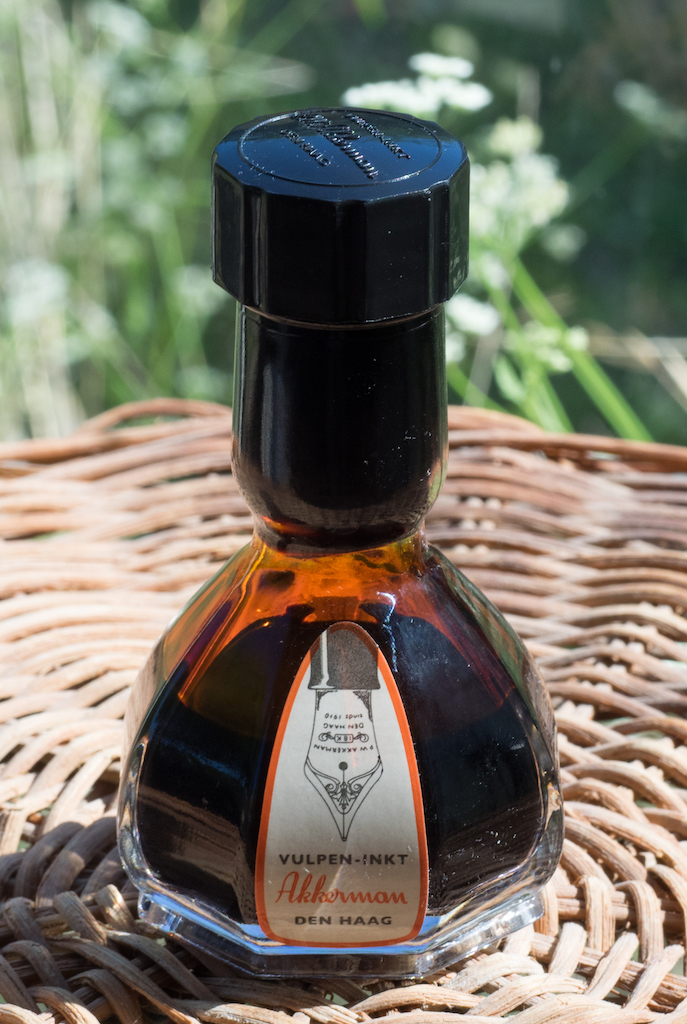
I also love me P.W. Akkerman inks (though SBRE Brown is actually made by Diamine). Not only are the inks absolutely amazing (Shocking Blue, for example) but the bottles--oh, my, the bottles! Why can’t all inks come in bottles that look like a genie could emerge if you rubbed the top? Plus, the Akkerman bottles have a really cool system for drawing the ink into the bottle stem with a glass marble. Dutch engineering is awesome-sauce.

SBRE Brown Ink is, of course, named for Stephen BRE Brown, a well known ink aficionado with a popular YouTube video series. He discusses the ink in its current Akkerman Dutch Masters Bottle format here.

Akkerman SBRE Brown is a gorgeous brown that leans toward the orange spectrum. It is rich and wet with lots of shading and a bit of sheen.

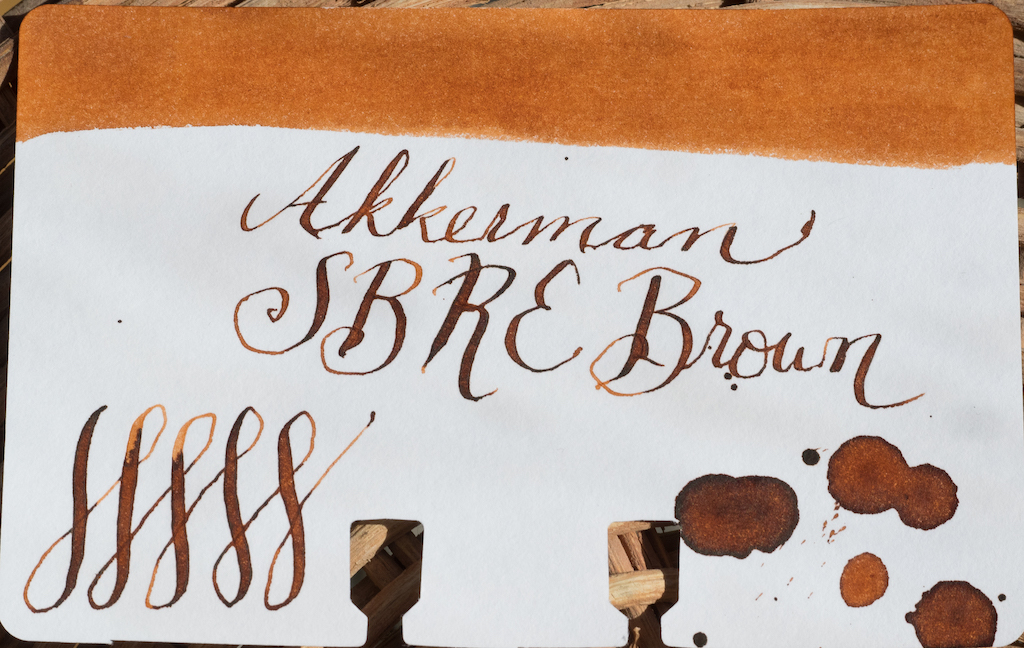
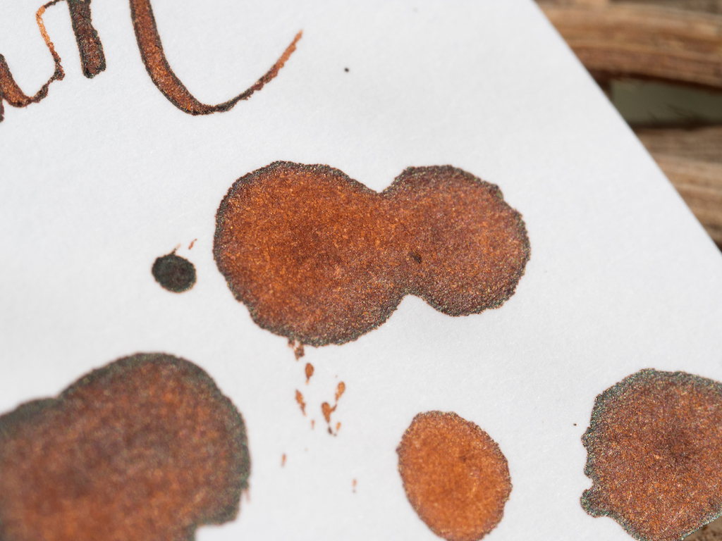
As you can see in my ink test (on Maruman Septcouleur paper), the ink shades nicely even in a medium stub nib. The swab shows the richness of the color. It is not waterproof.

The chromatography test confirms that the ink contains mostly tan and orange colors.

In a super wide nib (I used my Handwritmic Pen), the ink shades beautifully and pools with lovely brown sheen.

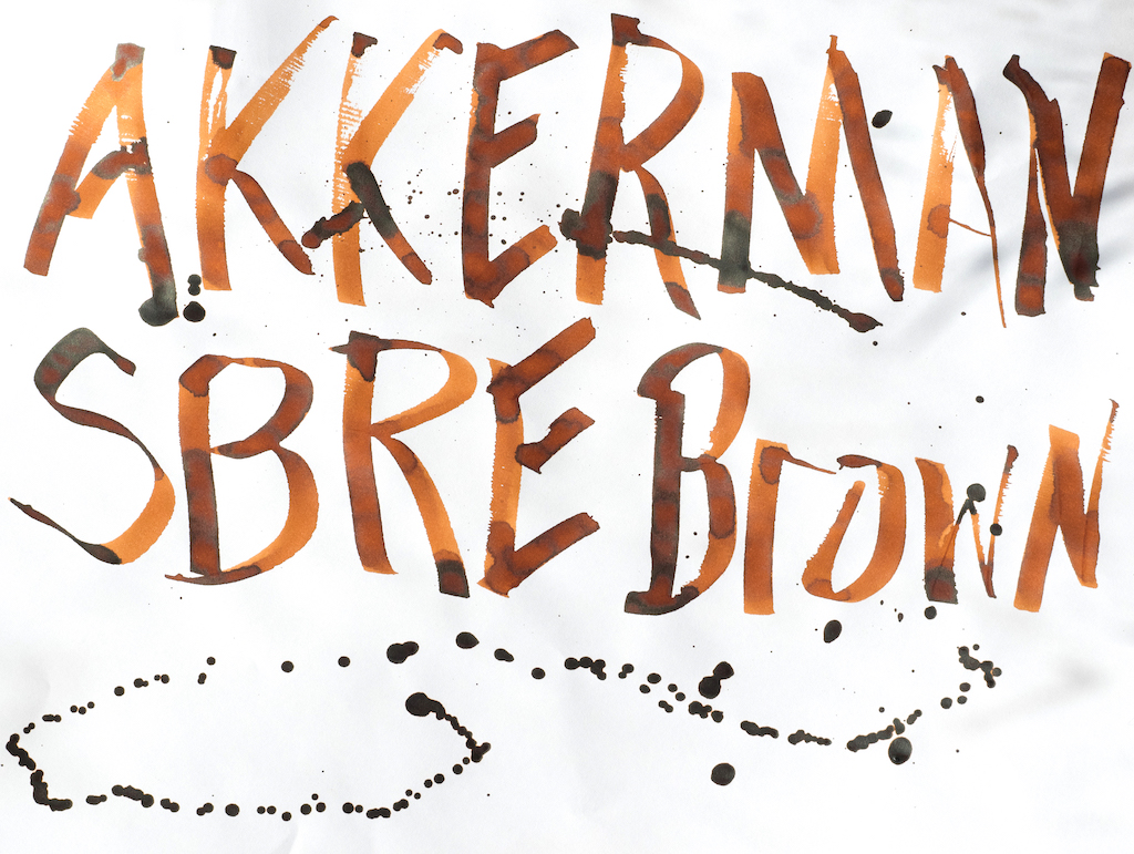
Akkerman SBRE Brown fills a niche in my brown ink collection. It is unlike any of my other browns, as you can see in this comparison on Col-o-dex cards.

Akkerman inks are not cheap. You are paying a premium for the amount of (ink 60ml) and the heavy glass bottle. I think it’s totally worth it, as these inks are stellar in quality and color. Shocking Blue remains one of my all-time favorite inks. SBRE Brown is now my first choice for any of my brown pens.

You can purchase Akkerman SBRE Brown ink from Vanness Pens for $32.00.

(This ink was purchased from Vanness Pens with a reviewer’s discount.)


Enjoy reading The Pen Addict? Then consider becoming a member to receive additional weekly content, giveaways, and discounts in The Pen Addict shop. Plus, you support me and the site directly, for which I am very grateful.

Membership starts at just $5/month, with a discounted annual option available. To find out more about membership click here and join us!

Posted on May 31, 2019 and filed under Akkerman, Ink Reviews.

3 Oysters Ink Delicious Blue and Delicious Chilli Red: A Review

(Susan M. Pigott is a fountain pen collector, pen and paperholic, photographer, and professor. You can find more from Susan on her blog Scribalishess.)

3 Oysters Ink is made in Seoul, South Korea. The inks are formulated with pure, ionized water and dye-based colors. I received two colors for review: Delicious Blue and Delicious Chilli Red.

The inks come in glass 38ml bottles with black caps. The bottom corner of the bottle is cut so that you can angle the bottles for easier filling, though I’m not convinced the bottles are all that stable when angled. Thankfully, they are tall and deep, not squat and flat like Sailor bottles, so it’s easy to fill even large pens.

Delicious Blue

Delicious Blue is a basic blue ink leaning more towards turquoise than navy. It’s a rather flat color with a tiny bit of shading but no sheen. It’s definitely darker when I write with my Blue Pumpkin nib (in a dip pen) than with my Leonardo Stub nib.

In my initial ink testing, I used Maruman Septcouleur Paper which is a pure white 75gsm paper. Delicious Blue remains a consistent color whether you’re writing or swabbing. It is fairly wet and is not waterproof.

My chromatography test reveals that the color is a mid-range blue with a tiny bit of violet.

I also tested the ink on Tomoe River Paper and on a Life Renover notebook. It remains consistent on each kind of paper. In the second photo, I compared the Maruman paper with Tomoe River and couldn’t see much of a difference. Tomoe paper generally brings out sheen if an ink has any, and Delicious Blue does not.

Chilli Red

Although the spelling (“Chilli”) drives me to distraction since I’m from New Mexico and chile is chile, this color is definitely a hot red. In swabs it leans more toward orange than burgundy.

Like Delicious Blue, Chilli Red is a rather flat color that exhibits some shading but no sheen. Although the color is rich when I use my Blue Pumpkin nib, in swabs it washes out pretty easily, turning almost coral. This is also true for wider nibs, such as my super-wide Handwritmic pen used in the first Chilli Red photo above. It’s a very wet (even watery) ink that takes a long time to dry. It is obviously not waterproof.

Chilli Red is much more interesting when you do a chromatography test. It has lots of pink, dark pink, and orange.

The ink performed consistently on the Maruman paper, Tomoe River Paper, and in the Life Renover notebook. The second picture compares the ink on Maruman and Tomoe.

I’m sad to say that I’m not all that impressed with 3 Oysters ink, at least in these two colors. Both Delicious Blue and Delicious Chilli Red are flat, basic colors. You can get a bit of shading from them, but they don’t have any sheen at all (which may please those of you who don’t like sheeny inks). I’m also not too keen on how washed out Chilli Red becomes in wider nibs.

I’m not going to give up on 3 Oysters yet. I’d like to try some of their more interesting colors, such as Hwangto.

You can purchase Delicious Blue and Chilli Red from Vanness Pens for $18.00 (38ml) or $2.50 (4ml sample).

(These inks were purchased from Vanness Pens with a reviewer’s discount.)


Enjoy reading The Pen Addict? Then consider becoming a member to receive additional weekly content, giveaways, and discounts in The Pen Addict shop. Plus, you support me and the site directly, for which I am very grateful.

Membership starts at just $5/month, with a discounted annual option available. To find out more about membership click here and join us!

Posted on May 17, 2019 and filed under 3 Oysters, Ink Reviews.

Pilot Iroshizuku 100th Anniversary Daikokuten Ink Review

For all the grief I have given Pilot over the past year for their handling of their 100th Anniversary celebration, you knew I was going to participate in it when and where I could. I was hoping it would be a pen, and I was hoping it would be in 2018 - the actual 100th year of the company - but alas, neither were meant to be.

I finally got to join in on the fun last month, as Pilot’s 100th Anniversary Iroshizuku inks hit the US market. Better late than never I guess!

This ink set consists of 7 colors, designed in conjunction with their 7 Gods of Good Fortune maki-e fountain pen set made for their anniversary. On the whole, I was disappointed with the color choices. I would have liked to see Pilot push the boundaries a little more if I’m being honest. That said, there are a couple of interesting colors in this group, none more so than Daikokuten in my eyes.

I don’t own a yellow-leaning ink. I have tried a few light oranges in my time, but have never been compelled to go even lighter with yellow. How would this ink look on the page? Would I be able to read it? Can I use it with my favorite extra fine nibs and be happy with it?

As you can tell, Daikokuten requires you to answer a few questions about your ink usage before committing to using it. A simple, basic ink this is not.

I’ve shied away from yellow inks in the past because of their inherent lightness. My eyes are bad as it is - why do I want to strain them even more? The pictures and samples of Daikokuten compelled me because it appeared to have some depth and character to it. And, it wasn't as boring as the rest of the 100th Anniversary Iroshizuku lineup. It seemed fun.

So far, it is. I’d say it’s even better than I thought, although it will never be a daily driver for me. This is a special occasion ink, meaning a 50ml bottle is probably not the way to go unless you have a great use case for it.

Daikokuten performs as well as any other Iroshizuku ink I have tested, which is to say very well. I chose to use it in a 14k gold Sailor EF nib purposefully. If the edge case ink works well in an edge case nib, then I will be happy - even if this isn’t the recommended setup. Light ink plus wide nib is usually the best combination.

I thought white paper would be the best choice for Daikokuten too, but the cream-colored page of the Yoseka Notebook was the winner. It beat out my other standard choices of Rhodia, Tomoe River, and Apica by a decent margin. With Yoseka paper, I could see the character in the ink that made me want to purchase it in the first place. As I alluded to earlier, your paper choice will effect an ink color this light.

The big question is: Would I recommend this ink to you? Definitely maybe. It’s a fun ink, but not an ink I will use all of the time. That makes it the perfect candidate for an ink sample purchase, or 15ml mini bottle if you can find someone willing to break up the set.

For me, I’m happy to at least have one cool product from Pilot’s 100th Anniversary event.

(I purchased this ink at a discount from Vanness Pens.)


Enjoy reading The Pen Addict? Then consider becoming a member to receive additional weekly content, giveaways, and discounts in The Pen Addict shop. Plus, you support me and the site directly, for which I am very grateful.

Membership starts at just $5/month, with a discounted annual option available. To find out more about membership click here and join us!

Posted on May 13, 2019 and filed under Pilot, Iroshizuku, Ink Reviews.