Posts filed under Ink Reviews

Colorverse Apollo 11 50th Anniversary First Moon Landing Limited Edition Ink Set Review

(Sarah Read is an author, editor, yarn artist, and pen/paper/ink addict. You can find more about her at her website and on Twitter. And check out her first novel, The Bone Weaver’s Orchard, now available where books are sold!)

There have been so many fun moon landing anniversary editions in the stationery world this year, and the Colorverse Apollo 11 Ink Set is certainly no exception. It's a fun theme, a great celebration, and this is probably the most drool-worthy ink set I've encountered.

The first thing you can't help but notice about this set is the amazing packaging. The spacey looking grey box unfolds to fun facts and illustrations about NASA's mission and the spacecraft. Then there's a layer of wee cute ink bottles nestled in formed foam. The cardstock has more fun facts. Beneath that is another layer of ink bottles and yet more educational nuggets. The set comes with napkins and info cards and stickers. It's clear a lot of thought went into what would be inside this box besides the fun inks themselves.

I love the color choices for this set. It's the essentials--every color you really need is here, yet they're all still wonderfully within the theme. And somehow they've used common colors and still made them unique. Of all my sample cards, I could not find any that looked like a clear duplicate of any of these five colors.

Best of all, I love the tones. The blue-black, called Apollo 11, has a lovely smoky blue shade that pools to a deep navy. The grey, called One Small Step, is a perfect moon dust color. It seems cool in its lighter tones, and warm where it's darker. The teal, called Eagle, is fresh and bright but still readable. The green, Tranquility Base, is a lovely, earthy, matcha green. And the red, Columbia, is sometimes pink, sometimes orange, and sometimes deep red with a gold-green sheen.

The chromatography tests for these inks blew me away. The teal and red were fairly straightforward, through it did bring out the pinks in the red. The green left a lovely smoky line behind as the brighter neon green crept away. The blue-black had some lovely hidden pinks and purples that I hadn't been expecting. But that grey? Holy cats! Bright orange, pink, and teal. There's clearly some sort of alchemy afoot at the Colorverse laboratory. As I watched the colors climb the paper, I felt like I was watching some sort of spell unravel. And it also explains that dual warm/cold look to the ink itself.

I'll do a part two of this review where I talk about all of their behaviors in actual pens. But for now, I can easily say that this is the most fun I've had with inks in a long time. The only downside to this set? The price. The $100 cost is a bit high, even for all this magical fun. While I think the packaging is unbeatable as far as coolness goes, I wonder how much it has driven up the cost of this set. There are only 125ml of ink here. And while there's a good color variety, and the bottles are adorable, I'm not sure I'd have splurged on this. I think the audience for this package requires a very specific overlap in the Venn diagram of ink buyers: People who are drawn to practical colors, who are space fanatics, and collectors of limited editions. I'm sure there are plenty of pen addicts who fit into those categories, and I do hope that this limited run will all find good homes. I can't help but love it, myself. More fun with these inks to come next week!

(JetPens provided this product at no charge to The Pen Addict for review purposes.)


Enjoy reading The Pen Addict? Then consider becoming a member to receive additional weekly content, giveaways, and discounts in The Pen Addict shop. Plus, you support me and the site directly, for which I am very grateful.

Membership starts at just $5/month, with a discounted annual option available. To find out more about membership click here and join us!

Posted on September 26, 2019 and filed under Colorverse, Ink Reviews.

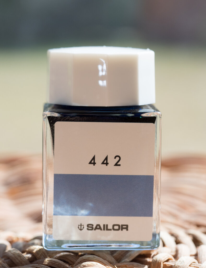
Sailor Ink Studio 442: A Review

(Susan M. Pigott is a fountain pen collector, pen and paperholic, photographer, and professor. You can find more from Susan on her blog Scribalishess.)

A few months ago I reviewed my first Sailor Ink Studio ink: Sailor 123. It is a fascinating color that shifts and changes before your eyes. Around the time I bought Sailor 123, I also purchased Sailor 442 from a different retailer.

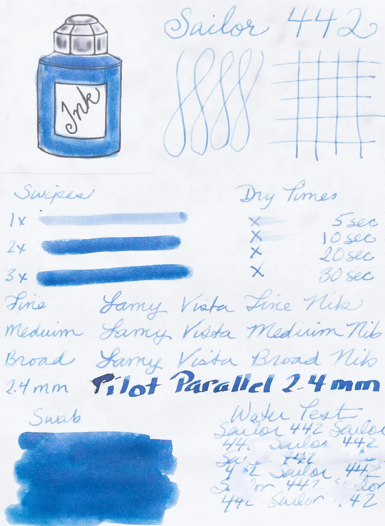
Sailor 442 is a blue ink with purple tones. On my Col-o-dex card, the swab looks like a basic blue, but there is some green sheen in the splats. Shading isn’t very evident on the card because my Brause Blue Pumpkin nib was pretty saturated. You can see better shading in my other writing samples.

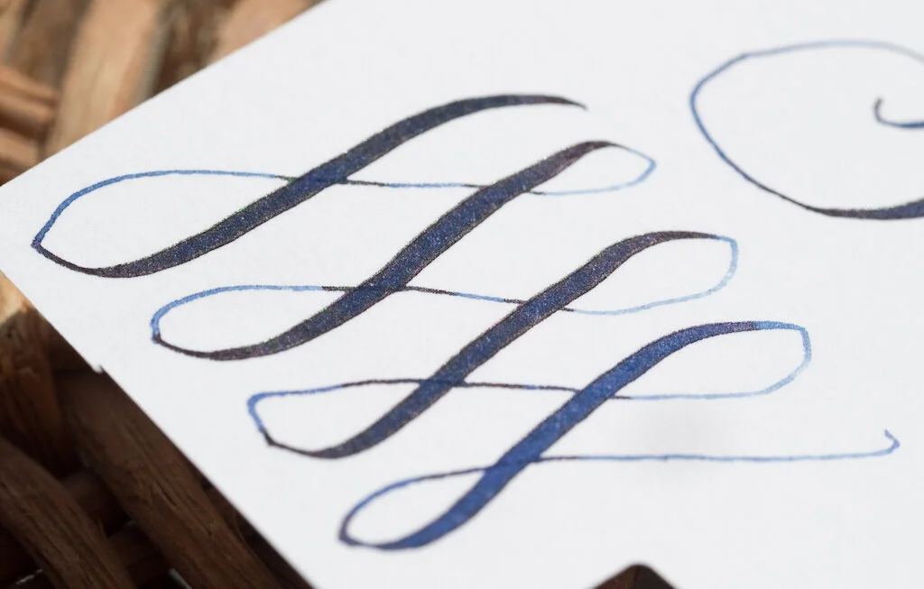
I tested the ink on Rhodia dot-grid paper with three Lamy Vistas in different nib sizes and the 2.4mm Pilot Parallel (dipped). The ink is a medium to dark blue with good shading in wider nibs. The purple tone comes out slightly in the broader nibs, but is most evident in the water test. The ink dries quickly but seems well lubricated when you write with it.

Chromatography reveals all the different shades combined to create this ink (light blue, purple, lavender, turquoise, green, and yellow). It’s a shame these colors don’t show up in swabs or shading. Unlike Sailor 123, 442 is not a shade-shifting ink. It’s quite striking in chromatography, but rather bland in the nib.

Even in my Handwritmic nib, which best displays the color variations, shading, and sheen potential of an ink, Sailor 442 was disappointing. There’s a good amount of shading, but only slight hints of the color variations found in the chromatography test. On the Midori Cotton paper, sheen was not evident.

After the magical experience of Sailor 123, I must say I was disappointed with 442. It’s not that it’s a bad ink--it’s actually a very nice blue with good shading and medium wetness. I just expected more from this rather expensive little bottle of ink. I now know that only certain Sailor Ink Studio inks have the shade-shifting characteristics of Sailor 123. I definitely plan to purchase those. I’ve read that the higher the number given to Ink Studio inks, the more sheen they have.

For an amazing overview of all 100 Sailor Ink Studio inks, I recommend Mountain of Ink’s blog. Not only can you read about the collection as a whole, there’s a detailed review of each one.

I purchased Sailor 442 from an eBay seller for around $21.00 plus shipping. Now you can purchase Sailor Ink Studio inks at $18.00 a piece (plus shipping) from Dromgoole’s (though you have to do so over the phone).


Enjoy reading The Pen Addict? Then consider becoming a member to receive additional weekly content, giveaways, and discounts in The Pen Addict shop. Plus, you support me and the site directly, for which I am very grateful.

Membership starts at just $5/month, with a discounted annual option available. To find out more about membership click here and join us!

Posted on September 20, 2019 and filed under Sailor, Ink Reviews.

Cult Pens Diamine Christine Iridescink Review

I guess I’m a sheen ink guy now. At least somewhat.

For any ink that is created to exhibit properties on the more extreme end of the spectrum - sheen and shimmer, for example - I am cautious. That means, I stick with the big brands who have a track record of good inky behavior. Not only do I expect them to work well, they need to flow well, clean well, dry well, and not act odd on the nib or on the page.

Diamine is one of those brands I have had great luck with, so when Cult Pens asked if I wanted to review round two of their Iridescink collection, it was an easy yes.

The relationship between these two great British brands extends back for several years, beginning with the Deep Dark series. Those colors were a hit, and the Iridescink has turned this entire collaboration up to eleven.

Previously, I reviewed Maureen and Robert, the first two inks in the series. I love both, but I cannot tell a lie: I love Maureen the most. Sorry Robert! Maureen is a bright blue with a red sheen, so when I saw Christine’s formulation - blue black with red sheen - you could say I was excited. I’m happy to report Cult Pens and Diamine delivered another winner.

I used my TWSBI ECO 1.1 mm stub to test Christine with. The ink goes down dark on the page, and dries with a red sheen covering what seems to be around 90% of the line. Where the letters start, and the ink is thinner, a bright blue peeks out from underneath, making for a great result on the page. I’m biased, of course, because blue black ink with red sheen may be my single favorite every day ink option. (Note: Similar to my Maureen and Robert review, it is practically impossible for me to get a good picture of this ink.)

It’s this level of sheen that I am not used to. It shows up the best on sheen-favorable (aka long dry time) paper like Tomoe River and in my Yoseka notebook. On Rhodia, it’s not as pronounced and more of the blue comes out on the page, with some sheen around the edges. On Leuchtturm, it was darker with less sheen, but dried the fastest.

Rhodia DotPad

Cult Pens lays all of this out on the product page, stating:

“Sheen can be fickle. Everything has to be just right for sheen to show up, so we can't guarantee you'll see sheen when you write with these inks, but they give you a good chance in the right conditions. You need the right combination of ink, pen and paper.”

This matters if you want the full effect of Iridescink, or any sheening ink. Heck, this matters for any pen, ink, and paper combination. That said, Christine is a color I enjoy on any paper type so far. The next test will be if I like it in a fine nib, as opposed to a stub. My guess is I will.

Yoseka Notebook

As much as I have fawned over these inks, I have yet to discuss possibly the best part of all: The price. At £9.50 (just under $12) for an 80 ml bottle, they are practically giving it away. That makes biting the bullet on international shipping a whole lot easier.

I’m a fan of sheen when it is well-behaved. The Iridescink inks from Cult Pens and Diamine are exactly that, and I can’t wait to see what they come up with next.

(Cult Pens provided this product at no charge to The Pen Addict for review purposes.)

Posted on September 16, 2019 and filed under Diamine, Cult Pens, Sheen, Ink Reviews.