Posts filed under Ink Reviews

Akkerman #12 Mauritshuis Magenta Fountain Pen Ink Review

The correct order of operation when you buy a new pen you immediately buy a new ink to go with it, right? And there are bonus points if the ink matches the pen? I’m pretty sure these are the rules, but if not, I’m making them official today.

I bought the Leonardo Momento Zero Fountain Pen Lavande Rose Gold from Dromgoole’s Pens at the 2020 Baltimore Pen Show. I’m a Leonardo fan, and this new color spoke to me, so I went for it. I had two decisions to make after purchase: One, do I get the nib ground because they only had Medium in stock, and two, what ink will go with this pen the best because I am here, and this is now?

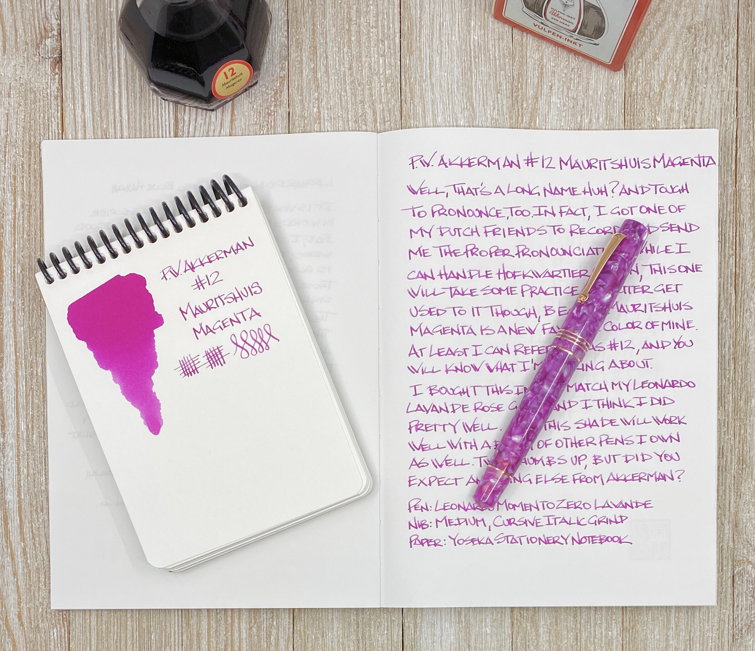
Being the matchy-matchy person that I am, I wanted a color close to the Lavande of the pen barrel, but no normal pink or purple would do. I pored through the large swatch books at Vanness Pens rejecting colors left and right, until it hit hit me. Doesn’t Akkerman have a nice magenta? Why yes, they do! Akkerman #12 Mauritshuis Magenta is the exact color I was looking for.

Many of you may be yelling at the screen by now, “Brad, I love pink-purple-magenta inks, and there are a TON of great ones out there.” Yes, I admit I’m a little bit late to the party with this shade, but with my already-professed love for all things pink and purple, it was only a matter a time before I combined the two into a new love.

My main question is this: What do you call this color? Magenta seems right. I see Rose used a lot, or maybe it’s Purply Pink? Regardless, it’s great, and I’m glad I added a new Akkerman to the collection, which now totals six.

Mauritshuis Magenta is a classic Akkerman mix of quality, performance, and color. There are inks out there that will out-sheen this classic, but for pure writing with a decent amount of shading, Akkerman more than holds its own. Plus, they have the coolest ink bottles in the world, and are reasonably priced at $30 for a 60 ml bottle.

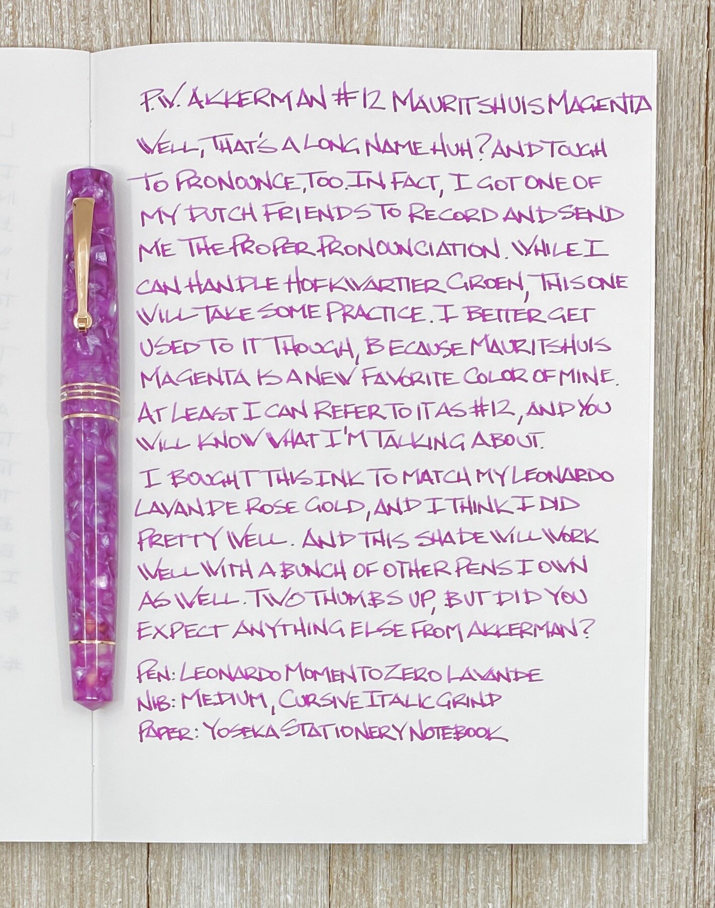
The cursive italic grind I had put on this nib by Gina at Custom Nib Studio shows off the shading well in the vertical strokes, and the ink flow never skipped a beat when writing. I think that is my favorite feature of Akkerman Inks - they just work.

And they look great too. I may not be able to pronounce their names, but at least I have a number to work off of. Welcome home #12!

(Vanness Pens provided this ink at no charge to The Pen Addict for review purposes. I purchased the Leonardo from Dromgoole's at a discount.)


Posted on March 23, 2020 and filed under Akkerman, Ink Reviews.

TWSBI Sapphire Blue Fountain Pen Ink Review

(Jeff Abbott is a regular contributor at The Pen Addict. You can find more from Jeff online at Draft Evolution and Twitter.)

For a fountain pen company that sells some of the most popular and innovative pens in the affordable bracket, it seems like TWSBI should have been selling fountain pen ink all along. In fact, they even sold specialized (but empty) ink bottles since the beginning. Well, TWSBI have finally come around and started offering their own fountain pen inks alongside their pens. The Sapphire Blue that I got my hands on is a fairly basic blue ink that does a good job of staying professional and reliable.

I'm a huge fan of blue inks — the brighter and more poppy, the better. Even though I have a slew of basic blue inks from different manufacturers, I don't break them out very often because I prefer using my more interesting and bombastic blue inks. But, there's always a time and place for everything. Sometimes you need that textbook dark blue ink that looks similar to any blue gel pen ink off the shelf at your local big box retailer. Nothing wrong with that color, but it also needs to be a rock-solid, dependable ink that you can rely on in different situations. Similar to TWSBI's pens, you need to be able to use it in a variety of conditions and different types and varying qualities of paper. These are the factors that make up a good basic blue. It's not terribly exciting, but it's reliable.

To my eyes, the shade and hue of Sapphire Blue is very similar to Pilot Blue and Kaweco Royal Blue. It's a bit darker than the Lamy Blue, and J. Herbin's Eclat de Saphir is a lot brighter — to the point that I don't really consider it a basic blue. If I wasn't currently out of Waterman Blue, I'm sure it would compare very closely with Sapphire based on past experience.

It's a good shade of blue! One that blends in well in legal or professional settings. It won't call any attention to itself like other flamboyant fun inks, and that can be a good thing. It's a classy blue.

Even though this is a pretty bland color (on purpose), there is a fantastic hint of shading when using the right nib. It's not dramatic like other inks, but there's a small amount of color variation in some strokes, which provides just enough visual interest to let you know that this is definitely a fountain pen ink.

When I brushed the ink onto a swatch card, I was also pleasantly surprised to see some dark teal/turquoise hints in the ink as well. I've never seen these tones when writing, but they show up pretty clearly in the swatch.

Another thing that really surprised me with this ink is the dry time. It's an extremely fast-drying ink. I know this can vary depending on environmental factors like humidity and paper quality, but it's consistently a fast drier. In most of my tests, it's dry by the 15 second mark and impossible to smudge. This could be a great ink for left-handed writers.

The ink is also well-lubricated and flows well in the pens I've tried it with. I haven't had any issues with it skipping or drying up in the nib after a few days. Overall, it's a really well-behaved ink that I'd put in any of my pens. It does have a noticeable smell, but half the inks I use have some sort of chemical smell when you first uncap a pen or bottle. Nothing to worry about.

While Sapphire Blue is a great basic blue, I do have some gripes about the packaging and the bottle. I don't care about packaging in most cases; if I don't have a use for it, I throw it away after unboxing everything. For inks, I like to keep the box so that the ink bottles are easier to store and transport. While the 70ml ink bottle is what I'd expect in size compared to other bottles that hold the same amount of ink, the box that the ink was packed in is absolutely ridiculous. The box is about twice the size of the ink bottle and seems really wasteful. Plus, in my situation, it takes up a lot of space in my ink storage area that could be used for other inks.

My other gripe is with the confusing decision on TWSBI's part on how to supply an inkwell. In particular, why they chose to ship the inkwell outside of the bottle. I guess I can understand the reasoning for people that prefer their ink bottles sans-inkwell, but I really like inkwells. Fine. I have to install the inkwell myself — no big deal, right? Not quite. The ink bottle is so full that you can't install the inkwell without removing about 10ml of ink. Otherwise, you'll overflow the bottle, make a huge mess, and waste a lot of ink. I don't understand this decision, and wish TWSBI would just install the inkwell at the factory before shipping them out to customers.

At $18, TWSBI's 70ml ink bottle is a pretty good deal. That's a lot of ink, and most manufacturers don't ship bottles that large. For example, Lamy, Pilot, Kaweco, and others normally use 50ml bottles for their normal-size ink offerings. 70ml is a lot of ink, and it's a good deal at this price.

Aside from Sapphire Blue, TWSBI currently offers Black, Blue-black, and Red. Their selection is pretty limited for now, but I'm curious to see if they have more interesting colors on the release roadmap!

(JetPens provided this product at no charge to The Pen Addict for review purposes.)


Enjoy reading The Pen Addict? Then consider becoming a member to receive additional weekly content, giveaways, and discounts in The Pen Addict shop. Plus, you support me and the site directly, for which I am very grateful.

Membership starts at just $5/month, with a discounted annual option available. To find out more about membership click here and join us!

Posted on March 4, 2020 and filed under TWSBI, Ink Reviews.

Colorverse Joy in the Ordinary Coffee Break Ink Review

(Sarah Read is an author, editor, yarn artist, and pen/paper/ink addict. You can find more about her at her website and on Twitter. And check out her latest book, Out of Water, now available where books are sold!)

The Joy in the Ordinary series from Colorverse is truly delightful, as a theme. What would astronauts miss when in space? Lots of lovely earth things, like hot coffee--the inspiration for Colorverse Coffee Break. I love a good warm brown ink, and this one is well up in the ranks with some of my favorites.

The packaging, as with any Colorverse ink, is so charming that you're inevitably smiling before you even set eyes on the ink itself. The box is fully decorated with delightful illustrations. When all the different colors are lined up, the illustrations on the outside of the boxes form one continuous scene. I don't know any other company that puts this much thought into their presentation, and I totally love it.

The ink bottle itself is an egg-shaped blown glass 30ml jar. The front is flattened where the label goes. It's a cute bottle, as all Colorverse bottles I've seen to date are. It's a practical shape, too, allowing for easy pen filling, even when the ink starts to run low. The smaller size bottle helps to keep the cost down, as well. This bottle retails for $13.75, which seems just right.

The ink itself is a nice warm brown. It leans a bit yellow, I think. This isn't a black coffee, or a creamy latte coffee. This is more like the weak coffee you get in a hotel lobby at 3am. But I dig it. Chromatography shows a lovely split between an almost purple-mauve, fading into pink, to coral, to bright yellow. It's easy to see where all that warmth is coming from. And Colorverse remains the most surprising brand when it comes to chromatography tests.

It has quite a lot of shading, ranging from a dry grass color to a rich chocolate. It's well balanced between wet and dry. It doesn't feel like a wet ink, but doesn't have the drag of dry ink, either. The dry time on it is decent, between 20 and 25 seconds. There is almost no water resistance to this ink at all. The slightest splash washes it clear away. A bit ironic, since the thing that most people seem to spill on their writing is coffee.

As far as comparisons go, I can't say that this ink is unique. There are a lot of similar colors out there. The closest in my swab collection is J. Herbin Lie de The--a funny naming convention coincidence. The J. Herbin is a little bit cheaper than this Colorverse, but I strongly prefer the Colorverse bottle.

I really like this new series from Colorverse. Their previous offerings are all excellent, but the larger sets they come in often exceed my ink budget. These smaller singles at affordable prices are just what I needed from this line. And while the colors so far aren't anything wild, they perfectly capture their theme of joy in the ordinary.

(JetPens provided this product at no charge to The Pen Addict for review purposes.)


Enjoy reading The Pen Addict? Then consider becoming a member to receive additional weekly content, giveaways, and discounts in The Pen Addict shop. Plus, you support me and the site directly, for which I am very grateful.

Membership starts at just $5/month, with a discounted annual option available. To find out more about membership click here and join us!

Posted on February 6, 2020 and filed under Colorverse, Ink Reviews.