Posts filed under Ink Reviews

Robert Oster Signature Austrialian Opal Blue Ink Review

(Sarah Read is an author, editor, yarn artist, and pen/paper/ink addict. You can find more about her at her website and on Twitter. And check out her latest book, Out of Water, now available where books are sold!)

Every time I think that Robert Oster has made an ink for every shade of blue possible, he comes out with another blue! All of them are different and lovely in their own way. Austrialian Opal Blue is simpler and less flashy than some of them, so perhaps not one of the Oster rock stars, but it's a lovely shade of summer blue.

This is a very pale, soft color that may not be practical for everyday writing. It's a delicate shade that's difficult to see in dim light, but really dazzles in sunshine. It does have some nice shading, though, and where it pools, it has a beautiful, bold sky tone to it. The shading is even visible with a fine nib, which bodes well for its character in a firehose of a pen.

It has no water resistance, and washes away completely, not even leaving a washed-out droplet behind. It dries very quickly for liquid ink, between 15 and 20 seconds. This might be a great light blue for lefties. It does feel a bit dry when writing with it, but not to an unpleasant degree.

Chromatography shows a blue to aqua fade, very soft colors that are difficult to see at all unless the paper is on a white background. There's not a lot of complexity to this color.

I don't see any sheen with this ink. There is almost a hint of a purple sheen at the edges of where I pooled the ink and let it dry, but it's not visible in any writing I've done. My guess is that you'd only see a sheen from this ink if you spilled it on some fancy paper and let it dry.

This is a very different tone from my other blues. It almost comes close to Iroshizuku Kon Peki, but it's much more subtle and pale than that in writing. It's not like any other blue I've used, and I love that no matter how many colors there are, there are always new colors.

I've never met an Oster ink I didn't like. This one is perfect for celebrating the arrival of spring. But it's definitely one of the low-impact colors of the line. It's simultaneously not wild and not practical. It's too plain to be exciting, and too pale to be utilitarian--so I think it falls between purposes a bit. Despite that, it is a unique blue, so maybe it's the exact color you've been waiting for.

(JetPens provided this product at no charge to The Pen Addict for review purposes.)


Enjoy reading The Pen Addict? Then consider becoming a member to receive additional weekly content, giveaways, and discounts in The Pen Addict shop. Plus, you support me and the site directly, for which I am very grateful.

Membership starts at just $5/month, with a discounted annual option available. To find out more about membership click here and join us!

Posted on April 9, 2020 and filed under Robert Oster, Ink Reviews.

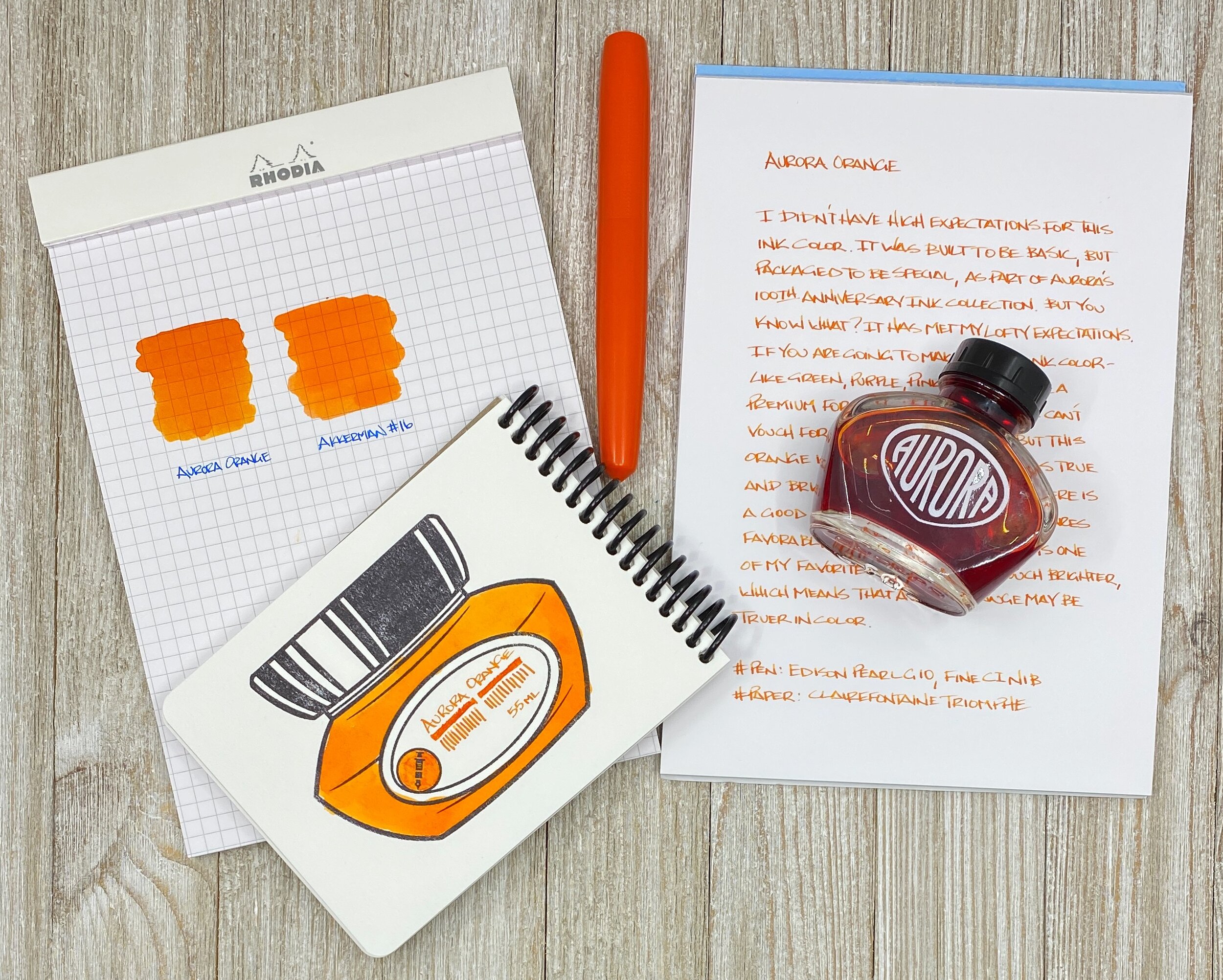
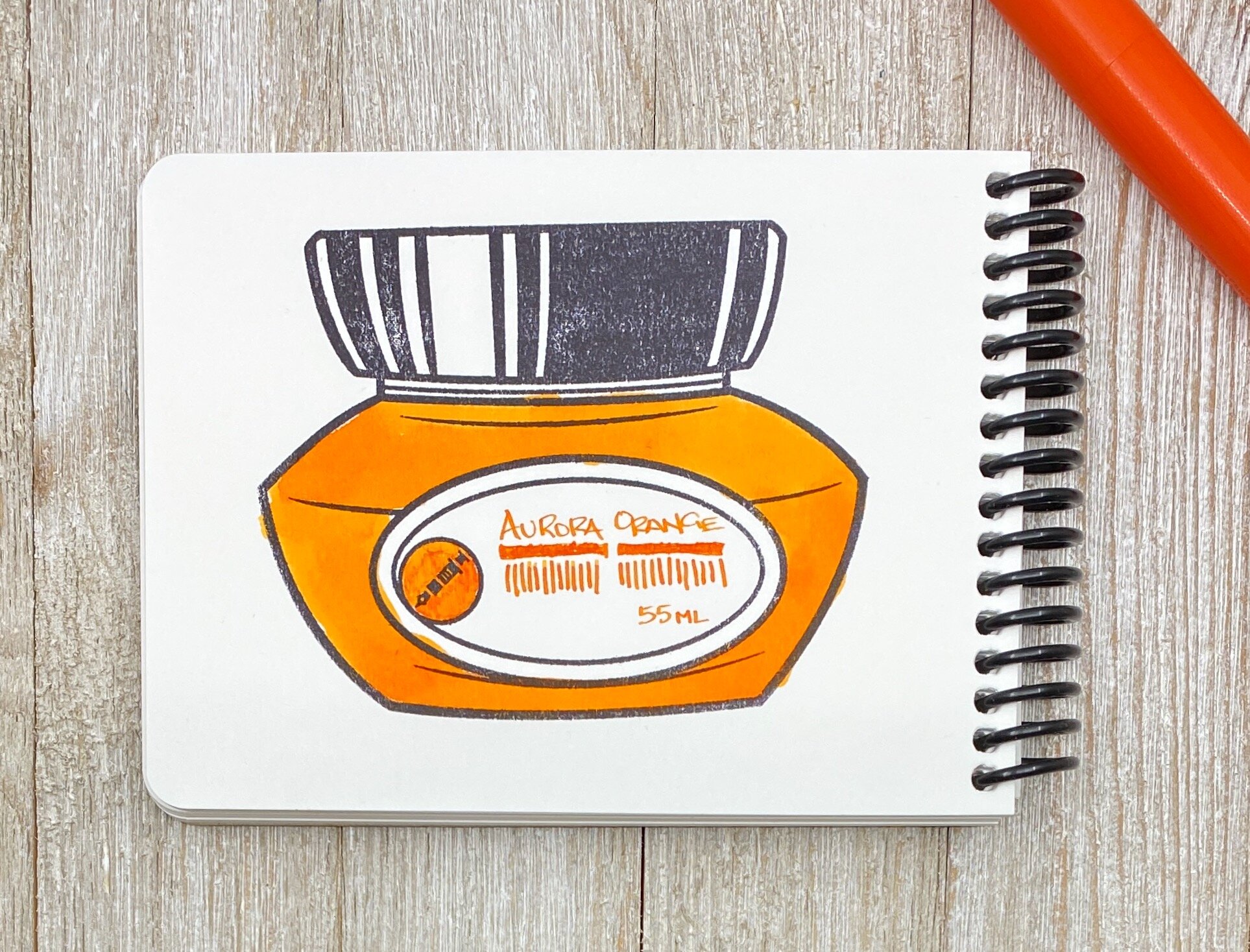
Aurora Orange Fountain Pen Ink Review

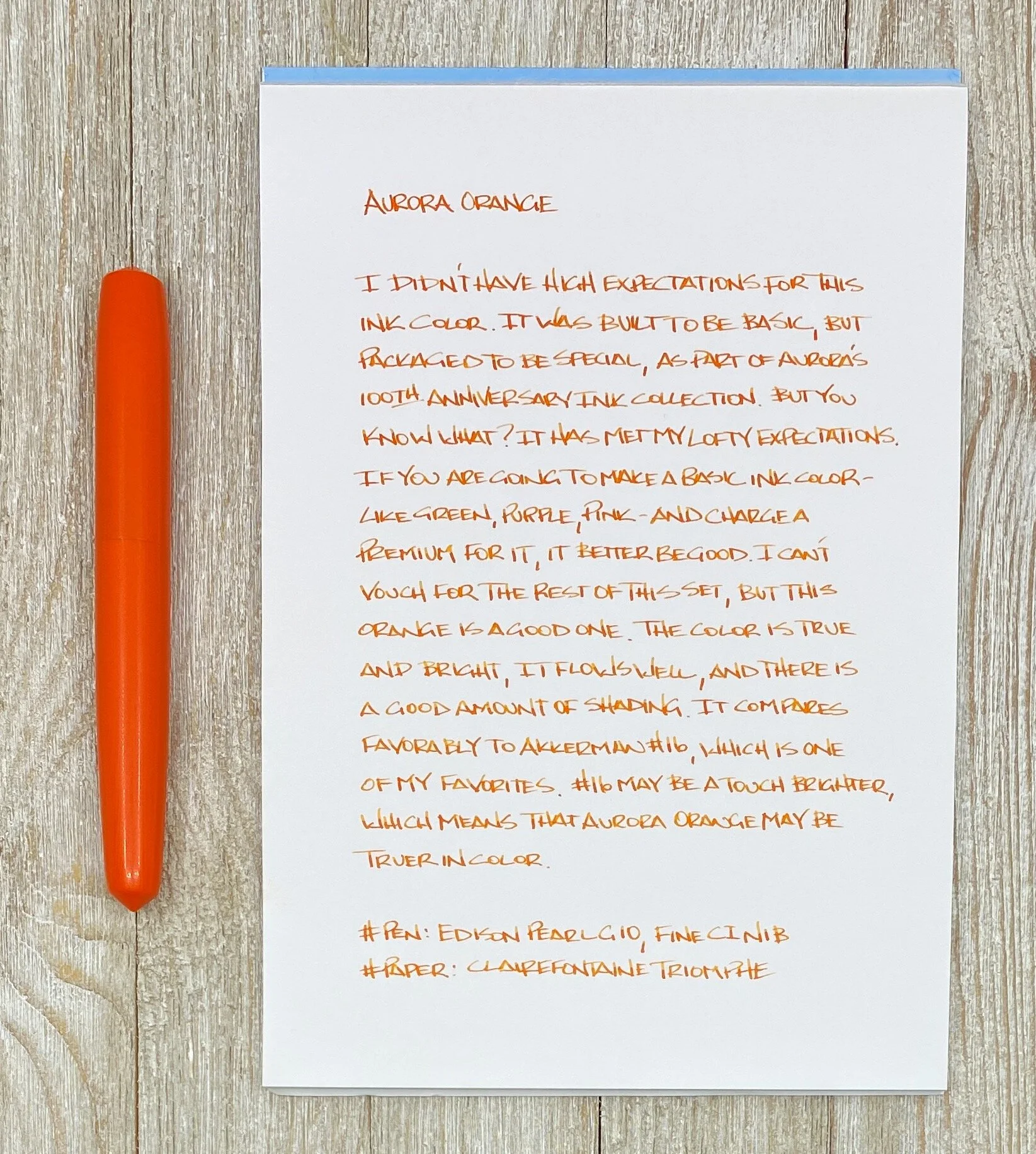
As a connoisseur of orange ink, I have high expectations. And to be honest, I was little concerned about Aurora Orange meeting those expectations. There is a lot about this ink the led me to question it before testing it. But I have to say in the end that it is better than I thought it would be.

What lead me to question this ink right out of the gate? Two things: Price and product name - and a combination of the two. At $30 for a 55 ml bottle, the inks for the the Aurora 100th Anniversary Ink Set, which Orange is a part of, are priced on the premium side of the ledger. The price isn’t outrageous, and I’ve certainly paid more for less, but that brings in the second part of the equation.

What’s in a name? Many ink fans have been waiting for Aurora to branch out of their Blue and Black inky ways for years. We were thrown a bone with Blue Black a few years ago, but that was it. Even though the colors were basic, Aurora’s inks were always well respected as good performers. So why don’t they expand their basic ink offerings with other standard colors like Red, Green, Purple, and Orange? Apparently because they needed to hold them for this 10 ink, 100th Anniversary set.

That’s where my confusion set in. If I’m buying an ink that is part of a limited edition set - and priced as such - I want to feel that I’m getting something special. Yes, the etched logo bottle is a nice upgrade, but you’re selling me the most basic of shades. Shades I can get from your competition for upwards of half the price?

So, Orange. That name doesn’t make me feel special. As special as Aurora wants this set to be. As special as the price dictates it should be. Same goes for the rest of the inks, all of which are named similarly. Throw me a bone and call it Tangerine, or name it after a region in Italy. Give me something special.

Unless this ink will become part of your core offering down the line? Without the fancy bottle, and without the fancy price. Aurora Orange would be great in the $18 for 45 ml that they offer normally. Same with all of the colors in the 100th Anniversary set (Blue, Black, and Blue Black are already available without the fancy bottle for that price.) This is what I see happening eventually.

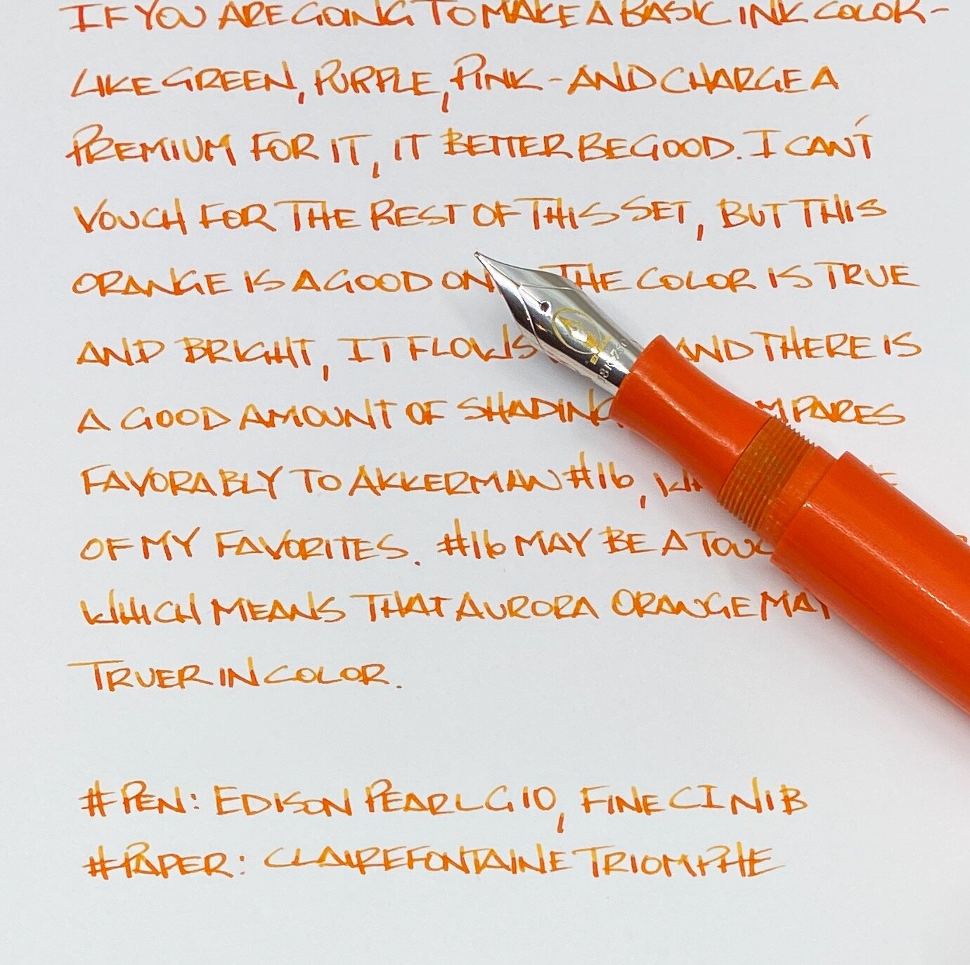
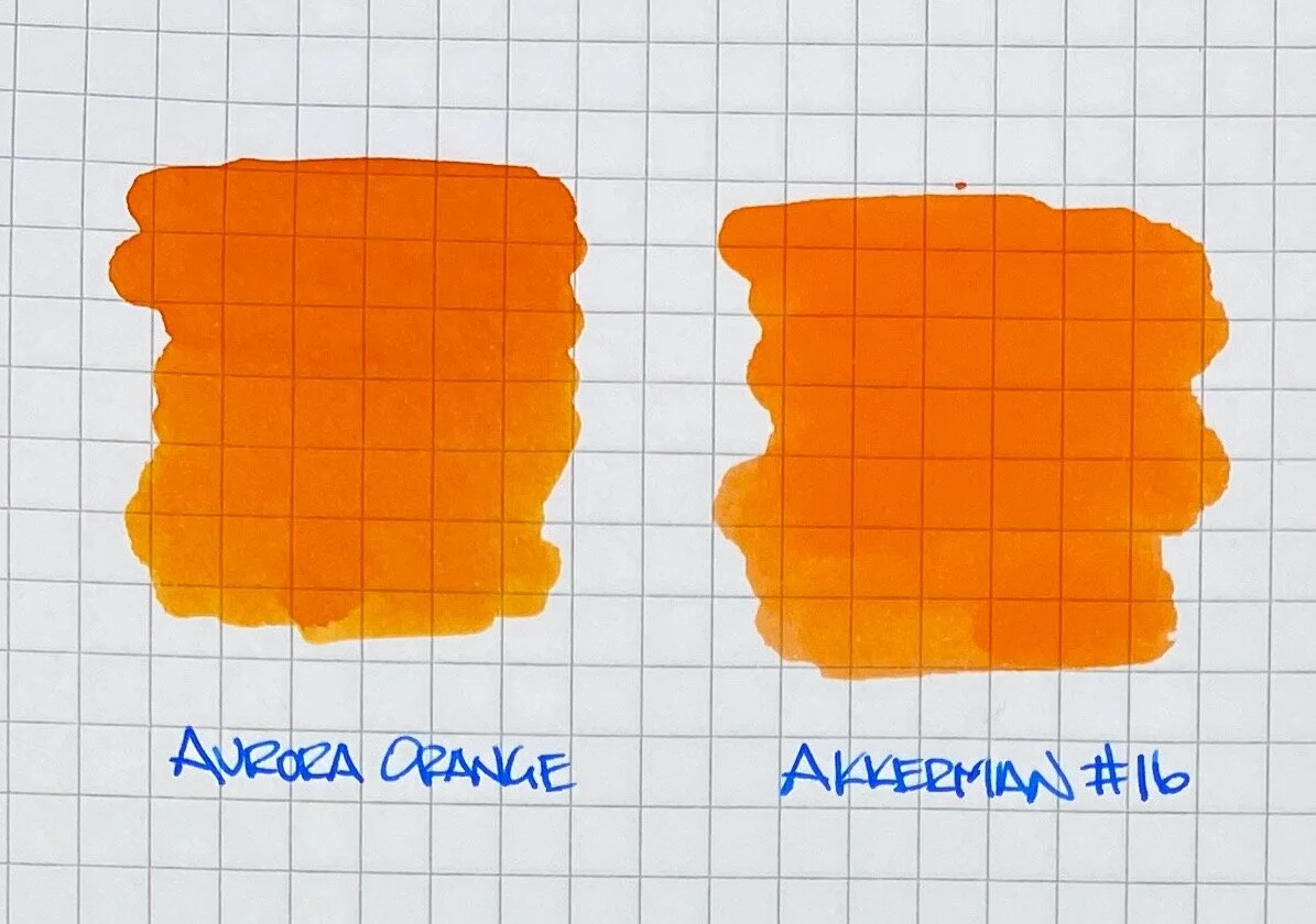
Because when you get down to it, Orange is a basic orange ink. It is your standard, core offering orange. If we rewind back to the top, I love orange inks and know a good one when I see it. Aurora Orange is a great one. It ranks up there with the best of them. It’s main feature is its shading. I found it to be a nice, moderate shader with the Fine Cursive Italic nib I was using, and on the various papers I tested with.

If you want a very traditional, exactly what you would expect orange ink, then Aurora Orange is an excellent choice. The only consideration is if that is enough for you to pay the price.

(Vanness Pens provided this product at no charge to The Pen Addict for review purposes.)

Posted on March 30, 2020 and filed under Aurora, Ink Reviews.

Akkerman #12 Mauritshuis Magenta Fountain Pen Ink Review

The correct order of operation when you buy a new pen you immediately buy a new ink to go with it, right? And there are bonus points if the ink matches the pen? I’m pretty sure these are the rules, but if not, I’m making them official today.

I bought the Leonardo Momento Zero Fountain Pen Lavande Rose Gold from Dromgoole’s Pens at the 2020 Baltimore Pen Show. I’m a Leonardo fan, and this new color spoke to me, so I went for it. I had two decisions to make after purchase: One, do I get the nib ground because they only had Medium in stock, and two, what ink will go with this pen the best because I am here, and this is now?

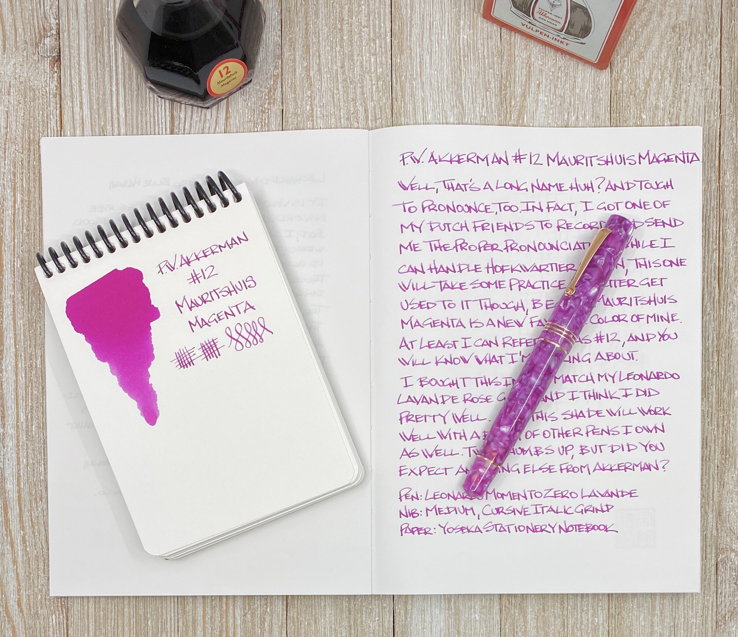
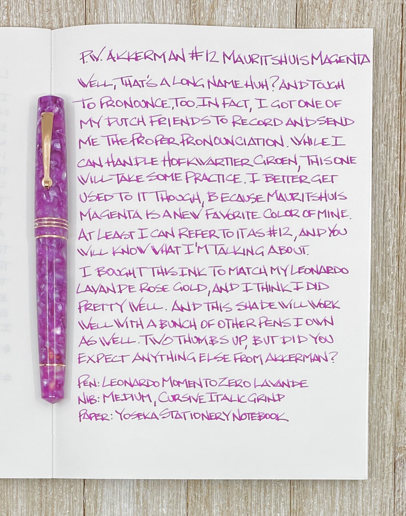
Being the matchy-matchy person that I am, I wanted a color close to the Lavande of the pen barrel, but no normal pink or purple would do. I pored through the large swatch books at Vanness Pens rejecting colors left and right, until it hit hit me. Doesn’t Akkerman have a nice magenta? Why yes, they do! Akkerman #12 Mauritshuis Magenta is the exact color I was looking for.

Many of you may be yelling at the screen by now, “Brad, I love pink-purple-magenta inks, and there are a TON of great ones out there.” Yes, I admit I’m a little bit late to the party with this shade, but with my already-professed love for all things pink and purple, it was only a matter a time before I combined the two into a new love.

My main question is this: What do you call this color? Magenta seems right. I see Rose used a lot, or maybe it’s Purply Pink? Regardless, it’s great, and I’m glad I added a new Akkerman to the collection, which now totals six.

Mauritshuis Magenta is a classic Akkerman mix of quality, performance, and color. There are inks out there that will out-sheen this classic, but for pure writing with a decent amount of shading, Akkerman more than holds its own. Plus, they have the coolest ink bottles in the world, and are reasonably priced at $30 for a 60 ml bottle.

The cursive italic grind I had put on this nib by Gina at Custom Nib Studio shows off the shading well in the vertical strokes, and the ink flow never skipped a beat when writing. I think that is my favorite feature of Akkerman Inks - they just work.

And they look great too. I may not be able to pronounce their names, but at least I have a number to work off of. Welcome home #12!

(Vanness Pens provided this ink at no charge to The Pen Addict for review purposes. I purchased the Leonardo from Dromgoole's at a discount.)


Posted on March 23, 2020 and filed under Akkerman, Ink Reviews.