Posts filed under Ink Reviews

Kala Tribute to Neon “Boogie” Fountain Pen Ink Review

Kala Tribute to Neon “Boogie” Fountain Pen Ink Review

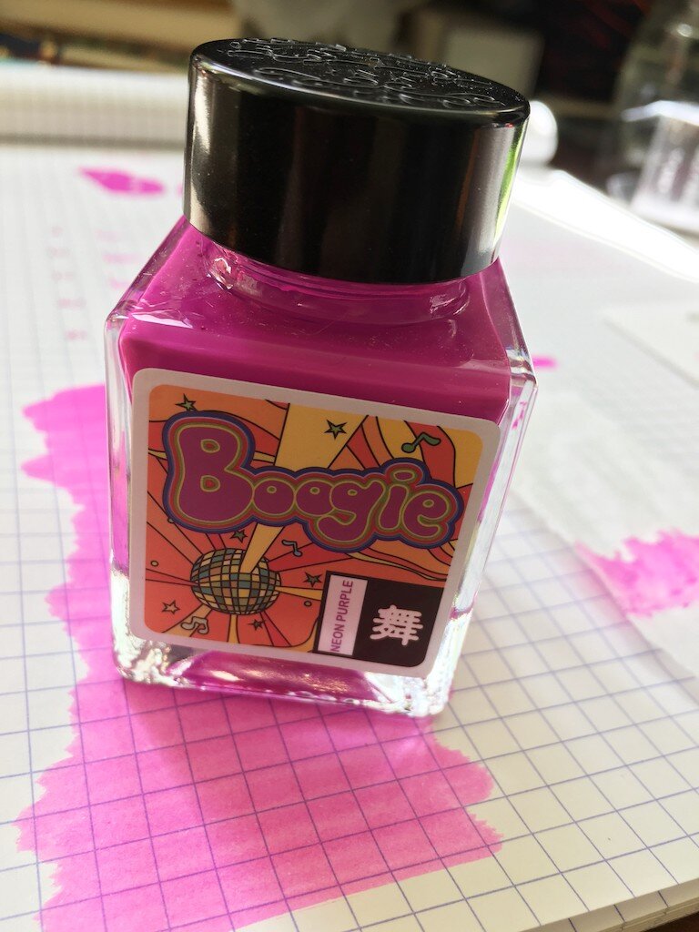
Eleven-year-old me is so happy right now. Boogie is the color theme for the 90s. This is Lisa Frank riding a unicorn on roller skates, zooming around the rink to Salt-n-Pepa. It's great. This is the first Kala Ink that I've tried, but I'll definitely be taking a look at their other offerings. Maybe even a few more of these neon colors.

Color-wise, this isn't as eye-searingly neon as I was expecting it to be. It's definitely a bright color, and a rich one, but it isn't glowing like a highlighter would. And while it would have been much cooler if it was highlighter neon, it's much more practical and useable as it is. It retains the attitude of neon, even if it doesn't quite possess the properties of it. I think a lot of that richness comes from the intense pigment saturation of this ink. It's a pigment-based ink, and doesn't look, at first glance, like something that would be safe to put in your pen.

Kala Neon Boogie Ink Review

The ink is fully opaque in the bottle. It looks more like nail polish than ink, and that might make any pen user nervous. And while I have it on good authority that it is safe to use in pens, it has a few characteristics that you might want to keep in mind when using it.

I get the sense that this ink is highly lubricated to make up for its natural thickness. I could see an almost separation of layers as I watched a puddle of it dry on my swab card. It would have to be lubricated in order to flow through a pen properly. That lubrication lends itself to a longer dry time. It remained fully wet until about the 25-second mark, when it suddenly became immovable.

Kala Neon Boogie Ink Waterproof

This ink is entirely waterproof! No amount of water dripping, rubbing, or soaking lifted it from the page. I couldn't even get it to do a proper chromatography test, because water didn't force it to travel through the paper unless I caught it before it dried.

It also tends to dry out on the nib a bit, leading to some difficulty getting it flowing at first. The first line or stroke after any amount of time (as short as ten seconds or so) would not lay down any ink. Once it was flowing, though, it flowed nicely.

Kala Neon Boogie Ink Swab

The ink shows lovely shading, but doesn't sheen. It does have a shiny coating to it, though. It dries as a layer on top of the page, rather than soaking in at all, so when the light hits it, you can see it shining off of this coating. It's less noticeable than on a calligraphy ink, and seems to occur mostly where the ink has pooled or concentrated. I can also feel the texture of this coating on the page when I run my fingers over it.

As far as pigment-based permanent inks go, this one is the most fun that I've tried. So many of them are sepia, blue, or black--which is great, too--but sometimes life needs a pop of color. This would make a great ink to use for sketches under color washes, for example. There are lots of uses for it beyond just writing a page of lovely, bright text (though I've been doing just that!).

Kala Neon Boogie Ink Bottle

Given its properties, though, I'd add a note of caution about putting it in fancy pens that are difficult to clean. Its texture is a bit more viscous than a typical water-based ink, and even more than other pigment inks I've used. So I'd expect some additional challenges in cleaning, especially if the ink has sat in the pen for a while. Time may show it to be just fine, but maybe don't use your prized pen as the guinea pig.

My only real criticism of this ink is that it makes me wish I was better at drawing unicorns.

(The Pen Addict purchased this ink from Shigure Inks at full retail price.)

Kala Neon Boogie Ink Writing
Posted on June 4, 2020 and filed under Kala, Ink Reviews.

Tono & Lims #11 Fountain Pen Ink Review

Tono & Lims #11 Fountain Pen Ink Review

(Jeff Abbott is a regular contributor at The Pen Addict. You can find more from Jeff online at Draft Evolution and Twitter.)

In a hobby where "not enough" ink variety can quickly turn into "OMG, way too many inks," I can honestly say that I wish I had more purple inks in my collection. The same is true of green inks. For me, that's just where my eye is drawn right now. Maybe I'm just craving happy, bright colors in a world that's otherwise dark and cruel, but all I know is that a little pop of color during the day helps me keep moving forward. The latest purple ink that I've had the pleasure of using is Tono & Lims #11.

Tono & Lims #11 Fountain Pen Ink

If you've never heard of this little ink shop, you're not alone. The company is fairly well-known and popular in South Korea, and they have quite a collection of inks for being relatively obscure (in the US market, at least). 11 is a pale purple that I've had extreme feelings about so far. As far as I can remember, I've never gone back and forth on liking and disliking an ink so many times. Is this ink trying to be purple or gray? Is it so light on purpose, or is that to showcase the lovely shading characteristic even more? While it's certainly not one of my favorite inks for everyday use, I've really enjoyed using it and seeing how it acts on different papers and in different sized nibs.

Tono & Lims #11 Ink Shading

Let's get the obvious out of the way: This ink is extremely watery and light. Until I looked up other ink samples online, I was second-guessing if I'd accidentally left some water in the pen after cleaning it, resulting in a less saturated and thin ink. Alas, #11 is light on purpose. Being so watery, it does best on coated papers, like Rhodia, Clairefontaine, Leuchtturm1917, and so on. I tried using this ink on some cheap copy paper and a Baron Fig notebook, and the results were disastrous. The ink bled and veined like crazy on these more absorbent papers, but they also dried in a couple of seconds. It's an odd ink in how it behaves, but that's part of the allure for me. That being said, it's not a great daily driver for use in an office or if your favorite paper is highly absorbent.

Tono & Lims #11 Ink Swab

The second thing that really confused me besides the really watery nature of this ink is the low saturation of the coloring. At times, it looks like a pale purple highlighter ink. And based on the beautiful Instagram feed from Tono & Lims, I wouldn't be surprised if people use #11 primarily as a shading or background color for larger pieces of art or illustrations. It's a lovely light color, but it just doesn't pop off the page. When writing with this ink on a blank page, the color is delightfully understated and calm. But, if you add even a touch of brighter color, #11 gets washed out completely and looks quite drab.

My favorite behavior from this ink so far is the immense shading capabilities. The differences between gray-purple and light see-through purple are marvelous. Again, it's all very subdued and easy to miss, but it's really well done and I love watching the ink pool up on certain pen strokes.

Tono & Lims #11 Ink Review

Another positive behavior with this ink is the incredibly quick dry time. In most cases, it's dry in ten seconds — fifteen if the ink has pooled up a bit. For left-handed writers, this is a fantastic quality. Still, given the pale color, it's not well-suited to everyday or office use.

The full lineup of inks from Tono & Lims looks really interesting and unique, and I'm really excited to see more of these hit our shores. While #11 isn't my favorite ink color, it still has a special place in my collection that I'll certainly break out semi-regularly to enjoy the subtle and delicate purple-gray tones it offers. You can pick up your own 30ml bottle from Shigure Inks. At $22 USD, it's not a fantastic deal, but this is a fairly reasonable and common size/price ratio for imported inks from small independent shops. I'm excited to try more from this interesting brand!

(The Pen Addict purchased this ink at full retail from Shigure Inks.)


Enjoy reading The Pen Addict? Then consider becoming a member to receive additional weekly content, giveaways, and discounts in The Pen Addict shop. Plus, you support me and the site directly, for which I am very grateful.

Membership starts at just $5/month, with a discounted annual option available. To find out more about membership click here and join us!

Posted on June 3, 2020 and filed under Tono & Lims, Ink Reviews.

Tono & Lims Fukuoka: Fidelity Ink Review

Tono & Lims Fukuoka: Fidelity Ink Review

I’m surprised at how much I like the color of Tono & Lims Fukuoka: Fidelity. But what color is it? I think it is more Watermelon Shaved Ice than Strawberry Popsicle, but I think that’s the range we are playing in. A range I have never dabbled in before.

Tono & Lims Fukuoka: Fidelity Review

In general, I like pink inks. Maybe even love them. But the pink inks I like the most have to be bright, vibrant, saturated, and strong. I’ve never found much use for lighter shades of pink, mostly - I think - due to my note taking style of writing, as opposed to journaling, letter writing, or other long forms of expressive writing.

Or it’s all just an excuse to not experiment, which is not a good excuse at all!

Tono & Lims Fukuoka: Fidelity Writing

When I went ink shopping a few weeks ago, I browsed through some of the swabs at Shigure Inks to find a few shades to try out that were out of my norm. Yes, I bought a blue black and a bright blue, but I tried to mix in something out of my wheelhouse a bit. Fukuoka: Fidelity fit the bill perfectly.

This shade of pink is quite a jump in color range from my normal favorite pink, Califolio Andrinope. Andrinople is more of a hot pink/magenta, which I love, while Fukuoka: Fidelity is more of a fruit-colored pink. Neither is a dusty/flowery pink, which is a shade I’m apparently working my way towards.

Tono & Lims Fukuoka: Fidelity Test

I inked it up in my Pilot Custom 92 with a Broad Cursive Italic nib to help show of the character of this color, which it has more of than I thought. The darkest shades are bright, evoking the ripe center of a watermelon, before toning down a shade or two, as if you were working your way down to the rind.

Too specific of a description? Yeah, probably so. But I like this ink! I won’t be eating it, or drinking it, or anything but writing with it, but I am having fun with it. That’s my favorite feature of any ink.

Tono & Lims Fukuoka: Fidelity Drawing

Tono & Lims is a new brand for me, and one of the dozens (hundreds?) of Asian ink brands (T&L is from South Korea) out there that are just now becoming accessible to the rest of the world. My first experience has been very positive, as the ink has been easy to use. It flows well, has moderate shading, dries quickly, and cleans well. It doesn’t have any of the more extreme ink features, like heavy sheen, but that’s not an ink feature I want all the time. This is an ink I can use all day, every day.

After using Fukuoka: Fidelity and enjoying it as much as I have, I’m ready to dabble a little more in the Tono & Lims ink catalog. I also sent off a couple of bottles to the review crew, so I’ll be interested in their colors and what they have to say about them.

(I purchased this ink from Shigure Inks at full retail price.)


Enjoy reading The Pen Addict? Then consider becoming a member to receive additional weekly content, giveaways, and discounts in The Pen Addict shop. Plus, you support me and the site directly, for which I am very grateful.

Membership starts at just $5/month, with a discounted annual option available. To find out more about membership click here and join us!

Tono & Lims Fukuoka: Fidelity Swab
Posted on May 25, 2020 and filed under Tono & Lims, Ink Reviews.