Posts filed under Ink Reviews

Robert Oster Australis Oak Fountain Pen Ink Review

Robert Oster Australis Oak Fountain Pen Ink Review

Robert Oster Australis Oak is exactly the type of ink that I never buy for myself, while simultaneously being the exact type of ink I should be buying for myself. Not every ink has to be Blue Black, Orange, or Purple - right? RIGHT???

I’ve wanted a good every day brown ink for a while now, and Australis Oak is certainly a contender. I’ve always thought the more chocolate brown shades would be my thing, but with the few I’ve tested none have stuck. They seem to lean flat, and boring. Leaning red is not much my style either, but what about a shade that goes a bit deeper in the gold/yellow range? Maybe so.

Robert Oster Australis Oak

That’s what I was hoping to get with this ink, and I believe I succeeded. This is a rich, brown gold that leans a little gold. Or maybe well-worn tan leather. Or maybe fresh out of the oven pralines. Wherever it lands, I’m happy with it.

Part of the challenge with brown inks is that, for my personal usage, they do need to favor the pen I am going to ink it up in. That means no Pink Love here, and no Primary Manipulation. It has to math more closely than if I was throwing a bright blue ink around, for example. With my Stylo-Art Kinpaku, I found the perfect match.

Robert Oster Australis Oak Notes

This is the perfect fall pen, with the perfect fall ink. Any brown, red, gold, or yellow would be ideal for this pen, and it doesn’t hurt that I’m inking it up while the leaves are turning.

From a performance perspective, Australis Oak is identical to every other standard Robert Oster ink I use. It flows beautifully from the Pilot stub nib in this pen, with moderate shading. There is no sheen to speak of, and the dry times and color saturation are right smack in the mid-range. In short, it’s a perfect all-day, every-day writing ink.

Robert Oster Australis Oak Lines

Will I commit to using it that way? That’s the question that still remains. I love it, and it is a great compliment to the rotation of inks I find myself using regularly. I guess we will find out together!

(Vanness Pens provided this product at no charge to The Pen Addict for review purposes.)


Enjoy reading The Pen Addict? Then consider becoming a member to receive additional weekly content, giveaways, and discounts in The Pen Addict shop. Plus, you support me and the site directly, for which I am very grateful.

Membership starts at just $5/month, with a discounted annual option available. To find out more about membership click here and join us!

Robert Oster Australis Oak Line Art
Posted on October 26, 2020 and filed under Robert Oster, Ink Reviews.

Colorverse Johannes Kepler Mini 3 Bottled Ink Set: A Review

Colorverse Johannes Kepler Mini 3 Bottled Ink Set Review

(Susan M. Pigott is a fountain pen collector, pen and paperholic, photographer, and professor. You can find more from Susan on her blog Scribalishess.)

The Colorverse Johannes Kepler Mini 3 Bottled Ink Set contains three 5ml bottles of dye-based fountain pen ink honoring Kepler, the famous astronomer and mathematician. The three inks in the set are called "Conjecture," (for Kepler's mathematical theorem on sphere packing) "Planetary Motion" (for Kepler's three laws) and "Somnium" (for Kepler's novel about a dream involving daemons and the moon).

Colorverse Johannes Kepler Colors

The 5ml bottles are tear-drop shaped and adorable.

Colorverse Johannes Kepler Bottle

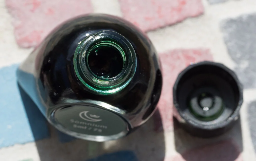
That said, the bottles aren't very practical. The opening is only .7mm, so you cannot insert nibs into it. A mini-pipette comes with each bottle. You can fill converters and eye-droppers with the pipette but not piston-filled pens.

Colorverse Johannes Kepler Bottle Opening
Colorverse Johannes Kepler Pipette

Conjecture

Colorverse Johannes Kepler Conjecture Bottle

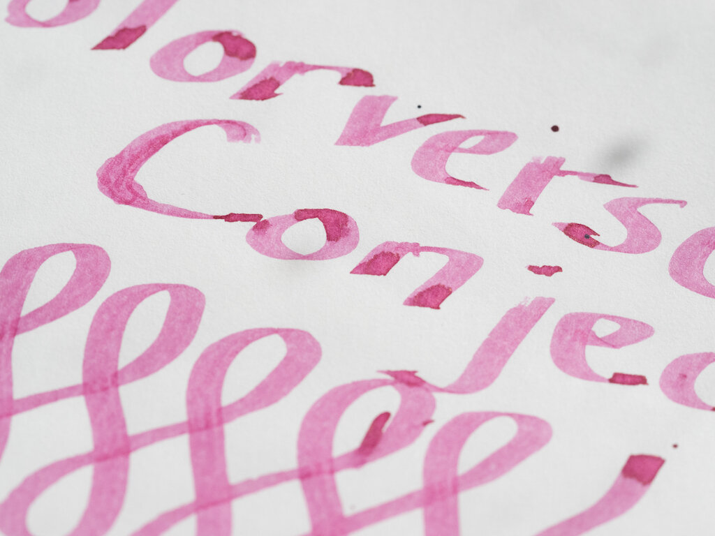
Conjecture is a wine colored ink with fair saturation. It exhibits little shading and no sheen on Rhodia paper, and it is not waterproof. Although my dry times test shows the ink smearing after 30 seconds, I think that's because a bit of ink had pooled. The ink is actually quite dry.

Colorverse Johannes Kepler Conjecture Rhodia

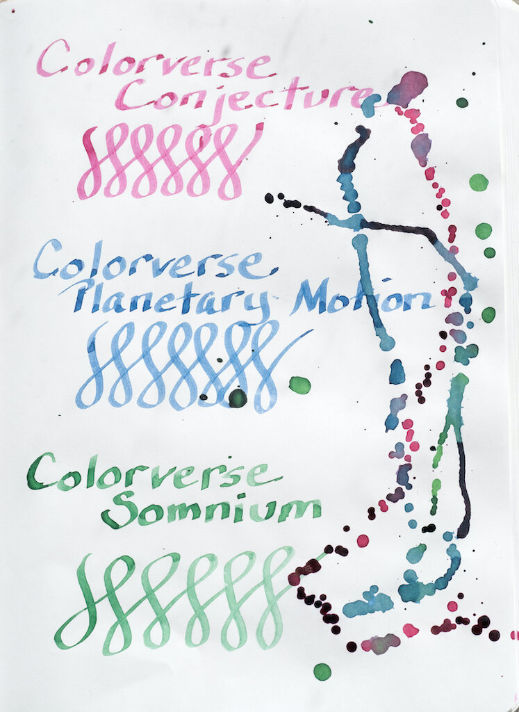
The Col-o-dex card also shows some shading but no sheen. I had to soak up the ink splats with a paper towel because sunlight was fading (and I needed to take my photos), so it's possible that ruined any sheen effect.

Colorverse Johannes Kepler Conjecture Colodex

Most interesting is the chromatography. This ink has a surprising bit of yellow-green in it along with pink and magenta. The yellow-green actually shows up in my water test (see above), but it wasn't evident in any of my writing, swatches, or splats.

Colorverse Johannes Kepler Conjecture Chromatography

Because the bottle is so small, I wasn't able to test the ink with my ruling pen. I opted instead for my widest Pilot Parallel pen (2.4mm). In this wider nib (which I dipped) the ink seems much lighter--more of a cherry blossom color than wine. Shading is much more evident in a wider nib.

Colorverse Johannes Kepler Conjecture

Planetary Motion

Colorverse Johannes Kepler Planetary Motion Bottle

Planetary Motion is a denim blue color. It has a bit of shading but no sheen and dries quickly. It is not waterproof, but when water is mixed with it, you can see the purple and teal undertones of the ink.

Colorverse Johannes Kepler Planetary Motion Rhodia

The Col-o-dex card shows off the shading of the ink. Again, it does not have any sheen (maybe due to my paper-towel blotting) but a bit of teal is visible in the splats.

Colorverse Johannes Kepler Planetary Motion Colodex

The various dyes in Planetary Motion come out clearly in the chromatography: teal, turquoise, light blue, lavender, and purple.

Colorverse Johannes Kepler Planetary Motion Chromatography

Testing on Midori Paper with the Pilot Parallel 2.4mm demonstrates decent saturation and shading.

Colorverse Johannes Kepler Planetary Motion

Somnium

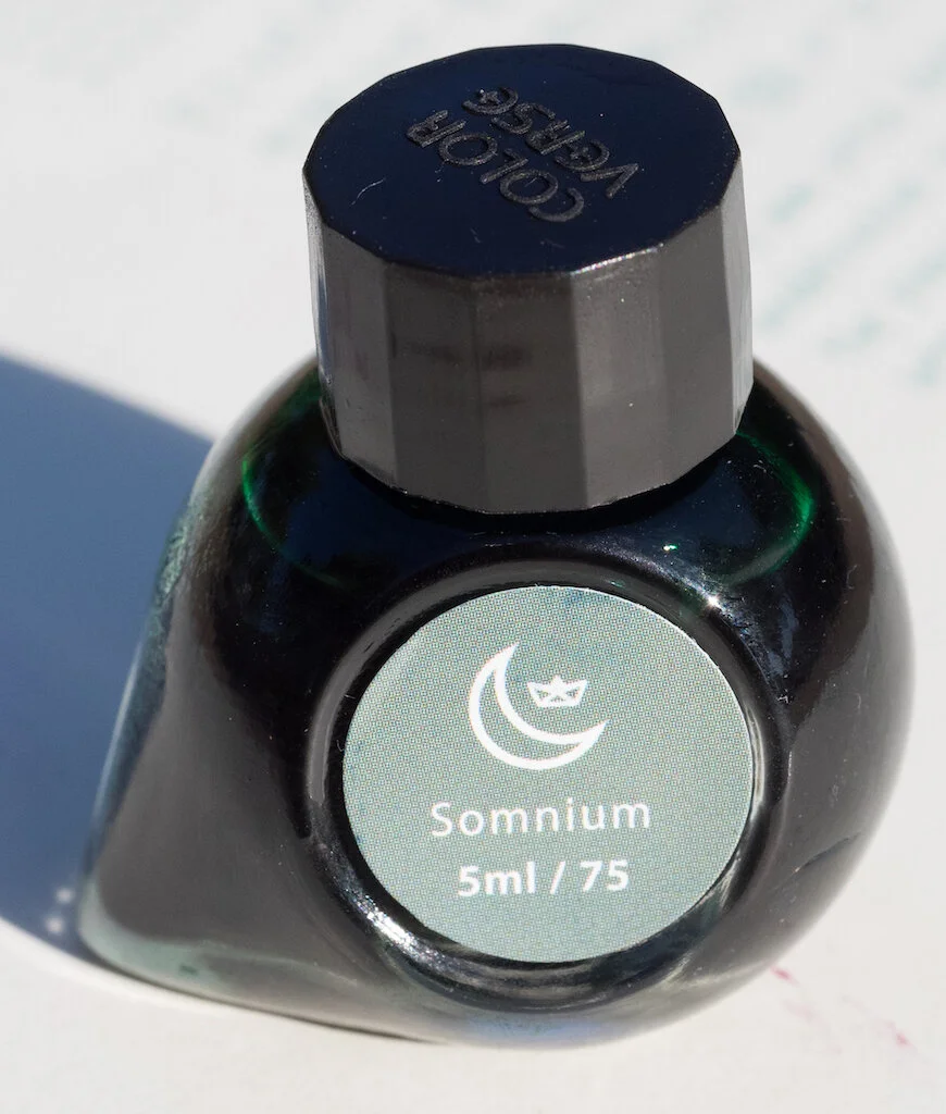
Colorverse Johannes Kepler Somnium Bottle

Somnium is a jade green color with a tiny bit of shading. It has low saturation except in swabs. It dries fairly quickly and is not waterproof.

Colorverse Johannes Kepler Somnium Bottle Rhodia

On the Col-o-dex card, the ink looks rather flat, with just a tiny bit of shading with the fine nib. Again, because I had to blot the splats, I don't know if there's any sheen with this ink. If there is, it's quite small.

Colorverse Johannes Kepler Somnium Bottle Colodex

Chromatography reveals different shades of green in this ink: olive green, light green, and blue green.

Colorverse Johannes Kepler Somnium Chromatography

The Pilot Parallel pen brought out some good shading in Somnium.

Colorverse Johannes Kepler Somnium

I found all three Colorverse inks in this set to be quite dry, especially in the fine nib I used to do longer writing samples. The colors are understated, and I'm not enthusiastic about any of them. They are much more interesting in the Pilot Parallel nib, so I suggest using wide nibs for these inks.

Colorverse Johannes Kepler Writing
Colorverse Johannes Kepler Writing Pilot Parallel

You can buy the Colorverse Johannes Kepler Mini 3 Bottled Ink Set from Goldspot Pens for $19.50. Keep in mind that you'll need to use these inks in pens that are either eye-droppers or cartridge/converters. You could also transfer the ink to a sample bottle in order to fill a piston-based pen.

(Goldspot Pens provided this Colorverse Ink Set to Pen Addict free of charge for review purposes.)


Enjoy reading The Pen Addict? Then consider becoming a member to receive additional weekly content, giveaways, and discounts in The Pen Addict shop. Plus, you support me and the site directly, for which I am very grateful.

Membership starts at just $5/month, with a discounted annual option available. To find out more about membership click here and join us!

Colorverse Johannes Kepler Ink
Posted on October 23, 2020 and filed under Colorverse, Ink Reviews.

Graf von Faber-Castell Yozakura Ink: A Review

Graf von Faber-Castell Yozakura Ink: A Review

(Susan M. Pigott is a fountain pen collector, pen and paperholic, photographer, and professor. You can find more from Susan on her blog Scribalishess.)

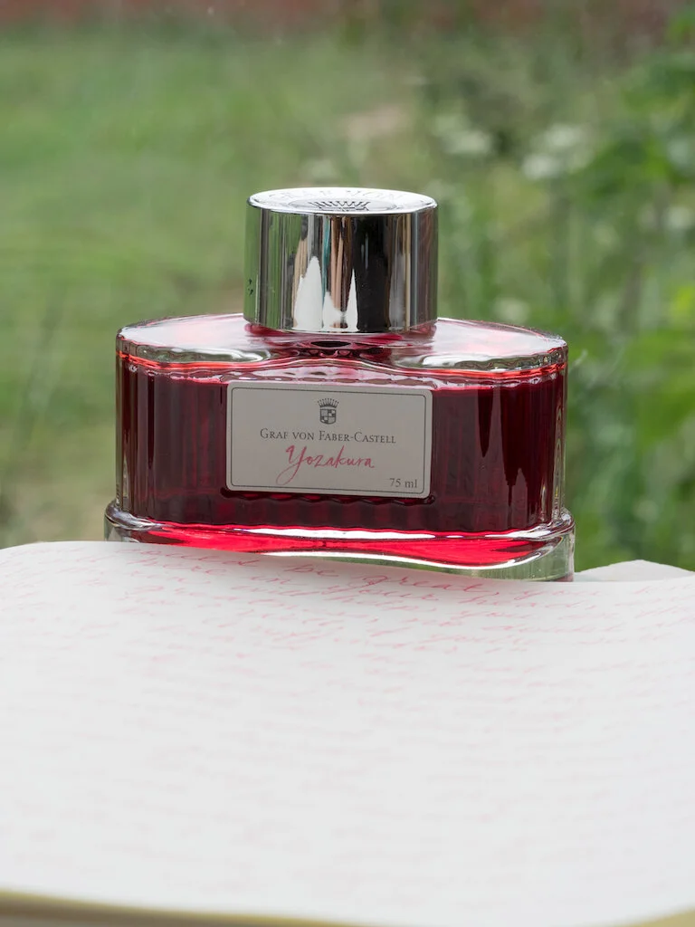
Yozakura means "night cherry blossom," and that certainly describes the color of this ink from Graf von Faber-Castell. It is the dusty pink color of cherry blossoms in the evening light of Japan.

The 75ml bottle is beautiful in its own right. It is made of glass in an oblong shape with a thick, stable base. The cap is gilded in silver with the Graf von Faber-Castell logo on top.

Graf von Faber-Castell Yozakura Ink Bottle
Graf von Faber-Castell Yozakura Ink Cap

Yozakura ink is dry and light, especially in finer nibs. It does not exhibit any sheen but offers good shading. Graf von Faber-Castell states that it is indelible ink, though in my water test it faded slightly.

Graf von Faber-Castell Yozakura Ink Test

The ink has a salmon tinge to it, as you can see on the Col-o-dex card. Because the ink is waterproof, chromatography doesn't separate the colors effectively.

Graf von Faber-Castell Yozakura Ink Colodex
Graf von Faber-Castell Yozakura Ink Chromatography

A large, wet nib brings out the best in this ink with lots of shading, color variation, and pooling.

Graf von Faber-Castell Yozakura Ink Letters

I used my TWSBI 580 EF nib to test the ink in longer writing sessions. This wasn't the best choice, in retrospect, because the ink is so dry and light. It's almost unreadable in my MD Paper journal. However, I think it would work much better in broad and stub nibs that have a wet flow.

Graf von Faber-Castell Yozakura Ink Alphabet
Graf von Faber-Castell Yozakura Ink Writing

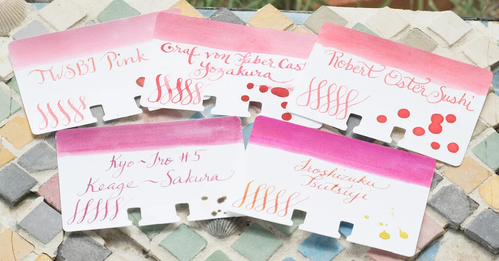
Yozakura is similar to Robert Oster Sushi (reviewed here). It's a bit darker than TWSBI Pink and much lighter than Kyo-iro Keage-Sakura and Iroshizuku Tsutsuji.

Graf von Faber-Castell Yozakura Ink Comparison

I love dusty pinks and purples, so I created a mandala with Yozakura and Kyo-no-oto Sakuranezumi (reviewed here). This isn't one of my better mandalas, but I like the color combination.

Graf von Faber-Castell Yozakura Ink Mandala

You can purchase Graf von Faber-Castell Yozakura from Vanness Pens. 75ml costs $32.00. That's a lot of ink, so you might want to try a 4ml sample first ($4.00).

(Vanness Pens provided this product at no charge to The Pen Addict for review purposes.)


Enjoy reading The Pen Addict? Then consider becoming a member to receive additional weekly content, giveaways, and discounts in The Pen Addict shop. Plus, you support me and the site directly, for which I am very grateful.

Membership starts at just $5/month, with a discounted annual option available. To find out more about membership click here and join us!

Graf von Faber-Castell Yozakura Ink Review
Posted on September 18, 2020 and filed under Graf von Faber Castell, Ink Reviews.