Posts filed under Ink Reviews

Taccia Ukiyo-e Hokusai Sabimidori (Rusty Green) Ink: A Review

Taccia Ukiyo-e Hokusai Sabimidori (Rusty Green) Ink: A Review

(Susan M. Pigott is a fountain pen collector, pen and paperholic, photographer, and professor. You can find more from Susan on her blog Scribalishess.)

The Taccia Ukiyo-e Hokusai collection is a series of inks based on the colors found in the works of Japanese artist Hokusai, in particular Thirty-six Views of Mt. Fuji. You can see Sabimidori in the painting below called Sundai, Edo:

Sundai Edo, By Katsushika Hokusai. This file was donated to Wikimedia Commons as part of a project by the Metropolitan Museum of Art. See the Image and Data Resources Open Access Policy, CC0.

Sundai Edo, By Katsushika Hokusai. This file was donated to Wikimedia Commons as part of a project by the Metropolitan Museum of Art. See the Image and Data Resources Open Access Policy, CC0.

Sabimidori means "rusty green," and that's the perfect name for this ink which turns into a dusty green when dry and exhibits rust-colored sheen. When the ink is wet, however, it is a beautiful deep teal blue.

Taccia Ukiyo-e Hokusai Sabimidori Review

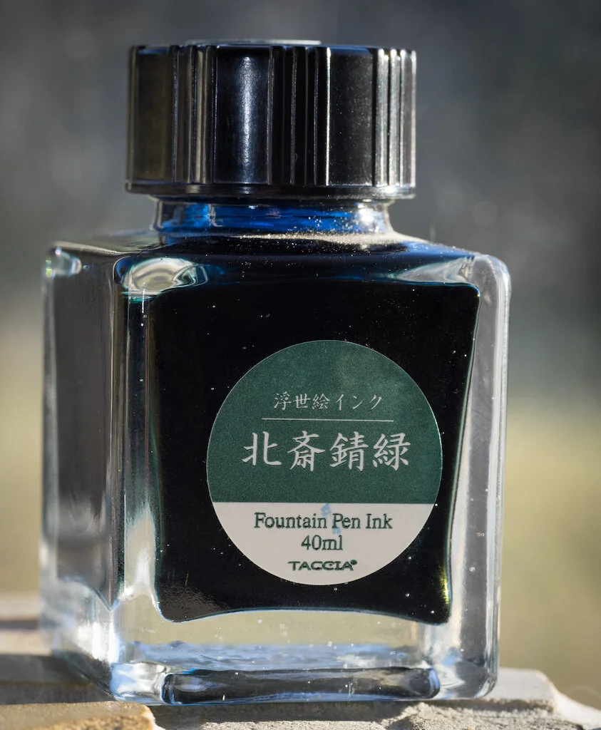
The 40ml bottle of ink comes well-packaged in a Hokusai inspired box.

Taccia Ukiyo-e Hokusai Sabimidori

On my Col-o-dex card, the ink swab looks dusty teal green. You can see the rusty sheen in the swirls and splats.

Taccia Ukiyo-e Hokusai Sabimidori Colodex
Taccia Ukiyo-e Hokusai Sabimidori Sheen

I've never tried Taccia ink before, but I'll say right off that I am impressed. In my testing on Rhodia paper, the ink flowed beautifully in my Sailor MF nib. It dries in about thirty seconds and is a well-lubricated ink. On white paper, the ink looks like a deep teal green, but you can see the blue component in the water test.

Taccia Ukiyo-e Hokusai Sabimidori Rhodia

Chromatography reveals the secret of why this ink looks blue when wet and green when dry: it is primarily composed of blue with a touch of green. I really love these colors.

Taccia Ukiyo-e Hokusai Sabimidori Chromatography

The sheen is most evident in my testing with a ruling pen. You can see glorious shading as well as that rusty sheen.

Taccia Ukiyo-e Hokusai Sabimidori Writing
Taccia Ukiyo-e Hokusai Sabimidori Close

In my MD Notebook Journal, the ink looks more green than blue (probably due to the cream color of the paper). Again, the ink is wet and easy-flowing. It's a perfect match for my Bungubox Sailor Sanctuary Blue pen (review on that pen coming soon).

Taccia Ukiyo-e Hokusai Sabimidori Alphabet
Taccia Ukiyo-e Hokusai Sabimidori Pages

I created this doodle in my Galen Leather Tomoe River Paper journal (reviewed here). On Tomoe paper, the blue tones come through more than the green.

Taccia Ukiyo-e Hokusai Sabimidori Doodle

I'm in love with this Taccia ink, and now I want to try all the inks in the series. You can purchase a 40ml bottle from JetPens for $23.00 (at this writing JetPens is out of stock, but they plan to restock the ink).

(JetPens provided this product at no charge to The Pen Addict for review purposes.)


Enjoy reading The Pen Addict? Then consider becoming a member to receive additional weekly content, giveaways, and discounts in The Pen Addict shop. Plus, you support me and the site directly, for which I am very grateful.

Membership starts at just $5/month, with a discounted annual option available. To find out more about membership click here and join us!

Taccia Ukiyo-e Hokusai Sabimidori Review
Posted on November 20, 2020 and filed under Taccia, Ink Reviews.

Diamine Meadow Fountain Pen Ink Review

Diamine Meadow Fountain Pen Ink Review

(Jeff Abbott is a regular contributor at The Pen Addict. You can find more from Jeff online at Draft Evolution and Twitter.)

As we head into the colder months of the year, I'm already missing the bright and saturated colors of spring and summer. To get past the dreary winter, there's always bright inks. Diamine Meadow is a rich medium green that goes down smooth and reminds me of fields of grass moving in a gentle summer breeze.

I don't have a huge collection of green inks to compare against, but Meadow is what I consider to be a medium green that strikes a fantastic balance between the cooler mint tones and the richer yellows that you sometimes see in different shades of green. But, it's also not so dark that you can't enjoy the happy colors in even a fine nib. It's a fun color, and I see myself using it quite a bit over the next few months as all the greenery fades away outside.

Diamine Meadow Fountain Pen Ink

Like every other Diamine ink I've used in the past, Meadow is very well-behaved in the pen and on the paper. It starts writing instantly after being capped for days, and it also doesn't have any issues with stuttering or skipping if left uncapped for a couple of minutes. It's a solid performer and also easy to clean out.

It's not a fast-drying ink, though. It takes roughly 25-30 seconds before the ink is fully dry and resistant to smudges. Not a great pick for any left-handed writers, and also something to consider if you want to use this in a notebook that you close shut quickly after finishing making your marks. The 30-second dry time applies to the Rhodia I was testing with, but the ink does dry a bit faster on uncoated papers. Though, I did notice some slight feathering on uncoated cheap paper with the 1.1mm stub nib. This didn't happen with a smaller nib, so it's likely a fringe use case that won't impact a lot of people.

Diamine Meadow Ink

As far as shading goes, Meadow has a pleasant amount of variation from rich medium greens to lighter greens. There isn't much in the way of yellow or blue in this ink, even when it shades. I really appreciate how solid it is in the green color-space. It shades nicely in a broader nib, but you can tease out a little bit of color variation in small nibs too.

If permanence is a requirement for you, then look elsewhere! This ink isn't even remotely water resistant or archival quality. When introduced to small amounts of water, it runs easily. Lots of water (ie. submersion) can easily wash away almost all traces.

Diamine Meadow Swab

This ink reminds me quite a lot of Standard Bindery's Road Trip, though Diamine's Meadow is a bit cheaper and much easier to find.

Diamine Meadow is a great green ink that really hits the happy middle ground of greens for me. It's not too dark, not too late, and stays true to basic green while also being quite vibrant. If you want to pick some up for yourself, you can choose between a 30ml bottle or a much larger 80ml bottle. At $7.50 and $16.50 respectively, they're also a fantastic value. Here's to some joyful colors to brighten these cold months!

(JetPens provided this product at no charge to The Pen Addict for review purposes.)


Enjoy reading The Pen Addict? Then consider becoming a member to receive additional weekly content, giveaways, and discounts in The Pen Addict shop. Plus, you support me and the site directly, for which I am very grateful.

Membership starts at just $5/month, with a discounted annual option available. To find out more about membership click here and join us!

Diamine Meadow Comparison
Posted on November 18, 2020 and filed under Diamine, Ink Reviews.

Robert Oster Australis Oak Fountain Pen Ink Review

Robert Oster Australis Oak Fountain Pen Ink Review

Robert Oster Australis Oak is exactly the type of ink that I never buy for myself, while simultaneously being the exact type of ink I should be buying for myself. Not every ink has to be Blue Black, Orange, or Purple - right? RIGHT???

I’ve wanted a good every day brown ink for a while now, and Australis Oak is certainly a contender. I’ve always thought the more chocolate brown shades would be my thing, but with the few I’ve tested none have stuck. They seem to lean flat, and boring. Leaning red is not much my style either, but what about a shade that goes a bit deeper in the gold/yellow range? Maybe so.

Robert Oster Australis Oak

That’s what I was hoping to get with this ink, and I believe I succeeded. This is a rich, brown gold that leans a little gold. Or maybe well-worn tan leather. Or maybe fresh out of the oven pralines. Wherever it lands, I’m happy with it.

Part of the challenge with brown inks is that, for my personal usage, they do need to favor the pen I am going to ink it up in. That means no Pink Love here, and no Primary Manipulation. It has to math more closely than if I was throwing a bright blue ink around, for example. With my Stylo-Art Kinpaku, I found the perfect match.

Robert Oster Australis Oak Notes

This is the perfect fall pen, with the perfect fall ink. Any brown, red, gold, or yellow would be ideal for this pen, and it doesn’t hurt that I’m inking it up while the leaves are turning.

From a performance perspective, Australis Oak is identical to every other standard Robert Oster ink I use. It flows beautifully from the Pilot stub nib in this pen, with moderate shading. There is no sheen to speak of, and the dry times and color saturation are right smack in the mid-range. In short, it’s a perfect all-day, every-day writing ink.

Robert Oster Australis Oak Lines

Will I commit to using it that way? That’s the question that still remains. I love it, and it is a great compliment to the rotation of inks I find myself using regularly. I guess we will find out together!

(Vanness Pens provided this product at no charge to The Pen Addict for review purposes.)


Enjoy reading The Pen Addict? Then consider becoming a member to receive additional weekly content, giveaways, and discounts in The Pen Addict shop. Plus, you support me and the site directly, for which I am very grateful.

Membership starts at just $5/month, with a discounted annual option available. To find out more about membership click here and join us!

Robert Oster Australis Oak Line Art
Posted on October 26, 2020 and filed under Robert Oster, Ink Reviews.