Posts filed under Ink Reviews

Van Dieman's Ink Sample Review, Part 2

Van Dieman's Ink Sample Review, Part 2

(Sarah Read is an author, editor, yarn artist, and pen/paper/ink addict. You can find more about her at her website and on Twitter. And check out her latest book, Out of Water, now available where books are sold!)

Here are three more samples of Van Dieman's ink, all from their "Seasons" series. These three are not sparkly inks, so I was curious to see how they would differ from the ones I reviewed last week.

Van Dieman's Spring Native Cornflower
Van Dieman's Spring Native Cornflower Chromatography

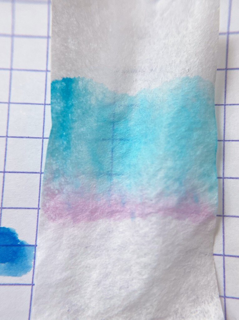
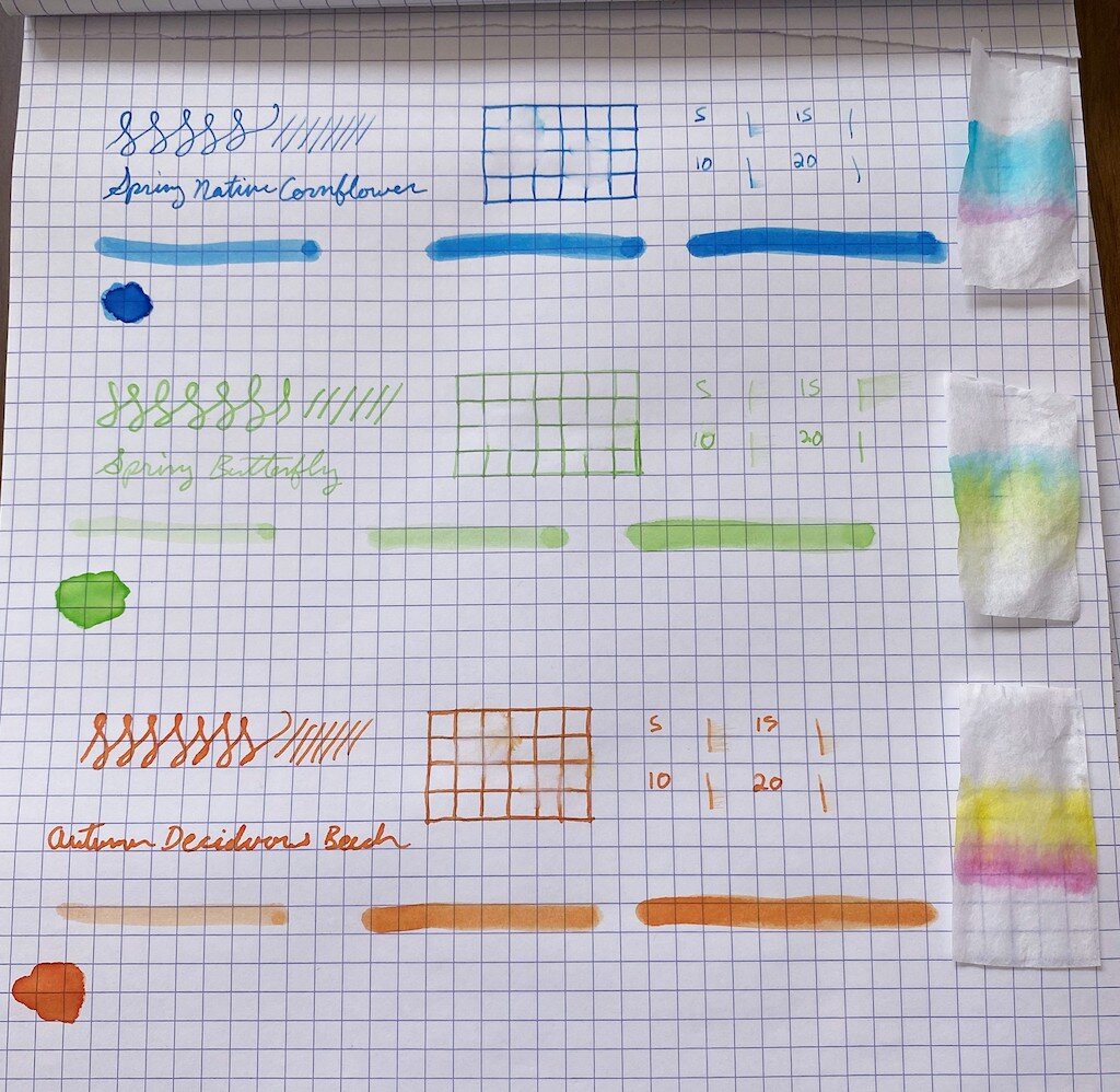
The first is Spring Native Cornflower, a bright blue. It was the best behaved of the bunch, with no feathering and a very reasonable dry time. The color is lovely, too, and it had some great shading properties. It does not have any water resistance, and washed completely away at the faintest hint of water. This was my favorite of this brand that I've tried so far. It's bright enough to be a fun ink, but still blue in a practical way. Chromatography shows a hint of lilac to its hue.

Van Dieman's Spring Butterfly
Van Dieman's Spring Butterfly Chromatography

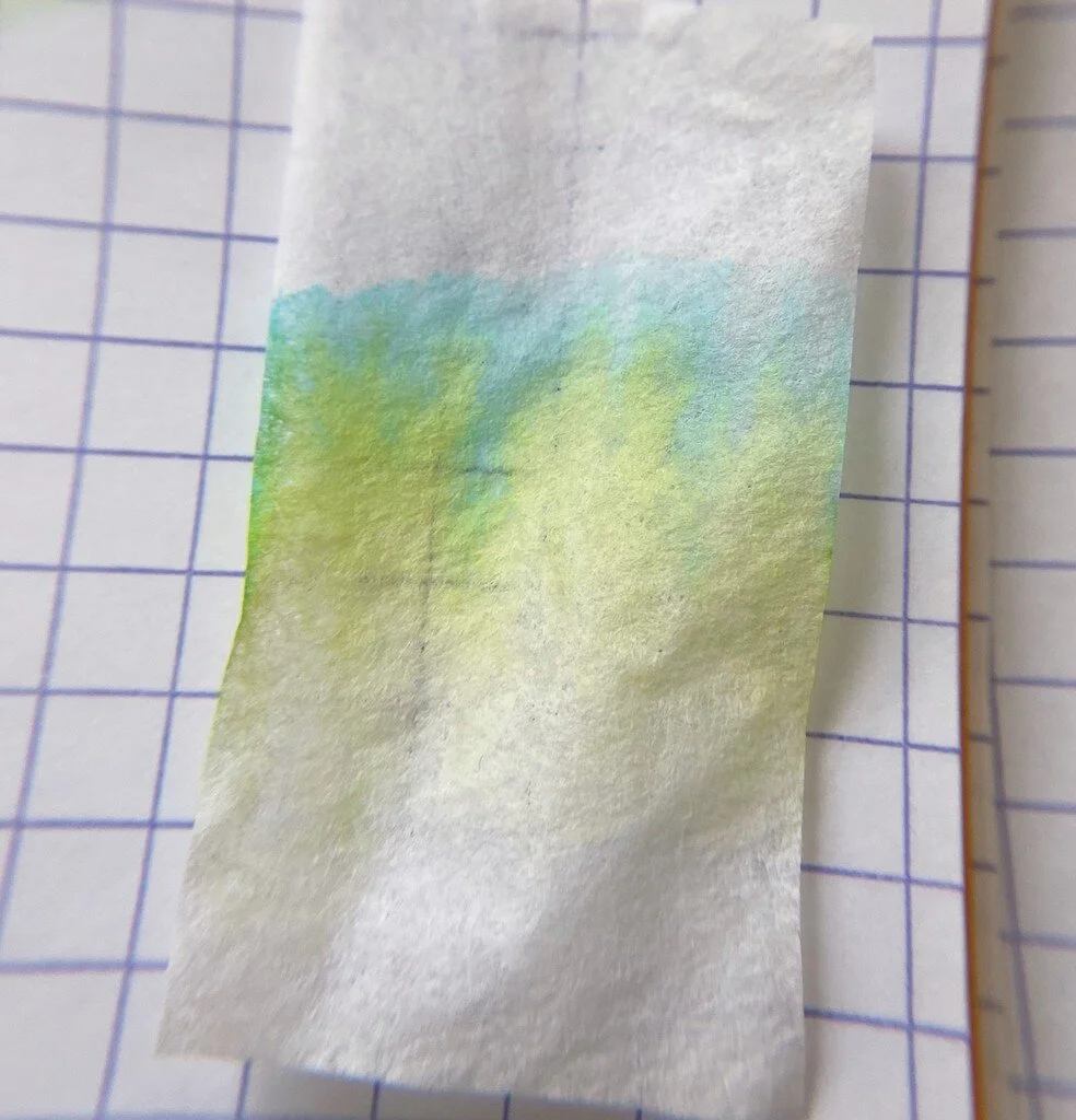
The second ink is Spring Butterfly, and this ink is perfect for if you want to whisper someone a note. It is almost unusably faint. It's a gorgeous, delicate, key-lime green, but I don't think I'd enjoy writing with it. It has a longer dry time, no water resistance, and doesn't appear to shade. Chromatography shows a balance of blue and yellow tones. It almost seems watered-down or undersaturated. I think it would make a lovely tone for illustration, but isn't great for fountain pen use.

Van Dieman's Autumn Deciduous Beech
Van Dieman's Autumn Deciduous Beech Chromatography

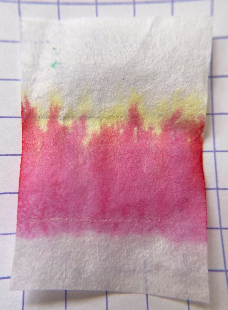
The third color this week is Autumn Deciduous Beech. This is a lovely rich amber orange. I did experience some feathering with this color, but it also had the fastest dry time. It shows some pretty shading, and a slight touch of line is still visible after a water drip test. This color had a fun chromatography, with a defined split between bubblegum pink and bright yellow tones.

So far, all of the Van Dieman's inks have shown a lot of character in chromatography, and though I'm not loving all of them for writing purposes, they are a blast to review and play with. There are three more colors for next week, and I saved those three for last because I'm most intrigued by them. Here's to another week frolicking with inky fingers!

(Vanness Pens provided this product at no charge to The Pen Addict for review purposes.)

Posted on January 14, 2021 and filed under Van Dieman's, Ink Reviews.

Van Dieman's Ink Sample Review, Part 1

Van Dieman's Ink Review

(Sarah Read is an author, editor, yarn artist, and pen/paper/ink addict. You can find more about her at her website and on Twitter. And check out her latest book, Out of Water, now available where books are sold!)

I have a small treasure chest of Van Dieman's ink samples to review! Which means reveling in multicolored inky fingers for weeks, and sharing the joy with you all. Here is the first installment of three reviews of this line of inks.

Van Dieman's Elizabeth's Violet Eyes
Van Dieman's Elizabeth's Violet Eyes Chromatography

First up is from their Hollywood series—Elizabeth's Violet Eyes, inspired by Elizabeth Taylor. It's a lovely balanced purple, not too warm or cool. It's well behaved and shows some nice shading. It's a wet ink with a longer dry time, and it survived with some faint lines remaining in the water drip test. This ink had some lovely chromatography, splitting from bright pink to magenta, to a bold turquoise. It's easily the most practical of the ones I reviewed for today, and while it's tame enough to be an everyday ink, it has a nice bit of excitement to it, too.

Van Dieman's Enchanted Woods Shimmer
Van Dieman's Enchanted Woods Shimmer Chromatography

The next ink I tried was the Enchanted Woods Shimmer from the Midnight series. This one is a bright emerald green with a silver shimmer to it. It's not shy on the bling, either. You could probably use this ink to signal passing airplanes. This ink has great character, showing some shading even through all that shimmer. It has a slow dry time, no water resistance, and the chromatography shows a beautiful yellow-green-blue progression. The ink description indicates that it is supposed to have a red sheen in addition to the silver shimmer, but I could not get one to materialize, even where the ink pooled.

Van Dieman's Ruby Slippers
Van Dieman's Ruby Slippers Chromatography

The third ink I tested somehow out-blings the Enchanted Woods. It's another from the Hollywood series, this one called Ruby Slippers. Wicked witches will no doubt be in hot pursuit of this ink. I don't recommend it for fountain pens, though, for several reasons. One, its very wet and feathers dramatically. Two, the particles settle almost immediately and require constant agitation to remain suspended. And three, it's highly water-resistant, and I'd be concerned about staining. Even in the ink description on the Vanness site it suggests dip and brush pens for this ink.

Van Dieman's Huon Midwinter Festival
Van Dieman's Huon Midwinter Festival Chromatography

The last one I reviewed this week was the insanely gorgeous Huon Midwinter Festival, from their Tassie Seasons line. This ink is enchanting. It's a rich sepia with an antique gold shimmer that makes me think of pirates. The chromatography for this ink was like watching a fireworks display--or a bonfire. From char brown to smokey purple to bright orange and yellow--this is clearly a complex ink. However, I strongly advise against using this in a fountain pen unless it it one that is easy to disassemble and clean. I let my sample vial sit for some time while I waited to get to this review, and when I picked it up to use it, I could not get the shimmer particles to come away from the plastic wall of the vial. Even with shaking, they stayed stuck. I had to knock the vial against my desk several times to get the shimmer to disperse. I assumed it was because it had sat for a few weeks. So I set it back down while I reviewed the other inks. When I picked this one back up to review, the same thing happened again, even though it had been sitting for less than an hour. I don't think these particles will behave nicely in a pen feed. For dip pens or brushwork, though, this is one of the prettiest browns I've ever used.

Van Dieman's Huon Midwinter Festival Sparkles

I still have six other colors to review, but my impression so far of the Van Dieman's inks is that they are very good with color, and all-in with their shimmer, but they fall more into the category of art-supply inks than writing inks. Which is not a bad thing--but I don't know if that is their intention. I do know that I would not put two of these four into a fountain pen. And I also have concerns about being hunted by flying monkeys.

(Vanness Pens provided this product at no charge to The Pen Addict for review purposes.)


Enjoy reading The Pen Addict? Then consider becoming a member to receive additional weekly content, giveaways, and discounts in The Pen Addict shop. Plus, you support me and the site directly, for which I am very grateful.

Membership starts at just $5/month, with a discounted annual option available. To find out more about membership click here and join us!

Posted on January 7, 2021 and filed under Van Dieman's, Ink Reviews.

Diamine Marine Ink Review

Diamine Marine Ink Review

(Jeff Abbott is a regular contributor at The Pen Addict. You can find more from Jeff online at Draft Evolution and Twitter.)

For the past few months, I've been trying to introduce more green into my fountain pen ink rotation. I wouldn't say I'm going all green all the time, but I am trying to include more green at a slow pace during these cold months. The latest ink I've been trying was supposed to be in this green genre, but it turned out to be a little more blue than I anticipated! Despite that error on my side, Diamine Marine is still a gorgeous blue-green ink that pops off the page.

Before getting into all the specifics of this color, it's fair to point out that this, like all other Diamine inks I've used, is extremely well-behaved and easy to use. The color is bright and accurate to their marketing swatches, and the price is really hard to beat. There's a reason I have so many Diamine inks in my collection at this point: they just work so well.

Diamine Marine Ink Swab

Marine is primarily a green ink, but it has a heavy blue undertone that you can't ignore. Diamine classifies this as a turquoise ink, but I'm not sure I agree. Any color in the realm of turquoise, teal, aquamarine, blue-green, green-blue, or other popular mixtures are highly subjective when it comes to naming and identifying the colors. To me, Marine looks more teal, but there are certain natural turquoise colors in nature that look just like Marine as well. It's a spectrum, and that just means there isn't one right answer! In this case, just know that Marine is a green-blue color.

Diamine Marine Ink Comparison

Questions of exact color aside, it's a gorgeous ink. I've really been enjoying using it because it makes me think of green (which is always a happy color to me), water, and also mint. The green is just light enough to bring out some mint comparisons, and the blue just adds a bit of depth to an otherwise flat color.

It's this additional depth of color that contributes to the minimal shading that this ink exhibits. Without the blue undertones, there wouldn't be much shading. Lucky for us, there's a good amount of color variation between light and dark strokes. This is more pronounced with larger nibs, but you can still see a good amount of variation with small or dry nibs.

Diamine Marine Ink Dry Time

One area that really surprised me with this ink is the dry time. I was anticipating something in the 15-second range, but I was really astonished when I discovered this ink was drying in the 5-10 second range depending on how wide/wet the nib stroke was. I'm still fairly shocked and impressed by this. It's hard to find any inks that dry that fast, let alone one with so much color saturation. If you're looking for a fast-drying ink and don't mine that it's a green-blue, this is a great place to start.

Like a lot of Diamine inks, you have several options regarding purchasing. With Marine, you can go for cartridges (box of 18), a 30ml bottle (my personal favorite), or an 80ml bottle.

(JetPens provided this product at no charge to The Pen Addict for review purposes.)

Posted on January 6, 2021 and filed under Diamine, Ink Reviews.