Posts filed under Ink Reviews

Hippo Noto & Kiwi Inks V. 1: A Review

Hippo Noto Kiwi Inks Review

(Susan M. Pigott is a fountain pen collector, pen and paperholic, photographer, and professor. You can find more from Susan on her blog Scribalishess.)

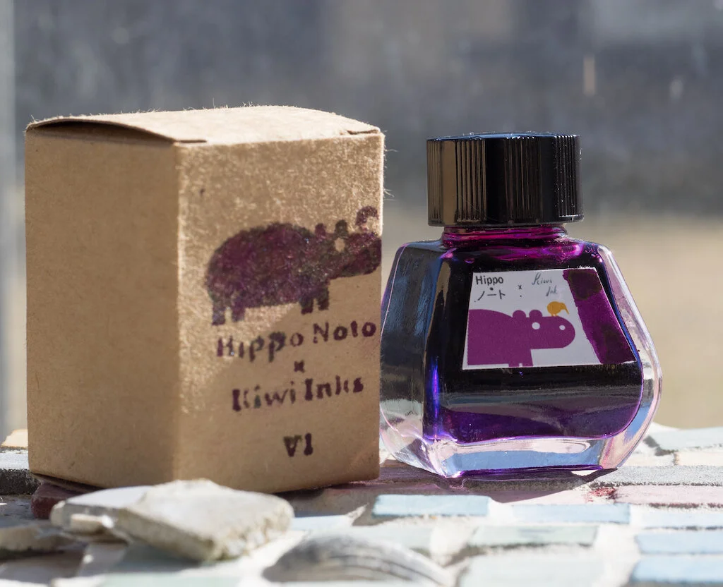
I received an email several months ago from Hippo Noto (makers of the Hippo Noto Notebooks) about a collaboration with Kiwi Inks. The photos showed a sheeny, shimmery, purple-pink-green-blue ink that immediately ushered an audible "Wow!" from my lips. I ordered a bottle, but I didn't open it until this week.

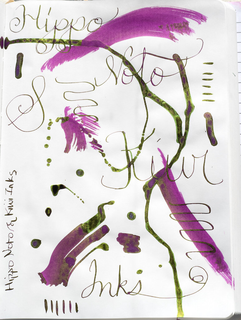
What a wondrous unicorn ink this is! It isn't something you'd want to use in a sober office environment. Nope. This is an ink that says, "Hey y'all! Wahooooo! Let's party and eat cotton candy and ride carousels and chew grape bubble gum and dance in glitter!"

Of course, the wahoo factor depends on the paper you use. On my Col-o-dex card, the ink's properties are subdued. A deep purple predominates with lovely lime green sheen breaking through in the writing and splats. I must have forgotten to shake up the bottle thoroughly before I did my card, because only a little shimmer is showing.

Hippo Noto Kiwi Inks Colodex

On Rhodia white dot-grid paper, the ink is even more tame. Virtually no sheen is displayed (except in the swipes) and all you see is the purple. I did remember to shake before swabbing, so you can see the blue shimmer in the swab.

Hippo Noto Kiwi Inks Rhodia
Hippo Noto Kiwi Inks Shimmer

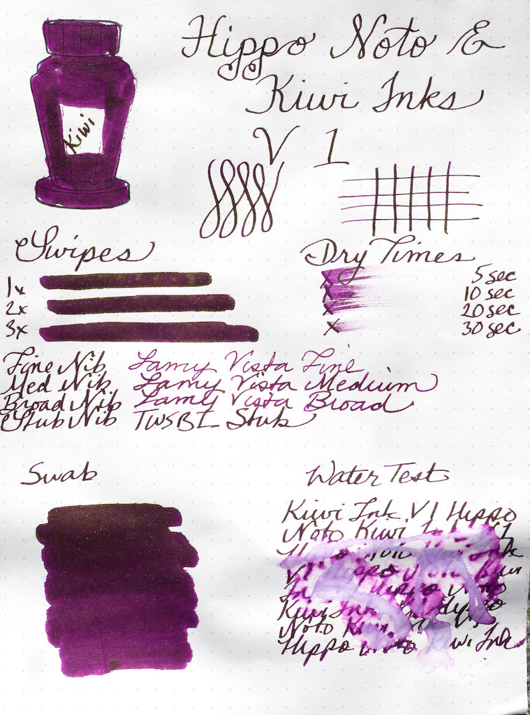
Chromatography shows the various base colors in the ink: lavender, pink, and magenta.

Hippo Noto Kiwi Inks Chromatography

Midori MD Cotton paper and a fat ruling pen bring out the gorgeous green sheen in the ink. Clearly, you'll get the best results with broad nibs and paper that isn't too absorbent.

Hippo Noto Kiwi Inks Big Writing

I wrote a longer writing sample in my MD Journal with a TWSBI stub nib. The ink flowed well and sheen shows up, especially in sunlight.

Hippo Noto Kiwi Inks Writing
Hippo Noto Kiwi Inks Sheen

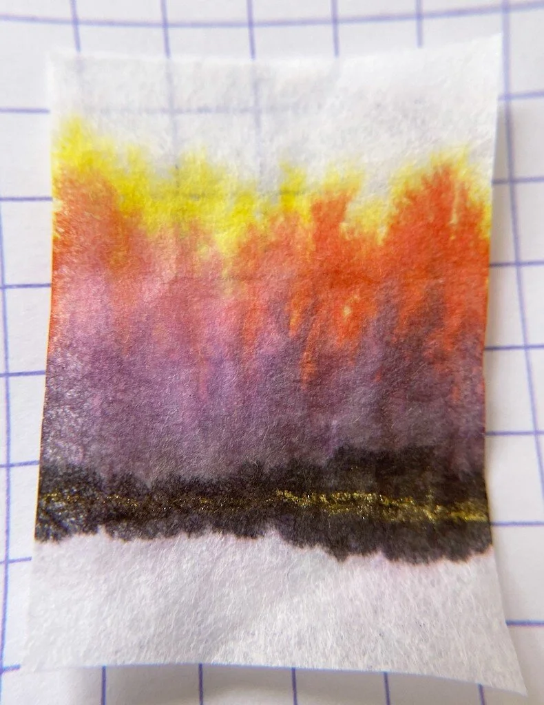
But the best paper to use in conjunction with Hippo Noto & Kiwi Inks V. 1 is Tomoe River Paper. On Tomoe, not only do you get the beautiful green sheen, but all the spectacular colors burst like fireworks in the splats and dribbles. This is definitely an ink you'll want to play with.

Hippo Noto Kiwi Inks Tomoe
Hippo Noto Kiwi Inks Tomoe Sheen
Hippo Noto Kiwi Inks

You can purchase Hippo Noto & Kiwi Inks V. 1 from the Hippo Noto website ($25.00 for 30ml). The third wave of this ink will ship at the end of January/early February. If you prefer even more wow you can opt for V. 2 which features rainbow shimmer!

(I purchased this ink with my own funds.)

Posted on January 15, 2021 and filed under Hippo Noto, Kiwi Inks, Ink Reviews.

Van Dieman's Ink Sample Review, Part 2

Van Dieman's Ink Sample Review, Part 2

(Sarah Read is an author, editor, yarn artist, and pen/paper/ink addict. You can find more about her at her website and on Twitter. And check out her latest book, Out of Water, now available where books are sold!)

Here are three more samples of Van Dieman's ink, all from their "Seasons" series. These three are not sparkly inks, so I was curious to see how they would differ from the ones I reviewed last week.

Van Dieman's Spring Native Cornflower
Van Dieman's Spring Native Cornflower Chromatography

The first is Spring Native Cornflower, a bright blue. It was the best behaved of the bunch, with no feathering and a very reasonable dry time. The color is lovely, too, and it had some great shading properties. It does not have any water resistance, and washed completely away at the faintest hint of water. This was my favorite of this brand that I've tried so far. It's bright enough to be a fun ink, but still blue in a practical way. Chromatography shows a hint of lilac to its hue.

Van Dieman's Spring Butterfly
Van Dieman's Spring Butterfly Chromatography

The second ink is Spring Butterfly, and this ink is perfect for if you want to whisper someone a note. It is almost unusably faint. It's a gorgeous, delicate, key-lime green, but I don't think I'd enjoy writing with it. It has a longer dry time, no water resistance, and doesn't appear to shade. Chromatography shows a balance of blue and yellow tones. It almost seems watered-down or undersaturated. I think it would make a lovely tone for illustration, but isn't great for fountain pen use.

Van Dieman's Autumn Deciduous Beech
Van Dieman's Autumn Deciduous Beech Chromatography

The third color this week is Autumn Deciduous Beech. This is a lovely rich amber orange. I did experience some feathering with this color, but it also had the fastest dry time. It shows some pretty shading, and a slight touch of line is still visible after a water drip test. This color had a fun chromatography, with a defined split between bubblegum pink and bright yellow tones.

So far, all of the Van Dieman's inks have shown a lot of character in chromatography, and though I'm not loving all of them for writing purposes, they are a blast to review and play with. There are three more colors for next week, and I saved those three for last because I'm most intrigued by them. Here's to another week frolicking with inky fingers!

(Vanness Pens provided this product at no charge to The Pen Addict for review purposes.)

Posted on January 14, 2021 and filed under Van Dieman's, Ink Reviews.

Van Dieman's Ink Sample Review, Part 1

Van Dieman's Ink Review

(Sarah Read is an author, editor, yarn artist, and pen/paper/ink addict. You can find more about her at her website and on Twitter. And check out her latest book, Out of Water, now available where books are sold!)

I have a small treasure chest of Van Dieman's ink samples to review! Which means reveling in multicolored inky fingers for weeks, and sharing the joy with you all. Here is the first installment of three reviews of this line of inks.

Van Dieman's Elizabeth's Violet Eyes
Van Dieman's Elizabeth's Violet Eyes Chromatography

First up is from their Hollywood series—Elizabeth's Violet Eyes, inspired by Elizabeth Taylor. It's a lovely balanced purple, not too warm or cool. It's well behaved and shows some nice shading. It's a wet ink with a longer dry time, and it survived with some faint lines remaining in the water drip test. This ink had some lovely chromatography, splitting from bright pink to magenta, to a bold turquoise. It's easily the most practical of the ones I reviewed for today, and while it's tame enough to be an everyday ink, it has a nice bit of excitement to it, too.

Van Dieman's Enchanted Woods Shimmer
Van Dieman's Enchanted Woods Shimmer Chromatography

The next ink I tried was the Enchanted Woods Shimmer from the Midnight series. This one is a bright emerald green with a silver shimmer to it. It's not shy on the bling, either. You could probably use this ink to signal passing airplanes. This ink has great character, showing some shading even through all that shimmer. It has a slow dry time, no water resistance, and the chromatography shows a beautiful yellow-green-blue progression. The ink description indicates that it is supposed to have a red sheen in addition to the silver shimmer, but I could not get one to materialize, even where the ink pooled.

Van Dieman's Ruby Slippers
Van Dieman's Ruby Slippers Chromatography

The third ink I tested somehow out-blings the Enchanted Woods. It's another from the Hollywood series, this one called Ruby Slippers. Wicked witches will no doubt be in hot pursuit of this ink. I don't recommend it for fountain pens, though, for several reasons. One, its very wet and feathers dramatically. Two, the particles settle almost immediately and require constant agitation to remain suspended. And three, it's highly water-resistant, and I'd be concerned about staining. Even in the ink description on the Vanness site it suggests dip and brush pens for this ink.

Van Dieman's Huon Midwinter Festival
Van Dieman's Huon Midwinter Festival Chromatography

The last one I reviewed this week was the insanely gorgeous Huon Midwinter Festival, from their Tassie Seasons line. This ink is enchanting. It's a rich sepia with an antique gold shimmer that makes me think of pirates. The chromatography for this ink was like watching a fireworks display--or a bonfire. From char brown to smokey purple to bright orange and yellow--this is clearly a complex ink. However, I strongly advise against using this in a fountain pen unless it it one that is easy to disassemble and clean. I let my sample vial sit for some time while I waited to get to this review, and when I picked it up to use it, I could not get the shimmer particles to come away from the plastic wall of the vial. Even with shaking, they stayed stuck. I had to knock the vial against my desk several times to get the shimmer to disperse. I assumed it was because it had sat for a few weeks. So I set it back down while I reviewed the other inks. When I picked this one back up to review, the same thing happened again, even though it had been sitting for less than an hour. I don't think these particles will behave nicely in a pen feed. For dip pens or brushwork, though, this is one of the prettiest browns I've ever used.

Van Dieman's Huon Midwinter Festival Sparkles

I still have six other colors to review, but my impression so far of the Van Dieman's inks is that they are very good with color, and all-in with their shimmer, but they fall more into the category of art-supply inks than writing inks. Which is not a bad thing--but I don't know if that is their intention. I do know that I would not put two of these four into a fountain pen. And I also have concerns about being hunted by flying monkeys.

(Vanness Pens provided this product at no charge to The Pen Addict for review purposes.)


Enjoy reading The Pen Addict? Then consider becoming a member to receive additional weekly content, giveaways, and discounts in The Pen Addict shop. Plus, you support me and the site directly, for which I am very grateful.

Membership starts at just $5/month, with a discounted annual option available. To find out more about membership click here and join us!

Posted on January 7, 2021 and filed under Van Dieman's, Ink Reviews.