Posts filed under Ink Reviews

P.W. Akkerman #28 Hofkwartier Groen Fountain Pen Ink Review

P.W. Akkerman #28 Hofkwartier Groen Fountain Pen Ink Review

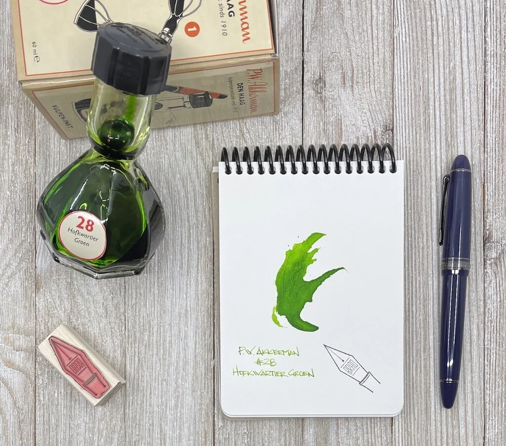
P.W. Akkerman #28 Hofkwartier Groen is my favorite green ink, and it’s not particularly close.

It also falls into the category of products that I love and talk about constantly, but have never reviewed. It’s time to correct that.

Akkerman #28 is a bright green ink, with a healthy dose of yellow undertones. Inks with that color definition don’t always have the best readability on the page, but I’ve never had a problem with this one. It pops off the page, even in my finest nibs.

P.W. Akkerman #28 Hofkwartier Groen

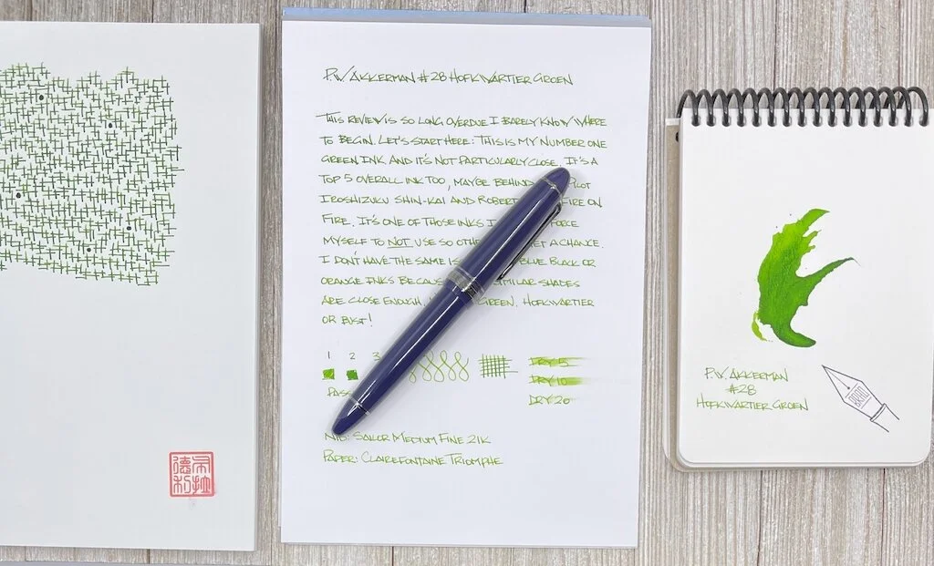
Of course, a wide, wet nib will show off the feature that this ink is known for most: Shading. It’s subtle when you are writing, but after a few sentences, the range of shades between dark and light begin to appear on the page.

I used a Sailor 21k Medium Fine nib for this review, and the ink performed flawlessly. That’s the thing about all Akkerman inks - they behave perfectly. Good flow, good lubrication, good saturation, good dry time - good all of the things. These inks are right in the middle of all of those ranges, which, in my mind, makes for a great quality, every day use, fountain pen ink.

P.W. Akkerman #28 Hofkwartier Groen Dry Time

I think the only question left to ask about any Akkerman ink is does the ink bottle design sway how I feel about the ink itself? Yes. Yes it does. Sure, I could get a similar color ink (say, from Diamine,) in a more traditional bottle shape (like the ones Diamine uses,) at a lower price per ml (around Diamine’s price point,) and be perfectly happy. But have you SEEEEEN this bottle? It makes all the difference in the world.

P.W. Akkerman #28 Hofkwartier Groen Review

And Hofkwartier Groen makes all the difference in the world to me in the world of green inks. From a usage standpoint, it is right up there with Pilot Iroshizuku Shin-kai and Robert Oster Fire on Fire as my most used ink. In fact, I have to actively choose not to use it so other inks get the chance. It’s that good.

At $30 for a 60 ml bottle, Akkerman inks fall on the higher side of ink prices. I find the cost to be completely justifiable for the ink quality, plus the amazing bottle that certainly comes at no small cost. At least that is what I tell myself as the owner of five bottles of this awesome ink.

(I purchased this ink at a pen show a long time ago, in a galaxy far, far away. I probably paid full price for it.)


Enjoy reading The Pen Addict? Then consider becoming a member to receive additional weekly content, giveaways, and discounts in The Pen Addict shop. Plus, you support me and the site directly, for which I am very grateful.

Membership starts at just $5/month, with a discounted annual option available. To find out more about membership click here and join us!

P.W. Akkerman #28 Hofkwartier Groen Lines
Posted on March 22, 2021 and filed under Akkerman, Ink Reviews.

Van Dieman's Wilderness Series Ink: Devil's Kitchen Review

Van Dieman's Wilderness Series Ink: Devil's Kitchen

Van Dieman's is a totally new ink maker to me, and before I received several sample vials from Vanness to try out, I had never heard of them. It's fascinating now to see so many small ink shops popping up around the world offering so much variety and vitality to the fountain pen ink market. It was tough to pick one to start, so I really just picked one at random and came out with Devil's Kitchen — part of the Wilderness Series.

The Wilderness Series is a collection of ten inks that are, in the words of the creator, inspired by the "majestic, beautiful and ofttimes humbling wonders that await in the Tasmanian wilds." The description of Devil's Kitchen had me itching to try it out in a pen.

The Devil’s kitchen, where The Great Southern Ocean smashes into scattered inlets lining the Eagle Hawk Neck cliff face on the eastern side of the Tasman Peninsular, creating a violent churn and the rich vibrantly cool teal which inspires this colour. Tasmania’s wilderness of this caliber is breath-taking.

With a description like that, I can't decide if I want to try out the ink or plan a trip to Tasmania to see this in person.

Van Dieman's Devil's Kitchen Swab

Since traveling is a joke right now, I guess my decision is an easy one. Devil's Kitchen is a lovely dark teal with a great deal of green covering up slight hints of blue. There's a good amount of shading, but not so much to be dramatic. It's well-behaved and would look great on business papers and journals alike. Using this ink has been really enjoyable because of the slight amount of drama the murky shading adds to the page.

The ink is dye-based, which makes it more robust than your typical fountain pen inks. Despite that, the ink is still very well lubricated and flows quite nicely. I haven't had any issues with dry starts or scratchy nibs. Even after being capped for a while in a pen that usually has trouble regardless of what ink I'm using, it does just fine starting after being dormant for a few days.

Van Dieman's Devil's Kitchen Dry Time

There's no shimmer in this ink, but there's a rare sheen that I've only noticed a couple of times in areas that the ink has a chance to pool up significantly. The sheen is hard to detect, requiring perfect lighting and near impossible conditions — but it's there if the conditions are perfect.

I've really enjoyed using this ink over the past couple of weeks. I didn't expect much because I had never heard of Van Dieman's before, but the name has quickly rocketed to the top of my list. A 30ml bottle costs $12.95 from Vanness, but you can also pick up a small sample vial for under $3 if you're unsure. If, like me, you haven't heard of Van Dieman's yet, make sure to add it to your list when you're next in the mindset to do some ink shopping.

(Vanness Pens provided this product at no charge to The Pen Addict for review purposes.)


Enjoy reading The Pen Addict? Then consider becoming a member to receive additional weekly content, giveaways, and discounts in The Pen Addict shop. Plus, you support me and the site directly, for which I am very grateful.

Membership starts at just $5/month, with a discounted annual option available. To find out more about membership click here and join us!

Van Dieman's Devil's Kitchen Writing
Posted on March 10, 2021 and filed under Van Dieman's, Ink Reviews.

Lennon Toolbar Atmospheric Inks (Night Sky, Blue Sky, and Sunset Glow): A Review

Lennon Toolbar Atmospheric Inks (Night Sky, Blue Sky, and Sunset Glow): A Review

(Susan M. Pigott is a fountain pen collector, pen and paperholic, photographer, and professor. You can find more from Susan on her blog Scribalishess.)

Lennon Toolbar is a Taiwanese company founded in 2014. Originally, their focus was Indigo Dyeing, but recently they've branched out into fountain pen inks.

Night Sky, Blue Sky, and Sunset Glow are the three newest inks in the Atmospheric Series, which emphasizes colors inspired by atmospheric phenomena. The inks in this series are waterproof.

Night Sky

Lennon Toolbar Night Sky Bottle

Night Sky is a grey-blue ink that reminds me of new denim blue jeans or the deep blue of the sky just after sunset. The ink offers good shading in swabs and wide nibs, but it has no sheen.

Lennon Toolbar Night Sky Colodex
Lennon Toolbar Night Sky Colodex Close

On Rhodia paper, the ink is a dusky blue with a bit of shading. It dries quickly and, as you can see in the water test, is completely waterproof.

Lennon Tool Bar Night Sky Ink Test

Even on legendary Tomoe River Paper, Night Sky does not exhibit any sheen, but the ink and paper interact beautifully, offering a wonderfully smooth writing experience. The ink looks its best on Tomoe paper.

Lennon Tool Bar Night Sky Tomoe

MD Cotton paper along with a juicy ruling pen bring out the shading and pooling properties of the ink. Even where the ink pools, however, there's no sheen.

Lennon Tool Bar Night Sky Big Writing

Of the three inks reviewed here, Night Sky is my favorite. It is the most saturated, and it is easy to read on all the papers tested.

Blue Sky

Lennon Tool Bar Blue Sky Bottle

Blue Sky is a light blue shade reminiscent of old, faded blue jeans or the soft blue color of the sky on a moody winter day. Using a dip pen fitted with a Brause Blue Pumpkin nib, the ink exhibits shading and color variation. There's no sheen, however.

Lennon Tool Bar Blue Sky Colodex 1
Lennon Tool Bar Blue Sky Colodex 2

On Rhodia paper, Blue Sky is very light, and there's not much color variation or shading. This ink was a bit wetter than Night Sky, taking slightly longer to dry. It also is waterproof.

Lennon Tool Bar Blue Sky Ink Test

Blue Sky is a little more legible on Tomoe River paper. The paper brings out some subtle shading as well.

Lennon Tool Bar Blue Sky on Tomoe

This ink definitely looks best on MD Cotton paper with a ruling nib. If you want to enjoy the shading and pooling characteristics of the ink, you'll need to use it with wide nibs.

Lennon Tool Bar Blue Sky Big Writing

Blue Sky is too light in my opinion, at least for use in fine, medium, and broad nibs. It interacts best with Tomoe paper and, in combination with wide nibs (BB, BCI, and wider), it is more saturated.

Sunset Glow

Lennon Tool Bar Sunset Glow Bottle

Sunset Glow makes me think of an Orange Julius and my mouth starts watering. It's a peach-orange that, when it pools, becomes a striking red-orange. Again, using the Brause Blue Pumpkin dip nib brings out some nice shading in this ink. A tiny bit of sheen appears on the edges of the ink splats.

Lennon Tool Bar Sunset Glow Colodex 1
Lennon Tool Bar Sunset Glow Colodex 2

Sunset Glow appears rather light on Rhodia paper, but it is legible and exhibits some shading. Like the other inks, it is waterproof and has a fluorescent green afterglow that made me think it might glow in the dark, but it doesn't.

Lennon Tool Bar Sunset Glow Ink Test

On Tomoe River Paper, Sunset Glow flows well and exhibits some shading.

Lennon Tool Bar Sunset Glow on Tomoe

This ink looks most spectacular on MD Cotton Paper with a ruling nib. The dark, rich oranges develop where the ink pools and shading is quite striking. Of the three inks, Sunset Glow is my second favorite.

Lennon Tool Bar Sunset Glow Big Writing

You can purchase Night Sky, Blue Sky, and Sunset Glow from Shigure Inks ($24.00 for 35ml).

(Shigure Inks sent Pen Addict these three Atmospheric inks at no charge for review purposes.)


Enjoy reading The Pen Addict? Then consider becoming a member to receive additional weekly content, giveaways, and discounts in The Pen Addict shop. Plus, you support me and the site directly, for which I am very grateful.

Membership starts at just $5/month, with a discounted annual option available. To find out more about membership click here and join us!

Lennon Tool Bar Atmospheric Inks
Posted on March 5, 2021 and filed under Lennon Tool Bar, Ink Reviews.