Posts filed under Ink Reviews

Dominant Industry Lake Ink Review

Dominant Industry

Is this the best looking ink bottle on the market? Is this the best performing ink on the market? Dominant Industry has a good chance of going 2-for-2 in those categories.

Glass ink bottles interest me greatly. Why? They shouldn’t matter in the grand scheme of things. I mean, you aren’t writing with the bottle - are you? The liquid inside is what matters, but I would be lying if a cool storage vessel for ink didn’t make a difference in what I think about the brand. That said, a good ink can come in a basic bottle. A bad ink can come in a Faberge Egg and will still be a bad ink.

Dominant Industry

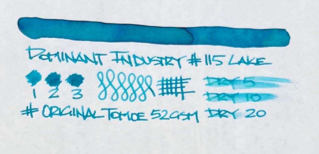
Fortunately, Dominant Industry Lake is one of the more enjoyable inks I’ve tested in quite some time.

When they first made their splash, it was for wild-looking dip nib only inks like Hologram. While that ink looks amazing and I’ll probably test some down the line, what I was most anxious to test were their standard fountain pen inks.

I grabbed a few bottles for the review crew, and kept No. 115 Lake for myself to try out. It has been a great experience so far.

Dominant Industry

It could be that I hit the pen and nib perfecta for this ink, allowing it to perform so wonderfully. I used a new Faber-Castell Ambition, with a steel Medium nib. The ink flows perfectly from this nib, even on the more absorbent Story Supply Thick Plot notebook the writing sample was done on.

Dominant Industry

I guess all good inks are consistent, but this perfect from start to finish? That’s not always how it goes. Lake behaved exactly the same, letter to letter, line to line. It has medium wetness, a small amount of shading, and only sheen if you let it pool up on the page. Dry time is fantastic on Clairefontaine Triomphe, checking in at just over 10 seconds on my finger swipe. On Tomoe River that dry time doubled, but that is better than most on that paper.

Dominant Industry Ink

What I want to do now is test out Lake in a finer nib pen. The way the ink flows in this Faber-Castell makes me think it will perform just as well in some of my Japanese fine nibs. And the color is strong enough to be able to handle the narrower width of the lines.

Dominant Industry Ink Test
Dominant Industry Ink Test Tomoe

The made-for-Instagram bottles drew me in. The ink performance kept me around. And I want more Dominant Industry inks, for both reasons.

You can pick up the fountain pen compatible versions of Dominant Industry inks at Yoseka Stationery for $17.00 for a 25 ml bottle. A little pricey, but not remotely out of line. I look forward to seeing how the other colors I purchased test out. I have high hopes after my first go.

(I purchased this ink from Yoseka Stationery at full retail price.)


Enjoy reading The Pen Addict? Then consider becoming a member to receive additional weekly content, giveaways, and discounts in The Pen Addict shop. Plus, you support me and the site directly, for which I am very grateful.

Membership starts at just $5/month, with a discounted annual option available. To find out more about membership click here and join us!

Posted on December 20, 2021 and filed under Dominant Industry, Ink Reviews.

Van Dieman's Tassie Season Sweet Fig Fountain Pen Ink Review

(Jeff Abbott is a regular contributor at The Pen Addict. You can find more from Jeff online at Draft Evolution and Twitter.)

It's really difficult for me to believe, but winter is just a few days away (the official date anyway). I live in an area that rarely experiences the spring and fall seasons, so I'm more than happy to enjoy some of those seasons through ink colors and baked treats. In this case, I'm using Van Dieman's Tassie Season Sweet Fig — a luscious dark red ink that you could easily mistake for a blank ink in certain light. It makes me think of autumn weather and changing leaves, and I really appreciate it for that.

I generally need to be in the right mood to enjoy a dark ink, but Sweet Fig is just light enough in the thinner areas to really tickle my fancy. On first writing with this ink, I was a little disappointed with how dark the ink was. After using it a little more, I noticed all the little nuances that this ink has to offer. It's dark, but it also has depth.

The dark red tone is the most prominent, but I love the small hints of purple that come through from behind. This mixture of deep red and dark purple are just fabulous, and they complement each other perfectly. The shading of this ink from deep red and purple is really fantastic.

Along with the interesting shades and layers of colors, there's also an interesting sheen effect that you can notice in certain light. I've never used an ink with a black sheen before, but I'm somewhat blown away by how it behaves now that I've seen it with my own eyes. In the right light, this ink looks black — but it changes back and forth from black to deep red/purple like someone switching a light on and off. It's so cool.

The dry time for this ink is fairly average at around 10 to 15 seconds. I was using a large nib for the sample here, and I'd say the dry time is closer to 10 on smaller nibs. Not an incredibly fast-drying ink, but pretty good nonetheless.

Like all Van Dieman's inks I've tried before, this one behaves elegantly. It's well lubricated, starts easily, doesn't bleed or feather, and cleans out quickly. The more of these inks I try, the more they teeter into my favorite brand of inks.

A 30ml bottle of Sweet Fig is available from Vanness for $12.95, which is an excellent deal. If you'd rather try a small sample instead, you have that option. But if you like dark inks that have a few secrets to share, this ink is well-worth the small investment. While you're at it, browse the other inks that Van Dieman's offer and see what else tickles your fancy.

(Vanness Pens provided this product at no charge to The Pen Addict for review purposes.)


Enjoy reading The Pen Addict? Then consider becoming a member to receive additional weekly content, giveaways, and discounts in The Pen Addict shop. Plus, you support me and the site directly, for which I am very grateful.

Membership starts at just $5/month, with a discounted annual option available. To find out more about membership click here and join us!

Posted on December 15, 2021 and filed under Van Dieman's, Ink Reviews.

Birmingham Pen Co. Pincushion Moss Ink Review

(Jeff Abbott is a regular contributor at The Pen Addict. You can find more from Jeff online at Draft Evolution and Twitter.)

A few weeks ago, I reviewed my first ink from the Birmingham Pen CompanyPennsylvania Slate. I was really happy with that ink and surprised by the color. I've been enjoying it ever since. Later, I broke out the other ink I currently have Birmingham Pen Co.: Pincushion Moss. This ink is quite different than the previous one for one main reason (aside from the color!) — Pincushion Moss uses their Everlasting ink formula, which means it is a pigmented ink that is highly water-resistant.

In my day to day usage of pens and ink, I never use archival or water-resistant inks on purpose. I really don't have any requirements for using these types of ink in my daily routines, but I still enjoy using them. These types of ink can tend toward the dull side of the color spectrum due to the necessary ingredients that make an ink resistant to washing away. There really aren't many examples of bright or poppy archival inks for this reason. This is why Pincushion Moss really caught my eye. It's an organic green color that really reminds of my soft moss that you find in the forest. It's not bright, but it definitely draws my eye. It's light enough in color to stand apart from the typical dark office colors, but not bright enough to cause any problems. Plus, it's not a typical blue, black, or red which means you can use it alongside those colors if you need some kind of color coding system.

There's a fair bit of shading that makes the ink even more interesting to look at once it's dried on the page. It varies between a dark medium green to a lighter thin green. In a lot of lighting situations, it also looks gray and brown. This just makes the moss connection even stronger for me because those are the same colors you'll find around moss in the wild when it's on the forest floor or up against some gray tree bark. The color isn't exciting in a pop-off-the-page way, but it's certainly an eye-catching and interesting color.

The archival quality of the ink is stellar. In my rudimentary tests, there's only a slight decrease in saturation after the paper sample is totally submerged in water for a bit. I couldn't get the ink to smudge either, proving that the chemical bond took place and the ink is now one with the paper. If archival ink is your thing, this one certainly does the trick.

The most astonishing think about this ink that I discovered is the dry time. This is seriously impressive. In most cases, the ink was dry in as little as five seconds. I couldn't do any tests that resulted in smears at the ten-second mark. This ink dries incredibly fast. I'm not a left-handed writer, but I'm pretty sure this dry time should catch the attention of the lefty crowd. I haven't been this surprised by a dry time for quite a while. Seriously impressive!

The only downside I've noticed with this ink is the tendency for it to feather a bit at the edges when it's drying. It's nothing major, but you can see it when you look closely. It feels like a fairly wet ink, and I assume this has something to do with the water content that allows the pigments to suspend properly until they come in contact with paper. It feels great while writing — not scratchy at all — but the feathering does show up here and there, unfortunately.

I love that Birmingham Pen Co. prints some guidance on the ink bottle packaging that explains how to use the Everlasting ink. Tips like, "don't allow the ink to dry inside the pen," and "do not use in demonstrator pens" may sound scary, but it's just part of the territory when using pigmented inks. I appreciate that they've printed some clear and concise tips for the uninitiated. Even with those warnings, you shouldn't be scared to try out this ink! Just make sure you use the pen regularly to avoid any drying/clogging issues, and wash it out when you're done! If your pen does get a little clogged, a thorough cleaning will restore it in no time. But you shouldn't use this ink in a clear pen as it might stain the plastic.

Overall, I've been really pleased by this organic-looking ink! The color is exactly what I'd want in an ink that has "moss" in the name, and the super fast dry time is such an unexpected treat. Throw the everlasting nature of the ink on top and you've got a winner.

Pincushion Moss is available in three size: 30ml, 60ml, and 120ml for $19, $29, and $39 respectively. This is a little more expensive than their normal inks, but the Everlasting formula comes at a (well-owed) premium. If you're looking for a lovely green, a quick drying ink, or an archival ink for your collection, add this one to your list!

(Birmingham Pen Co. provided this product at no charge to The Pen Addict for review purposes.)


Enjoy reading The Pen Addict? Then consider becoming a member to receive additional weekly content, giveaways, and discounts in The Pen Addict shop. Plus, you support me and the site directly, for which I am very grateful.

Membership starts at just $5/month, with a discounted annual option available. To find out more about membership click here and join us!

Posted on December 8, 2021 and filed under Birmingham Pen Co, Ink Reviews.