Posts filed under Ink Reviews

Colorverse NASA Blue Ink Review

Colorverse NASA Blue Ink Review

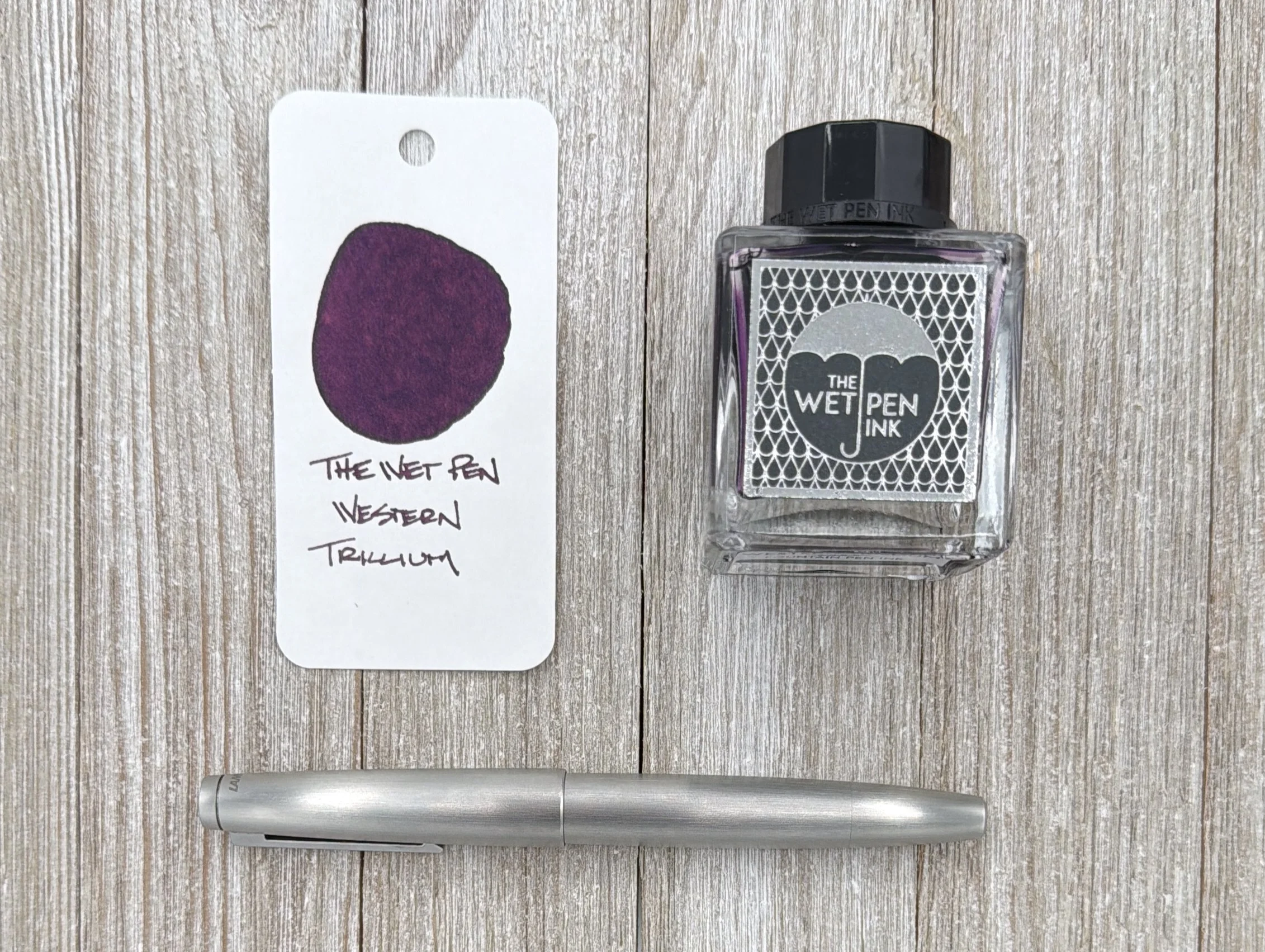
(Sarah Read is an author, editor, yarn artist, and pen/paper/ink addict. You can find more about her at her website and on Bluesky. And her latest book, The Atropine Tree, is now available!)

Colorverse is one of the more exciting ink brands out there these days. Everything they do is at least interesting. So when I get a bottle of blue Colorverse ink, I know I'm in for so much more than just a blue ink. And I was right!

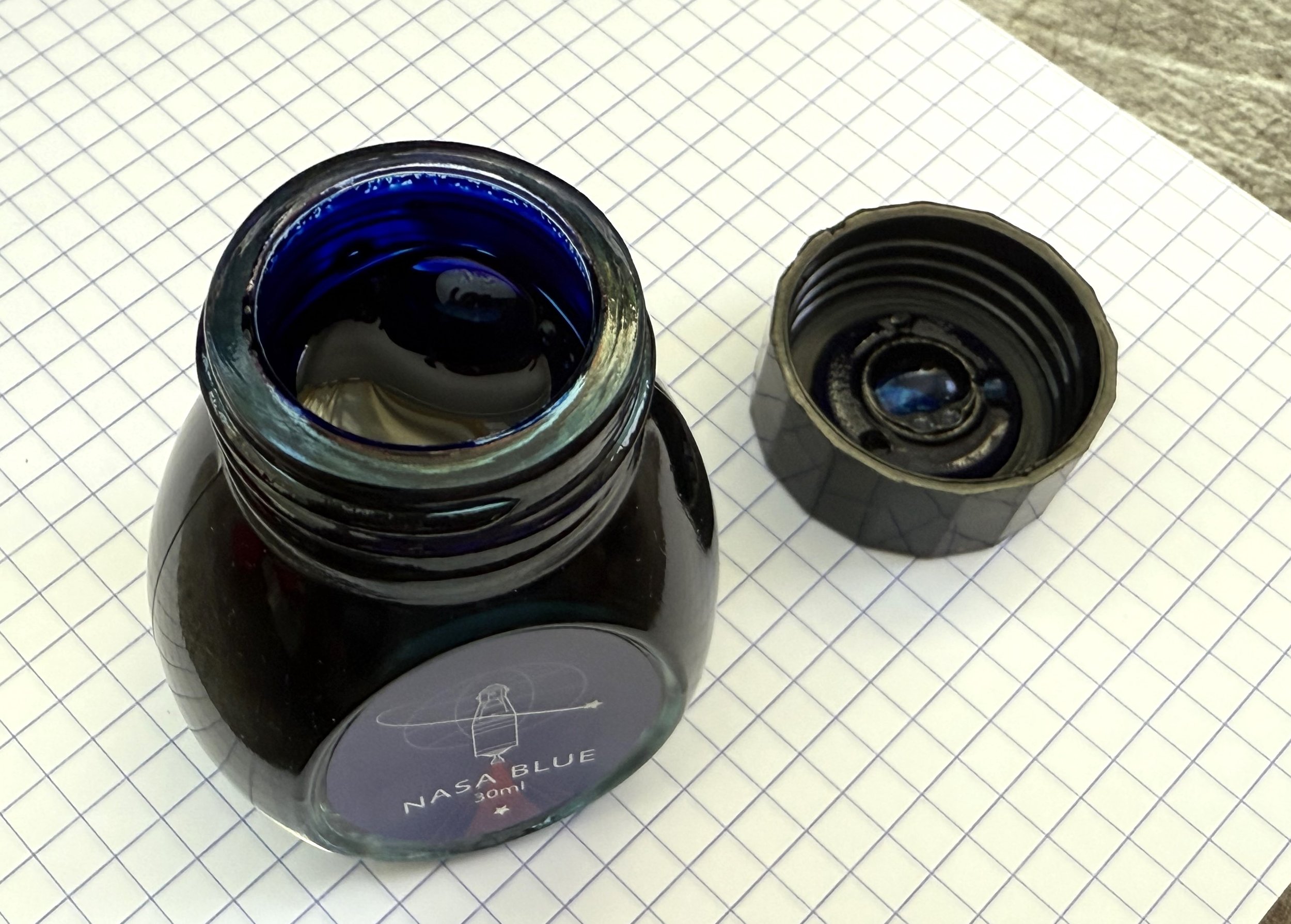
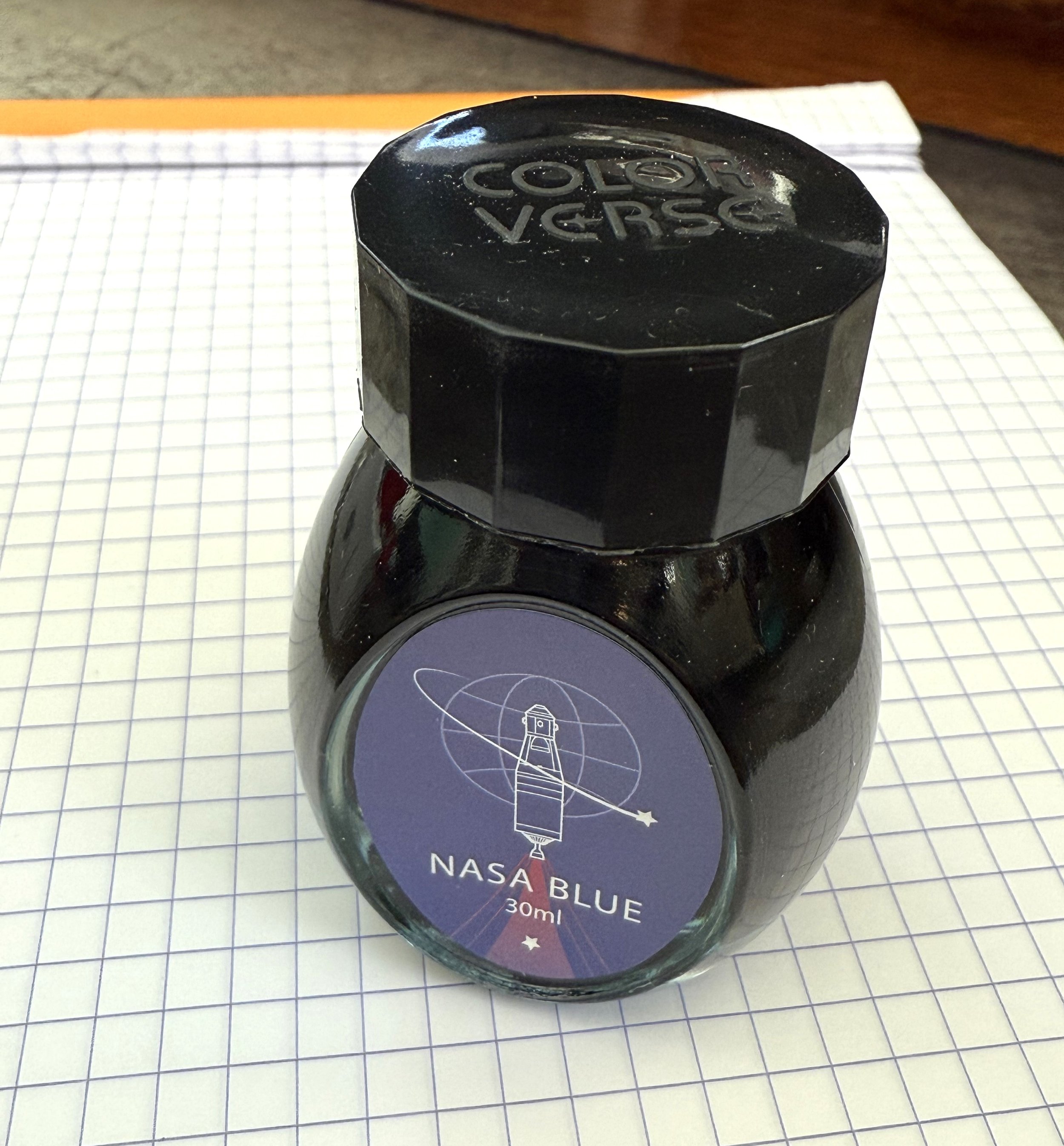
The Colorverse Nasa Blue ink comes in a 30 ml glass bottle. It's not one of their comet tail shaped bottles. It's more of an oval, or a flat-bottomed egg. I like the fun shaped bottles, but this is probably more practical. The bottle opening is a good size, and it's sturdy enough that it doesn't feel like it will tip or spill.

Colorverse NASA Blue Ink

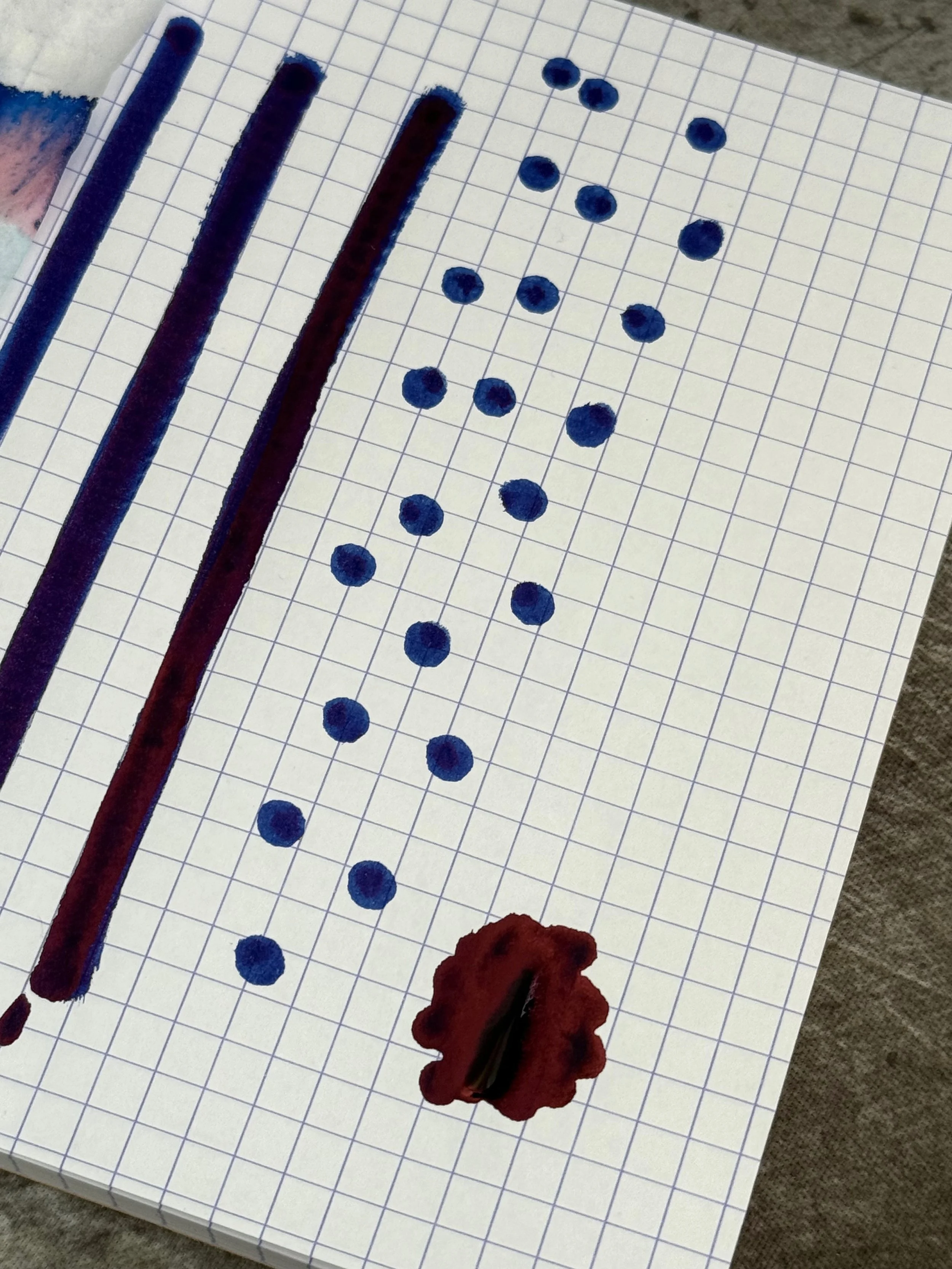
The ink itself is shockingly saturated. While wet, it is a deep midnight blue. Yaknow, like space. As it dries, it takes on a more violet-blue color. And then it pops with a dramatic magenta-rose sheen. It has a ton of attitude. You could totally use it as a professional blue ink, but it definitely has a wild side.

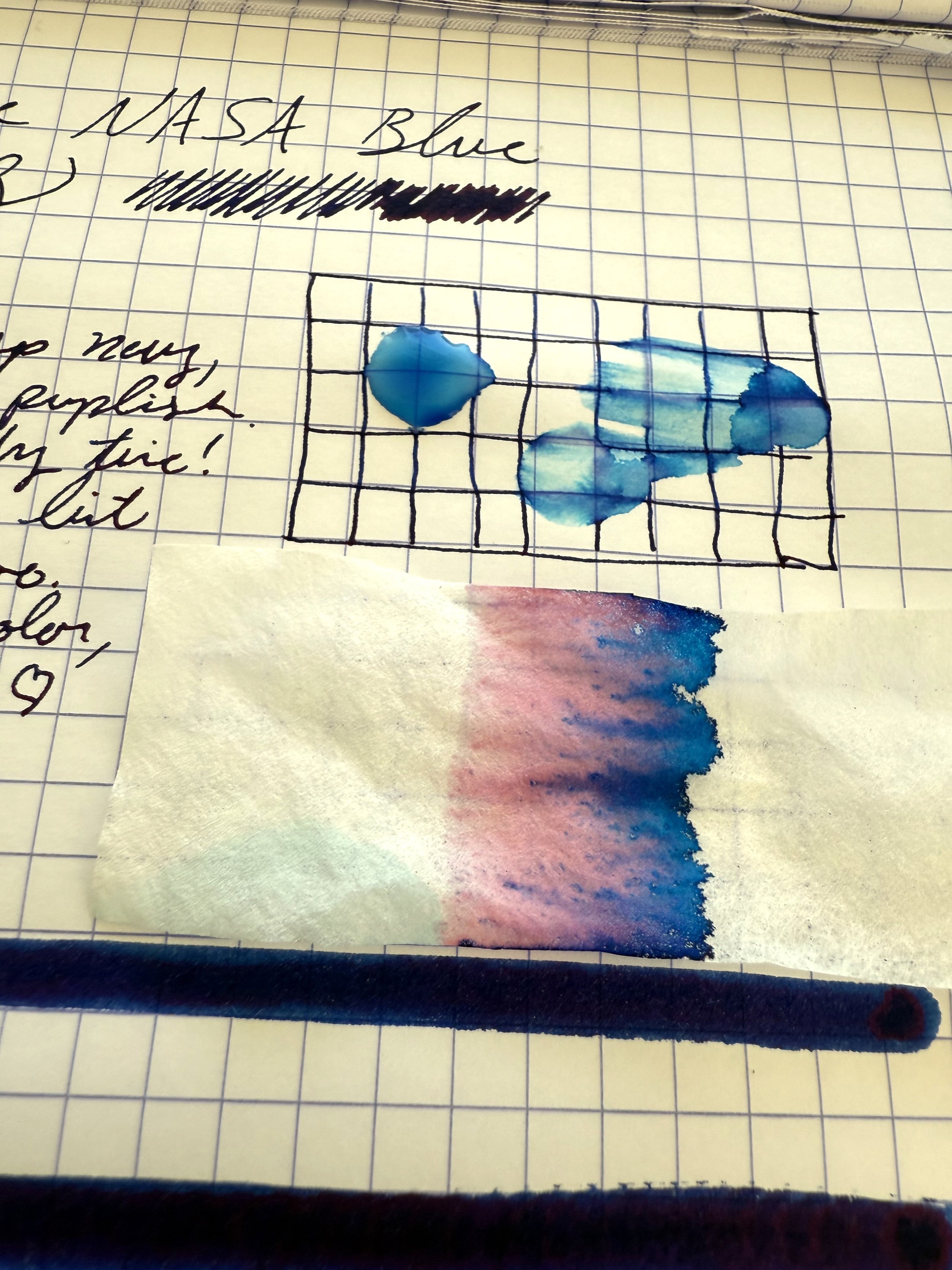
Chromatography shows those rosy-violet undertones with the blue pigment. And the painted layers of the ink show how it goes from dark to darker. Not even the faintest application of this ink is pale in any way.

Colorverse NASA Blue Ink Chromatography

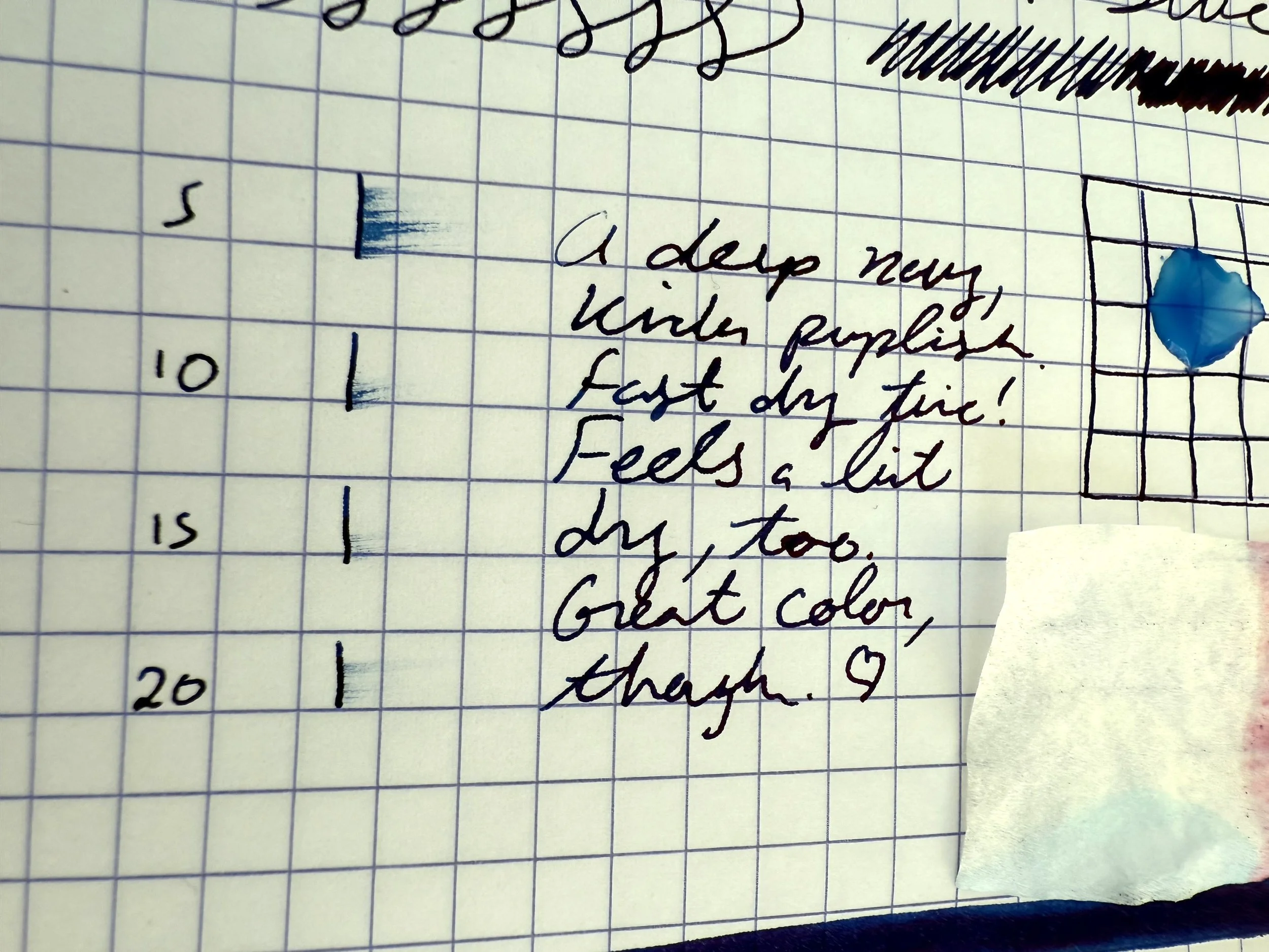
It's a very dry ink. It's not unpleasantly dry to write with, but it has a dry feel to it, and the dry time on the writing test was maybe the fastest-drying ink I've ever tested. It barely ran at ten seconds.

While the ink has no water resistant properties, it's so pigmented that some traces of lines stay behind even when water is spilled on it.

Colorverse NASA Blue Ink Test

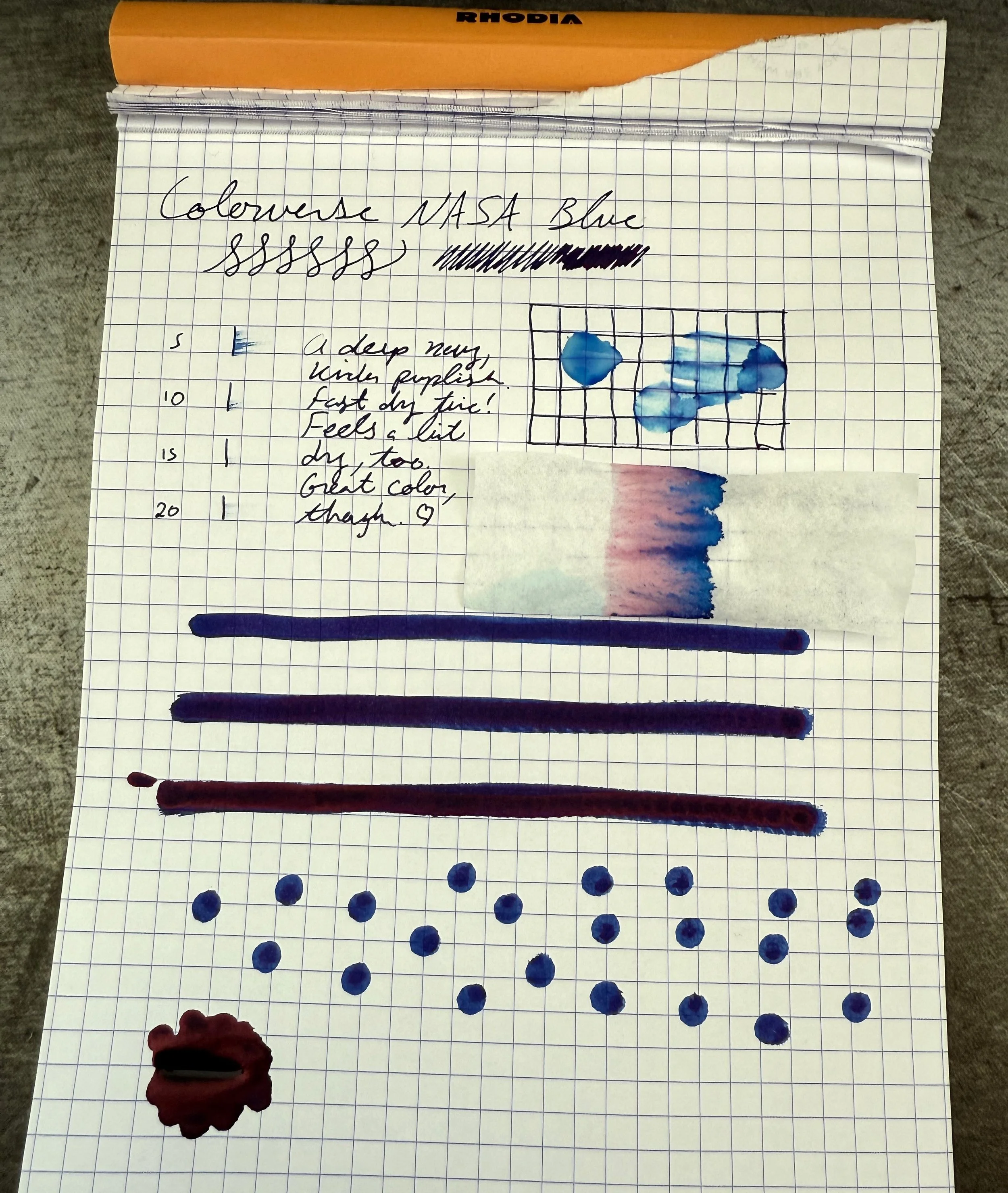
The most exciting thing about this ink, though, is the sheen. It's aggressive. It's not one of those inks that only sheens under certain pooling conditions, or only on some paper in some light--it's very sheeny. You could signal aircraft with the reflective surface of this ink. Where it does pool, the sheen is so complete that the ink doesn't even appear blue anymore--it looks like metallic red.

This is a very fun ink, and reinforces my enjoyment of Colorverse as a brand. This color is a Dromgoole's exclusive and sells for $19 for a 30 ml bottle. That's about twice the cost of a Diamine ink, and it's even more expensive than some Sailor inks, ml for ml. Colorverse is an expensive brand. You can certainly get a deep blue ink with a red sheen for less, though this one does have more sheen and more richness than most. If you like a high-impact saturation and drama in your ink, this is the one.

(This product was purchased from Dromgoole’s at regular price.)


Enjoy reading The Pen Addict? Then consider becoming a member to receive additional weekly content, giveaways, and discounts in The Pen Addict shop. Plus, you support me and the site directly, for which I am very grateful.

Membership starts at just $5/month, with a discounted annual option available. To find out more about membership click here and join us!

Colorverse NASA Blue Ink Bottle
Posted on January 29, 2026 and filed under Colorverse, Ink Reviews.

J. Herbin Opale Nocturne Ink Review

J. Herbin Opale Nocturne Ink Review

We are many milliliters deep into Inkvent season, and while I’m not participating in any daily ink slinging, that doesn’t mean I can get my shimmery ink on!

J. Herbin Opale Nocturne is the latest shimmer ink from the company who may do shimmer inks better than anyone. I know, those are fighting words, but ever since Emerald of Chivor knocked down the door over a decade ago, J. Herbin has been on a can’t miss kick with each of their yearly releases.

J. Herbin Opale Nocturne Ink

When I first saw the images of Opale Nocturne, I immediately wondered if this is Emerald of Chivor, part two. Once I got it in hand, I realized that it’s not particularly close, outside of the Gold shimmer that both share.

J. Herbin Opale Nocturne vs Emerald of Chivor

Translated to Night Opal, this Blueish-Green ink has a hint of Grey going down on the page, and then dries into an interesting Dusty Blue. The color should be simple to describe, but it’s just a bit different than any shade I use regularly. Add in the shimmer, and it’s a clear standout.

I used a TWSBI 580 ALR with a 1.1 mm Stub Nib for this review, and it worked well. The flow is wet, and the shimmer shows up in nearly all of the lines. The amount varies with how long I have been writing - there is more shimmer on the first few lines after uncapping the pen, and if I don’t stop for many lines the shimmer lightens up. That’s normal behavior. The ink never missed a beat on the page, and any time I uncapped it over the past couple of weeks it wrote immediately.

J. Herbin Opale Nocturne Writing

The key with shimmer inks is to use a pen with good flow, and the wider the nib the better time you will have. Also, choose a pen that is easy to clean. I’ve used this pen many times with shimmer ink and never had any issues.

In the grand scheme of all the J. Herbin 1670 shimmer inks, this one ranks near the top. Emerald of Chivor is still the S-Tier choice, but Opale Nocturne is in the conversation. It may only be behind Shogun for my own personal shimmer use.

J. Herbin Opale Nocturne Lines

At $34 for a 50 ml bottle it is on the expensive side, but the quality is worth it. And the bottle is one of the best in the business, and no, I don’t mean my 10 ml sampler! You can pick up a 4 ml sample from Vanness Pens if you want to try before you commit.

What is your favorite J. Herbin shimmer ink release? And what other ink color looks like this base Blue/Green/Grey? I’d be interested to try it out!

(Exaclair, the US distributor of J. Herbin, sent me this ink at no charge.)


Enjoy reading The Pen Addict? Then consider becoming a member to receive additional weekly content, giveaways, and discounts in The Pen Addict shop. Plus, you support me and the site directly, for which I am very grateful.

Membership starts at just $5/month, with a discounted annual option available. To find out more about membership click here and join us!

Posted on December 15, 2025 and filed under J. Herbin, Ink Reviews.

The Wet Pen Western Trillium Ink Review

The Wet Pen Western Trillium Ink Review

Fountain pen inks from The Wet Pen have been on my radar thanks to readers of this site, and I finally got my order in a few weeks ago. Hello fresh ink!

I bought six inks, and Matthew, the maker behind the brand, threw in two more of his favorites, bringing my total to eight. I tested them all with a couple of dip nibs, trying to find the one I wanted to ink up first.

The Wet Pen Inks

Kokuyo paper.

That, of course, proved to be impossible. To solve that issue, I grabbed the pen I wanted to ink up, my LAMY 2000 Stainless Steel with an Extra Fine nib, and made a decision from there. Western Trillium was the winner, given that 1. the color is lovely, and 2. it doesn’t appear to need a wide, wet nib to display its characteristics, like some of the other inks I purchased.

Col-o-ring paper.

Even though any color would match the plain steel color of the LAMY, I made the right choice. Western Trillium is a flower found primarily in the Western United States that starts out White when it initially blooms, and then changes into a beautiful Magenta/Pink as it matures. That’s the shade that The Wet Pen matched here, and it turned out great.

It doesn’t take much to get me to enjoy a color in this spectrum. Magentas are some of my favorites, and Western Trillium lands a little bit on the darker, or Purpler, side. According to the product description, Blue will show up in the shading on certain papers, so that makes sense that it is Purple-leaning.

The Wet Pen Western Trillium

Life Noble paper.

The performance from this Extra Fine nib has been perfect. Flow is fantastic, with some shading and a moderate to quick dry time. Again, this is an EF nib, so it’s not going to pop in all the categories, but you can see more of the character in the swatches, or with the glass dip nib pen.

Yoseka Notebook paper.

Overall, it is so far, so good with Western Trillium. It has been a good, consistent writing ink so far, and I love the color. At $16 for 50 ml, or $12 for 20 ml, it’s also a good value. I look forward testing out more inks from The Wet Pen soon.

(I paid full price for the ink used in this review.)


Enjoy reading The Pen Addict? Then consider becoming a member to receive additional weekly content, giveaways, and discounts in The Pen Addict shop. Plus, you support me and the site directly, for which I am very grateful.

Membership starts at just $5/month, with a discounted annual option available. To find out more about membership click here and join us!

Posted on December 1, 2025 and filed under The Wet Pen, Ink Reviews.