Posts filed under Notebook Reviews

Apica CD Notebook Review

Apica CD Notebook.jpg

I've done a few notebook reviews in the past several weeks, so don't take it lightly when I say that this is one of the best value notebooks available today. The Apica CD11 A5 notebook has quickly flown up the ranks in my mind of notebook ratings. Let's take a look at my reasons for such an opinionated statement.

The Paper

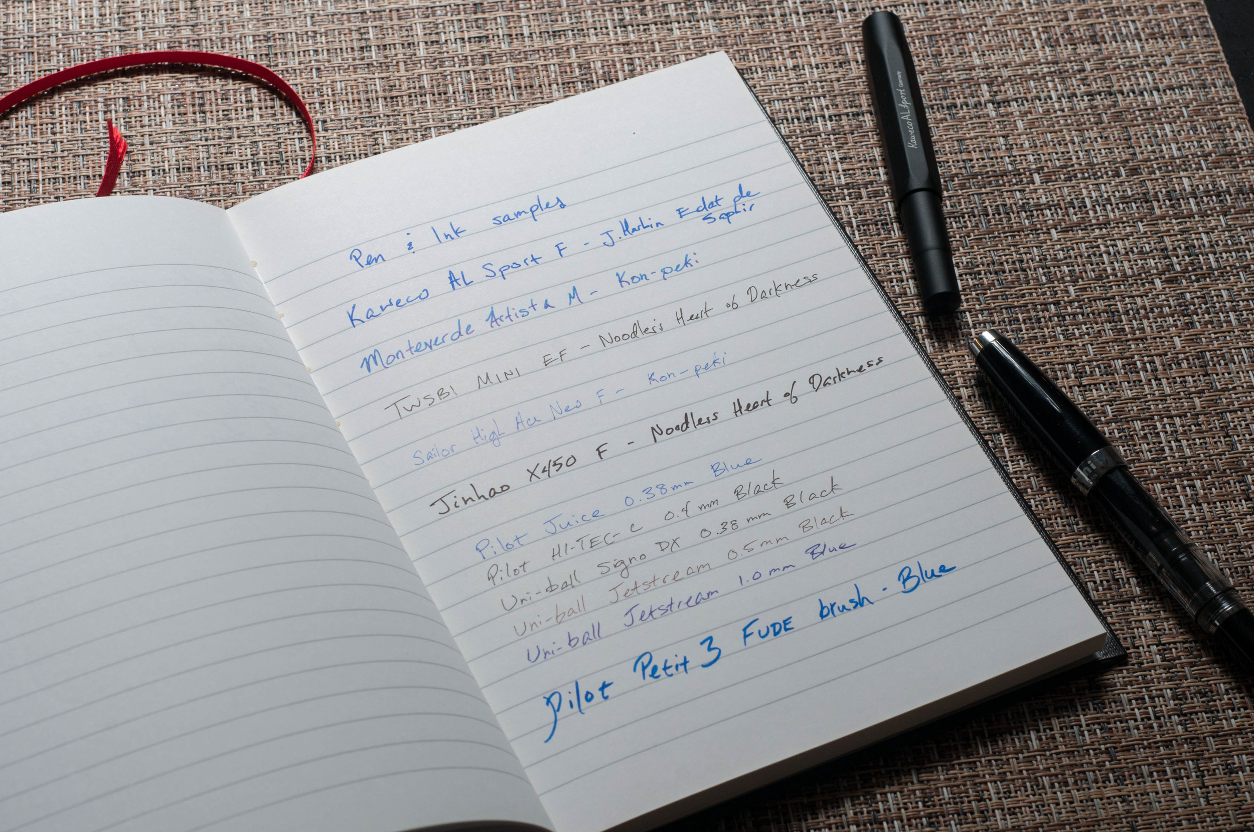
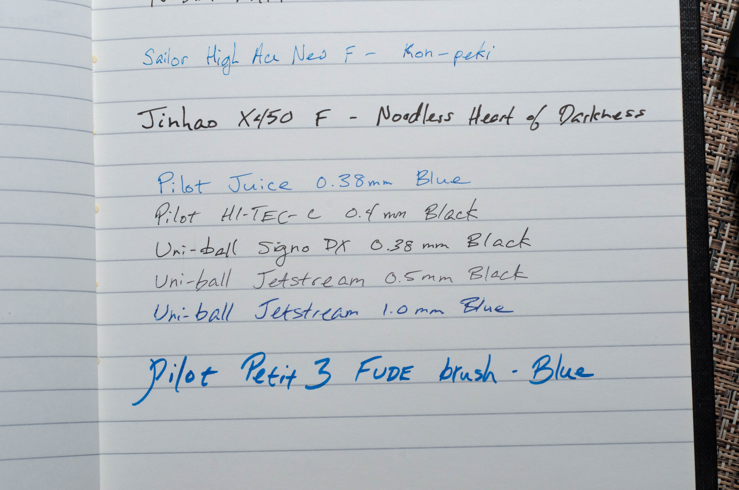
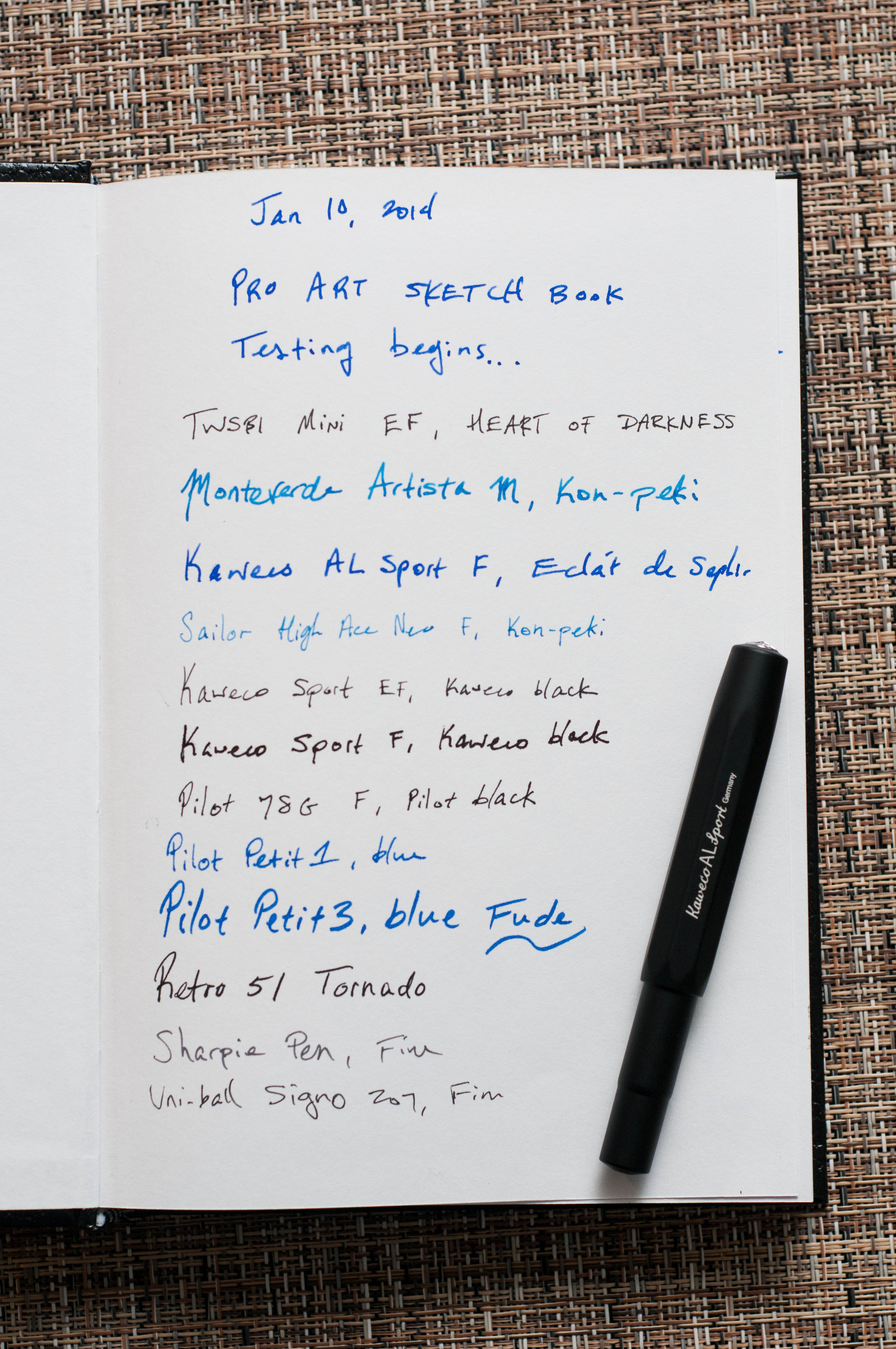
Wowzers — this is some nice paper. It's on par with the Clairefontaine paper that I've reviewed, but it's available at a lower price. $6.95 is the price at JetPens for the A5 size. Oh, and that price includes 3 notebooks that have 28 sheets a piece. I know, right?

The paper is white with gray-blue lines. According to JetPens, the lines are 7 mm apart, which is similar to narrow or "college" rule. It's very smooth to the touch and when you write. Every pen that I've used with this paper has performed admirably. I haven't noticed any negative qualities with the paper except with one ink, but I'll cover that later.

Apica CD Notebook Ink Test.jpg

In all the inks and pens I've tried, there's been no feathering (except for one ink) and no bleed through to speak of. Every pen I've tried glides effortlessly over this paper. It's as smooth as can be.

I noticed some feathering when I used J. Herbin Eclat de Saphir on this paper. I used the inks in two pens, and they both had the same symptoms. I wasn't really surprised when the Plumix created some feathering, but I was perplexed when the Kaweco EF also did it. My only answer is that there's some property (or properties) in the Eclat de Saphir that make it susceptible to feathering on this paper. I haven't noticed this behavior from this ink on other papers. Strange.

Apica CD Notebook Bleed.jpg

Anyway, apart from that one downside, I love this paper.
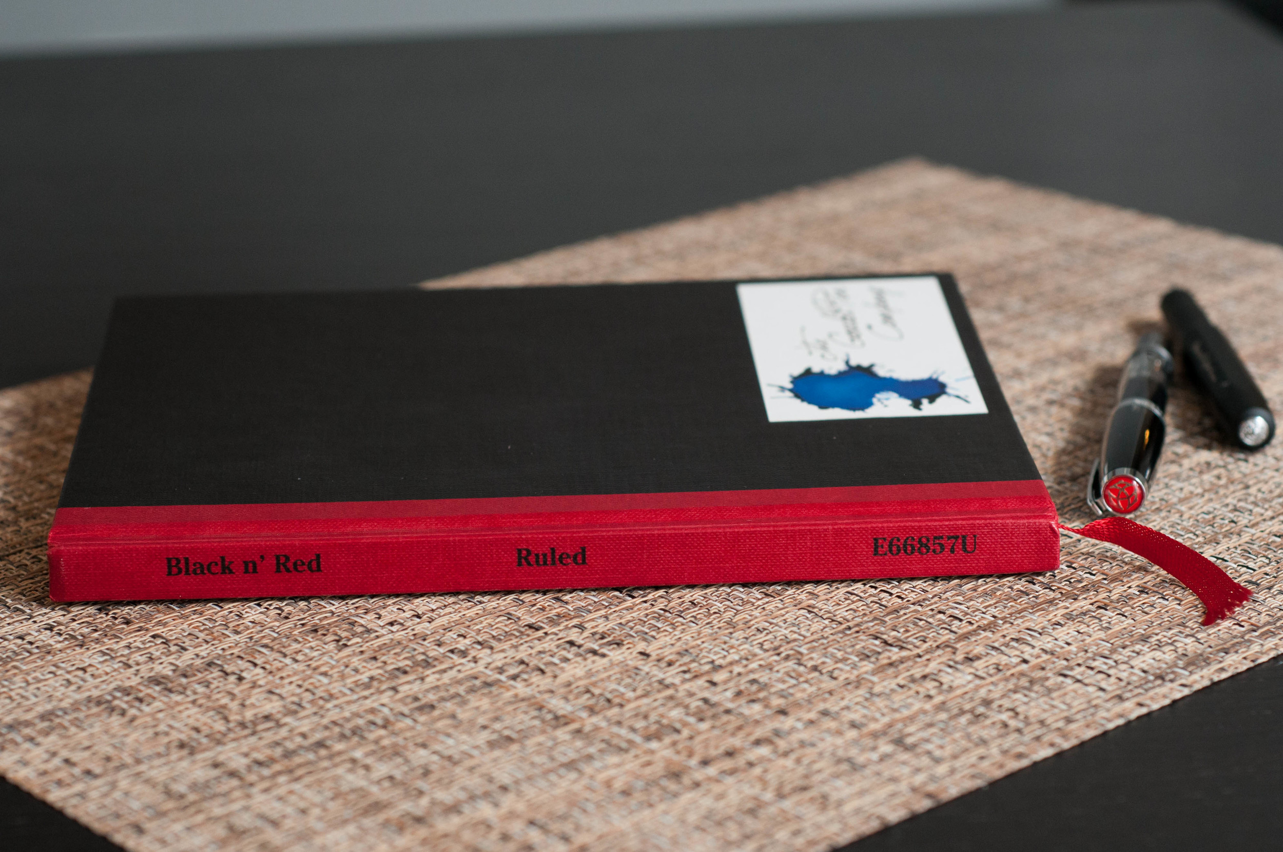
The Style

I went with the navy cover, but the other color options aren't bad. I might end up trying other colors out at some point. JetPens offers these books in yellow, white, sky blue, red, navy, mustard, light green, light blue, and black.

The cover is a thick paper that seems to do OK with regular wear and tear. Personally, I think a nice leather cover would be a great addition to this book. The paper just isn't thick enough to stand up to some of the abuse it might see during its tour of duty. There's silver decorative print (or black, depending on the cover color) and designs on the front cover, and minimal product information on the back. The paper has a nice texture that adds to the feel and aesthetic of the book. Overall, it looks nicer than what it cost.

The book is bound with thread. So far, it's a strong bind and the book has no problem laying flat once you've broken it in a little.

Apica CD Notebook Cover.jpg

The Value

For the quality of paper in this notebook, you really can't beat the price. Like the description from JetPens says, these "notebooks are ideal for your basic writing needs." Yes, they're relatively inexpensive. Yes, they're fairly basic and offer no perks. But they offer a writing experience that is friendly to every pen I've tried. That's difficult to come by. Give these notebooks a shot! They're available in the A5 size that I've reviewed here, or in semi B5.

(You can find more from Jeff online at Draft Evolution, Twitter, and App.net.)

Apica CD Notebook Samples.jpg
Apica CD Notebook Back.jpg
Posted on February 27, 2014 and filed under Apica, Notebook Reviews.

Black n' Red Notebook Review

Black n Red 4.jpg

The Black n’ Red notebook line from Hamelin, which is a part of Oxford, is a simple, no-frills book that delivers decent quality at an outstanding price.

I’ve had a Black n’ Red notebook in my possession since 2009. I think I bought the first one at Target. This was a time before I was a Registered Pen Addict (RPA) and didn’t know or care about paper quality. I thought it looked unique, so I bought it. I still think the notebook look unique, and I’m attracted to the simple black and red design. It’s the composition notebook of the Moleskine class, if you will.

Black n Red 1.jpg

Specs

The Black n’ Red notebook I have is pretty average. It’s an A5 sized notebook with 96 pages (192 sheets) of white, lined paper. The lines are gray, which is awesome, and they’re about 7.5mm apart. This is perfect for my handwriting, which is on the medium to large side. In American terms, this spacing size is very similar to college ruled paper.

A nice feature of the paper is the 24 lb weight, which contributes to the nice feel and accommodating behavior toward all sorts of pen inks.

The front cover contains a calendar and dates table, and a table of contents on the first page. The back cover has a US map and a few of the more popular public transit maps. I’ll be honest, I’ve never referred to the maps, but they’re interesting to look at.

According to the Black n’ Red site, the notebook is “casebound.” This is my first time to stumble across this term, and I wasn’t really sure what it meant. A little research led me to this definition: “bound by gluing sewn sheets into a separately made cover.” So, very similar to lots of other hardcover notebooks.

The hard cover is very unique because of the color scheme. The front and back are black with a heavy texture, and the spine is red. There’s also a small red ribbon for holding a place in the notebook, naturally.

Black n Red 3.jpg

Feel and Performance

The paper is smooth and quiet. Every pen I’ve tried with this notebook glides with ease and hardly makes a noise. It took me a while to notice, but some papers are noisier than others. I like the quiet nature of this paper.

Bleeding and show-through are almost non-existent. Of course, the ink will vary. You can see in my samples that the paper does a great job of preserving the lines.

A major downside for this paper is the dry time. Since the paper is thick and not super absorbant, it takes a while to dry. For me, this means I have to wait a few minutes before closing the book if I want to avoid getting ink spots on the opposite page. For left-handed writers, I’m sure this is a much larger issue. I would expect lots of smearing and smudges.

Black n Red 6.jpg

Another general comment I have repeatedly had about this notebook is it is very stubborn about laying flat. It requires a heavy hand to keep the pages down and the notebook flat. It won’t entirely close on itself, but it tries. The good news is that even though I have to apply some “tough love” to the binding, it doesn’t really show any signs of wear. It’s resilient, and that’s great.

Overall, this is a great general notebook. It’s not the best out there, and it can hardly shake a stick at a Rhodia book, but I can also buy 3 of these for the same price. They also offer a larger A4 version as well as spiral bound versions.

(You can find more from Jeff online at Draft Evolution, Twitter, and App.net.)

Posted on January 27, 2014 and filed under Notebook Reviews, Black n' Red.

Pro Art Hard Bound Sketch Book Review

Pro Art Sketch Book 1

There was a brief period where I was trying to find a cheap notebook that would perform admirably with all kinds of fountain pens. I've since given up on this endeavor. I'm convinced that buying notebooks that use high-quality paper is much more beneficial than buying notebooks that I hope will perform. The Pro Art sketchbook is one of the many notebooks I bought on this ill-fated journey.

For around $7, the Pro Art sketchbook is a pretty solid little notebook. It's 8"x5.5" inches in size, has 110 pages (220 sheets) of 65# white, acid-free paper, and a hard cover. Sounds like a great contender on paper, and I firmly believe that this is a solid notebook. There are just a couple of downsides to this notebook that keep me from carrying it with me and using it daily.

The first, and most crucial, downside is the paper feel. This paper has a tooth on it that's noticeable with every pen I've tried on it. For me, this makes it difficult for long writing sessions or quick bursts. There's too much friction between the nibs and the paper. The finer the nib, the more accentuated the feeling. I'm sad to say it, but this isn't the perfect paper for fountain or gel pens.

Another downside is the cover. I don't expect much from a notebook that costs this little, but the sharp corners are a point of concern for me. They tend to get hung in different parts of my bag when trying to tuck it away or pull it out. Not a big deal really, but I thought I'd mention it. It's one of the small quibbles that adds up in the grand scheme.

It's also a bit thick for just 110 pages. That's due to the thick paper, so I won't complain about that. It's about half an inch thicker than other similar notebooks.

Top to Bottom: Clairefontaine 1951, Moleskine, Leuchtturm softcover, Ecosystem Journal, Pro Art sketchbook.

Top to Bottom: Clairefontaine 1951, Moleskine, Leuchtturm softcover, Ecosystem Journal, Pro Art sketchbook.

There are still plenty of positives for this paper. For one, it's thick. I've only noticed minimal show-through with even my wettest pens. Only a couple of my nib/ink combinations resulted in bleeding on the page. Not perfect, but much better than other notebooks in the same price range or even a Moleskine.

Overall, I think this notebook is meant for other dry art instruments, such as graphite and charcoal. At some point I'll give it a shot, but I've misplaced my art supplies from college somewhere in the attic.

It's hard to tell people this is a bad notebook when it costs so little. The paper is scratchy, the corners are sharp, and it's a bit thick. It's also a heavy paper that takes well to wet inks and wide nibs. Keep these things in mind and give it a try if it sounds like your sort of thing.

Pro Art Sketch Book 3

(You can find more from Jeff online at Draft Evolution, Twitter, and App.net.)

Posted on January 17, 2014 and filed under Notebook Reviews, Pro Art.