(Jeff Abbott is a regular contributor at The Pen Addict. You can find more from Jeff online at Draft Evolution and Twitter.)
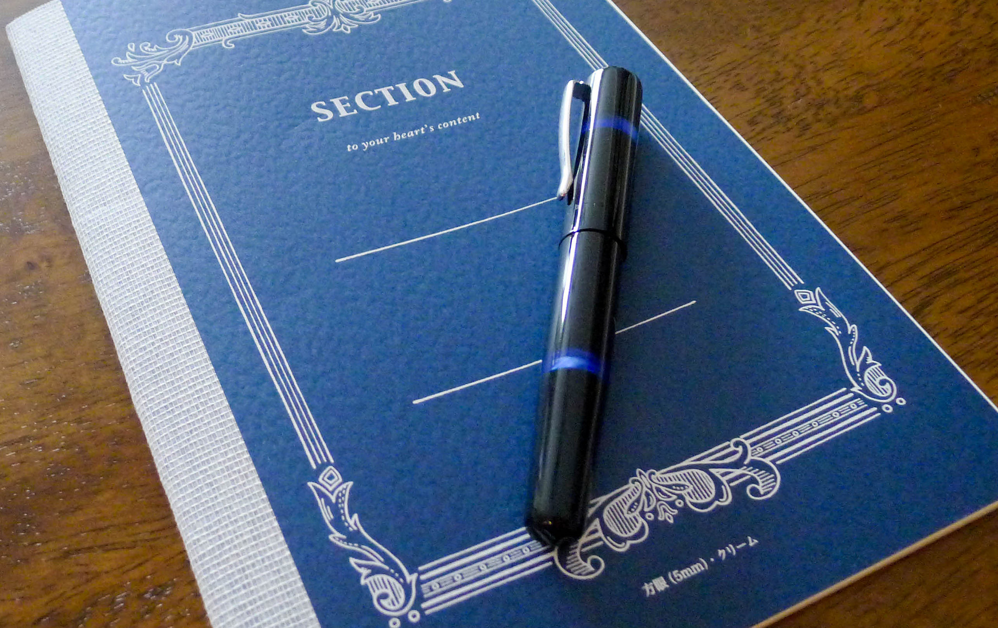
Pocket notebooks are extremely trendy today. I really have no idea why or where the trend started (actually, I think I have a pretty good idea why—I'm just being really sarcastic). And that trend is perfectly fine with me, because it means there's always plenty of new things to try. Besides the standard Field Notes, pretty much every notebook maker offers some sort of pocket-sized notebook. Some are a bit smaller or have different paper than standard Field Notes, but I've recently been smitten by the Doane Paper Utility Notebook — the small version, to be exact.
Brad reviewed this notebook back in 2008, but these notebooks deserve some more attention. Question is, is Brad's opinion still the same about these books? His thoughts from almost 6 years (six years!!) ago mirror my own thoughts almost exactly.
I, like many of you, have a problem with acquiring too many Field Notes for my own good. They're unique, practical, and have such a great design and versatility. To me, they're made to be used, and that's exactly what I do with them.
The Doane Paper Utility Notebooks are also made to be used, and I've been enjoying the heck out of them since I bought a few. I'm sorry to keep comparing them to Field Notes, but it's kind of hard not to since they're so similar in size.
Similar, yes. But very unique in so many good ways.
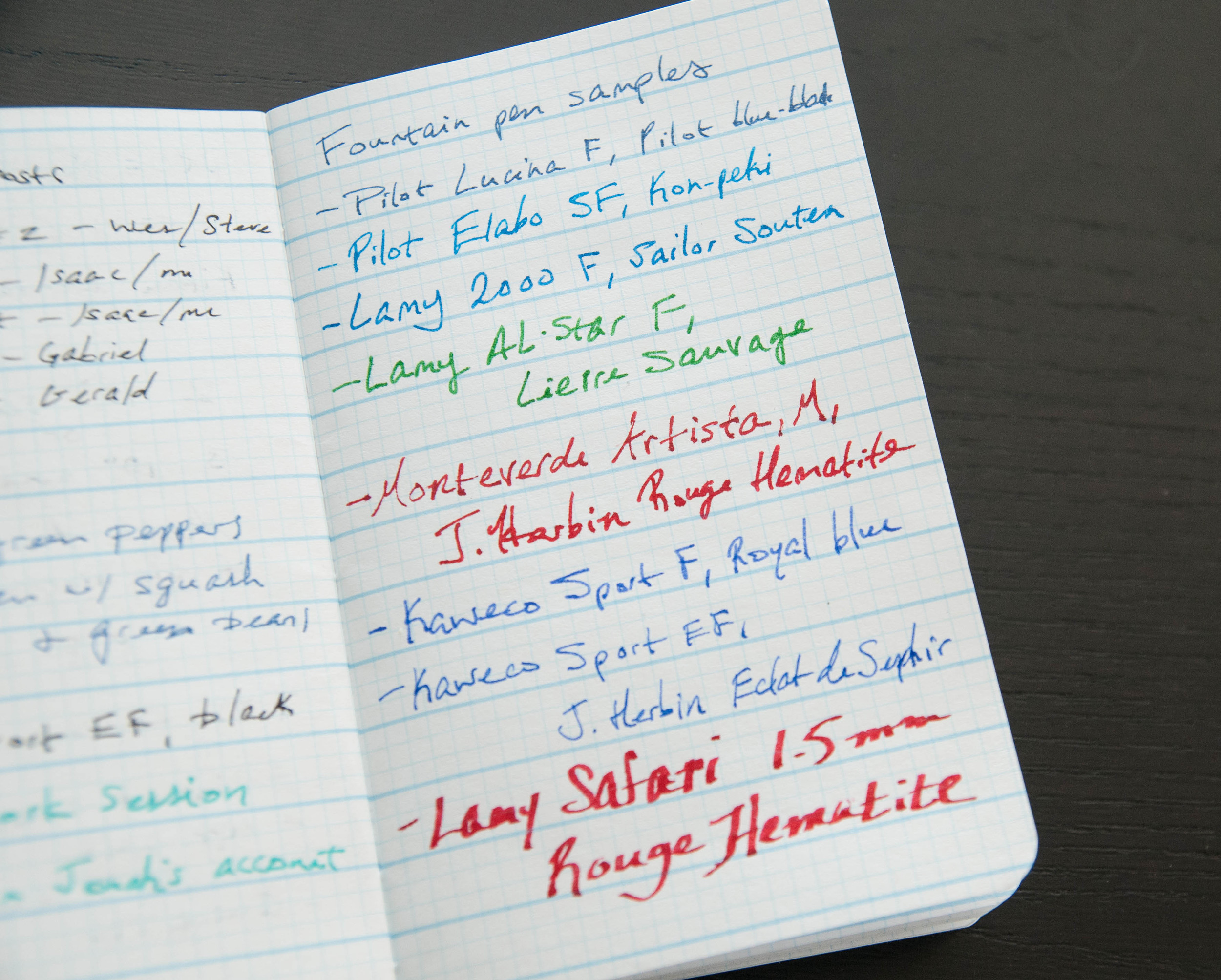
The paper used in the Utility Notebooks is awesome in my opinion. It takes fountain pen ink like a champ and is smooth while doing so. Of course, it has the signature Doane Paper "grid+lines" pattern on the pages—something that I've grown very fond of since using the books. The lines are wide enough to handle my frantic scrawl when writing down an important note or idea, and the grids are small enough for more detailed and exact writing. It really is the best of both worlds. When I first started using the paper, I was a little overwhelmed by all of the lines, but I got over it pretty quickly. They're calming now.
There's show-through in the paper when using fountain pens, but it's usable. I don't use fountain pens in my Field Notes for that reason—the standard Field Notes paper doesn't do well for me with fountain pen ink. Of course, gel and rollerball inks act perfectly well-behaved on the paper. According to the Doane shop, the paper is 60# recycled paper, which is one mark higher than the standard 50# Field Notes paper. (Yes, some Field Notes editions have thicker paper, but I'm talking about the standard-issue books).
Being the same size as Field Notes, you know they fit in your pocket like a champ. That means they even fit in my Nock Hightower, no sweat.
The cover is a cardstock that is fairly resilient. I expected it to fade faster since it's a black stock, but it's held its color really well. I've recently transitioned to working from home, so my pocket notebooks don't get nearly as much time in my pockets, so keep that in mind. Daily pocket carry would definitely leave more signs of wear.
The design of the cover is unassuming. It's a black book with some white text that describe the book. Personally, I love the look of the black books as well as the other colors. I don't believe you can buy the 3-pack traffic light variety any more, but they very recently released a very attractive 6-pack of gorgeous colors that I feel compelled to buy.
The inside covers are blank, which feels a bit odd after using so many Field Notes. But, the beauty of a blank white cover is that it can be used for whatever you want. You can add your own personal contact information or favorite uses for the books. Hey, if you're really careful you can even draw your own ruler.
Three silver staples bind the book together, and I haven't experienced any issues with the binding coming apart. These are really well-made.
Overall, these are fantastic notebooks that I highly recommend. For me, they've become the new standard. I won't be able to resist any special edition Field Notes that come along that strike my fancy, but these definitely have my vote over the standard edition. They're working notebooks, and that's what matters.