Posts filed under Notebook Reviews

DesignWorks Standard Issue Notebook Review

(Sarah Read is an author, editor, yarn artist, and pen/paper/ink addict. You can find more about her at her website and on Twitter.)

This is the first time I've used a DesignWorks notebook, and the experience was a bit mixed. There are some features I love about it, and some that didn't work very well for me.

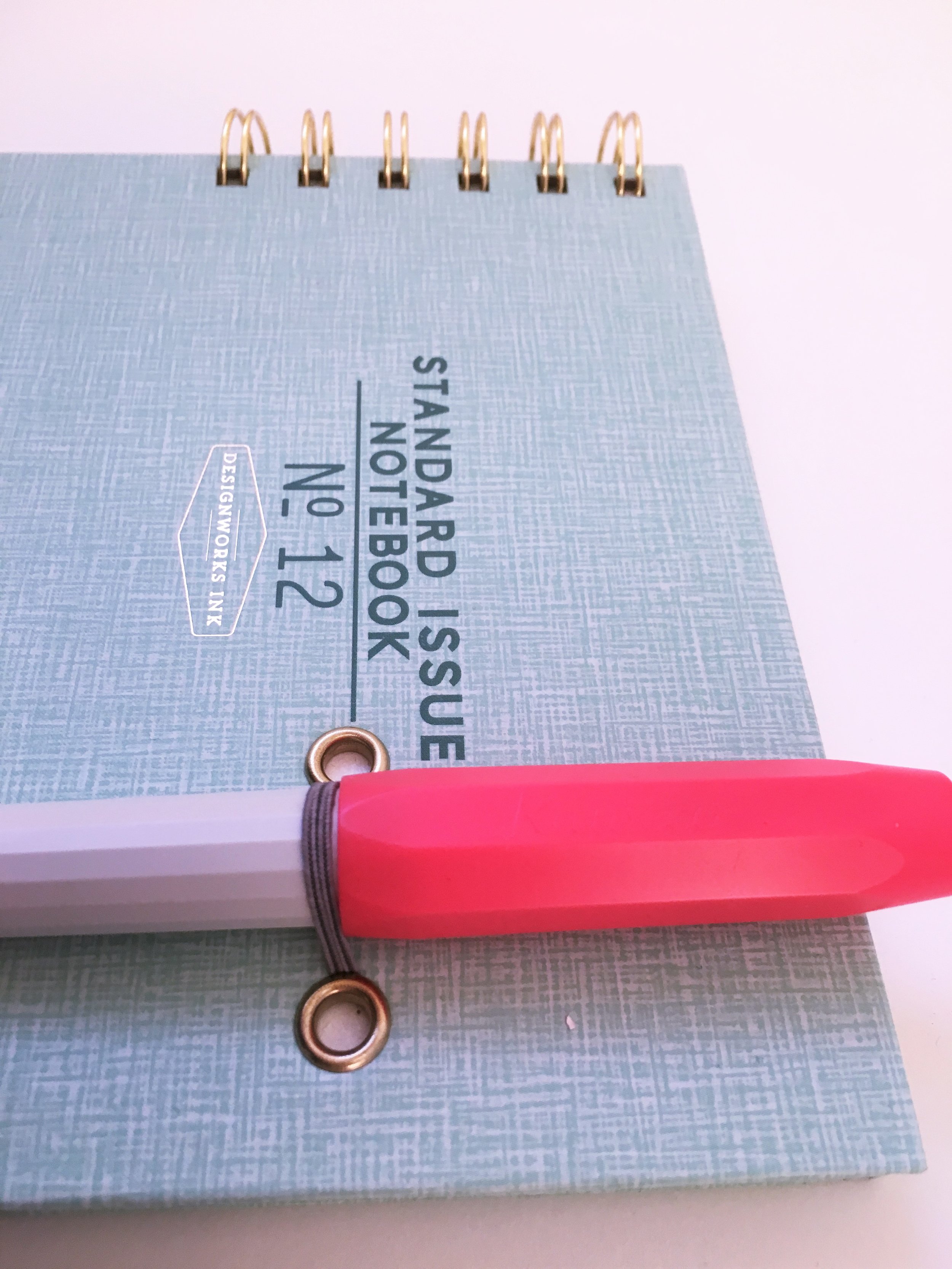
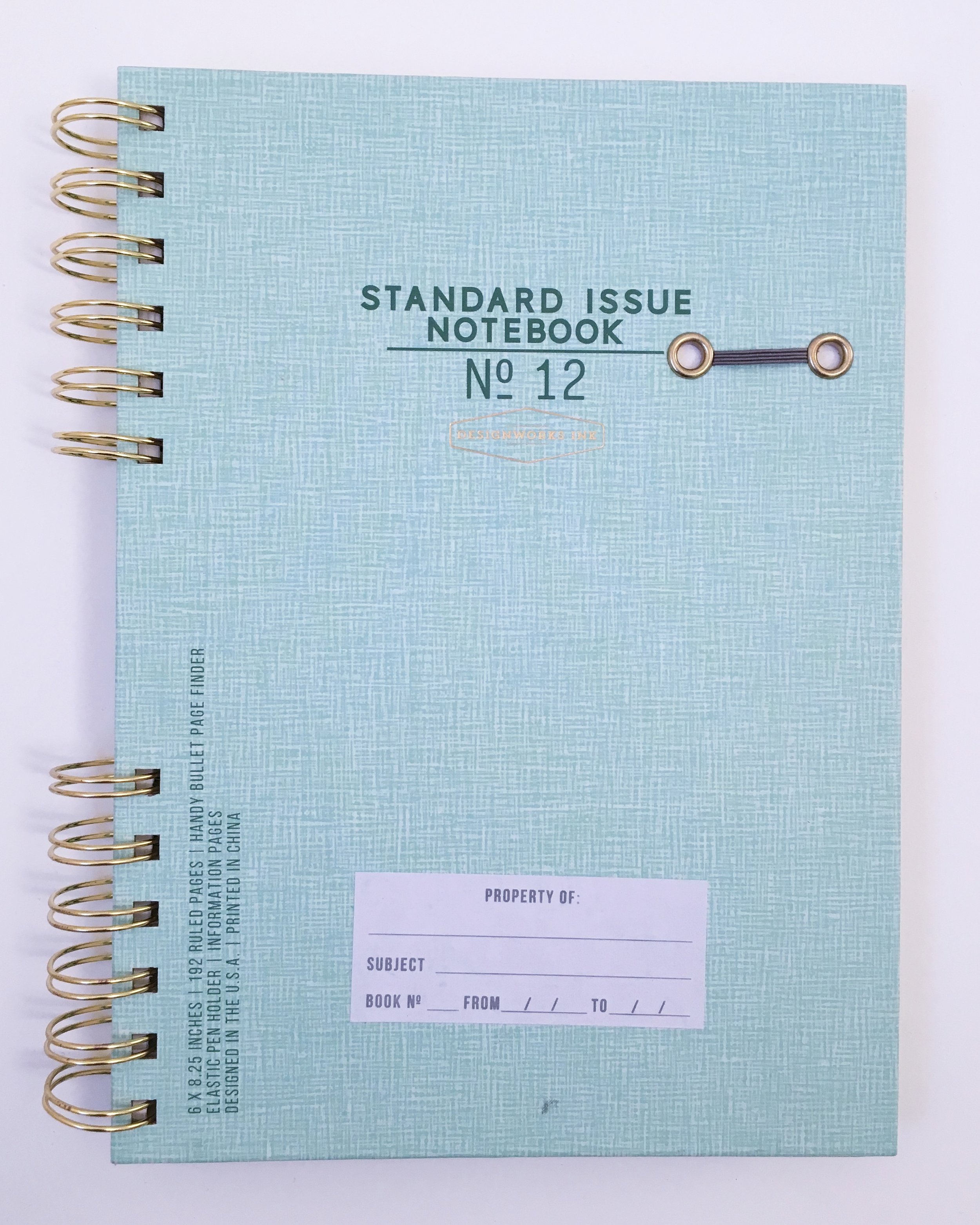
The DesignWorks Standard Issue Notebook is a hardcover, spiral-bound notebook. The spiral is twin-ring, brass colored and is only bound at the top and bottom third of the book. The rings are wide--about an inch in diameter. They're already starting to bend a bit after only light carry--so they're already beginning my primary pet peeve of ring-bound books. They also tend to snag at the cover or pages when I'm closing the book. Of course, the rings allow the book to lay flat or fold over on itself--so there are upsides, too.

The front cover has a pale green crosshatch pattern, the logo, and a sticker label. The sticker on mine is crooked, which drives me a bit crazy. There's also a list of the notebook's specs printed directly on the cardstock. It's useful information to have, but I don't particularly like having it printed on the front. At the upper right is a narrow elastic band that serves as a pen loop. This is one of the features I like. It's not quite stretchy enough to handle a very wide pen, but most will fit fine. One advantage to the wide rings is that you can hide another pen in there if you need to color-code on the go.

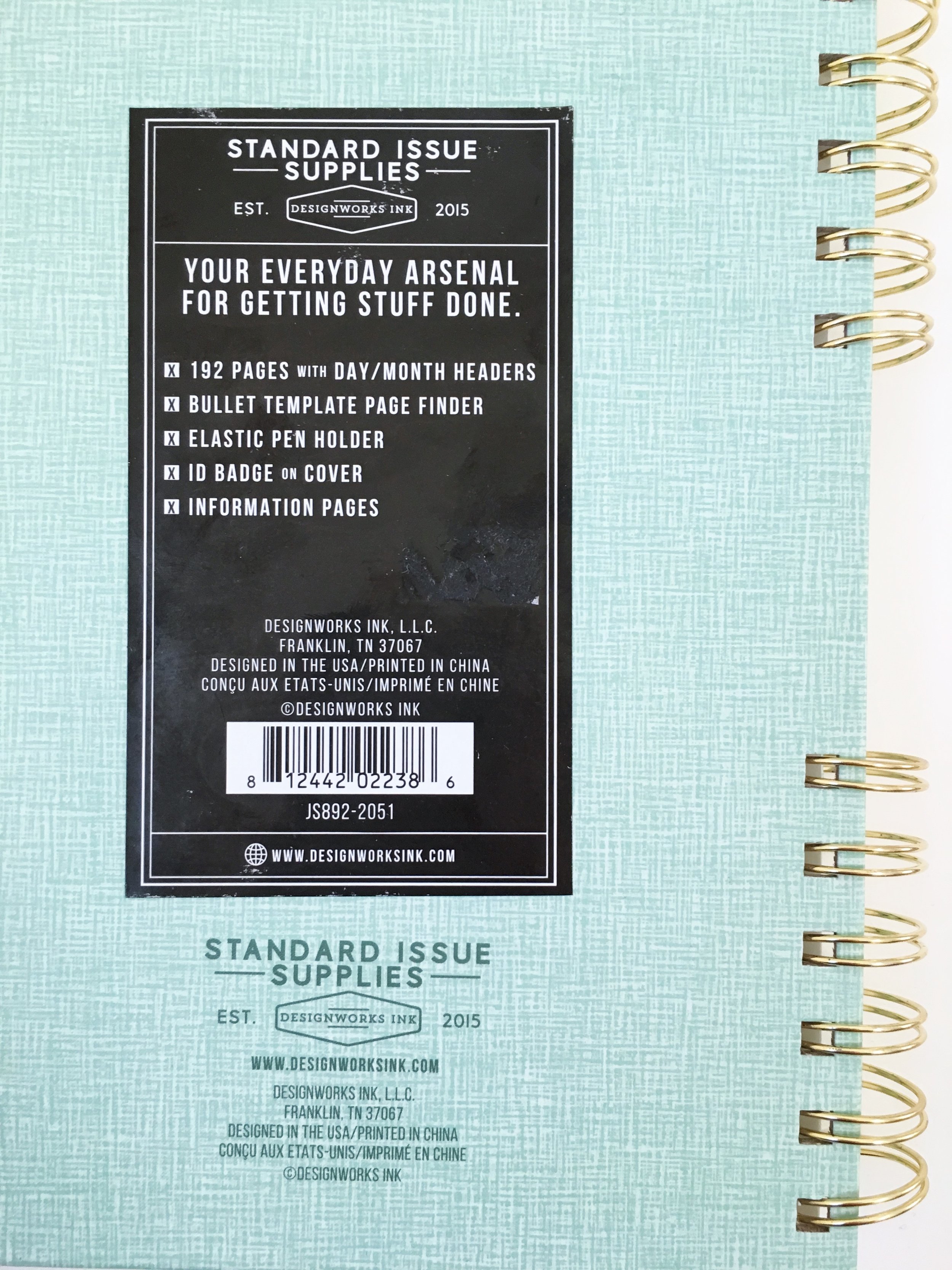
The back cover has another crooked sticker that repeats the notebook specs, and the company info. The inside front cover has room for all your contact info and a map of the time zones. The inside back cover has conversion charts. The notebook comes with a removable stencil ruler that has all the marks and icons you need for planning or bullet journaling. The stencil is definitely my favorite feature of the book. It's sturdy and handy, and I think I'll be using it long past when this notebook is full.

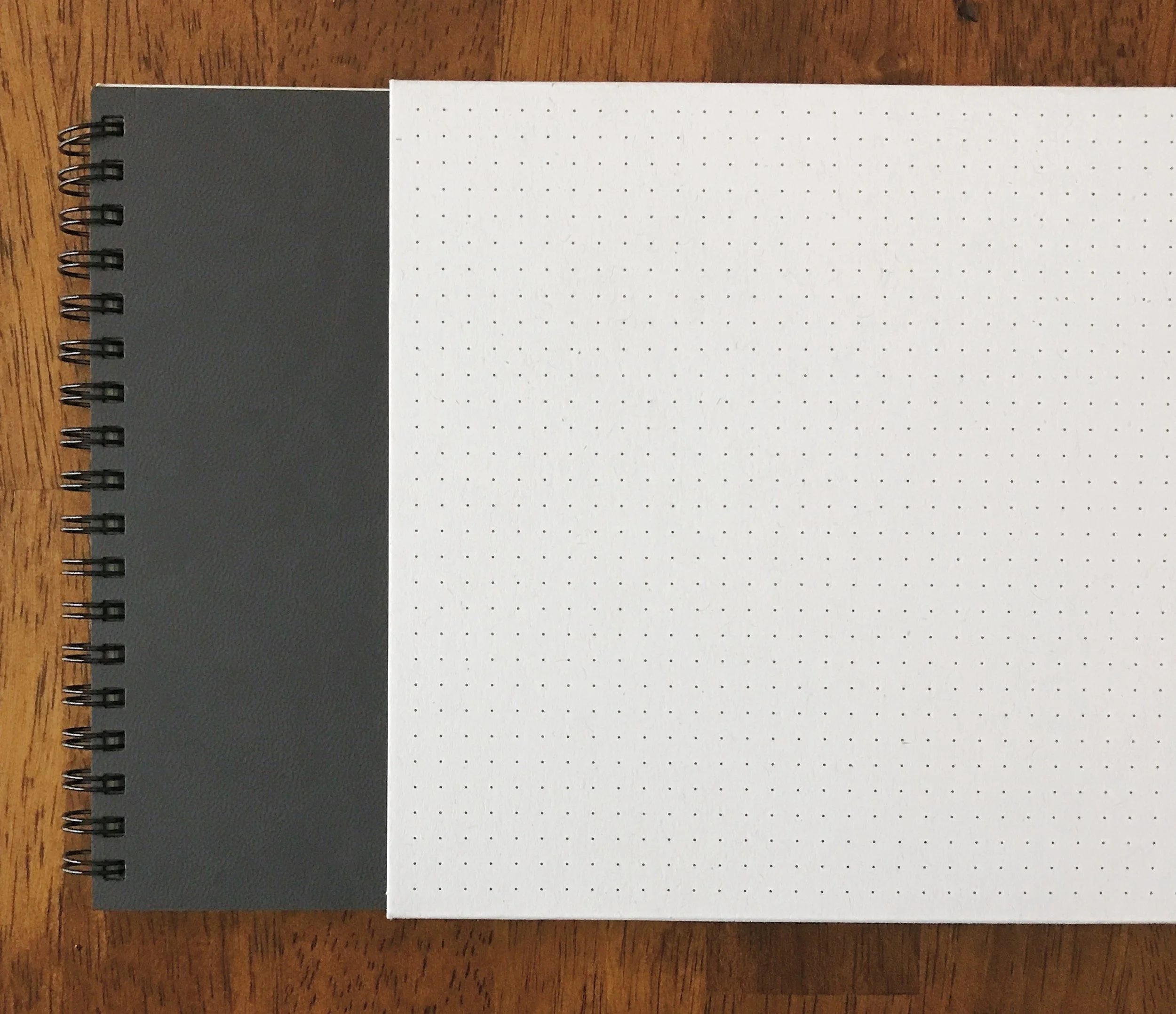
There are 192 lined pages that have the months and day numbers listed across the top. The left margin has a column for your bullet icons. The rest is pretty open form--it's not too restrictive of a layout, so it could be used as plain lined paper as well. The pages aren't perforated, so if you need to remove one, it will have the dreaded fuzzy edge.

When I first felt the paper, I thought it would probably be a pencil or ballpoint-only notebook. But the performance totally surprised me. There was light show-through, but no bleed-through for any fountain pen I tried with it. Huzzah! It showed shading nicely, too. The dry time was very long with wetter inks, though. Overall, I'm thrilled with its performance. It's also acid-free, which is always a plus.

When it comes down to it, I don't love the binding, cover, or attention to detail with this product. But the paper is lovely enough that I'm definitely going to check out some of their clothbound books. All their products seem more than fairly priced, especially for good paper. As tempting as the nice paper in this books is, I can't get past my pet peeves with the cover and binding. I'll probably hand this one on to the kids, and they will likely use it for nefarious planning. Except the stencil. I'm keeping that part.

(Vanness Pens provided this product at no charge to The Pen Addict for review purposes.)


Enjoy reading The Pen Addict? Then consider becoming a member to receive additional weekly content, giveaways, and discounts in The Pen Addict shop. Plus, you support me and the site directly, for which I am very grateful.

Membership starts at just $5/month, with a discounted annual option available. To find out more about membership click here and join us!

Posted on December 21, 2017 and filed under DesignWorks, Notebook Reviews.

Netto de Techo Kobo (Online Planner Bindery): A Customized Bound Planner Just for You

(Original Mai-Bun article published on 10/02/2017. Written by Makiko Fukushima. Translated by Bruce Eimon)

This is the time of the year when people start thinking about which datebook/planner to buy for the coming year. Despite all the different products out there, it is frustrating when you can’t quite find that perfect one for you. (There are literally hundreds of different kinds of planners sold in Japan. There is even an event called the 100 Planner General Election, where you get to try 100 different planners and vote for your favorite one!) If you are one of those picky planner users, why not make your very own for next year?

Making my own datebook? That’s gotta be hard, no? No worries, this September, a new service was launched: Netto de Techo Kobo (Online Datebook Bindery).

This is an online service that lets you design a 200 page perfect-bound planner and have it delivered right to your doorsteps. Most custom book binding services like this require a minimum order of 100 copies. What is revolutionary about this service is that it is specifically designed for producing single copies. Each order will put you back 5400 yen (approx. $45 USD).

Oh and by the way, this isn’t a service run by a bunch of twenty-somethings working out of their garage. This is a service offered by Canon IT Solutions, a subsidiary of the company known for producing high quality cameras and printers. It was the winning project of an internal innovation contest, entered by their very own stationery fanatic, Mr. Tadashi Ono.

All you have to do is create an account and follow the instructions. The sign-up and design steps can all be done for free. You can even print out watermarked sample pages at home. Once you confirm your order and enter your payment information, your planner will be delivered to you in 3 to 4 weeks.

The following is my experience of trying this service:

Adding my touch #1: I don’t use the monthly calendar pages.

I usually use a weekly left format (horizontal date pages on the left, note pages on the right), and hardly ever use the monthly calendar pages. Most planners have monthly calendar pages taking up two pages per month. I opted to condense these to a single page per month, covering two months per spread. The system offers a template for this, so the only thing I had to change was the font and the line color to suit my taste.

Adding my touch #2: I don’t want to miss any birthdays, including those of my pets.

The service supports the uploading of CSV files with personal birthdays and anniversaries, so you can easily have these very special dates show up in your monthly or weekly pages. This is super useful! I set it up so that they will show up in both. Not only did I upload the birthdays of my friends and family, but I also uploaded work related anniversaries and the birthdays of my two cats.

Adding my touch #3: I like a simple and clean aesthetic.

I’m a fan of the weekly horizontal format. In order to keep the design simple, I started with the weekly horizontal template and tweaked the fonts and the line colors. I chose gray lines, removed references to auspicious days (Rokuyou), and included only the date numbers. For the right pages, I kept them blank.

Adding my touch #4: I don’t want to wait until January 1.

One nice thing about this service is that you can have your planner start whenever you want it to. So rather than ordering it and having it collect dust for 3 months, I had it start from the projected delivery date in October! You don’t even have to have it span a whole year - you can design a 6 month planner, or even one that starts on your birthday!

Adding my touch #5: Making room for my Washi-tape collection.

Since I like to collect washi-tape, I designed a section to catalog my new acquisitions. I designed a format where I can paste both the tape and the labels. I specifically made sure there would be enough space for both the front and back labels. This is an example where I didn’t use one of the provided formats, but designed my very own format and uploaded it as a PDF file.

Adding my touch #6: For my list pages, I used pink lines.

I like the grid format in general, but I usually don’t like the color of the lines used in most notebooks. Since I get to use whatever color I want, I chose a faint pink line. I couldn’t be happier with how it turned out! It is awesome that I get to choose the colors of the font, the lines, and even the background for every single page.

Adding my touch #7: I made special pages for my two cats.

I uploaded pictures of my two beloved cats, Cookie and Anko, so that I could have pages specifically devoted to write down my favorite memories of them. The colors turned out really nice. I know there are a lot of people who like to paste pictures of their pets in their planners , but this way I don’t have to worry about the bulk from the pasted photographs. It is also a nice way to carry with you the pictures of your loved ones wherever you go.

This is a planner that gives you complete freedom with the format and the content. What I showed you was very specific to my likes and needs, and what you end up designing is going to be completely different from mine. How fun is that!?

Until now, a planner was something we had to choose from what was available at the stores. Yes, there are filofax-type planners where you can pick and choose your refills, but it was impossible to customize a perfect-bound planner to your liking. Of course, you would always have to write in all of your birthdays and anniversaries, and you were bound by the lines and space provided by the publishers.

Netto de Techo Kobo flipped all of these “norms” on its head. Why not make your one-and-only planner that fits you like a glove?

Recommended for:

  • People who aren’t quite happy with the planners available in stores.
  • People who have a meticulous attention to detail and know exactly what they want.
  • People who don’t want to be bothered by having to enter their birthdays and anniversaries into their planners every year. Information Netto de Techo Kobo | Canon IT Solutions
Posted on December 19, 2017 and filed under Planner Reviews, Notebook Reviews, Mai-Bun.

Studio Neat Panobook Notebook Review

When my friends Tom Gerhardt and Dan Provost from Studio Neat told me they were interested in making a notebook I was hyped. Knowing these guys like I do, I knew no detail would be spared, and I was right. The Panobook is an awesome notebook.

Yes, I consider Tom and Dan friends, and yes, I gave feedback throughout the design process. I even have some early prototypes laying around here that changed a good bit before the final product was settled on. This is so you know where I’m coming from with my review. But as you know, and as Tom and Dan learned, I don’t hold back my opinions. I deal in honesty and facts based on my experience with the product in question. And with the Panobook, there wasn’t much questioning to go around.

I’ll start you off with this: This is my most used notebook over the last month. By far. What I am enjoying so much about the Panobook is that the firm covers allows me to write comfortably with the notebook in my lap. I’ll grab a drawing pen - recently the Deleter Neopiko - or anything with a Schmidt P8126 refill - recently something Top Secret - and go to town. I can sit in a comfy chair in my living room and just write away. Like I told Myke on last weeks podcast, I wrote two pages of notes in my Panobook for one of the topics we covered. It made for fun and easy show prep.

The Panobook is designed to be a desk notebook, and I use mine there too. I generally keep it to the right side of my laptop or keyboard and in the vertical position. I surprised myself by using it in that orientation, as I love landscape mode in notebooks. But that is what works for me. It’s like a tall A5 pad.

It handles all inks very well, including fountain pen ink. I don’t like using fountain pens with the Panobook though, as the paper is dry and uncoated. There is no feathering, bleed, or ghosting, but the colors are flat with no shading or sheen, like the line from a drawing marker. They work fine, but I enjoy other pens and pencils more.

Back side of the ink samples page

From a design perspective, Studio Neat thought of it all. The covers are firm but have a soft feel. The dot grid is a light grey with subtle guide markers for UI design or storyboards. The wire binding is strong and smooth, allowing you to turn the page easily and lay flat. There is even a slip cover for storage between uses or when done and filed away.

At $20, it is priced right in line with every other quality notebook in this category. I bought all three of mine through their very successful Kickstarter project, and they are taking pre-orders for them on the Studio Neat site for the next batch.

As a Studio Neat fan and customer for years, I’m glad to see them dip their toes into the stationery market. I have a feeling this won’t be the last product we see from them in this area.


Enjoy reading The Pen Addict? Then consider becoming a member to receive additional weekly content, giveaways, and discounts in The Pen Addict shop. Plus, you support me and the site directly, for which I am very grateful.

Membership starts at just $5/month, with a discounted annual option available. To find out more about membership click here and join us!

Posted on November 20, 2017 and filed under Studio Neat, Panobook, Notebook Reviews.