Posts filed under Notebook Reviews

Field Notes Pitch Black Note Books Review

(Sarah Read is an author, editor, yarn artist, and pen/paper/ink addict. You can find more about her at her website and on Twitter.)

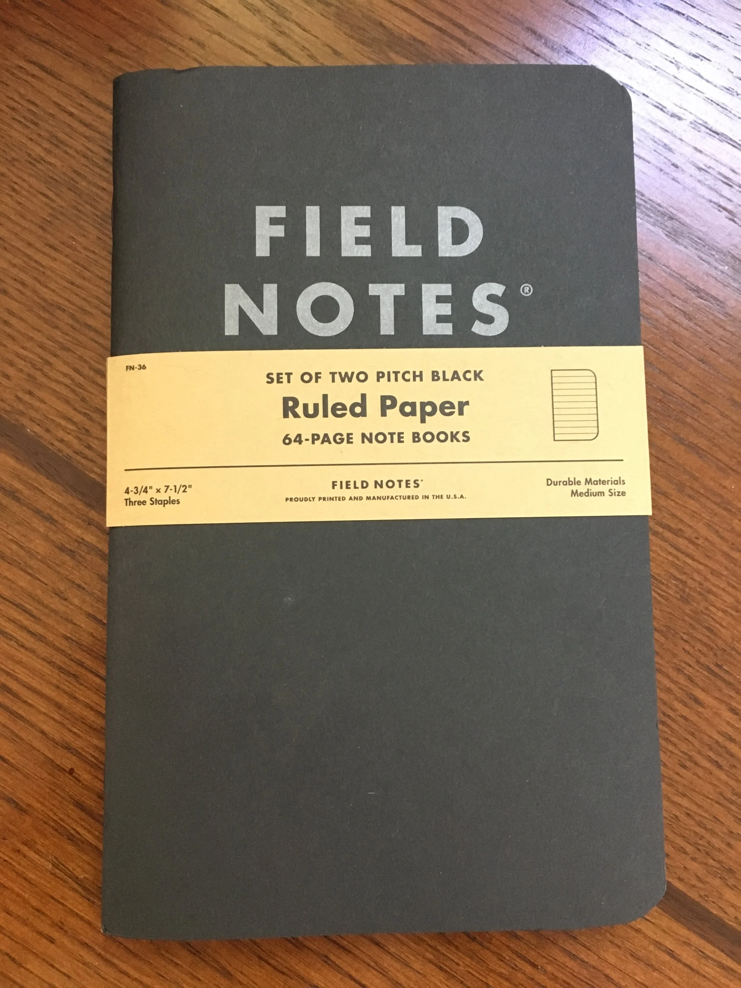
The Field Notes Pitch Black Note Books are so simple and so plain. There is absolutely no logical reason for why these delight me as much as they do, but I love these notebooks. They are one of my staples--I used one for my first ever writer's conference notes, and now they're a conference tradition. I have to have one with me for my notes and diary for such events. I associate them with adventure, enrichment, and bonding with distant friends. And now--I can have them in the larger 7.5" x 4.75" size, which I adore and my life feels so complete now.

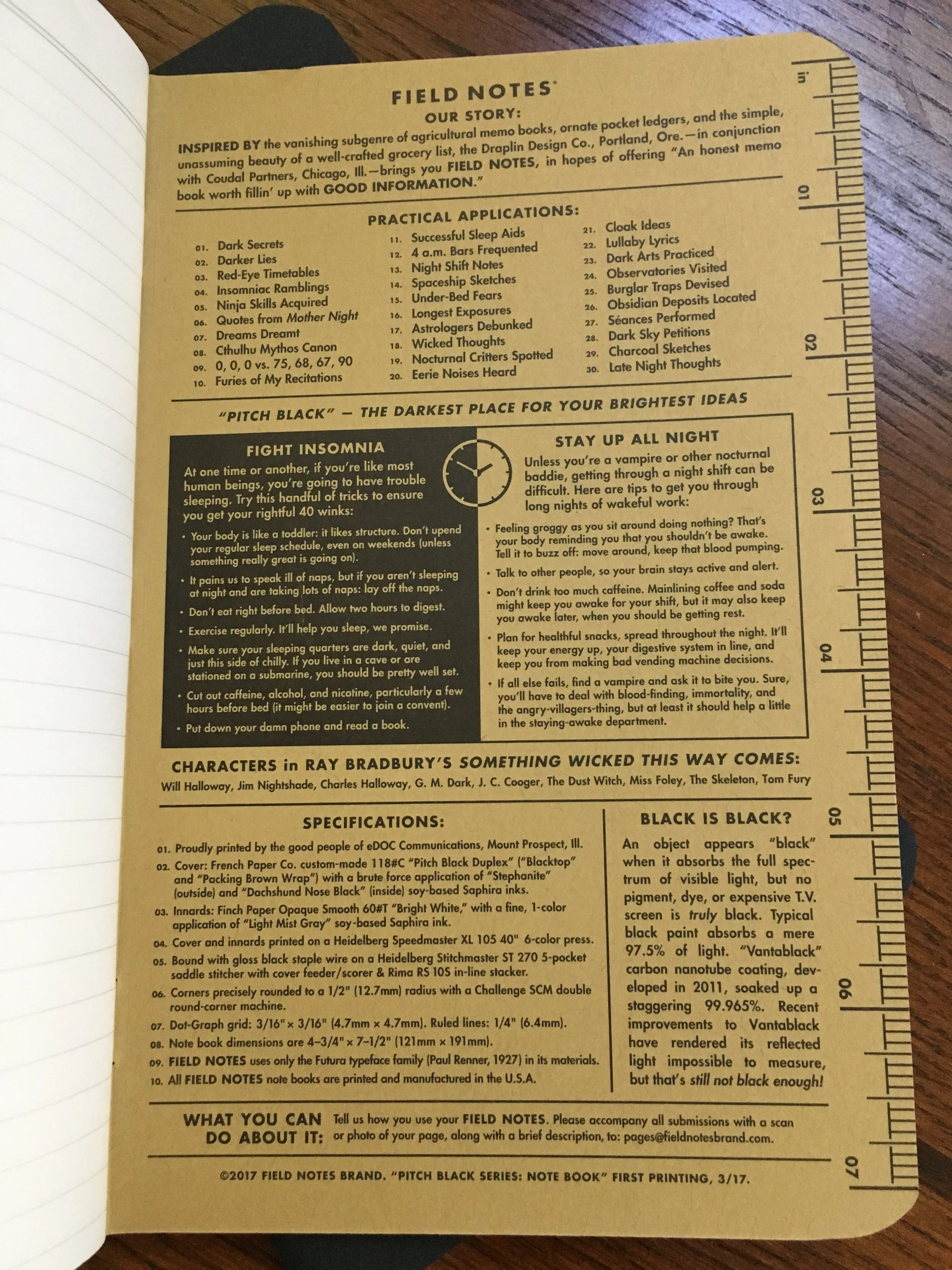
The notebooks sport a soft cover of duplexed black and kraft cardstock, so they're flexible but sturdy. They have the dusty charcoal outer cover with the Field Notes logo in matte silver, and the inside covers have all the delightful cheekiness that Field Notes specializes in. Reading through them is one of the highlights of cracking a new notebook. I mean, there are gender neutral labels and Ray Bradbury references. There are tips for getting better sleep...or staying up all night. I open this book and know that the people who made it are my people, and I feel their influence on the work--they're bridging a connection between the designer and the user that feels like friendship.

I think that's one of the things that sets Field Notes apart--I don't feel like I've received a product, I feel like I've been passed a lovely note.

But I digress, because notebooks have to be useful, too. And huzzah, it is.

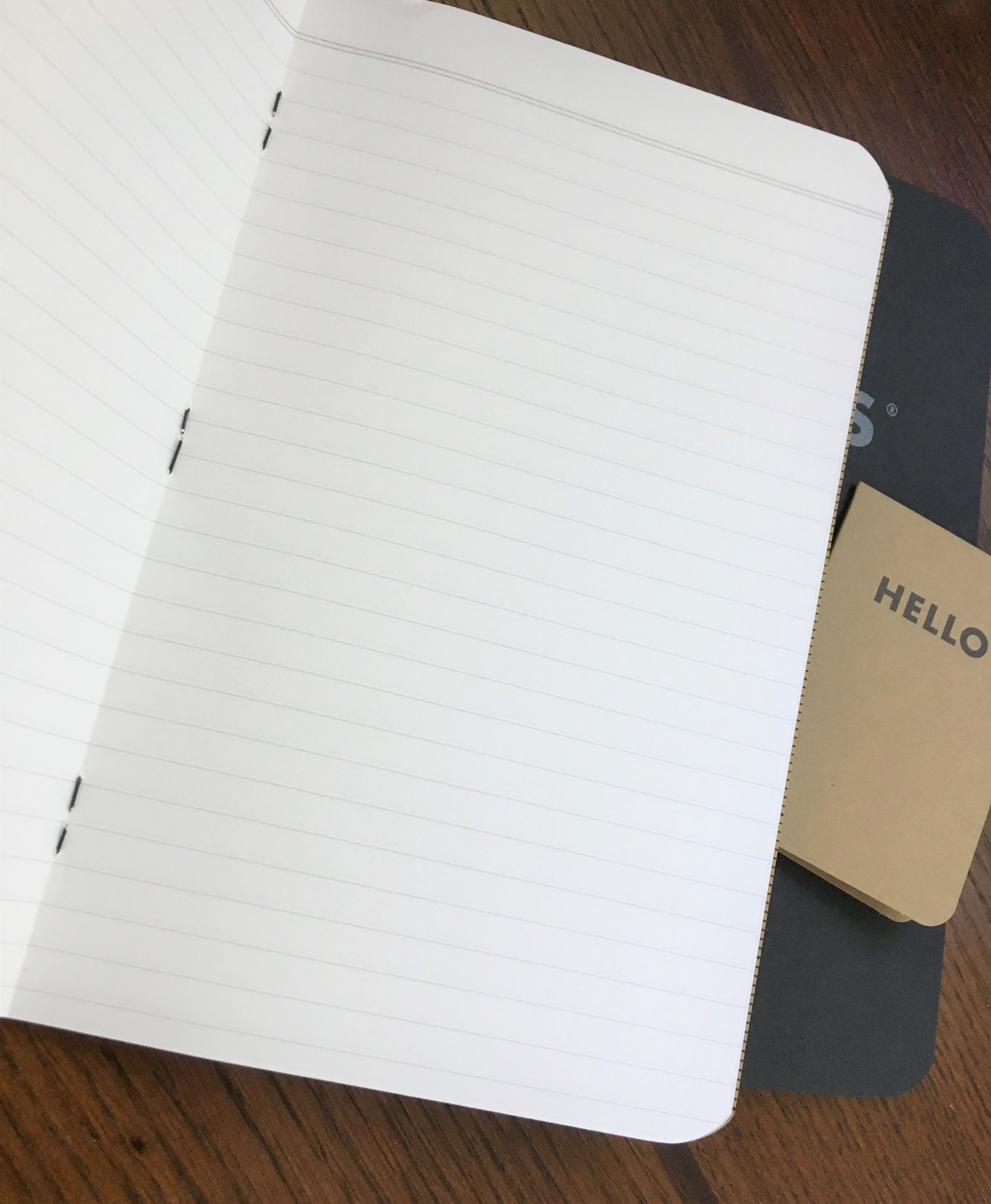
Between those fabulous covers are 32 sheets of 60 lb acid-free paper. They're printed with unobtrusive 6.5 mm lines in light grey. It is all held together with staple binding--the staples are a lovely shiny black.

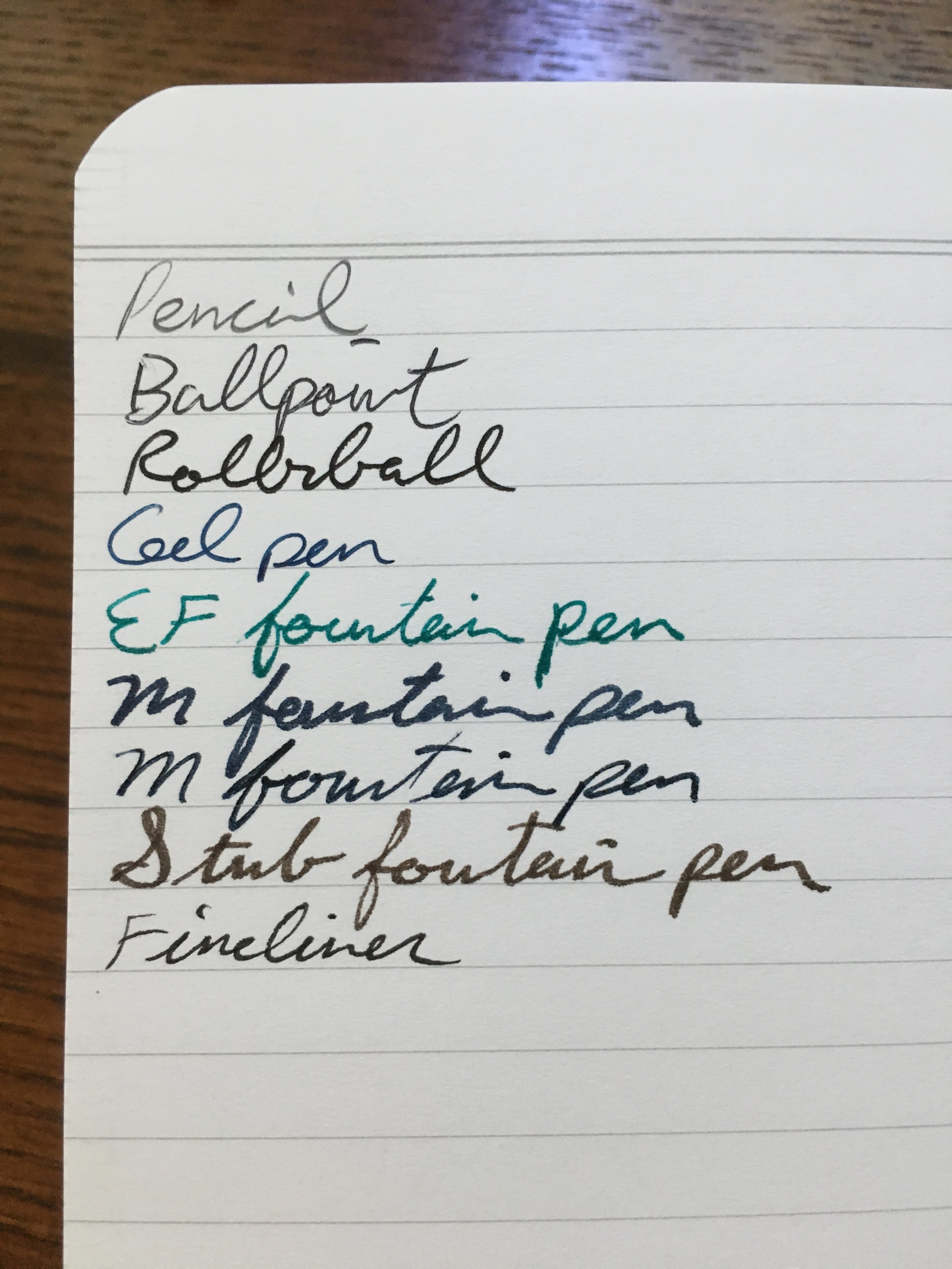
As with many Field Notes, the paper isn't the best for fountain pens, but it really didn't do too badly. Broader pens and darker inks showed through, and one particularly wet ink bled a slight bit. There is some faint feathering. But overall, it performed well enough that I'll have no qualms using fountain pens in it. I don't mind show-through, or even slight bleeding, so long as I can still read the text. And of course it works wonderfully for pencils, ballpoints, rollerballs, fineliners, and gel pens.

So, while it isn't flawless, it's still perfect. And I'm so glad this is a part of the signature line--that way I can stock up over time instead of ordering an unseemly amount immediately. Which I am tempted to do anyway, frankly.

(JetPens provided this product at no charge to The Pen Addict for review purposes.)


Enjoy reading The Pen Addict? Then consider becoming a member to receive additional weekly content, giveaways, and discounts in The Pen Addict shop. Plus, you support me and the site directly, for which I am very grateful.

Membership starts at just $5/month, with a discounted annual option available. To find out more about membership click here and join us!

Posted on July 5, 2018 and filed under Field Notes, Notebook Reviews.

Col-o-dex Rotary Cards: A Review

(Susan M. Pigott is a fountain pen collector, pen and paperholic, photographer, and professor. You can find more from Susan on her blog Scribalishess.)

When Ana Reinert from Well-Appointed Desk came out with her Col-o-ring cards, I was thrilled. I wrote a review here, and discussed the nice quality of the cards and how convenient they were for doing ink swatches.

Recently, Ana came up with a new ingenious idea: Col-o-dex Rotary Cards. What a terrific brainstorm! The Col-o-dex cards work on any normal-sized Rolodex card system. So, no longer do you have to fiddle with rings, now you can put your ink swatch cards in a Rolodex and organize them with the Col-o-dex Tab Cards.

The Col-o-dex cards are 4 inches x 2.625 inches, which is plenty of room for whatever you want to include. On my cards, I put a large swatch at the top so that I can easily compare colors within color groups. I wrote the name of the company and the ink color in the middle. On the left side I did some swirls to test for shading, and on the right I did splats since those often are what show off an ink’s sheen. For all my cards, I used a Brause 361 Steno Blue Pumpkin Calligraphy Pen Nib for consistency. Plus, this nib (for dip pens) is super easy to rinse off, so I could do numerous cards at once.

The Col-o-dex cards are made of 160gsm European pure white paper. The paper is thick enough that ink does not bleed, feather, or show through. It has some texture that you can see in your swabs, but the paper fibers do not get caught in your nib.

However, the cards do curl a bit due to the wetness of the swabs. I’m sure you could press them between heavy books to flatten them out before you put them in your Rolodex.

The best part about the Col-o-dex Cards is that you can organize them with a set of tab cards. I labled the tabs with color names and then organized the cards by company name alphabetically. This is an OCD-ink-fanatic’s dream system!

Another wonderful thing about organizing your ink swatches this way is you discover interesting things about your ink collecting trends. For example, I have a zillion blue and turquoise inks, which makes sense because blue is my favorite ink color.

But, I was surprised to discover that I own only three red inks: Montblanc Corn Poppy Red (my favorite); Robert Oster Astorquiza Rot, and Diamine Red Dragon. I don’t use red ink very often, so that’s why I don’t own many bottles of it, but it’s definitely a color I need to test more. In fact, I need to get out of my blue ink rut and try more pinks, yellows, golds, and browns.

I think the Col-o-dex Cards are an absolutely fantastic way to organize your ink swabs. The only caveat is that it is super hard to find a freaking ordinary Rolodex! Sure, you can find some models on Amazon, but most of them are for business cards or they get horrible reviews. I finally caved and bought this massive Rolodex 200-card File.

This thing is TOO BIG, but it matches my triple-decker pen box, so . . .

At first I thought, “This thing is way too big! I’ll never fill it up enough for it to work well.” And, it’s true. Right now, the cards just dangle like limp fish and won’t rotate when I turn the knobs.

I thought about sending the thing back, but then I realized how much ink I have. I spent several hours swabbing most of my bottled ink. But I haven’t even touched all the samples I’ve accumulated over the years. Maybe my Texas-sized Rolodex isn’t too big after all.

Obviously, you can find older, ordinary Rolodex systems on eBay or in your mom’s garage. I know I had my mom’s old Rolodex, but I think I threw it away when I cleaned my home office a while back. Now, of course, I’m upset that I didn’t keep it.

You can purchase the Col-o-dex Rotary Cards from Vanness Pen Shop for $15.00. The pack comes with 100 cards. I suggest also purchasing the Tab Accessory Pack ($5.00 for 20) so you can organize your swatches. The Tab Accessory Packs come in three colors: kraft brown, blue raspberry, and limeade green.

(Vanness Pens provided the Col-o-dex Rotary Cards and an Accessory Tab Pack to Pen Addict for review at no cost.)


Enjoy reading The Pen Addict? Then consider becoming a member to receive additional weekly content, giveaways, and discounts in The Pen Addict shop. Plus, you support me and the site directly, for which I am very grateful.

Membership starts at just $5/month, with a discounted annual option available. To find out more about membership click here and join us!

Posted on June 8, 2018 and filed under Col-o-ring, Notebook Reviews, Ink Reviews.

Print Prologue Foil Stamp ed. 1 Notebook Review

(Jeff Abbott is a regular contributor at The Pen Addict. You can find more from Jeff online at Draft Evolution and Twitter.)

There's never a shortage of notebooks available on the market at any given moment, and that means that the choices are nearly endless. Interested in a minimal, no-frills notebook? Easy. Something rugged and suited to outdoor use? You have several options there as well. The one thing that they all have in common, though, is that there was significant thought put into the printing materials and method before the product ever existed. These design decisions sometimes get left out once the final product is completed, but some companies like to publish that information along with the stationery products they provide. Field Notes is a great example of this. The materials, machinery, print shop, and other meticulous details are documented in the back cover of each notebook. You know, in case you're interested in that.

In the case of Print Prologue, the assumption is that you're definitely interested in those details.

The front cover of the Foil Stamp limited edition notebooks contains the detailed specifications of the notebook, from paper, ink, size, machinery, binding, and more. Print Prologue are definitely serious fans of the printing process, and that enthusiasm is seen in every detail of these notebooks.

While you can't buy these notebooks anymore, this review will hopefully provide some awareness for the company and help you decide if you'd like to jump on the next limited edition notebook they release.

The Foil Stamp ed. 1 notebook features 48 pages of 5" x 7" 60# white paper. I'm not an aficionado when it comes to paper stock, but this sounds (and feels) very similar to the paper you find in the standard Field Notes. And, of course, there's a single black foil stamp on the front cover to commemorate the edition.

The edges are square, and the binding is "perfect binding," which means the spine is square and uses glue to bind the pages. The notebook is fairly easy to open and break in, meaning it lays open fairly easily when in use. But, this also means that the front cover will always be slightly ajar once you break it in.

The inside covers are blank, and the back cover features a few places to organize your notebook. There's a place to add a date range, and there's also a nifty "Thumb Index" built into the notebook. This allows you to categorize the notebook into the three areas.

Overall, I'm not a huge fan of the exterior aesthetic of this notebook. But, I can see how it would speak to others. It's classy and well-done.

As for the insides, the notebook has a great dot-grid system using a "light-black" ink. The grid spacing is 0.25" (no metric system here) and feels comfy when writing. As an added perk, the notebook comes with a 6-inch ruler inside.

While trying out different pens and inks with this paper, I came to the conclusion that I would only use this notebook with gel or ballpoint pens and pencils. Fountain pens and rollerball pens just bleed too much to be useful. Another thing I noticed when using fountain pens is that this particular paper stock has a lot of fibers in it that get caught between the tines. I've never had this experience with other notebooks, so this was fairly disappointing. For gel pens, ballpoints, and pencils, the paper works great. It's a smooth surface with minimal feedback.

This particular edition cost $16 per notebook when it came out. Each notebook came with a 6-inch ruler and one Print Prologue branded pencil. It certainly nails the aesthetic they're after, and I'm sure that it appeals to a wide range of people. For me, the Foil Stamp ed. 1 missed the mark both aesthetically and performance-wise. That said, it's still a well-executed notebook, and I'll be interested to see what Print Prologue come up with next.

(Print Prologue provided this product at no charge to The Pen Addict for review purposes.)


Enjoy reading The Pen Addict? Then consider becoming a member to receive additional weekly content, giveaways, and discounts in The Pen Addict shop. Plus, you support me and the site directly, for which I am very grateful.

Membership starts at just $5/month, with a discounted annual option available. To find out more about membership click here and join us!

Posted on May 30, 2018 and filed under Print Prologue, Notebook Reviews.