Posts filed under Pen Reviews

Lamy 1.5 mm Stub Nib Review

(Jeff Abbott is a regular contributor at The Pen Addict. You can find more from Jeff online at Draft Evolution and Twitter.)

When I wrote about the Pilot Plumix several months ago, I said that it wasn't a large enough variation for my tastes. Well, I tried the other end of the spectrum with a 1.5mm Lamy calligraphy nib, and I can't say the same thing about this one. This nib makes a voluptuous line, but doesn't quite cut it for me in the everyday writing area. Still, it's a fantastic nib and loads of fun.

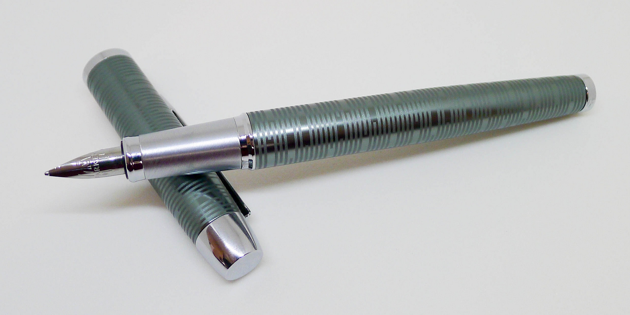
The Lamy 1.5mm calligraphy nib fits on almost any Lamy fountain pen very easily. Just slip off the normal nib from the feed, and slide the 1.5mm nib on. If you have a Safari, Vista, or AL-Star lying around, this is a great way to try out a well-made calligraphy nib. There are many other options, but rarely for this price.

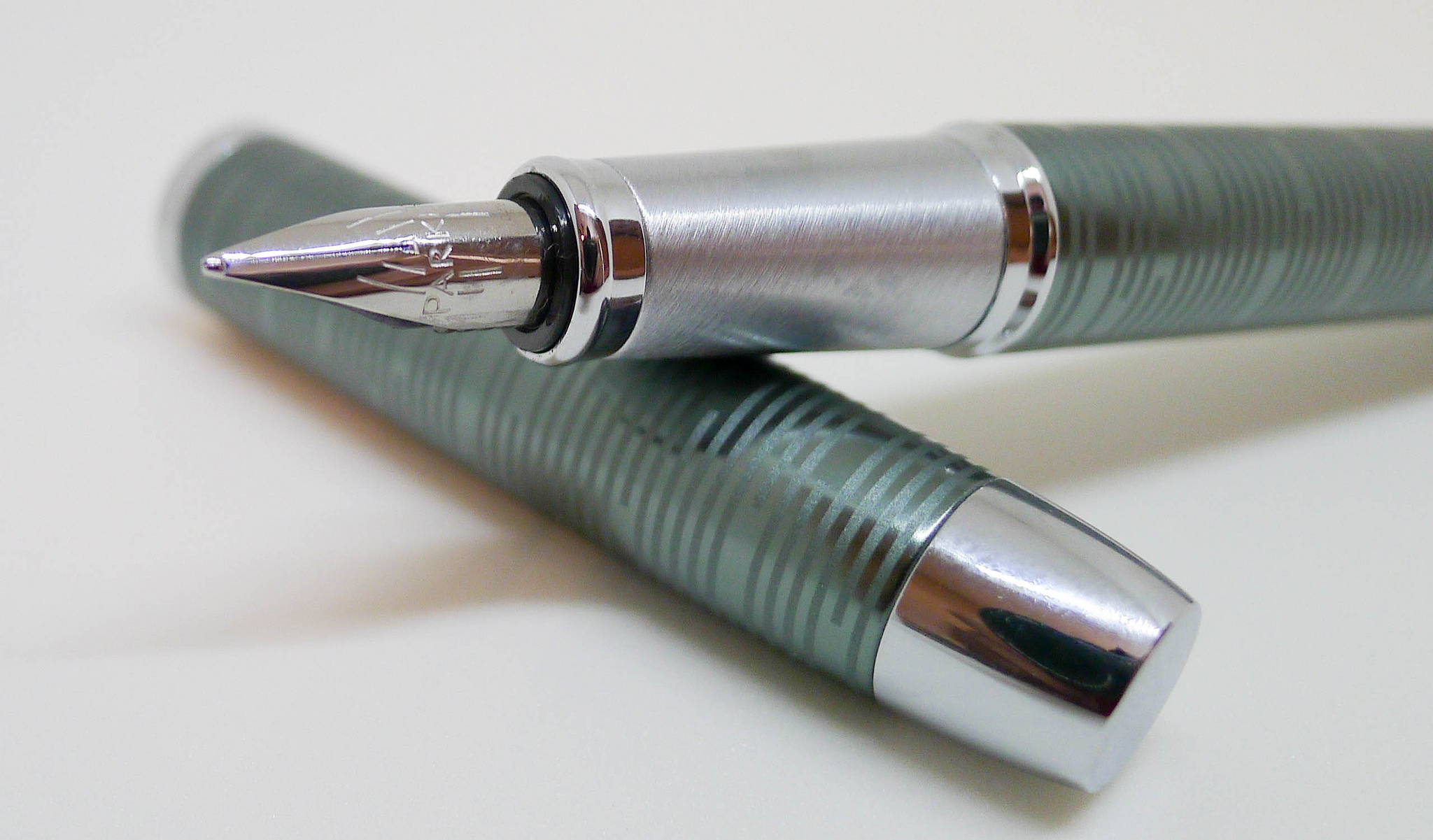
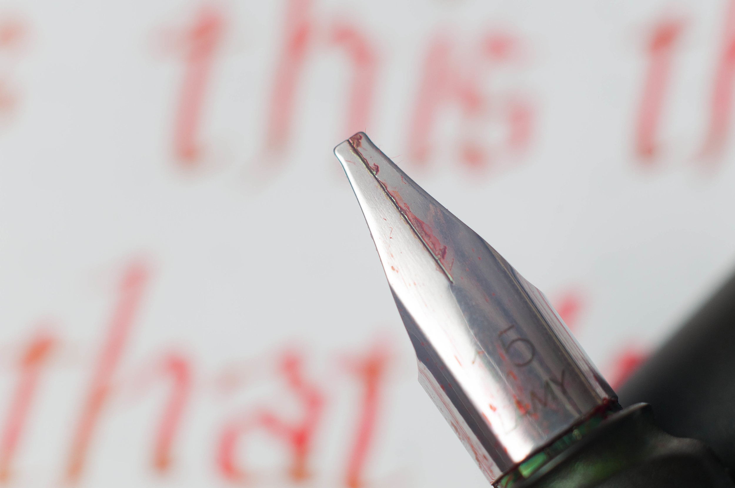
First looking at the nib, you can't really tell it apart from the other Lamy nibs. Then, you notice the blunt tip and the large "1.5" stamped on the top and realize how wide it actually is. I really had no idea it would be that wide. Little did I know.

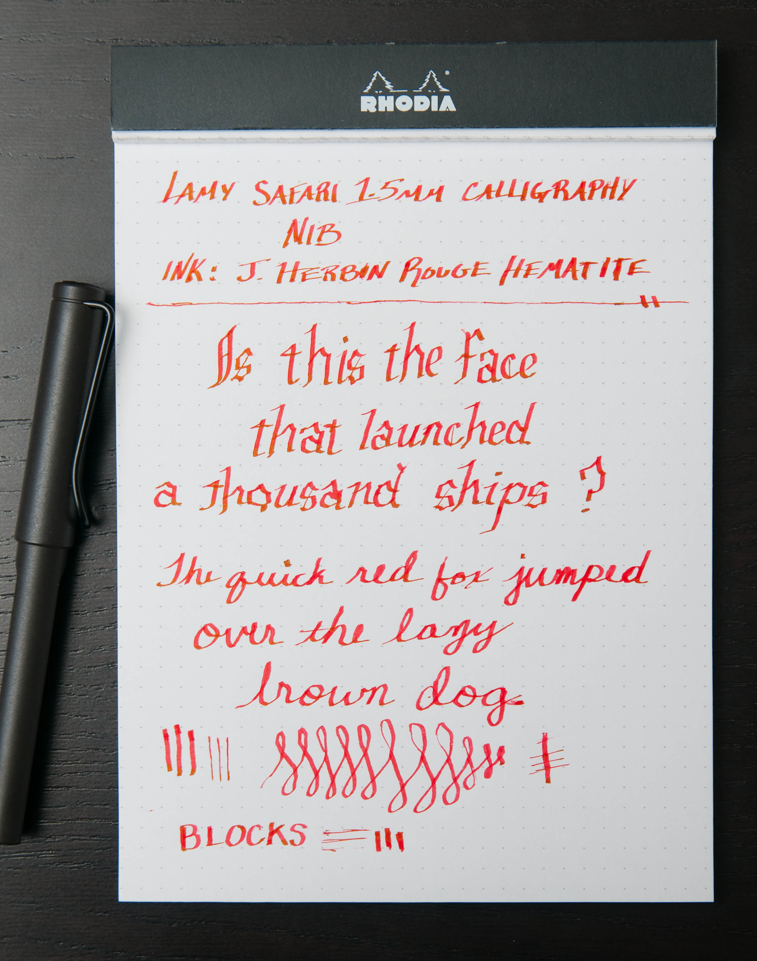
I put the nib on a Safari that I had lying in a drawer, and promptly filled it up with some green ink. In my rush, I didn't think to pick out an ink that has great shading qualities, so I was little disappointed to find that the finished product looked a bit like a magic marker line—wide and wet. After a quick flush, I filled it with J. Herbin Rouge Hematite. What a difference that made. It no longer looked like a magic marker line, but a sophisticated and interesting line of varying widths, shades, and hues.

This nib was made to be used with calligraphy lettering. I don't do much calligraphy lettering, and I certainly don't claim to be any good at it. Using this nib and experimenting with the variations, I wanted to practice lettering a lot more. Expert lettering really takes a lot of skill and practice, and I really admire anyone who can make it look fluid and consistent. They've put a lot of practice into it, and they can make it look as easy as scribbling in a Field Notes book propped up on my knee.

That said, I didn't really find much place for this nib in my everyday writing. For one, you have to write really big in order to form letters and words (as opposed to big blobs of ink). Second, since the nib is wide and requires a bit more from the feed system, there are consistent starting issues. They're never difficult to get rid of, and I found that they're actually very predictable, but they're still frustrating in general writing practices.

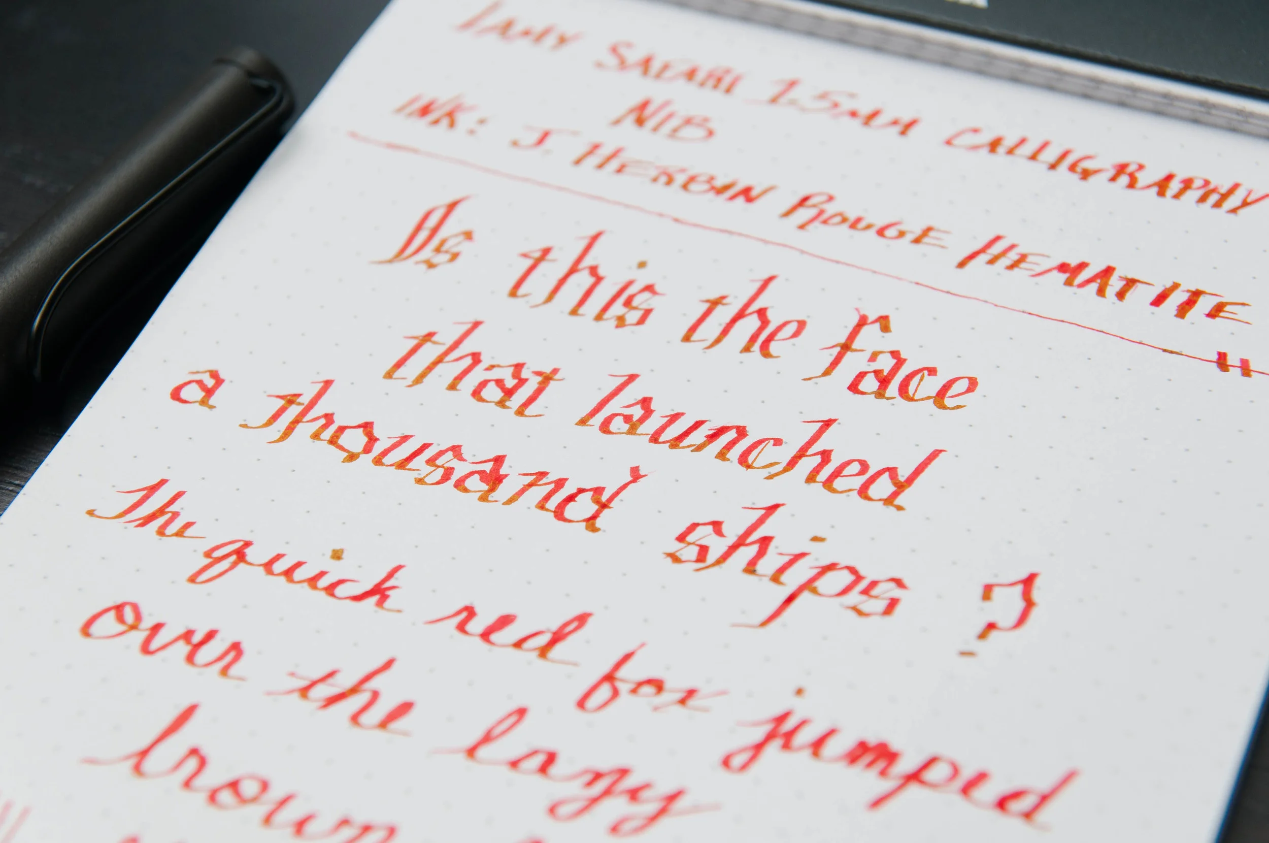
For me, this nib gives me two things: the ability to play and experiment with large, ornate lettering, and a nib that provides a great showcase for inks that have excellent shading properties. This nib is more about creating art, and much less about writing things down.

If you're even the slightest bit interesting in calligraphy nibs, and you already have a Lamy, I can't think of a better way to try out a calligraphy fountain pen (I'm not counting disposable porous tip pens here) than the Lamy nibs. They have other sizes besides the 1.5mm, which are 1.1mm and 1.9mm. I just recommend getting an ink that shades well to go with it!

Posted on October 15, 2014 and filed under Fountain Pens, Lamy, Pen Reviews.

Parker IM Premium Fountain Pen Review

In its heyday, Parker was on top of the pen and pencil world. Anyone who was anyone owned a Parker, with many of their classic designs still highly sought after to this day. The last couple of decades haven't been so nice to this once elite brand though. Their offerings have been mostly mediocre in my view, and are getting lapped by competitors who offer more for less.

I was honestly not excited when I heard about the latest Parker fountain pen releases, but one thing caught my eye: They used the word Vacumatic in the product description. Along with the Duofold and the 51, the Vacumatic is classic Parker design at its best. I own a Vacumatic and it remains one of the most intriguing and beautiful pens I own. Just that one little mention had me anxious to see what Parker had up its sleeve.

The Parker IM Premium pays homage to the original Vacumatic's horizontal stripe design, and they pulled it off well. The Emerald Pearl model I received from JetPens shares a bit of the color scheme with my classic Vac, but the materials and functionality are completely different.

First off, this is an aluminum barrel pen, unlike the resin barrels of yesteryear. So, no translucency through the barrel, but rather a solid, lightweight metal replacement. Secondly, this is a cartridge/coverter filler, meaning no fancy vacumatic filling action, which is likely a cost issue. This is not your grandfathers Vacumatic, and based on the naming, it isn't supposed to be.

The IM Premium is a good quality entry level fountain pen - that's what it is designed to be. I think Parker pulled it off well here, too. It has a classic look while retaining a modern style. The traditional Parker arrow clip is there, but they mix in a brushed metal section to give it an up to date feel.

One thing that caught my eye when first unboxing it was the scale of the nib compared to the pen body. It is small - smaller visually than I am used to. Once I inked it up with the provided blue ink cartridge it wrote so well I no longer noticed the size. The medium stainless steel nib is smooth and the line width is controlled and just the proper width. The ink flow was spot on. And the blue ink color itself? Really, really nice, which was another surprise.

I didn't think it would happen, but I am enjoying this pen. Either Parker has been doing a better job of late (I dig their Jotter 60th Anniversary Edition), or I am turning into my grandfather. Neither of those would be a bad thing.

(JetPens is a sponsor of The Pen Addict and I received this product at no charge.)

Posted on October 13, 2014 and filed under Fountain Pens, Parker, Pen Reviews.

Uni-ball Vision Elite BLX Roller Ball Pen - 0.5 mm - Purple Black Review

In the world of non-standard inks, purple black is only behind blue black as my favorite color outside of the standard black, blue, red trifecta. If I could only use blue black inks the rest of my life I would be happy, but dang it if purple black doesn't sneak into the rotation frequently.

Uni-ball introduced their BLX lineup in 2012 to some fanfare but I personally never fully embraced it. That was a mistake because these are really good pens. And after using the Vision Elite 0.5mm Purple Black model I think I am ready to name it my number one liquid ink roller ball when I add that list to my next Top 5 Pens update, which will be out before the end of the month.

I've defaulted to the Pilot Precise line as the best liquid ink roller ball pen for years, but the Vision Elite is where it is at, especially in the 0.5 mm tip size. The line is super clean and as smooth of an 0.5 mm pen as you will find. The barrel design is great, including the comfortable cross-hatched grip. On top of that, the Vision Elite uses archival ink, and the pen is airplane safe. What more can you ask for?

The only knock you are likely to have is that while the pen is refillable it is not very cost or size effective. Due to the design, and assumedly to keep it airplane safe, the "refill" comprises replacing at least 50% of the total pen, if not more. It is a huge piece that includes the grip section and pen tip, along with the ink reservoir. I think most users would just buy a new pen.

That oddness aside, I love this pen. I've long been a fan of Uni-ball's use of lavender black in the Signo DX and Signo RT so I am glad to see this similar color make its appearance in on of Uni-ball's main line products like the Vision Elite. The Signo 207 and Jetstream lineup also feature the same colors. I hope to add those to the arsenal soon.

(JetPens is a sponsor of The Pen Addict and I received this product at no charge.)

Posted on October 6, 2014 and filed under Pen Reviews, Uni-Ball, Vision Elite, BLX.