Posts filed under Pen Reviews

Kuretake Zig Cartoonist Mangaka Flexible Pen Review

Image via JetPens.com

Image via JetPens.com

Everyone knows I love a good brush pen, but not for the normal artistic reasons. I like writing with them, and the added flair they add to my lettering is enjoyable. Some are better than others in the writing department though, so where does the Kuretake Zig Cartoonist Mangaka Flexible stand?

First off, Kuretake has become one of those brands that can do no wrong in my book. The Zig Cartoonist Mangaka Outline Pen is my favorite plastic tip pen, beating out stalwarts from Sakura and Copic, and the Fudegokochi Super Fine Brush Pen is the best writing brush pen I own. Just look how clean my lettering is in those reviews. Hard to not be impressed.

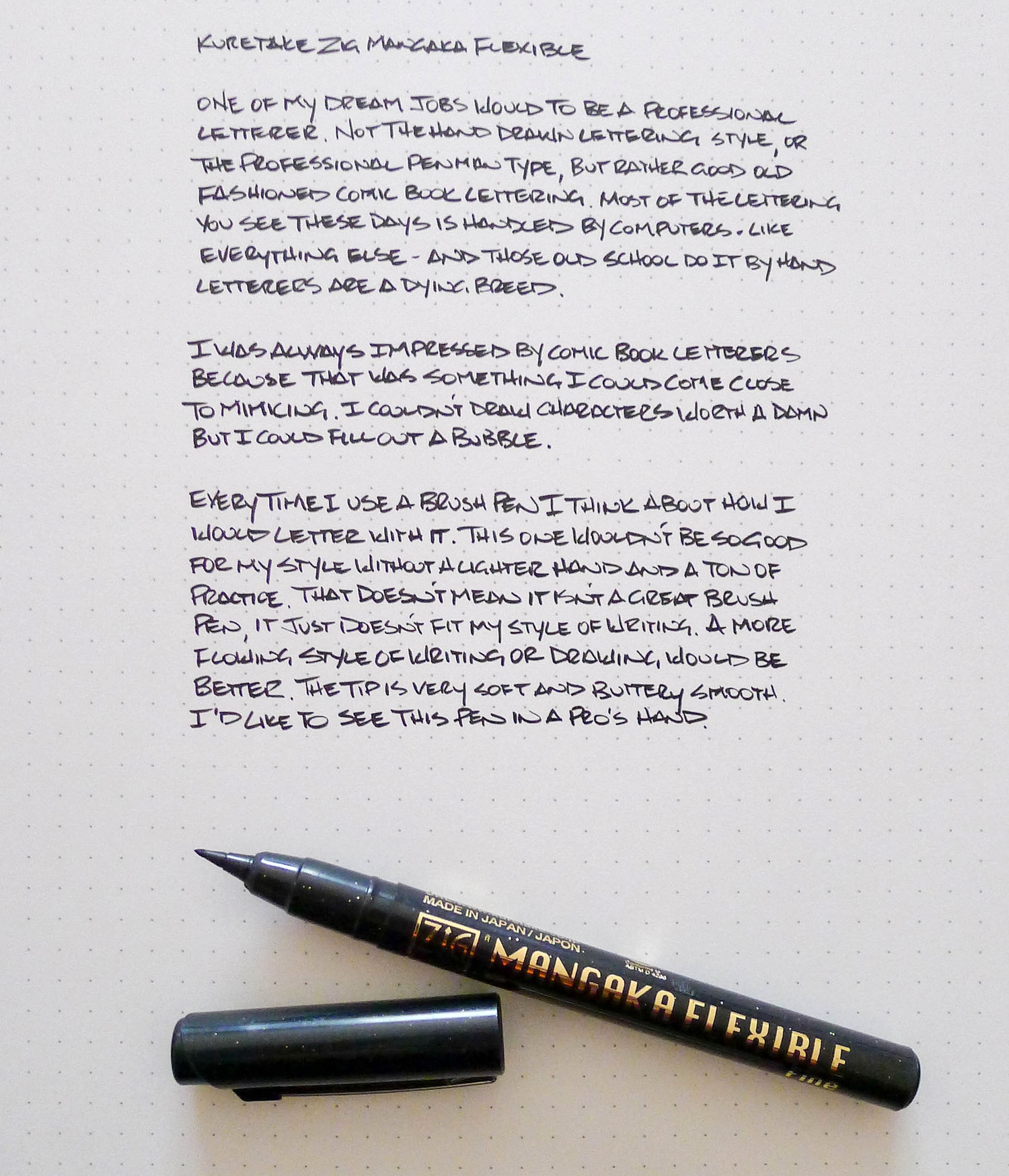
The Zig Cartoonist Mangaka Flexible Pen is a different animal from those two. It is a soft tip brush which allows for a range of both thin and thick lines. Essentially, it is exactly what you should think of when you are thinking about a brush pen.

I don’t have the hand skill to do this pen justice but I was impressed with the quick, clean transition from wide to narrow in the lines. The meat of my letters were solid and the end of the lines had that nice snap you want to see in a brush. This is an effect you cannot get from a standard drawing pen.

For my daily writing purposes it isn’t all that great - the Fudegokochi works better for that. But in the right hands - artistic hands - the Mangaka Flexible would sing.

(JetPens is an advertiser on The Pen Addict and I received this product at no charge.)
Posted on November 28, 2014 and filed under Brush Pen, Kuretake, Pen Reviews.

Regal 82 William Fountain Pen Review

(Jeff Abbott is a regular contributor at The Pen Addict. You can find more from Jeff online at Draft Evolution and Twitter.)

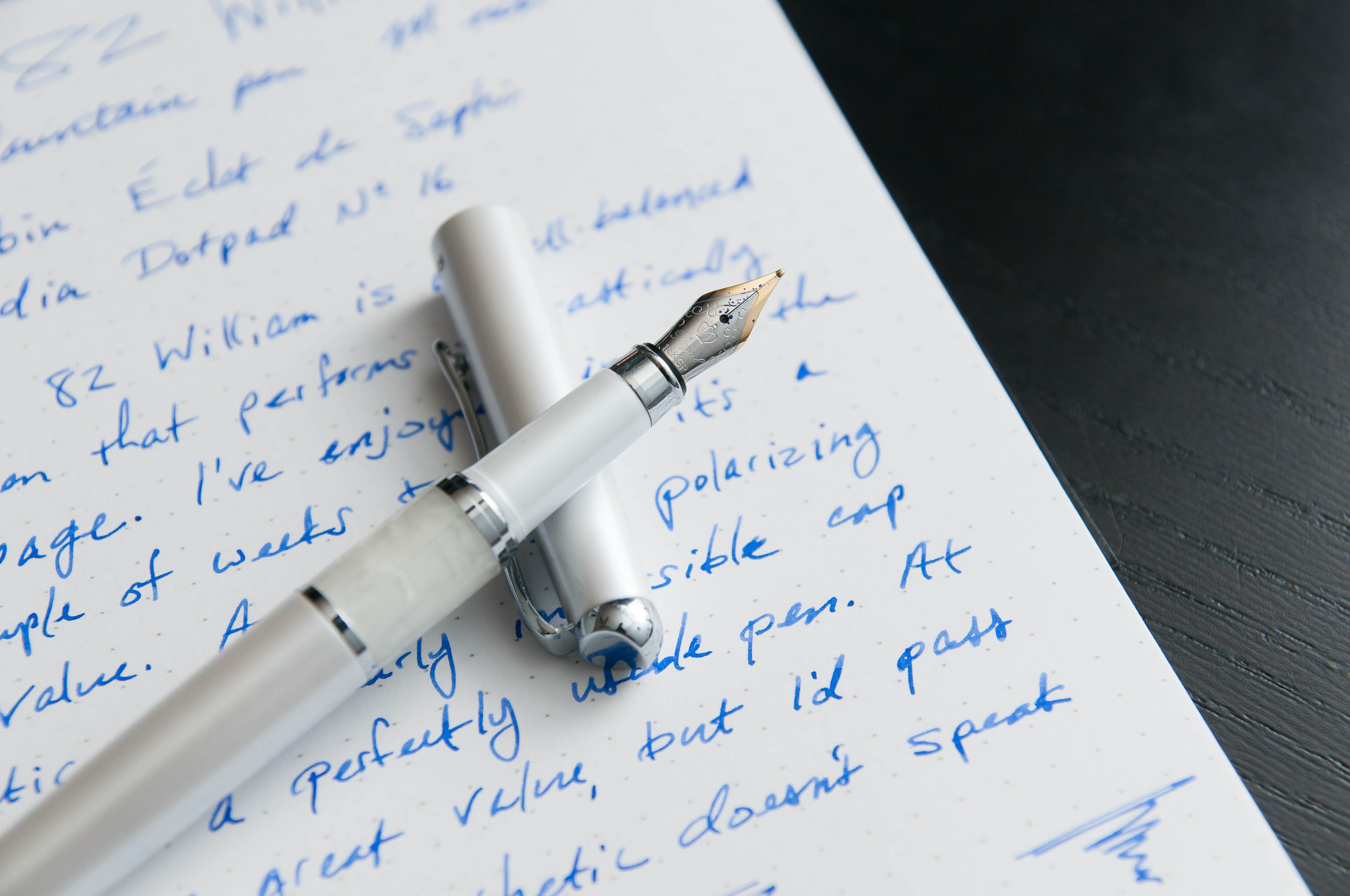
The Regal 82 William fountain pen caught my eye when it landed on JetPens for two reasons: it has a brass body and a metal grip section. I typically love pens with a heavy body and metal grips, so I dove on it immediately. Not knowing anything about the brand, I made a mental note to look into them later on. After some brief research, it appears that Regal is a large wholesaler of their own line of pens with a presence in several large US cities, as well as India. I don't know for sure, but word on the street is that the pens are made in Taiwan. Not bad, right? So, how does this new player stack up against the other competitors? It puts up a good fight, but I think a lot of it will come down to personal aesthetic preference.

Aesthetics

The pen comes in 5 different colors: black, white, French rose, lavender pink, and hot pink. Is it just me, or is that a lot of pink? White and black are standard, and pink is also a popular color, but I can't help but think that some other choices would be advantageous here. Purple? Green? Blue? You get my point, right?

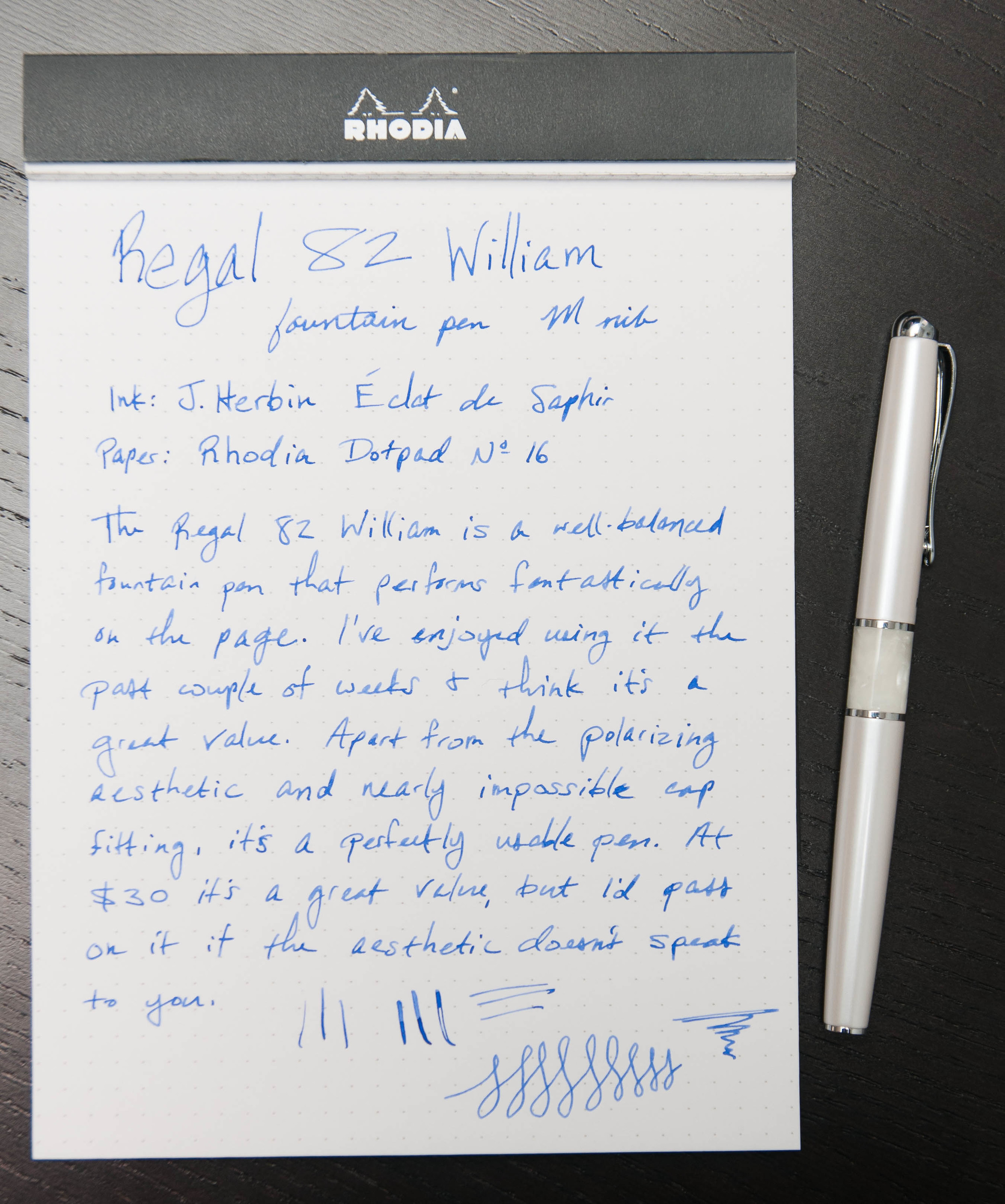
The pen has a great heft to it. It's a fairly slim body, so the weight can be a bit unexpected when you first pick it up. Being slim, it still feels very good in hand. I really enjoy writing with it and haven't experienced any cramps or fatigue while using it. This is always a good sign of proper balance and sizing for pens that I use.

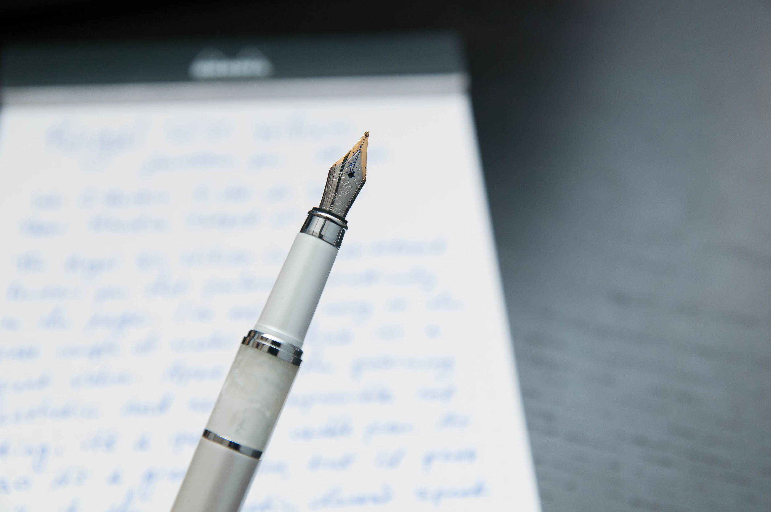
There's a marble-like band above the grip section of the barrel, and I'm not a huge fan of it for two reasons: it looks fake and it seems misplaced on the pen. Other than that, I really like the white color of the model I chose. It's pearly and has a nice glimmer to it. The chrome furniture is also a great touch.

The decorative thing at the top of the pen cap is...confusing. I'm not sure what it is or what it represents, but it just doesn't speak to me in any way. I want to replace it with something flat and subtle.

The clip is strong, but not annoyingly so. The cap, on the other hand, has been a major problem for me. This cap is snug when it's on the pen. It takes two hands (firmly gripped) to remove the cap from the pen. I'm worried that I might damage the nib at some point from trying too hard to remove the cap. I'm hoping this will get easier with some wear, but I also think it's unacceptable for a new pen. The cap can post on the pen, but it's awkward. It makes the pen extremely long and put it off balance. I've been using it without the cap posted, and that seems to work best.

The grip is metal and feels very nice. It's smooth and is mostly the same shape, which is a big win in my book. The nib is small and two-toned, which isn't a problem, but the fact that it says "18K GP" bothers me. I think this is meant to be decorative, and it might very well have some small amount of gold-plating, but it gives the wrong impression.

Overall, the pen feels good in the hand, and that's the most important part of the aesthetics, right?

Writing

The 82 William only accepts international short catridges, or that's what it claims. I'm sure that you could use a converter if it was slim enough. The cavity in the pen body is deep enough to hold a converter. The Monteverde converter comes to mind.

I loaded the pen with J. Herbin Éclat de Saphir instead of the black cartridge that came with the pen. This ink does really well in the medium nib on the pen, and I've been completely happy with the way it writes.

The line is consistent and tad on the wet side, which is what I prefer in a medium or bold nib. So far, it's been very good about not drying out in between uses — there haven't been any problems with starting or skipping, and it can even write after a few minutes of being uncapped and unused.

Overall, it writes really well and feels great in the hand. For that reason, it's a really good pen, and at the $30 price point, it's a fairly good value. Like I said earlier, I think the major factor to consider here is aesthetics. Do you like the way this pen looks? If so, then I'm pretty confident that you'll enjoy using it as it's a great writer. If you don't like the look of the pen, I'd recommend passing it.

After using this pen from Regal, I'd be interested in trying others from the company.

Posted on November 26, 2014 and filed under Fountain Pens, Pen Reviews, Regal.

A.G. Spalding & Bros Bullet Roller Review

(Jeff Abbott is a regular contributor at The Pen Addict. You can find more from Jeff online at Draft Evolution and Twitter.)

Liquid ink roller ball pens seem to be more difficult to find than your average gel ink or ballpoint pen – even fountain pens are more plentiful. That's why I always enjoy trying out a new roller ball pen. I like roller ball pens because they're typically very smooth and lay down thick, dark lines that look so good on the page. Sometimes they disappoint, but other times they become new favorites. The A.G. Spalding Bullet easily became a favorite for me – right up there with the Retro 51 Tornado.

To be honest, I've looked at this pen on JetPens many times. It just never caught my eye. It looked boring, and I had other more interesting things in my wish list. For some reason, I decided to give it a go this time, and I'm really happy I did. I have a new favorite with this pen.

Like every pen, it has some downsides, but it's an overall great writer that looks good too.

Aesthetics

The Bullet (I keep shortening the name because it's so long to begin with) is incredibly simple in style. It's sleek, slim, and unique. I love the way the cap lines up flush with the body of the pen no matter which end it's clipped to. Capped or posted, it's still very sleek and slim.

I don't know what material the body is made of – some type of metal – but there's a clear coat on top of the metal that gives the entire body a nice shine and 3-dimensional look. It's really nice to look at, which is surprising for such a simple design. It just works really well.

All of the parts feel like they're made of high-quality materials. The tolerances in the threads and the cap are tight and feel great. Either I got a really great example, or there is a lot of care put into the quality control on these pens.

One thing I do miss on this pen is a clip. It rolls around very freely on a desk, and I've lost it several times for that reason. An optional clip (similar to Kaweco or Fisher's Bullet pen) would be a great accessory for this pen as long as it was equally stylish and sleek.

Writing

The real secret with this pen is in the refill. It's a Uni Mitsubishi refill, and it's absolutely fantastic. I love the Retro 51 Schmidt refills, but now I've found another go-to refill. I like it just as much as the Schmidt refill, and it's a different shape as well, so maybe I'll have luck transplanting it to other pens that aren't so well-endowed in the refill area.

The writing experience is smooth and consistent. The lines are dark and crisp. No starting or pooling issues that I've seen. I think this might be because the ink is a liquid gel, which might make it less runny than most liquid inks. Honestly, I really don't know what kind of ink is in this pen. The descriptions on JetPens lean both ways. Does it really matter, though? It's a great refill that I'm glad I discovered.

Downsides? Sure. I've noticed one downside when writing: the grip. It can become a bit slippery when writing for a while due to the finish on the body. It looks great, but it's not good for strenuous writing sessions.

Brad reviewed this pen way back in February of 2008, but it's definitely worth another look for anyone that wants to expand their roller ball collection with another beautiful pen and excellent writer.

Posted on November 19, 2014 and filed under A.G. Spalding, Pen Reviews.