Posts filed under Pen Reviews

The Pen By Ajoto Review

I didn't back the original Ajoto pen Kickstarter. In retrospect, that was a huge mistake now that I have one in my hands that Ajoto graciously sent me. It is an exercise in beautiful simplicity, which is often times difficult to get right. Ajoto has nailed it with The Pen.

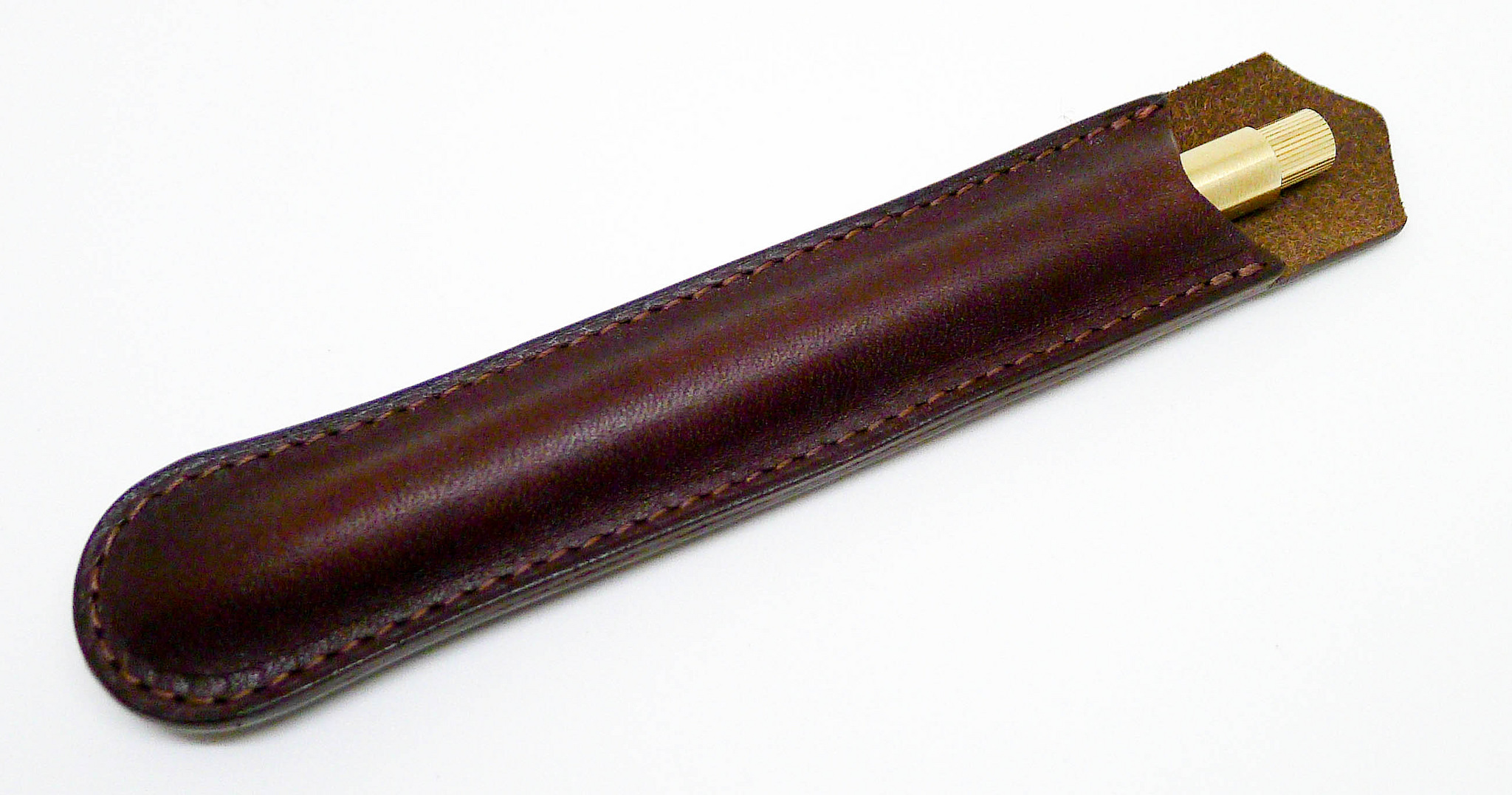
The first thing you notice when opening the envelope is the packaging surrounding the pen. I'm not a packaging guy in general, most of it hits the trash after all, but what Ajoto did here makes you take notice. The pen itself lays in a molded cork tray which slides into an anodized aluminum box. And not just that, there are additional printed cards included to top the cork box with (that also includes your product serial number) and a great little folded card covered in the Ajoto logo that holds the refill. If Ajoto cares this much about their packaging, then what is contained inside must really be special.
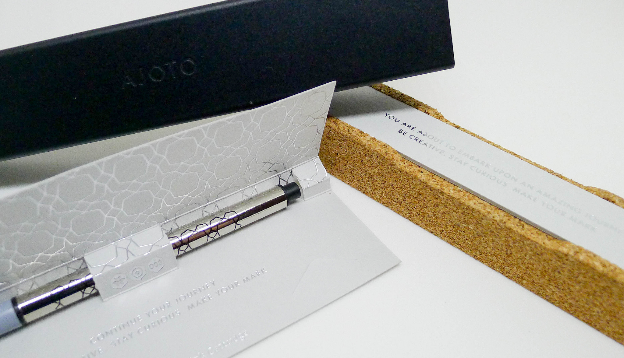
And it is. The overall feel of the pen is not just solid, but completely in sync as a whole. This is done by limiting the moving parts and having a smooth twist deployment mechanism for the refill. It is quiet, easy, and simple. To top it off, the refill the pen is built around is the Schmidt P8127, which for my dollar is the best rollerball refill on the market.

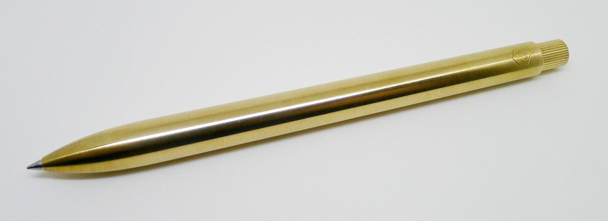
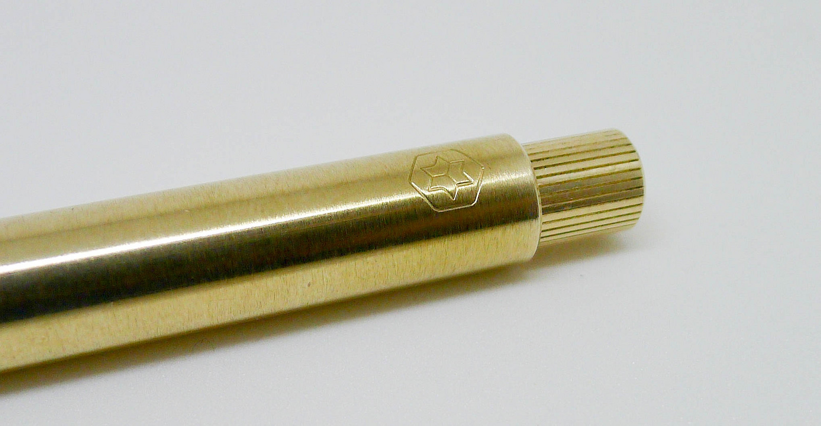
All of the fawning up to here would be pointless if the Ajoto pen didn't live up to its design beauty when ink hits the page. And there, it excels. In a metal machined pen, in this case brass, balance is key. Many first time pen manufacturers miss this critical point, but not Ajoto. At 50 grams, weight could be an issue, but the way the pen is balanced makes it feel almost weightless as the pen glides across the page. An impressive feat for sure.

The elephant in the room with the Ajoto pen is the price. It is very expensive, with aluminum models starting at £125 (~$188), and moving on up the charts for Brass, Rose Gold, Rhodium, and 14ct Gold barrels. This is not a purchase to be made without consideration.

After using the pen, I understand the price. This is a high-quality production that will last a lifetime. That doesn't make it any easier to pull the trigger though, and I would have a hard time recommending it over pens a fraction of the price. But, if you are looking for something unique that will make an impression in the hand and on the page then Ajoto is a brand well worth checking out.

My thanks to Ajoto for providing this pen at no charge for review purposes.
Posted on January 30, 2015 and filed under Pen Reviews, Ajoto.

Machined Beauty: The Tactile Turn Mover

(Jeff Abbott is a regular contributor at The Pen Addict. You can find more from Jeff online at Draft Evolution and Twitter.)

Machined pens are quite a thing over on Kickstarter. They're a fascinating genre of pen because they're created by small shops from pieces of metal and eventually shipped to your door. While Tactile Turn now has a shop that you can buy from anytime, the didn't start off that way. Brad took a look at their pens a year ago and came away impressed. I joined the second round of their Kickstarter that featured new materials, and I'm really happy I did.

I have to be honest — it was extremely difficult to pick a style of pen. It was equally as difficult to select a metal and color. They all look good and if money were not object, I'd own one of each. But, money is certainly a consideration, so I went with a black aluminum Mover.

Let's back up a little. There are two main styles of these pens: The Mover and the Shaker. The only real difference is the length of the pen. The Mover is designed to accept anything similar to a Pilot G2 refill, while the Shaker is designed for a Parker style refill. It boils down to choosing the body that supports your favorite refills. Being a huge fan of the Pilot Juice, I went with the Mover.

Apart from the choice between the Mover and the Shaker, you then have a chioce of several metals, of which the aluminum can be had in different colors. Here are your options: titanium, polished bronze, polished copper, polished brass, raw aluminum, and anodized aluminum. The latter comes in the following colors: dark red, black, teal, dark blue, and olive drab.

I really liked the looks of the olive drab pen, but eventually decided to stick with black for now. I'm slowly convincing myself that I need an olive drab Shaker.

The pen you purchase comes with a refill. The Mover comes with a blue Pilot G2 0.38mm refill, and the Shaker comes with a Schmidt Easy Flow 9000.

So, how does this look and feel in person? Like a high-quality piece of art that can withstand abuse and write like a champ.

I've used other machined aluminum pens, and none of them have the right balance for me. They're usually significantly heavier on the nock end, which makes them feel top-heavy when writing. Not so in the case of the Mover. It has a wonderful balance. Another feature that I love about this particular machined pen's design? The textured grip. This is the first one I've tried that has one, and I love it. An alumnium barrel can get slick, and that makes it difficult to control. With the Mover, I haven't had this problem.

The nock used in this pen is the same one that was used in the Retrakt before it. It's a high-quality, smooth, silent mechanism that works like a charm. Personally, I think it looks really nice, too.

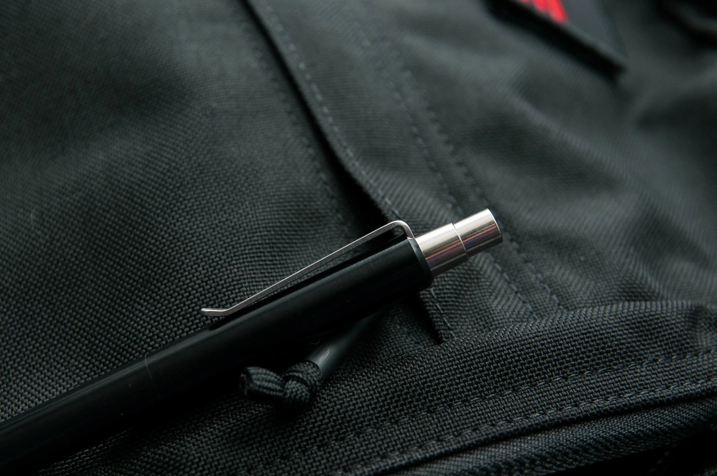
The clip is strong, but easily slides on and off when attaching it to my jeans pocket or in a Nock case. Other machined pens I've used have clips that are a bit tight and sometimes require two hands to operate.

The thickness of the barrel is another thing that I love about the design. It's the perfect width for writing. The diameter is really close to my Lamy 2000, which is a pen that I enjoy writing with more than most.

The build quality of this pen is superior, but that's something that you should expect from a machined pen. These make great EDC pens given their simple, excellent design and strength. They also make excellent gifts — they look fantastic and they accept "normal" refills that non-addicts understand.

Prices for these pens range by material. Aluminum bodies are $69, and prices range up to $139 for the titanium model.

All in all, if you're looking for a high-quality machined pen that accepts a wide range of refills and also looks and feels great doing it, the Mover and/or Shaker are a perfect choice. I can't wait to make my collection a pair.

Posted on January 28, 2015 and filed under Pen Reviews, Tactile Turn.

Sailor G-Free Ballpoint Pen Review

(This is a guest post by Dwayne Lively, pen addict, knife collector and writer for DwayneLively.com. You can follow him at: @DwayneLively on Twitter and @blatherama on Instagram.)

I don't understand why the Sailor G-Free needs to exist. It seems more like a proof-of-concept than a product people might be clamoring for.

It’s 300 yen (which as of this writing is around US $2.50 or 1.6 Pounds Sterling). This makes it expensive for a ballpoint, even in Japan.

My first impressions of this expensive pen, though, were not particularly good because it’s ugly.

It has a big Sarasa-style clip and a chunky rubber grip that makes it look like a stretched hourglass. The monster clip, unfortunately, serves as the nock release, meaning you can’t just snap it off and go clipless.

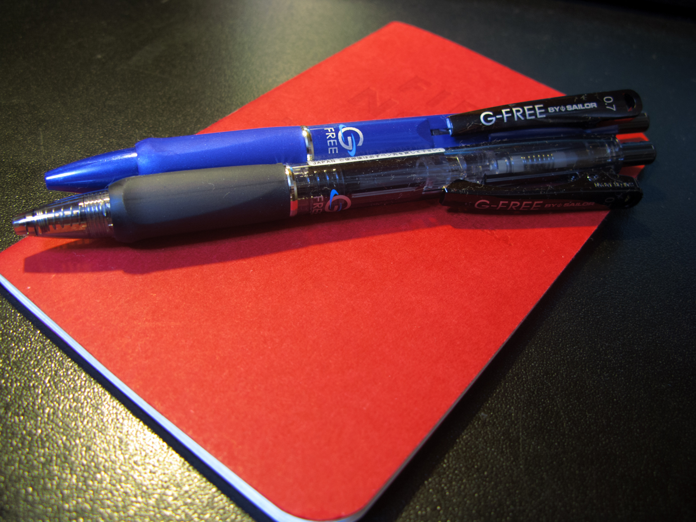
Two versions of the G-Free by Sailor on a Field Notes Red Blooded.

Two versions of the G-Free by Sailor on a Field Notes Red Blooded.

Sailor claims the pen has two special features that make it worth the extra money: hard/soft adjustment and a special low-friction ink.

First, by twisting the nock, the user can adjust a spring that changes how springy the pen feels. For example, if you're writing on a blotter, the hardest setting is fine, but if you switch to a hard surface, you can adjust the pen to make it feel better as you write. This is kind of interesting, but it’s not something I’ve ever wished a pen could do.

On the softest setting, you can almost push the nib back into the pen; on the hardest setting it barely moves. However, there’s not enough difference that it’s worth more money than my Pilot G2 or the 130 yen a UNI Jetstream would cost me. I’m also not sure the G-Free needs seven different levels of adjustment. The difference between 7 (hard), 4 (medium), and 1 (soft) is noticeable, but there’s not much change felt by switching from setting 2 to 3.

Details of the ugly clip and the hard-soft spring.

Details of the ugly clip and the hard-soft spring.

Second, Sailor claims its ink — which as near as I can tell is a gel ink — is specially formulated to have less friction, making for easier and faster writing. They even claim specific percentages for how much more efficient your writing will be.

Although it is smooth, I haven't noticed anything special about the ink except that it only comes in black and there isn't much of it. The black version of the pen is translucent and you can see the refill stops halfway up the pen to allow space for the hard/soft mechanism. The eight different barrel colors available are just for fashion, although each version has the ugly black clip.

You can see the where the ink stops right in the center of the picture.

You can see the where the ink stops right in the center of the picture.

After using both pens for a few days on different types of paper, including Field Notes, Moleskine, Tomoe River and copy paper, I haven’t noticed much difference in the writing experience than I’d get from a standard gel ink pen. The chunky rubber grip section is triangle shaped and I found it awkward to hold at first despite the fact I’ve used a Pilot Vanishing Point for almost 20 years. I eventually twisted the grip around and that made it feel more comfortable.

Although I don’t expect line variation from a ballpoint pen, I was disappointed there was no effect at all on the size of the line by adjusting the hard/soft settings. The line was always the same thickness. That said, I was surprised that although the G-Free is only offered in a 0.7 size, the line from both pens was thin. They actually felt like 0.38 pens.

One final pet peeve is that the nib has a black circle around it, even on the blue version. This has no effect other than to constantly make me think that ink residue was building up on the nib.

The ugly black ring on the nib and some ugly handwriting.

The ugly black ring on the nib and some ugly handwriting.

As of this writing the pen is apparently only available in one physical store (Tokyu Hands in Ikebukuro), the Sailor online store, and at Amazon Japan where you have to buy an 8-pack. In the end, all I have are questions about this pen: Does the Sailor G-Free need seven different adjustment levels especially when there’s no visible change in the line? Is a slight difference in springiness enough to justify the price and the ugly?

The answers, I’m afraid, are “No” and “Not for me”.

Some examples of bad handwriting at three of the seven settings. This was written on a soft surface.

Some examples of bad handwriting at three of the seven settings. This was written on a soft surface.

Posted on January 22, 2015 and filed under Pen Reviews, Sailor, G-Free.