Posts filed under Pen Reviews

Kuretake Zig Cartoonist Mangaka Outline Pen 003 Review

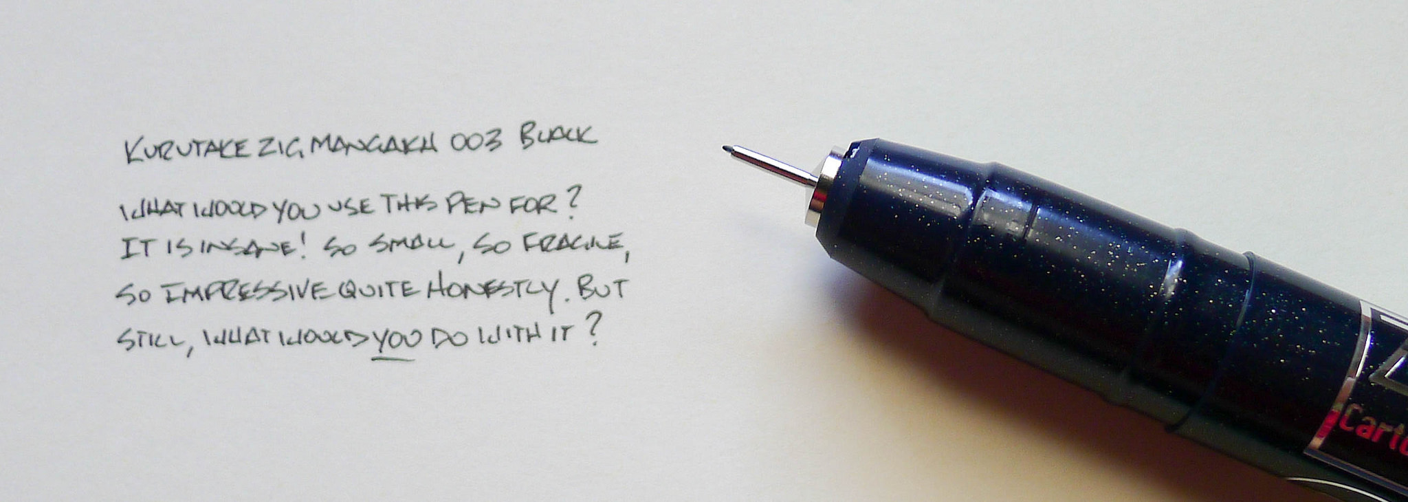
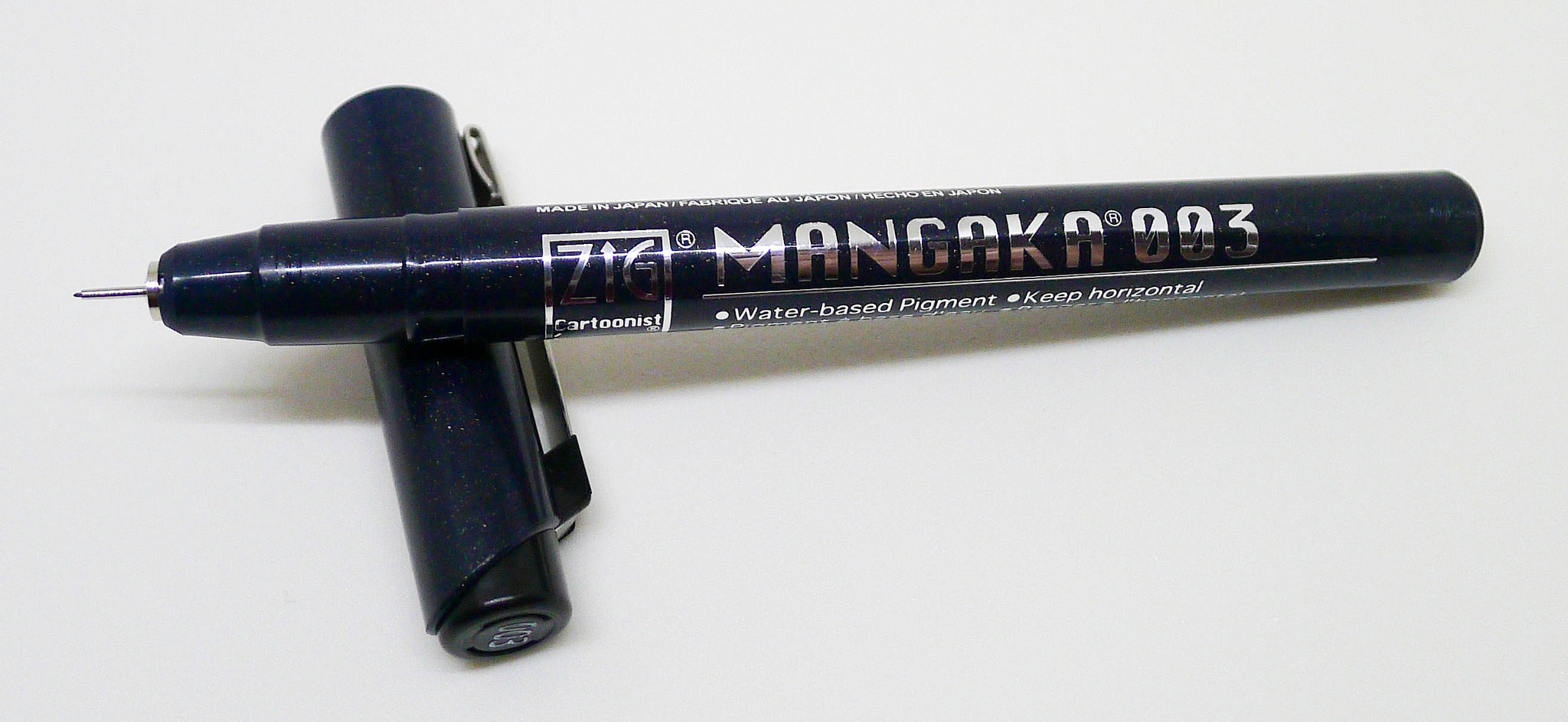
My love for the Kuretake Zig Cartoonist Mangaka Outline Pen is well known. My handwriting looks awesome, and the 02 size has become a regular part of my rotation.

Notice I said the 02 size. It's a wonderful writer, checking in around 0.35 mm line width, and even the 01 size sees a lot of use, leaving a line around 0.3 mm. But the 003 size Zig Cartoonist? Who do you think I am, Sam Larson?

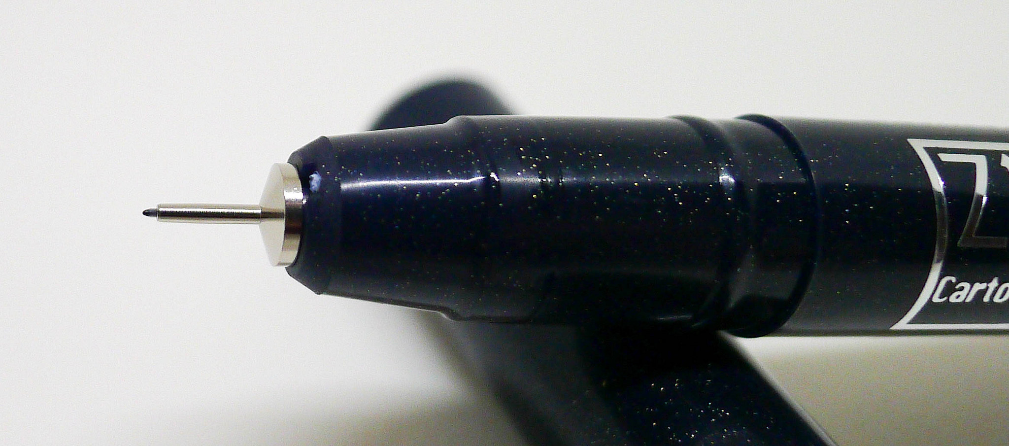
I pick on Sam because I love his artwork. He does amazing work with some of the finest drawing pens on the planet, but I can't swing the 003 personally. I don't have the need for it. That said, compared to other tiny tipped drawing pens this Kuretake has a firmer tip than most. That's why I like the 01 and 02 sizes so much. Durability is important with this style of pen.

I'm curious how many readers out there have a use for such a specialized pen. It's clearly useful for many people, and honestly it's technically impressive that such a pen exists. How and why would you use a pen with a tip this small? Let me know in the comments section.

(JetPens provided this product at no charge to The Pen Addict for review purposes.)

Posted on May 27, 2015 and filed under Kuretake, Drawing Pen, Pen Reviews.

Sailor 1911 Standard Music Nib Review

What is a music nib? That is a question I have wondered for years. I know generally what they are all about: A wider than normal nib suited well for writing musical scores. But how does it work, and most importantly, how will it work for me? Thanks to my friends at Goldspot Pens, I was able to get a Sailor 1911 Standard with Music Nib on loan to see what it is all about.

When you have a non-standard nib like a music nib, it becomes the singular reason you are buying the pen. The barrel feel and design are obviously important in the grand scheme, but they are secondary considerations to how the nib performs. As is the norm with all of Sailor's nibs, the music nib performed wonderfully.

From a design perspective, the majority of music nibs are designed with two slits and three tines. This is to allow for big ink flow, which is a staple of music nibs. Sailors music nib is more traditional in that it has a single slit and two tines, but the tip of the nib is designed in such a way as to keep that same big ink flow. That was clear once I started writing with it using Sailor's Shigure ink. There were no issues putting this beautiful purple ink down on the page.

Top view

Top view

As I learned while researching this nib, music nibs are designed to hit the page more vertically than standard nibs, and at approximately a 90 degree angle. Picture your normal fountain pen writing grip where the nib hits the page at around a 45 degree angle. Rotate the pen in your hand counterclockwise (if you are a righty) until the nib hits the page at a 90 degree angle. Then move the barrel into a more vertical position instead of laid back as you would normally. Now become Mozart!

Side view

Side view

Once I realized this, well after my handwritten review mind you, all I could think of is isn't this what an architect grind is supposed to accomplish, without all of the angle adjustments? Wide horizontal strokes, thinner vertical strokes. Seems like it would do the trick. The thing is, no one uses a music nib for its named use these days anyway.

Bottom view

Bottom view

What the modern age of music nibs brings to the table is a thick, luscious line, perfect for large, sweeping writing. Big block lettering, cursive flourishes, and fancy styling. That's what this music nib is good at. Think of it as a chisel tip marker in a fountain pen nib. Go big or go home.

As I worked my way through this review my early prediction came true. It really is all about the nib. Sailor's 1911 barrel is excellent in its own right, with black, rounded ends set off by strongly colored resin barrels. I'm not a gold furniture guy but it's hard to argue how sharp these pens look.

Your writing style and planned use is the determining factor in purchasing a pen with a music nib. I've seen some amazing work with nibs like the one found in this Sailor. It's not a daily writer for me, but if I want to put some ink down on the page this is the way to go.

My thanks to Goldspot Pens for loaning me this pen for review. It will be heading back to its rightful home later this week, and I wish it safe travels!

Posted on May 18, 2015 and filed under Fountain Pens, Pen Reviews, Sailor, Music Nib.

The TWSBI 580 AL Orange, With A Twist

(Jeff Abbott is a regular contributor at The Pen Addict. You can find more from Jeff online at Draft Evolution and Twitter.)

If you've never had the pleasure of owning a TWSBI pen, I hope that this review can change your mind. For the money, they're nearly impossible to beat. They feel great, write well, and offer one of the most economical ways to try out a true piston filler mechanism. In a word, TWSBI pens are fantastic.

The most recent TWSBI that I've fallen in love with probably won't surprise many of you — the 580 AL. My first TWSBI was a 540 in Amber, so it seemed fitting that I should pick the orange version of the 580 AL. Yep, I'm pretty happy with my choice.

TWSBI madness

If you follow TWSBI very much, you'll probably know that the orange model of the 580 AL was limited, and they're pretty much sold out at this point. I bought my pen from Pendleton's Pens, and it looks like he still has some of the orange in stock. If you were wanting one of these, I'd hop to it. And if you get one of these pens, you get a huge advantage over the stock TWSBI because it's been pre-tuned by Mr. Pendleton to his signature BLS — Butter Line Stub — grind. This is probably half of the reason I love this pen so much (possibly more than half).

Before I get into the delicious nib, let's take a look at the outside of the pen. The 580 is a full-size pen. It's mostly demonstrator, but the grip section and piston mechanism is aluminum. In the case of my pen, the aluminum is anodized orange, which looks fantastic next to the clear plastic. Like all other TWSBIs, the plastic body is fairly high quality with a great feel to it. The clip is a little weak, but I've come to expect that from the brand. It works fine, but don't expect it to perform at a tactical level.

The 580 is a great length for me unposted. You can technically post this pen, but it becomes comically large at that point. Unlike the 540 before it, the 580 has a bit of shiny trim around the grip section and the piston knob. The shiny metal does a great job of offsetting the clear plastic and subdued aluminum. When you throw in the fact that I have some shimmery blue ink in the pen, the 580 is visually stimulating. You can't shake the impulse to pick this thing up when you see it. For me, it's a great design and aesthetic.

Like I mentioned earlier, this is a piston filler fountain pen. All that means is that the back of the pen has a knob that you can twist to operate the piston filler. Basically, the body of the pen acts like a giant cartridge converter and can hold a large amount of ink. I haven't measured it exactly, but I'd guess it holds around 1.5 ml of ink. And, you always have a very clear view of how much ink you have left as this is a demonstrator body.

The "Elegant Butter-line Stub / Cursive Italic" nib

Ah, the nib. This grind is Pendleton Brown's signature style, and I love it. Basically, it's a mix between a stub and cursive italic, or a cursive italic with "soft" edges. For anyone new to nib grind magic, stub and italic grinds give a nib a nice variance of line width when writing. Generally, a stub grind is much smoother on the paper since the corners of the nib tip are "softer," or ground down a bit. The stub is smooth, but doesn't afford you as much line variation, nor is the variation as crisp as the italic. On the other hand, the italic grind creates sharp lines with more dramatic line width variation. On the downside, they usually have a small "sweet spot," and if you stray from that, then the nib feels scratchy and might even hang on the paper in extreme cases.

All that to say, the BLS grind is a perfect marriage of the two styles. It provides an elegant amount of line variation while remaining incredibly smooth and effortless. If you're new to custom nib grinds, I'd highly recommend trying this one first. You can buy one of Pendleton's pre-tuned TWSBIs, or you can send in a pen of your own for him to grind. Definitely check him out for nib work — he's super nice and he got my order out to me extremely fast. He even sent me an email with a picture of the pen and a writing sample before he shipped it.

I chose a medium nib with the BLS grind for my TWSBI 580. In case I forgot to mention it earlier, I love this nib. It's smooth, right between wet and dry, and provides fantastic line variation. It's not crazy like a flex nib, but it's also not as subtle as my fine Franklin Christoph nib. I really like the medium nib range for this type of grind, although I might need to buy a broad nib now. You know, for science.

The TWSBI 580 is a fantastic pen that I highly recommend. It's Brad's #1 pick for the "Top 5 Fountain Pens $50-$100" category, and it performs at a much higher bracket if you ask me. With that in mind, this BLS nib grind takes the 580 to another level of bliss. If you're in the market for a TWSBI, check out Mr. Brown's selection, or send him a pen of your own to try out some of that buttery goodness.

Posted on May 13, 2015 and filed under Fountain Pens, Pen Reviews, TWSBI.