Posts filed under Pen Reviews

Danitrio Sho-Hakkaku Ki-Dame Tamenuri: A Review

(Susan M. Pigott is a fountain pen collector, pen and paperholic, photographer, and professor. You can find more from Susan on her blog Scribalishess.)

I've been wanting to buy a Danitrio fountain pen for a long time. I love their beautiful designs, and while I own several Nakayas, I wanted to try out a different Japanese brand. Joke's on me. Danitrio is not a Japanese company. They make pens using Japanese techniques and many (if not all) of their craftsmen are Japanese, but they are headquartered in Newport Beach, California. The company was founded by Mr. Bernard Lyn (read an interview with Mr. Lyn here).

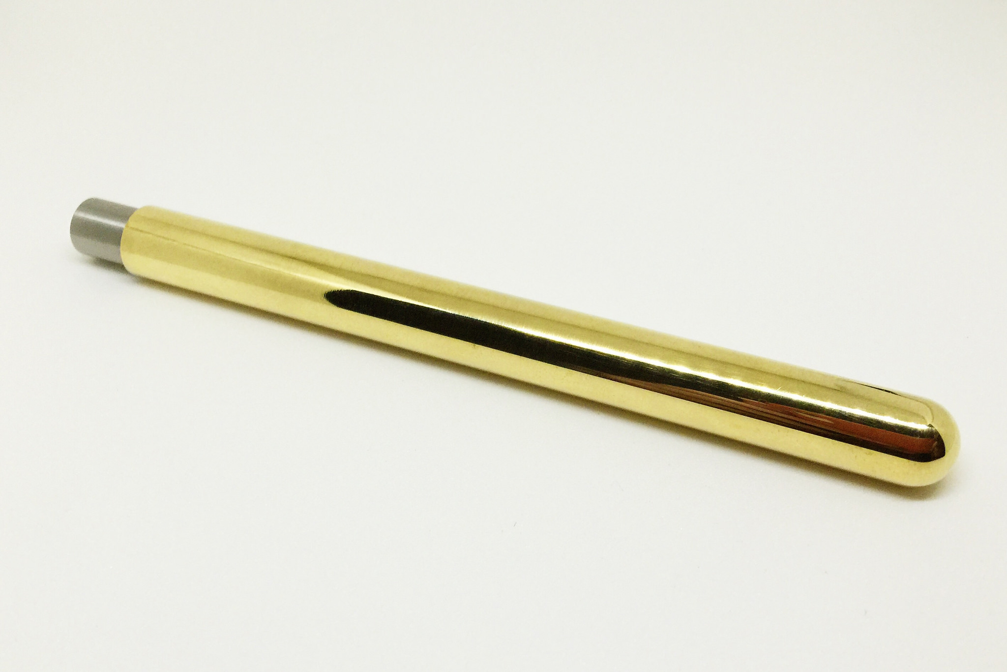
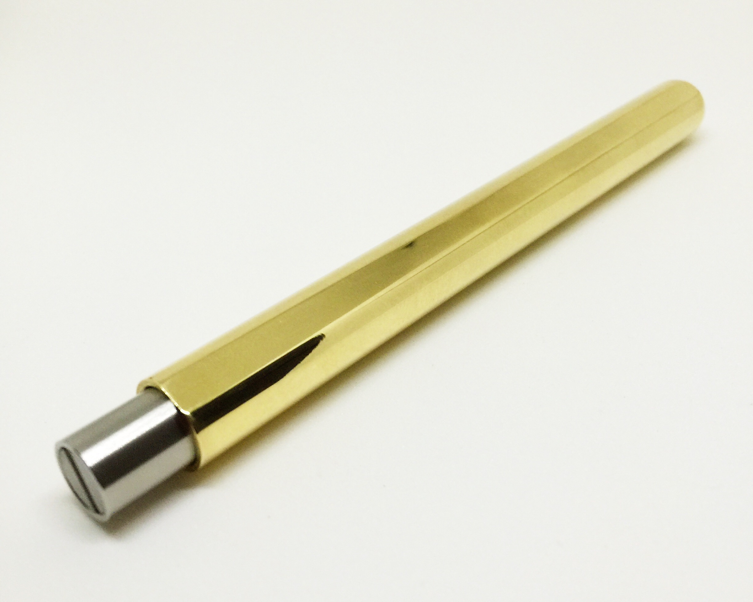
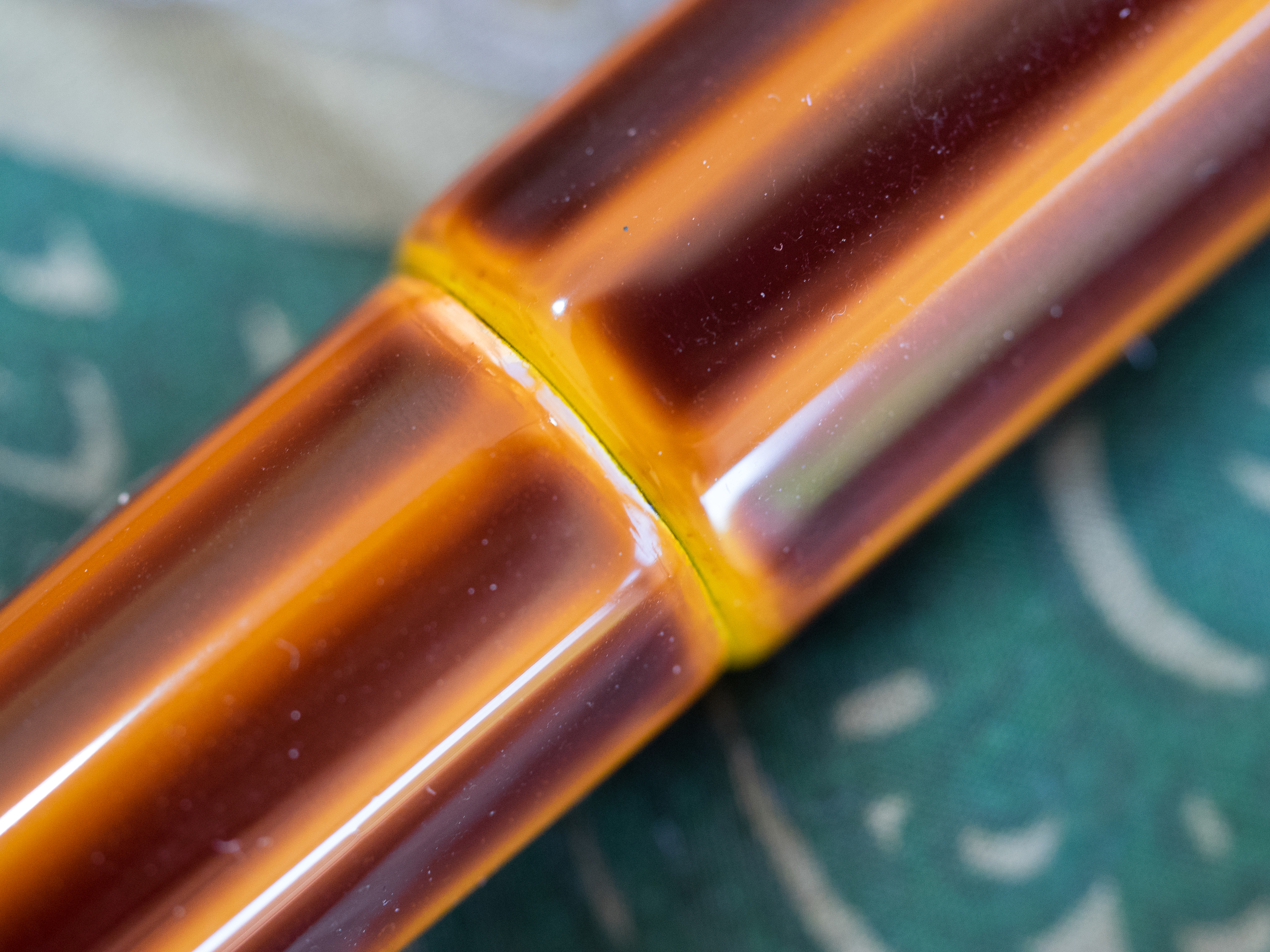
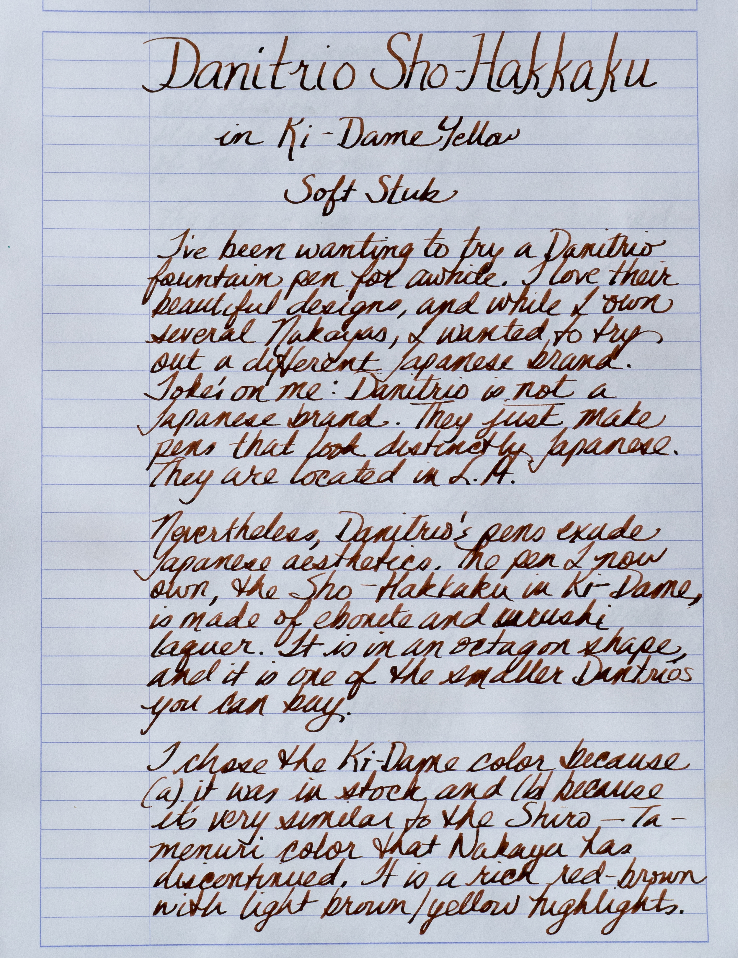
Danitrio pens exude Japanese aesthetics. The pen I now own, the Sho-Hakkaku in Ki-Dame Tamenuri, is made of ebonite coated in Urushi lacquer. It is an octagon shape, and it is one of the smaller Danitrios you can buy.

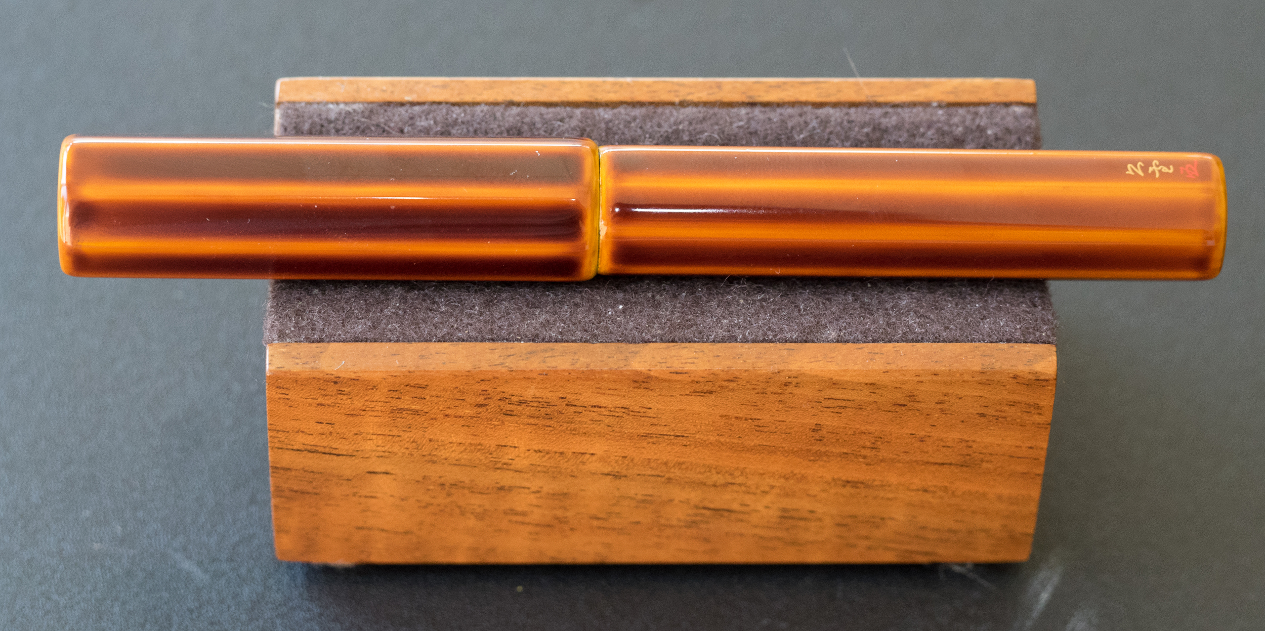
I chose the Ki-Dame (yellow) color because (a) it was in stock and (b) it is very similar to Nakaya's discontinued Shiro-Tamenuri color. It is a rich red-brown over a yellow foundation which will show through more as the pen ages.

My Sho-Hakkaku is clipless, which suits me fine. I only use clips as roll stoppers, and the Sho-Hakkaku doesn't roll easily because of the octagonal shape.

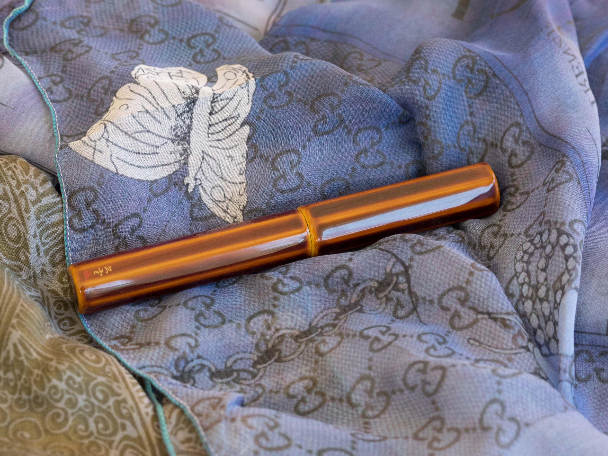
The pen is simple and uncluttered–the only ornamentation is the artist's signature in gold and red kanji on one facet of the barrel. I love this small, beautiful detail.

The portion of the barrel where the cap screws on is black, and I like how that contrasts with the rest of the pen.

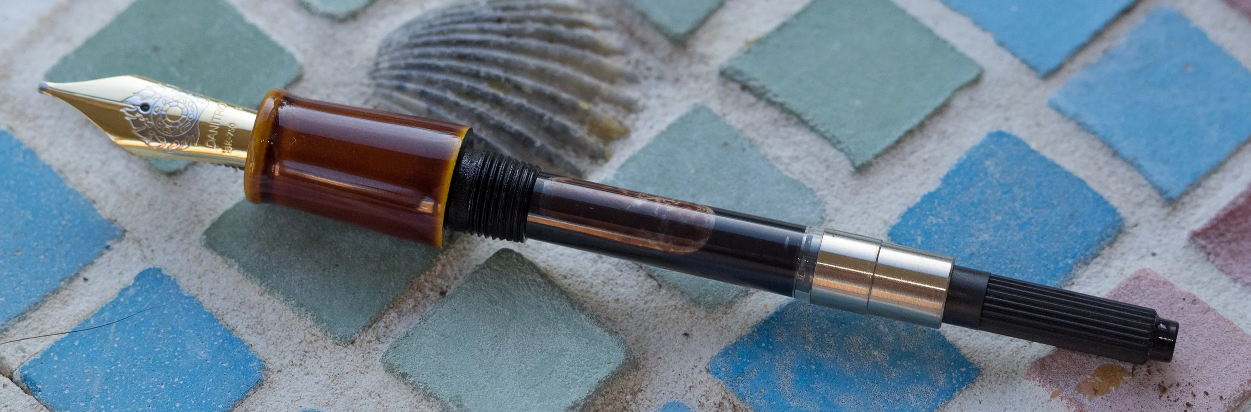
The Sho-Hakkaku comes with a big, gorgeous, ornamented #6 18K nib.

I opted for the soft stub because I heard that it was a delight to write with. And it is. The stub offers nice line variation without any pressure, but when you apply pressure the lines really pop.

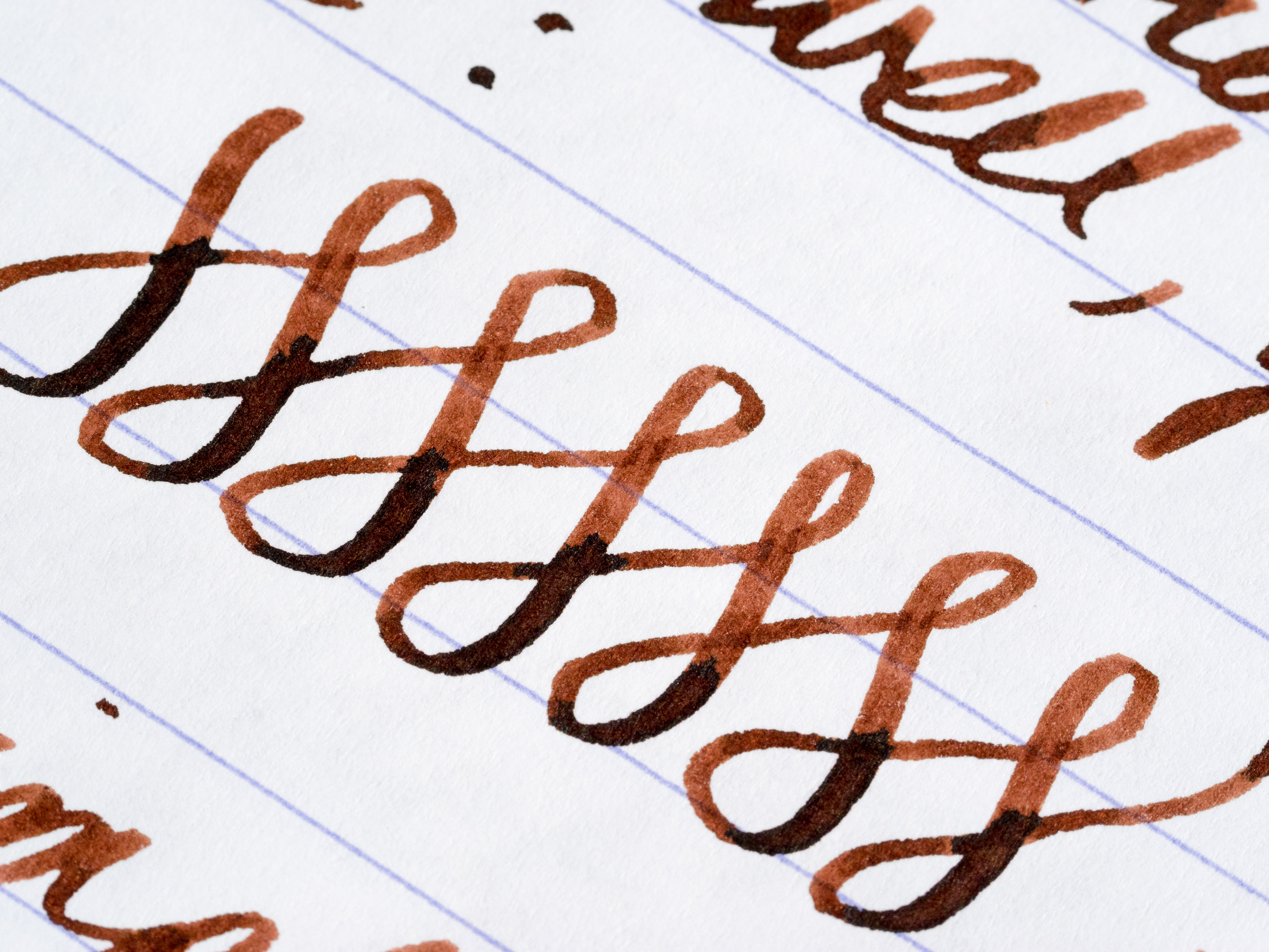
The nib writes smoothly, and the feed has no trouble keeping up with the stub's ink demand even when flexed.

The pen is a cartridge/converter. I wish it were one of Danitrio's eyedropper pens, but the converter holds a decent amount of ink and is well made.

Like Nakaya pens, the Danitrio comes packaged in a soft wood box lined in red velvet. Unlike Nakaya, there is no kimono. In all honesty, I rarely use my Nakaya kimonos, but I missed that added special touch. The pen did come with a polishing cloth.

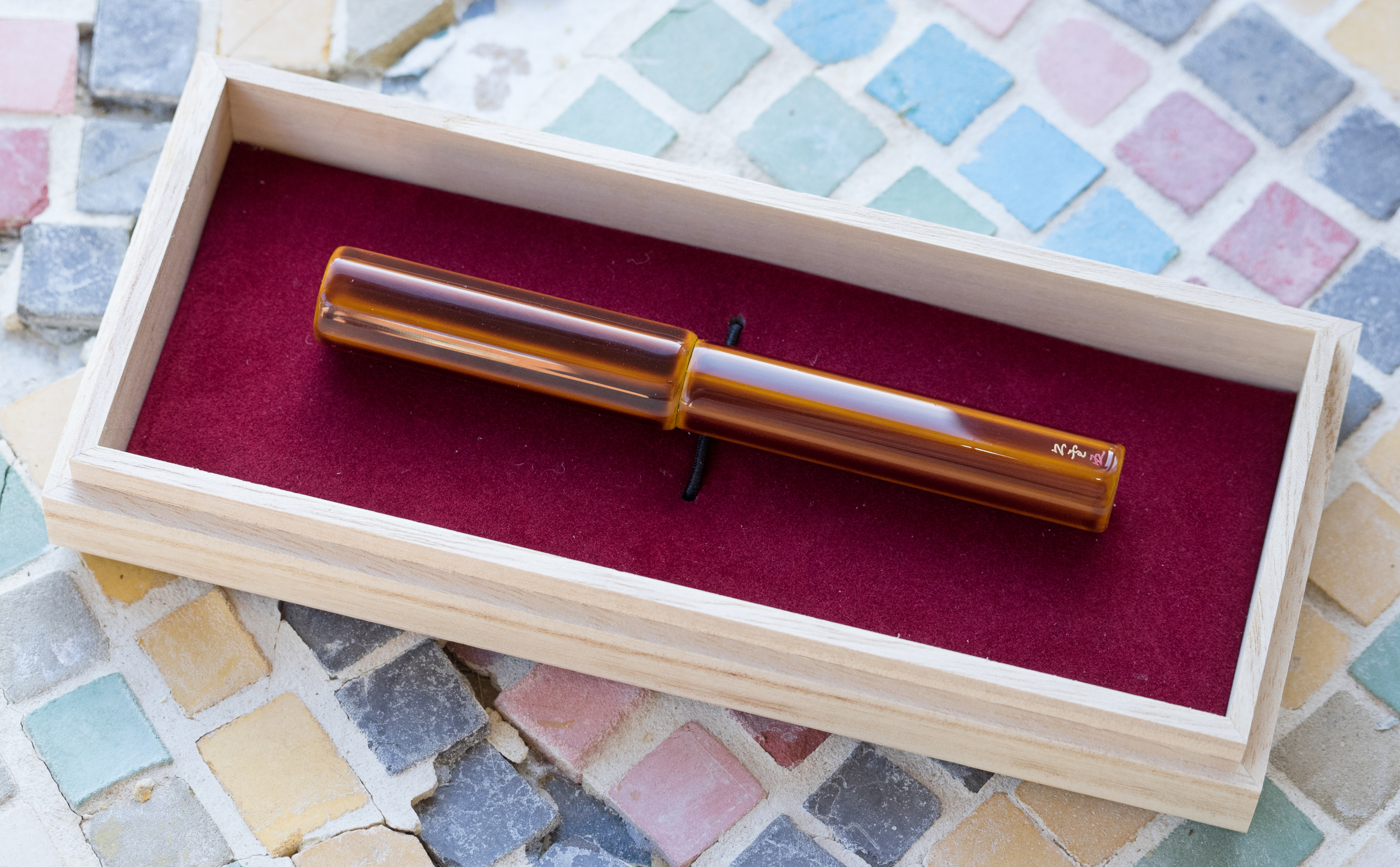
The Sho-Hakkaku is one of Danitrio's smaller pens. It measures 5.31 inches capped and four inches uncapped. The cap cannot be posted. The barrel width (0.6 inches) makes it fatter than many other pens, but it's not uncomfortable to hold (the grip section is .45 inches). The pen weighs only 27.5 grams so you don't notice its size at all, despite the barrel's girth.

The only negative comment I have about this pen is the purchasing experience. Apparently, ordinary people cannot order directly from Danitrio nor can they contact the company directly. I went through Classic Fountain Pens (nibs.com) to purchase my pen.

Unfortunately, it's impossible to know what pens you can actually order using the nibs.com website. Unlike Nakaya, there is no availability chart for Danitrio pens. Consequently, I had no idea which pens might be in stock for purchase. After searching through all the pens on nibs.com as well as on the Danitrio site, I tried to purchase a pen. This led to a long, confusing email exchange over a period of three weeks, during which the nibs.com folks mediated between me and Danitrio. All I wanted to know was which pens Danitrio had in stock. At one point, a nibs.com representative told me you "can't ask them too many questions at once because they get confused." Seriously? The Danitrio people get confused if you ask them which pens they have in stock?

In any case, it took a long time to place an order for my Danitrio, and that was for one they actually had in stock. If you order something not in stock, be prepared for a three to eight-month wait or longer. I think this girl needs some Zen patience if she ever orders another Danitrio. I drove the longsuffering people at nibs.com crazy.

As impatient as I was, it was worth the hassle. The Sho-Hakkaku is absolutely beautiful. I've read that some people think Danitrio's ebonite pens aren't as well crafted as Nakayas. But I'm completely satisfied with mine. It seems every bit as beautiful as my Nakayas.

If you like Japanese-style pens and are unfamiliar with Danitrio (as I was), you ought to check them out. Although you can't buy directly off the Danitrio website, it's fun to go through all their models, especially the $20,000 ones (none of which I will be purchasing).

My Sho-Hakkaku was by anyone's standards very expensive ($960). Danitrio does not make inexpensive pens, but neither does Nakaya. Expect to pay a premium for Urushi pens, regardless of the company.

Pros

  • A stunning pen in unusual colors.
  • Gorgeous, huge nib with multiple nib size options.
  • The soft stub is a fantastic writer offering smooth writing without pressure and wonderful line variation with pressure.
  • The kanji signature adds a nice touch to an otherwise unadorned pen.
  • The octagonal shape accentuates the foundation color of the pen and the Urushi makes the pen glow.
  • Almost weightless in the hand, making the pen comfortable for long writing sessions.

Cons

  • Difficult and confusing to place an order.
  • Some might not like the cartridge/converter system.
  • Expensive. Very expensive.
Posted on October 23, 2015 and filed under Fountain Pens, Pen Reviews, Danitrio.

Pelikan M205 Amethyst Fountain Pen Review

(Jeff Abbott is a regular contributor at The Pen Addict. You can find more from Jeff online at Draft Evolution and Twitter.)

The Pelikan M205 is one of the highly regarded "entry level" fountain pens out there, and one of the best options for an affordable piston-filler pen. Sure, there's TWSBI, but what if you want something in a solid barrel, or with other color options? Pelikan has you covered.

If you remember, I wrote about the new Pelikan Edelstein ink for 2015 last week — Amethyst. Well, Pelikan also created a special version of their popular M205 with the same color for 2015. That's right — a semi-translucent amethyst barrel. It's gorgeous, but it's also my first experience with a Pelikan pen. The Amethyst Pelikan M205 is a pretty pen, but how does it write?

Like I mentioned, the M205 is a piston-filler fountain pen that comes with a steel nib. Pelikan, a German fountain pen and ink company, are known for their beautiful line of fountain pens and inks that many people collect or wish to try. There's always plenty of Pelikans at the pen shows I've attended, so I'm surprised I'm only just getting around to trying one out. First impressions? It's a fantastic pen.

Aesthetics

The Amethyst M205 is an amethyst demonstrator. Yeah, you can see the innards of the pen, but the amethyst resin is fairly dark, so you mostly notice the color of the pen instead of the insides. To me, it has to be translucent to give the proper effect. Remember, the color is taken from the gem, which is also translucent. In my opinion, it looks great.

Pelikan M205 Amethyst vs Pearlette.jpg

The pen is smaller than I expected. It's much smaller than a TWSBI or Lamy Safari. It's even smaller than a Pilot Metropolitan. The closest sized pen I own is the Edison Pearlette. It's nearly identical in size, which is fairly small. I'd say it's also similar in size to a Pilot Prera.

The Pelikan logo sits atop the cap of the pen and is hard to miss. Personally, I like the logo, so I really appreciate the emblem on top. It's classy — black and white — so I think it goes well with the pen. Then, the clip is another favorite feature of mine. It's strong and works well, but I think it's a great-looking clip. It has a nice swoop at the business end, and it's always really easy to clip the pen to a case, pocket, bag, etc.

The cap screws on and has a good quality feel. The pen can post, but I tend to use it unposted. The piston mechanism also feels really great.

The furniture/accents on this pen are silver, not gold.

The nib is fairly plain compared to other nibs. There's not much on it besides the Pelikan logo and nib size indicator. It's a long and skinny nib, which matches the pen's overall aesthetic.

Overall, I think it's a very handsome pen.

Writing

So, how does it write? It's mediocre. With my copy of the pen, it was a little scratchy at first. Some minor adjustments mostly cleared up the issue, but it's still not perfectly smooth. It's an EF nib, but it's still possible to achieve a glassy feel even in a nib of this size.

If you've owned a few pens in your day, you know that nib issues are fairly standard ground with most pens in this price range. Still, it's disheartening to spend $140 on a pen that doesn't write perfectly since that's the primary function.

Still, with the slight scratch, it writes well. There's never been a flow issue, it does fairly well after being unused for a day or two, and it feels great in the hand.

Overall

The Amethyst Pelikan M205 is a beautiful pen. It's a great size for a small pen, and it has some really nice features. If the color really grabs you, you'll love this pen. If the color isn't your thing, I think you could find something more enjoyable in the same price range. For example, for about $20 or $30 more, you could buy a Lamy 2000 or a Pilot Vanishing Point — both with gold nibs. The Pelikan has a steel nib, but it also features a design that is unique to Pelikan. So, if it calls to you, go for it! It's a timeless design that will never get old.

(Goldspot Pens provided this product at no charge to The Pen Addict for review purposes.)

Posted on October 21, 2015 and filed under Pelikan, Pen Reviews, Fountain Pens.

First Look: Pen Type-B from CW&T

It's a good time to be a Kickstarter pen fan, isn't it?

This weeks First Look comes from my old friends Che-Wei and Taylor, better known as design group CW&T. Possibly even better known as the team who brought you the Pen Type-A. They were kind enough to get one of the early builds of the Pen Type-B into my hands for review, and for that I am very thankful.

Many of you have heard of the Pen Type-A, and for those who haven't, you have quite a bit of catching up to do! The Pen Type-A was the first Kickstarter pen to break through to the mainstream, and with that came money, exposure, failure, theft, and more. It was quite the story during the production and fulfillment process. The Kickstarter updates and comments section are worth reading if you have several hours to spare. NOTCOTdid a good job of rounding up the details if you are looking for the shorter version.

With the learning experience of all learning experiences behind them, Che-Wei and Taylor set out to improve on the Pen Type-A. Not just improve actually. They believe in the Pen Type-B so much they are calling their shot: This is the last pen they will ever design.

At it's core, the Pen Type-B is the barrel of the Pen Type-A with a new exterior sleeve to make the pen portable, which the Pen Type-A wasn't. The sleeve isn't just an afterthought either. It is solid brass, machined to such a tight tolerance that it creates a piston-like effect when pulling the barrel out and sliding it back in. Again, just like the Pen Type-A did.

The brass sleeve is something special. It is stunning to look at and hold, and the addition of a single flat side on the sleeve serves as the perfect roll-stopper. It is HEAVY though. When I opened the package and grabbed it for the first time I let out a "whoa", then did the whole balance in my palm lift it up and down thing. I got used to it the more I carried it around, but if you are planning on carrying it in your pocket you will want a tight one, like found in jeans to prevent the pen (like a phone) from bouncing around too much. You also probably aren't going to write with the sleeve posted either. It's doable, but the balance is a little off. I don't post it to write with personally.

The fatal flaw with the Pen Type-B, as many will point out, is the use of the Pilot Hi-Tec-C refill. Both universally loved for its crisp, clean lines, and loathed for its tendency to fail, it is a divisive refill. And rightfully so. I'm on the side of the fence that puts up with it because when it works it is impossible to beat the output. So far, no issues with my refill in the Pen Type-B, and I wonder if the tight tolerances will even help keep the tip from drying out? Only time will tell. And if you like the design but hate the refill, CW&T lists other compatible refills that will work with the addition of a spacer.

I'm a backer of this pen on Kickstarter, and now that I have had the chance to sample one, I am an ecstatic backer. This is one of those pens that will cause some reshuffling of the deck, if you will. I can only carry so many pens at a time, and one of them is going to be relegated to the desk when my Pen Type-B arrives.

My thanks to CW&T for sending me one of their few pre-production samples for review.

Posted on October 19, 2015 and filed under Kickstarter, Pen Reviews, Pen Type-A, Pen Type-B.