(Jeff Abbott is a regular contributor at The Pen Addict. You can find more from Jeff online at Draft Evolution and Twitter.)
My experience with Monteverde is fairly limited, as I only have one fountain pen from the company. That being said, that one fountain pen is one of my favorite and most dependable pens I own.
The Artista was a complete impulse purchase — I had no clue about the company at the time, but I liked how it looked. That pen grew on me quickly for its smooth writing experience, mesmerizing demonstrator body, and silver accents. I still highly recommend that pen to new fountain pen users as a 2nd or 3rd pen after trying out cheaper pens.
Trying out a Monteverde Invincia had me excited from the start. I've seen these pens at every pen show I've been to and have always been drawn to the design and colors. For some reason, I'd never pulled the trigger. Well, I finally had a chance to try one out and put it through the paces. The Invincia, like the Artista, is a solid fountain pen that many people will enjoy.
Look and feel
The Invincia has a nice heft to it that lets you know that the barrel and cap are made of some type of metal. It's not as heavy as a Karas Kustoms Ink, but not as light as a Pilot Metropolitan. It's a nice weight when writing unposted.
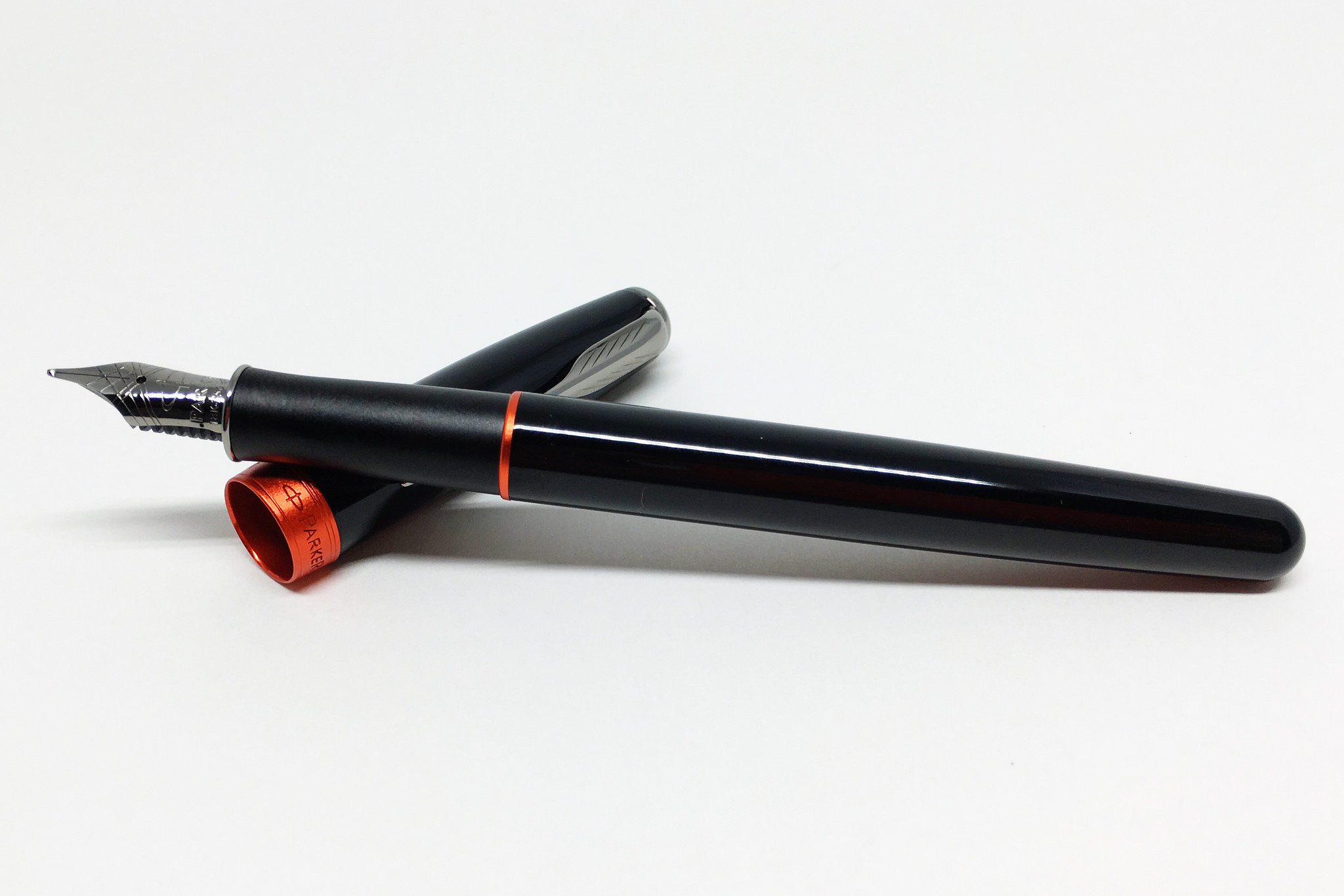
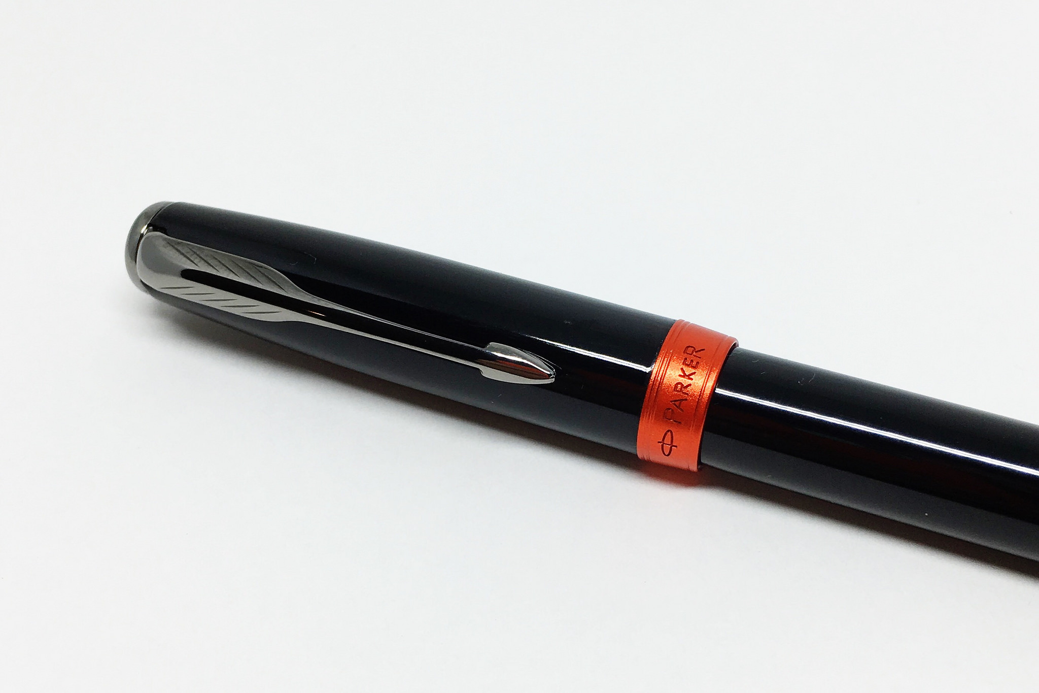
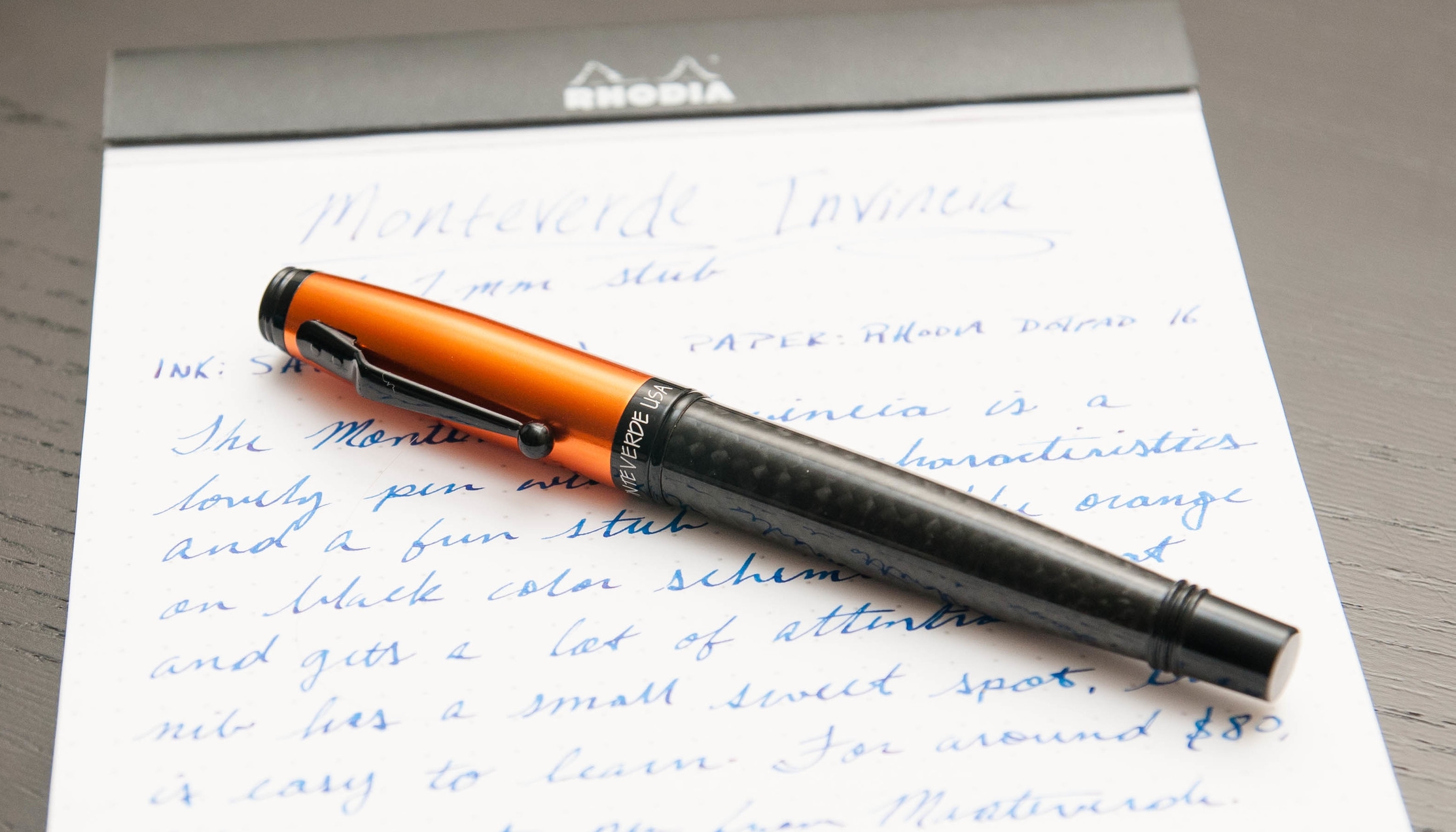
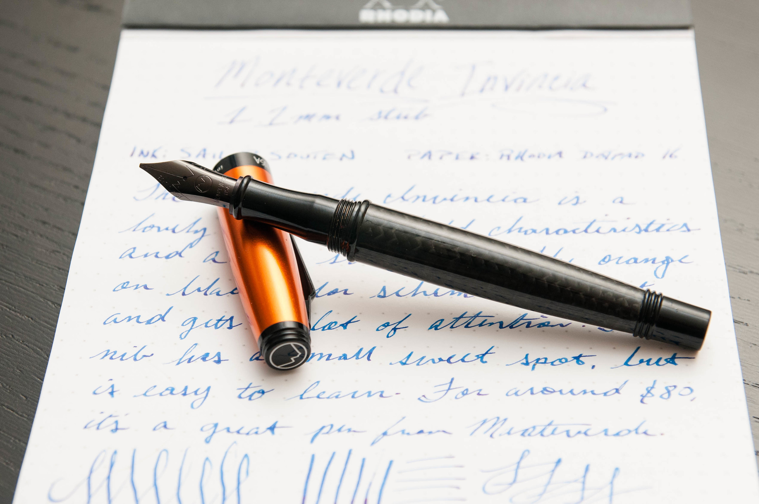
The model I have is the Orange Carbon Fiber. Now, the name implies that it's made out of an orange-colored carbon fiber material, but that's (sadly) not the case. Instead, the cap is a bright, shiny orange and the body is made of a carbon fiber (or carbon fiber imitation — I'm not good at telling the difference). Overall, it's a stunning combination of textures and colors. I love the dark gray carbon fiber mixed with the bright orange pop.
The clip is a unique shape, and one that I've only seen from Monteverde. It has a sharp angle just outside off the cap, but has a nice ball shape at the end to make clip use easy when clipping or removing it from different things.

The cap is a twist off, but only requires a quick turn to cap or uncap — not like your average screw lid. It's somewhere between a friction cap and a screw cap. I really like the secure motion of using the cap on this pen. I never have to wonder if I'm over-tightening or if it's really secured. The cap posts perfectly, but makes the pen feel a bit too top-heavy, so I normally write with it unposted.
The grip section is made of metal, and is very smooth and nicely contoured. There's a nice lip at the end of the grip to provide a place for your finger tips to rest when writing. For me, the grip section is very comfortable. Even though it's smooth, I haven't had any issues with grip or slippiness.
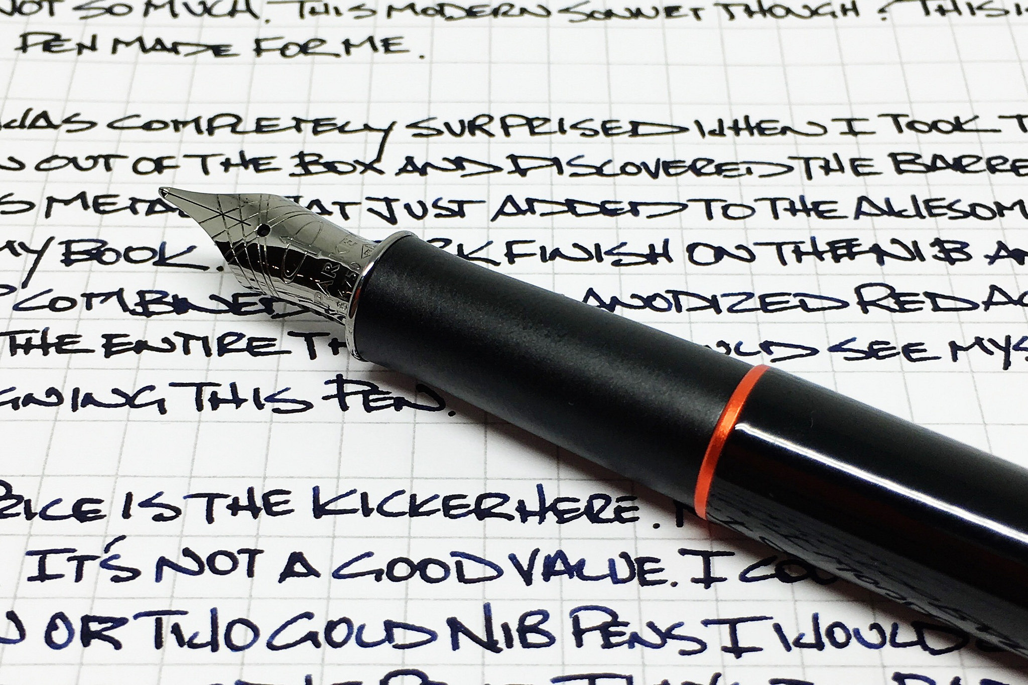
The nib on this pen is one of the most striking visual pieces. It's a long, elegant shape, but it's also completely black. It has minimal branding etched into it, so that shiny black goodness can really take the spotlight. I'm never expecting a black nib when I open a pen, and this one still delights me when I uncap the pen. It's a really well-shaped nib and the black color really sets it off.

Writing
A pen might look and feel amazing, but a bad nib can ultimately ruin it. These pens come with a range of nib options, from Fine, Medium, Broad, and Stub. The stub nib is a 1.1mm nib that lays a very nice line. I have the stub version, and I've mostly been happy with it.
First, the good things about the nib. It's smooth, flows well, and makes some fantastic line variations from the stub nib. Even though they call it a stub, it has some distinct line edges that resemble a couple of italic nibs I have. Stub nibs usually have softer edges, but each manufacturer interprets these nib sizes and specifications differently. In the case of Monteverde, it looks like the value a crisper line over a forgiving position. And that brings me into the bad part of the nib.
When you move into specialized nibs, one of the first things you'll encounter is certain characteristics and nuances that only exist in specialized nibs. For example, stub and italic nibs have a large flat edge designed to create dramatic line variation. The trade-off in these nibs is that there's a small "sweet spot" when using the pen. You have to hold the pen a certain way against the paper in order to keep it writing smoothly. If you rotate either way, it will either scratch, skip, stop, or a combination of all three.
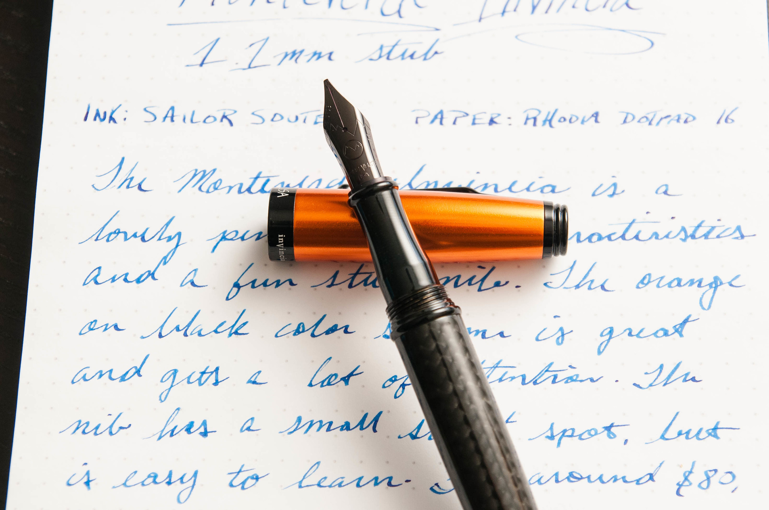
In the case of the Monteverde stub nib, it has a fairly small sweet spot. It's nothing that I classify as a deal-breaker, but it is something that causes me some frustration. Like all pens, it has a personality when it comes to writing, and I've come to learn how it likes to be treated when writing. When held properly, it really is a beautiful, well-behaved nib.
That being said, specialized nibs create specialized opinions. What I dislike about a nib, another person might love. So, take my quibble with a grain of salt.
Overall
As a pen, the Invincia is beautiful, eye-catching, well-balanced, and fun to use. I love the amount of variation I can get from the steel stub nib, and I love the weight and feel of the pen in my hand when writing. Apart from my own nib preferences, this pen has no downsides for me. I'm happy that it's part of my collection alongside my Artista.
You can find the Invincia in a variety of colors and nib types from Goulet Pens. As I'm writing this, they have black, blue, lime green, and orange in stock, all of which look as nice as this one.
(Goulet Pens provided this product at no charge to The Pen Addict for review purposes.)