Posts filed under Pen Reviews

The Parker Vacumatic

(Ron Gilmour is a fountain pen enthusiast, would-be calligrapher, and librarian. You can find him online at Twitter @gilmour70 and Instagram.)

In the introduction to this series, I mentioned that one of the drawbacks to the various sac-filling pens was ink capacity. Because you need room for the sac itself and whatever is compressing it, there's a limit to how much ink you can get into a sac-filling pen.

In the 1930s, Parker came up with an interesting solution. What if suction could be created in the entire pen barrel rather than just the sac? They replaced the sac with a flexible diaphragm at the rear of the pen. When the diaphragm was pushed inward by a plunger, air was forced out of the pen. When the diaphragm was released, ink was taken up. A breather tube was added to prevent ink taken up by one stroke of the plunger from being squeezed out by the next stroke. This innovative mechanism, eventually dubbed the "Vacumatic," allowed a far greater portion of the barrel to be filled with ink than any sac filler.

Another drawback of sac fillers was that it was impossible to see how much ink you had left. (Sheaffer tried to make lever-fill pens that would allow this, but were only moderately successful.) The smart people at Parker realized that once they had eliminated the sac, all they had to do was use some transparent material in the body and the ink level would be easily visible.

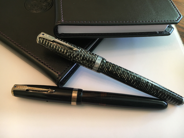
And that brings us to the pen's aesthetics. An innovative filling system and a visible ink supply were great, but the Vacumatic might not have been the success that it was if not for another factor: it was gorgeous. The alternation of solid and transparent bands of celluloid still turns heads today. (A friend refers to my silver Vac as "your Matrix pen.") The striking, arrow-shaped clip is a design element that Parker still uses on their pens today. The total package is an Art Deco masterpiece.

The "alternating bands" pattern, available in several colors, is the most common, but there were a number of other patterns, especially on the "junior"-sized pens. See, for instance, Brad's drool-worthy "Golden Web" Vac that he bought at last year's Atlanta show.

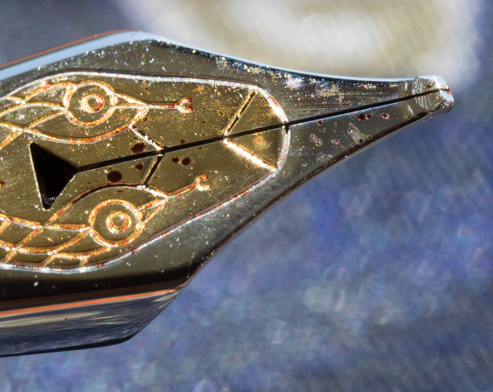
Furthermore, Parker in Days of Yore was known for their excellent gold nibs, so a great writing experience is almost guaranteed, barring a damaged nib. I've owned several vintage Parkers (Vacumatics and others) and they have all written smoothly and consistently.

If you're the collector type, Vacumatics are a lot of fun because of their seemingly endless variations. When you take into account the different sizes, colors, clips, cap bands, presence/absence of an end jewel, etc., one can happily collect Vacumatics for decades and never see the end.

Buying a Vac

When shopping for a Vac online, make sure that the pen you're considering is a usable size for you. The Vacumatic came in a wide variety of sizes, some of which are very small, which might not be your thing. You can't depend on model names: both of my Vacs are "Majors," but they're slightly different sizes. Make sure the seller provides measurements, or at least a picture that shows scale.

Also be aware that like sacs, Vac diaphragms are flexible parts that can break down over time. Make sure the pen you're buying has been tested and actually fills.

If seeing the ink level is important to you, make sure that you buy a pen with good barrel clarity. Many vendors will provide back-lit photos to demonstrate this quality.

Nibs on vintage Parkers, and many other vintage pens, have no visible size indication. Most reputable sellers will give you a good indication of nib width in their description: "Writes a wet western fine" or similar. It may be helpful to ask for a writing sample on a known paper marking (e.g., Rhodia grid) to help you judge the nib width.

Given the large number of variations mentioned above, prices will be greatly influenced by the rarity of the particular combination of features on a pen, along with condition. For a functional, but not cosmetically perfect, Vacumatic in one of the more common models, you can expect to pay about $100-150 US. Prices can get significantly higher for rare colors and patterns, for pens in pristine condition, and pens with unusual nibs.

Filling a Vac

Filling a Vacumatic is simple, but may take a few seconds longer than some other mechanisms. First, remove the blind cap at the back end of the pen to expose the plunger. Submerge the nib completely in the ink bottle. Depress the plunger. You should hear bubbling as air is forced out of the pen. Release the plunger and hold the pen in place while ink flows into the pen. Repeat this sequence (press, release, wait) until you no longer hear bubbling when you depress the plunger. Wipe the nib and section with a paper towel, replace the blind cap, and you're ready to write.

Cleaning a Vac

So here's the bad news: Vacumatics are a pain to clean. You can expel ink from the pen by depressing the plunger slowly. Then you can suck water into the pen and slowly depress the plunger to expel that. Repeat this until a) the water comes out clean or b) you're hungry, your thumb hurts, and you just don't care anymore.

Do yourself a favor and use easy-to-clean inks in your Vacumatic.

In Closing

The Parker Vacumatic is one of the most iconic vintage American fountain pens, and is also a beautiful and practical choice for the modern fp user. They are more expensive than some of the other models we will look at in this series, but the combination of exquisite celluloid, large ink capacity, sturdy construction, and high-quality gold nibs makes them a good buy. Try finding that set of features in a modern pen for under $200 US.

Further Reading

Posted on July 28, 2016 and filed under Parker, Vacumatic, Pen Reviews.

Sailor Pro Gear Slim Four Seasons Haruzora Spring Sky Fountain Pen Review

Out of the top three Japanese pen brands, Sailor does the best job of mixing in limited and seasonal releases alongside their primary fountain pen offerings. My favorite manufacturer, Pilot, is the the worst in this area, with Platinum not doing much either, unless it relates to a Japanese lake.

Sailor, on the other hand, seems to enjoy putting out a few extra releases each year. And whether they revolve around neon colors, seasons, cities, or galaxies, they always seem to be interesting.

In late 2015, Sailor released the Pro Gear Slims Four Seasons lineup, featuring four colors: Haruzora Spring Sky Manyou, Summer Woods Meigetsu, Autumn Moon Yukitsubaki, and Winter Camelia. All feature unique resin colors to match the seasons, and 14k Medium Fine nibs.

It was hard to choose which one I wanted to review from Goldspot. An argument could be made for any of them actually. I thought Haruzora Spring Sky with its bright metallic light blue barrel was the standout, and, judging by the response on social media, I think I chose correctly.

The stark black end caps matched with the bright blue barrel and gold trim makes every bit of this pen pop. Although the blue isn’t a perfect match, I find the look to be Tiffany-esque. It’s classy, clean, and eye-catching.

Bottom to top: Pro Gear Slim, Pro Gear, 1911, King of Pens

The Sailor Pro Gear Slim, often called the Sapporo, is the smallest and lightest of Sailor’s gold nib pens. Despite that, it is a comfortable writer for all but the biggest of hands. Even when posted it remains light and well-balanced.

Sailor nibs are considered some of the best in the world, but I personally rank them behind both Pilot and Platinum. That is relative of course, like how I said above that Pilot is the worst among the three with seasonal releases. They are still wonderful, as are Sailor nibs. They have more tooth when compared to the smoothness of Pilot and precision of Platinum. Placing them third among that group is like saying someone is the third best supermodel in the world.

If you have never owned a Sailor fountain pen and were shopping for one of their gold nib models, my recommendation would be to go for the standard Pro Gear due to the larger barrel and nib. Yes, it is more expensive, but if it is your one and only Sailor it will make you the happiest in the long run I believe. If you have tried a Sailor and are familiar with the Sapporo size then you will certainly enjoy the unique colors of the Four Seasons series.

(Goldspot loaned this product at no charge to The Pen Addict for review purposes.)


Enjoy reading The Pen Addict? Then consider becoming a member to receive additional weekly content, giveaways, and discounts in The Pen Addict shop. Plus, you support me and the site directly, which I am very grateful for.

Membership starts at just $5/month, with a discounted annual option available. To find out more about membership click here and join us!

Posted on July 21, 2016 and filed under Sailor, Fountain Pens, Pen Reviews.

The Montblanc Heritage Rouge et Noir Coral Fountain Pen: A Review

(Susan M. Pigott is a fountain pen collector, pen and paperholic, photographer, and professor. You can find more from Susan on her blog Scribalishess.)

I've long been entranced by the Montblanc Agatha Christie Writer's Edition–that serpent clip and nib are so fabulous. When Montblanc announced the Heritage Rouge et Noir edition, I fell in love immediately. I mean, what's not to love? A Montblanc pen in coral (coral is the new black) and a serpent clip with green spinels for eyes and a serpent nib–all for a price significantly less than an Agatha? I knew I had to have one.

I ordered my pen from Appelboom and requested a special factory-made oblique medium nib.

"This," I told my beleaguered husband, "will be my Mother's Day, Anniversary, Birthday, and Christmas gift!"
"Okay," he said, "but you can't open it until Christmas."
"Sure!" I said. "I can totally wait until Christmas."

But, sacrifices have to be made for the Pen Addict. What's the point of waiting until December to review this pen when all of them might be sold by then? No. Pen Addict readers need to know whether or not they should buy this pen themselves. I am such a fountain pen martyr that I opened it for your sake, good readers. But, I promise that I will clean it thoroughly, put it back in its box, and save it for Christmas once I'm done with this review. Really!

The Montblanc Heritage Rouge et Noir is part of a retro series Montblanc embarked on with the Heritage 1912 (see my review here). The Heritage Rouge et Noir series–one in black, one in coral, and one in black ebonite–hearken back to the 1906 safety-pens, though the modern ones are piston fillers. Taking a cue from the past, the pens have large snowcaps/stars on their finials and a retro-looking serpent clip.

I chose the coral version because, frankly, I'm tired of black pens. Plus, the serpent on the coral version has green spinels for eyes whereas the black version has no jewels. The far more expensive ebonite version has rubies for the serpent's eyes.

The packaging for the Heritage Rouge et Noir is pretty understated for Montblanc. The pen is housed in a black and cream clamshell cardboard box (albeit a nice cardboard box) with a cream velvet interior. A leaflet accompanies the pen.

Aside from the added flare of the serpent clip and nib, this pen is a simple design. The barrel is made of lacquered metal with an antique-looking metal grip. The cap threads are on the nib end of the grip, so your fingers don't contact them. The piston knob is set off with a metal ring that matches the grip. The knob turns on metal threads, and I'm pretty sure there's a ball or agitator inside the piston housing to keep the ink flowing. I can hear it when I shake the pen.

The cap is made of resin with a large cream-colored snowcap/star with a ridged ring around the finial. These details evoke the look of the 1906 safety pens.

An old-style Montblanc logo is etched into the side and matches the cream color of the star.

Of course, the highlight of the cap is the serpent clip. The tail wraps around the cap twice and the upper body of the serpent forms the clip. Montblanc says that the clip is made of a special alloy that has been "aged by a unique galvanic and stripping process." The green crystal serpent eyes glint in the sun and make me smile.

The nib is 14K gold, rhodium-plated with a golden engraved serpent (the black model has a single-tone nib, whereas the ebonite model also has a two-tone nib). The triangular breather hole nicely melds with the serpent's head. It is a striking design (pun intended).

The nib is small but in proportion with the rest of the pen. Unlike the Heritage 1912 nib which has a vintage, springy feel to it, this nib has no "give," unfortunately.

The oblique medium grind offers some line variation and accommodates my tendency to rotate the pen while writing. It took me a little practice to find the sweet spot, but, once I did, the nib wrote smoothly. For some reason the feed doesn't deliver as much ink as I'd like, so periodically I have to shake the pen to get the ink flowing more. It's not that the pen ever completely stops writing or skips, it's just that the ink flow slows down.

I should note that getting my Rouge et Noir with the OM nib took some time. I ordered the pen on April 9, but Appelboom didn't receive it until late June. The specialty nibs are simply not well stocked by Montblanc.

So. How does my Mother's Day, Anniversary, Birthday, and Christmas pen measure up? In terms of quality and beauty, this pen is outstanding and gorgeous. But, dang it, it's just too skinny. It measures 135mm in length, capped; 125mm uncapped; 160mm posted but is less than 10mm in diameter at the grip. Although the proportions are elegant and lean, it feels like a (rather heavy) Bic in the hand (horrors!).

The metal barrel gives the pen some heft, but my hand cramps up when I'm writing for any length of time. I love everything else about this pen, but I don't much enjoy writing with it, and that truly is a shame. Perhaps, with some time, adjusting my grip, and experimenting with different inks, I'll discover I can write with this pen without discomfort. Still, beauty and elegance won't heal hand cramps, so I may have to let this one go. Honestly, I think I really just want an Agatha, but this one almost scratched that itch.

The MB Heritage Rouge et Noir is available at many retailers and Montblanc boutiques. The list price for the black or coral resin versions is around $700.00. If you want the ebonite version, the list price is around $2,000.

Pros

  • The Montblanc Heritage Rouge et Noir is a well-crafted, retro-looking fountain pen.
  • Despite its svelt girth, the pen feels solid in the hand because the barrel is made of metal.
  • The serpent clip and nib are absolutely stunning. The coral color is a welcome departure from black.
  • It is a piston filler, though the ink capacity is rather small (less than 1ml).
  • The nib performs smoothly but does not have the spring of the MB Heritage 1912 nib.

Cons

  • Unfortunately, the pen is very thin in diameter. While this might not bother some people, others will find the pen uncomfortable to write with.
  • The pen is expensive (but that's true for all Montblancs).
  • The Rouge et Noir is quickly becoming more difficult to find. And, if you want a special nib, be aware that it takes a long time to obtain one.
  • I found the ink flow to be a bit stingy but need to experiment more with different inks.

I purchased this pen with my own money and was not compensated by Montblanc for this review.


Enjoy reading The Pen Addict? Then consider becoming a member to receive additional weekly content, giveaways, and discounts in The Pen Addict shop. Plus, you support me and the site directly, which I am very grateful for.

Membership starts at just $5/month, with a discounted annual option available. To find out more about membership click here and join us!

Posted on July 15, 2016 and filed under Montblanc, Fountain Pens, Pen Reviews.