Posts filed under Pen Reviews

Copic Multiliner Pen Review

(Sarah Read is an author, editor, yarn artist, and pen/paper/ink addict. You can find more about her at her website and on Twitter.)

With the Copic Multiliner, this is the first time that I have used a fineliner in a color other than black, and I'm totally in love with that, now. These have planted themselves squarely into the "things I didn't know I needed in my life" category. Unfortunately, while the ink makes these a fantastic product, the build of these pens makes me less likely to meet their price point unless I have a specific project in mind for them.

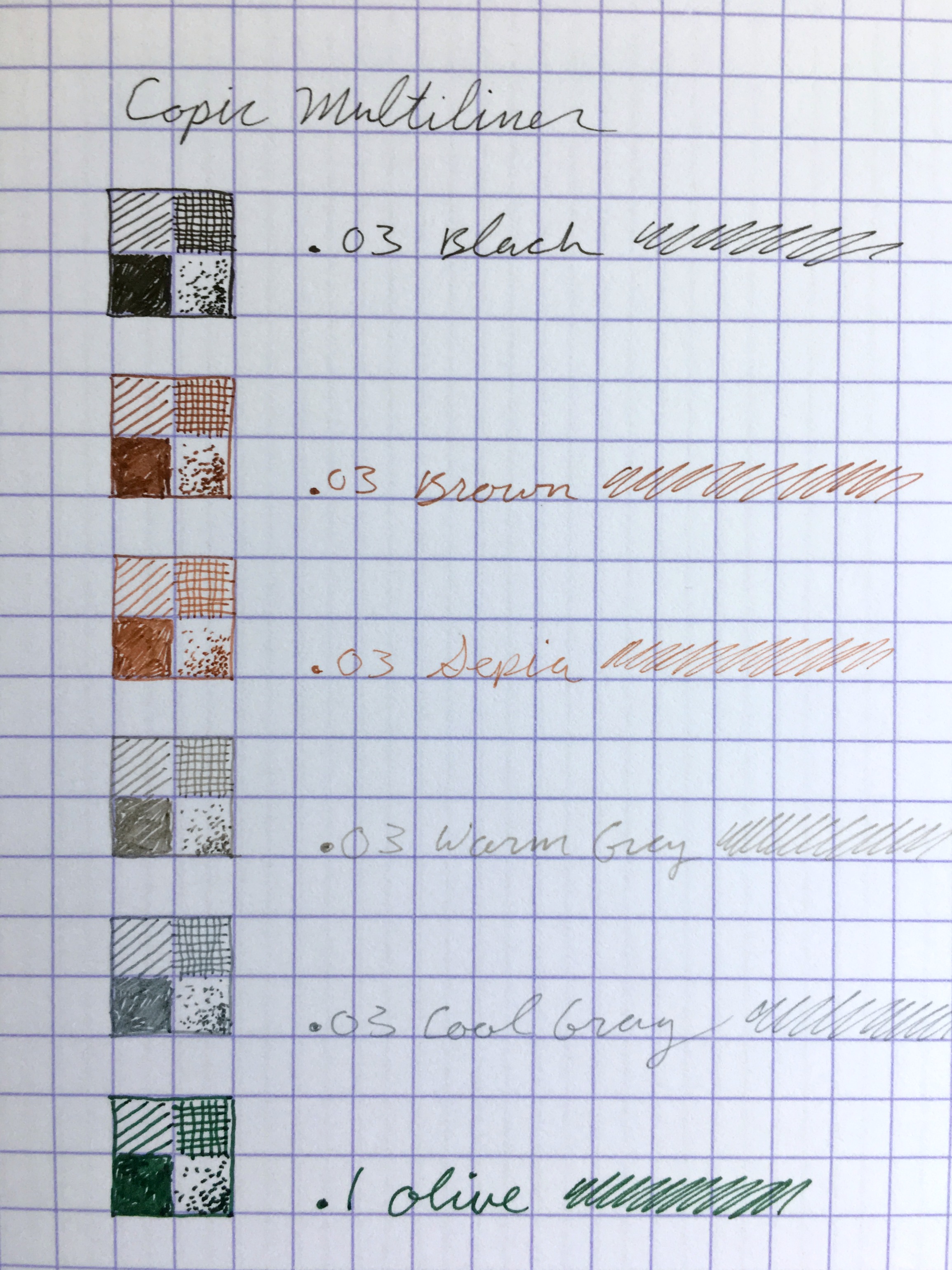
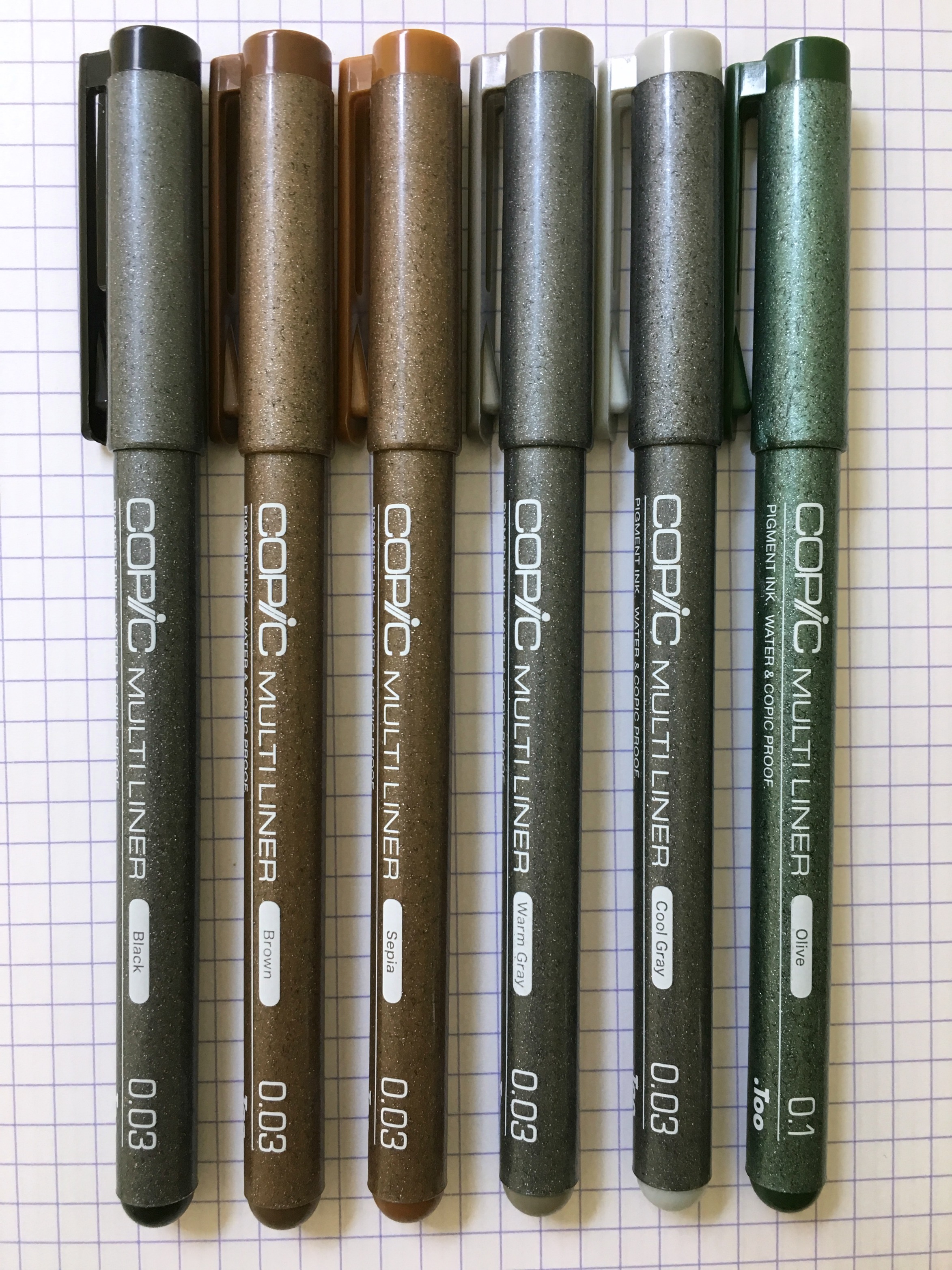
The strength of these pens lies completely in their pigment-based ink. It's waterproof, acid-free, bleed-proof, archival, and works with alcohol markers. It doesn't dissolve toner, so it's safe to use on printouts or photocopies. The colors are well-pigmented and leave solid lines. There's a range of ten colors available in neutral and natural tones that are perfect for sketching.

The tips are available in a huge range of sizes from .03 up to 1.0 in the felt-tips, and several sizes of sponge-tip brush tips. The long needle-point makes it easy to see your work as you sketch, and the tip runs over the paper with a good bit of feedback. The tips do wear out quite quickly on textured paper. Even on smooth paper, it feels like the .03 size, which is particularly fragile, wears out before the life expectancy of the pen. Because these are the disposable model of pen (unlike the refillable SP version), that life expectancy is more important, especially considering that these pens run $3.60 a pop.

These disposable models cost only a little more than a cartridge for the refillable version, and less than a refill and new tip for the SP model--which makes them, in general, a better investment than the refillable pen. That seems a bit backwards to me. But I think the issue here is that the ink and tip are really all you are paying for in the disposable version. It doesn't feel like much has been invested into the pen body at all.

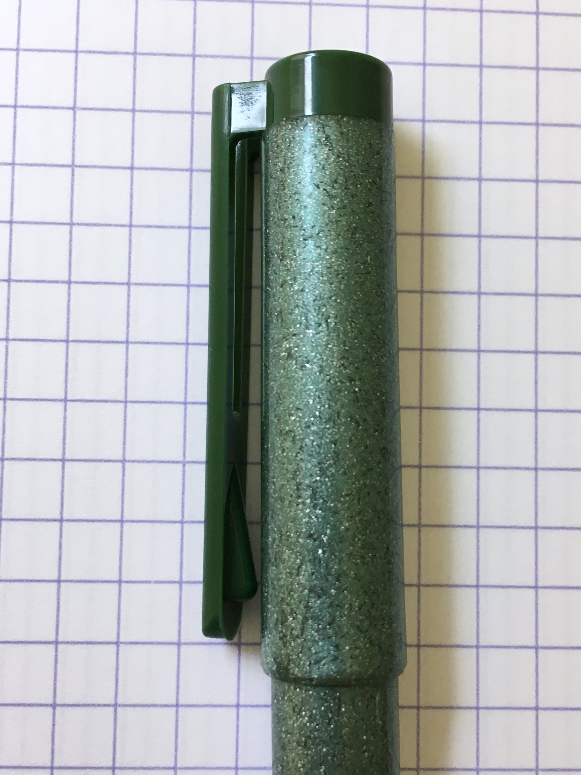
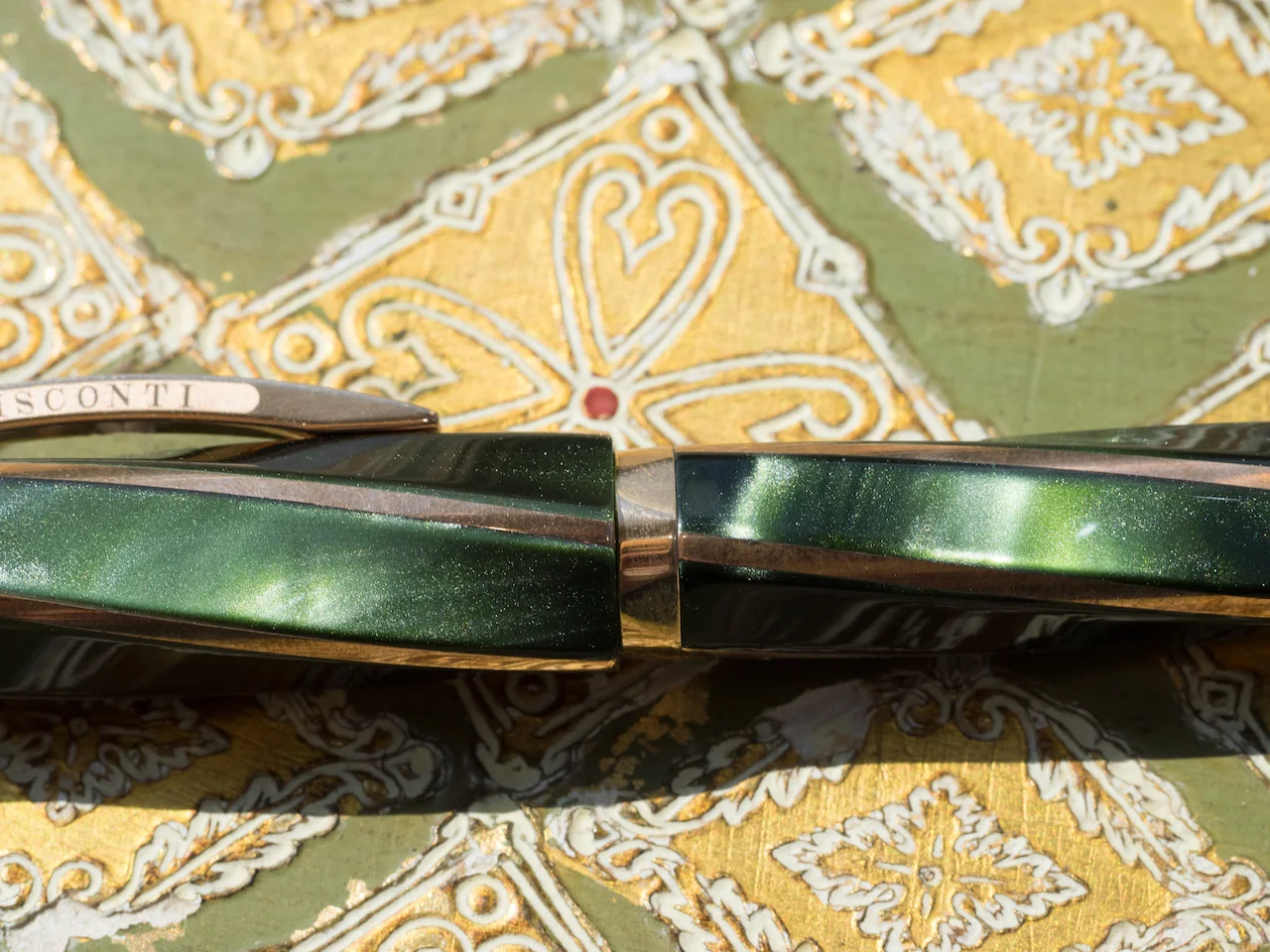
The body is made of a slightly sparkly, almost granite-looking plastic. I think that's a bit misleading. When I first saw them, I assumed they were glitter gel pens. When I realized they were serious business copic liners, I was surprised. I certainly don't see an architect carryiCg these into an important meeting. The quality of the plastic feels fairly cheap. If they weren't branded, I'd be guessing these came from a line that costs pennies per unit. The molded plastic has rough seams and edges, and the clip is so flimsy I can bend it way back with barely any pressure at all. The cap does post, but with a friction that feels ill-fitted and unreliable.

Basically, I think these pens are unicorns in mule clothing. I'm not likely to spend this much for a disposable pen that might wear out before it runs dry. But I am very likely going to need to outline something in olive green or lavender on occasion--and for that, I am very glad these exist.

(JetPens provided this product at no charge to The Pen Addict for review purposes.)


Enjoy reading The Pen Addict? Then consider becoming a member to receive additional weekly content, giveaways, and discounts in The Pen Addict shop. Plus, you support me and the site directly, which I am very grateful for.

Membership starts at just $5/month, with a discounted annual option available. To find out more about membership click here and join us!

Posted on July 20, 2017 and filed under Copic, Multiliner, Pen Reviews.

Aurora 88 Minerali Azurite Pen Review

I fell in love with the Aurora 88 Minerali Azurite the moment I saw it at the Chicago Pen Show. It was a very early preview, and I wasn’t able to share it at the time. I got the go ahead a few weeks back and shared it on Instagram, and now the same pen has returned to my hands for this review thanks to Kenro Industries.

When talking about this pen on the podcast I mentioned how if I were designing a pen for me that it would look a lot like the Minerali lineup. All five of the upcoming models have a clear demonstrator barrel with one of five color accents - Azurite, Diopside, Amber, Cinnabar, Amethyst - and each are limited to 388 units.

Azurite is up first, and the blue accents are wonderful. The acrylic has great depth and brightness, taking after the mineral it was named for. Each end of the pen is adorned with the color, along with a thin belly band around the middle of the pen.

Aurora’s nibs are what made me fall in love with them initially, and the medium nib on this 88 is perfect. Even as someone who loves finer nibs, I find the medium to have a narrower line than comparable European medium nibs. It was perfect out the box and is smoother than my two extra fine Aurora nibs that I love so much.

As perfect as this pen is for me, I do have one big hangup with it: The price. Street price from retailers that have it up for pre-order (available July 31st) is $716. That is a steep price to pay - too much for me in fact. I didn’t blink when I saw the Aurora 88 Nebulosa launch at the same price, but it is a much more impressive pen design in my mind. The purple acrylic and rose gold trim are breathtaking.

The Minerali pens don’t offer that wow factor with the price factored in. My Optima is nearly identical, with flat ends swapped out for round ends, and I was able to pick one up in the secondary market for under $500. As much as I want one of these, I’ll be waiting to see if I can pick one up down the line at a better price.

The want is there, but waiting is the right thing to do. If you can't wait, Vanness Pens has them available for $795.

(Kenro Industries loaned this product to The Pen Addict for review purposes.)


Enjoy reading The Pen Addict? Then consider becoming a member to receive additional weekly content, giveaways, and discounts in The Pen Addict shop. Plus, you support me and the site directly, which I am very grateful for.

Membership starts at just $5/month, with a discounted annual option available. To find out more about membership click here and join us!

Posted on July 17, 2017 and filed under Aurora, Fountain Pens, Pen Reviews.

Visconti Divina Elegance: A Review

(Susan M. Pigott is a fountain pen collector, pen and paperholic, photographer, and professor. You can find more from Susan on her blog Scribalishess.)

The Visconti Divina Elegance is one of those pen models that is distinctive. It is a spiral shape based on the divine proportion 1.618.

The pen arrives in typical Visconti packaging: an outer cardboard box enclosing an inner brown plastic clamshell box with a satin-like interior holding the pen. A booklet is included.

The Divina Elegance comes in a pearlescent green resin with gorgeous shimmer. The solid bronze trim complements the green resin perfectly.

The cap attaches with the Visconti hook and lock system, and for you OCD folks out there, the system means that the spiral accents line up perfectly every time (I love this!) I much prefer the hook and lock system to typical threads because the cap is quicker to open and close and it is absolutely secure.

See how the spirals line up perfectly?

The cap is adorned with a gold finial engraved with the Visconti logo.

And it has the spring-loaded Visconti clip that is effortless to use.

This Visconti fills via a pull and turn piston which is actually a captured converter. There’s no ink window to view your ink level, but an ink window would ruin the beautiful aesthetic of this pen. The converter holds approximately 1.1 ml of ink, which is fairly small considering how large this pen is.

Weighing 41 grams capped and 25 grams uncapped the Divina Elegance is heavy. But, it is so comfortable in the hand you don’t really notice the weight. The pen is well balanced unposted. I don’t recommend posting because the cap puts too much weight on the end and throws the balance off. The pen measures 152mm capped, 138mm uncapped, and a whopping 180.5mm posted.

The Divina Elegance is fitted with a 23K Palladium nib plated in rose gold. The rose gold is gorgeous with the green resin and bronze accents. The nib is engraved with Visconti’s beautiful scroll work.

This fine nib wrote perfectly straight out of the box. In my experience, Visconti nibs can be hit or miss, so I was very pleased with this one. It is rigid, unlike the Palladium nib on my Visconti London Fog, which verges on being semi-flexible (see my review here). Even though this nib doesn’t have any bounce or flex, it is wonderfully smooth.

I currently own two other Viscontis: the Homosapiens Bronze Age Maxi and the London Fog. I love both of those pens and each is beautiful in its own way. But I have to say that the Divina Elegance is one of the most beautiful pens I’ve ever held. There is something special about the shimmery green resin combined with the bronze and rose gold accents.

If you want to own this incredible beauty, you will pay a premium price. It retails for $1,195.00 at Goulet Pens. It’s always hard to say whether a pen is worth that much money, because worth is such a subjective thing. Is this pen extremely well made? Yes. Are the materials top notch? Yes. Does it write well without any problems such as skipping, blobbing, and inconsistent ink flow? Yes (though that is always dependent on the nib you get). Would I pay $1,195.00 for this pen if I had the money? Yes, for this pen I would. But, again, I realize not everyone would be willing to do that.

The only semi-negative thing I have to say about this pen (other than the relatively small ink capacity) is that the bronze accents will develop a patina over time. In fact, after just a few weeks the bronze accents on my loaner pen are starting to discolor. This isn’t a huge deal since you can easily polish and remove the patina. And, some people might actually like the patina as it develops.

You can order the Visconti Divina Elegance from Goulet Pens in various nib sizes, including EF, F, M, B, and 1.3mm stub. I’ll be honest, sending this beauty back is going to be very difficult.

Pros

  • In my view this is the most beautiful pen Visconti has produced thus far. The green resin has depth and shimmer and the bronze accents and rose gold nib complement the color perfectly. The spiral Divina shape is stunning.
  • I found the pen to be perfectly balanced in my hand. Even though it is a hefty pen, I was able to write page after page without any hand fatigue.
  • I like the filling system. Even though this model doesn’t hold as much ink as the Homosapiens or London Fog (which are vacuum filled models), the pull and turn system works just like a piston and is easy to use.
  • The fine nib on this model is smooth and trouble-free. I wish it had some bounce to it, but I was thrilled that it wrote so well. As stated in the review, I’ve found Visconti nibs to be hit or miss. I had to have my Homosapiens worked on twice. One of my Van Goghs had a troublesome nib. But my London Fog nib was perfect out of the box.

Cons

  • Obviously the biggest con for the Divina Elegance is the price.
  • People who require light pens will likely find this pen too heavy for sustained use. I’ve grown to prefer heavy pens, and I found this model extremely comfortable. If possible, try before you buy.
  • The bronze accents will develop a patina over time. If that bothers you, you’ll need to get a polishing cloth (I didn’t find one included with this pen, though one came with my Homosapiens).

Thank you to Goulet Pens for letting me borrow the Visconti Divina Elegance for this review.


Enjoy reading The Pen Addict? Then consider becoming a member to receive additional weekly content, giveaways, and discounts in The Pen Addict shop. Plus, you support me and the site directly, which I am very grateful for.

Membership starts at just $5/month, with a discounted annual option available. To find out more about membership click here and join us!

Posted on July 14, 2017 and filed under Visconti, Fountain Pens, Pen Reviews.