Posts filed under Pen Reviews

TWSBI ECO Fountain Pen Review, From An Artist’s Perspective

(This is a guest post by Nick Folz. You can find more of Nick and his work on his blog, Smallberry Drive, Twitter, and Instagram.)

I am a waking, talking pen cliché of 2016. I bought my first fountain pen last year, along with bottle of ink. Which pen and ink? The TWSBI ECO and J. Herbin Emerald of Chivor. See what I mean about cliché?

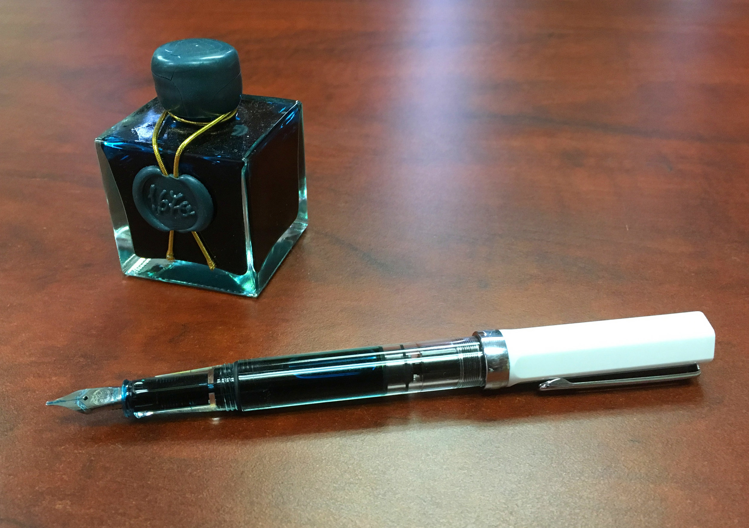
The ECO is a beautiful instrument. I got the white model and love the look of the white details with the clear barrel. The vacuum is super intuitive and easy to use. The clip is solid enough to be an everyday pocket carry. The pen is a bit long when the cap is posted, but not so much that I don’t post it anyway. The whole thing is pretty durable. From drops onto concrete to shoving the cap on instead of threading it, it has taken a beating but is no worse for wear. The weight is good, and it feels as good as it looks. I often found myself just holding it or fiddling with it in meetings. It grabs attention as well, a whispered “what pen is THAT?” or “can I try writing with it?” were not uncommon. At this super forgivable price point, I can’t think of a reason not to recommend this if you are interested in the least.

I went with the 1.1 Stub nib. I write rather large, so the thick width doesn't bother me, but I can see how some might dislike it for writing. My first impression was that it is a joy to doodle with. I found myself sketching on post-its constantly. The ink flow is consistent and smooth. The nib is no doubt a huge factor here since stubs tend to have a juicier feel, or so I’ve heard.

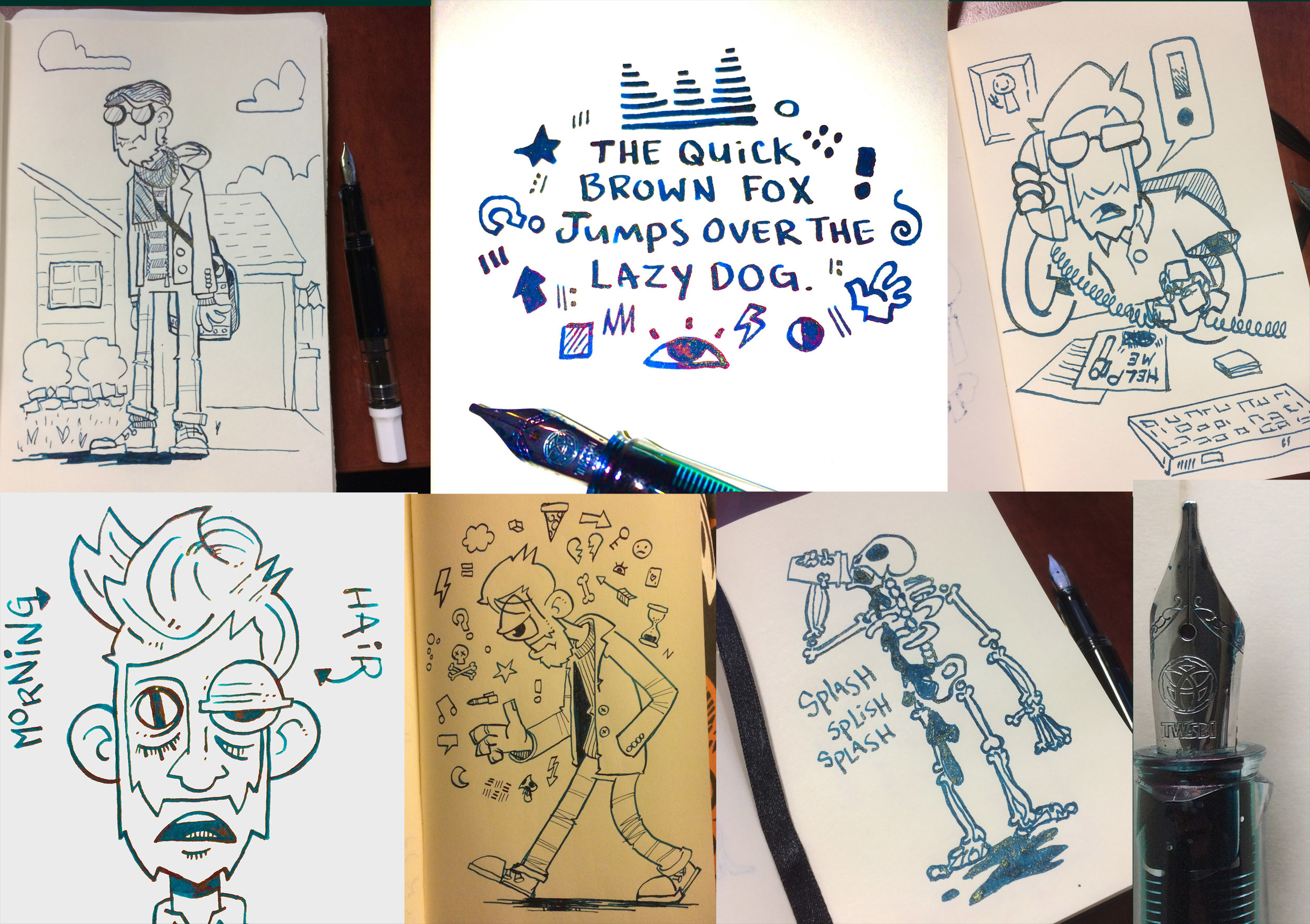
Drawing is just like writing; people have different priorities and preferences. I value line width variation above almost everything else. I love the dynamic range of the stub. Being mindful with the nib can get you fine detail lines or thick bold ones. I love pulling straight down and getting a wide line and then, not lifting the pen, changing the direction of the line 90 degrees to get a hair thin line. Changing direction to dictate line thickness is fun and adds a ton of variety. I imagine I would really dig a flex nib, but I like the predictability of the stub. I often would sketch freely, without being mindful of line weight, then going back in with adding thickness later.

My main draw to fountain pens was bottle inks, I use lots of India inks and acrylic inks with brushes, but wanted to try out the other side ink world. Plus I really like the atheistic of bottle inks and fountain pen inks are some of the most beautiful bottles in the world. J. Herbin really outdo themselves in packaging. The box is wonderfully decorated but nothing worth saving, the bottle is the main show, with it’s wax seal, gold string, and cube angles. I have mine on my desk at all times; it is too pretty to put in a drawer. Filling the pen is a joy, the barrel of the ECO fits perfectly into the bottle opening. It is a pleasant ritual that I enjoy, and have a hard time believing that I would ever find similar joy in replacing a cartridge. It is not waterproof, but that’s not the end of the world. It can actually be blended with water if you are careful about it. The stub nib really lets this ink shine, literally. It is a thing of beauty just to watch the ink dry as you make lines. I filled sheets and sheets of hatch marks when I got this pen, almost hypnotized. It dries quick enough to sketch with and looks like nothing else out there.

I’m a doodler first, writer second. If something doesn’t work for drawing it doesn’t last in my pocket. I had the TWSBI ECO as my pocket pen for about 3 months, then I went to switch back to a lead holder. It lasted two days before the TWSBI was back in my pocket. I missed it too much. I don’t have much negative to say, even my criticisms have positive notes:

· I sometimes hate that I have to twist off the cap, but I love the security of a twist cap.

· I wish I had an erasable option, but I love watching the liquid ink dry before my eyes as I draw.

· I miss the utilitarian metal pencil body, but not as much as I love watching that beautiful emerald ink slosh around the clear barrel of the ECO.

The ECO has lasted over six months as my main carry, and if it broke tomorrow I’d be placing an order for another of the exact same. The J. Herbin bottle sits proudly at my desk, and even after several refills I have so much left that I haven’t gotten wistful yet. I can’t think of a better recommendation than that.

(JetPens provided this product at no charge to The Pen Addict for review purposes.)


Enjoy reading The Pen Addict? Then consider becoming a member to receive additional weekly content, giveaways, and discounts in The Pen Addict shop. Plus, you support me and the site directly, for which I am very grateful.

Membership starts at just $5/month, with a discounted annual option available. To find out more about membership click here and join us!

Posted on November 21, 2017 and filed under TWSBI, Eco, Fountain Pens, Pen Reviews.

Franklin-Christoph 03 Iterum in Coco and Créme with an EF SIG Nib: A Review

(Susan M. Pigott is a fountain pen collector, pen and paperholic, photographer, and professor. You can find more from Susan on her blog Scribalishess.)

The Franklin-Christoph Iterum is a medium-sized fountain pen in acrylic with a screw-on cap. The pen comes packaged in a Franklin-Christoph cardboard box and a zippered leather pen envelope.

The Iterum’s body and cap are cylindrical with a flat finial and barrel bottom. The grip tapers down from the barrel and the cap threads are near the nib—out of the way but also providing a lip to prevent your fingers from slipping.

The Coco and Créme acrylic is a deep brown with shimmery swirls of cream. It’s a subtle pen, and I love the colors which remind me of hot chocolate or a well-brewed cappuccino.

The cream-colored finial is embedded into the cap and is engraved with the Franklin-Christoph logo. One reason I chose the Iterum model is because I liked the complementary colored finial.

The clip is rhodium-plated with four F-C diamonds engraved. It is a fairly stiff clip, so it will keep the pen secure on a shirt pocket or a thin tablet.

The only other adornment is “Franklin-Christoph 03” lightly engraved near the base of the cap.

The pen is a size I think most writers will find comfortable. Unposted, it is 5.01 inches in length, 6.91 inches posted, and 5.5 inches capped. The pen is quite light (25.79 grams), so posting shouldn’t present a weight problem. But because the cap doesn’t post deeply, the pen feels unwieldy posted.

Like many Franklin-Christoph models, the Iterum can be filled via cartridge, converter, or eyedropper. If you choose to eyedropper this pen, it will hold a lot of ink. I eyedroppered one of my other Franklin-Christoph pens, but I found it messy and inconvenient (plus it can stain lighter acrylics). So, I use the provided converter. Yes, I have to refill the pen more often, but I like that there’s less mess.

The nib I chose for this F-C pen is an EF steel SIG nib. SIG stands for “stub italic gradient.” Essentially it’s an extra-fine italic with the corners smoothed so that it is in between a cursive italic and a stub nib.

The EF SIG nib obviously doesn’t show as much line variation as a broader nib would, but I like that it offers a little more character than a regular EF nib would. Unfortunately, this particular nib is a little scratchy compared to my other F-C nibs, but I think that’s because it’s an EF. I’m accustomed to F-C medium italics.

The Iterum is no longer available in the Coco-Créme color. I got one of the last ones before the color was retired. You still have several color options, though: black and maroon, emerald and white, smoke and maroon, or ghost and smoke. Prices for this pen depend on what nib you choose. If you purchase the Iterum with a basic steel nib, you’ll pay $175. For one like mine with a SIG nib, you’ll pay $185. 14k nib options start at $265 for regular nibs and $285 for Masuyama nibs. See the Franklin-Christoph Iterum page for all the options.

I now own three Franklin-Christoph pens: the Marietta (model 20), the Stabilis (model 66), and the Iterum (model 03), and I love them all. I like the Iterum’s size, shape, and styling.

Pros

  • The Iterum is a pen style that I think most people will like. It’s a medium-sized pen with a comfortable grip.
  • The Iterum comes in a variety of acrylic colors with complementary finials.
  • I think one of the great benefits of buying Franklin-Christoph pens is the wide variety of nib options. I really like the SIG nib grind because formal italics can be too sharp and stubs can be too rounded. The SIG is nicely in between. Plus, those of us who can’t get to pen shows to have Mike Masuyama grind nibs for us, can still experience his workmanship via Franklin-Christoph. Note that you can’t purchase Masuyama nibs separately; you have to order a Masuyama nib along with a pen. All the other nibs are available for purchase separately.
  • Another advantage of Franklin-Christoph pens is the three different filling options.

Cons

  • Honestly, the only possible negative I can think of with Franklin-Christoph pens is how light they are. I personally prefer pens with some heft to them, but I find the Iterum incredibly comfortable to write with. I’d much prefer a pen to be light rather than so heavy it’s uncomfortable.

Enjoy reading The Pen Addict? Then consider becoming a member to receive additional weekly content, giveaways, and discounts in The Pen Addict shop. Plus, you support me and the site directly, for which I am very grateful.

Membership starts at just $5/month, with a discounted annual option available. To find out more about membership click here and join us!

Posted on November 17, 2017 and filed under Franklin-Christoph, Fountain Pens, Pen Reviews.

Pentel EnerGel Pearl 0.7 mm Gel Pen Review

(Sarah Read is an author, editor, yarn artist, and pen/paper/ink addict. You can find more about her at her website and on Twitter.)

The Pentel EnerGel is arguably one of the best pens you can find in any random stationery aisle. They're widely available, and they might even be stocked in your office supply closet at work. If not, I suggest sneaking some in there.

The EnerGel ink is a blend of gel and rollerball ink. It's known for writing smoothly and drying quickly. It is sometimes described as a smudge-free ink, though I found all of the colors smear a bit--some more than others. While it does dry more quickly than some gel inks and claims to be good for lefties, I worry that it may smear when a hand is dragged across. It does okay with highlighter, but not great. Even the dry ink smudges a little, and will leave a residue on the highlighter tip. But the text was still clear, and it didn't perform any worse than most pens under the circumstances.

The writing experience was smooth, for the most part. I did have a little stuttering with the black ink, but the other pens wrote beautifully. The .7 mm line is broader than I'm used to, but I enjoyed it, and it showed off the intensity of the ink colors. The ink is very well saturated and bright. The 8-color Pearl set includes black, red orange, lime, sky blue, blue, and violet. I also tried the pink ribbon edition of the black pen. I love that Pentel has this line that benefits breast cancer research. I did have some trouble telling the difference between the pink pen and the black-ink pen in the pink body. They are identical except that the tip size is outlined in black for the black-ink pen.

The pen body is a very good build. And it's responsibly made, being 54% post-consumer recycled plastic. The silicone grip is latex-free and comfortable to hold. This Pearl edition has a pearlescent white body with transparent color accents that indicate the ink color (except in the case of the pink ribbon edition). They have sturdy, flexible clips and a solid click mechanism. The click button does rattle a bit when depressed, which is one of my personal pen pet peeves, but the other features more than make up for that small flaw. The body appears to be identical to the RTX model, apart from the body color. The ink colors are the same and they both take the same refills.

At $22 for an 8-color pack, or $2.80 for open stock, I think these are a little on the pricey side. They're comparable to the Uni-ball Signo pens, but considerably more than the Pilot Juice—which is, in my opinion, a better pen. But there’s a lot to like about these, and they're way more fun than the usual office fare.

(JetPens provided this product at no charge to The Pen Addict for review purposes.)


Enjoy reading The Pen Addict? Then consider becoming a member to receive additional weekly content, giveaways, and discounts in The Pen Addict shop. Plus, you support me and the site directly, for which I am very grateful.

Membership starts at just $5/month, with a discounted annual option available. To find out more about membership click here and join us!

Posted on November 9, 2017 and filed under Pentel, Energel, Gel, Pen Reviews.