Posts filed under Pen Reviews

A.G. Spalding & Bros Brass Ballpoint Pen Review

(Jeff Abbott is a regular contributor at The Pen Addict. You can find more from Jeff online at Draft Evolution and Twitter.)

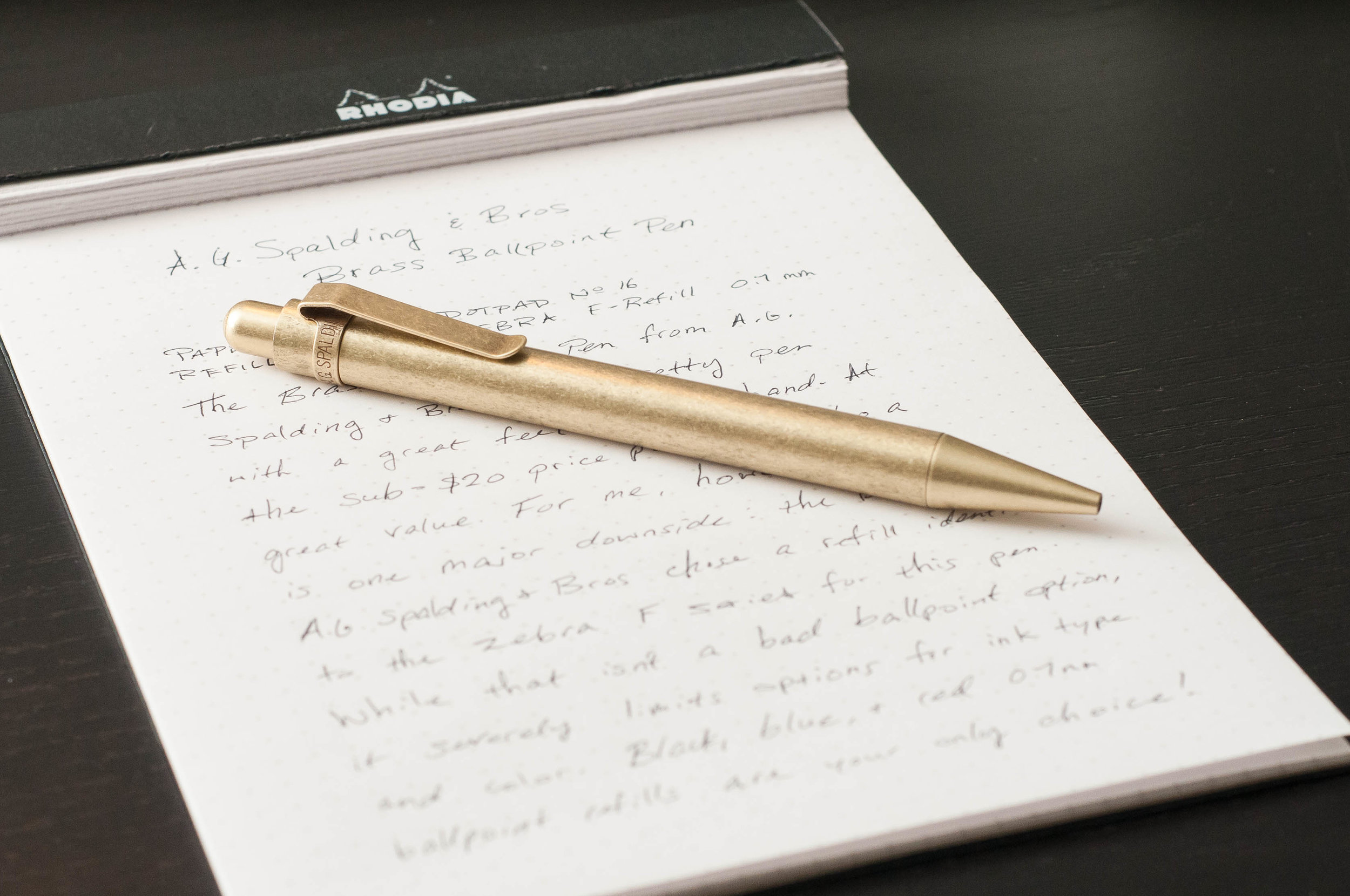
The A.G. Spalding & Bros ballpoint pen has been around for a while, and I've recently had the opportunity to try one out. I've been using the Brass version of the pen for the past couple of weeks, and while it looks and feels great, I'm not sure I can recommend it for most people.

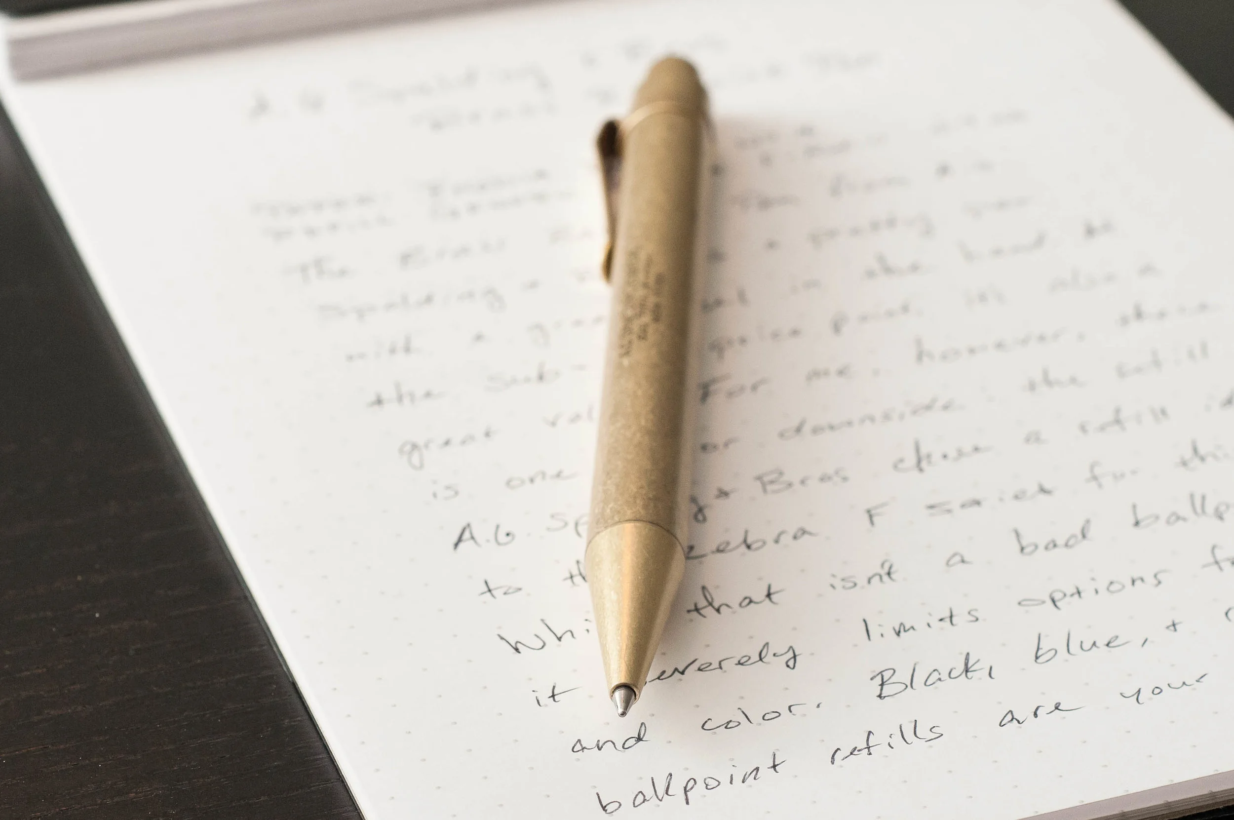
The brass version of this classic design has a tumbled and aged finish that looks great on any desk, and the balance of the pen when handling and writing is fantastic. And when you consider the price (less than $20), it's an even greater value. But, for me anyway, it all falls apart with the refill they've chosen for this pen: the Zebra F-Refill. While this isn't a bad refill in its own right, it's a severely limited choice. With the number of fantastic ballpoint, hybrid, gel and rollerball refills available today, it's a true shame to lock a pen into a refill format that is so unyielding. It's so similar to the ubiquitous Parker-style refill, but just different enough to make them unusable in this pen without major modification.

Sure, you can probably find a suitable alternative if you're also game for cutting, filing, or possibly ruining another refill to make it fit in this pen. To me, it seems like the designers of this pen lost a great opportunity. To most people, it's fair to say that most writing instruments have 3 major factors that influence purchasing: writing feel, aesthetics, and ink options. In the case of the A.G. Spalding & Bros Brass Ballpoint, it definitely has great writing feel and aesthetics. It could easily have fantastic ink options as well if some minor changes were considered during the design. What a shame!

Aside from my major disappointment in the refill choice, I've really enjoyed this pen. Like I said, the Zebra F refill isn't a bad refill at all — it's just limited to three colors in the same tip size (black, blue, and red in 0.7mm). If the Zebra F refill is a favorite of yours, this is a great option.

The size of the pen is very comfortable; it's a bit chunky compared to your standard ballpoint pen, but not too thick to make writing uncomfortable. It also lacks any texturing on the grip area, but I haven't had a problem holding onto it when writing. According to the JetPens description, only the nose cone is brass, while the rest of the body is aluminum with an aged brass-like finish on the outside. I'm not a metals expert, but this looks right to me. Either way, the extra bit of weight in the cone makes it easy to control when writing and doodling.

The click mechanism is smooth and sturdy, making a noticeable, but subdued noise when operated. The rounded top of the nock feels good on the thumb and features an A.G. Spalding logo on the top. Apart from the nock, you'll find branding along the clip band and on the side of the pen barrel. Even though branding exists in three places on the pen, it's all very well done and non-intrusive.

I'm not sure how they've achieved the finish on the barrel, but it looks fantastic in person. It pairs nicely with leather.

You can also choose from a copper version of this pen (which has more of a red/pink tone), a silver version, and a hexagonal navy body.

Overall, I really want to love this pen, but the limited refill options will probably mean this pen doesn't see as much use as I'd like. I guess I can keep my fingers crossed that someone might manufacture an aftermarket refill for this size at some point!

(JetPens provided this product at no charge to The Pen Addict for review purposes.)


Enjoy reading The Pen Addict? Then consider becoming a member to receive additional weekly content, giveaways, and discounts in The Pen Addict shop. Plus, you support me and the site directly, for which I am very grateful.

Membership starts at just $5/month, with a discounted annual option available. To find out more about membership click here and join us!

Posted on November 22, 2017 and filed under A.G. Spalding, Pen Reviews.

TWSBI ECO Fountain Pen Review, From An Artist’s Perspective

(This is a guest post by Nick Folz. You can find more of Nick and his work on his blog, Smallberry Drive, Twitter, and Instagram.)

I am a waking, talking pen cliché of 2016. I bought my first fountain pen last year, along with bottle of ink. Which pen and ink? The TWSBI ECO and J. Herbin Emerald of Chivor. See what I mean about cliché?

The ECO is a beautiful instrument. I got the white model and love the look of the white details with the clear barrel. The vacuum is super intuitive and easy to use. The clip is solid enough to be an everyday pocket carry. The pen is a bit long when the cap is posted, but not so much that I don’t post it anyway. The whole thing is pretty durable. From drops onto concrete to shoving the cap on instead of threading it, it has taken a beating but is no worse for wear. The weight is good, and it feels as good as it looks. I often found myself just holding it or fiddling with it in meetings. It grabs attention as well, a whispered “what pen is THAT?” or “can I try writing with it?” were not uncommon. At this super forgivable price point, I can’t think of a reason not to recommend this if you are interested in the least.

I went with the 1.1 Stub nib. I write rather large, so the thick width doesn't bother me, but I can see how some might dislike it for writing. My first impression was that it is a joy to doodle with. I found myself sketching on post-its constantly. The ink flow is consistent and smooth. The nib is no doubt a huge factor here since stubs tend to have a juicier feel, or so I’ve heard.

Drawing is just like writing; people have different priorities and preferences. I value line width variation above almost everything else. I love the dynamic range of the stub. Being mindful with the nib can get you fine detail lines or thick bold ones. I love pulling straight down and getting a wide line and then, not lifting the pen, changing the direction of the line 90 degrees to get a hair thin line. Changing direction to dictate line thickness is fun and adds a ton of variety. I imagine I would really dig a flex nib, but I like the predictability of the stub. I often would sketch freely, without being mindful of line weight, then going back in with adding thickness later.

My main draw to fountain pens was bottle inks, I use lots of India inks and acrylic inks with brushes, but wanted to try out the other side ink world. Plus I really like the atheistic of bottle inks and fountain pen inks are some of the most beautiful bottles in the world. J. Herbin really outdo themselves in packaging. The box is wonderfully decorated but nothing worth saving, the bottle is the main show, with it’s wax seal, gold string, and cube angles. I have mine on my desk at all times; it is too pretty to put in a drawer. Filling the pen is a joy, the barrel of the ECO fits perfectly into the bottle opening. It is a pleasant ritual that I enjoy, and have a hard time believing that I would ever find similar joy in replacing a cartridge. It is not waterproof, but that’s not the end of the world. It can actually be blended with water if you are careful about it. The stub nib really lets this ink shine, literally. It is a thing of beauty just to watch the ink dry as you make lines. I filled sheets and sheets of hatch marks when I got this pen, almost hypnotized. It dries quick enough to sketch with and looks like nothing else out there.

I’m a doodler first, writer second. If something doesn’t work for drawing it doesn’t last in my pocket. I had the TWSBI ECO as my pocket pen for about 3 months, then I went to switch back to a lead holder. It lasted two days before the TWSBI was back in my pocket. I missed it too much. I don’t have much negative to say, even my criticisms have positive notes:

· I sometimes hate that I have to twist off the cap, but I love the security of a twist cap.

· I wish I had an erasable option, but I love watching the liquid ink dry before my eyes as I draw.

· I miss the utilitarian metal pencil body, but not as much as I love watching that beautiful emerald ink slosh around the clear barrel of the ECO.

The ECO has lasted over six months as my main carry, and if it broke tomorrow I’d be placing an order for another of the exact same. The J. Herbin bottle sits proudly at my desk, and even after several refills I have so much left that I haven’t gotten wistful yet. I can’t think of a better recommendation than that.

(JetPens provided this product at no charge to The Pen Addict for review purposes.)


Enjoy reading The Pen Addict? Then consider becoming a member to receive additional weekly content, giveaways, and discounts in The Pen Addict shop. Plus, you support me and the site directly, for which I am very grateful.

Membership starts at just $5/month, with a discounted annual option available. To find out more about membership click here and join us!

Posted on November 21, 2017 and filed under TWSBI, Eco, Fountain Pens, Pen Reviews.

Franklin-Christoph 03 Iterum in Coco and Créme with an EF SIG Nib: A Review

(Susan M. Pigott is a fountain pen collector, pen and paperholic, photographer, and professor. You can find more from Susan on her blog Scribalishess.)

The Franklin-Christoph Iterum is a medium-sized fountain pen in acrylic with a screw-on cap. The pen comes packaged in a Franklin-Christoph cardboard box and a zippered leather pen envelope.

The Iterum’s body and cap are cylindrical with a flat finial and barrel bottom. The grip tapers down from the barrel and the cap threads are near the nib—out of the way but also providing a lip to prevent your fingers from slipping.

The Coco and Créme acrylic is a deep brown with shimmery swirls of cream. It’s a subtle pen, and I love the colors which remind me of hot chocolate or a well-brewed cappuccino.

The cream-colored finial is embedded into the cap and is engraved with the Franklin-Christoph logo. One reason I chose the Iterum model is because I liked the complementary colored finial.

The clip is rhodium-plated with four F-C diamonds engraved. It is a fairly stiff clip, so it will keep the pen secure on a shirt pocket or a thin tablet.

The only other adornment is “Franklin-Christoph 03” lightly engraved near the base of the cap.

The pen is a size I think most writers will find comfortable. Unposted, it is 5.01 inches in length, 6.91 inches posted, and 5.5 inches capped. The pen is quite light (25.79 grams), so posting shouldn’t present a weight problem. But because the cap doesn’t post deeply, the pen feels unwieldy posted.

Like many Franklin-Christoph models, the Iterum can be filled via cartridge, converter, or eyedropper. If you choose to eyedropper this pen, it will hold a lot of ink. I eyedroppered one of my other Franklin-Christoph pens, but I found it messy and inconvenient (plus it can stain lighter acrylics). So, I use the provided converter. Yes, I have to refill the pen more often, but I like that there’s less mess.

The nib I chose for this F-C pen is an EF steel SIG nib. SIG stands for “stub italic gradient.” Essentially it’s an extra-fine italic with the corners smoothed so that it is in between a cursive italic and a stub nib.

The EF SIG nib obviously doesn’t show as much line variation as a broader nib would, but I like that it offers a little more character than a regular EF nib would. Unfortunately, this particular nib is a little scratchy compared to my other F-C nibs, but I think that’s because it’s an EF. I’m accustomed to F-C medium italics.

The Iterum is no longer available in the Coco-Créme color. I got one of the last ones before the color was retired. You still have several color options, though: black and maroon, emerald and white, smoke and maroon, or ghost and smoke. Prices for this pen depend on what nib you choose. If you purchase the Iterum with a basic steel nib, you’ll pay $175. For one like mine with a SIG nib, you’ll pay $185. 14k nib options start at $265 for regular nibs and $285 for Masuyama nibs. See the Franklin-Christoph Iterum page for all the options.

I now own three Franklin-Christoph pens: the Marietta (model 20), the Stabilis (model 66), and the Iterum (model 03), and I love them all. I like the Iterum’s size, shape, and styling.

Pros

  • The Iterum is a pen style that I think most people will like. It’s a medium-sized pen with a comfortable grip.
  • The Iterum comes in a variety of acrylic colors with complementary finials.
  • I think one of the great benefits of buying Franklin-Christoph pens is the wide variety of nib options. I really like the SIG nib grind because formal italics can be too sharp and stubs can be too rounded. The SIG is nicely in between. Plus, those of us who can’t get to pen shows to have Mike Masuyama grind nibs for us, can still experience his workmanship via Franklin-Christoph. Note that you can’t purchase Masuyama nibs separately; you have to order a Masuyama nib along with a pen. All the other nibs are available for purchase separately.
  • Another advantage of Franklin-Christoph pens is the three different filling options.

Cons

  • Honestly, the only possible negative I can think of with Franklin-Christoph pens is how light they are. I personally prefer pens with some heft to them, but I find the Iterum incredibly comfortable to write with. I’d much prefer a pen to be light rather than so heavy it’s uncomfortable.

Enjoy reading The Pen Addict? Then consider becoming a member to receive additional weekly content, giveaways, and discounts in The Pen Addict shop. Plus, you support me and the site directly, for which I am very grateful.

Membership starts at just $5/month, with a discounted annual option available. To find out more about membership click here and join us!

Posted on November 17, 2017 and filed under Franklin-Christoph, Fountain Pens, Pen Reviews.