Posts filed under Pen Reviews

The Masuya Monokaki Pocket Notebook and the Platinum Plaisir Fountain Pen: A Good Everyday Carry Set

(Susan M. Pigott is a fountain pen collector, pen and paperholic, photographer, and professor. You can find more from Susan on her blog Scribalishess.)

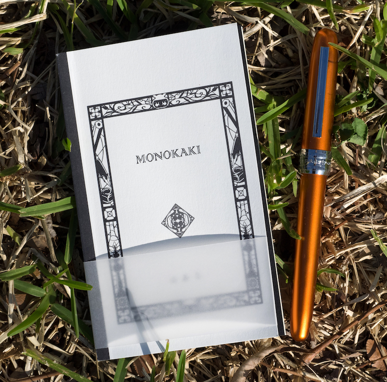
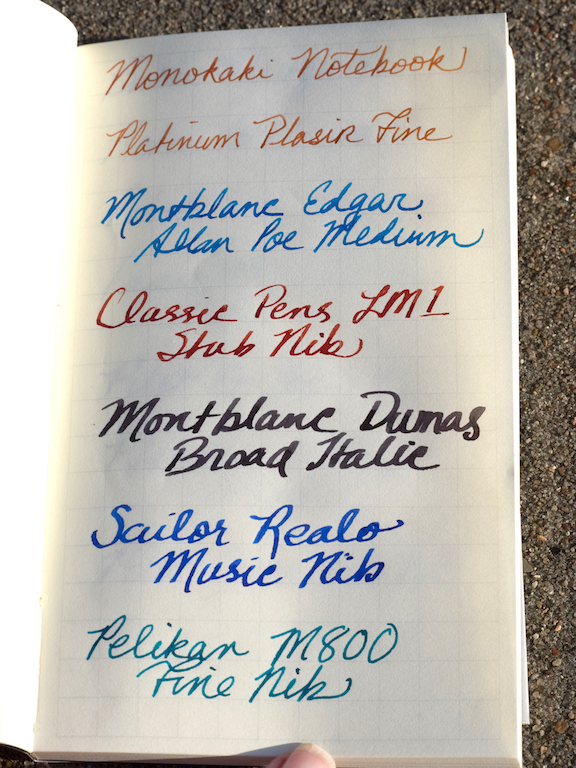
I received the Masuya Monokaki Pocket Notebook several months ago from JetPens, but I have so many notebooks, I hadn’t had a chance to use it until now. The pocket notebook is an interesting size (14.0 cm /5.5 inches in length and 8.6 cm /3.4 inches in width), and it has 64 sheets printed on both sides with 0.7mm graph lines.

The notebook has a soft cardboard cover with a cool design on the front, and it is thread and glue bound.

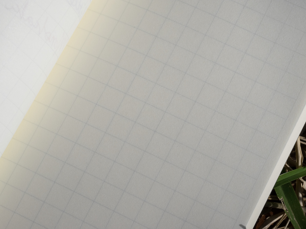
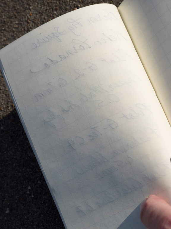
The cream-colored paper is fountain-pen friendly, but it is also very thin, so if you don’t like your writing to show through, you will not like this paper. I tested it with several different nib sizes and inks. There was no feathering or bleed-through. However, as you can see in the second photo below, there’s plenty of show through.

I also tested the paper with various gel pens, rollerballs, and pencils. It works well with all of them, but, once again, show through is obvious.

The Monokaki notebook is the perfect size for purses, satchels, and backpacks. But, the soft cover is easily bent, so you’ll want to put it in a pocket or sleeve to protect it. The notebook does not lay flat when open, which is a weakness. The 7mm graph lines almost seem too large for a notebook this size, and since show through is unavoidable, you probably won’t want to write on both sides of the paper. You will get the best results from fine nibs and/or pencils.

You can purchase the Monokaki Pocket Notebook from JetPens for $7.75.

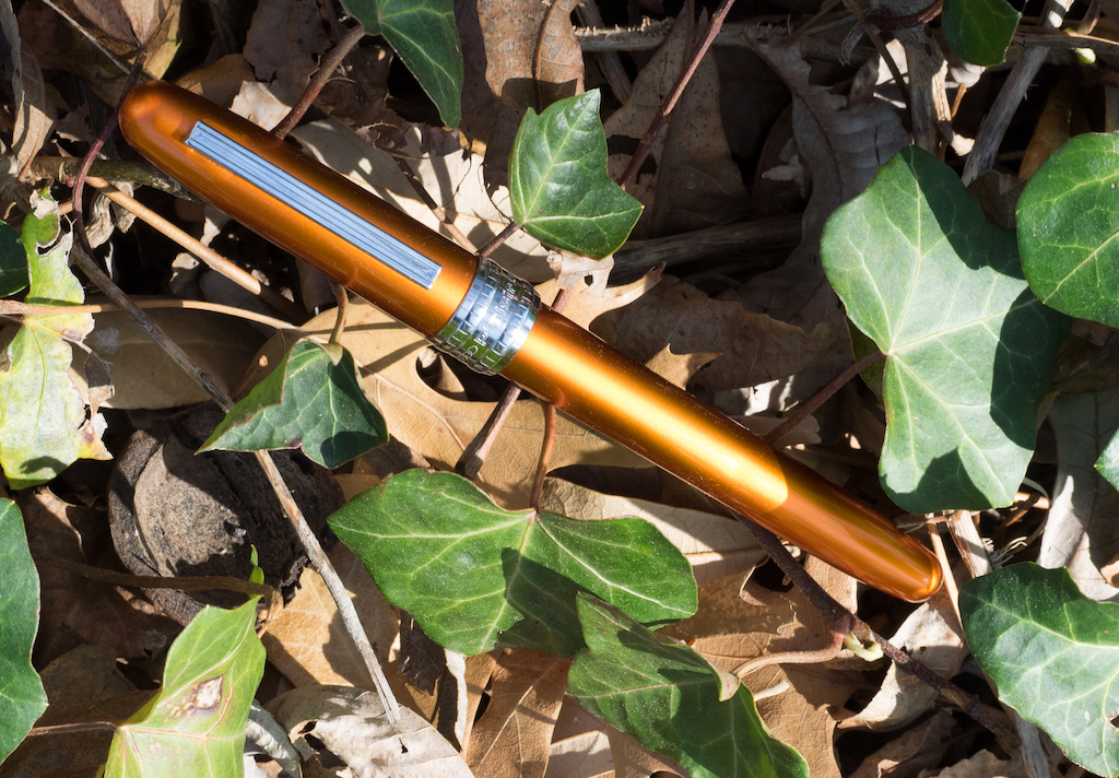
The Platinum Plaisir fountain pen is an aluminum pen with a stainless steel Preppy nib. It is available in a wide array of colors that have a beautiful iridescent finish.

The pen comes with one black Platinum cartridge (which is proprietary, so you’ll have to buy extras), but you can use a Platinum converter (not included) if you prefer. I wanted to use an orange ink with my Plaisir, so I put in a converter.

The Platinum Plaisir is an inexpensive pen at $14.25. That’s not bad for a metal pen. It’s comfortable to hold, especially since the grip is plastic not metal. It’s a small pen unposted (4.8 inches). Posted it is 5.8 inches, and capped it is 5.6 inches.

The grip is transparent, so you can see the ink filtering down to the nib. Although you can remove the nib to clean the pen, the ink pools in the threads in the grip, and it doesn’t rinse out so easily.

The cap snaps on securely and it is postable. It’s got a basic steel clip and a large steel cap ring with the words “Platinum Plaisir Japan.” The pen is quite beautiful.

The fine nib is smooth but rigid. I tested it with Kyo-iro 04 Higashiyama Moonlight (reviewed here), and that ink was simply too dry for this fine of a nib. Iroshizuku Fuyu-Gaki flowed much better.

Although the pen is meant to be rugged, I noticed dents in the body and scratches. This pen has not been roughly handled, and I didn’t let it loose in my purse where it could get scratched. I think the dents may have come from posting the cap. Regardless, the pen is definitely not as durable as you might expect.

The Platinum Plaisir comes in a whole rainbow of colors and you can get each color with either a fine or medium nib. You can purchase the Plaisir from JetPens for $14.25.

The Monokaki Pocket Notebook and Platinum Plaisir are a perfect match for one another if you are looking for an everyday carry set.

(JetPens provided this product at no charge to The Pen Addict for review purposes.)


Enjoy reading The Pen Addict? Then consider becoming a member to receive additional weekly content, giveaways, and discounts in The Pen Addict shop. Plus, you support me and the site directly, for which I am very grateful.

Membership starts at just $5/month, with a discounted annual option available. To find out more about membership click here and join us!

Posted on April 6, 2018 and filed under Monokaki, Platinum, Pen Reviews, Notebook Reviews.

Aurora Optima O’ Sole Mio Fountain Pen Review

How do you review a product you have already reviewed, and already love? How do you keep it fresh? How do you say something new? I’m not sure I have all of the answers to those questions, but let’s find out. One thing I do know: I love the Aurora Optima.

I knew I loved it from the first time I picked one up, which ended up in the purchase of my first, the Optima Red Demonstrator. And yes, I still think just as highly of it now, even though I had to send it to the shoptima. It’s a pen that fits me perfectly.

Until this week, I wasn’t sure why it was so perfect for me. Then I read a review of the Aurora Optima 365 on Hand Over That Pen. Pam, Queen of Tiny Handwriting, First of Her Name, said this about the Optima:

“ I really love the Optima’s shape and size. Why you ask? Because, to me, the Aurora Optima 365 is a gaudier Sailor Progear with the use of a wider, more ostentatious cap band.”

That explains a lot about me and my likes, doesn’t it?

Aurora Optima (Top), Sailor Pro Gear Bungubox 5th Anniversary Edition

Looking at pictures of the Optima and Pro Gear side-by-side the comparison is inevitable. Why didn’t I think of this before! I guess that makes the Aurora 88 and the Sailor 1911 cousins as well.

One area where they do not compare is in price. The Aurora is twice as much as the Pro Gear, but I feel it is priced correctly for what it brings to the table. You can feel the difference in your hand before even getting into the technical aspects.

First off, the Optima is a piston filler, while the Pro Gear uses a cartridge/converter filling system. And this is no normal piston either. It’s easily the most substantial I have felt in a pen, and even has a small, stealth, ink reservoir to get those last drops out until you can get it filled up again.

The Optima has a large ebonite feed, too. Does it make the ink flow better than a standard plastic feed? I’d be lying if I told you I could tell the difference. But the sheer size of it, which is mostly hidden in the section, is impressive.

The materials of this pen - in the case of the O’ Sole Mio black acrylic and marbled orange auroloide - are substantial, and beautiful. The Pro Gear acrylic barrel is lightweight in comparison. The walls of the Optima barrel are thick, and you can feel it in your hand.

Aurora has some of the best gold nibs on the market. So does Sailor. And they are completely different. Aurora’s nibs are thick, and on the firmer side for a gold nib. The medium nib in this Optima is smooth with a little give when writing, but with no bounce or variation when you push it. Sailor’s nibs are obviously finer in comparison, and do have a different feel when writing. Both offer some of the best nibs in the business.

And finally, as Pam says above, the Optima has a gaudier cap band. And it’s a good-looking gaudy! While the Pro Gear offers sleek, refined hardware, Aurora steps up the hardware game in comparison, both in size and style. I think it looks great.

So, if you like the Sailor Pro Gear, will you like the Aurora Optima? I say undoubtedly yes. It does come at a cost though, and in the case of these two pens, it is worth it to me.

(Kenro Inc. provided this product at no charge to The Pen Addict for review purposes.)


Enjoy reading The Pen Addict? Then consider becoming a member to receive additional weekly content, giveaways, and discounts in The Pen Addict shop. Plus, you support me and the site directly, for which I am very grateful.

Membership starts at just $5/month, with a discounted annual option available. To find out more about membership click here and join us!

Posted on April 2, 2018 and filed under Aurora, Fountain Pens, Pen Reviews.

KACO SKY II Fountain Pen Review

(This is a guest post by Frank Dong. You can read more from Frank at his blog Frank Underwater)

What is KACO SKY II?

KACO is a stationery company in Shanghai, China. Established 8 years ago, the company has been delivering stationeries with award-winning industrial designs. While the gel-ink pens are their primary focus, they do keep offering fountain pens over the years. Recently the company has been partnering with the Pen World Magazine to promote its fountain pens lines.

The SKY fountain pens started in early 2016, priced at 39RMB ($6) on launch. Though KACO’s premium offerings have been largely neglected by Chinese pen lovers, the SKY did gain some traction within the community. Last May, the SKY II was launched, which shares the same design as the SKY but deployed some upgrades. Currently, you can have a SKY II from the Pen World magazine’s booth for free during a pen show if you get a subscription on-site.

Makrolon and black Schmidt nib, that’s the key differentiators marketed by the company, and they make this pen the first KACO pen that I want to own. After two weeks with the pen, I am in love. Forget the cliché designs from legacy brands, this is the best entry level fountain pens that have ever been made in China. But the SKY II is also imperfect or even annoying if you want to pull it out from a student’s pen cup and make it part of your EDC since the company clearly neglects the need of having a functional clip.

Let’s start with the bright side. For 69RMB ($11) you will get a metallic-looking pen instead of one in banal solid color, along with a stainless-steel nib with extra black coating, and both of these two upgrades worth the money.

The metallic red barrel makes this review unit pops up easily in my pen collection and resonates with certain electronic gadgets. According to the KACO, the barrels of the SKY II models are made from Makrolon polycarbonate, a name that deeply rooted in the success of LAMY 2000. For the 2000, LAMY put glass fibers into the material and brushed the surface, resulting in a pen that feels like a piece of warm wood (I learned this expression from Myke). While in the case of this SKY II, KACO finished it by applying a metallic paint to the red Makrolon base, creating a texture feels like a piece of warm aluminum. The metallic coating is thick and scratch-resistant, and I only managed to see the red base material from the outside by scraping it off with a knife. I don’t know too much about the properties of the specific grade of Makrolon used in the SKY II, but the material did survive several chest-height drops along with the rubbing with keys in my pocket. Most importantly, it just feels smooth, light and warm in hand.

With SKY II’s black Schmidt nib, the KACO joins the bandwagon of high-quality stainless-steel nibs moving beyond the basic looks of being in either silver or gold. That delivers a striking look which transforms the feeling of this pen—no lights could hit the black nib and bounce back to your face during your writing, and when the pen is rest on the desk, the black nib gives it an understated existence. Another reason for me to love a black German nib is that I can enjoy any ink without caring too much about cleaning the nib, making the whole experience more focused on the writing part rather than the pen I am writing with.

Even the physical performance of the nib could change a little bit. The company reminds its buyer that the extra black coating around the tipping material would result in more friction in certain writing angle, which is true in my experience. Thankfully (or not?) this extra friction from the tip disappeared after days of use.

Regarding other basics, the pen is a cartridge/converter filler, and its black nib is of size 5, made by Schmidt and branded in KACO’s logo. Unlike the black nibs from Kaweco Perkeo, it is a firm writer. It is noteworthy that although the nib and feed look the same as every other pen with a #5 Schmidt nib, they can’t be easily screwed out, due to a unique design at the end of the nib housing. I am fine with this move since in reality, this is not a pen built for pen addict who has a dozen of spare nibs.

Besides the nib and the barrel, the remaining of the pen is basically the same as the first generation of SKY, which is still an acceptable design two years later. The cylinder shape is simple and minimalistic, if not as nuanced as design from LAMY Aion or Pilot Kakuno. The clip still features a KG stamp, representing the KacoGreen branding the company uses for its writing instrument, and at the end of the barrel you may still be perplexed by an F (it's an EF-nib pen!), which means Fountain pen in the company’s explanation. All of these legacy designs are not ideal, but I can live with them. Nonetheless, I am rather glad to see the original design of SKY’s ergonomic nib section stays. That’s a really nice-looking grip, making the inside of the pen visible but not too distracting. The section also feels clear and crispy in hand, thanks to the unique surface pattern and large triangular construct.

(Photo Credit: KACO)

But by this point, I must look on the dark side of the SKY’s design, which I really hate—the clip is more of a decoration than a real clip. The clip on this SKY II is still an injection-molded one, integrated seamlessly into the top finial, and it is just bad. Since the clip is of the same material as the plastic part, itself is loose and lifeless. To render it even more useless, the clutch of the clip was moved from the clip to the body of the cap. That’s a confusing design, and I can barely clip the pen to my shirt, my pen loop, or sometimes even a hardcover notebook. There is no way to deny this clip is more functional when acting as a rotating stopper. If you happen to be a pen user who loves to clip your pen, this is a deal-breaker

However, I still remember comments from Paul G, one of the Pen Addict readers, under the Kaweco Perkeo review—be alert about the target audience of the pen when we are reviewing it from a power user’s perspective. At a price around $11, the SKY II is super affordable and looks totally different from other entry level Chinese pens, and that’s enough to get it noticed. Comparing with clipless student pens like Perkeo and Kakuno, the KACO SKY II is fine to have a sofe clip, since students usually don't clip pens and keep a big pencil case for their pens. Oh, did I mention the matte finish plastic package of this pen? It is a high-quality MUJI style pen case in nature!

To sum it up, the mark II version of the pen feels warmer, flashier, and way more confident in hand than its predecessor. Maturity and refinement are the keywords I always think about for this pen. Despite some lacks, it is still a legitimate upgrade and may lead a new direction for the KACO pens.

Posted on March 30, 2018 and filed under Kaco, Fountain Pens, Pen Reviews.