Posts filed under Pen Reviews

Architect Nib vs. Stub Nib

One of the most frequent questions I get asked at a pen show is “Do you have an architect nib grind I can test out?” I try to bring the one that I have, a Platinum 3776 broad nib modified into an architect nib by Dan Smith. I don’t always remember it, so I figured I would do a quick comparison between an architect nib and stub nib so you can see what this grind has to offer.

Let’s start with this: Pictures will never do an architect nib justice. It has a completely different feel when writing, more than even the sharpest cursive italic nib offers. It requires a consistent writing angle to reach its full effect, and no amount of practice is ever enough. It’s a commitment, as the ~$60 price tag for just the grind tells you.

Once you get it, it can be a complete blast to use. The line variance is enormous, and the exact opposite of what you get from a stub or cursive italic nib.

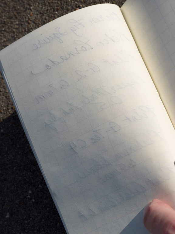
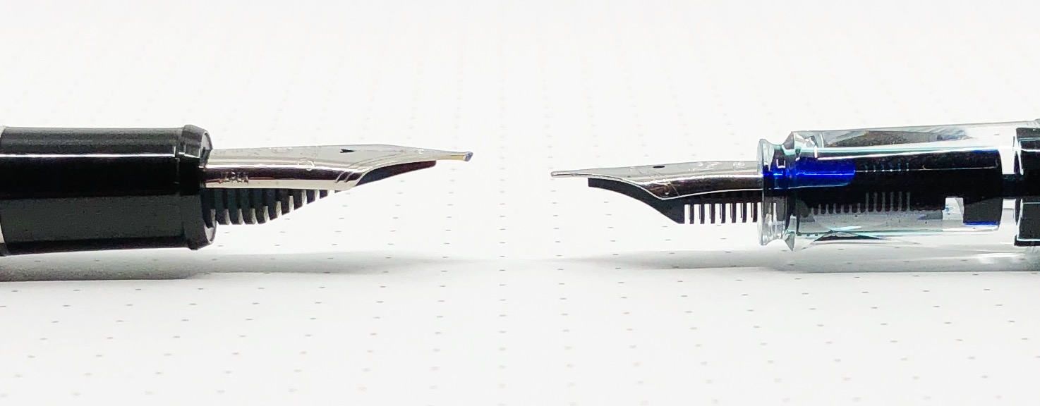
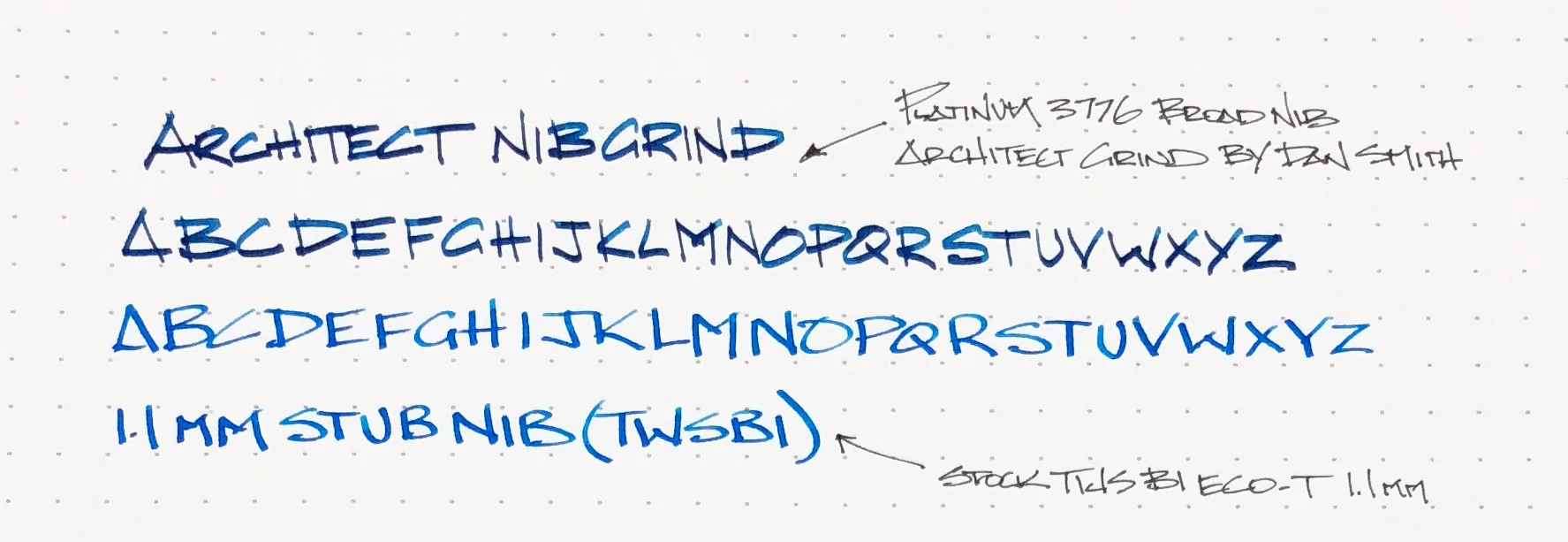
For this comparison, I put my TWSBI ECO-T with a stock 1.1 mm stub nib to the test. I figure it is a fairly normal stock stub nib to compare to that many people may have used. And as stated above, the architect grind was done on a broad Platinum 3776 nib for full effect. The more nib tipping for an architect grind for a nibmeister to work with, the better. Also, the more line variation you will have.

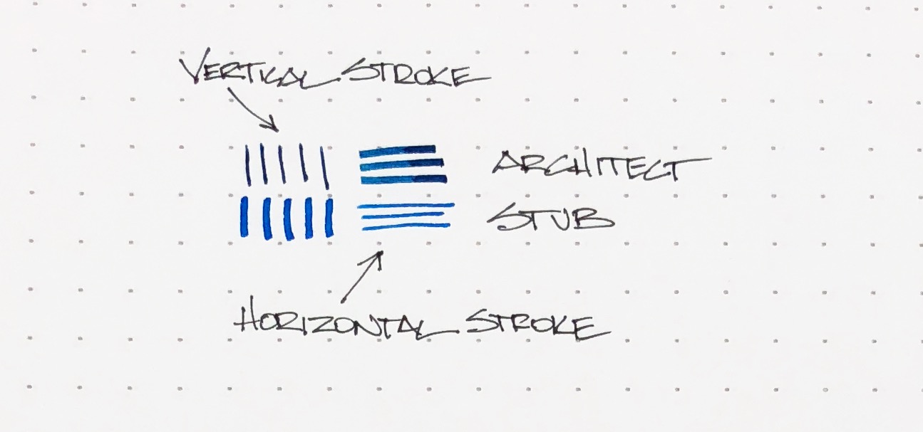
You can see in the picture above, the architect nib gives you thin vertical strokes and wide horizontal strokes. The stub nib is essentially the opposite, but with wider thin lines. When writing the alphabet, you can see how the line thicknesses caused by the shape of the nibs compare. Letters like E, F, and T with very defined, angular strokes show this variance. H may be my favorite.

I write with a blocky architecture style to begin with, so at a quick glance you may not notice a ton of difference. Rest assured, the feel of the nib is very different. I have to pay more attention with the architect nib, and force myself to slow down. The architect nib isn’t the best with curved shapes, and I would hesitate using it for cursive handwriting due to the angle of the nib. I’m sure it can be done, I’m just not sure how enjoyable it would be.

The architect nib is designed for sharp, straight lines, and that’s what it does best. The more letters I put down on the page, the more I notice the different effect this nib provides. As much as I love it and have fun with it when I use it, it is not an all day, every day writer for me. But, I’m glad I have it, and I’m glad to let you try it out whenever you see me at a pen show. I’ll make sure I have this pen with me, inked up and ready to write!


Enjoy reading The Pen Addict? Then consider becoming a member to receive additional weekly content, giveaways, and discounts in The Pen Addict shop. Plus, you support me and the site directly, for which I am very grateful.

Membership starts at just $5/month, with a discounted annual option available. To find out more about membership click here and join us!

Posted on April 9, 2018 and filed under Architect Nib, Pen Reviews.

The Masuya Monokaki Pocket Notebook and the Platinum Plaisir Fountain Pen: A Good Everyday Carry Set

(Susan M. Pigott is a fountain pen collector, pen and paperholic, photographer, and professor. You can find more from Susan on her blog Scribalishess.)

I received the Masuya Monokaki Pocket Notebook several months ago from JetPens, but I have so many notebooks, I hadn’t had a chance to use it until now. The pocket notebook is an interesting size (14.0 cm /5.5 inches in length and 8.6 cm /3.4 inches in width), and it has 64 sheets printed on both sides with 0.7mm graph lines.

The notebook has a soft cardboard cover with a cool design on the front, and it is thread and glue bound.

The cream-colored paper is fountain-pen friendly, but it is also very thin, so if you don’t like your writing to show through, you will not like this paper. I tested it with several different nib sizes and inks. There was no feathering or bleed-through. However, as you can see in the second photo below, there’s plenty of show through.

I also tested the paper with various gel pens, rollerballs, and pencils. It works well with all of them, but, once again, show through is obvious.

The Monokaki notebook is the perfect size for purses, satchels, and backpacks. But, the soft cover is easily bent, so you’ll want to put it in a pocket or sleeve to protect it. The notebook does not lay flat when open, which is a weakness. The 7mm graph lines almost seem too large for a notebook this size, and since show through is unavoidable, you probably won’t want to write on both sides of the paper. You will get the best results from fine nibs and/or pencils.

You can purchase the Monokaki Pocket Notebook from JetPens for $7.75.

The Platinum Plaisir fountain pen is an aluminum pen with a stainless steel Preppy nib. It is available in a wide array of colors that have a beautiful iridescent finish.

The pen comes with one black Platinum cartridge (which is proprietary, so you’ll have to buy extras), but you can use a Platinum converter (not included) if you prefer. I wanted to use an orange ink with my Plaisir, so I put in a converter.

The Platinum Plaisir is an inexpensive pen at $14.25. That’s not bad for a metal pen. It’s comfortable to hold, especially since the grip is plastic not metal. It’s a small pen unposted (4.8 inches). Posted it is 5.8 inches, and capped it is 5.6 inches.

The grip is transparent, so you can see the ink filtering down to the nib. Although you can remove the nib to clean the pen, the ink pools in the threads in the grip, and it doesn’t rinse out so easily.

The cap snaps on securely and it is postable. It’s got a basic steel clip and a large steel cap ring with the words “Platinum Plaisir Japan.” The pen is quite beautiful.

The fine nib is smooth but rigid. I tested it with Kyo-iro 04 Higashiyama Moonlight (reviewed here), and that ink was simply too dry for this fine of a nib. Iroshizuku Fuyu-Gaki flowed much better.

Although the pen is meant to be rugged, I noticed dents in the body and scratches. This pen has not been roughly handled, and I didn’t let it loose in my purse where it could get scratched. I think the dents may have come from posting the cap. Regardless, the pen is definitely not as durable as you might expect.

The Platinum Plaisir comes in a whole rainbow of colors and you can get each color with either a fine or medium nib. You can purchase the Plaisir from JetPens for $14.25.

The Monokaki Pocket Notebook and Platinum Plaisir are a perfect match for one another if you are looking for an everyday carry set.

(JetPens provided this product at no charge to The Pen Addict for review purposes.)


Enjoy reading The Pen Addict? Then consider becoming a member to receive additional weekly content, giveaways, and discounts in The Pen Addict shop. Plus, you support me and the site directly, for which I am very grateful.

Membership starts at just $5/month, with a discounted annual option available. To find out more about membership click here and join us!

Posted on April 6, 2018 and filed under Monokaki, Platinum, Pen Reviews, Notebook Reviews.

Aurora Optima O’ Sole Mio Fountain Pen Review

How do you review a product you have already reviewed, and already love? How do you keep it fresh? How do you say something new? I’m not sure I have all of the answers to those questions, but let’s find out. One thing I do know: I love the Aurora Optima.

I knew I loved it from the first time I picked one up, which ended up in the purchase of my first, the Optima Red Demonstrator. And yes, I still think just as highly of it now, even though I had to send it to the shoptima. It’s a pen that fits me perfectly.

Until this week, I wasn’t sure why it was so perfect for me. Then I read a review of the Aurora Optima 365 on Hand Over That Pen. Pam, Queen of Tiny Handwriting, First of Her Name, said this about the Optima:

“ I really love the Optima’s shape and size. Why you ask? Because, to me, the Aurora Optima 365 is a gaudier Sailor Progear with the use of a wider, more ostentatious cap band.”

That explains a lot about me and my likes, doesn’t it?

Aurora Optima (Top), Sailor Pro Gear Bungubox 5th Anniversary Edition

Looking at pictures of the Optima and Pro Gear side-by-side the comparison is inevitable. Why didn’t I think of this before! I guess that makes the Aurora 88 and the Sailor 1911 cousins as well.

One area where they do not compare is in price. The Aurora is twice as much as the Pro Gear, but I feel it is priced correctly for what it brings to the table. You can feel the difference in your hand before even getting into the technical aspects.

First off, the Optima is a piston filler, while the Pro Gear uses a cartridge/converter filling system. And this is no normal piston either. It’s easily the most substantial I have felt in a pen, and even has a small, stealth, ink reservoir to get those last drops out until you can get it filled up again.

The Optima has a large ebonite feed, too. Does it make the ink flow better than a standard plastic feed? I’d be lying if I told you I could tell the difference. But the sheer size of it, which is mostly hidden in the section, is impressive.

The materials of this pen - in the case of the O’ Sole Mio black acrylic and marbled orange auroloide - are substantial, and beautiful. The Pro Gear acrylic barrel is lightweight in comparison. The walls of the Optima barrel are thick, and you can feel it in your hand.

Aurora has some of the best gold nibs on the market. So does Sailor. And they are completely different. Aurora’s nibs are thick, and on the firmer side for a gold nib. The medium nib in this Optima is smooth with a little give when writing, but with no bounce or variation when you push it. Sailor’s nibs are obviously finer in comparison, and do have a different feel when writing. Both offer some of the best nibs in the business.

And finally, as Pam says above, the Optima has a gaudier cap band. And it’s a good-looking gaudy! While the Pro Gear offers sleek, refined hardware, Aurora steps up the hardware game in comparison, both in size and style. I think it looks great.

So, if you like the Sailor Pro Gear, will you like the Aurora Optima? I say undoubtedly yes. It does come at a cost though, and in the case of these two pens, it is worth it to me.

(Kenro Inc. provided this product at no charge to The Pen Addict for review purposes.)


Enjoy reading The Pen Addict? Then consider becoming a member to receive additional weekly content, giveaways, and discounts in The Pen Addict shop. Plus, you support me and the site directly, for which I am very grateful.

Membership starts at just $5/month, with a discounted annual option available. To find out more about membership click here and join us!

Posted on April 2, 2018 and filed under Aurora, Fountain Pens, Pen Reviews.