Posts filed under Pen Reviews

Kaweco Student 70s Soul Fountain Pen: A Review

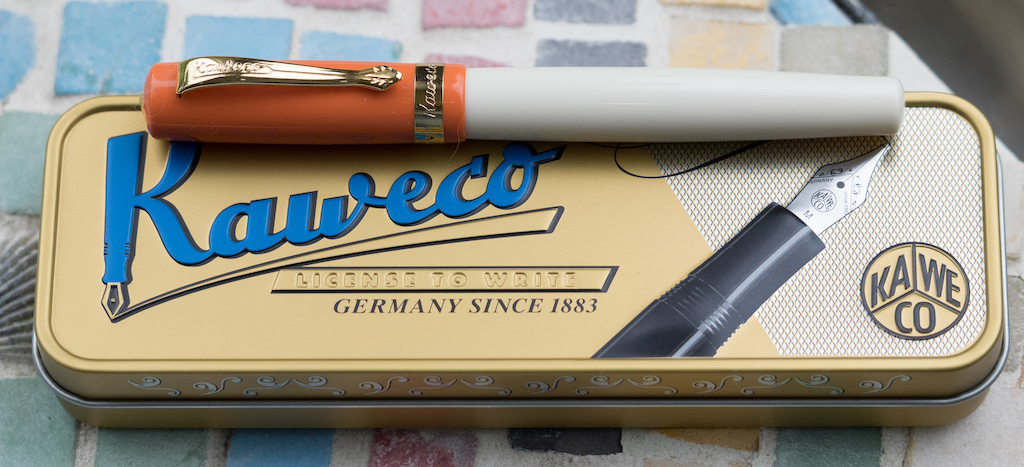
I saw the Kaweco Student 70s Soul Fountain Pen a few months ago on the Vanness Pens website. It was love at first sight--I mean who wouldn’t love a pen that looks like a creamsicle? Unfortunately, Vanness was out of stock, and I decided that it wasn’t meant to be. But, a couple of weeks ago there it was! The 70s Soul back in stock! So I ordered one immediately.

The pen comes in the usual Kaweco tin box with one blue cartridge.

Fortunately, I had a Kaweco converter in my stockpile, so I loaded it up with my favorite orange ink: Kyoto Kyo-Iro Higashiyama Moonlight (reviewed here).

The Student is a small pen, though it is not pocket-sized. It measures 5 and 1/8 inches/130mm capped; 4 and 3/4 inches/121mm uncapped, and 6 and 1/4 inches/159mm posted. Although the pen writes fairly well posted, I always feel like posting throws off the balance unless the cap posts deeply. This one does not.

I love the shade of orange used on the 70s Soul. It really does look like a creamsicle alongside the cream-colored barrel. The cap has a gold Kaweco finial, a gold clip engraved with the Kaweco name in cursive, and a gold band engraved with “Kaweco Germany.” The back of the cap also has “Kaweco Student Germany” printed in gold lettering.

The body has no branding at all, just a clean, uninterrupted line. I love how it tapers near the bottom. The grip is gold (presumably over steel). I normally don’t like metal grips, but this one isn’t heavy and my fingers don’t slide all over it. That said, it is a thin grip. I don’t own a caliper, so I can’t state the diameter of the grip, but it’s too thin to be comfortable for long writing sessions, at least for me.

I chose a steel, gold-plated fine nib for this pen. It’s a tiny nib, but, fortunately, it’s smooth and the tines are aligned. Kaweco nibs are often hit or miss, and I lucked out on this one.

Unfortunately, the converter is just okay. Ink tends to pool near the piston end, so I have to open the pen up and manually push the ink down toward the nib to keep things flowing. I’ve read that Kaweco pens work best with cartridges, but, dang it, I like using my matchy Japanese inks!

The Kaweco Student 70s Soul Fountain Pen is adorable. I love the colors, and it’s fun to write with (at least in short spurts). At $70 (converter not included) I think it’s way overpriced. I guess you’re paying for the Kaweco brand and . . . I’m not sure what else. It’s a plastic pen with a steel nib. I think $30 would be more reasonable for a pen of this size and quality. Vanness Pens has this pen in stock if you need some 70s soul in your life.

(I purchased this pen with my own funds with a reviewer’s discount from Vanness Pens.)


Enjoy reading The Pen Addict? Then consider becoming a member to receive additional weekly content, giveaways, and discounts in The Pen Addict shop. Plus, you support me and the site directly, for which I am very grateful.

Membership starts at just $5/month, with a discounted annual option available. To find out more about membership click here and join us!

Posted on May 10, 2019 and filed under Kaweco, Fountain Pens, Pen Reviews.

NibGrinder Micro Architect Nib Grind Review

The NibGrinder Micro Architect grind is the Pilot Hi-Tec-C 0.3 mm of nib grinds.

If you have followed me for any length of time then you know that the Pilot Hi-Tec-C 0.3 mm is one of my all-time favorite gel ink pens. You also know that I rarely, if ever, recommend it. It is fine almost to the point of obscene, and extremely finicky. It hard starts and can be uneven, but when it is going good, it makes my handwriting look amazing.

These words are exactly how I feel about this nib grind.

Mark Bacas, the man behind NibGrinder, sent me this nib after the 2018 Atlanta Pen Show. It was one of those experiments that I get involved in frequently. “Hey Brad, I think this is right up your alley.” My friends know me well.

Mark called this a micro architect grind, but it is no different than any standard architect nib grind. It just happens to be on a finer stock nib than most architect nib grinds. An architect grind generally works the best on broad nibs to give the nib grinder a larger area of manipulation, while giving the consumer a smoother writing experience. Since this is a North/South angled grind, as opposed to East/West like a stub (see the previous link), the wider the nib, the smoother the writing experience.

What would the results be if you applied this grind to a finer-nibbed pen, like this steel Jowo F nib? For me, the results are amazing, but not without challenges.

First and foremost, the nib is sharp. This means there is a small sweet spot on the nib, and your writing angle better hit it. You run into this with standard architect nib grinds as well, but you have more wiggle room. Angle of attack matters with this pen more than any other pen I own.

Writing pace matters, too. I’m a fast writer, and to get the full effect of this nib grind, I had to slow it down. I’m ok with this because the results are worth it, but I dug the tip of the nib into the page more than once on a south to north stroke. That stroke should be eliminated with most architect grinds, but even more so with one this fine. I have to slow it down.

If you have a bad writing angle and incorrect pace, your results will be inconsistent. The ink flow will be poor, as will the line consistency. You will also end up with paper fibers stuck in the nib, so keeping my brass shim handy was important.

Bringing this full circle, I feel like my comparison is correct. What I get from this micro architect grind is the same thing I get from the Pilot Hi-Tec-C 0.3 mm gel ink pen. It can be a troublemaker if you aren’t ready for it, but when it goes right, it is fantastic.

(NibGrinder provided this product at no charge to The Pen Addict for review purposes.)


Enjoy reading The Pen Addict? Then consider becoming a member to receive additional weekly content, giveaways, and discounts in The Pen Addict shop. Plus, you support me and the site directly, for which I am very grateful.

Membership starts at just $5/month, with a discounted annual option available. To find out more about membership click here and join us!

Posted on May 6, 2019 and filed under Nib Grind, Architect Nib, Pen Reviews.

Conway Stewart Churchill Peppered White Bespoke Fountain Pen: A Review

(Susan M. Pigott is a fountain pen collector, pen and paperholic, photographer, and professor. You can find more from Susan on her blog Scribalishess.)

The Conway Stewart Churchill Peppered White is a bespoke pen--only eighteen were made. Vanness Pen Shop had one of the eighteen, and Brad purchased it (at a discount) for me to review on The Pen Addict.

Packaging is, of course, not the most important factor when reviewing a pen. But, when you’ve purchased a special pen, presentation can make it feel even more extraordinary. Conway Stewart definitely knows how to present a pen. The Churchill comes in a handsome leatherette box with a black velvet interior. Included are a certificate of authenticity, a user guide, cartridges, and a pen cloth to remove tarnish from the silver fittings.

The Churchill is an oversized pen, measuring 5.7 inches/146mm capped; 5.4 inches/138mm uncapped; and 7.1 inches/181mm posted. Unposted, the pen feels wonderful in the hand with excellent balance. Posted, the pen is ridiculously long and feels more like a wizard’s wand than a fountain pen. Actually, my Professor McGonagall wand is better balanced than this Conway Stewart pen is posted! The pen weighs 35gm total.

Although the barrel and cap are made of acrylic, both have brass fittings which gives them heft. The barrel screws onto brass threads, and the finial is attached to a brass piece in the cap. I like the fact that there is added weight near the grip because it makes the pen more comfortable.

The cap has a large, engraved black finial. The clip and cap ring are solid sterling silver. I love the shape of the clip which ends in a diamond, and the raised Conway Stewart logo looks classy. The cap ring has no branding, but the silver content is engraved in small letters.

The body of the pen is acrylic with a black grip and black finial at the bottom. Both ends are adorned with silver rings (two near the grip and one near the bottom).

The acrylic is called “Peppered White,” which is an apt name. It has white, gray, and black flecks and an occasional blue fleck.

My pen is fitted with an 18k gold two-tone fine nib. It has a simple design without any scrollwork. There’s a tiny British flag engraved underneath the breather hole, and the gold content and nib size are engraved near the base of the nib.

I’ve found the nib to be smooth and wet and unyielding. It’s definitely a Western fine with no flex or bounce. Although it writes well most of the time, occasionally it skips on downstrokes. Nevertheless, I really enjoy writing with this pen.

The Churchill is a cartridge/converter pen. I’m a little disappointed that a pen of this size and price point isn’t a piston filler, but the converter works well and supplies an adequate amount of ink to the nib. I definitely prefer a cartridge/converter over a lever filler (some modern Conway Stewarts are lever fillers), because lever fillers can be difficult to clean.

I am really pleased with my Conway Stewart. It’s a gorgeous pen with presence. The size and weight are perfect for me, but if you prefer small, light pens you won’t want this model.

Vanness only had one Peppered White in stock (and I now own it), but you can purchase this bespoke pen directly from Conway Stewart for $478.80.

(This pen was purchased at Vanness Pens with a reviewers discount.)


Enjoy reading The Pen Addict? Then consider becoming a member to receive additional weekly content, giveaways, and discounts in The Pen Addict shop. Plus, you support me and the site directly, for which I am very grateful.

Membership starts at just $5/month, with a discounted annual option available. To find out more about membership click here and join us!

Posted on May 3, 2019 and filed under Conway Stewart, Fountain Pens, Pen Reviews.