Posts filed under Pen Reviews

Uni-ball Signo 207 Premier Review

(Jeff Abbott is a regular contributor at The Pen Addict. You can find more from Jeff online at Draft Evolution and Twitter.)

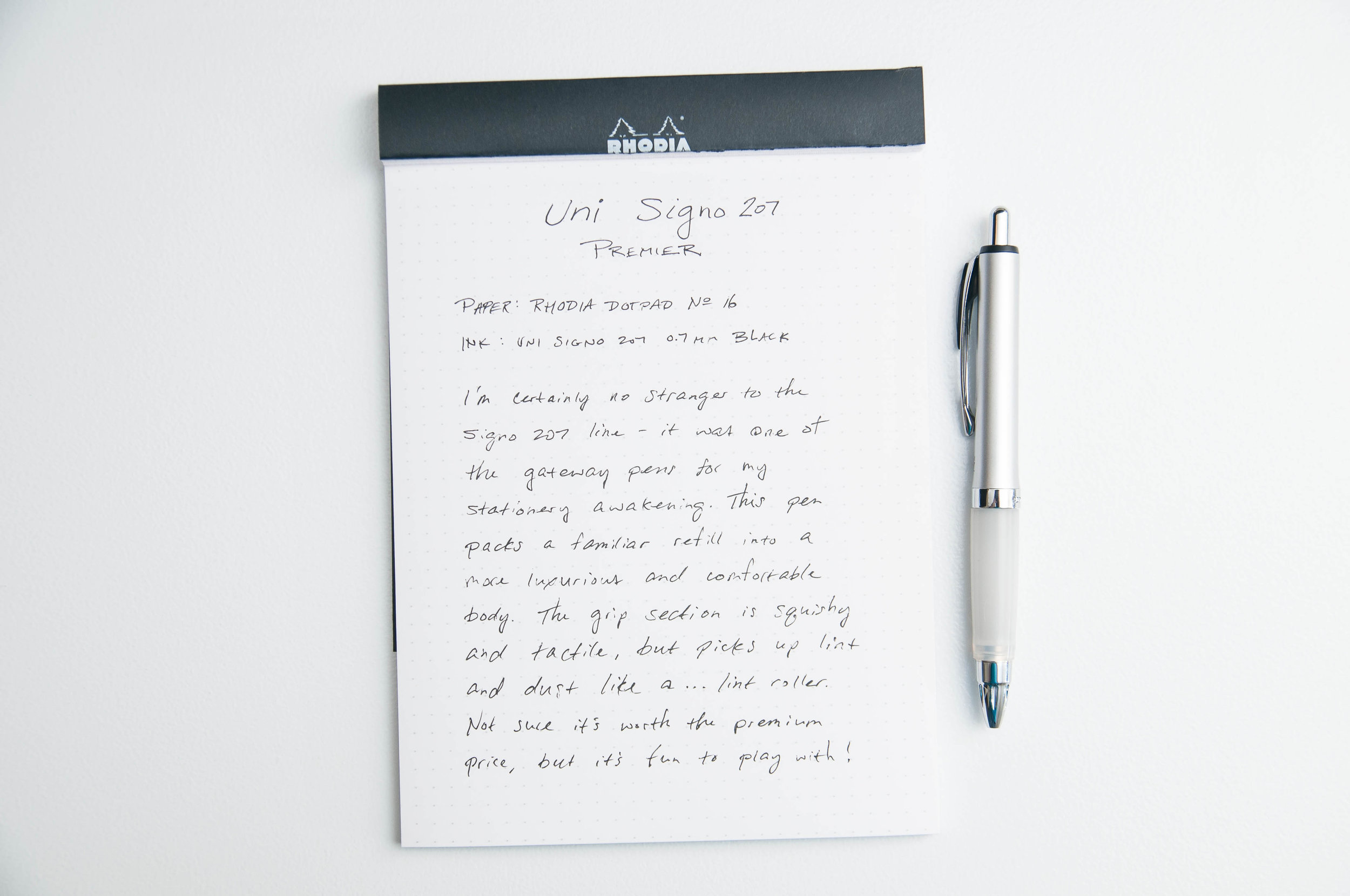
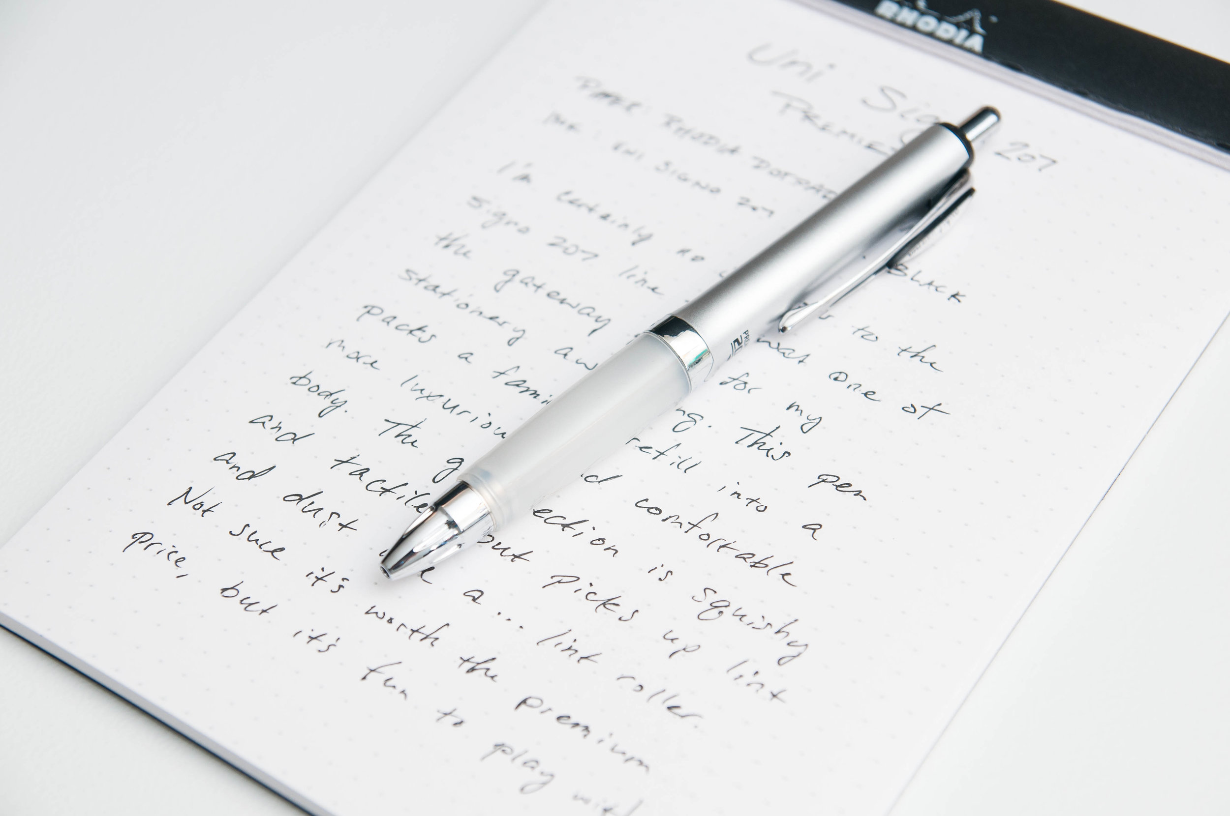
I'm no stranger to the Uni Signo 207 line. In fact, they were one of my gateway pens into my stationery awakening back in the day. Regarded as one of the most accessible "nice" pens available at every big box store today, it's probably been a gateway pen for many, many people. Given the smooth, crisp refills and high quality body, it's no wonder. As good as the standard 207 is, I had to give the Uni Signo 207 Premier a shot to see if the extra cushion could improve on an old classic.

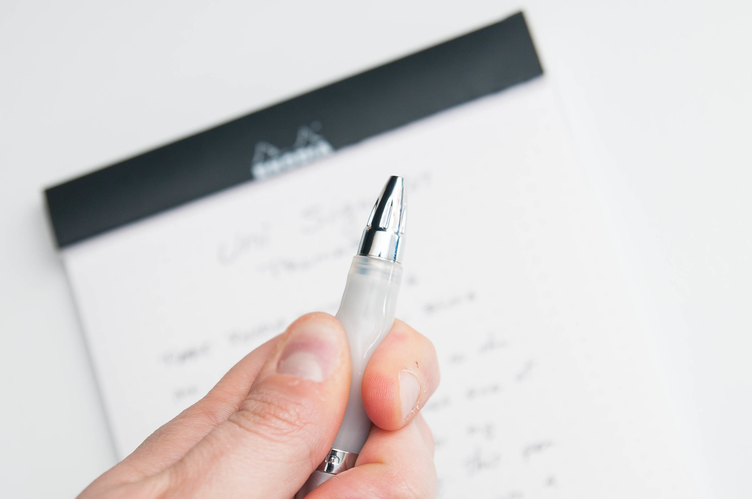
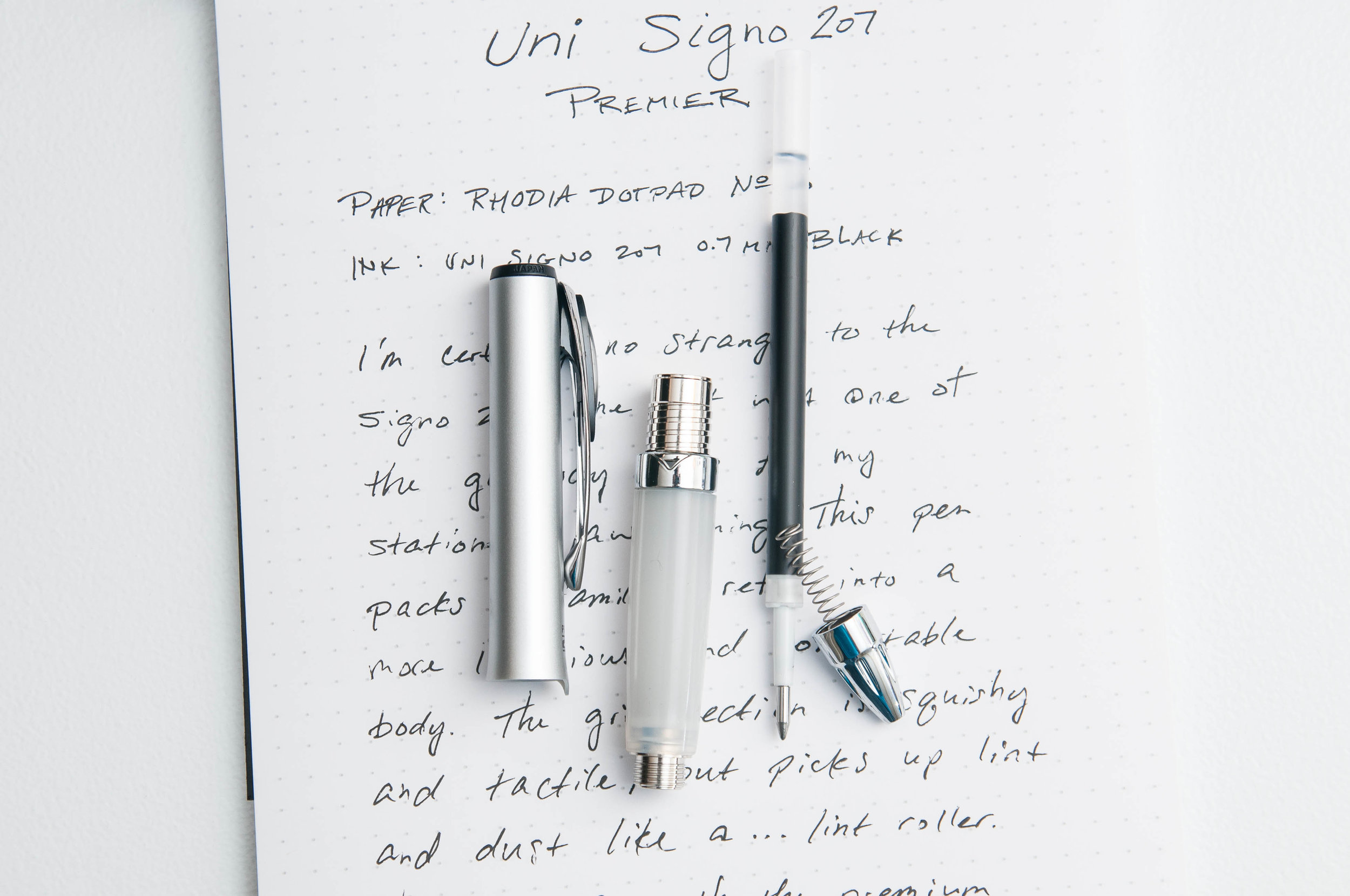
Since the refill inside this Premier body is no surprise, I'll just say that it is exactly what you can expect from the regular 207 line. They all use the same refill, so you can easily swap it out for the size and color that works best for you. I don't have any spares at the moment, but I mostly prefer blue 0.5mm refills with this pen. The black 0.7mm works great, though. The ink is smooth and crisp and I have zero complaints about it.

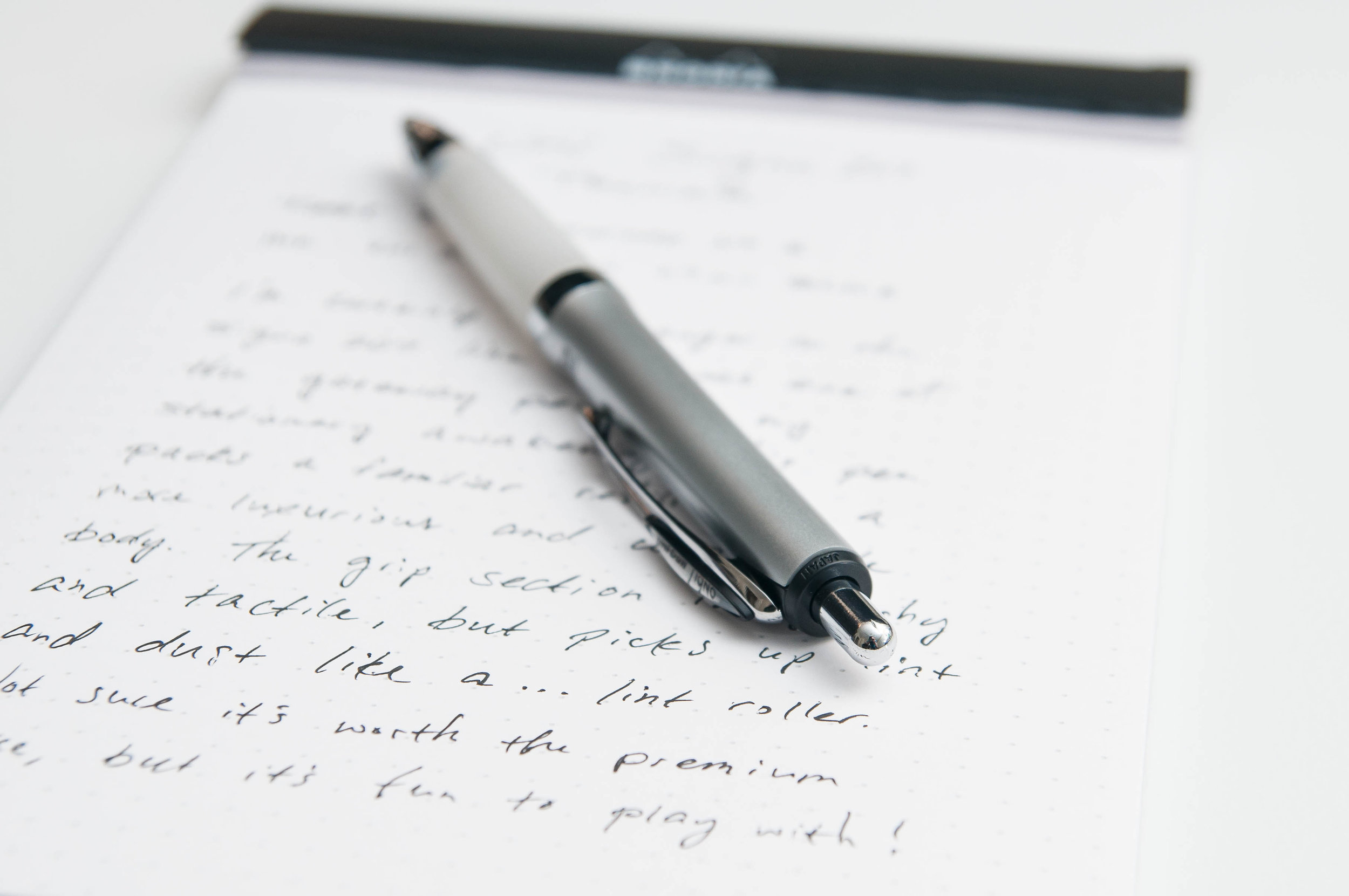
The key difference between a regular 207 and the 207 Premier is the luxurious grip section. This thing is a delightful little pillow for your fingers. I've had so much fun playing with it and enjoying the plush texture. The additional cushion does also make the overall diameter of the pen a bit larger as well, so it feels a little more chunky than the standard 207. In my experience, it hasn't really made the writing experience any more or less comfortable. This mostly comes down to how I hold the pen. My grip is fairly low on any pen I use, so I end up gripping the space between the nose cone and the beginning of the grip. At that part, there just isn't much cushion because of the underlying mechanism that locks the grip section into the cone. You don't really get to fully experience the cushy grip unless you hold the pen a little higher. This is uncomfortable to me just because of old habits, but I envy the people who can naturally pick this pen up and write with the cushion in the appropriate place for their fingers. I imagine it feels great and relieves fatigue.

I'm willing to discount this critique on the 207 Premier because one size does not fit all when it comes to pen grips. I knew what to expect, and I wasn't disappointed or surprised when I finally held it in my hand. But, one area I do criticize the 207 Premier's grip is how it reacts to lint and dust. It LOVES it. Between playing with the grip, writing, and cleaning lint and dust off the grip, I'd say I've split my time equally three ways. It really is a magnet for picking up lint, and I haven't even slid this pen into a jeans pocket. I really don't want to for precisely this reason. This is not something I expected from looking at the pictures, and it does prevent me from using the pen like I normally would.

At just under $9, you could pick up a couple of 3-packs of the regular 207s. Unless you know that your writing grip would fit this grip section perfectly, and you know you'd love to write with the pillowy cushion under your fingers, I'd recommend you pass on this one. The bonus of the fancy grip and larger body don't elevate the value over the regular 207 lineup. Save a few bucks and enjoy the already-excellent Uni 207 instead!

(JetPens provided this product at no charge to The Pen Addict for review purposes.)


Enjoy reading The Pen Addict? Then consider becoming a member to receive additional weekly content, giveaways, and discounts in The Pen Addict shop. Plus, you support me and the site directly, for which I am very grateful.

Membership starts at just $5/month, with a discounted annual option available. To find out more about membership click here and join us!

Posted on May 15, 2019 and filed under Uni-Ball, Signo, 207, Pen Reviews.

Kaweco Student 70s Soul Fountain Pen: A Review

I saw the Kaweco Student 70s Soul Fountain Pen a few months ago on the Vanness Pens website. It was love at first sight--I mean who wouldn’t love a pen that looks like a creamsicle? Unfortunately, Vanness was out of stock, and I decided that it wasn’t meant to be. But, a couple of weeks ago there it was! The 70s Soul back in stock! So I ordered one immediately.

The pen comes in the usual Kaweco tin box with one blue cartridge.

Fortunately, I had a Kaweco converter in my stockpile, so I loaded it up with my favorite orange ink: Kyoto Kyo-Iro Higashiyama Moonlight (reviewed here).

The Student is a small pen, though it is not pocket-sized. It measures 5 and 1/8 inches/130mm capped; 4 and 3/4 inches/121mm uncapped, and 6 and 1/4 inches/159mm posted. Although the pen writes fairly well posted, I always feel like posting throws off the balance unless the cap posts deeply. This one does not.

I love the shade of orange used on the 70s Soul. It really does look like a creamsicle alongside the cream-colored barrel. The cap has a gold Kaweco finial, a gold clip engraved with the Kaweco name in cursive, and a gold band engraved with “Kaweco Germany.” The back of the cap also has “Kaweco Student Germany” printed in gold lettering.

The body has no branding at all, just a clean, uninterrupted line. I love how it tapers near the bottom. The grip is gold (presumably over steel). I normally don’t like metal grips, but this one isn’t heavy and my fingers don’t slide all over it. That said, it is a thin grip. I don’t own a caliper, so I can’t state the diameter of the grip, but it’s too thin to be comfortable for long writing sessions, at least for me.

I chose a steel, gold-plated fine nib for this pen. It’s a tiny nib, but, fortunately, it’s smooth and the tines are aligned. Kaweco nibs are often hit or miss, and I lucked out on this one.

Unfortunately, the converter is just okay. Ink tends to pool near the piston end, so I have to open the pen up and manually push the ink down toward the nib to keep things flowing. I’ve read that Kaweco pens work best with cartridges, but, dang it, I like using my matchy Japanese inks!

The Kaweco Student 70s Soul Fountain Pen is adorable. I love the colors, and it’s fun to write with (at least in short spurts). At $70 (converter not included) I think it’s way overpriced. I guess you’re paying for the Kaweco brand and . . . I’m not sure what else. It’s a plastic pen with a steel nib. I think $30 would be more reasonable for a pen of this size and quality. Vanness Pens has this pen in stock if you need some 70s soul in your life.

(I purchased this pen with my own funds with a reviewer’s discount from Vanness Pens.)


Enjoy reading The Pen Addict? Then consider becoming a member to receive additional weekly content, giveaways, and discounts in The Pen Addict shop. Plus, you support me and the site directly, for which I am very grateful.

Membership starts at just $5/month, with a discounted annual option available. To find out more about membership click here and join us!

Posted on May 10, 2019 and filed under Kaweco, Fountain Pens, Pen Reviews.

NibGrinder Micro Architect Nib Grind Review

The NibGrinder Micro Architect grind is the Pilot Hi-Tec-C 0.3 mm of nib grinds.

If you have followed me for any length of time then you know that the Pilot Hi-Tec-C 0.3 mm is one of my all-time favorite gel ink pens. You also know that I rarely, if ever, recommend it. It is fine almost to the point of obscene, and extremely finicky. It hard starts and can be uneven, but when it is going good, it makes my handwriting look amazing.

These words are exactly how I feel about this nib grind.

Mark Bacas, the man behind NibGrinder, sent me this nib after the 2018 Atlanta Pen Show. It was one of those experiments that I get involved in frequently. “Hey Brad, I think this is right up your alley.” My friends know me well.

Mark called this a micro architect grind, but it is no different than any standard architect nib grind. It just happens to be on a finer stock nib than most architect nib grinds. An architect grind generally works the best on broad nibs to give the nib grinder a larger area of manipulation, while giving the consumer a smoother writing experience. Since this is a North/South angled grind, as opposed to East/West like a stub (see the previous link), the wider the nib, the smoother the writing experience.

What would the results be if you applied this grind to a finer-nibbed pen, like this steel Jowo F nib? For me, the results are amazing, but not without challenges.

First and foremost, the nib is sharp. This means there is a small sweet spot on the nib, and your writing angle better hit it. You run into this with standard architect nib grinds as well, but you have more wiggle room. Angle of attack matters with this pen more than any other pen I own.

Writing pace matters, too. I’m a fast writer, and to get the full effect of this nib grind, I had to slow it down. I’m ok with this because the results are worth it, but I dug the tip of the nib into the page more than once on a south to north stroke. That stroke should be eliminated with most architect grinds, but even more so with one this fine. I have to slow it down.

If you have a bad writing angle and incorrect pace, your results will be inconsistent. The ink flow will be poor, as will the line consistency. You will also end up with paper fibers stuck in the nib, so keeping my brass shim handy was important.

Bringing this full circle, I feel like my comparison is correct. What I get from this micro architect grind is the same thing I get from the Pilot Hi-Tec-C 0.3 mm gel ink pen. It can be a troublemaker if you aren’t ready for it, but when it goes right, it is fantastic.

(NibGrinder provided this product at no charge to The Pen Addict for review purposes.)


Enjoy reading The Pen Addict? Then consider becoming a member to receive additional weekly content, giveaways, and discounts in The Pen Addict shop. Plus, you support me and the site directly, for which I am very grateful.

Membership starts at just $5/month, with a discounted annual option available. To find out more about membership click here and join us!

Posted on May 6, 2019 and filed under Nib Grind, Architect Nib, Pen Reviews.