Posts filed under Pen Reviews

Uni EMOTT Sign Pen Review

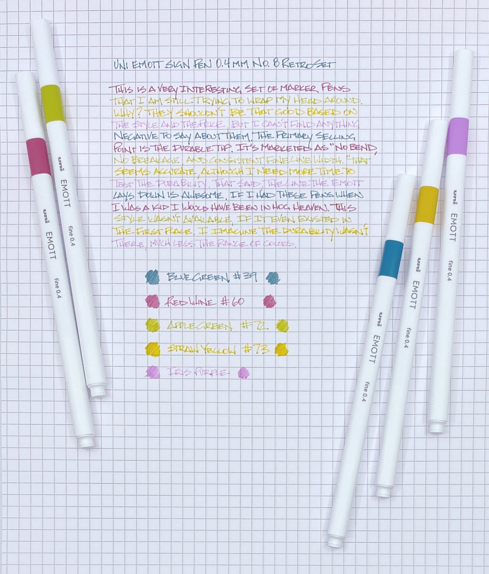
Any time a new sign pen hits the market you better believe I’ll be getting them to test as soon as possible. The Uni EMOTT Sign Pens look exactly like a pen that would be perfect for me. Now that I have them in hand, are they?

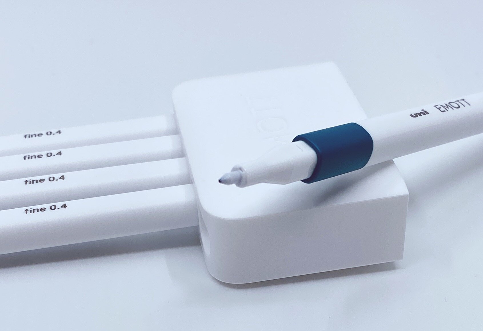
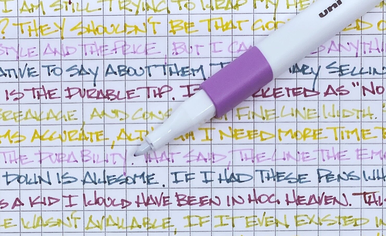
First of all, they write wonderfully. 0.4 mm plastic tip pens are not the norm by any stretch, and based on the way I write, they are great. The line is sharp and clean, which is the exact requirement for a pen tip like this.

The marketing of the EMOTT focuses a lot on the durability of the tip as well, stating it is “no bend, no breakage, and a consistent fine line width.” So far, I’m buying what they are selling, but I have a lot more writing in front of me to really test the durability.

The water-based ink is also water resistant, no bleed, and no smearing - which is honestly the cost of entry into this market. Your marker/sign pen has to have those features. What else can the EMOTT bring to the table? How about 40 colors of ink.

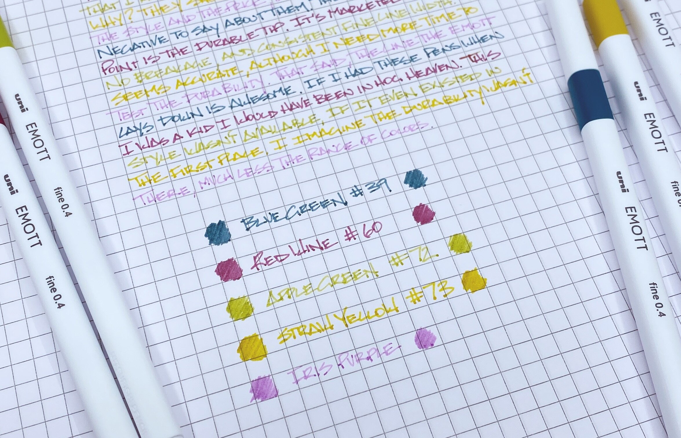
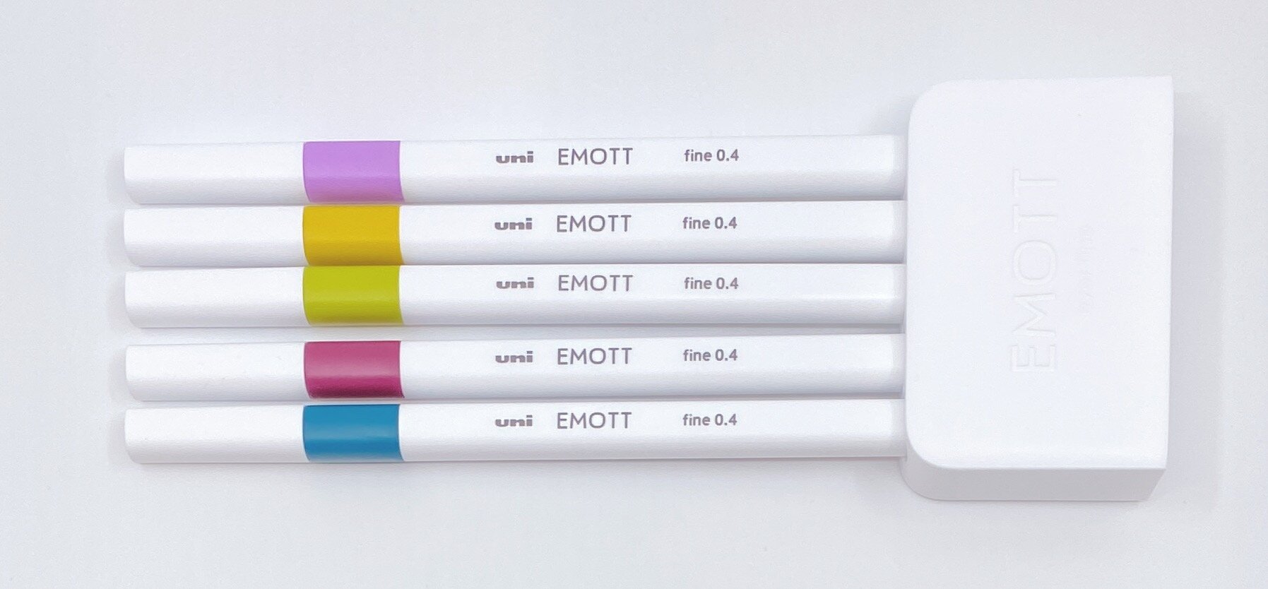
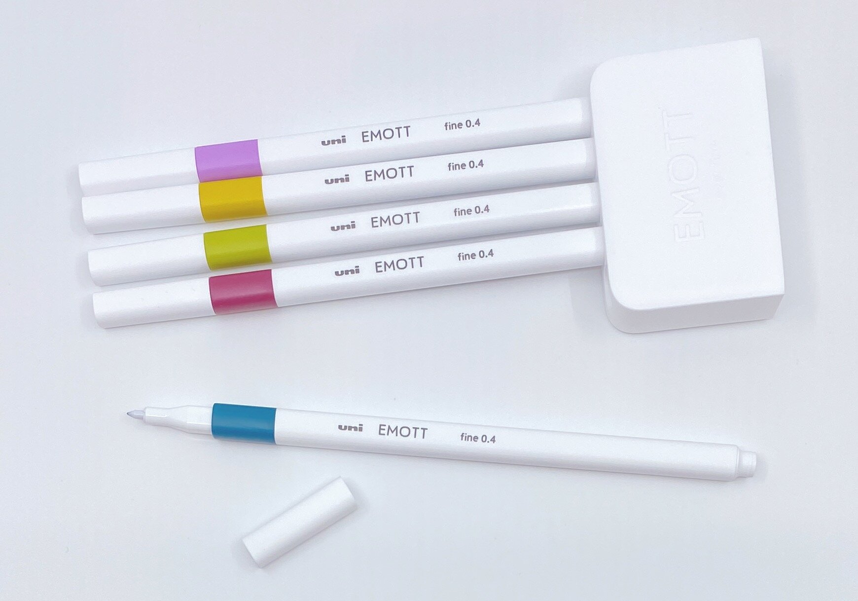
I chose the No. 8 Retro Set, which consists of Blue Green, Red Wine, Apple Green, Straw Yellow, and Iris Purple. It’s a great combination of colors, and it will shock you none that Blue Green is my favorite of the bunch. The only downside of this set is that they aren’t sold as individual pens like the 10 base colors are.

The two hangups with the EMOTT that some may have are the barrel shape, and the price. These are long, skinny pens with a square barrel. I’d prefer it to be triangular, if not round, but square works for me. It may not for others.

Price-wise, I think $3 per pen is the top end of what I’d pay for these. It looks and feel more like a $2 sign pen, but if the durability is there as it states, they are probably worth it. I’ll likely pick up a basic black soon to write with more frequently and see how they really stand up.

So, are they perfect for me? No, but they are really good. Especially the tip size and the colors. I’m definitely enjoying them so far.

(JetPens provided this product at no charge to The Pen Addict for review purposes.)


Enjoy reading The Pen Addict? Then consider becoming a member to receive additional weekly content, giveaways, and discounts in The Pen Addict shop. Plus, you support me and the site directly, for which I am very grateful.

Membership starts at just $5/month, with a discounted annual option available. To find out more about membership click here and join us!

Posted on December 30, 2019 and filed under Uni, EMOTT, Sign Pen, Pen Reviews.

Kaco Retro Fountain Pen Review

(Jeff Abbott is a regular contributor at The Pen Addict. You can find more from Jeff online at Draft Evolution and Twitter.)

Trying new and unique fountain pens is always fun, especially when they come in at the lower end of the price spectrum. The Kaco Retro fountain pen is a sleek design from a Chinese company that offers a sense of nostalgia and modern colors.

I've definitely done my share of eBay perusing when trying to find some fun and inexpensive fountain pens to try from top Chinese sellers. But, you do run some additional risk when you purchase these pens because quality control isn't the best and your options for correcting any problems are convoluted. In the case of the Kaco Retro, you can purchase your pick from Cult Pens and be sure that your experience will be top notch. This takes all of the guess-work out of this particular pen!

Purchasing options aside, the Retro is actually a good pen. Like the name implies, it borrows heavily from the Parker 51 aesthetic, but manages to add some modern flair in the way of colors and the clip accent. Possibly the coolest feature of the pen is the use of a hooded nib, which means the grip section covers most of the nib and only allows the very tip to show through. The orange one I have is an eye-catcher, and it's also fun to pass around and let people try since it's an inexpensive fountain pen.

To me, the aspect of this pen that grabs my eye first every time is the little pin head at the end of the clip. The bright blue-green always catches my attention and I can't help but pick it up for a quick writing session. Each pen color has a coordinated clip accent, which just adds to the fun of these pens. The functionality of the clip is also excellent! It's strong and does a great job of holding the pen in place during transport.

Moving on the cap, it features a smooth friction-fit design to secure it to the pen when not in use. You can also post the cap easily while writing. The amount of force necessary to uncap or cap the pen feels almost perfect to my preference. It's a bit tight when trying to uncap, but you quickly get used to it after using the pen a few times. One thing I noticed quickly is that you should avoid twisting the pen in a counter-clockwise motion when uncapping it because this unscrews the grip section from the pen body! I never realized how much I rotate pens when removing the cap, but I have certainly noticed during my time with the Kaco Retro. This hasn't resulted in any ink accidents, but it is slightly annoying to be made to tighten the grip section after uncapping the pen.

Aside from the clip, the only other feature on the cap of the pen is a small embossed KG, which stands for the company name. It's very low-profile and is difficult to notice in most light.

The pen body and grip section are the same width and match up perfectly against a small clear ink window. The ink window is handy to show you how much ink is left in your converter or ink cartridge, but it's also really easy to just unscrew the section and take a closer look. Either way, it's definitely a nice visual point to break up all the orange.

The grip section is somewhat uncomfortable for my fingers due to the material and smooth, sloped nature of the grip. I always struggle with glossy plastic grips, and this one is no exception. It is comfortable in my hand at first, but quickly becomes slick and difficult to hold after I use it for a minute or two. Your experience will vary, but you should have a pretty good idea of whether this grip will work for you just based on the shape and materials used.

Now, how about that nib? It's a good nib! The manufacturer says it's an extra fine, but the one I have writes like a European fine. The Cult Pens website even notes that some of the pens write like a European medium, so keep that in mind when ordering. This isn't a good choice if you're trying to dial in your nib preferences or are only interested in certain nib sizes!

The nib is smooth, the feed provides plenty of ink while writing, and I've been really impressed with how well the pen works in general. My only complaint is due to the design of the grip and nib. The hooded nib looks great, but it's always difficult for me to make sure I'm holding the pen at the right orientation while writing. Fountain pen nibs work best when the nib is parallel to the page. In most cases, the nib ceases to function when you roll the nib too far to one side or the other. Not a big deal in most cases, but this pen lacks the visual cue of the actual nib, and it also has a featureless grip section to let you know when your grip is rolling a bit too far. The hooded nib is so hooded that I have a difficult time knowing where the sweet spot of the nib is located!

Minor quirks aside, this really is such a fun pen. It includes a couple of ink cartridges as well as a cartridge converter so that you can use your own bottled ink. As a writing instrument, it functions beautifully and manages to be really dependable and robust. The materials used are mostly plastic, but the pen body and cap feel solid instead of like thin plastic that will break easily. For a pen that costs about ten dollars, it's a fun experiment!

Aside from the awesome orange color featured in this review, you can also purchase the Kaco Retro in a variety of other fun colors, like Red, Blue, White, Turquoise, and Black.

(Cult Pens provided this product at no charge to The Pen Addict for review purposes.)


Enjoy reading The Pen Addict? Then consider becoming a member to receive additional weekly content, giveaways, and discounts in The Pen Addict shop. Plus, you support me and the site directly, for which I am very grateful.

Membership starts at just $5/month, with a discounted annual option available. To find out more about membership click here and join us!

Posted on December 18, 2019 and filed under Kaco, Fountain Pens, Pen Reviews.

The Top 10 Stationery Products of the Decade

The end of any decade marks a good time to look back, and I had a great time coming up with a list of products that made a difference to me in the past ten years. That’s right, this is a “me” list. What products impressed me the most, allowed me to tell a story, made a notable difference in the marketplace, and maybe even taught me something.

This list comprises a wide range of products. I could have made a Top 10 Pens of the decade list, but I feel that only tells part of the story. What good is a pen without paper? And ink? And maybe a pencil - or two - to take notes with? They are all represented here. And they all have their own story to tell.

The ten products below are listed in alphabetical order. Ranking them serves no real purpose since this isn’t a single item list. Telling you that a wood case pencil ranks number three and a bottle of ink ranks number six has no underlying meaning. I believe all of these products stand on their own as-is.

And it bears repeating: This list represents my opinion. My goal isn’t to tell you the best fountain pen of the decade. It’s to tell you a story about a product that made a difference to me in the last ten years of writing The Pen Addict.

I hope you enjoy it.

Blackwing 602 (2011): What better way to start than with one of the most controversial releases in the past decade. Controversy? In the stationery world? Oh yes.

When word got out that California Cedar acquired the rights to the Blackwing brand, the pencil internet went nuts, and not all of it was positive. In fact, there was a large and vocal contingent of naysayers, who saw this as a travesty, money grab, and an embellishment of history for marketing purposes. Others, such as myself, felt that if it was done right, then this would be a boon to the pencil community, and spread the love of graphite even further.

Guess who won that battle.

I understand the romance that history provides, but from an outsiders perspective such as mine, I feel that the Berolzheimer family has been a good steward of the brand, and has pushed the simple pencil into a core stationery product once again. The modern Blackwing 602 is a prime example of that.

Bungubox Sailor Pink Love (2016): This was far from the first Sailor limited edition fountain pen, but it was the first one that made me sit up and take notice of a completely different side of the hobby.

You're telling me a major brand can make a pink glitter barrel, and match that with gunmetal plating on the nib and hardware? Is that a raden clover on the finial? There were only 100 of these made for a tiny stationery shop in Japan? And there is matching ink?

This pen was an eye-opener on many levels. Mainly, that there is an entire world of pens out there that I wasn’t paying attention to. To say that this pen gives me feelings is an understatement. It has also cost me a lot of money in future purchases of highly limited editions.

J. Herbin Emerald of Chivor (2015): The shimmer ink that launched a revolution.

Similar to the Sailor Pink Love, J. Herbin Emerald of Chivor changed the marketplace, although this time around it wasn’t just through my eyes. Emerald of Chivor turned the entire ink market on its head. With its release, we learned that shimmer inks can be something special, and not just a gimmick.

Shimmer inks that predate it always seemed boring and non-essential to me - even J. Herbin’s own releases. Often, the underlying color was basic and flat, and the shimmer they provided on the page was inconsistent on a good day.

Emerald of Chivor reset all expectations of what a shimmer ink can and should be. It took a while for other companies to catch up to J. Herbin in this aspect, but the quality of shimmer inks on the market these days, lead by brands such as Diamine and Robert Oster, is outstanding, and most importantly, interesting.

The shimmer ink market was boring until J. Herbin Emerald of Chivor came along.

Kaweco Liliput Fireblue (2014): One of my favorite Paul Bunyan-esque marketing stories of my time writing this blog is that each of the steel-bodied Kaweco Liliput Fireblue fountain pens were torched by Kaweco CEO Michael Gutberlet at his desk, using a 600 degree flame. I don’t know why, but this makes me giggle every time I think about it.

The results were no laughing matter though, as this pen set the torched pen market on fire - pun absolutely intended. At the time, I don’t believe I had run across any pen that looked like this, and already being a fan of the standard Liliput, I had to have it.

In relation to the rest of the lineup, the Fireblue was outrageously priced (around double), yet they were sold out constantly. It took consumers months of waiting to acquire one, and once they did, they loved it as much as I did. And I still do to this day.

Like a lot of products on this list, it wasn’t the first in its category to do a special thing, but it was the product that pushed what was special about it into the mainstream stationery world.

Nanami Seven Seas Journal (2015): Where were you when you discovered the wonder that is Tomoe River paper?

My first experience was from Pen Addict readers sending me loose sheets in envelopes to my house. It wasn’t easy to acquire, and nobody was binding it into notebooks that were easily accessible either. Nanami Paper changed all of that with their Seven Seas lineup of Tomoe River Journals.

Nanami first started with Tomoe River top-bound glue pads in 2013, followed by the launch of their keystone Seven Seas Journal in 2015. Our collective search for a high-quality Tomoe River Paper bound journal came to an end, and the resulting notebook has become a staple in the fountain pen community to this day.

Pen Type-A (2011): So you think that the re-launch of the Blackwing 602 was peak stationery drama? Ha! You know nothing, Jon Snow.

The Pen Type-A was my first introduction to Che-Wei Wang and Taylor Levy, the couple behind what has become one of my favorite brands, the appropriately named CW&T. It was also the pen that almost broke Kickstarter.

To say that this project was drama-filled would be an understatement of the highest degree. In fact, I’m surprised the story hasn’t been turned into a Gimlet-style five-part podcast series because it is rife with drama perfect for that format.

NotCot has a massive breakdown of what when on during this project, and is a worthwhile read if you are ever thinking about launching your own crowd-funding campaign. I even got caught up in it at one point.

This was a learning experience for everyone involved, myself included, and I’m happy to see that Che-Wei and Taylor were able to weather the storm and thrive. The Pen Type-A formed the baseline of what would become one of my favorite pen designs of all-time, the Pen Type-B, and CW&T have gone on to become an internationally respected design team with a huge range of products.

Platinum 3776 Kumpoo (2018): While many of the products above were at the start of a cycle of change in the marketplace - J. Herbin Emerald of Chivor, for example - the Platinum Kumpoo Fountain Pen marked the peak of what Platinum had been building towards for many years.

I’m the first to admit that I didn’t “get” what Platinum was selling me with the basic 3776 lineup. Yes, the nibs were fantastic, but the barrel designs left a lot to be desired.

Things slowly began to change over time, with simple changes like rhodium plating being introduced, along with a few basic limited editions, such as their Lake Series. I certainly took notice, and began to add them to my collection here and there.

The launch of the Nice Lilas in 2017 opened the communities eyes to what Platinum could do with the 3776 lineup. It wasn’t perfect - many people found the sharpe edges in the barrel to be uncomfortable - but it was a head-turner. The release of the Kumpoo the following year put them on equal footing as a real factor in the big three of the Japanese fountain pen market - along with Pilot and Sailor - not just the perennial bronze medal winner.

The Kumpoo resonated with fountain pen buyers across the board, and sold out almost immediately after launch. It is now the standard-bearer for Platinum 3776 limited edition releases.

Retro 51 Pink Robots (2018): Is this a self-important entrant into this list? Yes, but I’m extremely proud of this pen, and I think it made a difference.

I knew from the moment I saw my friend Matthew Morse’s artwork, titled “Go Yoshimi Go!” that I had to ask him to work with me on making a pen based on the design. The story that the artwork is based on is an important one, and I wanted to share that with others in the form of one of my favorite pens, the Retro 51 Tornado.

The biggest challenge with this design was if myself, Matthew, and the team at Retro 51 could execute the vision we all had for the pen. The story was perfect, could we make a pen that lived up to it?

I think we did, and I’m very proud of that. It’s on this list because I’m not sure I can ever top it.

Schon DSGN 01 (2012): If you weren’t aware, I have a thing for pocket pens. And, when they are as uniquely designed and as well made as the Schon DSGN 01, then you can be sure I love it.

That said, I waited on this one. I didn’t jump on it at launch, but the more I saw them, the more I read about them, and the more I got to use friends pens, the more I realized I was missing out on a pen that is perfect for me.

I still wonder what made me not back that initial Kickstarter campaign in 2012. I can’t pinpoint it, but I’m glad I’ve gone all in on anything and everything Ian has made - at least on the pen front.

My first 01 was the basic all-black model, followed by the clip model, which has become my preferred setup. That said, Ian branched out a couple of years ago with wild and wonderful anodized barrels, featuring finishes like the beautiful Lisa Frank model, pictured above.

If there is any one theme the last decade of stationery should be known for it should be the rise of the independent makers. I’m glad to see Ian Schon is at the forefront.

TWSBI ECO (2015): Expectations are an interesting thing. For example, with the Schon DSGN pen I just mentioned, I had zero expectations going into it. I bought it, loved, it, and therefore it exceeded any expectations I had of it.

The TWSBI ECO, on the other hand, had high expectations from the jump, from myself and the community as a whole. TWSBI, as a brand, could be defined by the expectations we placed on them. This is a brand built to provide a unique and wonderful writing experience at a value price. In the early years of the company, they often fell short of those lofty expectations, but slowly and steadily, they got better.

In the lead up to the ECO, it’s fair to say expectations were high, but tempered. In the past, to own a TWSBI meant being burned in some way, shape, or form. Would that happen once again with the ECO?

Not even close. The ECO has exceeded even my highest expectations for a fountain pen.

At its $30 price point, TWSBI may have cannibalized it’s own higher priced pens because the ECO represents such great value. Its looks are unique, and far from traditional, but the performance, feel, and functionality ranks up there with pens ten times the price. That’s no hyperbole. The TWSBI ECO can hang with pens far greater in historical stature, but it is a pen made today for today’s fountain pen users, and we are all better off for it.

Looking back on the past decade of stationery releases can be a daunting task, but boy was this fun to put together. If I tried again tomorrow, I may come up with ten new products to feature, but I’m thrilled with the stories each of these products represent in my journey.

Thanks for joining me for the ride, and I would love to hear what your favorite products of the last ten years are.


Enjoy reading The Pen Addict? Then consider becoming a member to receive additional weekly content, giveaways, and discounts in The Pen Addict shop. Plus, you support me and the site directly, for which I am very grateful.

Membership starts at just $5/month, with a discounted annual option available. To find out more about membership click here and join us!

Posted on December 9, 2019 and filed under Pen Reviews, Top 10.