Posts filed under Pen Reviews

Wancher Bakelite Seven Treasures Fountain Pen Review

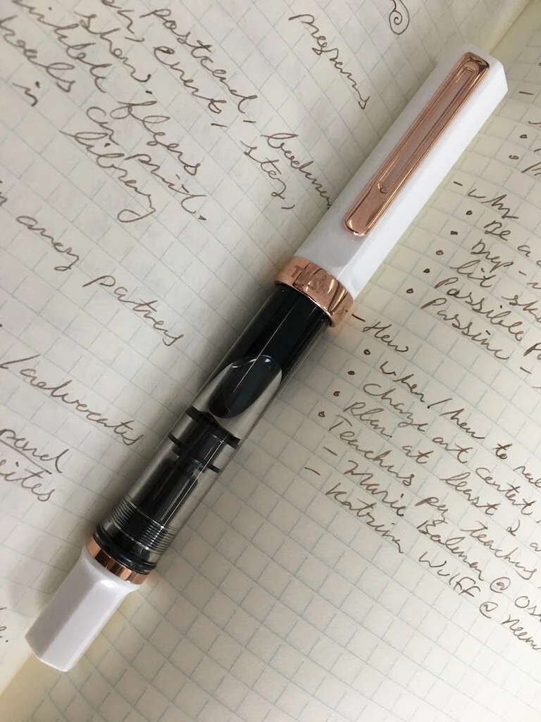
I’ve been able to spend a couple of weeks with the Wancher Bakelite Seven Treasures Fountain Pen, and I am confident in saying this: This is a good pen. It looks good, feels good, writes well, and is fairly priced.

That’s the TL:DR version of this review. Why not end it right there? Because there is a whole lot more to discuss with this pen than whether it is good or not. And that conversation may help you determine if it is good for you.

Let’s start with this: What is Bakelite? That’s a great question! Reading the Bakelite Wikipedia page (which made me want a whiskey) told me that it is a synthetic plastic, developed in the early 1900’s. Over the past 100+ years, it has been used for a wide-range of products - from jewelry, to radio knobs, to equipment coatings. The raw material can be molded into almost anything, including pen barrels.

The Bakelite formula changed and improved with the times, but as other synthetic materials were created, it was pushed aside due to its added cost of manufacturing. Wancher chose to bring Bakelite back with the Seven Treasures fountain pen, and I’m glad they did.

The feel of this pen reminds me of a combination of two materials: G10 and Micarta. Both of these are fibrous materials, manufactured in sheets and pressed together to build the structure of the finished product. G10 is rock hard, and Micarta is sturdy, but softer and more porous. This Bakelite lands right in the middle of those materials to me. It is firm, but has a warmth to it, and if you look closely, you can see the underlying material fibers.

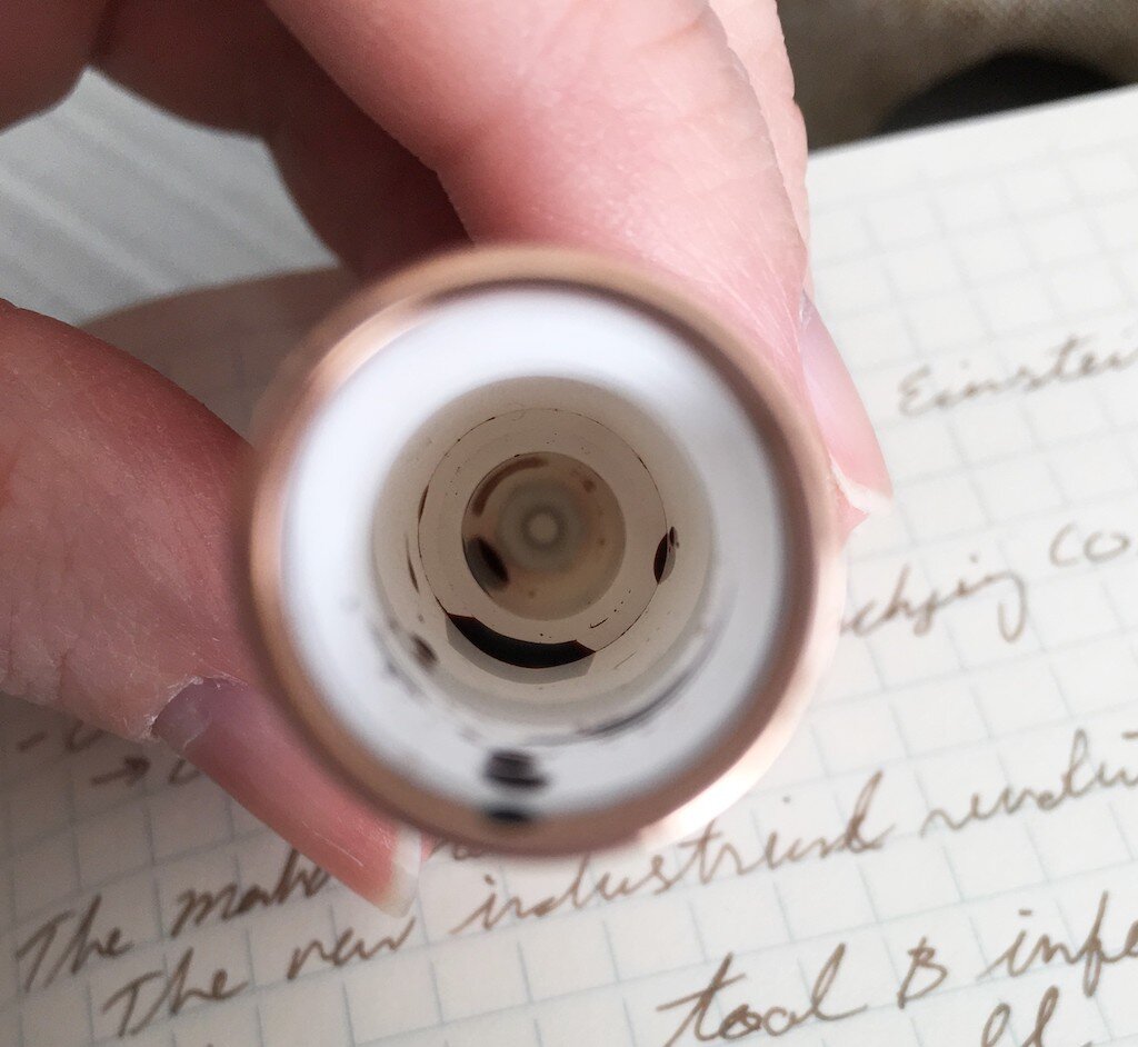
I bring all of this up because at first glance and feel, the Seven Treasures Bakelite doesn’t seem to be a pen that would absorb ink if dipped into an ink bottle. It seems like any other polished acrylic that you could wipe the ink right off of. That’s not the case, and Wancher has designed the pen taking this into consideration.

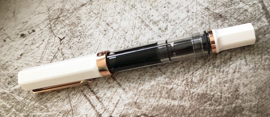
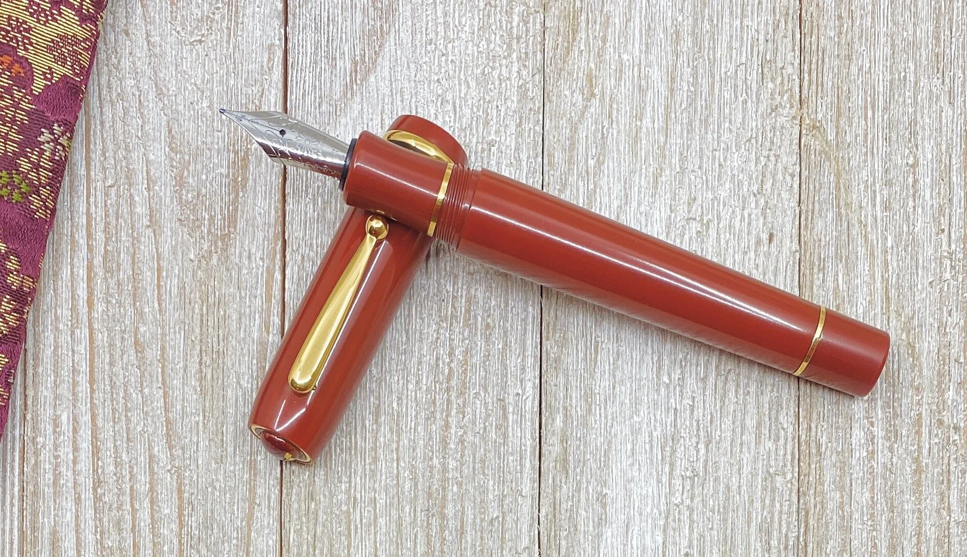
The grip section is removable from the barrel, but not in the way you would traditionally think. It’s a sleeve, designed to be removed so the pen doesn’t get stained when filling. You wouldn’t know that by looking through the campaign page though - it’s not pictured, even once. It’s not in the shape and size diagram either, despite having its own fixed measurement. The filling system is shown in the video without the sleeve, dipping into an ink bottle. That’s about it other than it laying on the table in a few shots.

Why is that? Backers should know what they are getting upfront. I don’t think it is a technical issue, but if Bakelite stains, and you’ve designed a way around that, it should be shown in the campaign. By no means is this a dealbreaker, and in fact I think it is a smart idea that other companies could pick up on. I just find it odd it is never mentioned.

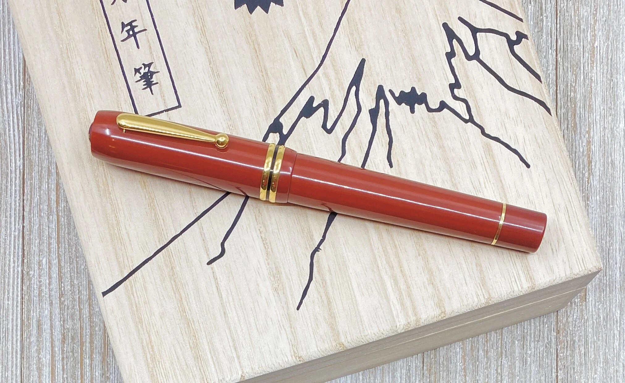
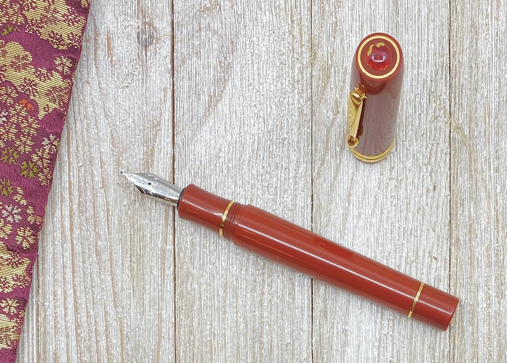
Aside from Bakelite, Wancher added another unique aspect to this pen. Shippoyaki is a traditional Japanese art style, and is featured prominently on the pen cap. Each piece is handcrafted by Master Okagaki Yukie, who has over 60 years experience in this form of artwork. And I have to say, all four pieces available are stunning, and really make the pen.

My pen features the Sangria artwork, which represents the Sun. It’s a wonderful match to the red barrel and gold trim of this pen. You can also choose from three other styles of Shippoyaki - Moonlight, Cosmos, and Verdant - all of which add a spark to the overall pen design.

For Kickstarter projects, I generally go with the stock steel nib and feed options, which is what this pen uses, but you can upgrade to Wancher’s own 18k gold nib, and even add an ebonite feed. The steel nibs are Jowo, and this medium works perfectly out of the box. The pen ships in a large balsa wood box, and includes a beautiful silk pen sleeve.

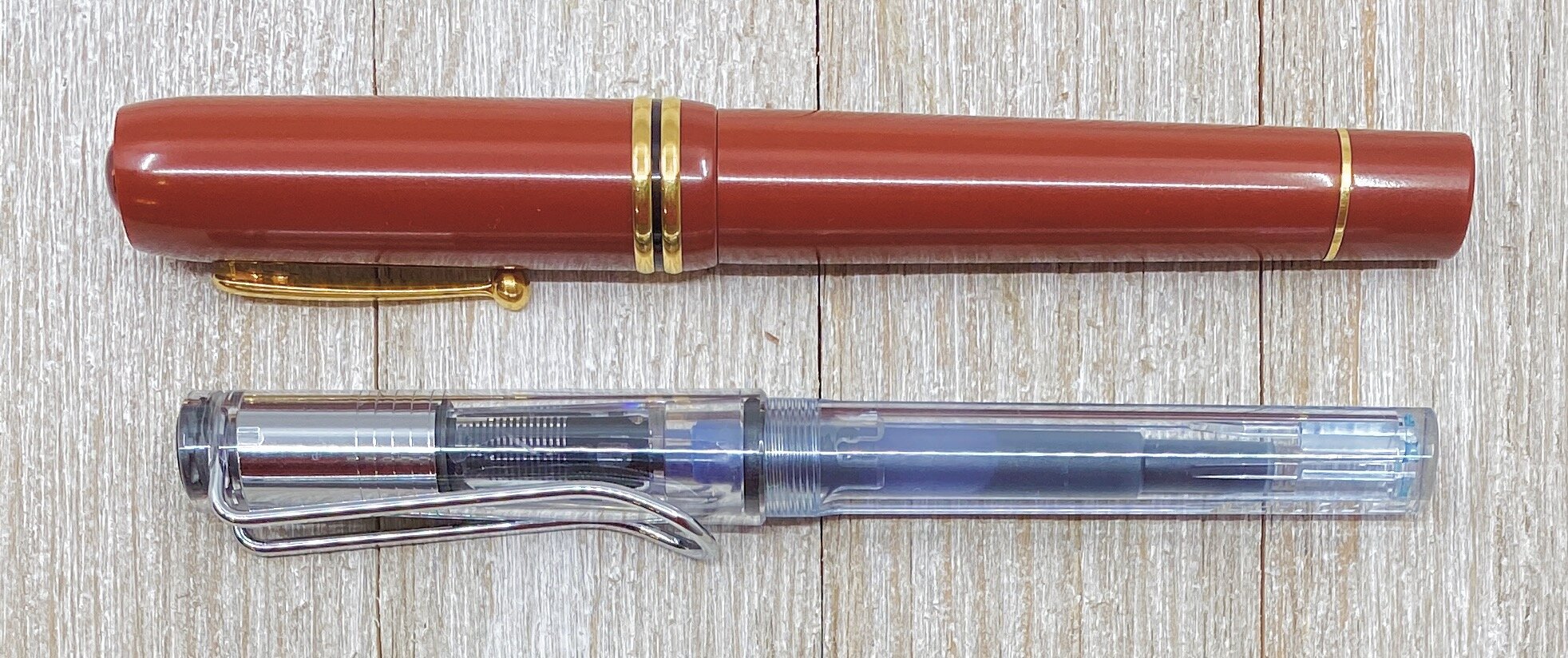
Wancher Seven Treasures vs. Lamy Vista

The big question left is will I back this pen. The answer is no, but not for any of the reasons I listed above. It’s because this is a big pen - too big for my daily use. I love the Bakelite idea, as well as the Shippoyaki artwork, but the size and style of the pen don’t fit my usage needs right now. If the Wancher Bakelite Seven Treasures Fountain Pen checks all of your boxes, I think you will enjoy it, and I think you are getting it at a great price, so back it confidently.

(Wancher provided this product at no charge to The Pen Addict for review purposes.)


Enjoy reading The Pen Addict? Then consider becoming a member to receive additional weekly content, giveaways, and discounts in The Pen Addict shop. Plus, you support me and the site directly, for which I am very grateful.

Membership starts at just $5/month, with a discounted annual option available. To find out more about membership click here and join us!

Posted on February 24, 2020 and filed under Wancher, Kickstarter, Pen Reviews.

TWSBI ECO White Rose Gold Fountain Pen Review

(Sarah Read is an author, editor, yarn artist, and pen/paper/ink addict. You can find more about her at her website and on Twitter. And check out her latest book, Out of Water, now available where books are sold!)

TWSBI has kept the hype alive for their ECO model by rolling out fresh looks for the line on a regular basis. With an affordable price-point and an endless train of fun and tempting hues, they're totally collectible. The latest irresistible offering is the White Rose Gold. This new look brings a more elegant, formal look to the line known for neon and pizzazz. The clear plastic body, white plastic lid, and rose gold accents look like the much-beloved ECO in an executive suit.

The fanciness of this model does raise the price considerably. Instead of $31.50, the rose gold runs at about $52.50. It's till within the realm of affordability, but it does push it over that $50 threshold into another category of pen, in my opinion. The standard ECOs are much beloved for their value--where the quality well exceeds the price tag. With a price hike of over $20, does this version maintain a good value? There are some materials upgrades that help justify the increased cost, and the rosy finish is an extra bit of production. But overall, this is still the same ECO--just in fancy pants. While this is a very pretty pen, I'm not sure I'd be tempted enough to pay the extra when I can get the same pen for so much less.

Like all ECOs, this pen has a piston filling mechanism with a remarkable ink capacity, and the clear body allows you to see your ink sloshing around inside, making it easy to see when your ink is running low. Which it won't, for a very long while. The cap screws on and contains an insert to help prevent ink from drying in the feed, so the pen will start writing even after sitting for a period of time. I have never had any issues with dry ink in any of the TWSBIs I've used. The grip section is clear and slightly molded to fit a triangular grip, but not so strictly shaped that other grips would find it uncomfortable. The cap does post, but it throws the balance off a bit, and it did not stay posted very firmly.

Most of the TWSBI pens I've used have been excellent writers. This is the first one I've tried where the nib felt scratchy in a way that goes beyond feedback. I don't see any obvious nib issues, so I wonder if the rose gold coating gives it an unpleasant texture, much like black coating does on other pens I've tried. It is also the driest writing TWSBI I've used, though it's not for lack of ink supply. In fact, this pen has a bit of a leaking problem.

After I filled the pen, I could see that ink was gathered inside the section of the pen. I had hoped it would stay there, but when I next used the pen, I was greeted by a cap full of ink, most of which spilled across my meeting notes. The more I wrote with the pen, the less leaking I noticed, so I hope this issue is only a factor for the first little while after a fill saturates the feed. I have, however, encountered this collar-leaking with TWSBI pens before.

Ultimately, the writing experience of this particular rose gold ECO has not been as nice as a standard ECO. There are inconsistencies in the quality control of TWSBI pens, however, that may mean that other rose gold ECOs are as dreamy as they look. I can't say this pen is as good a value as a regular ECO, but if you love ECOs and find this particular finish enchanting, it's still not a bad pen. And even with its quirks, I've used worse pens that cost twice as much and didn't look nearly so nice.

(JetPens provided this product at no charge to The Pen Addict for review purposes.)


Enjoy reading The Pen Addict? Then consider becoming a member to receive additional weekly content, giveaways, and discounts in The Pen Addict shop. Plus, you support me and the site directly, for which I am very grateful.

Membership starts at just $5/month, with a discounted annual option available. To find out more about membership click here and join us!

Posted on February 20, 2020 and filed under TWSBI, Fountain Pens, Pen Reviews.

Sailor 1911 Standard Royal Amethyst Fountain Pen Review

Sailor has perfected the art of the limited edition release. Case in point: The 1911 Royal Amethyst, designed in conjunction with Goldspot. It’s one of the prettiest releases I’ve seen since, well, their last release. That’s how much I love these pens.

As great as I find all of Sailor’s fountain pens, I’ll admit it took me a while to come around on the 1911 model. I was a Pro Gear guy, through and through. The smaller Slim size, or the larger Regular (don’t worry, I’ll yell about their naming conventions in a minute,) that was my Sailor. Until one certain 1911 changed me completely.

I didn’t buy the Royal Tangerine on launch. Shocker, I know. It is one of the most on-brand pens ever made, but it was a 1911. I’m a Pro Gear guy, remember?

I hemmed and hawed, but then the opportunity to try one out - from Goldspot, coincidentally - crossed my desk. I said yes, of course, and that one 1911 Standard changed everything I thought about one of Sailors primary product lines.

Ok, time to yell before we move on. Sailor’s naming convention for their two most popular pen designs needs to be synced up. The two smaller, 14k gold nib models are called the Pro Gear Slim and the 1911 Standard. The two larger, 21k gold nib models are called the Pro Gear Regular and the 1911 Large.

The two smaller pens and the two larger pens inhabit the same Sailor pricing spectrum, respectively. So why is a large one called Regular, and a small one called Standard? Your guess is as good as mine. As long as I have been using Sailor fountain pens, I still have to check if I’m using the correct descriptor for the pen I am using. Can we get a petition started for the two small pens to be called Slim, and the two large pens called Large? That would make my life so much easier Sailor!

Rant over - time to tell you why the size and shape of the 1911 Standard works so well for me: It is the perfect every day carry sized fountain pen. It reminds me a lot of the size and shape of the Pelikan 200/400 series of fountain pens. They are small, lightweight pens, but feel substantial and impressive when writing. Sailor’s 14k gold nibs provide a wonderful feel on the page, and the barrel of the pen molds into my hand like it was made for it.

I adore every moment I spend writing with this pen, and I am comfortable taking it anywhere and everywhere with me. The 1911 Standard is my choice of the two smaller Sailor pens, while the Pro Gear Regular is my choice for their larger models.

Knowing I was going to love this pen the moment I unboxed it, my biggest concern was what ink I was going to fill it with? My first thought was Bungubox Imperial Purple, making this pen the Royal Imperial Highness of the Purply Kingdom. I slept on that choice though, and I’m glad I did. As it turns out, Akkerman #28 Hofkwartier Groen is the perfect ink for me, and this pen.

Why? The vibrant purple and gold of this pen invoke the colors of my hometown, Baton Rouge, Louisiana. And February in Louisiana means only one thing: Mardi Gras. With this pen lacking only green to complete the trifecta of colors that represent the season, I knew I had picked the right one.

And the Sailor 1911 Standard is the right one for me. It took me a while to get there, but I’m glad I had the opportunity to have my mind changed.

(Goldspot provided this product at no charge to The Pen Addict for review purposes.)


Enjoy reading The Pen Addict? Then consider becoming a member to receive additional weekly content, giveaways, and discounts in The Pen Addict shop. Plus, you support me and the site directly, for which I am very grateful.

Membership starts at just $5/month, with a discounted annual option available. To find out more about membership click here and join us!

Posted on February 10, 2020 and filed under Sailor, Fountain Pens, Pen Reviews.