Posts filed under Pen Reviews

Monami 153 Neo Fountain Pen Review

(Jeff Abbott is a regular contributor at The Pen Addict. You can find more from Jeff online at Draft Evolution and Twitter.)

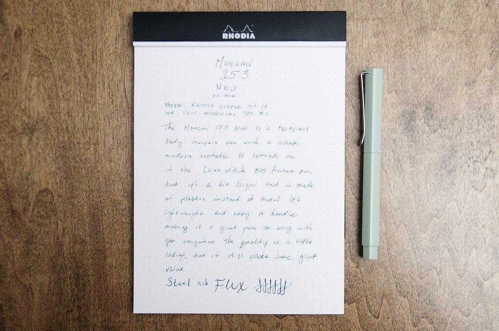
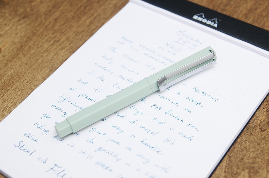
The Monami 153 Neo is a modern fountain pen that features a hexagonal barrel shape and a petite nib to match the sleek aesthetic. The edges that make up the hexagonal points are smooth and rounded off so that it feels good in the hand — not too jagged. It looks great, feels great in the hand, and comes in at under $30 — so how does it write?

The 153 Neo is actually a solid fountain pen. The price tag might make some people weary about the quality and longevity of a pen that should realistically hold up to a lot of abuse. In this case, I think the Neo does a good job of providing value and ruggedness in a stylish package.

The exterior of the pen is sleek and minimal. The only branding to be found is on the top of the cap — a small logo that appears to be etched into the metal. There's also a very small "Monami" brand etched into one side of the split clip. The branding doesn't jump out at all, and you actually have to look closely to find the Monami brand name. One thing that really bugs me about this pen is how the logo isn't etched dead center on the top of the cap. It's off quite a bit, and I think this shows that Monami isn't 100% focused on fit and finish with their products. When the branding and design is so minimal, you really can't afford any mistakes without losing some of that appeal. It definitely makes the pen feel cheaper.

The clip is strong enough to be useful but still easy to use. It reminds me of the Lamy Safari and AL-Star clip, but flattened. I really like that they went with a blasted matte finish on the clip instead of something shiny and polished. It keeps the attention on the body, which is what I think is most interesting about this pen.

The hexagonal body shape isn't a new concept. In fact, on first opening this pen and inspecting what was inside, I was a little annoyed to find what I assumed to be a knock-off Caran d'Ache 849. The inspiration is undeniable, but I think that the changes that Monami incorporated make it stand apart just enough to avoid any accusations. Still, it's way too similar to the 849 in my book. I doubt there's any kind of patent on pens that have a hexagonal barrel — plenty of companies do it well — but the 153 Neo just feels like a copy cat when put side by side with a 849.

Regardless of design inspirations, it's a solid body and cap. The cap pulls off easily and posts securely. Since it's a friction fit cap, there's also a mechanism built in that ensures the lines of the pen body and cap always line up perfectly. I always try to make my Caran d'Ache 849 line up when I put the cap on, so I appreciate that I can skip that step with this pen.

The body and cap have a semi-gloss finish that provides just enough shine to attract your eyes without taking away from the color and shape of the pen. The grip section, however, is a matte color with a more tactile feel than the shiny exterior. The grip is another area where I have some complaints about quality. There are obvious seams on the grip from the injection molding process. It would be one thing if the seams were aligned to the hexagonal joints, but they happen on the flat parts of the grip section, adding an awkward line that feels out of place. I think this could have been removed with some more fit and finish, but that's not something Monami chose to do.

Another problem I have with the grip section material (and this is a big one) is how it stained immediately when I submerged the nib and section into an ink bottle. This is usually no big deal, right? Just wipe away the excess ink after you fill it and you're good to go. With the Monami, the lowest part of the section that was submerged in the ink still has an obvious blue-green stain from the Iroshizuku syo-ro ink I used. To be fair, syo-ro is a really gentle ink and I've never had any staining issues with it before. I think this is directly due to the material and finish that Monami used on the grip section. Thank goodness I didn't dip the section any further into the bottle, or it would be an even bigger stain! I'm sure I could remove the stain with some rubbing alcohol or some other kind of cleaner, but that's really difficult to do when there's ink in the pen. It's so close to the section and nearly impossible to clean without more ink spilling out onto the rag or whatever I use to clean it. This is frustrating, but the pen is still completely usable. I should experiment with other inks to see if they also stain the section, but I'm not sure it's worth it. It's already stained now, so what does it matter?

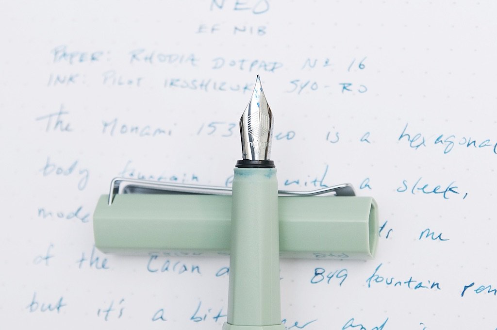
Moving down to another positive attribute of this pen: the nib! The steel nib is an EF and writes beautifully. It makes a small mark without being scratching, and the ink flow is perfect. There's a Monami brand and some minimal decoration stamped onto the nib, along with an "EF" to indicate the tip size. Unfortunately, EF is the only nib option for this pen.

I've really enjoyed writing with this pen. The size and weight are perfect for my hand, and the tactile grip section is great at providing grip without getting slippery after a few moments of use. I love how the cap always lines up with the body when capped or posted, and I love the lines that run up and down the body to create some visual interest on an otherwise plain pen.

Can I recommend it? Nope. It comes with a couple of black ink cartridges and a converter, so that's nice — but this doesn't come close to the feeling I get when opening up a new Pilot Metropolitan, Lamy Safari, Kaweco Sport, or even one of the new entry level TWSBIs. I'm not able to get over what I feel is a blatant copy of the iconic Caran d'Ache design combined with the staining issue on the grip section. If it weren't for the material choice in the grip, I'm not sure I'd mind as much. But at $26, the competition is excellent and you don't have any room for these kinds of mistakes. Plus, any of those pens listed above offer more color choices and nib sizes.

My advice? Go with one of the pens I mentioned above; if you want a hexagonal fountain pen, go with the classic 849 instead. They're almost twice the price as this Monami, but the quality is easily triple. And again, lots of colors and nib sizes to choose from!

(JetPens provided this product at no charge to The Pen Addict for review purposes.)


Enjoy reading The Pen Addict? Then consider becoming a member to receive additional weekly content, giveaways, and discounts in The Pen Addict shop. Plus, you support me and the site directly, for which I am very grateful.

Membership starts at just $5/month, with a discounted annual option available. To find out more about membership click here and join us!

Posted on October 20, 2021 and filed under Monami, Fountain Pens, Pen Reviews.

Pelikan Jazz Ballpoint Pen Review

Pelikan Jazz Ballpoint Pen Review

I am thoroughly enjoying the Pelikan Jazz Ballpoint pen. That shouldn’t come as a surprise given that I enjoy ballpoint pens, and Pelikan makes great products. It should be good! But, what I realized with the Jazz is not only that it’s good, but it’s good enough to make me think I’ve been missing out.

Ballpoint pens are continually underrated. Why is that? The problem with ballpoints is that we have all used terrible ones. Scratchy, skippy, dry, messy, sticky. There are some bad adjectives to describe some of these pens we have used in the past.

But modern ballpoints, using superior refill technology, are fantastic. Even great.

Pelikan Jazz Ballpoint Pen

The Pelikan Jazz is a new pen to me, and reasonably new to Pelikan’s lineup as a whole. It has classic Pelikan design elements, like the clip, but comes in fun, modern colors like this Orange model. There is even a full pastel lineup, which is what make me take a second look at these pens to begin with.

Pelikan Jazz Ballpoint

This is a twist-to-deploy pen, but it keeps tricking me into thinking it uses a knock-type mechanism. The barrel “cap” overlaps the lower barrel, and when I see a design like that, I want to push the cap down to engage and retract the refill. It’s not a problem whatsoever, but that hasn’t stopped me from continuously trying to click it.

The twist takes about half a turn to let loose the Pelikan 337 refill. It ships with a medium (1.0 mm) blue cartridge, in the Parker-style (or international G2) shape, so you can swap it to your hearts content. But I’m not sure you would want to.

Pelikan Jazz Ballpoint Writing

This refill is excellent. I expect 1.0 mm ballpoint refills to be smooth, and this one delivered. The lines were solid, and the color was rich. There was little tip residue to be found, although as with many good ballpoint refills, it did pop up from time to time. I never had to wipe it off.

After all of this praise, this must be an expensive pen, right? Well, compared to a Bic Stic, yes. But at $12, compared to other pens in this category, it is priced perfectly. It’s an upgrade to the basic ballpoints in your desk drawer, with enough style and quality to justify the price point.

If you couldn’t tell, I’m kind of enamored with it. I like having it around to pick up and use on a whim for just about any task. It may be worth grabbing another simply because I’m having so much fun with this one.

(Goldspot provided this product at no charge to The Pen Addict for review purposes.)


Enjoy reading The Pen Addict? Then consider becoming a member to receive additional weekly content, giveaways, and discounts in The Pen Addict shop. Plus, you support me and the site directly, for which I am very grateful.

Membership starts at just $5/month, with a discounted annual option available. To find out more about membership click here and join us!

Pelikan Jazz Ballpoint Review
Posted on October 18, 2021 and filed under Pelikan, Ballpoint, Pen Reviews.

2021 Chicago Pen Show Recap

(Kimberly (she/her) took the express train down the fountain pen/stationery rabbit hole and doesn't want to be rescued. She can be found on Instagram @allthehobbies because there really are many, many hobbies!.)

Normally held during the first weekend in May, 2021’s Chicago Pen Show was rescheduled to September 30 - October 3, which was the weekend following the Dallas Pen Show. I wasn’t going to be working this time around and was looking forward to spending time with pen friends and enjoying the show as an attendee for a change.

The Chicago Pen Show isn’t actually in downtown Chicago but in a suburb called Hoffman Estates, which is 45 minutes northwest of downtown (if you’re lucky, ha!) and about 30 minutes west of the O’Hare Airport. It’s conveniently located across the street from a shopping complex with a wide variety of food options as well as a Target, Ulta, etc.

Full weekend registration costs $60 and includes an extra pass for a significant other or child, early entry Thursday through Sunday (8am vs 9am entry), the pizza party on Thursday night, and whisk(e)y tasting (21+, of course); Friday night auction, and Saturday night party. Friday’s public hours were from 12pm-5:30pm and I was surprised to see that it cost $25 for a half day. Saturday and Sunday prices felt more reasonable, at $10, for 9-5:30pm and 9-4pm access, respectively. There were also free seminars as well as paid classes/workshops.

The show had a mix of both modern and vintage offerings, though some vendor absences were noticed and missed. Franklin-Christoph and Vanness Pens were two of the larger vendors who didn’t attend the show. There were others that usually attend this show that weren’t there, such as The Nib Smith, Carolina Pen Company, Shawn Newton and others who bowed out who had planned to make this their first Chicago show. Still, there were a wide variety of things to be looked at, tried out and of course, to buy.

Krusac.jpg

Ryan Krusac was one of the first people who greeted you at the atrium entrance with his beautiful display of wood and scrimshaw pens.Ryan Krusac was one of the first people who greeted you at the atrium entrance with his beautiful display of wood and scrimshaw pens.

LemurInk.jpg

John Phelan (right) of Lemur Ink with his Indy crew, Davy and Doug, were in the atrium with loads of inks, papers and pens.John Phelan (right) of Lemur Ink with his Indy crew, Davy and Doug, were in the atrium with loads of inks, papers and pens.

Cary And Dandon.jpg

Cary Yeager from Kenro and Dan Hoizner were all smiles while helping out at Jimmy Dolive’s table full of beautiful pens including LE MontblancsCary Yeager from Kenro and Dan Hoizner were all smiles while helping out at Jimmy Dolive’s table full of beautiful pens including LE Montblancs.

Sheaffer Pen Museum.jpg

The folks from the Sheaffer Pen Museum brought their Sheaffer pens and inks, of course but also these incredible vintage drawings and postcards.The folks from the Sheaffer Pen Museum brought their Sheaffer pens and inks, of course but also these incredible vintage drawings and postcards.

Ironfeather.jpg

Handcarved pens from Brian Weaver of Ironfeather Creative.

Esties.jpg

This whole binder of vintage Esterbrooks was available for sale. No, I didn’t buy it but wow, you just don’t get to see that everyday.

Vintage Parts.jpg

Need parts to fix your vintage pen? This is a great way to find inexpensive parts for your pens. (I’m still on the hunt for black Parker 45 grip sections for my desk set, so if you happen to see two…).

Atlas.jpg

Atlas Stationers had an incredible spread of pens, inks, papers, accessories and more! It was always busy so I barely managed to snag a picture of one of their ink displays!

Odyssey.jpg

There were lots of other fun items like inks, papers, pen wells and other desk accessories.

Rainbow Yeung from Odyssey Notebooks was at the show with their space-themed Tomoe River notebooks.

Randomthinks.jpg

Keith of RandomThinks makes some creative 3D-printed desk accessories like these pen stands, cups and super cool pencil spiral.

Good Made Better.jpg

Dan Keller of Good Made Better had his family in tow, along with many of his awesome penwells (if you look closely, you can see some prototype penwells on the upper left row.

Bookfellow.jpg

They also have a new product called the Bookfellow, which functions as a paper weight for your desk, as well as a bookweight.

Anderillium.jpg

Relative newcomers to the ink space is Anderillium Inks and their Avian and Cephalopod (pictured) series of inks.

Papier Plume.jpg

James and Patrick (not pictured) from Papier Plume were in attendance with their inks, wax stamps/seals and glass dip pens.

Cloudgate.jpg

Papier Plume created this shimmery Cloud Gate ink for the Chicago Pen Show (if you missed out at the show, they are currently available on their website)

Tinterias.jpg

Jeffrey Coleman and Erick Gama of the Tinterías Podcast brought their Sailor exclusive inks, Spicy Chipotle and Homemade Tortilla. Jeffrey and Erick are doing a great service to the community by sharing their love of fountain pens and stationery with the Spanish speaking world. If you can understand Spanish (even if you’re still learning), go give their podcast a listen! And if you can’t, support them by getting some ink - they’re beautiful!

Ink testing station.jpg

There were two ink testing stations, each inked up with 100 different inks!

chicago haul.jpg

My modest Chicago Pen Show haul included two Chicago Pen Show inks, the two Tinterías x Sailor inks and a Parker 2 ½ Lucky Curve with gorgeous flex from Myk Daigle of Mad Mercantile. And not pictured is a Leonardo with a steel flex nib from Les of StyloSuite which will be sent to me as soon as he’s finished the nib.

Like other shows this year, the Chicago show was smaller than in past years. Fewer vendors and fewer attendees - all understandable given the pandemic. There was supposed to be a mask mandate but I didn’t see anyone enforcing it. Mask adherence during the show was 75% at best. It was even worse amongst the hotel staff, with maybe half of the hotel staff being masked. After hours, I think that dropped even more, but likely because people were eating/drinking and hanging out with people they knew. I know I did the same amongst my friends. In retrospect, I should have kept my mask on regardless of who I was hanging out with. The reality right now is that Covid isn’t discriminating between vaccinated or not and we all need to do our part to stay safe. Get vaccinated, wear your masks (even when hanging out with vaccinated friends) and if you’re going to shows or other gatherings (whether or not you’re traveling like me), go get tested afterwards. We all need to stay healthy and safe so we can keep having pen shows and connecting with pen friends. I’m hoping the Covid situation improves so I can see you at future pen shows, including the next Chicago Pen Show on April 28-May 1, 2022. Until then, stay safe, be well and enjoy your pens!

Posted on October 8, 2021 and filed under Pen Reviews.