Posts filed under Pen Reviews

Nahvalur x Enigma Stationery "Brilliant Bunny" Nautilus Fountain Pen Review

(Kimberly (she/her) took the express train down the fountain pen/stationery rabbit hole and doesn't want to be rescued. She can be found on Instagram @allthehobbies because there really are many, many hobbies!.)

I have been a fan of the Nahvalur pens for a couple years now - I could have sworn I’ve written more reviews than the recent review about their Galen exclusive - so when the opportunity came up to review one with a gold nib, I said sign me up, even if it’s red! Little did I realize, it was a special Nahvalur Nautilus pen, created for Enigma Stationery, named Brilliant Bunny.

The Nahvalur Nautilus Brilliant Bunny was released earlier this year by Enigma Stationery in honor of the Year of the Rabbit which started on January 22, 2023 and goes to February 9, 2024 (at which point the Year of the Dragon begins). Only 50 pens were made for this edition.

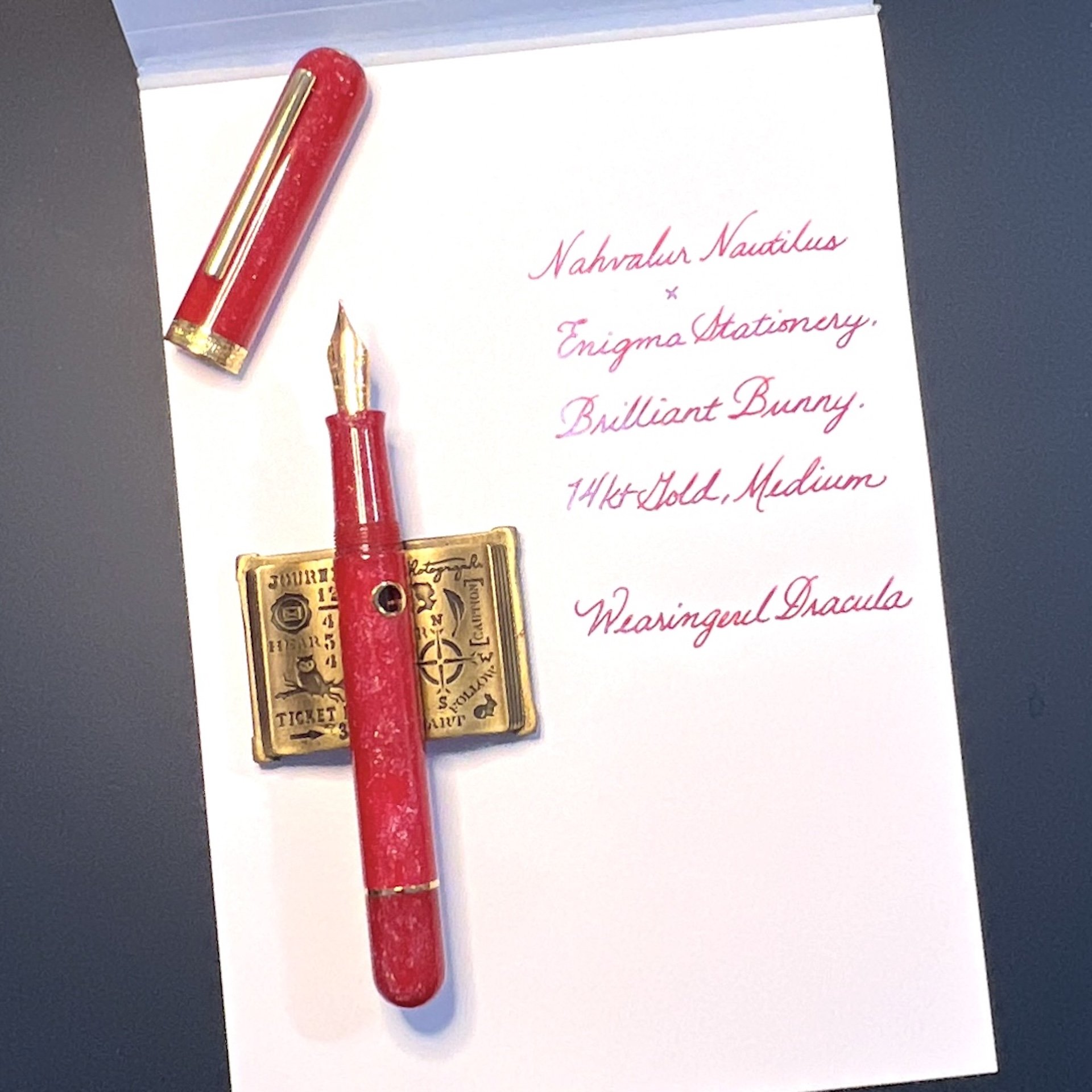
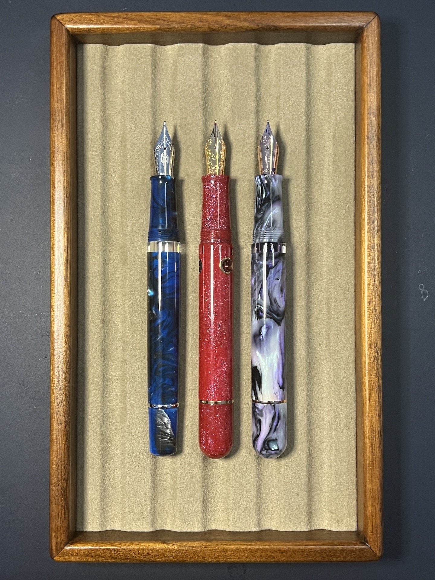
Following the Nautilus’ nautical theme, this submarine-shaped pen sports 3 circular “portholes”, which function as ink windows and remain visible when capped. The Nautilus has a yellow gold-colored clip and cap band with the same wave pattern and logo as similarly-sized Nahvalur models (I compared it to another Nautilus as well as a Voyage). The pen does not post. For this exclusive, the Brilliant Bunny was made from a bright red resin mixed with “teal, blue and purple sparkle” and comes with a yellow gold-colored 14kt gold nib in Medium with the Nahvalur logo.

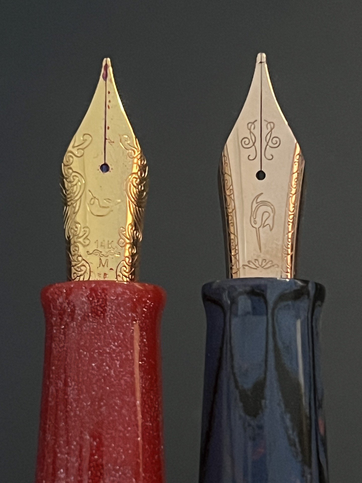
I like the design of the 14kt gold nib more than the steel version. You can also see how this yellow gold nib compares to their rose gold.

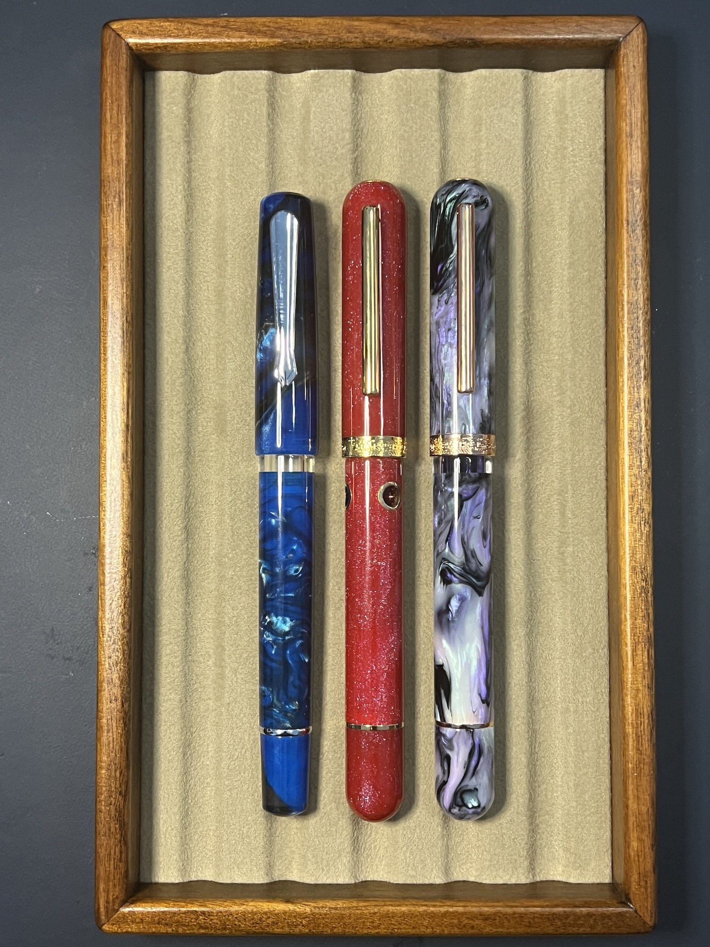
The Nautilus next to the Schuylkill (left) and Voyage Tromso (right.)

They are quite similar once uncapped, though the Schuylkill is a touch less girthy than the other two.

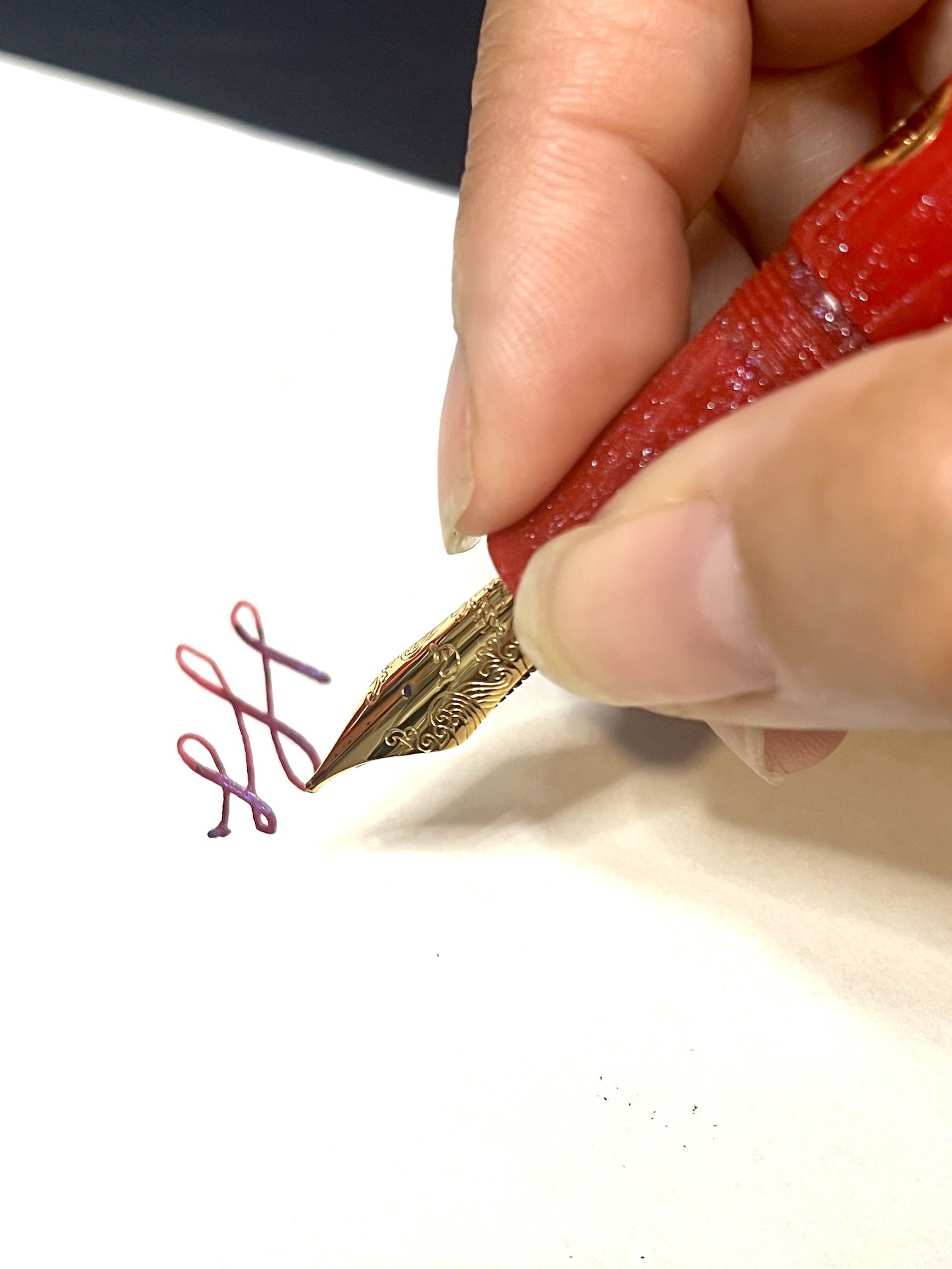
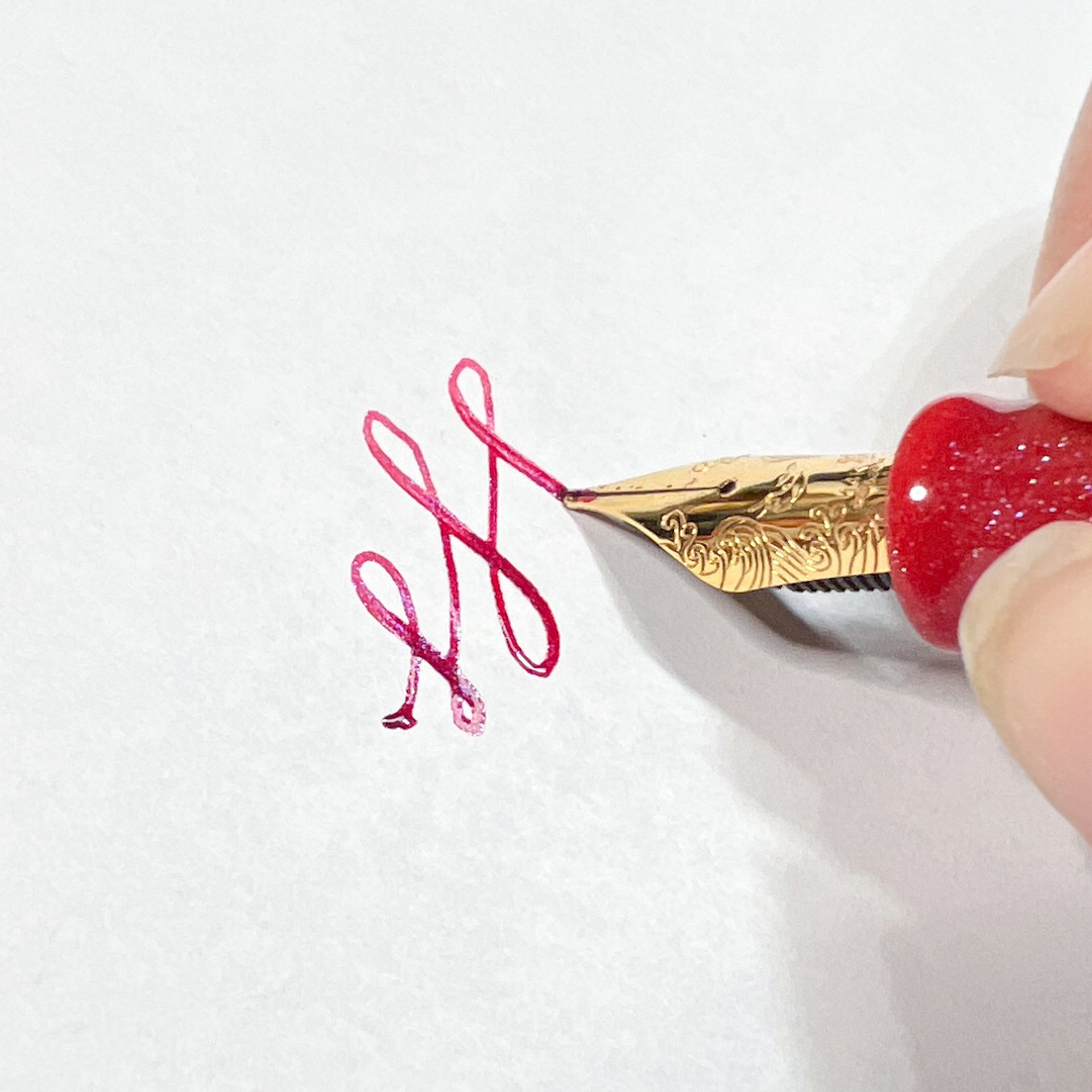
Since I had a good experience inking up other Nahvalurs with shimmer ink, I went for a matchy matchy red shimmer ink and picked Wearingeul Dracula. I had no problem with either the ink flow or seeing shimmer on the page, even when I didn’t use the pen for a few weeks (I deliberately set aside review pens for days and weeks at a time to test both evaporation and flow). As with all shimmer inks, to prevent clogging, periodically tilt the pen up and down so that the shimmer particles don’t all settle into the nib/feed.

The sparkles are subtle, which makes it difficult to photograph, but much easier to see in person, and pairs perfectly with Wearingeul Dracula.

The Nautilus feels balanced and comfortable in hand. It has a short, smooth step from the cap edge and threads, and tapers towards the nib where it flares to prevent your fingers from sliding forward.

I hold my pens pretty close to the nib, but neither the threads nor step felt intrusive when holding the pen further back.

The pen worked flawlessly each time, producing a nice, wet line. The nib is nice and smooth and softer than its steel counterpart. I could get a wee bit of line variation if I tried to “bounce” the pressure while writing, but I don’t recommend flexing the nib, but I did a little, for science :-) The softness of the 14 kt gold medium means that the line is a tad bit broader than the steel medium.

Writing sample on 68 gsm Tomoe River in an Endless Recorder.

Comparison of the Nautilus with the 14kt gold medium, steel medium as well as Platinum 3776 14kt gold medium, TWSBI Eco Steel Medium Architect and Sailor Pro Gear Slim 14kt gold medium.

Getting this bit of line variation made me nervous. I had to use more than my usual pressure (which, according to Pilot’s handwriting analysis, is fairly light). I don’t recommend pushing it further than this.

I’ve had this pen inked up for over 2 months and used it about a dozen times. Like other Nahvalur pens, cleaning the pen is pretty easy: you can either use the piston to get water in/out of the barrel or you can unscrew the nib unit and syringe clean it. Just be careful not to blast it too hard or you may get water behind the piston. If that happens, you can also disassemble the pen with a Nahvalur wrench (I don’t believe it was included with this pen since the Bossman literally handed me the pen by itself at one of the shows, lol).

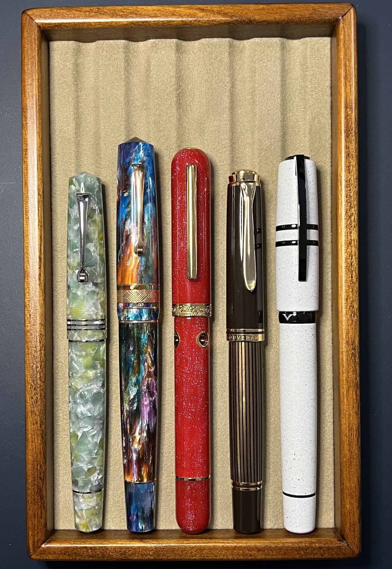
L to R: Leonardo Momento Zero, Leonardo Momento Zero Grande, Nahvalur Brilliant Bunny, Pelikan M800, Visconti Homo Sapiens.

Pros:

  • Lovely bright red pen with gorgeous shimmer
  • Piston-filler
  • 14kt gold nib is smooth and wrote well
  • Very comfortable in hand

Neutral:

  • Nib writes slightly broader than steel medium
  • Slightly girthy pen
  • Pen does not post (I didn’t take posted comparison pictures for this reason)

Cons:

  • Only nib option is 14kt Gold Medium - I understand having just the 14kt gold option, but it would have been nice if it was also available in Fine.
  • Price point? - I struggled with whether this was a Con or a Neutral, as there are plenty of gold nib piston pens that cost more than this pen (like Pelikan M6xx and M8xx), but also some that cost less (like the Pilot Custom Heritage 92). But there aren’t many in this price range that are made from a custom resin either.

I knew that I’d enjoy this pen (as I already have a Nautilus which I liked) but was pleasantly surprised by the smoothness and wetness of the 14kt gold nib. As of this writing, it is still available on the Enigma Stationery website for $295 USD.

(Disclaimer: Thank you to Dan of Enigma Stationery for sending us this pen for review. All other items in this article are my own.)

Posted on August 18, 2023 and filed under Enigma Stationery, Nahvalur, Fountain Pens, Pen Reviews.

Parker 51 Teal Ballpoint Pen Review

(Jeff Abbott is a regular contributor at The Pen Addict. You can find more from Jeff online at Draft Evolution and Twitter.)

The Parker 51 is one of the most popular and well-known vintage fountain pens from the 20th century, and for good reason. Along with Esterbrook, these pens were ubiquitous and high-quality tools that many people carried and relied on every day. Go to any pen show today, and you'll see a fair few Parker 51s on the show tables.

The pen we're looking at today isn't the vintage fountain pen, though. This is a modern ballpoint pen that takes a few style cues from the classic fountain pen design that made Parker famous. The Parker 51 Teal ballpoint pen is lightweight and elegant, and definitely makes you think of the classic Parker 51 that it borrows its name from. It uses a typical Parker style refill and comes with Parker's Quink refill with black ink.

The biggest similarity to the original Parker 51 is the cap. It's nearly identical to the fountain pen version in style, except the cap doesn't come off the ballpoint pen. Instead, the cap is a twist mechanism to extend and retract the refill tip. The body of the pen is made of a lightweight acrylic material that looks less like the original due to the smaller diameter and long taper to the tip. Twisting the cap is a smooth and satisfying motion. When retracted the refill, you don't even have to twist it manually. Just get it started, and it will finish retracting on its own due to the spring at the tip of the barrel.

Writing with the pen is also a nice experience. The grip is comfortable and the pen is easy to control thanks to the light weight and good balance. The metal cap adds just enough heft to the tall end of the pen to provide a great sense of balance when holding the pen in a 3-finger grip.

And this is where we run into my first complaint with the pen. I just said that writing with the pen is a nice experience, but that's only true if you swap out the refill first. The included Parker Quink refill is garbage and should be immediately discarded. The ink is difficult to start, splotchy once it's running, and is a very unsatisfying light-black hue. Even jotting down quick notes is frustrating due to how terrible the ink flow is. I have to redraw characters way too often due to bad ink flow. In an age where many manufacturers have fantastic ballpoint ink refill options, I really don't understand how Parker are still producing Quink refills that write so poorly. An updated, fantastic Quink refill would be an exceptional nod to the heritage of Parker.

Throw in a better refill, and this is a great pen that I've really enjoyed using. It feels more premium than a Parker Jotter, and it's also easier to control since it's a bit longer and has a larger diameter. At least, it's better for my hands and how I grip the pen. In fact, it's really similar in length to the Jotter XL, which is also a great pen (assuming you replace the refill).

Luckily, there are so many great refill options for this category. Parker style refills are abundant, and there are some truly fantastic ballpoint (and gel!) refills that you should try out and keep on hand.

My next complaint with this pen is the price. I understand that this pen has some additional prestige given the Parker 51 name, but I don't believe the pen delivers enough aesthetic or usability value to justify a retail price of $79. The Parker Jotter can be had for around $20, and the larger Jotter XL is around $35, and they're all metal. You get the same refill with all three, so just factor in the cost of a replacement refill as part of the overall total. When using this pen, it feels like a $40 pen.

Vanness Pens sells the Parker 51 ballpoint for just $63, which is way better than the suggested retail from Parker. If you're a big fan of the Parker 51 pen and this throwback ballpoint speaks to you, you'll be really happy with it because they did a great job of translating the classic design to a modern ballpoint package. If you're looking for a good ballpoint pen that uses Parker style refills, look elsewhere. The Jotter or Jotter XL are a great place to start, but the world is your oyster when it comes to Parker style pens. So many great options to choose from!


Enjoy reading The Pen Addict? Then consider becoming a member to receive additional weekly content, giveaways, and discounts in The Pen Addict shop. Plus, you support me and the site directly, for which I am very grateful.

Membership starts at just $5/month, with a discounted annual option available. To find out more about membership click here and join us!

Posted on August 16, 2023 and filed under Parker 51, Ballpoint, Pen Reviews.

Gravitas Pocket Fountain Pen in Teal Splash Review

(Jeff Abbott is a regular contributor at The Pen Addict. You can find more from Jeff online at Draft Evolution and Twitter.)

The Gravitas Pocket fountain pen is no stranger around here, but there's nothing like an injection of some fun colors to spice up something you've already seen. Teal Splash features a black pen with beautiful blobs of teal scattered over the body to make this pen really stand out.

If you're new to the Gravitas Pocket, here is the summary. It's a short pen that looks and feels similar to a Kaweco AL Sport, but with plenty of unique design choices that bring this pen close to the top of my pocket pen list. The cap unscrews and posts to the back of the pen to make it a more comfortable length for writing, and it takes short international cartridges due to the short body. You can fit some converters into this pen, but they have to be short — a standard converter won't fit.

Where this pen departs from the ordinary is obvious once you take a closer look. The cap features a flat edge that keeps the pen from rolling away, while the rest of the cap and body are round. The tips taper from a cylinder to a point in a really pleasing distance, and there's no branding outside of a tiny Gravtias logo debossed on the lower part of the cap.

Once you uncap the pen, you'll notice the grip section is much larger than the typical pocket pen. This makes for a really comfortable writing experience once you've posted the cap. The grip section also has micro grooves cut into it that provides a soft but tactile grip. The grip also flares out a bit at the end to provide a nice butt for your fingers to rest while writing. Overall, it's a really comfortable pen.

There's a nice feature on both sets of threads for this pen — both for the cap and the section. There's a small o-ring at the base of both of these threads that make for a snug and secure fit when the section or cap are tightened down. I don't know if this is technically necessary for the pen to function properly, but it definitely feels nice.

Something different for me on this model is the nib. This unit has a titanium flex nib that really fits my writing style. When writing with soft pressure, it puts down a line that is similar to any European fine nib. The line is crisp and the ink flows well. But, if you want to add some flourish, just apply a little pressure to the nib to make those tines spread and really distribute the ink. This flex nib isn't as dramatic as some I've used, but this one is so incredibly easy to use. I'm guessing part of this experience is due to the soft titanium material as well as the shape, but it sure is fun to use.

While flexing is easy, you have to be careful not to flex too hard or else the feed can't deliver enough ink and you'll end up with some railroading. This will vary a bit depending on what ink and paper you're using, but it's something to keep in mind. In my use, using soft and moderate pressure to flex the nib is no problem. It's only when I try to max out the tine spread that the railroading happens.

The nib is a #6 size that Gravitas produces in-house. There aren't any markings on it, and I really appreciate the dull finish of the titanium against the shiny black grip and speckled body.

Finally, the finish on the outside of the pen. I absolutely love this edition of the Pocket fountain pen. Teal Splash is a perfect name, and I really enjoy looking at the splatter patterns that adorn the pen. The regular pen is so sleek and unassuming, but this treatment kicks it up a notch to an eye-catching piece of art when it's on your desk.

The Gravitas Pocket Fountain Pen in Teal Splash starts at €120, but the model featured here is €135 due to the titanium flex nib option. In my opinion, the €15 difference is totally worth it for this nib. Gravitas is definitely one of the brands I suggest you check out if you haven't already. If the pen featured here doesn't fit your fancy, there are so many other models and options to pick from, and they all feature top-notch quality and craftsmanship.

(Gravitas provided this product at no charge to The Pen Addict for review purposes.)


Enjoy reading The Pen Addict? Then consider becoming a member to receive additional weekly content, giveaways, and discounts in The Pen Addict shop. Plus, you support me and the site directly, for which I am very grateful.

Membership starts at just $5/month, with a discounted annual option available. To find out more about membership click here and join us!

Posted on August 9, 2023 and filed under Gravitas, Fountain Pens, Pen Reviews.