Posts filed under Pen Reviews

Monteverde Ritma Ballpoint Pen Review

Monteverde Ritma Ballpoint Pen Review

(Jeff Abbott is a regular contributor at The Pen Addict. You can find more from Jeff online at Draft Evolution and Twitter.)

Continuing in my personal quest to collect as many green things as I can this year, I've been using the Ritma from Monteverde as my pen for taking notes at my desk during the workday. The Ritma is a minimal design that looks great and is easy to use.

It doesn't matter how many amazing fountain pens I have in my collection — I always have room in my daily kit for a humble ballpoint pen. They don't write as well or produce anywhere near the level of beautiful and nuanced lines as my fountain pens, but they're so simple. They utilitarian in a way that fountain pens often struggle. They require little maintenance and can take a lot of punishment. What they gain in utilitarianism, they certainly lose in style and customization.

Monteverde Ritma Ballpoint Pen

For a ballpoint to be comfortable for me to use, I'm looking for a few things: a good refill, a comfortable grip, and a balanced weight. At first glance, I didn't think the Ritma would be comfortable to use, but I let the pretty green color convince me to give it a try anyway — and I'm glad I did! It's actually a really comfortable pen to use.

The nose of the pen is shiny and looks like it would be a fingerprint magnet, but it doesn't actually attract a lot of fingerprints. And, when I see a shiny surface finish like this, I automatically assume that it will be slippery to handle and won't work well for writing more than a few words before I get annoyed with the unstable grip. This isn't the case with the Ritma. Whatever finish Monteverde used for the grip are is fantastic. It provides plenty of grip and friction even after writing for a while. This is good news because the nose/grip section is long enough that most people will only grip it by this area instead of the more textured barrel area.

Monteverde Ritma Ballpoint Pen Clip

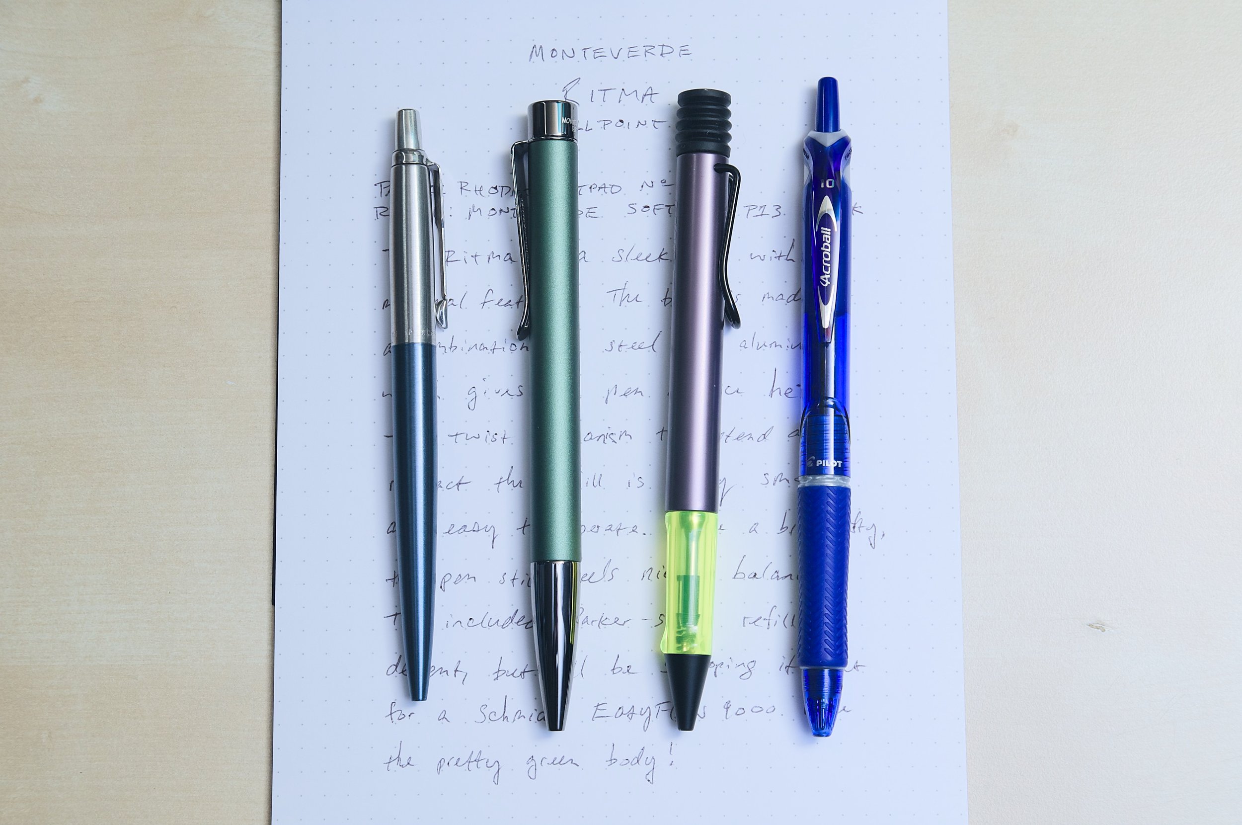
The other factor that makes this pen comfortable to use is the balanced weight. It's not a super lightweight pen — it has some heft, but not so much to cause fatigue after a short period. When holding the pen, it feels like the center of gravity is close to the grip area, with just enough weight at the top of the pen to provide a nice balance when writing so that you have excellent control of the tip. I was surprised by how well it balanced in my hand once I held in my normal writing grip. According to the specifications, the pen is a combination of steel and aluminum. I'm guessing the grip is steel, and the outside of the body is aluminum. The steel materials add an appropriate amount of weight in all the right spots.

Monteverde Ritma Ballpoint Pen Twist

To achieve a minimal look, the Ritma uses a twist mechanism to control the refill extension. A half rotation of the grip section is all it takes to extend or retract the refill. You can do this one-handed, but it requires you to do some minor hand gymnastics to shuffle the pen orientation back and forth to operate the twist mechanism and then return to writing position. I normally use both hands to open/close the pen, but I wish it was a bit easier to operate with one hand. This is where the click mechanism wins in use, but they don't look as sleek as this one!

Monteverde Ritma Ballpoint Pen Refill

Writing with the Ritma is a great experience. The balance is great for my standard three-finger grip, and I don't feel fatigue after writing a couple of pages non-stop. The refill that ships with the Ritma is a black Monteverde P1, but the pen will accept any Parker-style refill. There are many, many fantastic options in this format, which is another win for the Ritma. You can easily swap in another ballpoint refill (I prefer the Schmidt EasyFlow 9000) or even a gel refill. While the Monteverde refill is good and reliable, I prefer the Schmidt refill because it's smoother and darker. Again, it's great that the pen accepts such a ubiquitous refill so that you can swap in your favorite refill if you want.

Monteverde Ritma Ballpoint Pen Comparison

The Monteverde Ritma is $36, and this feels like a good price for what you get. It feels like a high-quality product when you handle it and write with it, and it looks great too. It's subtle enough to be at home in a professional setting, but it's also sturdy enough to be used in a portable setup with no problems. If you like the design, then this is a great ballpoint pen to pick up for yourself or as a gift. And, if you don't like the green there are several other colors to choose from too!

(Vanness Pens provided this product at a discount to The Pen Addict for review purposes.)


Enjoy reading The Pen Addict? Then consider becoming a member to receive additional weekly content, giveaways, and discounts in The Pen Addict shop. Plus, you support me and the site directly, for which I am very grateful.

Membership starts at just $5/month, with a discounted annual option available. To find out more about membership click here and join us!

Monteverde Ritma Ballpoint Pen Writing
Posted on May 14, 2025 and filed under Monteverde, Ballpoint, Pen Reviews.

Sun-Star Decot Overwriting Marker Review

Sun-Star Decot Overwriting Marker Review

(Sarah Read is an author, editor, yarn artist, and pen/paper/ink addict. You can find more about her at her website and on Bluesky. And her latest book, The Atropine Tree, is now available!)

I don't know what sort of sorcery they're practicing over at Sun-Star, but the Sun-Star Decot Overwriting Markers are pure magic. I was entirely skeptical of these when I first saw them. I expected smudging, bleeding, muddy marker tips... all the things one usually sees when trying to layer marker over marker. Instead, I was genuinely shocked at how well these work.

The marker looks perfectly normal, with no hint of its arcane superpowers. It has a white plastic body with an oval profile. The flattened round shape stops it from rolling and is very comfortable to hold. The marker has two tips. One is a thicker chisel tip, and this end has a broader cap with a plastic clip on it. The other end is a fine point marker, and it has a smaller clear cap. The marker body is also marked with lines and colors to show the thickness and color of the different tips. It's a nice design and has a super 90s vibe that takes me back to my school days.

Sun-Star Decot Overwriting Marker
Sun-Star Decot Overwriting Marker Writing

But this is no ordinary two-color marker. The inks are somehow formulated so that the narrow tip overwrites the thicker one. You can either use the thick tip to create a line and then write with the narrow tip over it, or you can write with the narrow tip and highlight over it with the chisel tip--either way, it works. The colors are vibrant and have bright contrast, so it's easy to see one against the other. The effect is very Lisa Frank. As a bonus, they didn't even bleed through the Hobonichi paper. Pure sorcery.

Sun-Star Decot Overwriting Marker Ink

The markers are sold individually at JetPens and cost $2.95 each. That's less than most other two-ended markers, and those ones aren't even magic. And these are just good markers, even if you have no need of the overwriting feature. They're perfect for notes, planners, scrapbooks--or for astonishing your coworkers with office supply magic tricks.

(JetPens provided this product at no charge to The Pen Addict for review purposes.)


Enjoy reading The Pen Addict? Then consider becoming a member to receive additional weekly content, giveaways, and discounts in The Pen Addict shop. Plus, you support me and the site directly, for which I am very grateful.

Membership starts at just $5/month, with a discounted annual option available. To find out more about membership click here and join us!

Posted on May 8, 2025 and filed under Sun-Star, Marker, Pen Reviews.

Monoc Monoc Monoc

(Kimberly (she/her) took the express train down the fountain pen/stationery rabbit hole and doesn't want to be rescued. She can be found on Instagram @allthehobbies because there really are many, many hobbies!.)

When Ian Schon first announced his in-house, titanium Monoc nib in late 2022, I rushed to pre-order it, picked it up a few months later at the Philly Pen Show, and ended up going through three converters’ worth of ink to write this Monoc review. Since then, I got a Bock Monoc with a Fine nib last year, and got the Cursive Monoc at the Baltimore Pen Show earlier this year.

Top to bottom: Fine, Medium, Cursive Monoc.

I won’t go into a lot of detail since that’s already been covered in the other article, but I wanted to share some writing samples since they all write differently. There is also a blog post that goes into more detail about the Monoc and has much better nib pictures than I can take.

One of the things that I like about the Monoc is that I can put them in a wide variety of pens that take #6 nib units, including Schon Dsgn Full Size and Pocket 6, Franklin-Christoph, and especially Montegrappa pens.

Left to right: Franklin-Christoph 46 in Italian Ice (Medium), Conid Minimalistica Monarch (Fine Bock), and Montegrappa Mia Everglades (Cursive.)

I will start with the Medium Monoc since that’s the one I’ve had the longest and used the most (in at least 7 different pens, some with multiple inkings). My Medium Monoc is a decently wet writer and produces lines that are a bit closer to a Medium-Broad Jowo, if such a thing existed. Each of these nibs are individually machined and hand-tuned by Ian (he’s the only one who tunes them) so there can be minor variations in wetness and width. I sometimes use drier inks to compensate - this time around I picked Robert Oster Viola, which is a lovely light purple ink but definitely on the dry side, even in this wet nib.

I love that all of the Monoc nibs can also be used to write on the reverse, that is, flipped around/rotated such that the feed is facing up. Some of the Monoc’s lines, as you will see, are more angle dependent. As a reminder, I am a high/steep angle writer (typically ~75 degrees) so my lower angle writing samples are a little messier. Paper and ink will also make a difference so keep that in mind when comparing writing samples.

Writing sample with the Medium Monoc, the reverse will give you a finer line. You can get more of a difference between the regular and reverse with a wetter ink. Writing angle doesn’t affect the line width much on either side.

Here is a writing sample with the Medium Monoc and Medium nibs from other brands: Graf von Faber-Castell Intuition (18kt gold), Lamy Studio (steel), Nahvalur Schuykill, Opus 88 Mini (Jowo 5 Medium), Platinum 3776, Sailor Pro Gear (21kt gold), Radius Settimo (Jowo 6 Medium), Sailor Pro Gear Slim (14kt gold), TWSBI Eco, Taccia Spectrum (Sailor steel), Kaweco Special.

The Bock Monoc has a Fine nib and is inked with a very wet ink, KWZ Monarch, in the Conid Minimalistica, which is also in a fairly wet pen. It has a smooth fine line on the regular, and a broad architect line on the reverse.

Writing sample with the Fine Monoc. Writing angle doesn’t make much of a difference on the regular but definitely does on the reverse.

Here is a writing sample with the Fine Monoc and nibs from other brands: Pilot Vanishing Point, Kaweco Sport, Platinum Plaisir 05, TWSBI Precision. On the reverse: Lamy Studio (steel B), Kaweco Sport (B), Lamy Accent (14kt gold M), Jowo Broad Architect, Lamy BB Architect (ground by Gena Salorino of Custom Nib Studio). The contrast of the Fine Monoc’s reverse down vs cross stroke isn’t as great as with a more traditional architect (the last two.)

Last and definitely not least, the Cursive Monoc isn’t a “regular” Monoc with a Cursive grind added to it. Ian says the Cursive Monoc starts off as its own nib shape (sorry, I can neither explain nor share the technical aspects) and then gets ground and tuned further to a smooth, “cursive italic”. I put that in quotes because Ian says it’s not a traditional cursive italic the way a nib grinder might describe it, but it’s definitely close enough to call it that. This grind makes narrow horizontal strokes and broader vertical strokes, giving noticeable line variation whether you are writing in cursive or print.

It is currently inked with an average wetness ink, Robert Oster x Vanness Pens Hemp, in a Montegrappa Mia. It has a smooth Medium to Medium Broad cursive italic line/variation on the regular, and an even broader line on the reverse than the Fine Monoc’s reverse.

Writing sample with the Cursive Monoc and nibs from other brands: Franklin-Christoph Fine SIG (Stub Italic Gradient), F-C Broad Stub (Masuyama), Jowo 1.1 (14k5 gold), Pelikan Steel Broad CI (Masuyama), F-C Medium SIG, Waterman Carene Stub (or BB, depending on who you ask), TWSBI Eco Broad & Fine “In Between” (Mark Bacas’ grind that’s “in between” a stub and a CI), and for the reverse, Lamy 2000 BB Architect by Gena Salorino, Jowo Broad Architect.

The writing angle doesn’t really impact the writing of any of the Monocs on their regular sides, nor for the Medium Monoc on the reverse. But on both the Fine and Cursive Monocs, the width of the reverse side is more angle dependent, moreso for the Fine than for the Cursive. Of the 3 Monocs, it’s hard to pick a favorite, but if I could only use one, it would be the Fine because I love how differently the regular and reverse sides write.

Here are a few things that Ian wanted folks to know:

  • The Bock-threaded Monocs aren’t listed on the website but they can be requested.
  • Monoc nibs have a 5-10 day fulfillment turnaround because they are made to order. If you need something sooner, please reach out to them in case there are some in stock.
  • If you see one of their nibs at a show or someone’s IG post but you don’t see it online, reach out to them to ask if it can be made. Ian and team will often make special anodized colors that might not be listed on the website.
  • Avoid using shimmer inks because the nib isn’t disassemble-able for thorough cleaning.
  • Schon Dsgn is 3 people and Ian is the only one who does the fine tuning on the Monocs, so be patient, especially around pen show time when some or all of them may be traveling. Definitely send them an email if you have any questions.

The Schon Dsgn Monoc starts at $385 for polished titanium. Anodized options are also available - prices vary depending on complexity of the anodization (nib anodizing is done in-house, while anodization on the aluminum pens are done elsewhere).

As I said in my other article and will say again, yes, it is an expensive purchase, and no, this is not a nib for everyone. I value the innovation that goes behind the research and design of these nibs. I also like the stiff, nail-like writing experience that it provides, and the reversibility of the nibs is twice the fun even though I don’t take advantage of the reverse as much as I should. If you’ve been thinking about getting one and it fits your budget, definitely check them out, especially if you’re reading this during this weekend’s Chicago Pen Show!

Posted on May 2, 2025 and filed under Schon DSGN, Nibs, Fountain Pens, Pen Reviews.