Posts filed under Pen Reviews

Pentel EnerGel Kuro Gel Ink Pen Review

Pentel EnerGel Kuro Gel Ink Pen Review

(Sarah Read is an author, editor, yarn artist, and pen/paper/ink addict. You can find more about her at her website and on Bluesky. And her latest book, The Atropine Tree, is now available!)

It's back-to-school season! Admittedly, the majority of the stationery supplies I have to acquire for my children at this time of year are not as exciting as the stationery I'd like to be playing with, but ALL stationery is fun in its own way. I wish I could send my kids to school with a box of Blackwing pencils, but it will have to be the store-brand #2 classics, as requested by The List.

But pens? We can have a little fun there. Gel pens are a staple of note taking in school, but The List doesn't say what kind they have to be. We have our old reliables, but it's always fun to try something new.

Pentel EnerGel Kuro

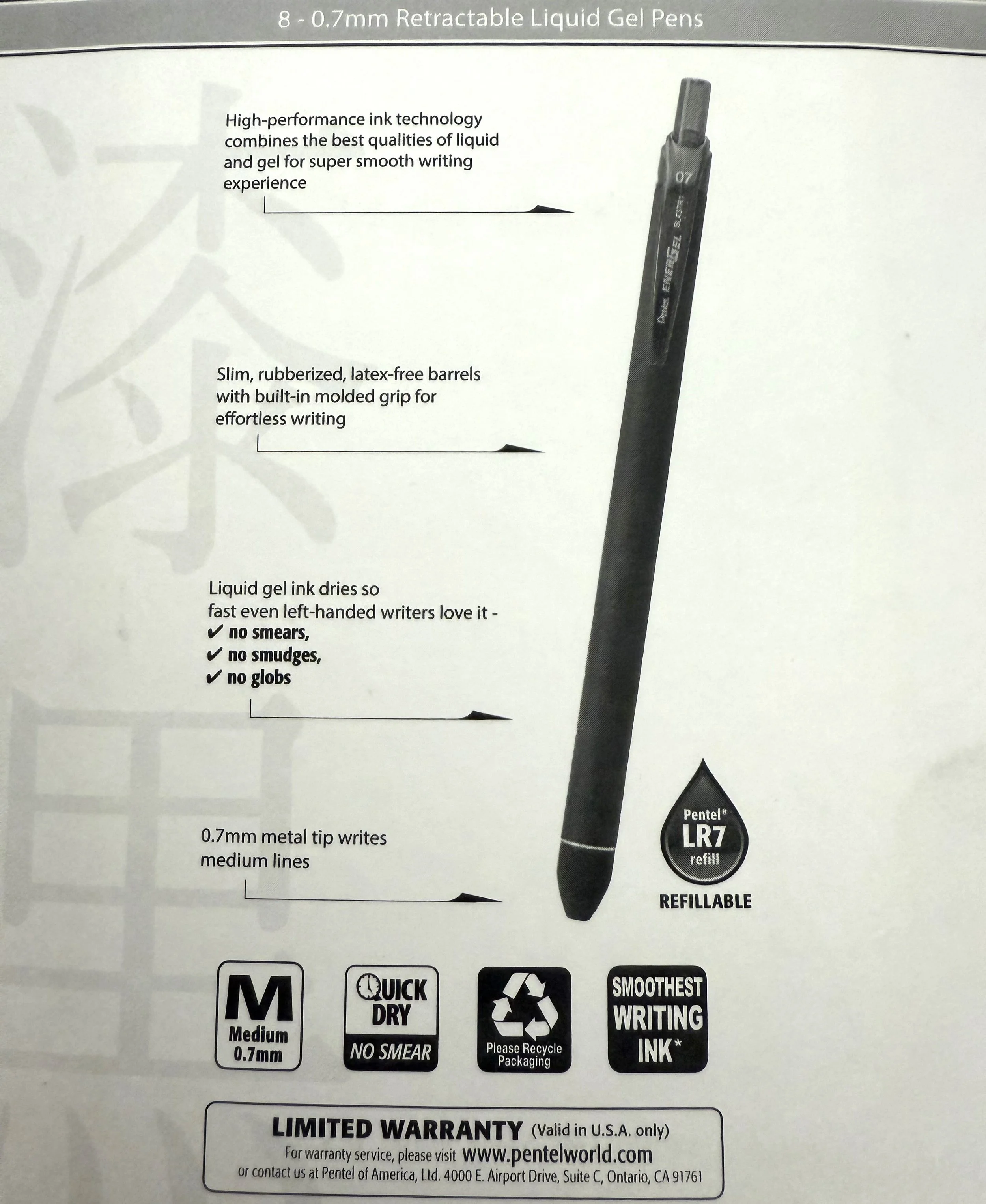
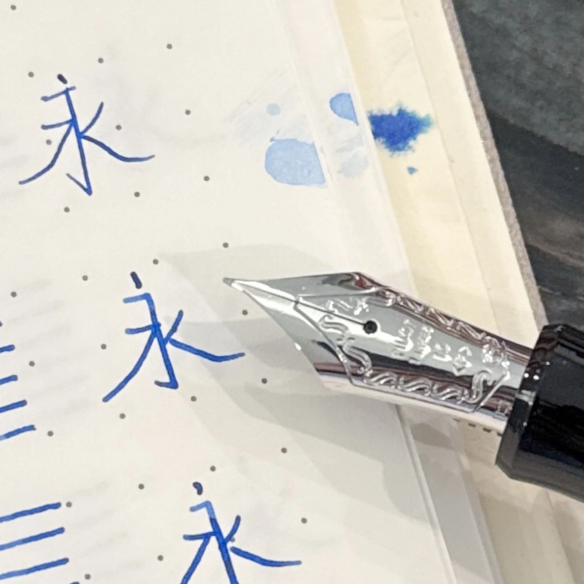
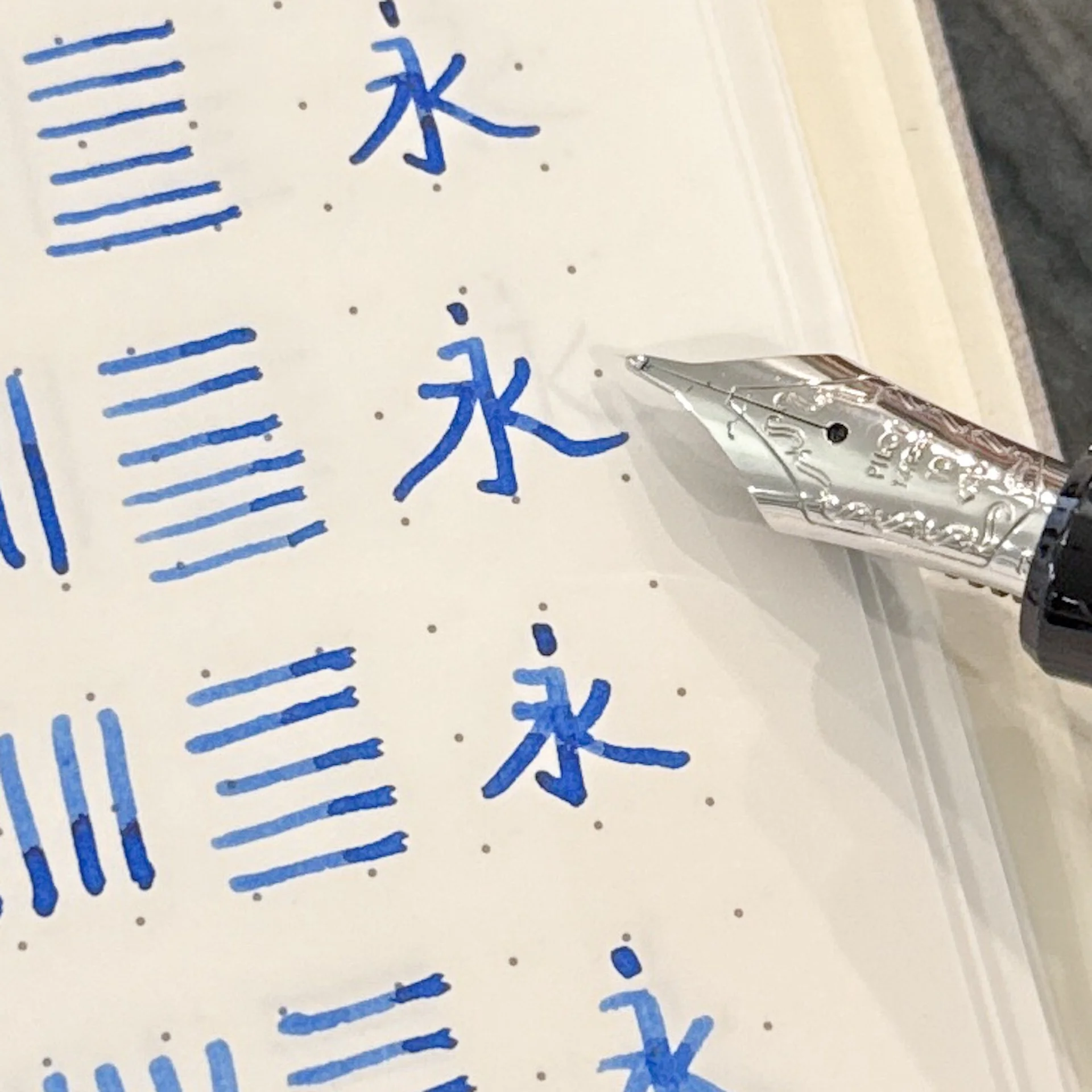
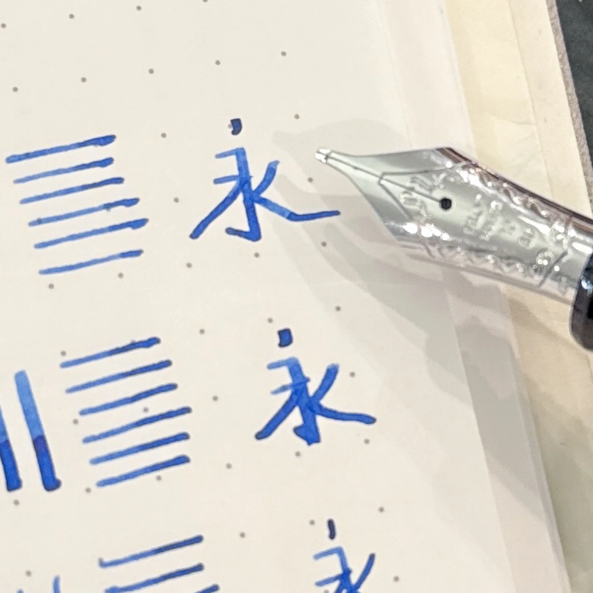
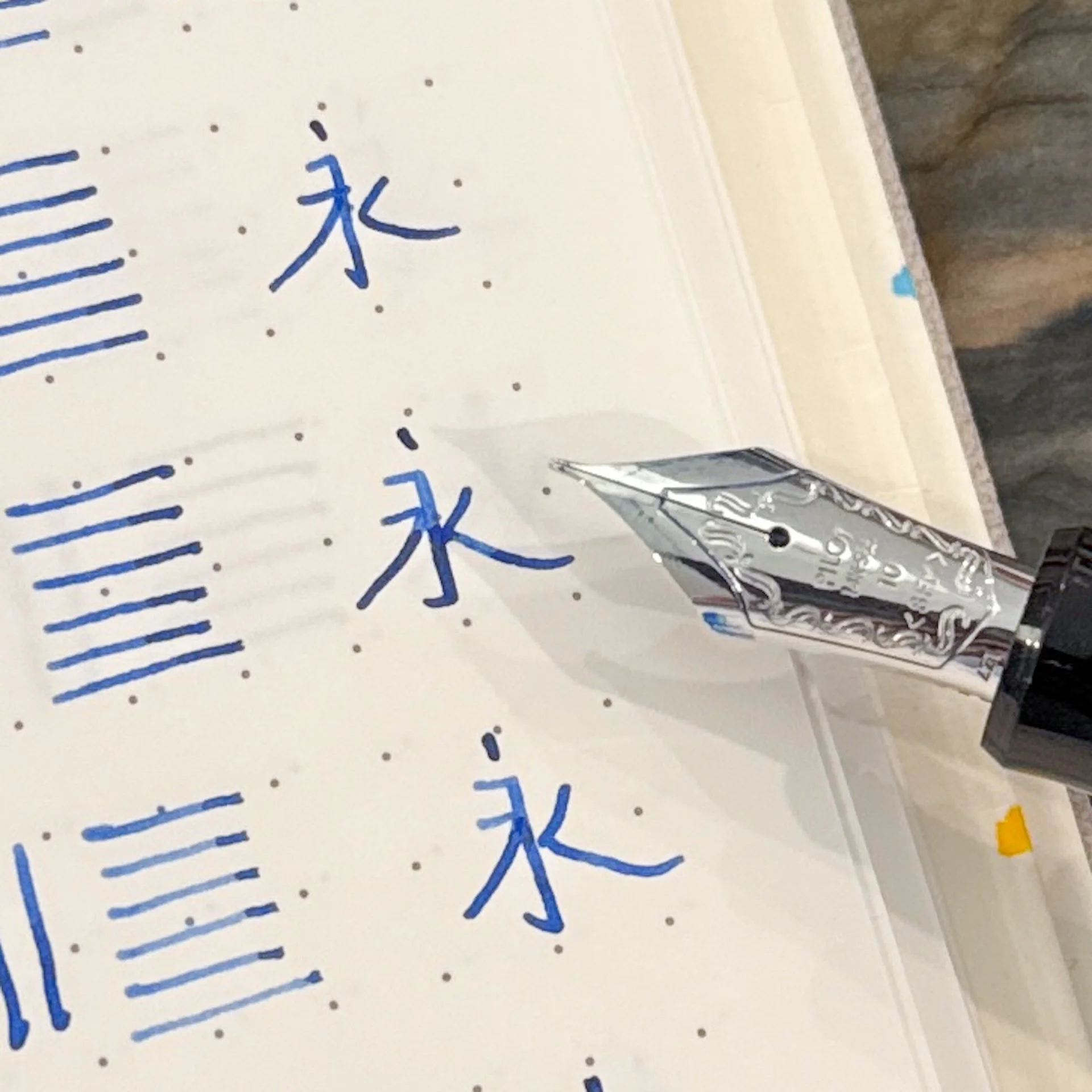
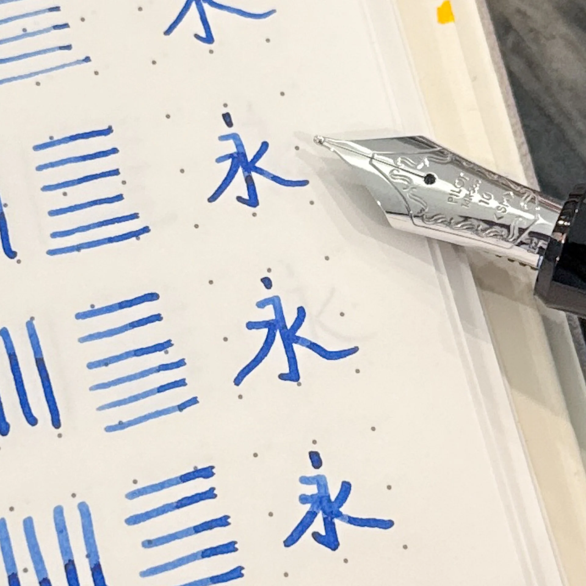
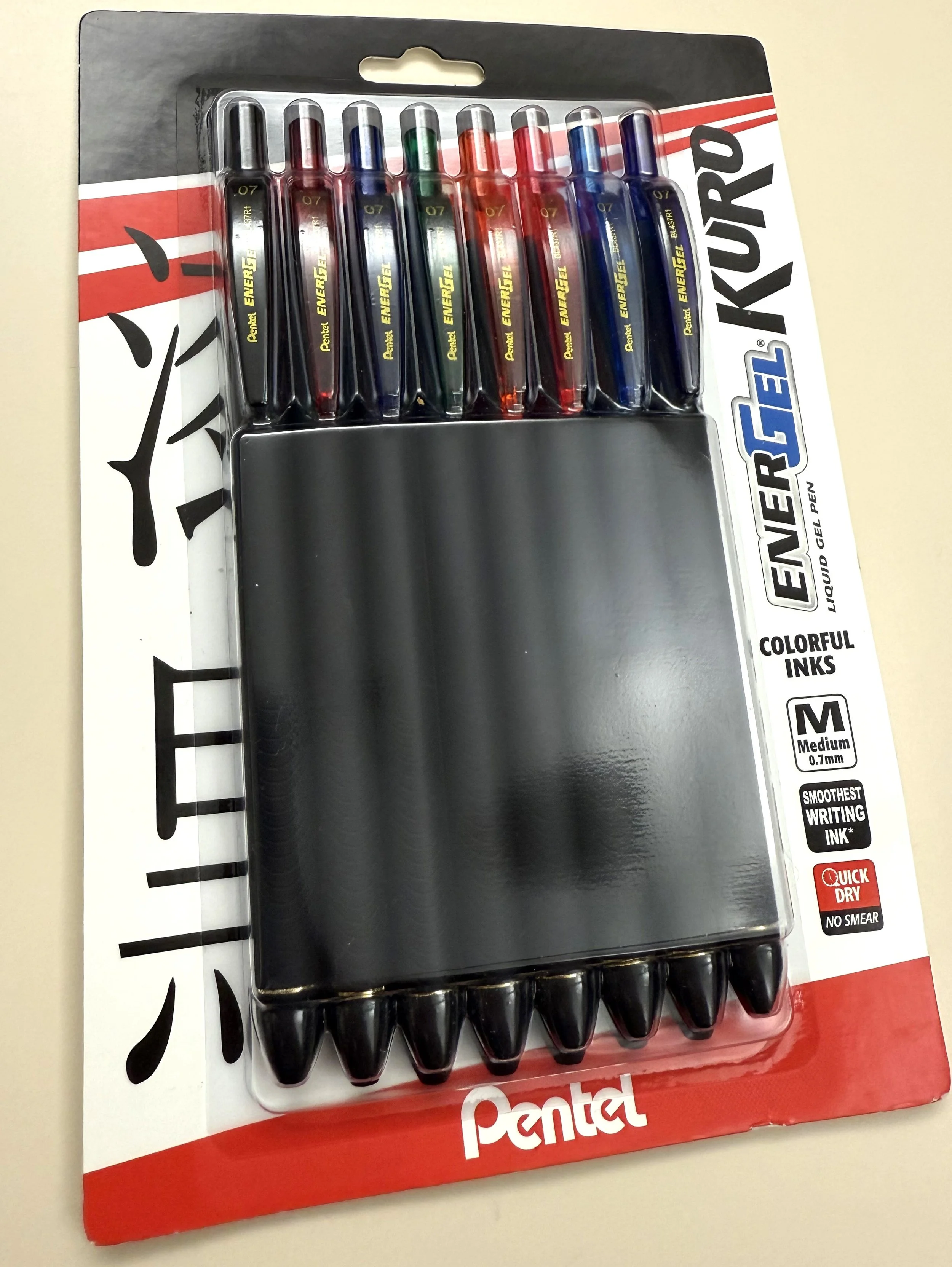
Pentel has a new build of their EnerGel model called the Kuro, and I think it's the perfect gel pen for this year's school adventures.

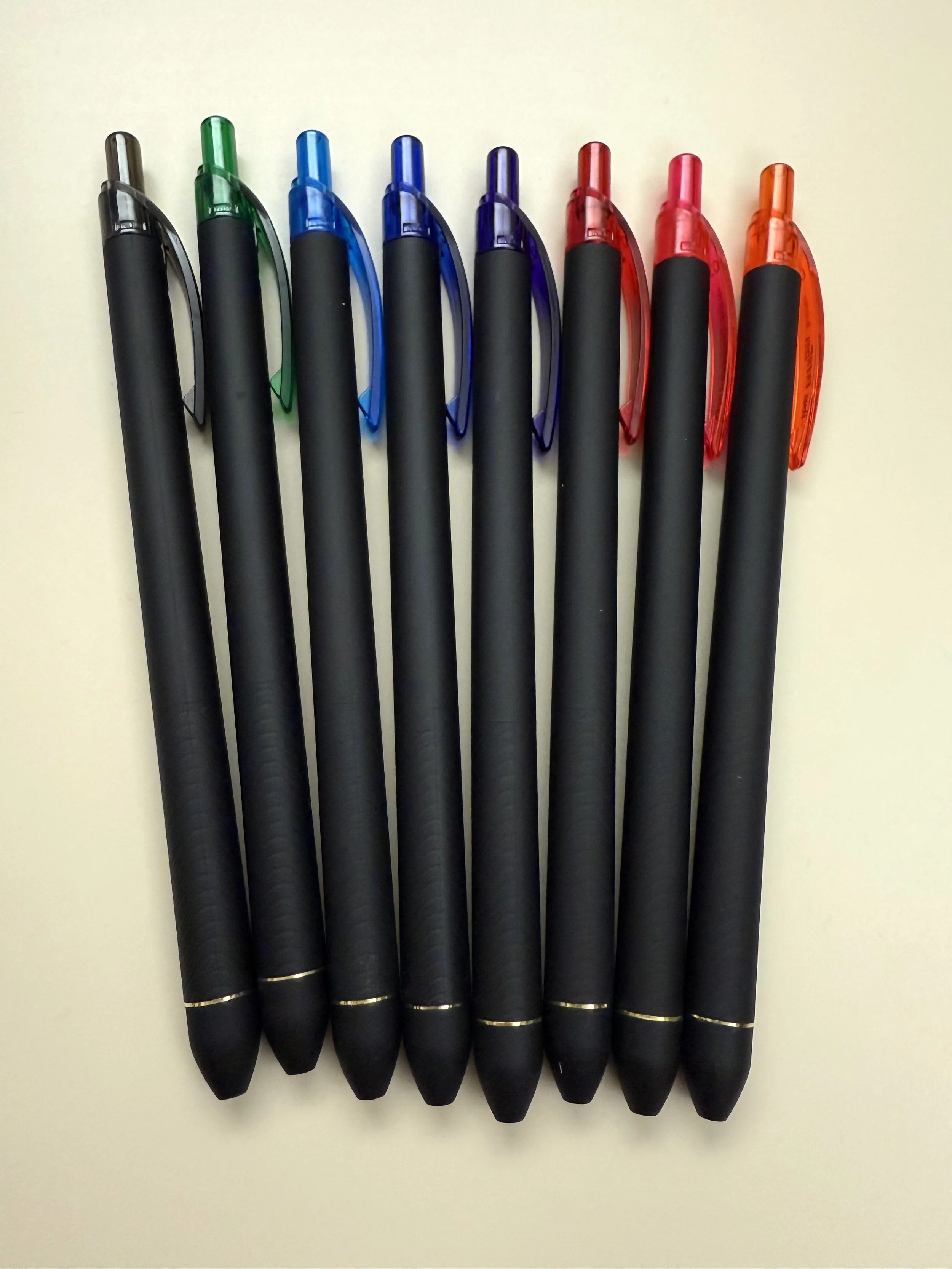
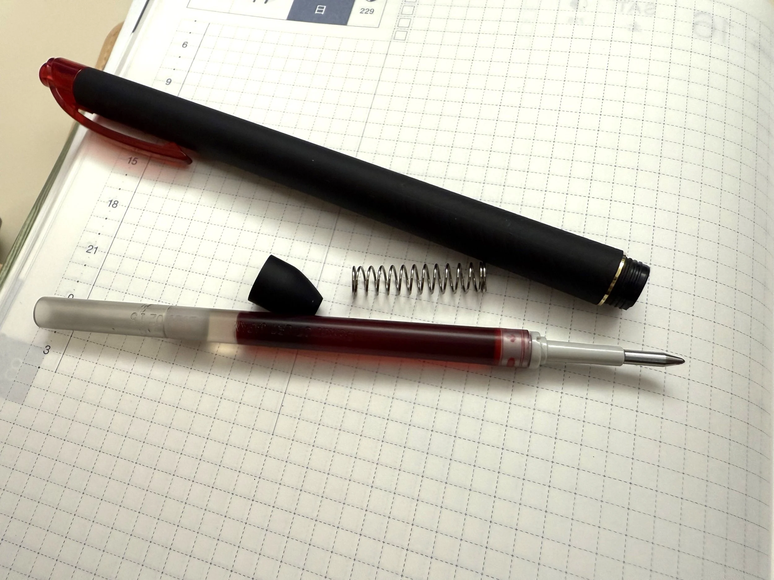
The Kuro has a slim body in a black rubberized material that is all non-slip and slightly cushioned, and the grip area has extra texture to it. It's smooth, but textured enough that your fingers don't slip on the barrel. It has a lightly flexible plastic clip and a click button top. The clip and click are in the color of the pen's ink, for easy identification.

Pentel EnerGel Kuro Tip

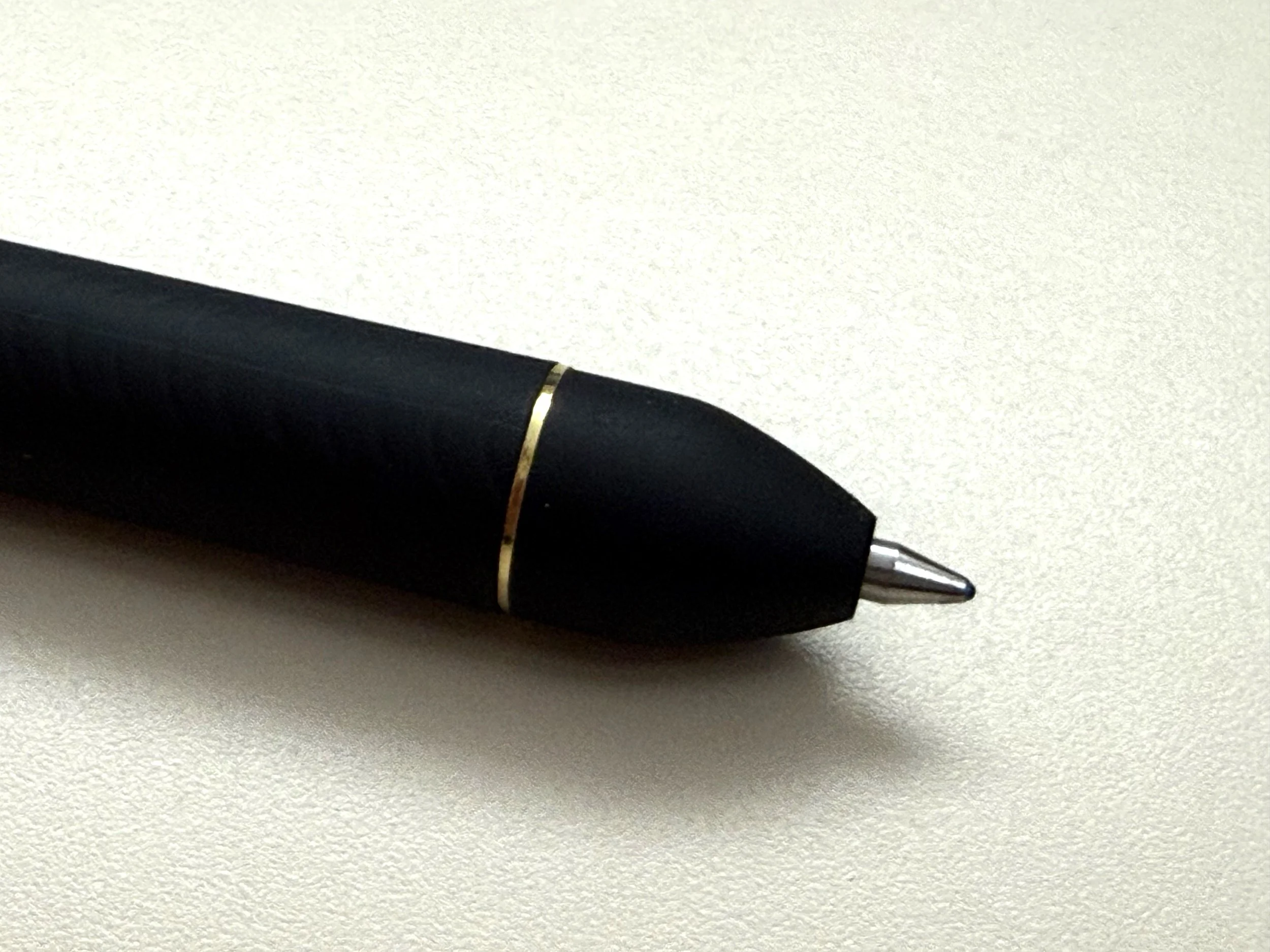
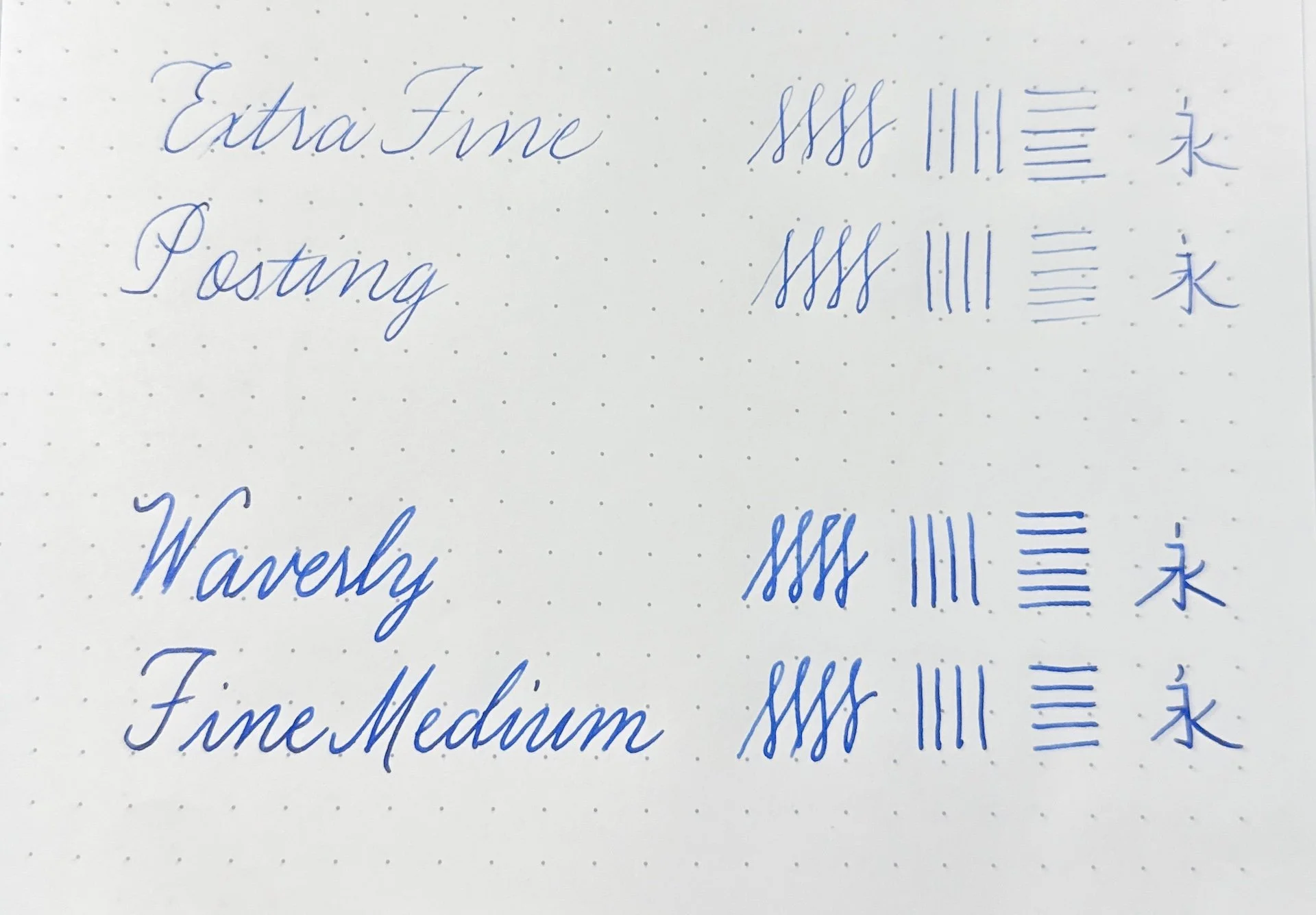
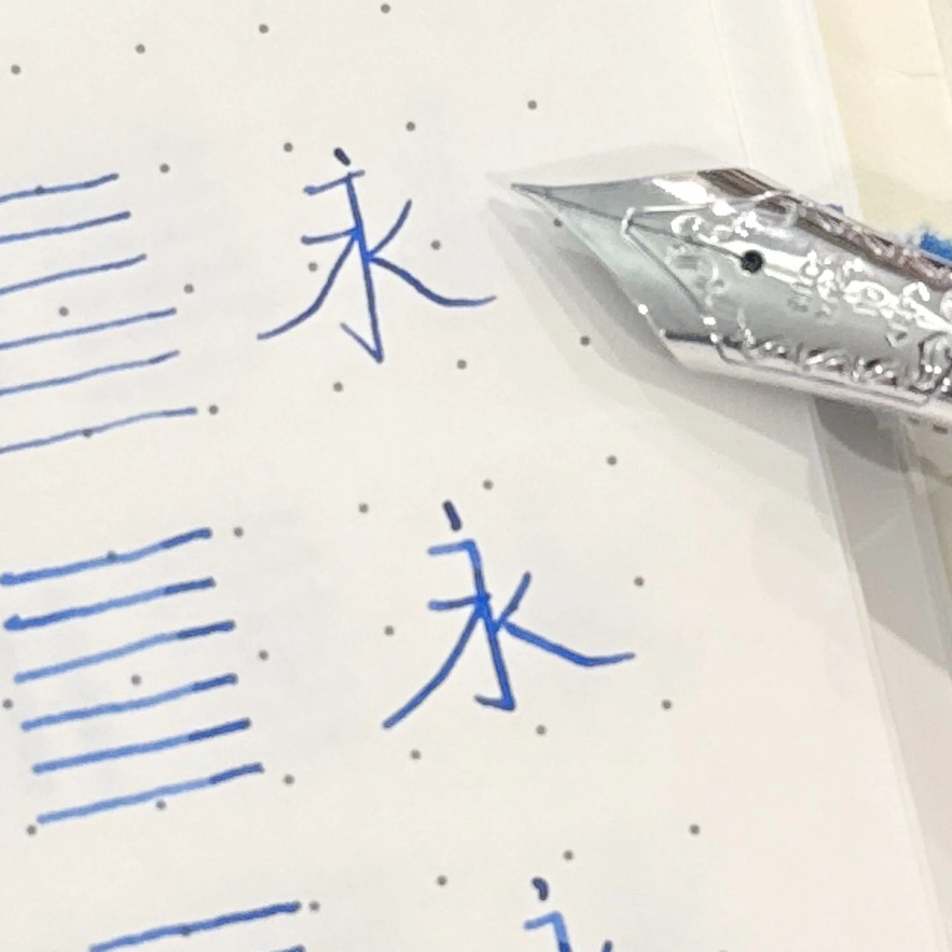
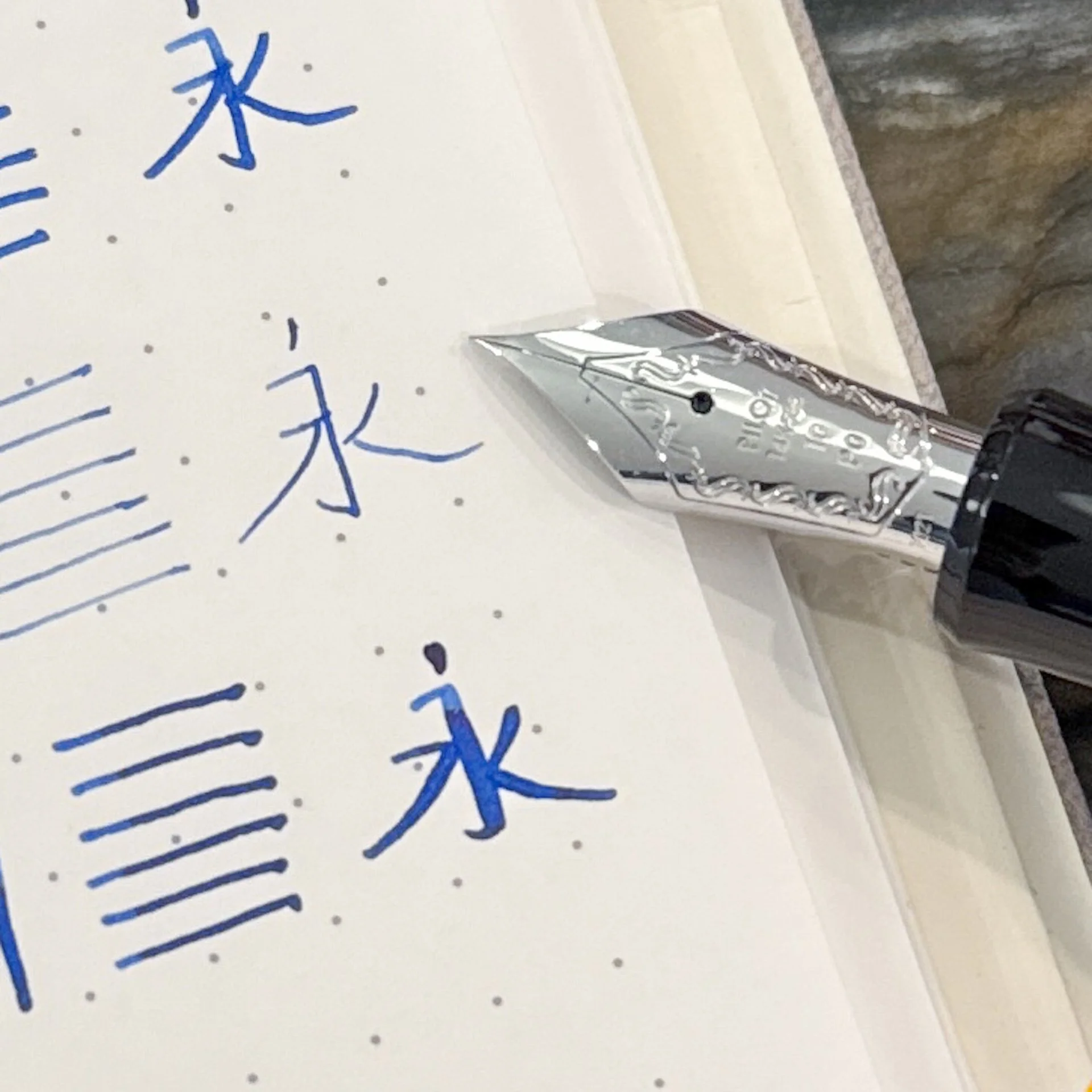
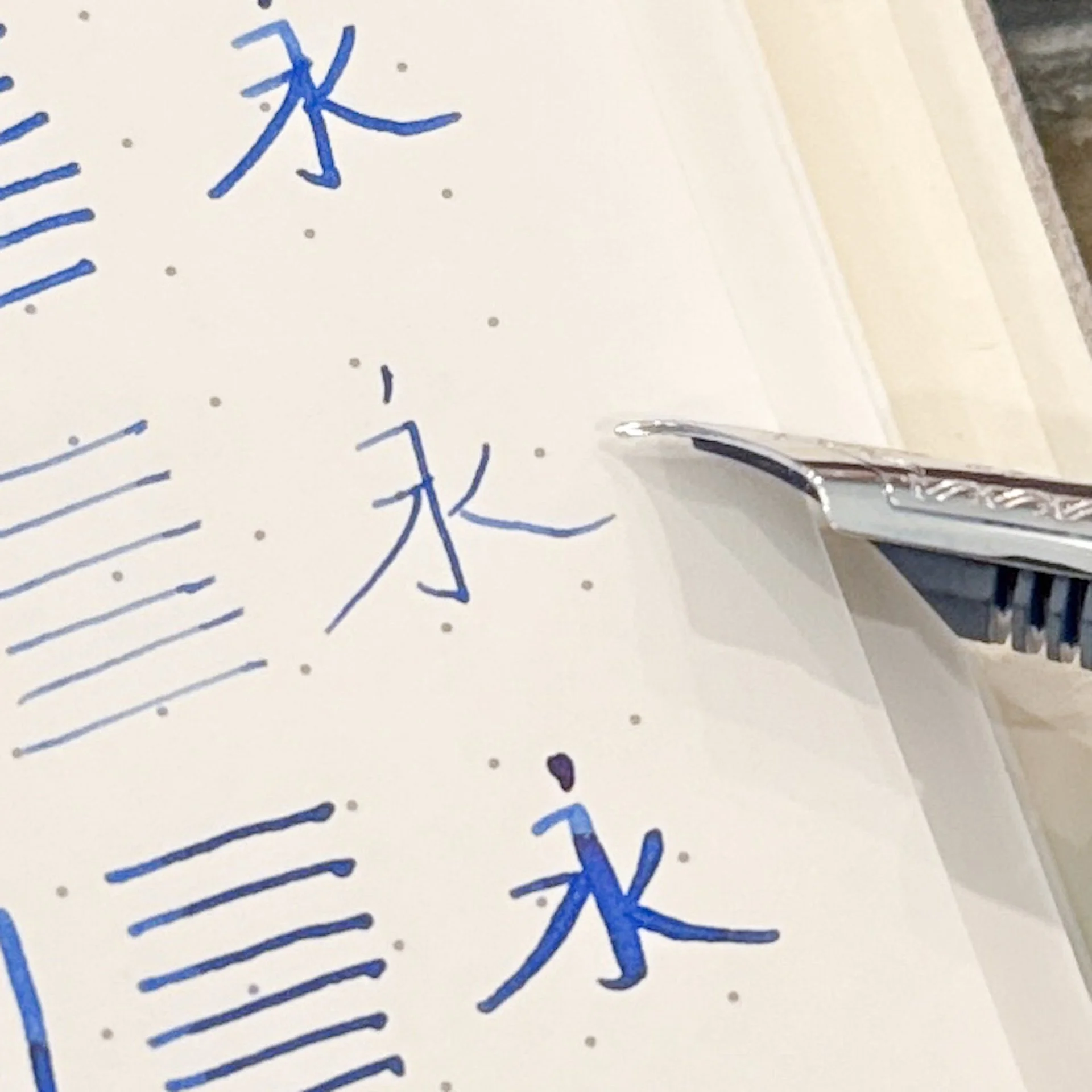
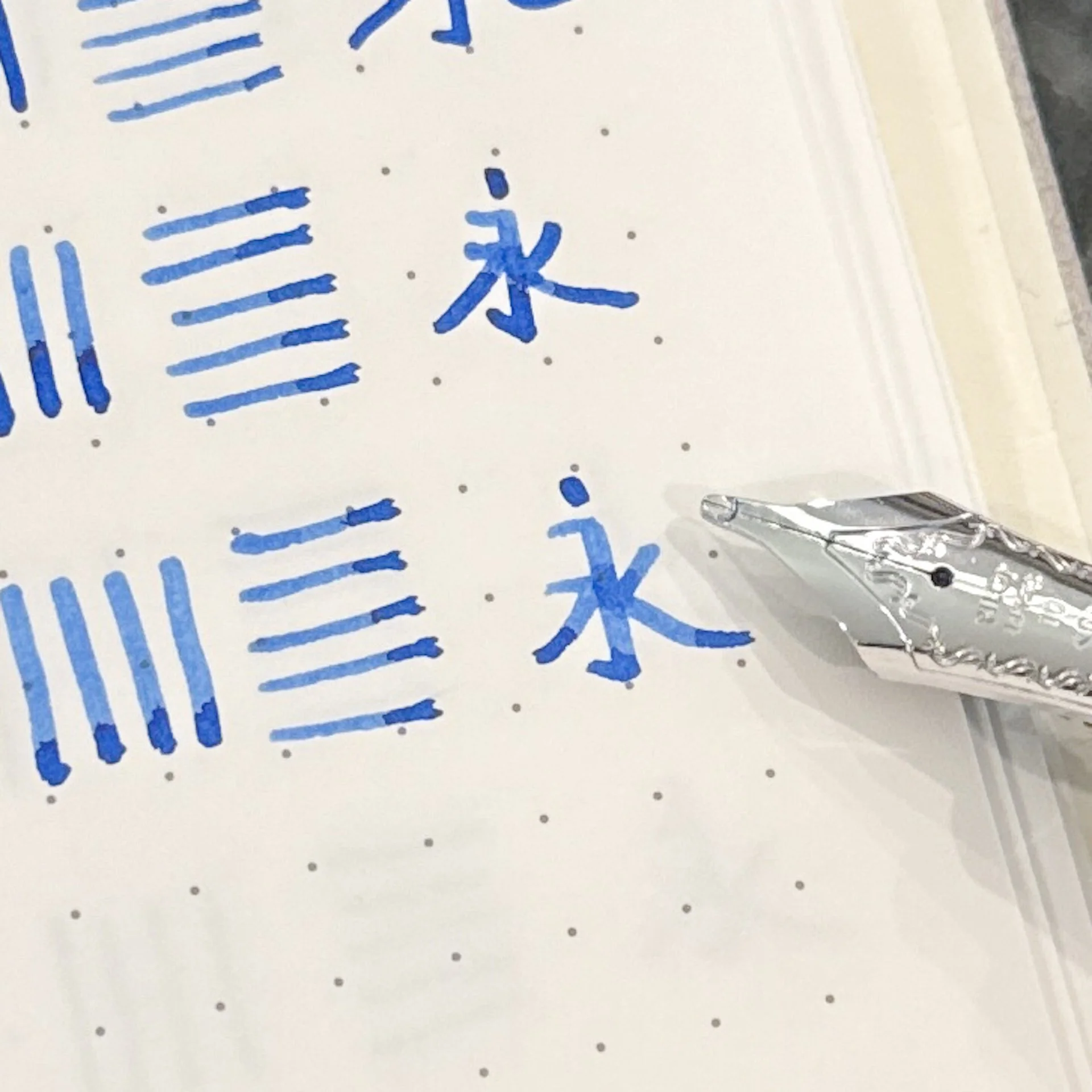
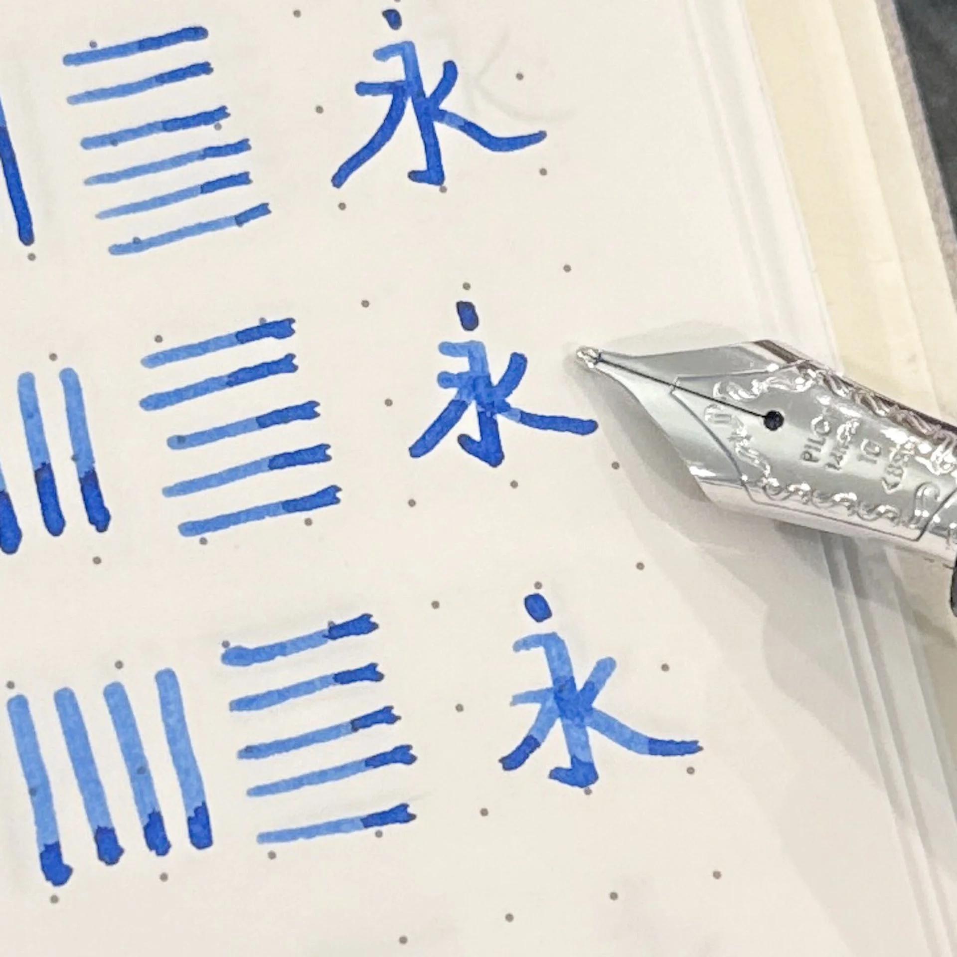
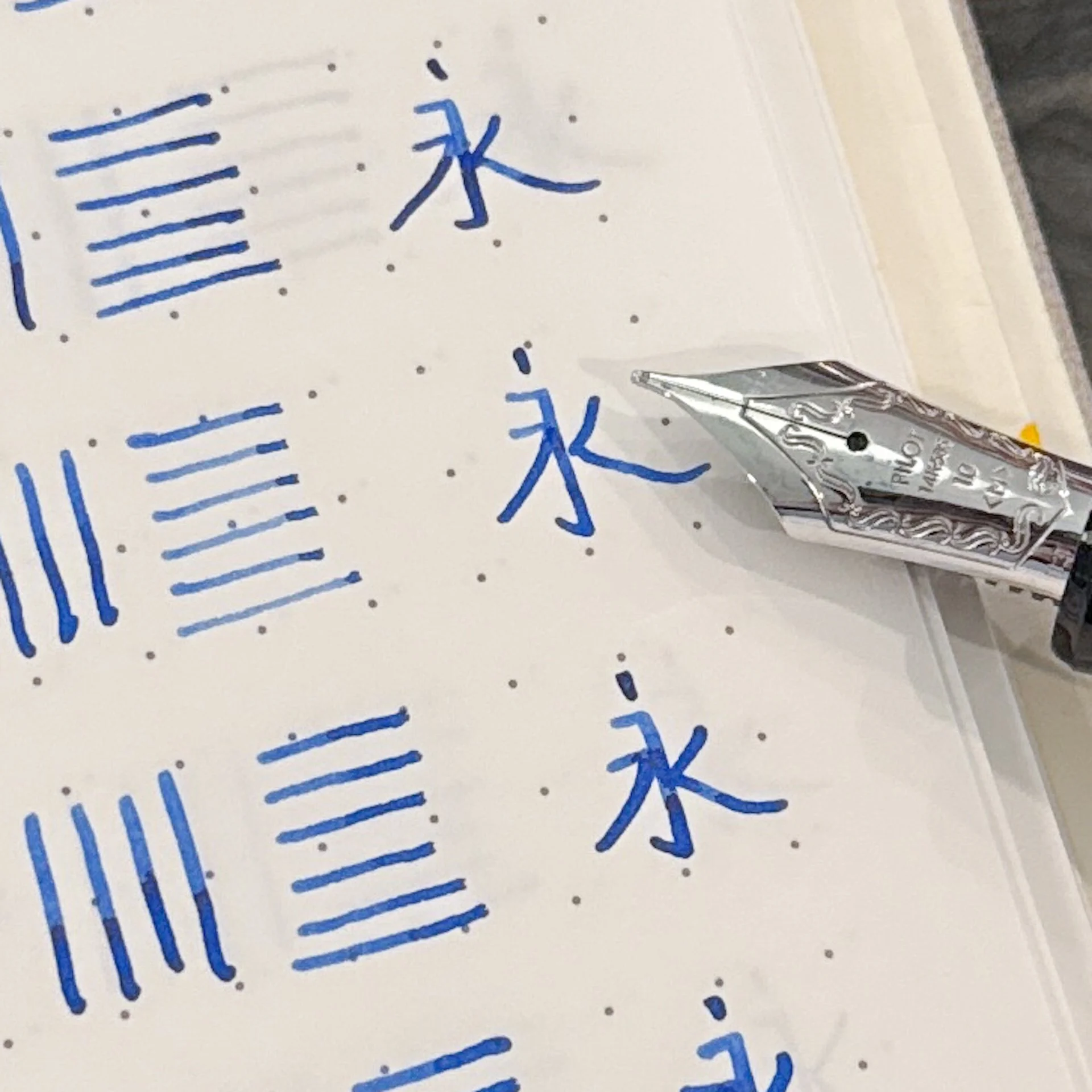
The tip is 0.7 mm, and it writes very smoothly. It downright glides. I had no skipping or blobbing with these, and I've been using them all day every day at work for a week.

Pentel EnerGel Kuro Ink

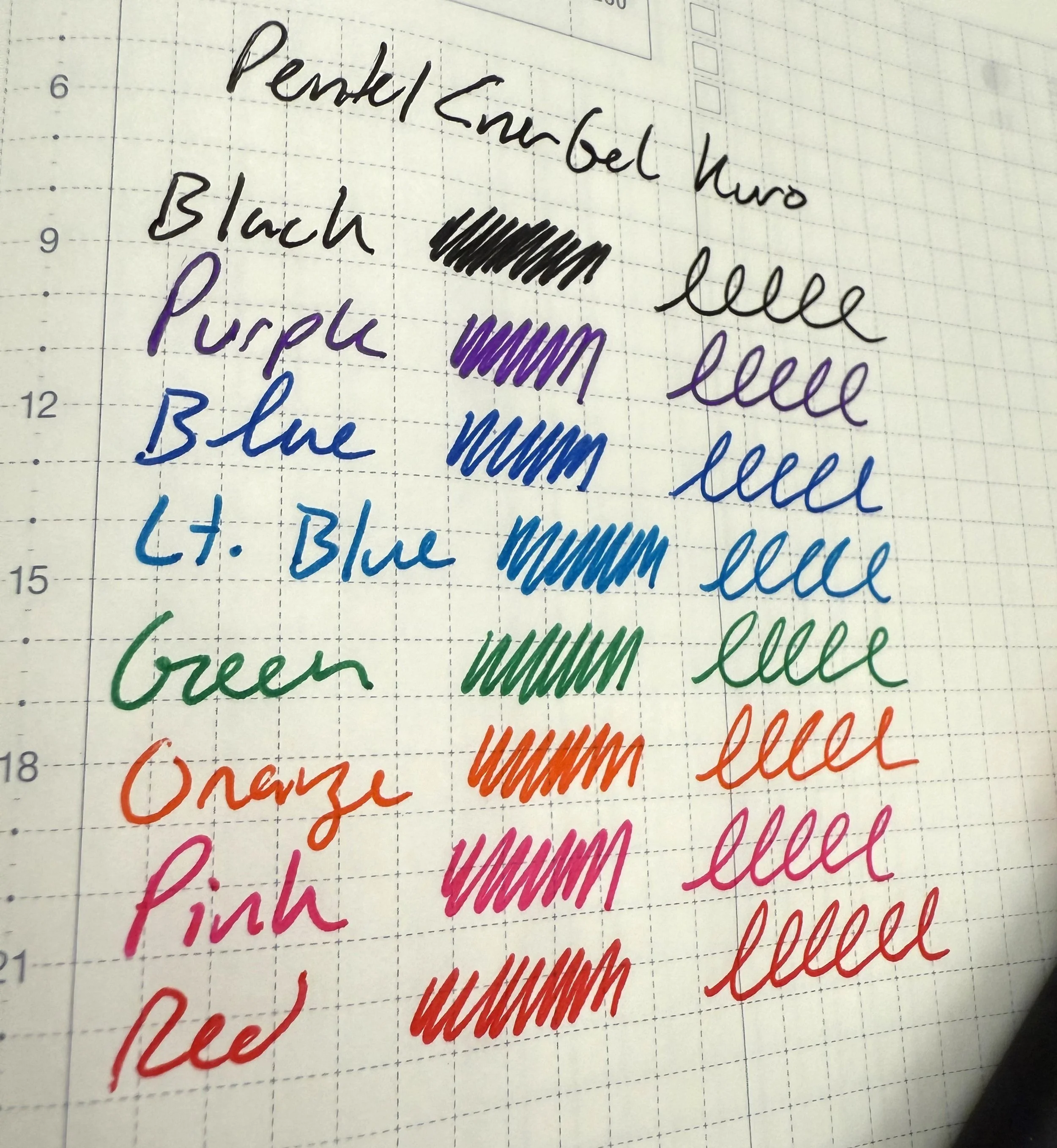
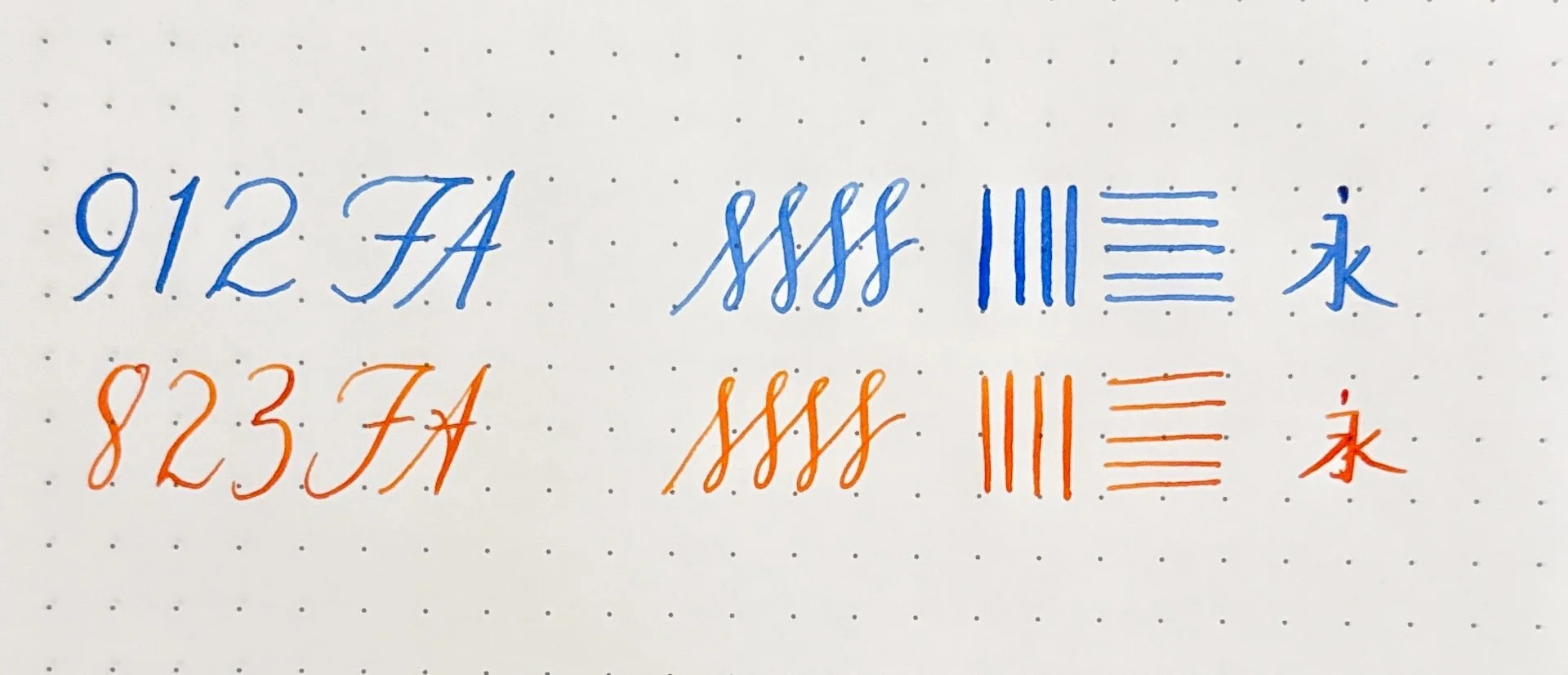
The ink is nicely saturated with bold, bright colors available in the set. This set has black, purple, pink, red, blue, light blue, green, and orange--enough colors for some excellent color coding. There are also 12- and 24-color sets available, as well as individual pens. They've been great in my planners, especially because they have a quick-dry, no-smear ink. They are also refillable. The nose cone unscrews to access the Pentel LR7 refill.

Pentel EnerGel Kuro Refill

The 8-color set costs $13.50, with individual pens costing around $2, and refills cost $1.35. Overall, they're one of the more affordable gel pens out there right now, which makes them even better for school, where pens vanish into the portal that lurks at the bottom of every backpack.

I've really enjoyed writing with these pens. And while I've turned the standard colors over to my children for school, the pink, purple, and light blue have stayed on my desk at work. Because mom has homework, too, and everyone needs good gel pens.

(JetPens provided this product at no charge to The Pen Addict for review purposes.)


Enjoy reading The Pen Addict? Then consider becoming a member to receive additional weekly content, giveaways, and discounts in The Pen Addict shop. Plus, you support me and the site directly, for which I am very grateful.

Membership starts at just $5/month, with a discounted annual option available. To find out more about membership click here and join us!

Pentel EnerGel Kuro Package
Posted on August 21, 2025 and filed under Pentel, Energel, Gel, Pen Reviews.

Pilot Custom Heritage 912 - Ranking the Nibs

(Kimberly (she/her) took the express train down the fountain pen/stationery rabbit hole and doesn't want to be rescued. She can be found on Instagram @allthehobbies because there really are many, many hobbies!.)

Last year, I was fortunate enough to get to test 14 of Pilot’s #15-sized 14K gold fountain pen nibs on the Pilot Custom 743, so I could see which ones would be my favorites. This year, I not-so-shyly asked Jaclynn Burleigh of Pilot USA if I could test their #10-sized 14k gold nibs in their Pilot Custom Heritage 912 pens and she said yes! The biggest difference between the 743 & 823 and the 912 & 742 is the size of the nib - the former utilizes the size 15 nib and feed while the latter takes size 10.

Side note: August sees the two of the largest US pen shows (DC and San Francisco), so you should take advantage of the opportunity to try all the nibs for yourself at the Pilot USA tables and let me know which ones are your favorites! But if you can’t, read on!

I have several pens with size 10 and 15 nibs, but I don’t have them all (nor do I want to, for now ;-) ) so I was curious to see if my favorites from last year’s 743 nib ranking would translate to the 912 nibs. It’s been a year since I’ve used some of these nibs in the 743 size, so I tried not to bias myself by re-reading last year’s article (I did rearrange them according to new rankings). I had limited time with these pens (as they needed to be sent back to Pilot so they can take them to different shows), which is a good thing because this would end up being a 10 page article, lol. I decided to follow a similar approach as in my last nib ranking, which was based off of the one the Bossman did in his Custom Heritage 912 writeup.

A few things to keep in mind:

  • I am right-handed but have a “stupid steep” writing angle - 75 degrees isn’t uncommon for me, while most people have a 45-50 degree angle.
  • I tend to write primarily in cursive, and occasionally in print (but not like the Bossman’s block print), typewriter font and calligraphy-esque styles like Copperplate and Italic. My go-to nib size from any maker/country/region is Medium. I also prefer broader nibs as well as stubs/italics. I rarely reach for Extra Fine, especially since I own very few of them.
  • Pilot asked that I dip these pens instead of inking them up, which I don’t think is the best way to test the flow in the nibs, but it’s enough for short writing samples. I dipped, then dragged the tip across the ink vial so there wouldn’t be blobs of ink on the page.
  • The first writing sample with all the nibs was done in the Maruman Bodoni A5 Notebook, while the others were written in an Endless Recorder with 68 gsm Tomoe River. I used a sample of Pilot blue ink.
  • My Chinese teachers from high school would be shuddering, but hey, it’s accurate, just not beautiful. The character means “always” or “forever”.
  • Thank you Pilot USA for sending these 912s so I could do a nib showdown!
  • Last but not least, I mostly followed Brad’s formatting but I did not read his ranking (nor mine from the 743 ranking) so I wouldn’t be biased.
Pilot 912 Fountain Pen

My aging eyes were so happy to be on #teamsticker even if the stickers didn’t all align with the front of the nib.

Based on writing samples of all of these nibs, do you think you can tell which ones I will like more than others? (Bodoni notebook)

Writing sample of the “regular” nibs on Tomoe River 68 gsm.

Specialty nibs - Stub, Music, Waverly, Posting, Falcon/FA.

Line width comparison of the Extra Fine & Posting nibs, and the Waverly & Fine Medium.

15 - Extra Fine

Admit it, you knew this was coming. I don’t hate EF nibs, I just really don’t prefer them most of the time from any brand. That said, I was expecting to like this more than the PO nib because I remember disliking the size 15 PO the most. For some reason, that wasn’t the case here. The EF gave me more feedback than I liked, so it was my least favorite of the nibs.

Pilot 912 Extra Fine

14 - Posting

The size 15 Posting nib was my least favorite to use because it felt like I was writing on the top of the nib, with it almost curving backwards on the paper. The original idea behind the nib was to write on postcards, which had limited space and therefore the extra fine line allowed you to fit more words. The angle of the nib also made it very stiff, unlike their regular and soft nibs, so you could also write on multiple sheets, like with carbon paper (does anyone remember what that is?) or forms in duplicate/triplicate. I’m not sure if it’s because the nib is smaller but this wasn’t as uncomfortable to write with, and while it was still uncomfortably fine for me, I liked it more than the EF>

Pilot 912 Posting PO
Pilot 912 Posting PO side

You can see the downturn of the Posting nib, which gives it a firmer writing experience as well as a drier line.

13 - Coarse

You would think that I’d love this mega broad line because I love showing off inks, but like its size 15 sibling, this nib lays down quite the Sharpie line! It gives a smooth writing experience but since I don’t have large handwriting, this isn’t a very practical nib. This would still be a great platform for a nib grind, but I’d probably get a Broad or Double Broad for grinding before I’d get the Coarse.

Pilot Custom 912 Coarse

Of COARSE this is a fun nib if you need a thicc line.

12 - Waverly

Unlike the Posting nib, the Waverly was designed with a slight upturn on the tip of the nib, which makes it much more pleasant for folks who “push” their nibs, like lefties. As a rightie, I didn’t really notice the difference as it still wrote with a smooth, slightly broader than Fine Medium line. I’m sure I’d rank this much higher if I was a leftie, but since I’m not, I’d pick any of the remaining nibs instead of trying to hunt this one down.

Pilot Custom 912 Waverly

The Waverly’s upturn is more noticeable from the side.

11 - Music

The Music nib was not offered in the 743, so I was not able to test this last year. The writing experience is very stub-like, wider down strokes and narrow side strokes. The down strokes are wider than the Stub’s. Similar to the Coarse, its lines are a bit too thick for my writing, so it’s less practical for me, but I do like the line variation, which is why it gets a higher rating that the Coarse.

Pilot Custom 912 Music

10 - Fine

The Fine gives a nice writing experience with a fine line. As I mentioned earlier, I like laying down ink and this Fine just doesn’t give me as much as I’d like.

Pilot Custom 912 Fine

9 - BB / Double Broad

I liked the not-quite-as-insane width of this nib compared to the Coarse but it is still too broad for my everyday use. As with the Coarse nib, this would also be a great canvas for a nib grind. Even though this is impractical for me, I ranked it higher because I’d picked this over a Fine if I had to choose between the two.

Pilot Custom 912 BB

This BB has one too many Bs for me.

8 - Soft Fine

I liked this more than the Fine because the slight bounce from the softer nib gives it an almost imperceptibly wider line and ever so slight line variation (more from the release of pressure than from adding pressure). That said, it’s still a bit too fine for me.

Pilot Custom 912 Soft fine

Soft Fine, you’re finally number nine! (it was #10 last year.)

7 - Fine Medium

The top seven are much harder to choose from, so I used two criteria to help me decide: (1) what would be a better everyday writer for me and (2) what nib would I pick to buy next.

This one was REALLY hard for me to put in this spot, but having owned this nib in both the size 10 and 15 sizes, I have come to accept that while it is a great writer, it is, say it with me, just a bit too fine. It is a very practical size for every day but this inkophile wants to lay down more ink, and go through fills quickly and this FM is too fine to do that.

Pilot Custom 912 Fine Medium

6 - Medium

Yep, my go-to nib size, Medium, barely made the top half of this list! It is such a nice and smooth writer that it’s one of my favorites, but I have enough Mediums so it barely made the top half of this list.

Pilot Custom 912 Medium

Medium is 7th because I’d rather get one of the other remaining nibs first, it’s not cuz I don’t love you.

5 - FA or Falcon nib

Not to be confused with the Falcon pen (aka Elabo), the FA nib has cutouts on the side of the nib that gives it the ability to flex a bit. It is not like vintage flex, more like semi-flex. The size 10 FA is actually softer/flexier than the size 15 FA, and gives a bit more line variation than the 15. I have both and prefer the 10 FA because I do like to really slow down and write in a Copperplate-like style when using it. Even though I already have one, I wouldn’t turn down another FA if it were to cross my path, but having both means it’s lower in the list for me.

Pilot Custom 912 FA

You can see the cutouts from the top of the FA nib.

A better view of the side cutouts.

#10 vs #15 size comparison.

Writing samples of the 912 FA vs the 823 FA, inked up with the Bossman’s Fire on Fire on Fire! You can see that I can get slightly wider down strokes with the 912 FA vs the 823 FA.

4 - Broad

I am shocked that I still don’t have any Broad nibs in either the 10 or 15 size, though I do have it in a VP nib and I love it. This would be a great ink layer-downer nib without having an overly broad line and as such would be a great addition.

Pilot Custom 912 Broad

Broad. It me.

3 - Stub

As someone who occasionally likes to do italic calligraphy, as well as write cursive with stub nibs, I was really curious to see how Pilot’s stub nib would feel. I absolutely loved writing with it! It is a fairly smooth stub, unlike Pilot’s sharper steel nibs like the ==CM== (Calligraphy Medium) which are more like italics. The only reason this is ranked third is because this wouldn’t be as practical for me as an everyday writer, but it’s definitely high on my list of nibs to get next.

Pilot Custom 912 Stub

Stub, where have you been all my life?

2 - Soft Fine Medium

I ranked the Size 15 SFM as #1 and I already knew that I loved the size 10 SFM since I’ve had it for several years now. Going into this test, I wondered how it would rank against the Soft Medium and while I still love this nib a lot, if I had to choose between a SFM and SM, I’d choose the latter. The slight softness of the nib makes the line a bit broader than the regular FM, which means it is the perfect width.

Pilot Custom 912 Soft fine medium

Soft Fine Medium, I still love you, even if you’re #2.

1 - Soft Medium

I don’t have this nib and I want it. I love the slight bounce that this gives over the Medium, but it also makes the line a touch wider too. I could have easily swapped the SFM and SM spots but this one ranked higher because I don’t have one. Yet.

Pilot Custom 912 Soft Medium

Soft Medium, I need this so much.

How did the size 10 nibs do compared to the size 15 nibs?

Ranking:

Pilot Nib Ranking

There was a bit more movement in the bottom half of the rankings versus the top half, but I was surprised that I liked the Waverly and Coarse nibs more last year than I did this year.

And there you have it, my ranking of the size 10 nibs from the Pilot Custom Heritage 912 collection! We already know that the Bossman and I don’t agree on most nibs and this is no exception (how dare he rank my #1 Soft Medium as #13??). That’s the beauty of this rabbit hole - we all like different things and that’s ok!

It’s the circle of life, I mean, nibs!

Oh, one more thing, this article also marks my 4 year anniversary of writing for The Pen Addict! Thank you so much to Brad “The Bossman” Dowdy for taking a chance on me four years ago and you still put up with the longest articles ever (barely over two thousand words in this one!). And an even bigger thank you to all of you for reading, commenting and encouraging me - it really means a lot! Can’t wait to see what the next year brings!


Enjoy reading The Pen Addict? Then consider becoming a member to receive additional weekly content, giveaways, and discounts in The Pen Addict shop. Plus, you support me and the site directly, for which I am very grateful.

Membership starts at just $5/month, with a discounted annual option available. To find out more about membership click here and join us!

Posted on July 31, 2025 and filed under Pilot, Nibs, Fountain Pens, Pen Reviews.

Schon DSGN x Custom Nib Studio Sashiko Fountain Pen Review

(Kimberly (she/her) took the express train down the fountain pen/stationery rabbit hole and doesn't want to be rescued. She can be found on Instagram @allthehobbies because there really are many, many hobbies!.)

My purchases at the recent 2025 Pacific Northwest Pen Show were pretty restrained and I hadn’t planned on buying any pens, but when I heard that two of my favorite pen people were doing a collab, I knew I had to take a look.

Schon DSGN x Custom Nib Studio Sashiko fountain pen.

Gena Salorino of Custom Nib Studio launched their Sashiko Fountain Pen collab with Ian Schon of Schon DSGN a couple weeks ago at the PNW Pen Show. This Sashiko pen has an engraved design, which is inspired by the Japanese stitching/embroidery technique of the same name. According to Wikipedia, “Sashiko (刺し子, lit. 'little stabs') is a type of traditional Japanese embroidery or stitching used for the decorative and/or functional reinforcement of cloth and clothing.” There are different kinds of patterns for Sashiko embroidery/stitching, like stripes, checks, diamonds, etc. Gena chose the cross stitch pattern because this is the technique they use to repair their own clothing, which I think is extra cool.

When asked how this pen came about, Gena said they had always wanted to work on a pen with Ian and it came about a few months ago when they “daydreamed” their idea of a pen to him, who took the idea and ran with it. And thus, the Sashiko fountain pen was born.

The Sashiko pen is made from Ultem (also known as polyetherimide or PEI), an engineered plastic that is much stronger than acrylic. It can also be machined to be very thin, resulting in a very lightweight pen. The finish is neither a matte nor super polished, giving it a “warm” feeling to it, similar to ebonite.

Rather than creating a single sashiko pattern and then reproducing that pattern on all the pens, Ian, ever the engineer, challenged himself to “create a style of 'macro' programming to create a new unique pattern for each pen that follows the same logic and styling, but is totally one of a kind.” This gives it a random, handmade feel without actually hand-crafting each stitch. As a result, each of these pens are unique. I appreciate the “imperfection” of the cross markings, which echoes real life stitching on fabric.

You can see that each of the stitches are similar but different.

One of the things that impressed me the most about the pen is the cap threading - in addition to it taking a mere half turn to cap/uncap the pen, the last little turn to cap the pen has a gentle resistance that tells you it’s about to be fully sealed. It’s hard to describe but it is such a satisfying sensation.

Just a few threads are needed for a half-turn cap/uncap.

Cleaning Ultem pens is easy - usually water (and soap, if necessary) is all you need. Alcohol is also safe if you need a deeper clean. Ian recommends avoiding ammonia-based solutions, including pen flush. If you want to use pen flush to clean the nib/feed, unscrew the nib unit to clean it separately.

The pen measures 5” (127.5 mm) when capped and 4.8” (122.5 mm) when uncapped (note that the pen does not post). It weighs 0.66 oz. or 18.77 g with nib unit & converter. Here are some pens that are similar in size, along with their weights:

Pen

Weight (uncapped with converter)

Weight (capped with converter)

Sashiko

0.546 oz/15.46 g

0.66 oz/18.77 g

Schon Dsgn Full Size Fountain Pen - Aluminum

0.729 oz/20.66 g

0.927 oz/26.28 g

Sailor Pro Gear

0.543 oz/15.43 g

0.835 oz/23.69 g

Platinum 3776

0.475 oz/13.50 g

0.840 oz/23.82 g

Franklin-Christoph 03

0.440 oz/12.48 g

0.657 oz/18.62 g

Pilot CH 912

0.440 oz/12.47 g

0.755 oz/21.41 g (with Con-40)

Pelikan M600

0.397 oz/11.22 g

0.646 oz/18.31 g

Note: I sorted this by descending uncapped weight since the Sashiko can’t be posted.

Pens similar in size and/or weight to the Sashiko pen (L to R): Sashiko, Schon DSGN full-sized fountain pen, Sailor Pro Gear, Platinum 3776, Franklin-Christoph 03, Pilot Custom Heritage 912, Pelikan M600.

Writing sample of the Sashiko pen, with a Broad Journaler. Robert Oster Tokyo Denim Blue seemed like a good choice for the Sashiko. Paper is Ayush Paper dot grid.

The Sashiko pen includes an o-ring for the grip for eyedropper use only.

The Sashiko pen costs $300 and comes equipped with a converter, an unbranded Jowo 6 nib from Extra Fine to Broad, and an o-ring (only for eyedroppering). If you want a nib grind for the Sashiko, you have to add that to your cart separately. You can also order a Monoc with a grind from Gena via email.

When I first saw the IG post announcing the Sashiko pen, I thought that it was cool, but probably not my thing. Despite being in the tongue-in-cheek Black Pen Society, I prefer more colorful pens. I’ve also felt that Ultem pens were a bit too light (weightwise) for me. But when I got to touch, hold, feel the pen in hand at the PNW Show, I was sold. It isn’t cheap but it wasn’t overly expensive either. I went from “it’s cool, but maybe not for me” to “this is more interesting than I expected it to be and I’m glad I get to buy one and support two wonderful people”.

A batch of 100 pens were made, with no current plans to make more. Gena will have them at their table at the upcoming DC Pen Show and SF Pen Show, as well as on their website.

(Disclaimer: The Sashiko Pen was purchased by me at full price from Gena at the 2025 Pacific Northwest Pen Show. I also paid regular price for the Journaler grind on the Broad nib. Everything else shown is also my own.)

Posted on July 25, 2025 and filed under Custom Nib Studio, Schon DSGN, Fountain Pens, Pen Reviews.