The Esterbrook SJ is the second of the two Esterbrooks I bought at the 2014 Atlanta Pen Show back in April. The first was an Esterbrook Dollar Pen, which I talked about back in May. Like I said then, Esterbrooks weren't on my list when I went to the show, but they snagged me while I was there, and now I'm pretty sure I've caught the bug.
Quick recap
Both of these pens were purchased from Carl Daniel, which I heartily recommend. Carl was friendly, helpful, and taught me a lot about these pens in the few minutes we spoke. He had dozens of Esterbrooks on display at his table, and it took me two or three passes to decide which ones I wanted. More accurately, it started off as picking one pen, but I failed at that goal and ended up deciding on two.
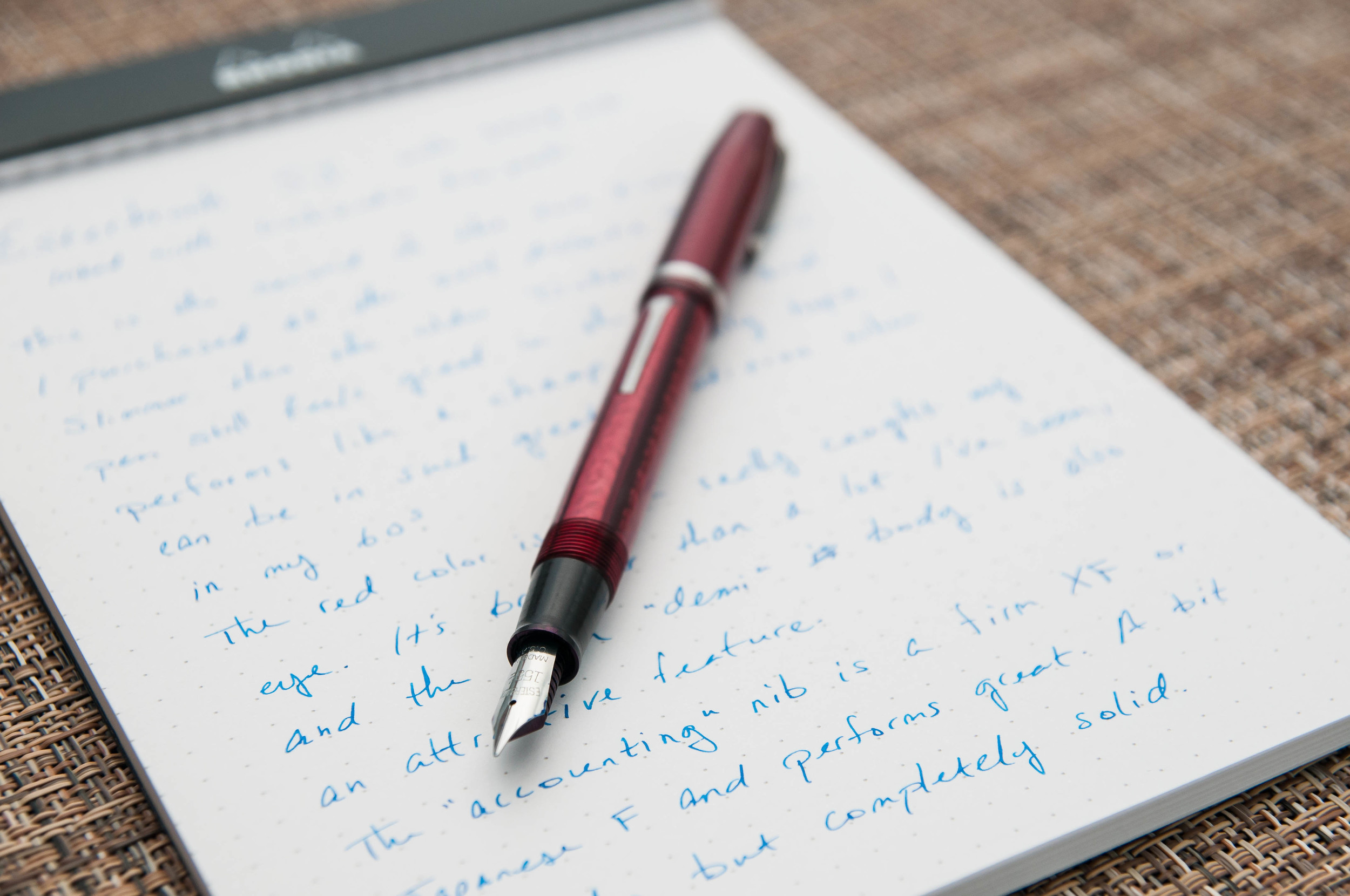
The SJ was the second pen that I picked up from Carl. I had already nabbed the Dollar Pen and spent several minutes looking at and handling the SJ models he had. For some reason, I enjoyed the size and weight of the SJ models compared to the regular J models. After that, I just had to narrow down the color. In the running was a blue, copper, and red model. I ended up going with the red because it caught my attention more out of the bunch. Today, I'm still extremely satisfied with my choice of color, but I'll definitely be expanding my collection to include other nice colors.

The pen
This particular pen came with a 1554 nib installed, which is a really fine nib originally meant for accounting work. With a regular grip and pressure, the line is very similar to a Japanese fine. I guess they designed the fine line to write in those tiny ledger lines. At any rate, it's a great nib considering how old it is. It isn't a new-from-stock nib like my other one, and it's also seen better days. It appears to have some damage to the point, but nothing that causes any performance problems. It's just a bit scratchy on some papers, which is normal anyway given the super-fine point.
Since it's such a fine nib, I don't use it nearly as much as my Dollar Pen. I prefer a smoother, larger nib when doing general writing, so I typically reserve this pen for more detailed stuff. With that said, I really want to find a new nib for the SJ because I want to use it more. Since the nibs are easily swapped, I can find something that suits my writing style and add this pen to the daily rotation.
With any Esterbrook, it can be difficult to pin-point an exact year of production, but this SJ was probably made somewhere between 1948 and the late '50s. Either way, it's doing a remarkable job of staying relevant and delightful. It still blows my mind that a pen this old can still be such an excellent writing instrument.

Size
The SJ is longer and slimmer than the Dollar Pen. The only other fountain pen that has a comparable width is the Hero 529, which the Esterbrook blows out of the water. Personally, I love the form factor. There are times when writing that I wonder if the larger cousin, the J, would fit my hands better, but I can't get over how sleek and modern the SJ design is.
The SJ is just a bit taller than the Dollar Pen, which means it's a small pen. Once posted, both pens are almost identical in overall length. They both feel spectacular in-hand.
Filling mechanism
Like the Dollar Pen, the SJ has a lever filling mechanism. It works just as well as the Dollar Pen, if not a bit better since the lever has more of a grip to it. The SJ lever has a semi-circle shape at the end, while the Dollar Pen has a flat, short grip. My clumsy fingers can operate the SJ lever much easier.
Again, it doesn't hold much ink, but that's not a big deal. At any rate, it's fun to fill and is hassle- and mess-free.
Writing
I've touched on it a bit already, but I'll go into some more detail about the writing experience with this pen and nib.
The nib is super-fine, and makes a crisp, sharp line. I currently have it inked with Iroshizuku kon-peki, which works flawlessly on all the paper I own. I've never had problems with it being clogged, skipping, or drying after a few minutes of uncapped rest. The ink does tend to become extremely saturated and thick if left for more than a week in the pen. That being the case, it gets cleaned pretty often.
Apart from being scratchy, the nib does a beautiful job. It's firm and dependable. From the naked eye, it looks like the point has a small slant to it. This creates an italic effect on some papers. It probably wasn't designed this way, but I love it.
This is a great pen, but I don't use it as much as I would like because of the nib. Super-fine nibs are useful in certain situations (for me), but I prefer something like a fine or medium for most writing. If I can find one, I'd love to swap the nib out for an Esterbrook stub nib of some kind. I hear those are really difficult to acquire, but I'll keep my eyes open for one.
Overall
The SJ is a fantastic pen, and I'm so pleased that I bought it back in April. I went from knowing nearly nothing about Esterbrooks to becoming a fan of the brand and learning everything I can about them. It's so interesting to show people these pens and hear them talk about how they remember one that their parents used or that they personally used when they were young. These pens are a legacy, and it's really awesome to own and use a part of history. And, at the end of the day, it's still just a pen, and it does that job remarkably well.
(You can find more from Jeff online at Draft Evolution, Twitter, and App.net.)