(Susan M. Pigott is a fountain pen collector, pen and paperholic, photographer, and professor. You can find more from Susan on her blog Scribalishess.)
Happy holidays to all the pen addicts out there! I’m certain we all asked for at least one fountain pen (or fountain pen related gift) for Christmas or Hanukkah, and I hope you all get what you wished for. Me? I asked for a Montblanc Rouge et Noir in Coral which I got in July and already reviewed. But I was a very good girl. I put it back in its box and am waiting to open it for real on Christmas day.
In the meantime, however, I wound up purchasing what I consider to be a true Christmas pen due to its vibrant red color: The Namiki Yukari Royale Vermillion.

The Namiki Yukari Royale is a large pen made of brass and coated with Urushi lacquer. The vermillion color is an intense, deep red that simply glows. The artist achieves this glow with a polishing method called Roiro Urushi Shiage (Non-oil lacquer finish). The artist polishes the pen with a special charcoal and then repeatedly rubs raw lacquer over it. The process can take as long as three months. (Source: Chatterly Luxuries).

The pen comes in some very impressive packaging, as you would expect at this price point (see below). There’s an outer golden-hued cardboard box. Inside is a large softwood box stamped with the Namiki logo. When you open this box, the pen and a large bottle of ink are nestled in plush red velvet. It’s a beautiful presentation, and it elicited a happy “ooooh” from me. Normally, I don’t care about packaging, but I appreciate a bit of pizzazz when I buy an expensive pen, and Namiki does pizzazz well.


The pen comes with some paperwork: a warranty card, a certificate of authenticity, and instructions for filling.

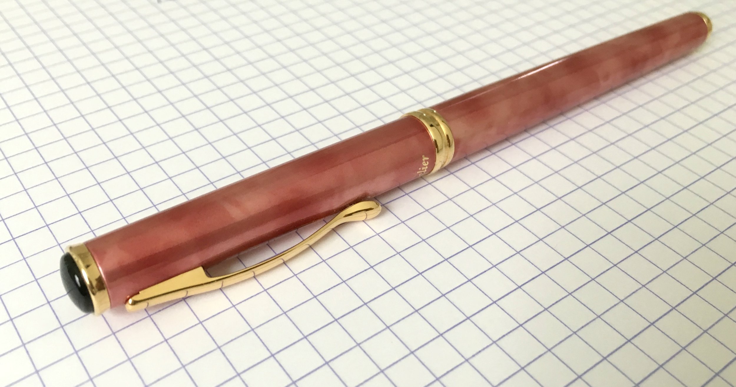
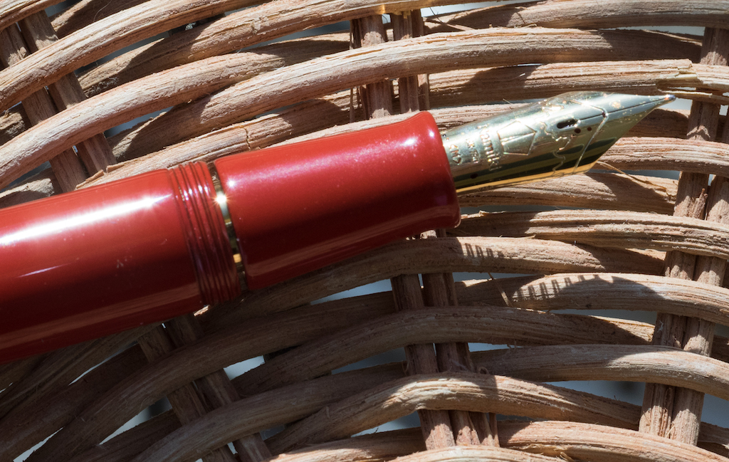
This is one elegant pen. It is made entirely of brass coated with urushi. The adornments are limited to a gold clip embedded in the cap (not around the cap) and a circlet of gold at the base of the cap.

The clip is engraved with the Namiki name, and on the top is a lot number.

The pen uses the Pilot Con 70 converter. Although it works well (it’s a push button converter), it is not my favorite filling system, mainly because it is almost impossible to get clean. That said, it is simple to use and it holds a respectable amount of ink (.9ml).

Because the pen is made of brass, it has some heft to it. It weighs 45 grams uncapped, so people who prefer light pens will probably find this pen too heavy. I, however, love the weight. When you pick this pen up, it feels substantial yet it is perfectly balanced. The barrel sits comfortably in the space between your thumb and index finger offering an effortless writing experience.

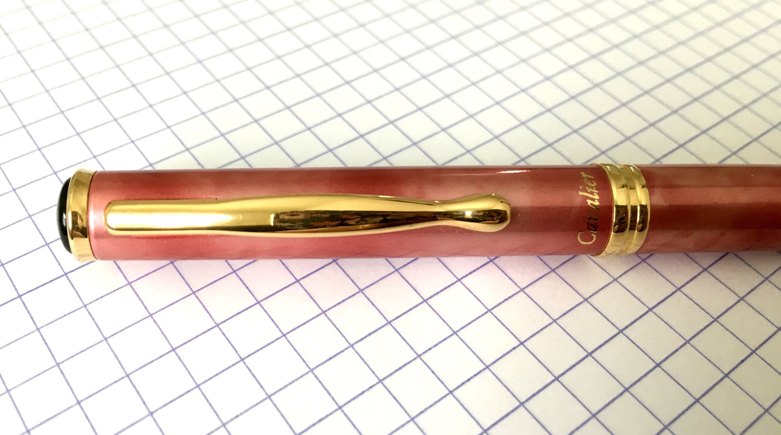
You can see how thick the barrel of the pen is.
The pen is about 150mm capped and 135mm uncapped. I would not advise posting this pen because it is already so heavy.

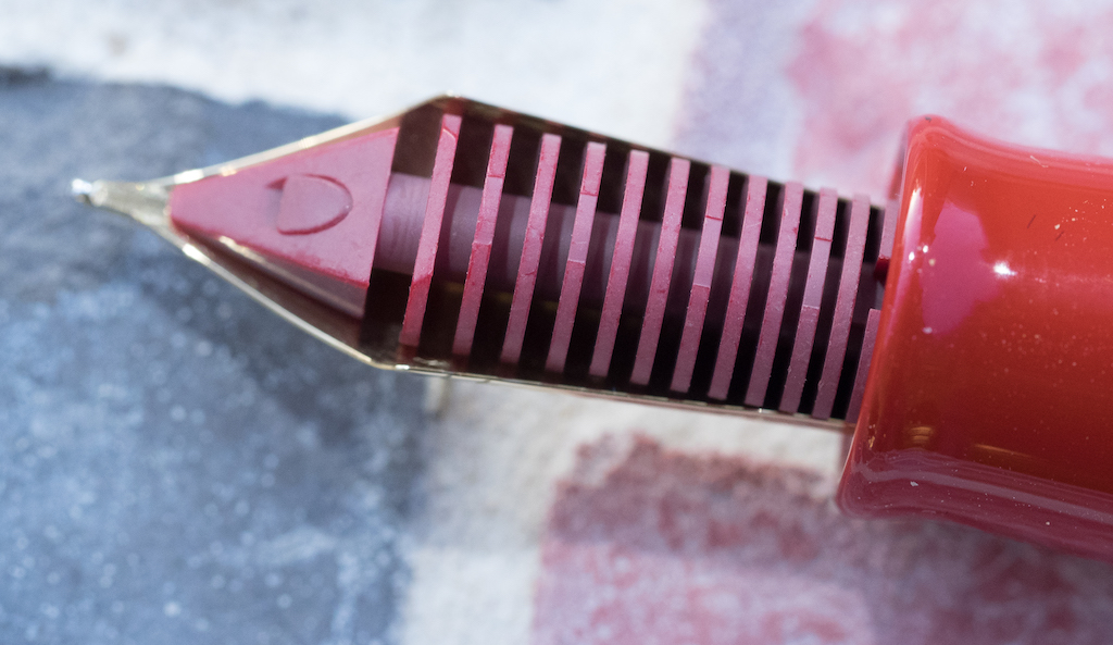
Of course, the most important quality of a fountain pen is the writing experience which is largely determined by the nib. This nib is a #20 in single-tone 18k gold with the Namiki logo and Mount Fuji engraved on it. It has a long oval breather hole. On the side of the nib the number 914 appears, which I think means the pen was manufactured in September of 2014.


The feed is red plastic coated in urushi. It is one of the few pens you can get with a matching feed. I love how the vermillion feed lends a unity to the overall aesthetic quality of the pen.
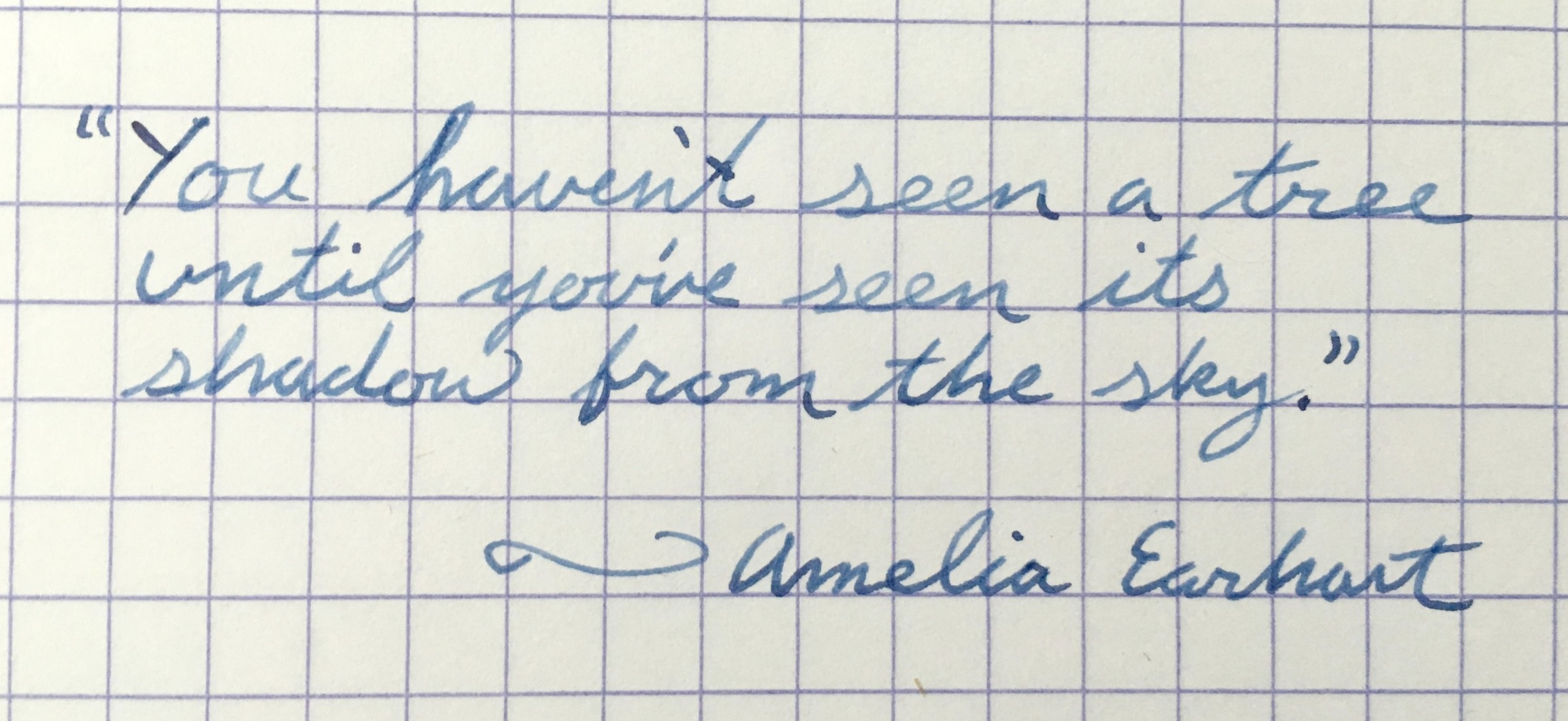
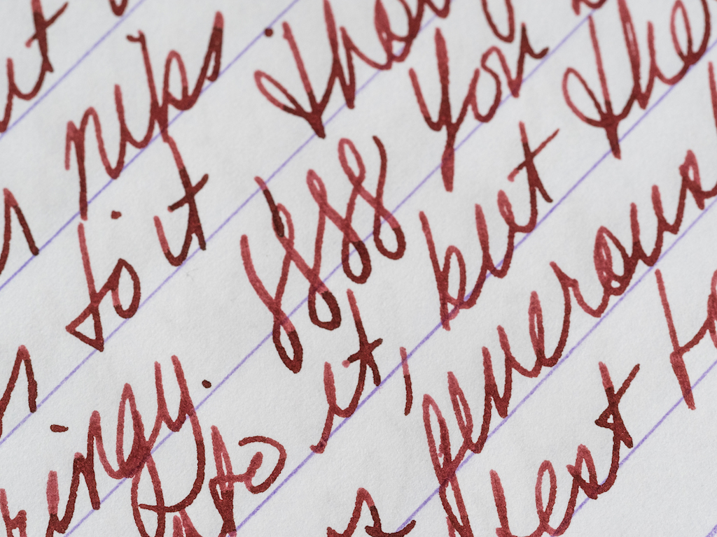
I chose a medium nib because Japanese nibs tend to be much finer than their Western counterparts. The medium writes smoothly with just a hint of feedback, but no scratchiness. The nib is not flexible, but it isn’t hard as a rock either. You can certainly press into it and feel its softness, but it doesn’t create line variation. The ink flows generously from the nib most of the time.

I flossed the nib to create more flow, and that seemed to help. However, sometimes I have to shake the pen a bit to get the ink flowing. I’ve been using Robert Oster Astorquiza Rot in the pen, but I need to try other inks to see if they have better flow. It may be my imagination, but Japanese pens seem to write better with Japanese ink.
One irritating thing I discovered about the Namiki is that when I unscrew the cap, the barrel tends to unscrew as well. I’m not sure what causes that, but I usually have to tighten the barrel before I begin writing.
Though some would say this pen’s design is boring and uninspired, I find it incredibly elegant. Its color is stunning but the pen remains zen-like because of its simplicity. As John Mottishaw writes on Classic Fountain Pens, “Perhaps this is what a haiku would look like if it took the shape of a fountain pen?”
I purchased this pen from Chatterley Luxuries after stewing for a long time over a Danitrio I had ordered previously. Bryant was very patient with me as I tried to decide between the Danitrio and the Namiki. Ultimately, I chose the Namiki and I’m very pleased with this pen. The retail price for the Namiki Yukari Royale is $1200. However, if you go to Chatterley Luxuries, they will email you their price which is significantly less than retail.
Pros
- The Namiki Yukari Royale was a grail pen for me, and it has definitely earned its status in my view.
- This pen is absolutely stunning both because of its gorgeous smokey-red color and simple, elegant design.
- This pen feels amazing. The urushi lacquer warms to your hand, and even though the pen is heavy, it is perfectly balanced.
- The nib is excellent, soft and smooth.
- The converter holds .9ml of ink and is easy to fill.
Cons
- This is a very expensive pen.
- When you unscrew the cap the barrel unscrews as well which is rather irritating.
- The Con 70 converter is difficult to clean.
- I’ve had some flow issues with the pen, but I need to try it with some different inks. It’s just that Astorquiza Rot goes so well with the pen I’ve not wanted to change inks!