

I turned the corner on shimmer inks a long time ago. They are easy to use and fun, plus, who could turn down a color as awesome as Robert Oster Fizzy Lime? This is everything I want a shimmer ink to be, and I have one bottle to give away this week. Read the rules below and enter away!
Posts filed under Robert Oster
Robert Oster Sushi Ink: A Review

(Susan M. Pigott is a fountain pen collector, pen and paperholic, photographer, and professor. You can find more from Susan on her blog Scribalishess.)
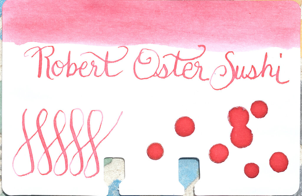
Robert Oster Sushi is a pink shade that definitely evokes the color of salmon or raw tuna you might find in sushi. The ink offers good shading in flex and wide nibs, but has no sheen, as you can see on the Col-o-dex card.
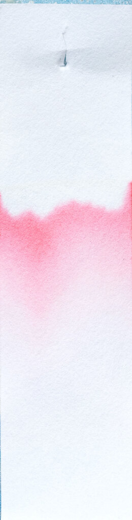
In my ink tests, I found the color to be a bit too light for use in extra fine and fine nibs, but in wider nibs it is readable and exhibits good shading. The ink dries very quickly which means you won’t have difficulty with smearing. The ink is not waterproof.

Chromatography shows little variation--just light and darker pink tones.
The beauty of this ink really comes through in wide nibs. I used my Handwritmic Ruling Pen on Midori Cotton paper and love the shading and pooling exhibited.

Unless you’re using a dip pen, flex nib, or broader nibs, you may find this ink too light for every-day writing. Still, it’s such a unique color, I think it’s worth having in your collection, especially for ink washes, italic, flex, and large lettering, and for drawing/art. (In the photos below, Vanness White Lightning Ink Additive was added to the ink before writing.)

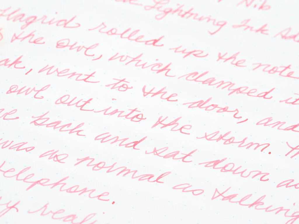
When I started inking my mandala (below) with Robert Oster Sushi, the ink was so dry that I feared I was going to scratch through the paper. I wound up adding Vanness White Lightning for better flow in my TWSBI 580 with an EF nib and was able to complete the mandala without any more dryness problems. I was pleased with the results.

I am quite taken with this beautiful shade of pink. It reminds me of well-worn ballet shoes or a ripe grapefruit cut in half. You can purchase Robert Oster Sushi from Vanness Pens for $17.00 for a 50 ml bottle.
(The Pen Addict purchased this ink at a discount from Vanness Pens.)
Enjoy reading The Pen Addict? Then consider becoming a member to receive additional weekly content, giveaways, and discounts in The Pen Addict shop. Plus, you support me and the site directly, for which I am very grateful.
Membership starts at just $5/month, with a discounted annual option available. To find out more about membership click here and join us!

Robert Oster Cosmic Swirl Ink Review
(Sarah Read is an author, editor, yarn artist, and pen/paper/ink addict. You can find more about her at her website and on Twitter. And check out her latest book, Out of Water, now available where books are sold!)
There's yet another lovely shade from our Australian rainbow of inks! Robert Oster Cosmic Swirl is a charming shade of purple that is somehow different from the alarming number of purples I already have in my swab collection.
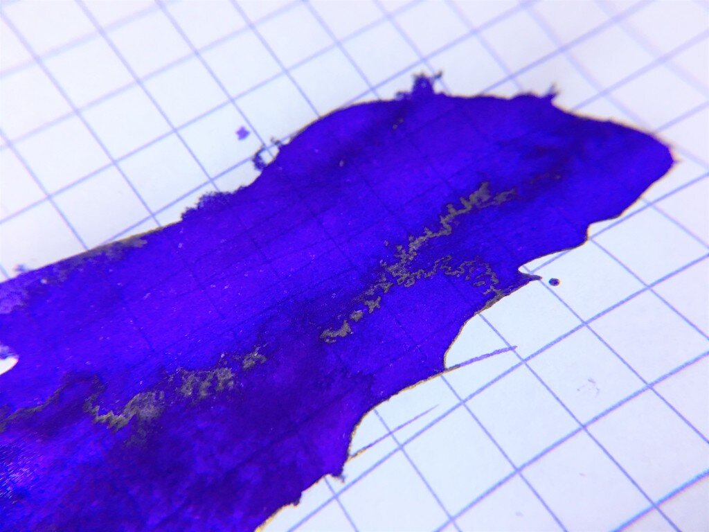
This is a lovely cool violet with blue undertones that come out in the chromatography. It's not a complex color, but it's a really nice tone that feels very fresh and nicely seasonal as we move from spring into summer.

This ink shows some pretty shading, from a very soft purple, to a more saturated tone, then showing its blue features where it pools, giving it a 3-color shade that is super difficult to photograph. There is a touch of bronze sheen, but only where I literally dumped ink on the page. I did not see any come out in writing.
It doesn't feel dry when writing, but it isn't a wet ink, either. It's a nice happy medium. It does have a fast dry time, though, between 15 and 20 seconds.
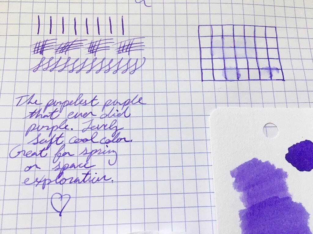
In the water drop test, it does show a slight resistance to water. It's not impervious at all, but I can still see my lines even where the water sat for a bit before I wiped it away.
While I'd consider this a fairly pale color, it's saturated enough that I don't have any trouble reading text in it, even in dim light. That hits a nice sweet spot for me, as I enjoy the soft colored inks, but I'm often writing at night, or trying to type my manuscripts in low light.

I think this is a great staple purple for people who are looking for a shade that isn't too pink. While it definitely has some blue tones, it isn't too blue, either. As far as comparisons go, I think it is closest to Iroshizuku Murasaki Shikibu, but doesn't layer as dark. This color stays fairly soft even where it's concentrated, which is unique in my purple universe.
I think Robert Oster offers some of the best purples out there (and probably also the most purples out there). This is another great one that I think will excite a lot of people looking for the perfect purple.
(JetPens provided this product at no charge to The Pen Addict for review purposes.)
Enjoy reading The Pen Addict? Then consider becoming a member to receive additional weekly content, giveaways, and discounts in The Pen Addict shop. Plus, you support me and the site directly, for which I am very grateful.
Membership starts at just $5/month, with a discounted annual option available. To find out more about membership click here and join us!


