Posts filed under Sailor

Sailor Professional Gear Earth Fountain Pen Review

I am a huge Sailor fan. This is known. So when Sailor announced last year’s Sky model, I went big. I went way out of my wheelhouse and bought my first King of Pens model. And it is amazing.

At the time, the Earth model had just been announced as the second in this special edition series, but wasn’t available yet. Did I just lock myself in to buying the complete set of these pens? And what is after Earth? Wind and Fire?

I liked the visual of Earth when I first saw it, but it was a little too gold for me to commit to a King of Pens model once again. I received this Pro Gear model on loan from Goldspot to try out though, and I have to say it is pretty great.

What makes it so great? I think Sailor’s Professional Gear shape and size is one of the best all-around fountain pen models on the market. It is the perfect combination of weight, balance, quality, and choice for nearly anyone. One of the two I own is always finds it way into my rotation.

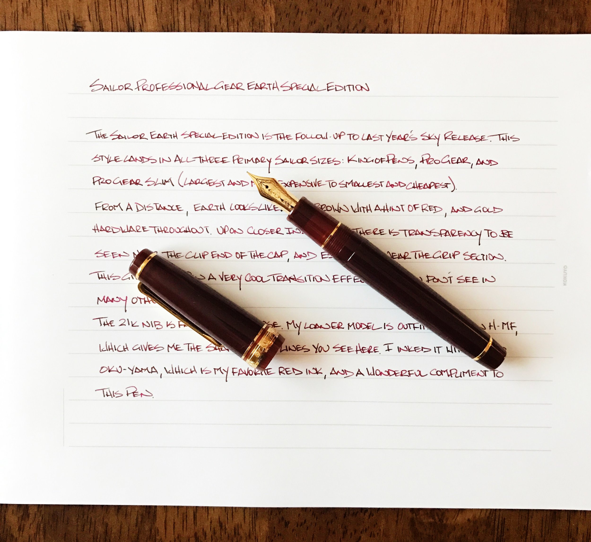
With the Earth, you get what at first looks like a brown barrel with gold hardware, but closer inspection reveals red undertones, and importantly in my book, some transparency. The body of the pen is generally solid, but the end of the cap and the grip section transition into a lighter, see-through color. It is a really nice effect.

The 21k nib is fantastic. This model is an H-MF so the firmness and line width is nearly ideal for my handwriting. Sailor nibs aren’t glassy smooth, and this one has the normal feedback I expect. It was flawless on the page, but you know the nib is there.

I did have one issue with this pen, and I wonder if it is a one-off situation, or if it appears on other units. In some areas around the gold cap band it looks like the barrel finish or coating went a little wild during manufacturing. I didn’t notice it at first, but if you look closely you can see that there is some bleed onto the gold hardware, giving it a tarnished look. I didn’t try to get it off because I don’t own this pen. If I am spending this kind of money I would ask to have mine checked before it shipped for a clean cap band. (UPDATE: Thanks to the commenters below, this is an issue Sailor caught and has since corrected.)

That bug aside, I love the Pro Gear as a daily writer. It has everything I look for in a fountain pen, Earth, Sky, or any of the dozens of other options.

My thanks to Goldspot for loaning me this pen for purposes of this review.


Enjoy reading The Pen Addict? Then consider becoming a member to receive additional weekly content, giveaways, and discounts in The Pen Addict shop. Plus, you support me and the site directly, which I am very grateful for.

Membership starts at just $5/month, with a discounted annual option available. To find out more about membership click here and join us!

Posted on October 31, 2016 and filed under Sailor, Fountain Pens, Pen Reviews.

Sailor Jentle Ink Kin-Mokusei: A Review

(Susan M. Pigott is a fountain pen collector, pen and paperholic, photographer, and professor. You can find more from Susan on her blog Scribalishess.)

Kinmokusei is a small shrub known as Orange Osmanthus (Tea Olive) in the United States. The plant boasts beautiful, fragrant, orange flowers that bloom in the fall. Sailor’s ink captures the flowers’ color perfectly.

Kin-Mokusei ink is supposed to be a re-release of the beloved Sailor Jentle Apricot that has been out of production for some time. Since I don’t have any Sailor Apricot, I can’t compare the two to see if they are exactly the same. Regardless, Kin-Mokusei is a beautiful ink in its own right.

The ink is a vibrant orange with significant pink tones and a bit of yellow, as demonstrated in the chromatography.

It offers excellent shading properties, especially in wide nibs.

Like other Sailor Jentle inks, you will notice a slight odor, but it is not pronounced (nothing as strong as the KWZ inks). It is wet, and on smooth paper takes a good amount of time to dry. It is not waterproof.

The ink exhibits a tiny bit of pink sheen, as you can see in these ink spots.

Kin-Mokusei is a true orange, with a vibrant hue that is unlike any of my other orange inks. I expected Iroshizuku Yu-Yake and Kin Mokusei to be an exact match, but they aren’t. Yu-Yake is much less vibrant. Diamine Autumn Oak and Pelikan Amber aren’t close matches either.

Kin-Mokusei is a perfect ink for autumn. You can order this limited-edition ink from Vanness Pens for $18.00. It’s currently sold out, but they’ve got more on the way. You can sign up for email notification when it’s in stock. Obviously, this is already a very popular color. If you like this ink, order several bottles!

(This ink was purchased at full price with my own funds from Vanness Pens.)

Posted on October 21, 2016 and filed under Sailor, Ink Reviews.

Bung Box Blue Black Ink Review

(Jeff Abbott is a regular contributor at The Pen Addict. You can find more from Jeff online at Draft Evolution and Twitter.)

As I experiment with more blue-black inks, it's becoming more clear that "blue-black" can mean a number of things. It doesn't always mean that the ink is just a really dark blue. Sometimes, the ink also has some green, gray, or purple hints as well. Some are darker than others, some shade well, and the list goes on. Blue-blacks are not created equal, which has made the process of trying new ones pretty exciting.

Quite a while back, I picked up a bottle of Bung Box Blue-Black, but in the bustle of moving, settling, and catching up on work, it got buried in the ink box for quite a while. Imagine my surprise when I was organizing my inks a few weeks back and discovered this little unopened gem! After that, I inked it up immediately to give a whirl in everyday writing tasks. While I wasn't very impressed at first, this ink won me over after a few days.

The color of this particular blue-black is undeniably indigo. There are no traces of purple or gray in this ink, but you can see some green in the swatch in my photos. In normal writing, I can't see any green. It's dark, rich, and blue all the way. Depending on the individual character of the pen you're using, it may be lighter or darker, but even in my "dry" pens, it's fairly dark.

There is some shading seen in this ink, but I wouldn't call it dramatic. It's subdued and classy, with just enough shading to be noticed if you're looking. Of course, the wider the nib, the more chances of tapping into the shading potential of this ink.

One surprising characteristic of this ink that I didn't notice for a while is a slight red sheen. It only comes out in certain lighting, but it's definitely there. Again, it's a subtle sheen and you have to look for it while holding the paper at a particular angle.

The writing experience is top-notch. This is a well-behaved ink that writes smoothly and is gentle on pens. The dry time is a little slow (coming in around 20 - 25 seconds in the 1.1mm stub), but does dry quicker than the test in my pictures if you're using a smaller, dryer nib. Still, it's something to consider if fast dry time is important to you (as in, this isn't a better option).

The only downsides I can see are the price and availability. It's pricey (over $40 usually) and not well-stocked, but that's generally true of all Bung Box inks. Vanness Pens is a good place to purchase this ink, and they typically have it in stock in a 50ml bottle or a 4ml sample vial.

Overall, I've been really happy with this blue-black! It's a rich, dark shade of blue, and it has subtle shading characteristics that make it stand apart from other blue-blacks. This is a high-quality choice for blue-black fans to try out at some point.


Enjoy reading The Pen Addict? Then consider becoming a member to receive additional weekly content, giveaways, and discounts in The Pen Addict shop. Plus, you support me and the site directly, which I am very grateful for.

Membership starts at just $5/month, with a discounted annual option available. To find out more about membership click here and join us!

Posted on September 14, 2016 and filed under Sailor, Bung Box, Ink Reviews.