Posts filed under TWSBI

TWSBI Sapphire Blue Fountain Pen Ink Review

(Jeff Abbott is a regular contributor at The Pen Addict. You can find more from Jeff online at Draft Evolution and Twitter.)

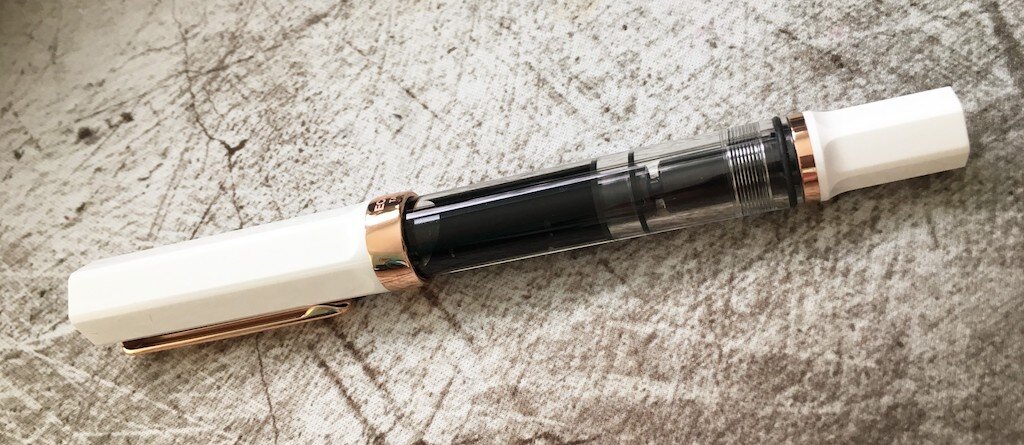
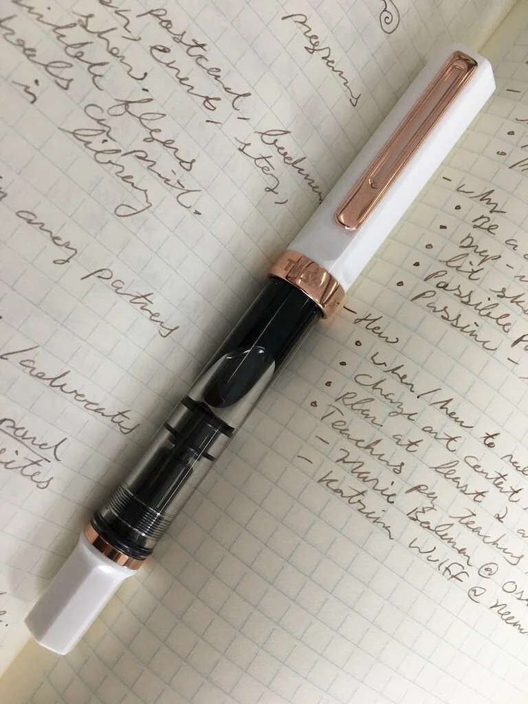
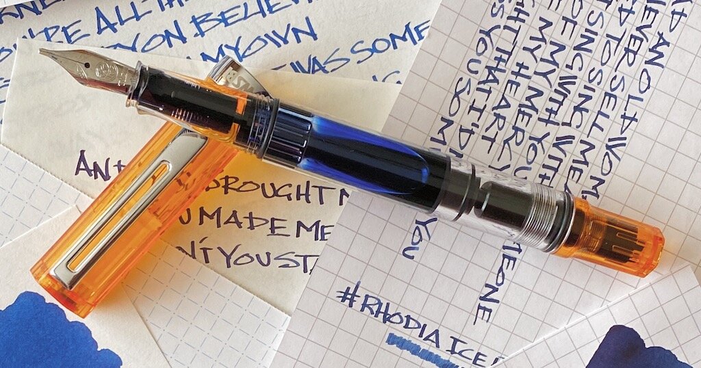
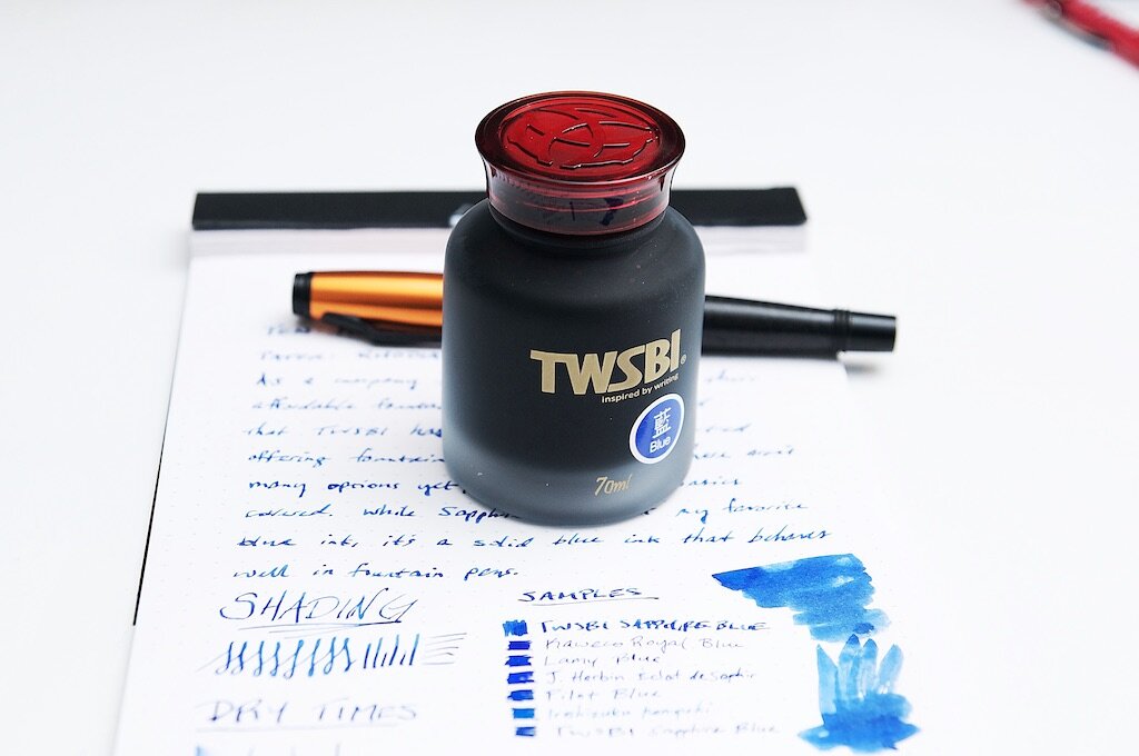
For a fountain pen company that sells some of the most popular and innovative pens in the affordable bracket, it seems like TWSBI should have been selling fountain pen ink all along. In fact, they even sold specialized (but empty) ink bottles since the beginning. Well, TWSBI have finally come around and started offering their own fountain pen inks alongside their pens. The Sapphire Blue that I got my hands on is a fairly basic blue ink that does a good job of staying professional and reliable.

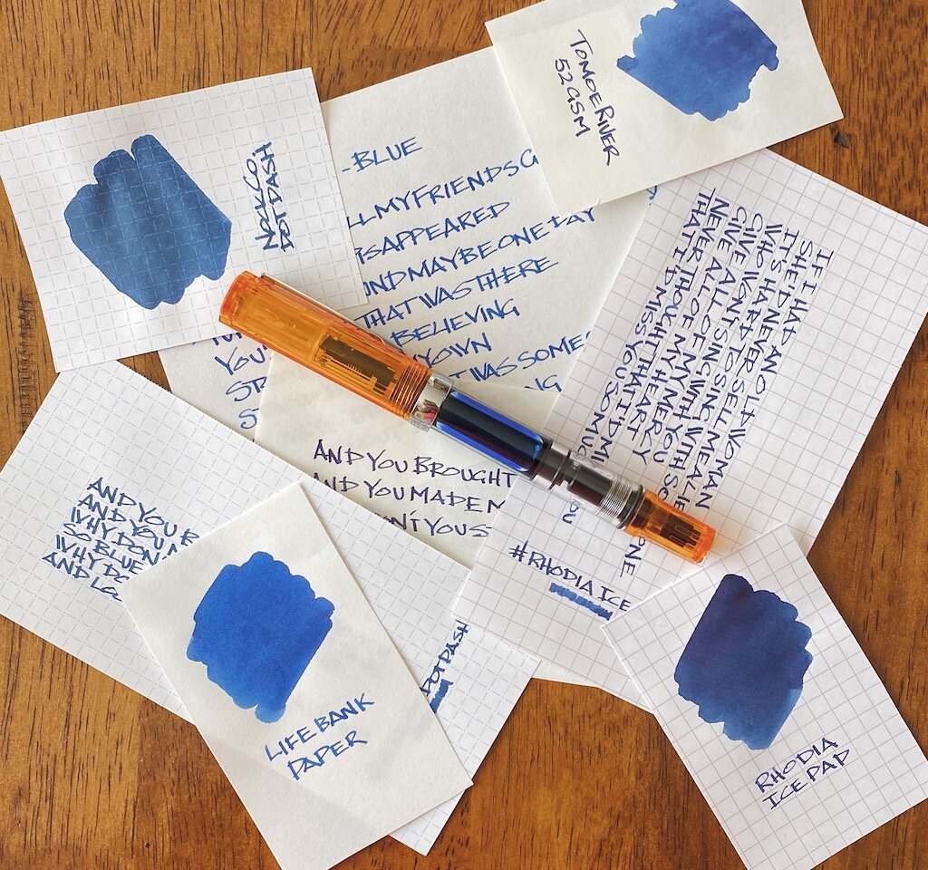
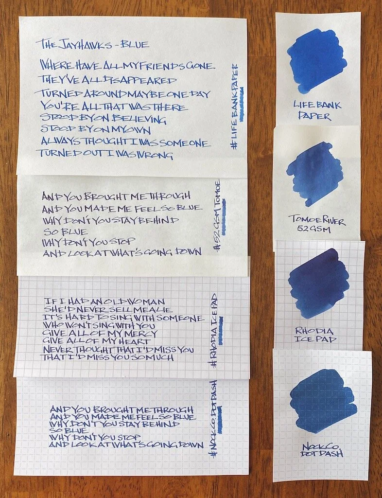
I'm a huge fan of blue inks — the brighter and more poppy, the better. Even though I have a slew of basic blue inks from different manufacturers, I don't break them out very often because I prefer using my more interesting and bombastic blue inks. But, there's always a time and place for everything. Sometimes you need that textbook dark blue ink that looks similar to any blue gel pen ink off the shelf at your local big box retailer. Nothing wrong with that color, but it also needs to be a rock-solid, dependable ink that you can rely on in different situations. Similar to TWSBI's pens, you need to be able to use it in a variety of conditions and different types and varying qualities of paper. These are the factors that make up a good basic blue. It's not terribly exciting, but it's reliable.

To my eyes, the shade and hue of Sapphire Blue is very similar to Pilot Blue and Kaweco Royal Blue. It's a bit darker than the Lamy Blue, and J. Herbin's Eclat de Saphir is a lot brighter — to the point that I don't really consider it a basic blue. If I wasn't currently out of Waterman Blue, I'm sure it would compare very closely with Sapphire based on past experience.

It's a good shade of blue! One that blends in well in legal or professional settings. It won't call any attention to itself like other flamboyant fun inks, and that can be a good thing. It's a classy blue.

Even though this is a pretty bland color (on purpose), there is a fantastic hint of shading when using the right nib. It's not dramatic like other inks, but there's a small amount of color variation in some strokes, which provides just enough visual interest to let you know that this is definitely a fountain pen ink.

When I brushed the ink onto a swatch card, I was also pleasantly surprised to see some dark teal/turquoise hints in the ink as well. I've never seen these tones when writing, but they show up pretty clearly in the swatch.

Another thing that really surprised me with this ink is the dry time. It's an extremely fast-drying ink. I know this can vary depending on environmental factors like humidity and paper quality, but it's consistently a fast drier. In most of my tests, it's dry by the 15 second mark and impossible to smudge. This could be a great ink for left-handed writers.

The ink is also well-lubricated and flows well in the pens I've tried it with. I haven't had any issues with it skipping or drying up in the nib after a few days. Overall, it's a really well-behaved ink that I'd put in any of my pens. It does have a noticeable smell, but half the inks I use have some sort of chemical smell when you first uncap a pen or bottle. Nothing to worry about.

While Sapphire Blue is a great basic blue, I do have some gripes about the packaging and the bottle. I don't care about packaging in most cases; if I don't have a use for it, I throw it away after unboxing everything. For inks, I like to keep the box so that the ink bottles are easier to store and transport. While the 70ml ink bottle is what I'd expect in size compared to other bottles that hold the same amount of ink, the box that the ink was packed in is absolutely ridiculous. The box is about twice the size of the ink bottle and seems really wasteful. Plus, in my situation, it takes up a lot of space in my ink storage area that could be used for other inks.

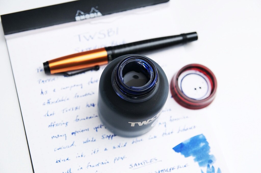
My other gripe is with the confusing decision on TWSBI's part on how to supply an inkwell. In particular, why they chose to ship the inkwell outside of the bottle. I guess I can understand the reasoning for people that prefer their ink bottles sans-inkwell, but I really like inkwells. Fine. I have to install the inkwell myself — no big deal, right? Not quite. The ink bottle is so full that you can't install the inkwell without removing about 10ml of ink. Otherwise, you'll overflow the bottle, make a huge mess, and waste a lot of ink. I don't understand this decision, and wish TWSBI would just install the inkwell at the factory before shipping them out to customers.

At $18, TWSBI's 70ml ink bottle is a pretty good deal. That's a lot of ink, and most manufacturers don't ship bottles that large. For example, Lamy, Pilot, Kaweco, and others normally use 50ml bottles for their normal-size ink offerings. 70ml is a lot of ink, and it's a good deal at this price.

Aside from Sapphire Blue, TWSBI currently offers Black, Blue-black, and Red. Their selection is pretty limited for now, but I'm curious to see if they have more interesting colors on the release roadmap!

(JetPens provided this product at no charge to The Pen Addict for review purposes.)


Enjoy reading The Pen Addict? Then consider becoming a member to receive additional weekly content, giveaways, and discounts in The Pen Addict shop. Plus, you support me and the site directly, for which I am very grateful.

Membership starts at just $5/month, with a discounted annual option available. To find out more about membership click here and join us!

Posted on March 4, 2020 and filed under TWSBI, Ink Reviews.

TWSBI ECO White Rose Gold Fountain Pen Review

(Sarah Read is an author, editor, yarn artist, and pen/paper/ink addict. You can find more about her at her website and on Twitter. And check out her latest book, Out of Water, now available where books are sold!)

TWSBI has kept the hype alive for their ECO model by rolling out fresh looks for the line on a regular basis. With an affordable price-point and an endless train of fun and tempting hues, they're totally collectible. The latest irresistible offering is the White Rose Gold. This new look brings a more elegant, formal look to the line known for neon and pizzazz. The clear plastic body, white plastic lid, and rose gold accents look like the much-beloved ECO in an executive suit.

The fanciness of this model does raise the price considerably. Instead of $31.50, the rose gold runs at about $52.50. It's till within the realm of affordability, but it does push it over that $50 threshold into another category of pen, in my opinion. The standard ECOs are much beloved for their value--where the quality well exceeds the price tag. With a price hike of over $20, does this version maintain a good value? There are some materials upgrades that help justify the increased cost, and the rosy finish is an extra bit of production. But overall, this is still the same ECO--just in fancy pants. While this is a very pretty pen, I'm not sure I'd be tempted enough to pay the extra when I can get the same pen for so much less.

Like all ECOs, this pen has a piston filling mechanism with a remarkable ink capacity, and the clear body allows you to see your ink sloshing around inside, making it easy to see when your ink is running low. Which it won't, for a very long while. The cap screws on and contains an insert to help prevent ink from drying in the feed, so the pen will start writing even after sitting for a period of time. I have never had any issues with dry ink in any of the TWSBIs I've used. The grip section is clear and slightly molded to fit a triangular grip, but not so strictly shaped that other grips would find it uncomfortable. The cap does post, but it throws the balance off a bit, and it did not stay posted very firmly.

Most of the TWSBI pens I've used have been excellent writers. This is the first one I've tried where the nib felt scratchy in a way that goes beyond feedback. I don't see any obvious nib issues, so I wonder if the rose gold coating gives it an unpleasant texture, much like black coating does on other pens I've tried. It is also the driest writing TWSBI I've used, though it's not for lack of ink supply. In fact, this pen has a bit of a leaking problem.

After I filled the pen, I could see that ink was gathered inside the section of the pen. I had hoped it would stay there, but when I next used the pen, I was greeted by a cap full of ink, most of which spilled across my meeting notes. The more I wrote with the pen, the less leaking I noticed, so I hope this issue is only a factor for the first little while after a fill saturates the feed. I have, however, encountered this collar-leaking with TWSBI pens before.

Ultimately, the writing experience of this particular rose gold ECO has not been as nice as a standard ECO. There are inconsistencies in the quality control of TWSBI pens, however, that may mean that other rose gold ECOs are as dreamy as they look. I can't say this pen is as good a value as a regular ECO, but if you love ECOs and find this particular finish enchanting, it's still not a bad pen. And even with its quirks, I've used worse pens that cost twice as much and didn't look nearly so nice.

(JetPens provided this product at no charge to The Pen Addict for review purposes.)


Enjoy reading The Pen Addict? Then consider becoming a member to receive additional weekly content, giveaways, and discounts in The Pen Addict shop. Plus, you support me and the site directly, for which I am very grateful.

Membership starts at just $5/month, with a discounted annual option available. To find out more about membership click here and join us!

Posted on February 20, 2020 and filed under TWSBI, Fountain Pens, Pen Reviews.

TWSBI Blue Black Fountain Pen Ink Review

Like many of you, I love to express myself through fountain pen ink. There are dozens, if not hundreds, of outrageous colors on the market that make me smile, and make the letters on the page look amazing. As cool as those inks are, there is always a need for classic colors, and TWSBI Blue Black is the latest and greatest.

I appreciate how TWSBI launched their new ink lineup. They dropped a six-pack of bright colors in quality packaging, allowing customers to sample one, or all of them, in smaller 18 ml bottle sizes. Following that release, TWSBI expanded the lineup with core colors - Black, Blue, Red, and Blue Black - that form the baseline for what is expected from a pen manufacturer that is producing their own inks.

While stock colors aren’t designed to set Instagram on fire, they are expected from any company bringing out their own ink to use with their full pen lineup. And TWSBI did it correctly in my book, with large, 70 ml bottles, and for a reasonable price of $18.

As a verified blue black ink aficionado, you know this was going to be the first one I tested out. I’m sure I’ll get more questions about the black - everyone needs a great black - but blue black is more my style when I’m picking out a standard color ink. In fact, it is the ink color that made me want to use fountain pen inks in the first place.

What makes a classic blue black ink in my opinion? Equal blue and black representation, and no hints of any other color except grey.

That combination is what I expect from the basic blue black ink in any fountain pen lineup. Now, there are variants of blue black that have a red sheen, a wider color range, and different undertones (all things I prefer in my most used blue blacks,) but for this ink, none of that is necessary.

TWSBI, ya basic. And I mean that in the best way possible.

I tested this ink on several types of fountain pen friendly paper, all with different characteristics. You can see how much your choice of paper makes a difference in the color the ink appears.

My handwriting on the Life Bank Paper showed the most accurate color representation, although a heavy swab of ink on the same paper made the ink appear the bluest. Tomoe River paper showed off a darker tone, primarily because the ink stays on the surface of the page more. There is very little sheen on Tomoe River, and less shading than I expected.

The darkness really popped on Rhodia - maybe too dark for what I want from this ink. And on the big swab it tried to sheen, but there is really nothing there in that category. The drier paper of the Nock Co. DotDash showed a mid-range color, closer to the Bank Paper than the other two, which makes sense.

Out of the entire batch, TWSBI Blue Black looks the best to my eye on the Life Bank Paper, although it is pretty great anywhere I’ve used it so far.

And that’s what I expect more than anything from a house ink such as this one. Sure, you can get the premium Botanist gin for your G&T, but some days, maybe those heavier writing days, call for the house brand. TWSBI has made a pretty good one that is worth inking up any day of the week.

(JetPens provided this product at no charge to The Pen Addict for review purposes.)


Enjoy reading The Pen Addict? Then consider becoming a member to receive additional weekly content, giveaways, and discounts in The Pen Addict shop. Plus, you support me and the site directly, for which I am very grateful.

Membership starts at just $5/month, with a discounted annual option available. To find out more about membership click here and join us!

Posted on February 3, 2020 and filed under TWSBI, Ink Reviews.