Posts filed under Van Dieman's

Van Dieman's European Honey Bee Eater Chin Ink Review

(Jeff Abbott is a regular contributor at The Pen Addict. You can find more from Jeff online at Draft Evolution and Twitter.)

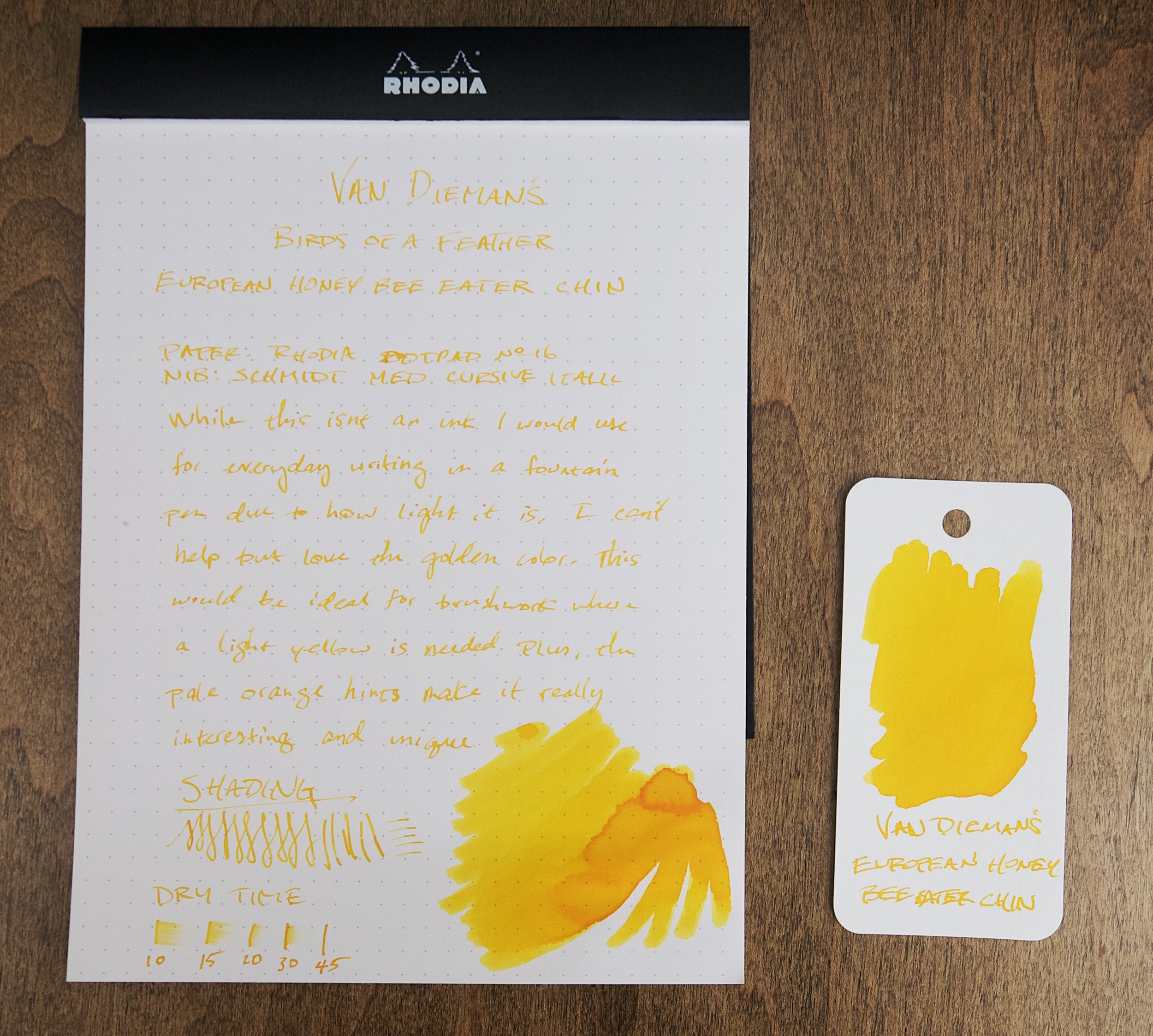
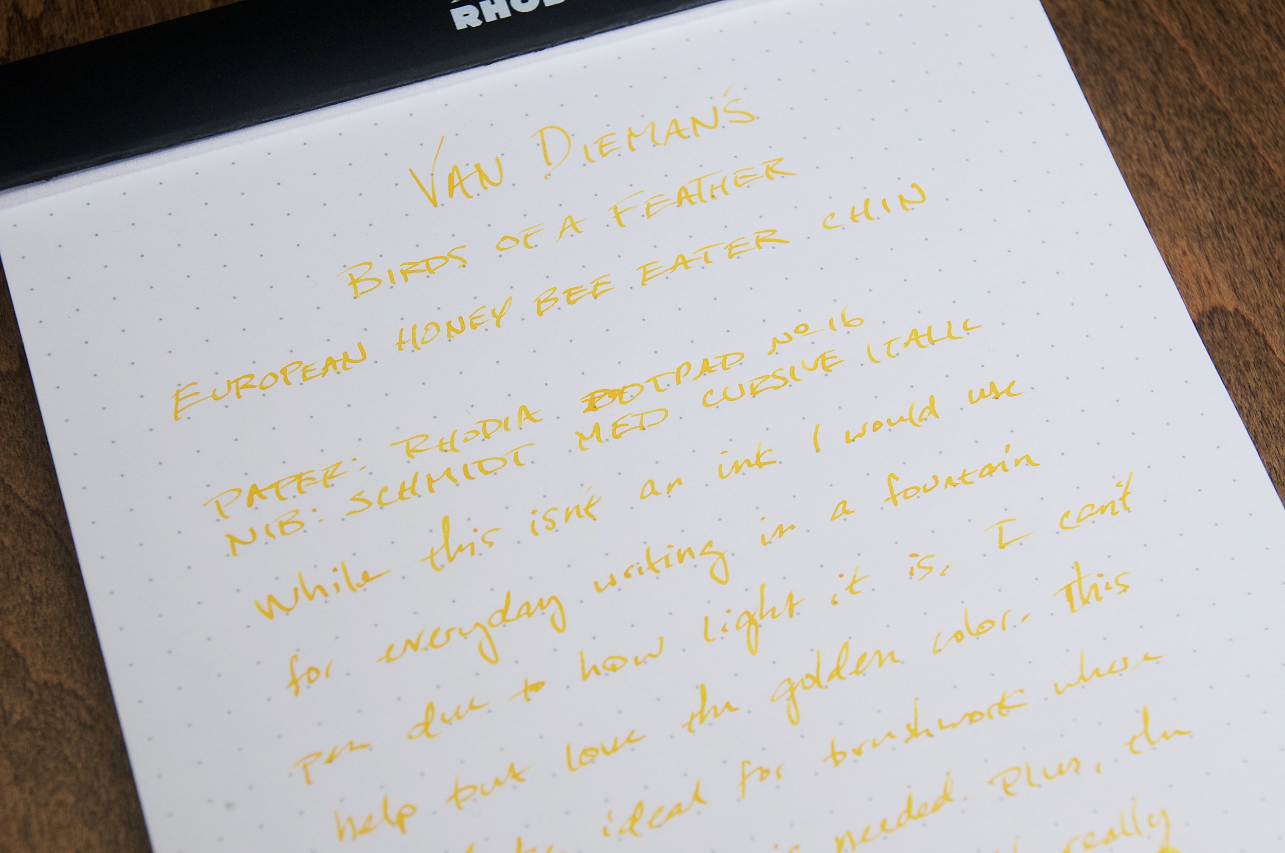
I really admire the level of bird knowledge that Van Dieman's possess, and I really enjoy the result of all that knowledge when it comes to their ink naming process. I'm no stranger to the Birds of a Feather collection from Van Dieman's. Each ink represents not only a specific bird, but a specific color of that bird's plumage. It's incredibly specific and I always learn about a new bird species with each of these inks. The latest of this collection to cross my desk is European Honey Bee Eater Chin. While not my favorite name, it's a surprisingly interesting yellow ink.

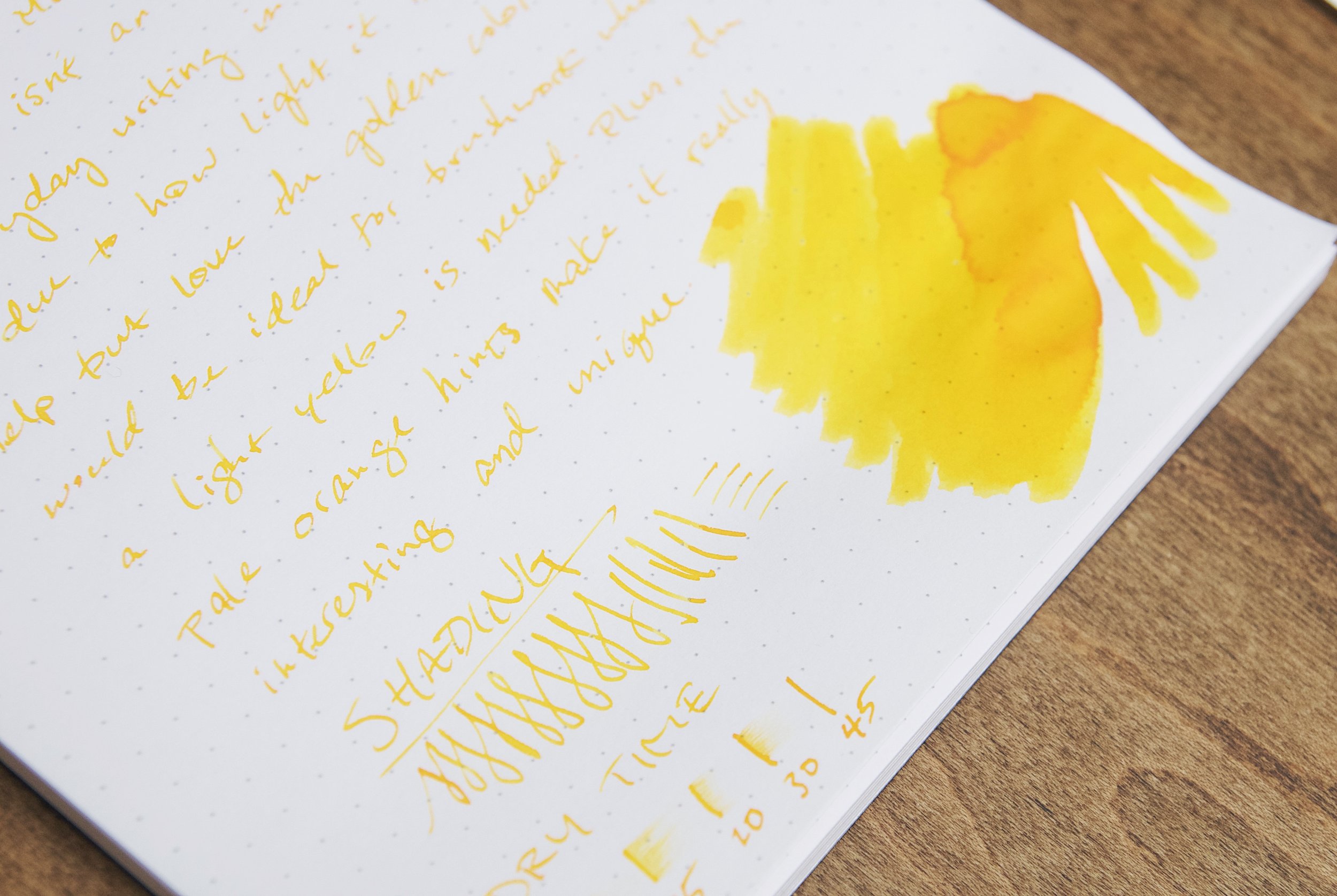
When it comes to yellow inks, you already know that you'll likely need a specific use case in mind prior to purchasing. Since they're so light, they don't tend to work well on typical light colored papers. It's not much fun to use a beautiful ink on a paper that doesn't allow the ink to show its full personality, and that's exactly the problem I see with European Honey Bee Eater Chin (known simply as EHBEC from here on). The golden yellow color is absolutely delicious, but you have to use it with the right paper to see it.

It's probably safe to guess that most fountain pen inks are intended as daily writing colors for typical paper (white, off-white, ivory, cream, etc.). There are outliers, sure — some inks are meant specifically for highlighting over other inks. In this case, you need a light-colored hue with plenty of transparency, but you also want an ink formula that doesn't cause other inks to bleed, feather, or smudge when used on top. EHBEC is a typical writing ink (I don't believe it's intended to be a highlighting ink), but I think the best way to use this ink is for ink drawings instead of writing. For someone that uses fountain pens for drawing, this color is something I assume would be fun to use to bring some golden yellow brightness to a drawing or illustration.

While the color isn't great on white paper, it's still legible if there's plenty of light. But this ink really shines when contrasted by nearby dark colors. I've always marveled at how much a tiny smidge of white or a similarly light color can dramatically change a drawing that's already full of color. This yellow is a great accent color.

Writing with this ink is typical for Van Dieman's inks. It's well-behaved — it starts easily, flows smoothly, and doesn't feather or bleed. Due to the light hue, nothing at all shows through to the back of the page. The ink is a little dry in terms of how the nib feels when writing (meaning it feels like the ink lacks lubrication), but there's plenty of flow for quick jots or shading strokes.

There's a small amount of shading that comes out in broader strokes (or in swatches or shading) that hints at a mild orange color hidden beneath the intense yellow colors. I wouldn't say the ink shades a lot, but there is a small amount of consistent shading that adds just enough orange character to catch my eye and make me smile.

I'm not an artist by any means, so I'm not sharing any of my doodles here — but I'm really pleased by how this ink interacts with others. It complements whatever I put it next to. While it will never be a daily writing option for me due to the difficulty in reading what I've written, I'll still keep it around for making accents and creating contrast.

If you haven't already, take a minute to admire the namesake bird. The pop of color on the bird's chin/throat is exactly how this ink acts on paper. The chin is such a small part of this bird's plumage, and I see several other colors that would also make fantastic ink colors.

This is a fascinating ink color that really respects the original inspiration, and this is why I find the Birds of a Feather collection so interesting. If you'd like to try it out, you can pick up a 4ml sample for $4.25 or a 30ml bottle for $17 over at Vanness Pens.

(Vanness Pens provided this product at a discount to The Pen Addict for review purposes.)


Enjoy reading The Pen Addict? Then consider becoming a member to receive additional weekly content, giveaways, and discounts in The Pen Addict shop. Plus, you support me and the site directly, for which I am very grateful.

Membership starts at just $5/month, with a discounted annual option available. To find out more about membership click here and join us!

Posted on November 1, 2023 and filed under Van Dieman's, Ink Reviews.

Van Dieman's Birds of a Feather — Mandarin Duck Nape Ink Review

(Jeff Abbott is a regular contributor at The Pen Addict. You can find more from Jeff online at Draft Evolution and Twitter.)

There's a reason that ink makers look to nature — and particular birds — for inspiration when mixing and naming their inks. The most recent ink that I've tried that borrows a name from the avian kingdom is Van Dieman's Mandarin Duck Nape, which is one of six in their Birds of a Feather collection. The Mandarin Duck is a colorful creature with lots of interesting characteristics, but the namesake of this ink focuses on the back of the duck's head (the nape), which is a vibrant teal.

I'm no stranger to Van Dieman's, so my expectations were higher than average due to my past experience. Mandarin Duck Nape is no exception here, which means it performs well and is gorgeous on paper. Based on pictures I've seen, the green-leaning teal of this ink matches the duck's feathers really well. It's a fairly dark ink, and it really works best in a wide and wet nib. Smaller nibs just don't show off the best characteristics of this ink, and it just looks like a dark green ink. In the flex nib I'm using right now, there's a small amount of shading from dark teal to a medium green-teal color. In some areas, you can even see some red sheen on top of the dried ink.

While the shading is a great feature of this ink, the dry time certainly isn't. In my tests, it takes more than 30 seconds for the ink to dry to the point that it won't smear from light to moderate pressure. In areas where the ink is a bit thicker, it can take anywhere from 40 to 60 seconds to fully dry. This is something you should definitely take into consideration if you're left-handed or if you want to use this ink in a notebook that will be closed shortly after jotting down some notes. Depending on your writing grip, smearing is a guarantee if your hand trails after the pen. And if you close a notebook within a minute after writing with this ink, there will be ink deposits on the opposite page. This is definitely a slow drying ink!

One of the features that I really love about this ink is the red sheen that you can see on top of the dried ink. Unfortunately, this is really hard to see in normal writing. It shows up easily in small pools of ink, swatches, or large areas of scribbles. If only the sheen was just a little less shy, this would be a fantastic perk!

To my eye, and according to pictures, this ink is really close in color and behavior to Robert Oster's River of Fire. River of Fire is more on the green side of the teal spectrum, but it also has a strong red sheen that you can see in large deposits of dried ink. Mandarin Duck Nape has more blue when you compare the two, but they're definitely both on the green side of the teal spectrum.

Writing with Mandarin Duck Nape has been a real pleasure. It works well in my pens, doesn't feather or bleed, and looks great. The slow drying time is a major caveat, so consider that before purchasing this ink. In the right situation, this beautiful ink is a great choice. You can pick up a 30ml bottle for $17 or a 4ml sample vial for just $4.25. If you go for the sample vial, be sure to add a few more samples that look interesting!

(Vanness Pens provided this product at a discount to The Pen Addict for review purposes.)


Enjoy reading The Pen Addict? Then consider becoming a member to receive additional weekly content, giveaways, and discounts in The Pen Addict shop. Plus, you support me and the site directly, for which I am very grateful.

Membership starts at just $5/month, with a discounted annual option available. To find out more about membership click here and join us!

Posted on October 11, 2023 and filed under Van Dieman's, Ink Reviews.

Pairings Party: Andhand Method Fountain Pen, Van Dieman’s Mandarin Duck Wing

You know a party is a success when you are pleasantly surprised throughout the event. That has been the case with the Andhand Method Fountain Pen, inked with Van Dieman’s Mandarin Duck Wing, over these past several weeks.

Andhand reached out to me earlier this year, offering up the Method for me to check out. I received the Brass model, with a #5 Medium Steel Schmidt nib, and I have to say that they made a metal barrel pen that fits my needs perfectly.

The key for me with brass pens is overall weight. They can’t be too heavy for me to write with comfortably for medium and long writing sessions. In conjunction with overall weight, the balance of that weight has to be managed correctly with the design of the pen. Many metal pen designs don’t consider the effect back-weighting has on the writing experience. The Method pen nails the balance - unposted, of course - making for a proper writing experience.

How did they accomplish this? This is a smaller barrel, closer to my favorite ystudio Brassing Fountain Pen than some of the bigger, bolder brass pens on the market. Big, heavy, brass pens certainly have their place, and their fans. My preferences lie in the smaller and lighter builds, and Andhand did a great job with that here.

Aside from being happy with the weight, balance, and overall feel of the Method, the cap design impressed me. The cut out facets add a nice visual touch to the design, but what I enjoyed even more was the snap cap. That’s right, no metal threads on the barrel to dig in to your fingers! The section is long enough to grip comfortably, with a slight taper down from the barrel seam to the nib.

Aside from Brass, the Method Fountain Pen comes in a ystudio-esque Black + Brass - both for £110 - and a Stainless Steel model for £130. The Stainless model checks in a few grams lighter, too: 48g vs 52g for the Brass.

Given the all-Brass design and color of my Method, I had the run of the rainbow for my ink choice, so why did I choose a more muted shade in Van Dieman’s Mandarin Duck Wing? Because I like to test ink colors outside of my normal usage zone.

Written on the Mitsubishi Bank Paper Notebook from The Paper Mind.

Reddish-browns rank far down my list of color choices, but I have been more than happy with Mandarin Duck Wing. Impressed, even. For starters, the color is a little more brown than red, which I prefer, and the performance is outstanding. Flow has been perfect, no matter if I have been using the pen several times throughout the day, or a week between uses. That is a compliment to the cap design of the metal barrel pen, too, sealing the nib off well from the elements.

It shows off a bit of shading on most pages I’ve tested it on (Midori, Mitsubishi Bank, PLOTTER,) and has a medium dry time. There is no sheen present, and the ink is not waterproof. It bears repeating just how consistent the flow is. I will definitely be trying this ink in finer nibs to see if the performance is similar.

If you like metal pens that are properly sized and weighted, then you should check out the Method Fountain Pen from Andhand. I like the Brass one that they sent me well enough to consider ordering the Stainless Steel model, which is a favorite material of mine. And which Mandarin Duck part should you ink it up with? I went with the brownish-red Wing, but feel free to check out the classic blue Mandarin Duck Breast, or the bright green/teal of Mandarin Duck Nape. All bottles are $14.95 for 30 ml. Any combination of the above would make a great Pairings Party.

(Andhand provided this pen at no charge, and Vanness Pens provided this ink at a discount to The Pen Addict for review purposes.)


Posted on July 31, 2023 and filed under Andhand, Van Dieman's, Ink Reviews, Pen Reviews.