Pilot Acroball 2013 US Version

Pilot Acroball

A few weeks back I was discussing the results of my Field Notes Expedition Edition ink testing on Twitter. The conversation covered the pens that were working well, and of course, the ones that were not. I didn't test every pen at my disposal but tested at least one sample of most ink types. I mentioned that hybrid ballpoint inks worked the best, and that caught the eye of @PilotPenUSA, who touted the Pilot Acroball as a great fit.

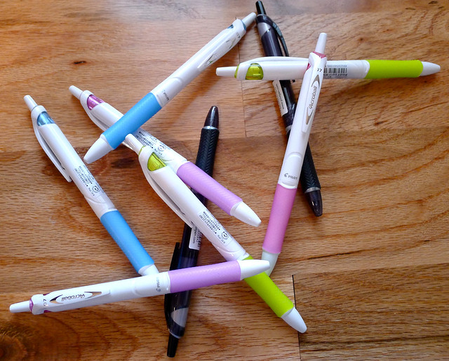
Being the fan of the Acroball that I am I inquired if that meant it would finally be making its way to the US. The answer was yes, and soon - March of this year to be exact. They also offered to send me some samples, which you see pictured above.

Fortunately for the US market Pliot decided to keep the barrel design and grip used in the original Japanese model. I am a fan of both, and wish some of these elements would find their way into the old and stale Pilot G2 design. The white barrel/pastel accent color scheme leaves a little to be desired (all are black ink) but at least they are offering the 0.7 mm tip. The black barrels you see in the pic are marked with an "M" on the clip as opposed to the 1.0 mm which they are. I'm not sure why that isn't consistent across the product line.

Regardless, this is a great pen that hopefully more people will have access to in a couple of months. I highly recommend it and thanks to Pilot Pen for providing me with these samples.

Here are a few of my previous Pilot Acroball reviews if you want to read why I enjoy this pen so much:

Pilot Acroball 0.7 mm Blue

Pilot Acroball 0.5 mm Blue

Pilot Acroball 3 Color Multi Pen

(P.S. - I'll pass out if the 0.5 mm or Multi Pen ever make it to the States. Your move Pilot.)

Posted on January 10, 2013 and filed under Pilot, Acroball, Pen Reviews, Hybrid.

The Pen Addict Podcast: Episode 37 - Off The Deep End

In Episode 37 of The Pen Addict Podcast Myke and I cover several follow-up items from the past couple of episodes, including notes on Platignum fountain pens and Myke's take on the Field Notes Expedition Edition which finally finished its expedition across the Atlantic.

We go a bit off the tracks at that point, but purposely so. I discuss some of the strange and funny pens I have come across, including one in particular that boggles the mind.

Subscribe in iTunes

Download Link

Posted on January 8, 2013 and filed under Podcast.

Zebra 301A Ballpoint Review

Zebra 301A

It has been nearly a year since I wrote the review for the Zebra 301A above - things sometimes have a way of getting overlooked in my Flickr stream. Re-reading what I wrote last January though, my first thoughts still hold true today.

When I see someone using the traditional Zebra F-301 Ballpoint I know they at least care a little about the pen they are writing with. It is a good pen, even a little bit above average, and many people swear by it. I won't go that far but I do understand its appeal. With the 301A, Zebra has gone after those same customers by applying a fresh coat of paint to an already good pen, but did nothing to take it further than that.

The 301A comes in four barrel colors - blue, gray, maroon, and gold - with the same grip and knock as the F-301. The font on the barrel has been "upgraded" too, but I liken it more to a logo you would find at the $2.99 t-shirt shop down at the boardwalk. It is not as classy as the old logo, and combined with some of the new colors it is downright disappointing.

Unlike the original, I have never seen one of these in use by anyone other than myself. I missed the mark in not reviewing this pen when it first came out, but Zebra missed the mark by not making a real upgrade to one of the anchors of their product line. Bring me an F-301 with an emulsion ink refill and then we can talk.

Posted on January 6, 2013 and filed under F-301, Zebra, Pen Reviews.