Pilot 2+1 Evolt 2 Color Multi Pen + Pencil Review

Pilot Evolt

Two months back I reviewed the Pentel Vicuna 2+1 Multi Pen. It was a solid multi pen - decent ballpoint writer, good build - pretty standard stuff. Not too long after, I saw the Pilot 2+1 Evolt Multi Pen appear in my JetPens new product feed. Wait a minute, didn't I just review that pen?

The design of two pens is eerily similar. Like I said, I thought they were the same pen. Not only do they look alike, they are priced exactly the same at $16.50. There is a lot of "borrowing" of design between pen companies, but never have I seen anything as close as this.

The Pilot Evolt offers more - and brighter - barrel colors, but that is the only check in the positive column compared to the Vicuna. The biggest flaw - which should be considered the multi pen plague - is a barrel that rattles. I'm surprised I didn't wake my kids when I was writing with this one. It is frustrating to see a pen this sharp looking function so poorly.

It is almost unfair to compare the Evolt ballpoint cartridges to the Vicuna. The Evolt uses standard ballpoint ink and the Vicuna uses hybrid ballpoint ink. That is an unfair fight, which is even more reason to consider the Vicuna if you are looking for this style of pen.

Better luck next time Pilot. Time to start using Acroball ink in your high-end multi pens!

(JetPens is an advertiser on The Pen Addict and I received this product at no charge.)

Posted on August 26, 2013 and filed under Pilot, Multi Pen, Pen Reviews.

Ink Links

-- Write This Down (Soapbox for Nerds)

-- Noodlers – Heart of Darkness (Informal Scribble)

-- Bullet Journal (Plannerisms)

-- Field Notes Pencil in Action (Pencil Revolution)

-- P.W. Akkerman Vorhoot Violet – Ink Review (Ed Jelley)

-- Stationery Store Series: R.S.V.P. in Berlin (Palimpsest)

-- Kaweco AL sport 'RAW' mechanical pencil (The Pencil Case Blog)

-- Review: Noodler's Konrad Flex Fountain Pen - Hawaiian Tortoise (Gourmet Pens)

-- Fountain Pen! Sailor Professional Gear (Matte Black) (The Daily Acquisition)

-- TWSBI Notebooks (Heath Cates)

-- Custom Grandee, Music Nib (1978) (Crónicas Estilográficas)

-- Sailor DE! (Good Pens)

-- Kokuyo Neo Critz (Penfan.ru)

-- Doom, Gloom And Suchlike (Goodwriterspens's Blog)

-- By Chance: Bexley BX802 Cappuccino Fountain Pen (From the Pen Cup)

-- Pelikan Fountain Pen Size Comparison / Pelikan Dolmakalem Ebatlari (Write to Me Often)

-- Pilot Custom with 74 SM nib, 2013 (Too many pens)

-- Ohto Sharp Pencil - Wooden Mechanical Pencil (OfficeSupplyGeek)

-- DC Fountain Pen Supershow (Part 3) (Inkdependence!)

-- Hybrid Ballpoint Showdown (The Well-Appointed Desk)

-- Endurance (Another Name for the TWSBI Mini? (Earnest Ward: Drawn to Life))

-- An Ode to a Pen (VintageZen)

-- For the Pen Addict Podcast (Mails From Mars)

-- Vertical Paper (Ink Review: Diamine Twilight)

-- Rainy day finds (And All Other Tasks)

-- Rik Reimert's Rotring Rapidograph Drawings (Mole Empire)

-- Black rOtring 600 Rollerball (The Clicky Post)

-- Why I number my nibs (JustDaveyB)

Posted on August 24, 2013 and filed under Links.

Montblanc Midnight Blue Ink Review

Montblanc

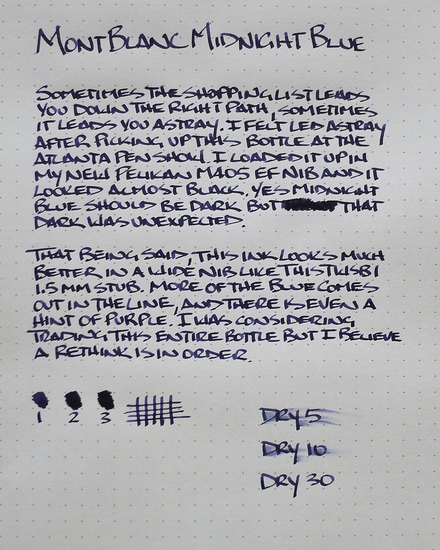
I don't understand myself sometimes. I love blue black and dark blue ink. Montblanc Midnight Blue fits in that range and I should like it.

I don't.

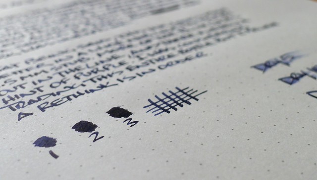
This is where the not understanding myself comes in to play. I desperately want to like this ink. I have tried it in different pens and different nibs and I find it to be too black. In wider nibs like the 1.5 mm stub in my TWSBI Mini the blue comes out but in the finer nibs I use on a daily basis it is too dark.

Why can't I just consider this a black ink, use it as such, and be done with it? Because it says BLUE in the name and I can't get past that! I'm certifiable, I know. I can't help it

Please tell me I'm not alone.

Montblanc

Posted on August 22, 2013 and filed under Montblanc.