Testing: The Hobonichi Planner Cover by Nock Co.

I am fortunate to work with an amazingly talented person in the form of my Nock Co. co-founder Mr. Jeffrey Bruckwicki. What he lacks in the surprise category ("I'm making you a cover for that thing for Christmas") he more than makes up for it in design and manufacturing skill. The guy has seriously got it.

To get him started, he outlined the shape of my Hobonichi Planner 2014 on a piece of paper. And that was it. About two days later I had a picture of the shell, and the day after that it was done. This is in his spare time, mind you, after working his day job and putting in long hours behind the machines for the Nock Co. Kickstarter project. To say I am impressed is an understatement.

To post this here is almost unfair because this is the only one Jeff is making...at least for this year. Maybe for the 2015 release if there is enough interest, but ordering a Hobonichi Planner from Japan is a hurdle for many people. Regardless, I just wanted to show off what Jeff came up with in a manner of hours because it blew my mind.

Hobonichi Planner Cover

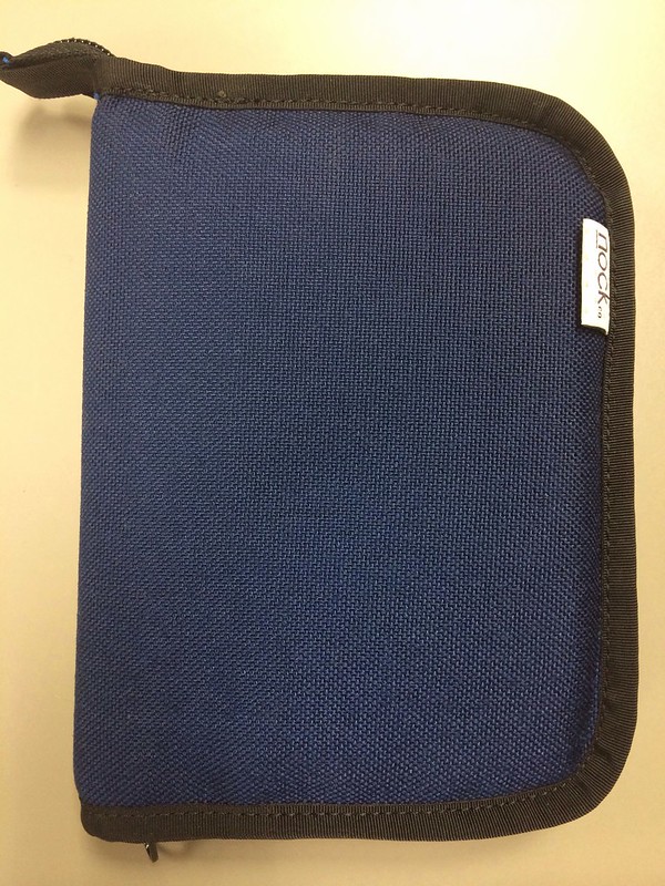
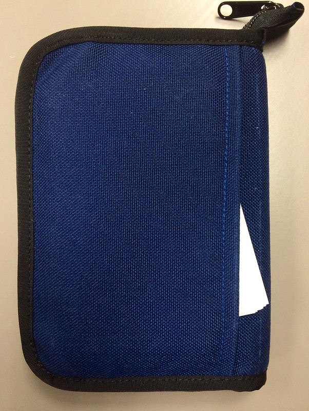
The front cover is simple, just how I like it. Jeff used Midnight Blue Cordura with black binding and a zip enclosure for added protection with a pull tab to assist with zipping and unzipping.

Hobonichi Planner Cover

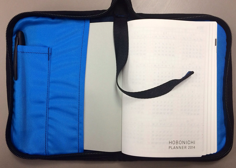
The innards are where this cover really stands out. The cover of the Hobonichi Planner slides easily into front and back slots to keep the book safe and stable, and there is a pen pouch on the front side which can hold a couple of your favorite writing utensils. A bookmark is stitched into the top so you can quickly access the current day in your planner.

Hobonichi Planner Cover

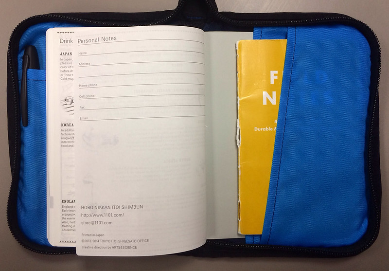
Party in the rear! Jeff snuck in a horizontal pocket in the back, perfect for loose sheets of paper or your favorite memo book. Did I mention the liner is the Blue Jay from our Kickstarter campaign? It is, and it is my favorite.

Hobonichi Planner Cover

One last sneak attack on the backside with another horizontal pocket. Perfect for index cards. I wonder if anyone will be releasing new index cards next year to fill these pockets? Hmmm...

This design nailed any and every high point I could think of. The funny thing is I didn't have to think of any. Jeff was in my brain and knocked this design out of the park.

The future is bright, folks.

For a full review of the Hobonichi Planner be sure to check out Ana's review at The Well-Appointed Desk.

Posted on December 23, 2013 and filed under Nock Co., Hobonichi.

Ink Links

-- Sheaffer 300 Fountain Pen Review (My Pen Needs Ink)

-- Between Parker and Waterman (Crónicas Estilográficas)

-- Pilot Precise Rolling Ball Extra Fine Review (THE UNROYAL WARRANT)

-- Monologue Ruled Notebooks (economy pens)

-- Ti-Click Classic in Raw Titanium - Kickstarter Pen Review (The Clicky Post)

-- Review: Delta Titanio Galassia Fountain Pen (Gourmet Pens)

-- A perfect marriage: Kaweco AL Sport and my pliers holder (Noble Ignitus)

-- InkDependence.com's First Give-Away! (Inkdependence!)

-- Writing with a Hero 9018 Fude Nib – Video Post (Ed Jelley)

-- Field Notes Cold Horizon Review (OfficeSupplyGeek)

-- The Standard Memorandum. Does It Compare to the Real Thing? (Inktronics)

-- Review: Hobonichi Planner 2014 (The Well-Appointed Desk)

-- Top 10 of 2013 (A Penchant for Paper)

-- Nibs in a box (Palimpsest)

-- Pelikan Edelstein Amber ink review (Pens! Paper! Pencils!)

-- A Plannerisms Going Places Planner (An Inkophile's Blog)

-- Uniball Signo 0.38mm (JoshMitch)

-- Scout Books Mega DIY Notebooks- Review (design concussion)

-- Noodler’s Walnut (Informal Scribble)

-- Pentel Side Clickers (My Supply Room)

-- Pilot Iroshizuku Ama-iro Ink Review (Write to Me Often)

Posted on December 21, 2013 and filed under Links.

Noodler's Heart of Darkness review

Noodlers Heart of Darkness 2.jpg

The "Heart of Darkness" conjures up alluring yet terrifying visions in my mind of being lost in an imperceptibly dense and living jungle labyrinth. Luckily for us, we're only talking about a fountain pen ink and not Joseph Conrad's depiction of the African wilderness.

Noodler's Heart of Darkness is my staple black ink for all my pens. You could call it my sweetheart ink, but that might be taking it too far. If a better looking black ink comes by, my loyalty will quickly vanish.

What is there to say about a black ink? Every black ink I've tried is similar. This is why it's so much fun to experiment with other color inks -- they have unique and beautiful properties that just don't exist in a black ink. But even though black can be "boring," it's also a beautiful thing in its own right. So, how does it differ from the other black inks out there?

In my experience, Heart of Darkness plays nicely with all types of paper. Sure, it will bleed and feather a tad on cheaper, thinner paper, but that's expected. It's a very lubricated, smooth ink, which is something I hear often about Noodler's in general.

The ink dries quickly in most cases. It took a bit longer to dry on my Rhodia notebook because of the paper properties. There's no shading qualities to speak of, and I had a difficult time producing any line variations. It also has a matte look once dried.

The main reason I like this ink and always come back to it is the color. It's a deep, deep black. Some of the black inks I've tried have hints of gray or brown in them. This ink is black like a moonless night in the African jungle (at least in my imagination). I've also found that it's extremely friendly when it's time to clean out your pen.

Another positive note about this ink is that it has no smell that I can detect. Both Pilot and Sailor black inks that I use have a very distinctive odor that I don't really enjoy.

Overall, this is an excellent black to keep on hand for when you need a solid, dark black ink.

Noodlers Heart of Darkness 1.jpg
Noodlers Heart of Darkness 3.jpg
Posted on December 20, 2013 and filed under Ink Reviews, Noodler's Ink.