Tactile Turn Mover Pen Review

Will Hodges and I have played email tag since he launched his first Kickstarter campaign for the EiMIM Pen in 2012. We have never been able to get in sync for a product review until now but the wait has been worth it. The Tactile Turn Mover is one of the best machined pens I have reviewed.

Will sent over a sample of the Dark Red Mover pen for me to check out and I was impressed right out of the envelope. First of all, the Dark Red finish is spotless. Admittedly, this would not have been my first color choice but I am glad I got to see how nice it is in person. Pictures don't do it justice.

Color aside, what really stands out with the Mover is the overall fit, feel, and finish of the pen. In the hand it feels outstanding. The weight is good, the balance is solid, the clip is tight, the knock is quiet, and the grip - wow - the grip is awesome. Will calls the grip a "custom lay pattern". The conical grooves start at the tip of the pen and run about an inch up the barrel. When gripping the pen it feels like your fingers lock into place, but it is comfortable at the same time. Much more so than a traditional knurled pattern which can get rough to hold over time if not done right.

Dat Grip.

Dat Grip.

The Mover ships with an 0.38 mm Pilot G-2 refill, and fits a wide variety of other refills as well. Will can add another to the list: The Pilot Juice. I recently bought a few 0.38 mm blue black pens to have on hand so I swapped in that refill and went to town. It fit perfectly with no modifications and no gap around the tip opening. The tolerances seem to be spot-on.

Along with the Mover, Will is offering up the Shaker which takes Fisher Space Pen and compatible refills. Both models come in the standard aluminum machined finish, as well as Black, Dark Red, Desert Sand, and Green anodized finishes.

While I received this review sample at no charge I am so happy with it I put my money where my mouth is and backed this project for an additional Mover. Well done Will, and for your next Kickstarter I would like you to manufacture that bitchin' jacket you are wearing in the video.

For more reviews of the Tactile Turn Mover and Shaker check out posts from Ed Jelley and The Clicky Post.

Posted on January 20, 2014 and filed under Kickstarter, Pen Reviews, Tactile Turn.

Ink Links

-- Self-pimp time! Check out my Weekly Loadout at EdJelley.com.

-- Noodler's Black Swan In English Roses - Review (Ionsomnia)

-- InCoWriMo or: How I Learned to Stop Worrying and Write a Letter (Pen Envy)

-- A Survey of Browns (Inkdependence!)

-- Bic Duo – Ballpoint Pen and Highlighter (No Pen Intended)

-- A major Waterman history discovery (Vintage Pen News)

-- Kaweco Art Sport Amber Fine Nib (The Well-Appointed Desk)

-- Post-It Flip and Fold Notes Cube Review (OfficeSupplyGeek)

-- Nomadic Wise-Walker Fanny-pack (American Otaku)

-- What's a Billet Pen? (legomac)

-- Uni Jetstream 3 Multi Pen 0.7mm Review (THE UNROYAL WARRANT)

-- Pilot Vanishing Point (That One Pen)

-- Review: Uni-ball Jetstream Color Series Ballpoint 0.7mm (Gourmet Pens)

-- Back to doodling in a Hobonichi Techo! (Filofax Love)

-- Nib Notes: Esterbrook #1461 Rigid Fine (Fountain Pen Quest)

-- Pelikan N100 Fountain Pen Review (Write to Me Often)

-- Papermate Flair (My Supply Room)

-- Guest post: Review of the X47 DUO4 wallet (Plannerisms)

-- Pilot Hi-Tec C Coleto 4-Color Multi Pen (The Daily Carry)

-- Hocus-Pocus: Delta Fusion 82 (From the Pen Cup)

-- Tombow 2558 B Wooden Pencil (Economy Pens)

-- A gift horse: A short review of Pilot Iroshizuku ‘Tsuki-Yo’ Ink (A fool with a pen)

-- Writer's Choice - Black or Heart Of Darkness (Bert Carson)

-- Review of Write Notepads & Co Gear, Part II. (Pencil Revolution)

-- Amber: Graf von Faber Castell's Pen of the Year 2004 (these beautiful pens)

-- Nockco Brasstown pen case review (The Write Obsessions)

-- J. Herbin Black Metal Ink Rollerball Pen review (Pens! Paper! Pencils!)

-- White for an Asian Christmas (And All Other Tasks)

-- First Ascent Topos (Huckberry)

-- The Search for the Ultimate Drawing Pencil! (stefan's sketch blog)

-- Pocket Notebooks: What does Fountain Pen Friendly really mean? (Ed Jelley)

-- Hand Written APICA CD11 Notebook Review (Inktronics)

-- Private Reserve Blue Suede (The Five Cat PENagerie)

Posted on January 18, 2014 and filed under Links.

Pro Art Hard Bound Sketch Book Review

Pro Art Sketch Book 1

There was a brief period where I was trying to find a cheap notebook that would perform admirably with all kinds of fountain pens. I've since given up on this endeavor. I'm convinced that buying notebooks that use high-quality paper is much more beneficial than buying notebooks that I hope will perform. The Pro Art sketchbook is one of the many notebooks I bought on this ill-fated journey.

For around $7, the Pro Art sketchbook is a pretty solid little notebook. It's 8"x5.5" inches in size, has 110 pages (220 sheets) of 65# white, acid-free paper, and a hard cover. Sounds like a great contender on paper, and I firmly believe that this is a solid notebook. There are just a couple of downsides to this notebook that keep me from carrying it with me and using it daily.

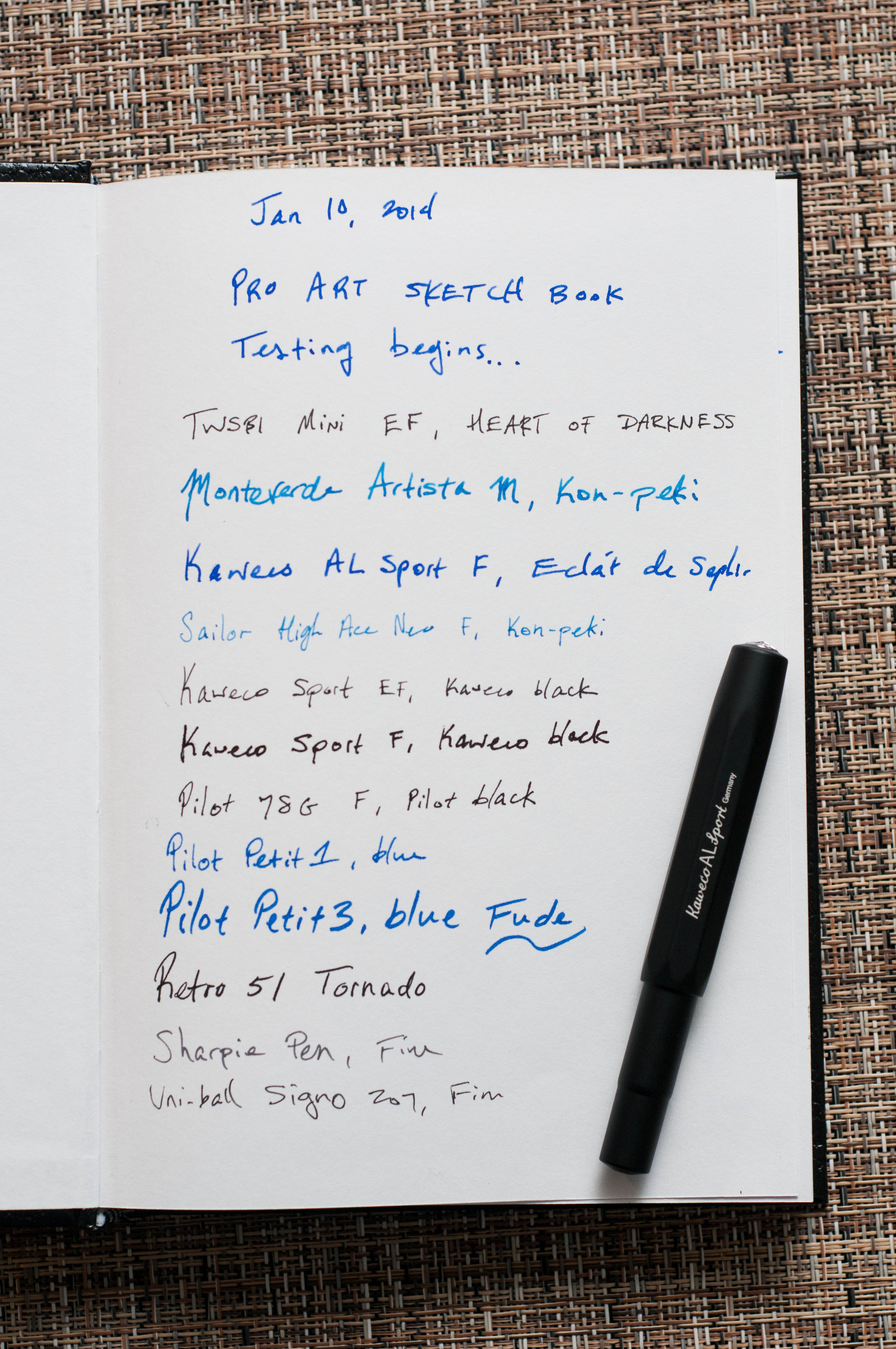
The first, and most crucial, downside is the paper feel. This paper has a tooth on it that's noticeable with every pen I've tried on it. For me, this makes it difficult for long writing sessions or quick bursts. There's too much friction between the nibs and the paper. The finer the nib, the more accentuated the feeling. I'm sad to say it, but this isn't the perfect paper for fountain or gel pens.

Another downside is the cover. I don't expect much from a notebook that costs this little, but the sharp corners are a point of concern for me. They tend to get hung in different parts of my bag when trying to tuck it away or pull it out. Not a big deal really, but I thought I'd mention it. It's one of the small quibbles that adds up in the grand scheme.

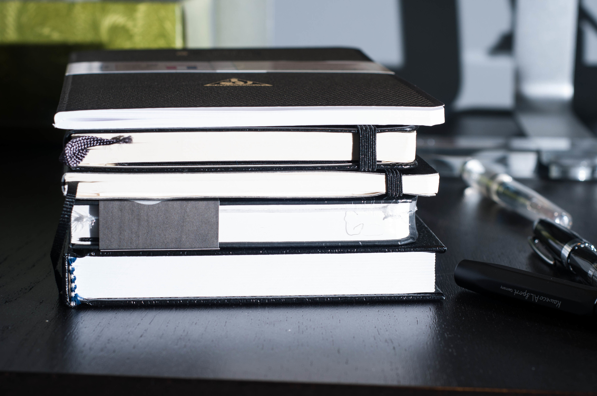
It's also a bit thick for just 110 pages. That's due to the thick paper, so I won't complain about that. It's about half an inch thicker than other similar notebooks.

Top to Bottom: Clairefontaine 1951, Moleskine, Leuchtturm softcover, Ecosystem Journal, Pro Art sketchbook.

Top to Bottom: Clairefontaine 1951, Moleskine, Leuchtturm softcover, Ecosystem Journal, Pro Art sketchbook.

There are still plenty of positives for this paper. For one, it's thick. I've only noticed minimal show-through with even my wettest pens. Only a couple of my nib/ink combinations resulted in bleeding on the page. Not perfect, but much better than other notebooks in the same price range or even a Moleskine.

Overall, I think this notebook is meant for other dry art instruments, such as graphite and charcoal. At some point I'll give it a shot, but I've misplaced my art supplies from college somewhere in the attic.

It's hard to tell people this is a bad notebook when it costs so little. The paper is scratchy, the corners are sharp, and it's a bit thick. It's also a heavy paper that takes well to wet inks and wide nibs. Keep these things in mind and give it a try if it sounds like your sort of thing.

Pro Art Sketch Book 3

(You can find more from Jeff online at Draft Evolution, Twitter, and App.net.)

Posted on January 17, 2014 and filed under Notebook Reviews, Pro Art.