Kaweco Dia2 Fountain Pen Review

You do know Kaweco makes full-size fountain pens alongside thier already awesome pocket-size fountain pens, right? The Kaweco Dia2 is another of the big batch of products Kaweco sent me for review and it might be my favorite.

The Kaweco Allrounder is a decent enough looking pen, but not really my style. The Kaweco Elite is my style, but is a big, chunky pen that may be too much for others. The Kaweco Dia2 is just right in all the right places.

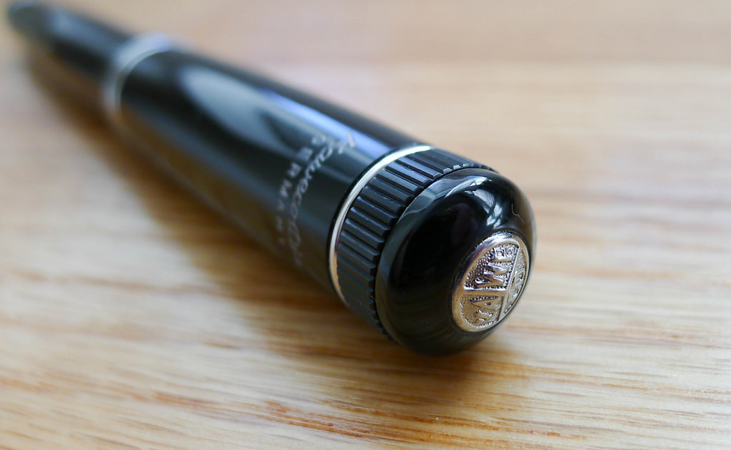
Simple. Classic. Understated. These are the words that describe the Dia2. Sounds boring, right? It is far from that in my mind. There are so many things that makes this a great pen. From a design standpoint, little touches like the knurling on the cap and end of the pen harken back to the original Dia2 which was released in the 1930's. The clip and Kaweco badge on the top of the cap are not unique to the Dia2 but the style of each fits this pen perfectly.

What I enjoy the most about the Dia2 is the grip section. Kaweco has done an excellent job unifying the barrel between the section and the body. The transition is smooth outside of the threading, which you hardly notice because there is no step to speak of. Sometimes a deep step in that area causes grip uncomfort but that isn't a problem here.

This nib, of course, is excellent. The Dia2 uses the same nibs found in the Kaweco AL Sport line and are easily swapable with a quick twist. I used an F nib with Kaweco Ruby Red bottled ink that Kaweco also provided. My lines were tight and clean and I liked the red ink better than I imagined.

While I find no downside to the Dia2, if I were King of Kaweco I would love to have this pen as a piston filler. It is cartridge/converter fill which doesn't bother me one bit, but this pen is screaming for a piston mechanism. At around $100 it is competing with the Pelikan M205 and the piston filler is the lone, and large, differentiator. Regardless, I'm happy with the Dia2 as-is and it works its way into my daily carry frequently.

Huge thanks to Kaweco for sending me this pen and ink to review. I think I have a few more goodies in the box to get to so stay tuned!

Posted on June 2, 2014 and filed under Fountain Pens, Kaweco, Pen Reviews.

Ink Links

-- Pilot Custom 743 Falcon Fountain Pen Review (THE UNROYAL WARRANT)

-- Pen Review: Pilot G2 Limited (The Gentleman Stationer)

-- Paper Based Markup Systems (The Cramped)

-- Namiki Falcon Fountain Pen - M Nib (The Clicky Post)

-- Review: Nanami Seven Seas Writer, the Best Notebook in the World (J. Robert Lennon)

-- PPIL Pencil Week 2014 - All Posts (Pen Paper Ink Letter)

-- KarasKustoms Retrakt (NibCreep)

-- Kaweco Eco Wild Raw Leather Pen Pouch (Fountain Pen Quest)

-- Uni Jetstream Prime 3 Color Ballpoint Multi Pen – 0.7 mm – Navy Body (No Pen Intended)

-- Baron Fig Confidant Review (Modern Stationer)

-- Parker Quink Black (Inkdependence!)

-- Pilot Custom Heritage 92 (The Pencilcase Blog)

-- Retro 51 Hex-o-Matic Ballpoint Review (Pen Pursuit)

-- Rotring Surf versus Reynolds Gallery (Taking Note)

-- Great Expectations: Visconti Opera Elements/Air (From the Pen Cup)

-- Fountain Pen Guide For The Left-Handed Writer (The Cramped)

-- J. Herbin Lie de Thé Ink Review (Write to Me Often)

-- Muji | The Modern General Store (A Continuous Lean.)

-- New York Stationery Shop Crawl (All Things Stationery)

-- Evolution of the Pencil (Pencil Revolution)

-- Waterman Florida Blue ink review (Peninkcillin)

-- Paper Review - Doane Paper (The Desk of Adam)

-- Retro 51 Tornado rollerball review (Pens! Paper! Pencils!)

-- Ink Review: Pelikan Edelstein Onyx (A Penchant for Paper)

-- Nakaya Long Piccolo in nuri hanashi shu (Leigh Reyes)

-- Omas Arte Italiana Vintage Arco Celluloid Paragon Fountain Pen Review (Ed Jelley)

Posted on May 31, 2014 and filed under Links.

P.W. Akkerman #8 Diep-Duinwaterblauw Ink Review

"What makes Akkerman inks so special?"

That is the question I get the most when talking about my P.W. Akkerman ink purchases. They are expensive, hard to come by, and some say, identical formulations to another very popular ink brand. Why spend the money and go through the trouble when you can get something similar for less and easier?

Located in The Hague, Netherlands, the P.W. Akkerman fountain pen shop has been in existence since 1910, carrying some of the finest brands on the market. To celebrate their 100th anniversary, they created their own fountain pen ink line which includes 31 vivid colors and possibly the coolest ink bottle on the planet.

Over the past several months I have been lucky enough to be sent several Akkerman ink samples, be part of a direct group buy, and grab a couple of bottles at the Atlanta Pen Show. So at the moment I have more Akkerman inks than any human being should ever own. Time to get reviewing.

Out of all the Akkerman inks in my possession, #8 Diep-Duinwaterblauw is my clear favorite. Knowing it is a blue black ink, that should come as no surprise. The funny thing is, as much as I loved it when I did the handwritten review below I don't think the color is an accurate representation of what I see looking at it in person. I actually think the color on my Pilot Letter Pad review is much more accurate. Looking at other reviews I'd say that is a fair statement.

Diep-Duinwaterblauw is a deep blue black with a hint of turquoise that I like more than I thought I would. The primary shade is dark, then pops of brightness come through, giving it a unique shading I have seen in very few other inks. It shows up in wide stub nibs as well as extra fine nibs and I find myself wanting to use it as much, if not more, than my favorite blue black inks.

One question that people have asked over the years about Akkerman is are these inks rebottled and rebranded? It is all speculation, but many people believe Diamine is the manufacturer of these inks. Not only that, there are Diamine equivalent inks that are exact matches to some Akkerman inks. I have no direct knowledge of this, and really have no comment on it either other than to inform you that there is a lot of conversation around this topic. Take from this what you will.

What I take away from my experience with #8 Diep-Duinwaterblauw is that this is a great color that perfoms wonderfully in any nib I pair it with. Is the price worth it? For me it is. I've spent as much on other inks that I haven't been nearly as happy with as my Akkerman inks. Look for more reviews of this brand in the very near future.

If you are interested in purchasing Akkerman inks and aren't visiting The Hague anytime soon, send an email to Vanness Pens and they may have what you are looking for.

Posted on May 30, 2014 and filed under Akkerman, Ink Reviews.